McLean, de Freitas and Carter rebutted... by McLean, de Freitas and Carter
Posted on 4 April 2010 by John Cook
Stephan Lewandowsky has written a thorough critique of the McLean 2010 paper on El Nino. Lead author John McLean subsequently published an illuminating reply. The key contention surrounding McLean's paper is the assertion that the El Nino Southern Oscillation is responsible for the long-term warming trend over the last few decades. How do they come to this conclusion? McLean clarifies how they prove that "there is no detectable sign of any global warming driven by carbon dioxide" - by eyeballing Figure 7 from their paper:
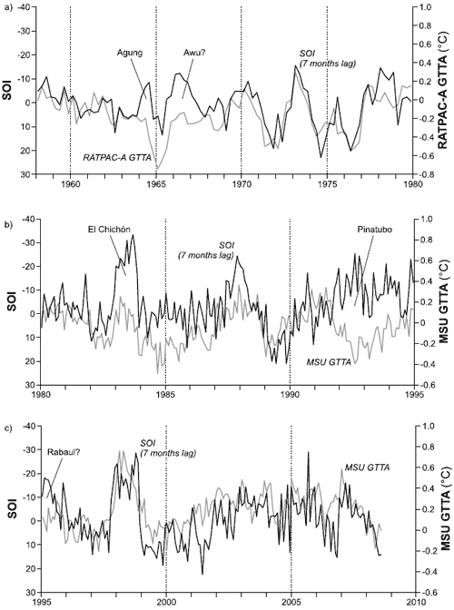
Figure 7 from McLean 2009: Seven-month shifted SOI with (a) weather balloon RATPAC-A temperature data 1958–1979 and satellite UAH temperature data (b) 1980–1995. Dark line indicates SOI and light line indicates lower tropospheric temperature. Periods of volcanic activity are indicated.
Foster 2010 explains how this figure splices together two separate data-sets: weather balloon data (RATPAC) to the end of 1979 followed by satellite data (MSU) since 1980. The splicing is obscured by the fact that the graph is split into different panels precisely at the splicing boundary. However, John McLean defends this graph by stating "The Y-axes are clearly labelled". In other words, the graph clearly states that box a) is RATPAC weather balloon data while boxes b) and c) are MSU satellite data.
What is not clearly shown in this graph and only discovered through analysis of the original data is that the mean values of the weather balloon and satellite data during their period of overlap differ by nearly 0.2°C. Splicing them together introduces an artificial 0.2°C temperature drop at the boundary between the two. In other words, they "hide the incline".
The crux of McLean's argument is that when you eyeball this graph split into several boxes, the temperature line fails to rise above the SOI line. Is there a plot of this data that isn't split into obscuring pieces? Is there a more rigorous analysis than a mere eyeballing of the data? To find such an analysis, you only need to go to an earlier section of McLean 2009. They start by plotting 12 month running means of the Southern Oscillation Index versus satellite temperature. This is before any long-term trends are removed. Eyeballing of the graph shows the temperature line clearly rising above the SOI line. Analysis of the data shows low correlation between the two data-sets. It's only by removing the long-term warming trend that they're able to establish a strong correlation between SOI and temperature.

Figure 1 from McLean 2009: Twelve-month running means of SOI (dark line) and MSU GTTA (light line) for the period 1980 to 2006 with major periods of volcanic activity indicated.
An even longer time period is possible by comparing weather balloon data to the Southern Oscillation Index. This is done in Figure 4 from McLean 2009.

Figure 4 from McLean 2009: Twelve-month running means of SOI (dark line) and RATPAC GTTA (light line) for the period 1960 to 2006 with major periods of volcanic activity indicated.
McLean argues that "If the SOI accounts for short-term variation then logically it also accounts for long-term variation". And yet despite McLean's attempt to hide the incline, his own analysis shows a strong divergence between temperature and the El Nino Southern Oscillation. Thus, the attempt to blame global warming on El Nino activity suffers from a serious divergence problem.

Arguments


I plan to check for myself, but this is a pretty funny result after the media frenzy over 'hide the decline'.
I take the point about figure 7 being confusing but if you do object to the splicing of two data sets then you can just ignore a) and look at b) and c). After all 1979 onwards is the most important period for global warming to show itself in the data. So just 'eyeballing' b) and c) of figure 7 suggest there isn't a great deal of separation between SOI and global temp.
There was one extra question I wanted answering. I had noticed that Figure 1 clearly showed temperature rising above SOI in later decades as mentioned in the article. This is less obvious in Fig 7 b) and c), which would be the equivalent set of data.
Now figure 1 is the 12 month running average for temp while Figure 7 is a plot of monthly averages. Does the smoothing of the temperature data do anything to cause the SOI and temp to diverge?
There are more links to relevant material in the Links section here at Skeptical Science, in these sections:
McLean's reply to Foster 2010 was censored and It's El Nino.
"Can El Nino Events Explain All of the Global Warming Since 1976? – Part 1"
http://bobtisdale.blogspot.com/2009/01/can-el-nino-events-explain-all-of.html
Bob Tisdale believes that big El Niños cause step changes in global temperatures, specially sea surface temperatures.
In short, the La Niñas reduce the cloud cover above the tropical pacific, so the Pacific Warm Pool accumulates heat (interestingly, it is there were the most rapid sea level rise happens, at a rate of more than 1 cm/year !).
Then when a big El Niño happens, the heat is released and transported to other ocean basins. When the next La Niña occur, part of this warmth persist(apparently, the effects of La Niña are less global than El Niño ones).
It seems to me to best skeptical argument I have ever read.
It fails, however, to explain the steady warming of deep oceans as shown in "Global hydrographic variability patterns during 2003-2008" by K. von Schuckmann.
What do you think?
They did the same y-axis label shifting in Figure 1 as well.
"Hide the incline" indeed!
Proving that AGW, as measured by atmospheric temperatures, is caused by ENSO, proves nothing. The oceans are where the judgement of AGW is actually written, and those oceans are warming.
It seems to me that Jeffs comments about the axis being shifted is correct. I presumed that the zero on each side lined up when I looked at the graph. It was very difficult to see that they did not line up. To McLean et al: is it normal to have this type of axis shift?
Of course it doesn't, noone is suggesting "McLean hid the decline therefore it's okay for Mann to hide the decline". In the case of the tree-ring divergence problem, what is required is a proper understanding of the tree-ring divergence problem. Contrary to what is commonly reported, it's not a divergence or decline in temperature - but a decline in tree-ring growth due to some factor other than temperature. This is an issue that is openly discussed in many peer-review papers.
In contrast, what we're talking about here is more straightforward - the direct comparison of temperature and SOI. But the comparison is being obscured by splicing of data, of obscuring the splice by dividing the graph into multiple boxes, of using different Y-axis ranges in the different boxes and a curious lack of divergence in Figure 7 that is not apparent in Figures 1 and 4. The way McLean and others talk up Figure 7, it's the smoking gun that disproves anthropogenic global warming. With all the question marks over this graph, it's more a smoking gun firing blanks.
If we were concerned about absolute values I would take your point about the shift in the axis but what matters here is trends and I still don't understand why the trend difference is more obvious in figure 1 than it is in figure 7. If the difference existed in figure 7 it would be shifted to one end of the graph (1980 or 2000) because of the axis shift, but it isn't.
Also, did I understand this correctly that they filtered out the long term trend, and then state that they detect no long term trend (global temperature rise)?
#11 comment, actually I think the smoking gun wasn't firing blanks, but it ended up pointed back at the shooter...
#12 Humanity Rules, if you put the three panels together, added back the 0.2 degrees offset in GTTA between panels a and b, then I think you would see the trend more clearly. Also note that the x-axis is expanded in panels b and c relative to panel a, which makes the trend appear smaller. In any case, as I mentioned above, the effect of putting the zero label in slightly different places on the right and left y-axes is visually deceptive.
The bottom line is that Figure 1 is a straightforward plot of two quantities, and they did several things differently in Figure 7, all of which had the effect of obscuring the trend in GTTA, which is obvious in Figure 1. You might ask yourself why they did that, or why they removed the trend for their statistical correlation while claiming they were just removing noise? I've drawn my own conclusion.
(this also posted at Deltoid).
I’ve offered this up before elsewhere.
Here are links to submissions made by McLean to a New Zealand Parliament Select Committee that was considering an Emissions Trading Scheme.
Three Select Committees have had a go.
For the first round in 2008 McLean co-submitted with someone who in a previous life called for a boycott of Mobil because of climate change issues and is now a denialist.
http://www.parliament.nz/en-NZ/PB/SC/Documents/Evidence/9/1/7/48SCFESCEvidenceCCETRP_ET44-Terry-Dunleavy.htm
For the second round in early 2009 McLean went solo:
http://www.parliament.nz/en-NZ/PB/SC/Documents/Evidence/6/3/2/49SCETSSCevidenceETSR_047A-John-McLean-supp1.htm
http://www.parliament.nz/en-NZ/PB/SC/Documents/Evidence/3/6/2/49SCETSSCevidenceETSR_047-John-McLean.htm
And nothing for the 3rd round in late 2009.
The bigger issue is that MCdF claimed that SOI explained 81% of the variability in the MSU record, but that was based on the detrended data. That was their ONLY quantitative comparison of the two, and it was fundamentally wrong.
Figure 7 is just for "eyeballing"; there's no quantitative analysis included. In his recent comments McLean keeps trying to shift the discussion to Figure 7. It's important to note the problem with Figure 7 (panel a vs. b/c) but it's also important not to let him shift the discussion away from his erroneous quantitative claims.
That's so classic! I can't believe he actually said that. ;-)
On blaming ENSO for global warming... where does the heat come from? No matter how much handwaving is employed, you can't ignore thermodynamics.
McLean's claim is different. He says that from the short term SOI variation logically follows the long term trend, which is quite obviously not the case.
"The oceans are where the judgement of AGW is actually written, and those oceans are warming"
The first part of the sentence is true. The second one is not quite so.
If the oceans are "not quite" warming, what then accounts for the consistent rise in level, if not thermal expansion?
Note that the rise occurs in the face of dam inpoundment which, according to BF Chao, removes more than 0.5mm/yr additional rise, from river inflows around the planet.
http://sait.oat.ts.astro.it/MSAIt760405/PDF/2005MmSAI..76..890T.pdf
However he won't be able to explain global warming by referring to solar winds.