Subscribe in a reader


Username
Password
Keep me logged in
New? Register here


It's the sun
Climate's changed before
There is no consensus
Surface temp is unreliable
Models are unreliable
It's cooling
Ice age predicted in the 70's
Al Gore got it wrong
We're heading into an ice age
CO2 lags temperature
View All Arguments...


Latest Posts


Tuesday, 8 April, 2008

The Mystery of the Vanishing Ocean Heat

Everyone loves a good mystery. If J.K. Rowling hadn't finished her series so emphatically, "Mystery of the Vanishing Ocean Heat" could've been the 8th Harry Potter book. The latest intrigue is the revelation that the oceans have showed a cooling trend since 2003. As oceans take in 84 percent of the heat absorbed by the Earth, ocean temperature is a good measure of global warming. Does this mean global warming has ended?

Earlier claims of ocean cooling

First, to clear up one common misconception. One paper oft quoted is Recent Cooling of the Upper Ocean (Lyman 2006). This found a rapid drop in ocean heat from 2003, as measured by the Argo network deployed in 2000. Argo is a global array of 3,000 free-drifting floats that measures the temperature and salinity of the upper 2000 metres of the ocean.


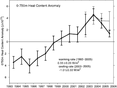
Figure 1: Yearly ocean heat content anomaly in the upper 750 metres.

However, the cooling trend was found to be exagerated when Lyman et al updated their results in Correction to “Recent Cooling 1 of the Upper Ocean” (Willis 2007). Systematic measurement biases introduced a spurious cooling trend since 2003. While this is somewhat old news, Lyman 2006 continues to be cited, including a recent comment on Skeptical Science.

Updated measurements of ocean heat

Nevertheless, the trend since 2003 is that of slight cooling, albeit not so dramatic. A new paper Assessing the Globally Averaged Sea Level Budget on Seasonal and Interannual Time Scales (Willis 2008) displays up-to-date data on ocean heat.


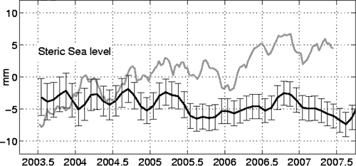
Figure 2: Steric component of global mean sea level (black line) with seasonal element removed.

Figure 2 displays the steric component of sea level rise. This is the sea level rise due to a change in sea water density, mostly due to thermal expansion and hence a measure of changing ocean heat. The black line shows a slight downward trend due to cooling temperatures (more on the grey line later).

However, upper ocean heat, like surface temperature, doesn't follow a monotonically warming trend during global warming. Ocean temperatures experience interannual variability and over the past 3 decades of global warming have had several short periods of cooling.


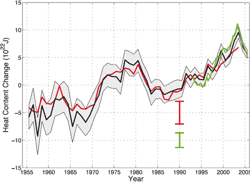
Figure 3: global annual upper ocean heat content. Black curve from Levitus 2005, red curve from Ishii 2006, green curves from Willis 2004. Red and green error bars denoting 90% confidence interval. Taken from IPCC AR4.

The early 80's and early 90's both display short term cooling trends. Low frequency analysis of ocean temperatures finds an 11 year cycle which correlates with the 11 year solar cycle (White 1997).


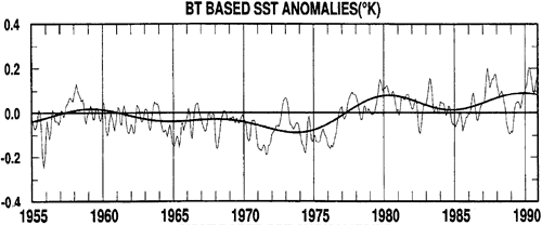
Figure 4: Bathythermograph measurement of sea surface temperatures.

This is not to say the solar cycle is driving current ocean cooling. White's later research (White 2003) finds the solar cycle is insufficient to explain the change in ocean heat content, attributing the cycle to internal mechanisms. The main point is that just as surface temperatures has experienced periods of short term cooling during long term global warming, similarly the ocean shows short term variability during a long term warming trend.

The real mystery of unabated sea level rise

While the skeptic blogosphere is fixated on cooling ocean temperatures, the real mystery is being overlooked. Willis 2008 assesses the sea level budget which is described by the following equation:

hTOT = hSTERIC + hMASS

To close the sea level budget, total sea level rise (hTOT observed by altimeter satellites) should match the steric component (hSTERIC observed by Argo) plus the mass component (hMASS calculated from GRACE satellite measurements of the Earth's gravity field). The big surprise is that the rate of sea level rise hasn't dropped since 2003, continuing at over 3mm per year.


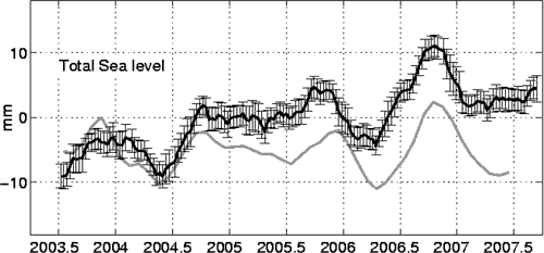
Figure 5: Total sea level rise as measured by altimeter satellites and confirmed by tidal gauges (black line). The grey line is what total sea level rise should be when adding the steric and mass components.

From 1993 to 2003, thermal expansion contributed slightly more than half the sea level rise with the rest coming from melting glaciers and ice sheets (IPCC AR4). If thermal expansion is no longer contributing, you would expect either less total sea level rise or a much greater contribution from melting ice. Neither have been observed.

The mass component of sea level rise is calculated from Grace satellite data which measures variations in the Earth's gravity field. The black line in Figure 6 below is the observed sea level rise due to a change in ocean mass. The grey line is the total sea level minus the steric sea level and should match the observed black line to close the sea level budget. The discrepancy is well outside the error bounds.


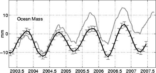
Figure 6: Observed mass component of sea level rise (black line). The grey line is the total sea level rise minus the steric sea level rise (eg - what the mass component is expected to be).

Over seasonal timescales, there is good agreement between total sea level rise and its components. The discrepancy emerges in the long term trend, which increases linearly at a rate of 3.3mm/year. What's the cause?

Argo takes measurements in the top 2000 metres of the ocean. Could the heat have moved to the deep ocean? This seems unlikely. Deep steric changes occur over time scales of decades or longer and aren't expected to explain the discrepancy over the last 5 years (Antonov 2005).

Willis 2008 speculates that there is most likely a systematic error in at least one of the three observing systems which is introducing a linear trend. It will be interesting to see how this issue is resolved over the next few years. Pity we can't flip to the last page now to find out how the mystery ends.

Posted by John Cook at 08:14 AM

Comments

  1. I notice that there is no mention of continental rebound as glacial weight continues to be removed. This has an effect on sea level measurement as it changes the reference points (increased altitude under the receded glaciers, reduced altitude nearer the equator. Also displacement from growing seamounts and ridges from vulcanism. Are these factored in or just considered miniscule?
    [ Response: I'm not sure if that would effect satellite measurements of sea level - it would have more effect on tidal gauge readings. Willis 2008 does mention a slight trend of sea level rise due to glacial isostatic adjustment changing the volume and shape of the ocean basins but has little mention of glacial rebound (just a reference to a glacial rebound signal in the Grace data). There's probably a mention of how it's factored into the data at sealevel.colorado.edu - you're very welcome to investigate and report back to us :-) ]
  2. I wonder if people really know what's going on in the ocean depths. I mean, there was a recent paper (LeQuere et al) stating that the deep ocean was saturated and releasing CO2, but that didn't really make sense (to me) either. They say there's increased winds and turnover in the Southern Ocean so that suggests (?) that there are meaningful interactions with the depths on short time scales.

    But okay, let's accept that the answer isn't in the deep -- here are two silly questions: 1) You say that a much greater contribution from melting ice has not been observed, but what level of confidence is there in the ice melt estimates? 2) What quantities of water are involved in changes to water vapour or additions from space or something (how closed is this system)?
    [ Response: To answer question 1, the graphs displayed above show the error bars for the various components of sea level rise. The discrepancy is well outside the error bars. ]
  3. Satellite measurements of sea level should not be affected if they use the equatorial sat. tracking stations to maintain cal. as they are located on coral atolls and islands and not subject to glacial rebound.
    The best data I found was from "Equatorial Atmospheric and Ionospheric Modeling at Kwajalein Missile Range" by Stephen M. Hunt, Sigrid Close, Anthea J. Coster, Eric Stevens, Linda M. Schuett, and Anthony Vardaro (PDF).
    [ Response: Added a link to the PDF for you. ]
  4. Steve L
    The system is not closed. Atmospheric gases are constantly lost to space, the rate depends on the speed of the solar wind which is not a constant (another sore point for me).
  5. Hi John, thanks for responding to my question in comment #2. But that error bar, I suspect, is calculated from the variance in the estimate. An estimate that is systemically biased can have high precision (tight error bars) and low accuracy. I don't know enough about how the ice melt is measured or calculated to evaluate whether or not the estimate could be missing something.

    Quietman (comment #4) -- there are also inputs from comets that presumably aren't constant but these should be pretty small, right? How about if the atmosphere carries a lot of water vapour and then dumps it when it gets a bit chillier. How much water could that be?

    Sorry to pursue questions I've already guessed are silly, but as part of getting into the mystery one has to eliminate the pool boy and the gardener before focusing just on the obvious maid and butler.
  6. Steve L
    Sorry but I could not even guess at that. I am a retired engineer with an interest in paleontology and paleoclimatology but I am not a scientist.
  7. You may be interested in how the map in this article compares ocean temps to US land temps:
    Vulcan Greenhouse Gas Map Zooms In On CO2 Sources7 April 2008 "The maps and system, called Vulcan, show CO2 emissions at more than 100 times more detail than was available before."
  8. Maybe this is just too simple of a theory, but could it be possible that the unexplained ocean cooling during what should otherwise be a warming period may be be related to the large amounts of near freezing cold ice water runoff from the poles and Greenland ice melt?
    [ Response: Spatial distribution of steric sea level rise (in other words, temperature change) doesn't show dramatic cooling near the poles or Greenland so this doesn't seem the case:

    ]
  9. John
    The ARGO map above has no date. Is this current? I went to their web site but the maps link gave me a 404 code.
    I would love to see this map for an EL NINO year and a LA NINA year to compare the area off the west coast of South America.
    [ Response: The pic came from Willis 2008 which I think gets published within a week or two (he emailed me the prepress). It shows the trend from July 2003 to June 2007. ]
  10. So then I can assume that the map colors reflect an average over 4 years rather than the maps in Atmoz's analysis which show monthly changes. This would make sense as the colors over the South American subduction zone (off the coasts of Peru and Chile) show neutral and warm when they should show cool as in Atmoz's presentation. What strikes me as odd is the warming around the horn between S.A. and Antarctica in both this map and the three monthly maps in question.
  11. Maybe not Greenland, but it certainly seems the case toward Alaska.
  12. I really wish you would have waited, John. I can't stand the suspense.
  13. In a recent article the new "Vulcan" system maps CO2 Sources (and sinks as well). Take a good look at the sample map in the article!
  14. Here is the link directly to the CO2 Sources sample map
  15. It seems that there is another new twist where the Antarctic Deep Sea Gets Colder.

    "The data gap can only be closed with the aid of autonomous observing systems, moored at the seafloor or drifting freely, that provide oceanic data for several years."
  16. John
    Heres an update on ocean cooling (top link) and background (bottom link) - Interesting I think.

    The Southern Hemisphere westerly winds have moved southward in the last 30 years. A new climate model predicts that as the winds shift south, they can do a better job of transferring heat and carbon dioxide from the surface waters surrounding Antarctica into the deeper, colder waters.
    The new finding surprised the scientists, said lead researcher Joellen L. Russell. "We think it will slow global warming. It won't reverse or stop it, but it will slow the rate of increase."

    Southern Ocean Could Slow Global Warming - ScienceDaily (Dec. 5, 2006)


    The current consists of a number of fronts. Observations indicate that turbulent mixing is enhanced in these fronts, penetrating through much of the water column.
    Noting that understanding the ACC is important to understanding regional and global ocean circulation, Saenko feeds a simple representation of mixing along the current's fronts into a global climate model to evaluate the mixing's potential impact on ocean's overturning circulation.

    Antarctic Current Roils Deep Ocean Waters - ScienceDaily (Jun. 6, 2008)
  17. Sorry - I put them in the wrong order.
  18. Concidering how much heat the oceans released to the atmosphere during the 97-98 El Nino, could this be a delayed effect from that?
  19. Lee Grable:

    I've had the same question. Another contemporaneous effect was also Pinatubo's lingering aftermath that aiding in the destruction of ozone in the stratosphere, hence cooling the stratosphere by -0.6 degrC, cooling the upper troposphere but allowing a great deal more UVb into the troposphere (heating surface-level ozone even more).
  20. "flipping to the last page"? Perhaps not, but a report in Nature today goes at least some way to sorting out the inconsistencies between apparent ocean cooling and continued sea level rise in recent years:

    C.M. Domingues et al (2008) Improved estimates of upper-ocean warming and multi-decadal sea-level rise, Nature 453, 1090-1093 (19 June issue)

    http://www.nature.com/nature/journal/v453/n7198/abs/nature07080.html

    The paper describes corrections to ocean heat content measures with various independently identified biases [ARGO as described in the top article, and XBT's (expendable bathy-thermographs which had various ocean depth calibration errors].

    The rise in ocean heat content is now rather more "regular" without the very large apparent decrease in heat content in the early 80's (see Fig 3 in John Cross's top article), matches pretty well the expected sea level rise expected from ocean thermal expansion, and the variability seems to have a signature of the various volcanic eruptions of the last 50 years....
  21. Of course I meant John Cook! :-)
  22. This article from Live Science may explain a little:
    Seas Striped With Newfound Currents By Brendan Borrell, 14 July 2008

Post a Comment

Foul language, trolling, personal attacks or non-relevant links will be deleted.

You need to be logged in to post a comment. Login via the left margin or if you're new, register here.

© John Cook 2008