Climate Science Glossary

Term Lookup

Enter a term in the search box to find its definition.

Settings

Use the controls in the far right panel to increase or decrease the number of terms automatically displayed (or to completely turn that feature off).

Term Lookup

Settings


All IPCC definitions taken from Climate Change 2007: The Physical Science Basis. Working Group I Contribution to the Fourth Assessment Report of the Intergovernmental Panel on Climate Change, Annex I, Glossary, pp. 941-954. Cambridge University Press.

Home Arguments Software Resources Comments The Consensus Project Translations About Support

Twitter Facebook YouTube Mastodon MeWe

RSS Posts RSS Comments Email Subscribe


Climate's changed before
It's the sun
It's not bad
There is no consensus
It's cooling
Models are unreliable
Temp record is unreliable
Animals and plants can adapt
It hasn't warmed since 1998
Antarctica is gaining ice
View All Arguments...


Username
Password
New? Register here
Forgot your password?

Latest Posts

Archives

Arctic Sea Ice Extent: We're gonna need a bigger graph

Posted on 1 September 2012 by Daniel Bailey

It's happened to all of us. 

Whether as a child on the school playground missing the call to come back in from recess or later, as teenagers, forgetting to return a library book until it was overdue or as adults realizing with a start that it's the day after taxes were due and we haven't done a thing, we've all wakened from a walking sleep to realize something we've just been missing all along.

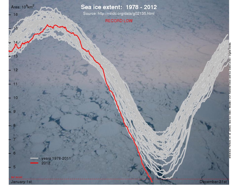
For the mainstream media and the average person in general, that thing is the ongoing demise of the Arctic sea ice cover.  And nothing puts facts, especially record-breaking facts, into perspective like a visual aid.  Consider this visual aid provided from RealClimate of the NSIDC Arctic Sea Ice Extent:

Arctic Sea Ice

[Source]

Virtually every sea ice metric there is shows a record-breaking loss of the Arctic sea ice "cap" in 2012. With Arctic sea ice dropping off the bottom of existing sea ice graphs, the noted sage Chief Brody might put it this way:

"We're gonna need a bigger graph"


SkS participant andylee has contributed this Youtube video, showing PIOMAS Arctic sea ice volumes:

0 0

Printable Version  |  Link to this page

Comments

Comments 1 to 26:

  1. Looks like the graph function is transforming to a sawtooth!
    0 0
  2. Reflecting the title, the NSIDC Sea Ice Index is already at the bottom of the graph above and still heading south. At the next update, the graph will have run out of room.
    0 0
  3. I keep a daily chart on the ice extent from IARC-JAXA. Like everyone else I had to make space at the bottom this year for the new melt. Deep Climate is projecting 3.56m km^2 for minimum. Deep Climate Projection One striking this is how long the melt season is becoming - from a V-shape to a U-shape in the chart. Means the re-freezing will be almost as interesting as the melting.
    0 0
  4. I've been drawing simple bar graphs that track the minimum ice extent, area or volume for each year to date. With the PIOMAS August update (through 8/25) the results are striking: [LINK]
    0 0
    Moderator Response: [DB] hot-linked URL. [RH] shortened link that was breaking page formatting.
  5. Most worrying is the fact that PIOMAS is following the exponential decline https://sites.google.com/site/arctischepinguin/home/piomas. Result ice free in 2015. Next year will be interesting
    0 0
  6. shoyemore "Means the re-freezing will be almost as interesting as the melting." Never a truer word spoken. This years refreeze pattern is next years melt pattern. If refreeze starts later because the water is still warmer, their is less time for that ice to thicken over the winter and next year it melts out even quicker, more open water, more warming of the water more ... you get the idea. heijdensejan Yep, PIOMas really is following that exponential curve. However I think there will be some aspects of the Gompertz curve will happen as well. Exponential trend till it is 'virtually ice free' then leveling out like the gompertz curve before the last remnant goes. This isn't some weird math's. Its just that the last remnant is the ice along the north shore of Greenland & Ellesmere island. Weather patterns aren't usually conducive to that being cleared out easily and that is where the last remnant of the thicker ice remains. So it might hang around a bit. What is far more likely is that over the next 1-3 years the rest of the Arctic melts out substantially and earlier and that old ice is the last bastion. And importantly, that would include an ice-free North Pole. Not the final, truely ice free point. But perhaps a far more visceral 'tipping point'. The Year Santa Drowned. Although nobody wants the Arctic collapse to be happening, it might be our best hope in the short term to wake the world up.
    0 0
  7. Yes, no one really predicted it. Maybe we weren't being "alarmist" enough?
    0 0
  8. Glenn@6: The Year Santa Drowned. I will wager my last hot dinner you just started--even before it's needed--a new GW meme. Not sure whether to cry or to laugh.... For nigh on 10 years now, and given my increasingly cynical nature (and this, from a born, inveterate optimist!) I've been thinking that it *will* take a truly catastrophic event like the total melt-out of the Arctic to grab folks by their short-n-curlies, before anything really substantial gets done. I just hope that point-of-action isn't too late. "No matter how cynical you get, it's *impossible* to keep up." -Lily Tomlin, from "The Search For Signs Of Intelligent Life In The Universe.
    0 0
  9. The Year Santa Drowned. I will wager my last hot dinner you just started--even before it's needed--a new GW meme.
    A meme that's already in play, and I'm sure that I wasn't the first. It'll be interesting to see just how it's used for the first time in the mainstream media, once an ice-free summer Arctic is achieved...
    0 0
  10. Due to idle curiosity I started wondering whether there would be a possibility for the arctic ice to become 'dislodged', and if, then what would happen. So looking around I found this schema (from here) of the polar currents. My understanding based on this is that it is the transpolar drift that pushes the existing sea-ice against the coast of Greenland as well as the islands to the west and thus also push it southward for more rapid melting. So no spinning ice in the Beaufort gyre. Or have I missed something else?
    0 0
  11. We don't need a bigger graph, we need a smaller carbon footprint.
    0 0
  12. Santa's Drowning: Twas the year before the great thaw and all over the land, No deniest were stirring nor any of their band ... (Any good poets out there!)
    0 0
  13. http://www.natice.noaa.gov/products/ice_extent_graphs/arctic_weekly_ice_extent.html Hoping to understand why this is different from what is in the mainstream information being shown to us. From a conversation on another site there were differences on sea ice figures. Natice sea ice extent does not have the record broken by its own graphs. I put in years 2000 to start and 2012 to end. According to NATICE 2012 has not broken the 2007 low ice extent record. How does NATICE differ in its data from the PIOMASS and others and why?
    0 0
  14. #13 jeffgreen I am not an expert, but that particular chart at the link seems to be updated fortnightly, so it will not be updated again until September 8th. The last date updated is 26th August. Here is another chart from the same site that is updated weekly. http://www.natice.noaa.gov/ims/ Better to wait until well into September until any message can be taken from these particular graphs. I notice Anthony Watts made great play with this second chart - until it got updated.
    0 0
  15. Jeff, The NSIDC has posted at several locations on the web, including Realclimate and WUWT, that the IMS ice product includes all ice detected in its extent analysis. The NSIDC includes only areas with at least 15% ice. Therefore the NSIDC is always lower than IMS. Because of the way the data is analyzed, IMS is not comparable from year to year. For this reason it is not useful for long term analysis. It is intended for use by Navy ships for navigation. A lot of the extent IMS currently measures is less than 5% ice and is expected to melt out soon. There is much more low concentration ice this year than there was in 2007. The deniers like IMS since it is the last measure of the ice that is not lower than 2007. Scientists use 15% extent like IJIS and NSIDC because the data is collected and analyzed for the purpose of long term comparisons. Note: Cryosphere Today uses sea ice area and DMI uses 30% extent. It is best to only compare one groups graphs with their own graphs. PIOMAS measures volume which is another animal completely.
    0 0
  16. This was posted at Nevens: blog: For those wondering about the NIC estimates (as can be seen here: http://nsidc.org/data/masie/, NIC produces operational ice analyses, focused on using many data sources of varying quality and quantity to detect as much ice as possible, even small concentrations. NSIDC’s passive microwave data may miss some low concentrations (it uses a 15% concentration cutoff), particularly during melt. So it’s not unusual for NIC/MASIE to show more ice, though it’s more than in other years because the low concentration ice is scattered over a much larger area. An important point is that NIC/MASIE, while picking up more ice, is produced via manual analysis and the data quality and quantity varies. So the product is not necessarily consistent, particularly from year-to-year. NSIDC’s product is all automated and consistently processed throughout the record. So there may be some bias, but the bias is consistent throughout the timeseries. This means that comparison of different years, trend values, and interannual variability are more accurate using NSIDC. Hope this info helps. Walt Meier NSIDC
    0 0
  17. jeffgreen11 @13, it will interest you to know that natice also shows the extent with 20% sea ice, which is most definitely at record low values (3.25 million square kilometers).
    0 0
  18. The canary finally fell off its perch. Here's an updated version of my raytraced PIOMAS visualization: http://www.youtube.com/watch?v=bNkyJ7eHHhQ I'm still working on the death spiral version. Takes hours and hours of scripting!
    0 0
  19. Thanks, Andy. Reposted it to the SkS FB page and embedded in the OP above; attribution to you.
    0 0
  20. Sauerj @12: One of my favorite poets (though he denies the label) is the Digital Cuttlefish. He is already on the job. And as always, he does not disappoint!.
    0 0
  21. Digital Cuttlefish did a great job on that! Thanks for the link. One has to wonder how the deniers will spin this. But then, they are already shifting to other arguments... "we can't do anything about it." "It's too expensive to deal with." Etc.
    0 0
  22. The Night Before Minimum 'Twas the Night before Minimum and all through the house The windows were leaking, Santa searched for his spouse The foundation was gone, 'twas no chill in the air Santa knew things had changed but he did not despair Santa'd bought a big boat, he knew this day would come He'd seen temperatures rising, seen this "Day in the Sun" He'd put floats on his reindeer, put floats on his shop Now it's time they were moving "'fore there's no place to hop" "On Dasher, on Dancer, on Prancer and Vixen" "On Comet, on Cupid, on Donder and Blitzen" "To the top of the deck, to the deck is my call" "To the deck 'fore this ice flow is nothing at all" "We're off to the South Pole where ice sits on land" "Where there's no need for ice to find some place to stand" They loaded the boat with all in their care They started the engine, they set wind to hair "To all Warm September! To all buy a fan!" "Let's put out the deck chairs it's time for a tan!" "Think of me in your dreams. Think of me and my house" "There's no ice in the ocean, there's no ice 'neath my spouse" "Think of great ways to spin, think of great ways to say" "That the Earth is not warming, it's not warming NO WAY!" "Say goodbye to the Arctic for it's now a warm bay" "And I've just retired.. no sled for Christmas Day."
    0 0
  23. The Y axis on ice extent and ice volume graphs should always have started at 0. {...snip...}
    0 0
    Moderator Response: [KC] Inflammatory snipped.
  24. No, william, it is neither necessary nor desirable to always start the graphs at 0. Scaling should be appropriate to the purpose of the graph's readers. If you want to maximize the readers' ability to discern changes in the graph, you should make the graph fill the space as much as possible. {...snip...}
    0 0
    Moderator Response: [KC] Inflammatory snipped
  25. As an example of Tom's point, go look at pretty much any graph of the Dow Jones Industrial Average or the NASDAQ for the prior, say, 24 month. You will never see such a graph starting with zero. Go to Google Finance and experiment with different time periods. The Y axis will automatically scale with the range being displayed. If you don't do this then, as Tom says, you run into troubles trying to discern any changes.
    0 0
  26. This has always struck me as a bizarre complaint. Spend any time on WUWT and you'll see numerous posts positively dripping with hatred towards those who dare try to present data in a graph with a scale they disapprove of. Isn't that why the values are shown on the axes? Even Excel, the fake sceptics' statistical analysis tool of choice, defaults to automatically adjusting the axes values to best fit the data when you use it to create a graph. And why stop with the Y axis? Surely the X axis should start at "0", too? Let's see, instrumental record ~150 years, X axis scale ~14 billion years, you'd need a sheet of paper 4 km long to have the entire instrumental record represented by a single pixel at 600 dpi on that graph. :-)
    0 0

You need to be logged in to post a comment. Login via the left margin or if you're new, register here.


The Consensus Project Website

THE ESCALATOR

(free to republish)


© Copyright 2024 John Cook
Home | Translations | About Us | Privacy | Contact Us