


 Arguments


Update of Visualisations of Carbon Dioxide
Posted on 1 June 2010 by Peter Hogarth
Guest post by Peter Hogarth
This post is an update on Visual depictions of CO2 levels and CO2 emissions and can be read in conjunction with Riccardo's recent post.
Visualisations courtesy of Andy Jacobson, ESRL NOAA
This CO2 animation is updated for 2009 and now also includes data from several Antarctic ice cores, which allows us to extend the CO2 record back 800,000 years - through several previous "Ice Ages" and interglacials. It can be seen that the rise in CO2 over the past two hundred years due to burning fossil fuels is now accelerating and is currently around 40% higher than pre-industrial levels. From the current paleo-records, it appears this rate of rise is unprecedented. The recent high resolution records, derived from from multiple stations worldwide show seasonal variations due to anthropogenic and natural sources and natural sinks such as high latitude vegetation growth in Summer, superimposed on a steady rising trend. The seasonal variations are strongest in the Northern Hemisphere, where most of the land masses, terrestrial vegetation, and anthropogenic industrial sources are. For over two centuries, almost all of the main industrial sources have been in the temperate regions in Europe, the US, Russia, China and Japan. Much of the CO2 patterns for domestic use follow seasonal variations also, with US CO2 output peaking in the coldest weather, but in recent decades a secondary peak is noticeable in summer months due to increased use of air conditioning.
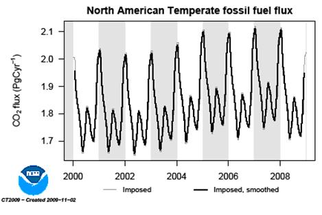
CO2 output from burning US fossil fuels. Image courtesy of ESRL NOAA
In the past 800,000 years at least, the temperature and CO2 have been closely related, with higher temperatures associated with higher CO2 levels due to natural interactions and temperature related sink/source mechanisms. The current dramatic rise is due to release of trapped chemical energy stored (over many millions of years) as coal or petrochemicals in the deep past when the climate, atmosphere and solar output were very different to today. In a relatively short timescale, extra CO2 emitted into the atmosphere due to this human activity is approaching the trillionth ton. The Oceans and biosphere have been absorbing around half of what we emit, measurably reducing the alkalinity of the oceans and increasing vegetation biomass where other conditions permit (for example the high latitude forest belt in Asia, where moisture and temperature are currently congenial).
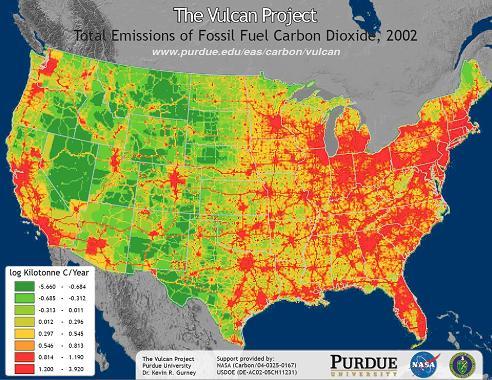
High resolution CO2 source/sink map from Vulcan Project, credit to Purdue University. Green indicates CO2 sink, reds are sources.
The Vulcan project attempts to measure, model and map sources of CO2 to very high resolution, so that CO2 outputs of individual industrial areas and even highways can be seen on country or regional scale maps. These are verified and backed up by high resolution measurements of the complete atmospheric vertical column from satellite sensors such as SCIAMACHY on Envisat. These maps unequivocally show that the primary sources of increasing CO2 are man made.
CarbonTracker visualization of CO2 sources and sinks for the US, showing atmospheric transport and mixing of CO2, and gradually rising levels. Visualisations courtesy of Andy Jacobson, ESRL NOAA
This emitted CO2 can be tracked (note: NOAA ESRL CarbonTracker is independent of the Vulcan project), measured and modeled throughout the global atmosphere, showing how the Northern Hemispheric troposphere and Stratosphere mix and transport greenhouse gases, and how they are distributed in latitudinal zones.
CarbonTracker visualization of global CO2 sources and sinks showing strong Northern Hemisphere variations compared to Southern Hemisphere. Visualisations courtesy of Andy Jacobson, ESRL NOAA
Whilst much of the Earths natural Greenhouse Effect is due to water vapour or clouds, these can precipitate out, controlled by temperature, and it is the other greenhouse gases such as Carbon Dioxide (and the much smaller amounts of the more powerful Methane) which really drive the variations in long wave atmospheric absorption and warming. These are controlled by sources and sinks. Currently there is an imbalance, due to increased anthropogenic sources, and it is this which is believed to be causing an imbalance in global stored thermal energy, and warming.
Thanks and credit to Andy Jacobson and the rest of the ESRL (Earth System Research Laboratory) at NOAA (National Oceanographic and Atmospheric Administration) for creating these new animations. Further information, visual resources and data can be found at http://carbontracker.noaa.gov


 0
0  0
0


Comments