


 Arguments


Arctic freezing season ends with a loud crack
Posted on 23 March 2013 by Neven
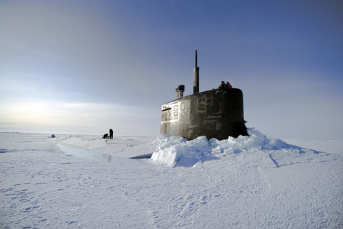 The sea ice cap on top of the Arctic Ocean is often imagined to be a monolithic, continuous sheet of ice floating on water. A closer look quickly shows it is rather a collection of larger and smaller pieces of sea ice. Of course, we have all seen the images of ice floes separated by open water during summer, but even during winter the ice pack gets fractured, leading to leads that quickly freeze over again. This explains how from the 1950's onwards submarines were able to emerge at the North Pole (the image on top is showing the USS Connecticut as it surfaces in the Arctic Circle on March 19th 2011; copyright: Kevin S. O'Brien, U.S. Navy). The subs couldn't break through the thick ice and had to look for a lead where the ice was thinner.
Strangely enough those who deny the reality and potential consequences of Anthropogenic, or human-caused, Global Warming still like to abuse this event and claim it somehow proves that nothing unusual is happening up North. It doesn't prove or disprove anything, as cracks and leads have always been a normal feature of the Arctic sea ice pack. But 'normal' is a word that has become less and less applicable to the Arctic in recent times. The 2012 melting season was the latest climax in a series of record years, that showed conclusively that the ice is thinner than it has been for a very long time.
We don't even have to await the coming melting season to see this re-confirmed. We can see it right now, at the end of the freezing season. Like I just said, cracks are a regular feature of the Arctic, but this video below, made by NOAA's Visualization Lab, shows a cracking event that is very rare, if not unique for this time of the year:
Ice, however thin, doesn't fracture by itself. It needs wind to pull the ice pack apart. This wind was provided by a big, intense and stubborn high pressure area that started about a month ago and kicked the Beaufort Gyre into action, which is an ocean circulation pattern that transports the ice in a clockwise fashion from the North American coast towards Siberia.
This short animation of ASCAT radar images shows the movement in 10 day intervals from January 1st onwards, compared to the previous three winters. The black dot represents the North Pole, the white mass below it is the northern part of the Greenland Ice Sheet, the brighter colours represent thicker multi-year ice that survived last year's melting season:
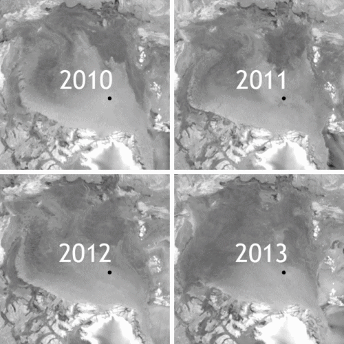
Aside from the red circle showing the start of the cracking event, there is clearly another big difference with previous years (blue rectangles). At the end of the previous three freezing seasons some of the multi-year ice in that disappearing safe haven north of Greenland and the Canadian Archipelago was transported into the Beaufort Sea. This buffer zone of thicker, older ice actually prevented an ice massacre in the 2010 and 2011 melting seasons, but unexpectedly didn't stand a chance in 2012. That means that this melting season there is no buffer zone on the Pacific side of the Arctic.
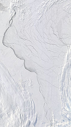 On top of that there is this cracking event, the effects of which are difficult to predict. Even though sea ice extent and area have reached their annual peak and temperatures aren't as low as they used to be, it is still quite cold in the Arctic. The labyrinth of leads that stretches all the way to Greenland due to another intense high pressure area, is freezing over again with a thin layer of ice (see image on the right showing the LANCE-MODIS March 21st satellite image). A possible outcome could be that when the Sun starts to beat down on this part of the Arctic from May onwards, the thin ice will quickly disappear leaving behind stretches of open water well inside the ice pack. Under the right circumstances this could significantly accelerate melting. Never mind the fact that the ice pack has started to break up in ever smaller parts so early in the year, making it much easier to move the ice around.
What about those big high pressure areas causing all that thin ice to crack and get caught up in the Beaufort Gyre? Not only have they been spurring on the spectacular cracking event of recent weeks, they are also helping winter to keep parts of the US and Europe in its icy grip. The highs are tied to a sudden stratospheric warming event (SSW) that has effectively made the Polar Vortex collapse relatively early, after it was already considerably weakened by a SSW in January. The Polar Vortex normally keeps cold air from spilling out all over the Northern Hemisphere. As Andrew Freedman wrote on Climate Central a couple of days ago:
The weather map across the Northern Hemisphere features a sprawling and unusually strong area of High pressure over Greenland that is serving as an atmospheric stop sign, slowing weather systems as they move from west to east, and allowing storms to deepen off the eastern seaboard and tap into more cold air than they otherwise might have.
That is not your typical fair weather area of High pressure, either. Some computer models have been projecting that, sometime during the next couple of days, the Greenland High could come close to setting the mark for the highest atmospheric pressure ever recorded.
The blocking pattern has helped direct cold air into the lower 48 states as well as parts of Europe, while the Arctic has been experiencing dramatically warmer-than-average conditions, particularly along the west coast of Greenland and in northeastern Canada. Blocking patterns are often associated with extreme weather events, from heat waves like the one that occurred last March, to historic cold air outbreaks and blizzards.
Another atmospheric blocking event on a large scale. What a coincidence. Below there's a composite image of the two recent high pressure areas, the extremely negative Arctic Oscillation Index and temperature anomalies for the Arctic since January 1st:
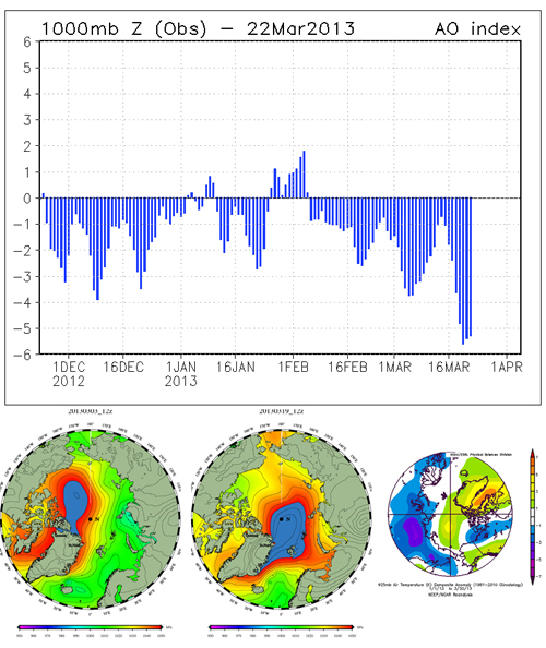
As can be seen on the image in the lower right corner, temperatures in the past three months have been anomalously high over Greenland and Baffin Bay, where sea ice area has already started to drop. This doesn't bode well with last year's events in mind, when almost all of the surface of the Greenland Ice Sheet was melting at one point (something which allegedly only occured once since the Holocene Climatic Optimum) and wild streams washed away bridges and heavy machinery, culminating in a record yearly amount of 570 Gt of melted volume.
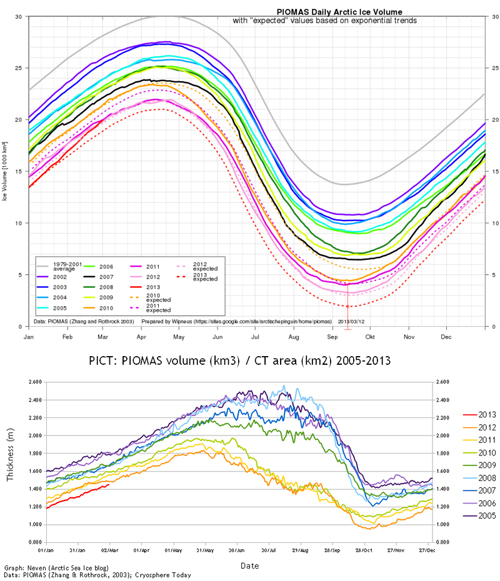
So is there any good news with regards to the Arctic? Well, more and more oil companies are deciding that Arctic drilling is too difficult and therefore not worth the investment. But when it comes to sea ice I can only offer one thin sliver of hope. According to the PIOMAS sea ice volume model, our best tool for estimating the volume and average thickness of the ice pack, there is approximately as much ice as there was last year. Even though average thickness figures (calculated by dividing the volume by total area) suggest that the volume increase occured on the outer edges of the ice pack where ice will melt out anyway, it is still mildly comforting, as volume numbers were quite a bit below those of previous years so far:
Although the melting season has now officially started and sea ice area/extent has begun to decrease, the ice will thicken some more until the Sun takes over the entire Arctic Circle. Perhaps weather conditions will be mild, gigantic cyclones leave the ice alone, and the ice turns out to be sturdier after all. But given the current status a new record is a very definite possibility. It's not for nothing that we are entering the period that according to Wieslaw Maslowski's model could see an ice-free Arctic (sea ice area below 1 million km2) for the first time in a very long time. This will probably have consequences, if they aren't already upon us.
We'll have to wait and see...


The comment that the leads freeze up rather quickly and the second comment that there is about as much ice volume now at its peak as there was last year hint at something interesting. One would expect more ice to form each winter in this transition stage to a new climate regime. If there is a cover of insullating ice on Sept 15, as was the case many years ago, heat has to conduct through this ice into the atmosphere in order to freeze more ice to the bottom of the ice sheet. With open water or thin ice, heat transfer is much faster. Later in the sequence, when the Arctic is open water, say, at the first of August, so much heat could be accumulated by the Arctic ocean that less total ice will be formed in the winter. The present situation may go some way to explain the increased influx of Atlantic water since more brine is being formed by the greater amount of ice formed and this sinking, south flowing brine is being replace on the surface from the south. Incidentally, go to the NSIDC site for November and it is reported about half way down that open water is causing rising air and a little further down that winds are coming from the south. Sounds very much like a reversal of the Polar Hadley cell which should occur in the fall as the land rapidly cools down. Note also that the high pressue is due to cold dense air falling. , spreading out southward with a clockwise spin provided by coriolis. It is weakening as this cooling decreases. When some serious heat is collected by the Arctic ocean as the state of openness comes earlier and earlier in the year, we should have longer and longer periods of rising air with air sucked from the south and with a counter clockwise spin. Coriolis tends to push floating ice in the conventional clockwise rotating Beauford gyre toward the centre. In a Counter clockwise rotation, which would be caused by rising air, Coriolis will tend to send the ice outward. If strong enough, a reversed Beauford gyre should have upwelling of deep Atlantic water at its centre.
This year so far, the Arctic has not matched last years high temperatures:
http://ocean.dmi.dk/arctic/meant80n.uk.php
Yet it seems that more cold air is pouring south from the Arctic than last year, at least in March. Is there a unified explanation for last year's high temperatures and this year's overall cooler Arctic?
Why did the Arctic temperature plummet at around day 50?
Could I suggest it might be more accurate, and appropriate, to echo Neven's description - that the Greenland ice sheet surface was melting, rather than claim that "almost all of the Greenland Ice Sheet was melting at one point" which is not the kind of scientifically accurate description I have come to expect from SkS?
Thanks for the good suggestion, gpwayne. Fixed now.
---
Pete, that's a good question, but keep in mind, as useful a tool the DMI temp graph is, it doesn't measure, but models temperatures above 80N, which is only a part of the Arctic Circle (see for instance the Uni Bremen SIC map to get an idea of the area above 80N, second circle from the North Pole). I think this is the main reason for the discrepancy between this year and last year.
On this post's image with the temp anomalies in the lower right corner you can see that most of the heat since January has been around the Greenland and Baffin Bay area. You can compare that to this image I used last year for my winter analysis. Again, see lower right image for 2012 JFM temp anomalies. There, more heat is within the 80N circle.
A comparison between the images gives an idea, but they are not completely identical. For this year's image the anomaly colour range extends from -7 to +7, but for last year's image it's -5 to +5. In April's winter analysis I will of course compare apple to apple.
It's also good to remember that high pressure areas cause cloudless skies, meaning that a lot of heat gets radiated out of the Arctic. Last year didn't have highs of this magnitude.
Thanks Neven. I'll watch for your winter review. Clear sky lets more radiation out while strong winds out of the Arctic must be replaced by possibly warmer air from elsewhere. Transfer of energy to the Arctic and from there to the universe is a large element of global heat balance, and evidently easy to underestimate.