


 Arguments


IPCC update temperature graphs with best available data
What the science says...
The original global temperature schematic which appeared in the IPCC First Assessment Report and seemed to show the Medieval Warm Period (MWP) hotter than Present was based on the central England temperature record, and ended in the 1950s. It was only a schematic, and based on one isolated geographic location. Subsequent IPCC reports showed actual hemispheric temperature reconstructions. They did not "disappear" the MWP, they simply presented the best available data.
Climate Myth...
IPCC ‘disappeared’ the Medieval Warm Period
"by the 2001 [IPCC] climate assessment...the Medieval Warm Period had been ingeniously wiped out. This was the headline graph in the 2001 report. It was reproduced six times in the report, large, and in full color, the only graph to be so favored. However, the graph was bogus. The warm period during the Middle Ages had been artificially eradicated" (Christopher Monckton)
Origins of the Myth
The myth that the Intergovernmental Panel on Climate Change (IPCC) "disappeared" the Medieval Warm Period (MWP) seems to be based on Figure 7.1c from the IPCC First Assessment Report (FAR):
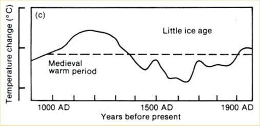
Figure 1: IPCC FAR Figure 7.1c - Schematic diagram of global temperature variations for the last thousand years. The dotted line represents conditions near the beginning of the twentieth century.
As you can see, IPCC FAR Figure 7.1c appears to show the MWP quite prominently, and warmer than the temperature as the end of the graph. But it's a rather strange figure - the temperature axis doesn't even have any numbers, and it looks hand-drawn. Where did it come from?
Pulling a Lamb out of a Hat
Jones et al. (2009) explore the origins of this figure. They note that the figure caption specifically stated that it was a schematic diagram, and not an actual temperature reconstruction.
"as far as palaeoclimatologists were concerned the diagram was nothing more than how it was originally described in the caption: a schematic."
Jones et al. trace the schematic diagram back to a series used by H.H. Lamb, representative of central England, last published by Lamb (1982). However, Lamb is plotting 50-year averages here, and the final data point appears to be 1950. Jones et al. superimpose IPCC FAR Figure 7.1c (black) with Lamb's central England temperature (red) and added the Central England Temperature data up to 2007 (blue):
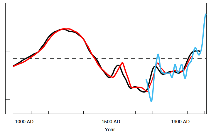
Figure 2: The black curve and the x- and y-axes are a redrawn version of IPCC FAR Figure 7.1c. The red curve is from Lamb (1982). The amplitude of this curve has been scaled to correspond to that of the black curve. The Lamb (1982) time series does have an explicit temperature scale, and the best-fit scaling between this curve and the IPCC curve indicates that one tick-mark interval on the IPCC figure corresponds almost exactly with 1°C. The blue curve is a smoothed version of the annual instrumental Central England Temperature record from Manley (1974, updated) including the last complete year of 2007. This has been smoothed with a 50-yr Gaussian weighted filter with padding.
Central England temperatures have risen by over 1°C since Lamb's last measurement. Jones et al. also note about Lamb's schematic:
"At no place in any of the Lamb publications is there any discussion of an explicit calibration against instrumental data, just Lamb’s qualitative judgement and interpretation of what he refers to as the ‘evidence’....Greater amounts of documentary data (than available to Lamb in the early 1970s) were collected and used in the Climatic Research Unit in the 1980s. These studies suggest that the sources used and the techniques employed by Lamb were not very robust (see, eg, Ogilvie and Farmer, 1997)."
In short, Figure 7.1c from the IPCC FAR was based on Lamb's approximation of the central England temperature. It was intended only as a schematic diagram, and known not to accurately reflect the global average temperature.
Advancements in Science
The Lamb diagram was dropped from the Supplementary IPCC report in 1992. Subsequent IPCC reports showed the first northern hemisphere temperature reconstructions based on proxy data. The IPCC Second Assessment Report (SAR) examined Bradley and Jones (1993). The IPCC Third Assessment Report (TAR) examined Jones et al. (1998); Briffa (2000); Crowley and Lowery (2000); and of course Mann, Bradley, and Hughes (1998) and (1999) (the so-called "hockey stick").
The IPCC TAR featured the "hockey stick" fairly prominently. The rather widespread belief that "the hockey stick is broken" and "suppressed" the MWP may contribute to this myth that the IPCC "disappeared" the MWP. However, although the MWP was not shown as prominently in the "hockey stick" as most other reconstructions due to the statistical methods employed in the study, all subsequent northern hemisphere temperature reconstructions have confirmed the general "hockey stick" shape.
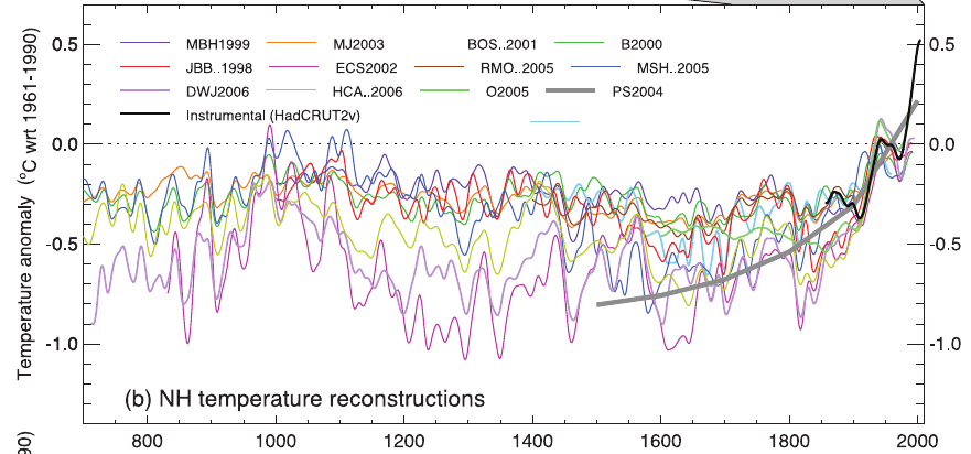
Figure 3: Various northern hemisphere temperature reconstructions using climate proxy records (Original image source: NOAA NCDC - broken link changed to local copy)
Furthermore, all of these reconstructions demonstrate that the present average northern hemisphere temperature is likely hotter than at the peak of the MWP. It's important to note that northern hemisphere temperature reconstructions are obviously much more representative of global temperatures than the temperature in central England. And it's also worth noting that most of the warming during the MWP was geographically located at high latitudes in the northern hemisphere.
Magicians without Secrets
On top of all this, the IPCC is very careful to discuss exactly what we know about MWP temperatures. Here is an excerpt from the IPCC Fourth Assessment Report (WG1 Chapter 6 page 468):
"The evidence currently available indicates that NH mean temperatures during medieval times (950–1100) were indeed warm in a 2-kyr context and even warmer in relation to the less sparse but still limited evidence of widespread average cool conditions in the 17th century (Osborn and Briffa, 2006). However, the evidence is not sufficient to support a conclusion that hemispheric mean temperatures were as warm, or the extent of warm regions as expansive, as those in the 20th century as a whole, during any period in medieval times (Jones et al., 2001; Bradley et al., 2003a,b; Osborn and Brif a, 2006)."
The bottom line is that the IPCC did not "disappear" the MWP. Rather, the IPCC has done its job correctly by evaluating the best available data and scientific studies at the time of each report. As climate scientists obtained more temperature data, it became clearer and clearer that the MWP was not hotter than present temperatures. A schematic of central England temperatures to 1950 is not quite the same as a reconstruction of northern hemisphere temperatures to 2007! The IPCC has done some impressive work, but it's no Harry Houdini.
Contradicting Low Climate Sensitivity
A favorite "skeptic" argument is "climate sensitivity is low". But if the MWP was particularly hot, that means there was a fairly large temperature change about 1,000 years ago. The hotter the peak of the MWP, the larger the temperature change, and the more sensitive the climate was to the factors causing that change (mainly increased solar activity and decreased volcanic activity). Arguing for a hot MWP is arguing for a high climate sensitivity to these natural factors, and if the climate is sensitive to an energy imbalance caused by a change in solar or volcanic activity, there's no reason it wouldn't also be sensitive to changes in greenhouse gases as well. In short, a hot MWP also means a high climate sensitivity. Sorry "skeptics", you can't have it both ways.
Intermediate rebuttal written by dana1981
[Update note - Feb 25, 2024: fixed the broken link to Jones et al. (2009)]
Update August 2015:
Here is a related lecture-video from Denial101x - Making Sense of Climate Science Denial
Last updated on 4 August 2015 by MichaelK. View Archives


The Jones et al. (2009) link is broken. This link to NASA without a paywall works. High-resolution palaeoclimatology of the
last millennium: a review of current
status and future prospects
Squiggles @8
Thanks for the heads-up! I updated the link to an archived version and also added a glossary entry for the paper while at it.