


 Arguments


What ended the Little Ice Age?
What the science says...
| Select a level... |
 Basic
Basic
|
 Intermediate
|
 Advanced
| ||||
|
The sun was warming up then, but the sun hasn’t been warming since 1970. |
|||||||
Climate Myth...
We're coming out of the Little Ice Age
"The global temperature has been rising at a steady trend rate of 0.5°C per century since the end of the little ice age in the 1700s (when the Thames River would freeze over every winter; the last time it froze over was 1804). On top of the trend are oscillations that last about thirty years in each direction. In 2009 we are where the green arrow points [on graph showing said oscillations- SkS], with temperature leveling off. The pattern suggests that the world has entered a period of slight cooling until about 2030." (David Evans)
At a glance
Where were you in 2009? It seems an age ago now. Climate science denial was everywhere. Skeptical Science was just two years old. It was like whack-a-mole - as one myth was dealt with, more would pop up.
Among the talking-points emerging around that time was the one that global warming was simply the planet recovering from the Little Ice Age (LIA). The LIA was a period of regionally cold conditions, usually said to have occurred between 1350 and 1850. Glaciers in the European Alps reversed their decline and advanced. In London, UK, the tidal Thames froze over sufficiently for 'frost-fairs' to be held on the ice, between 1608 and 1814. Their frequency is often exaggerated; roughly one winter in ten would be a realistic estimate.
Why was it so cold? Here, time travel would be wonderful. In the absence of that, we have had to develop more ingenious ways of reconstructing what happened.
A key factor is the LIA's regional nature. Its most dramatic effects were in Europe and North America. That suggests there was an element of 'internal climate variability' involved. The latter term refers to how heat is moved around within Earth's climate system, as opposed to being added to or removed from it.
During the LIA there were 'external forcing' factors too - these are things that do add or remove heat from the climate system. There was an extended period of minimal Solar activity, known as the Maunder Minimum. However, the Maunder Minimum took place between 1637 and 1719, more than 200 years into the LIA. It cannot have caused the initial cooling.
There were several colossal volcanic eruptions during the LIA, such as Laki in 1783 and Tambora in 1815. The Samalas eruption on the Indonesian island of Lombok was also huge, but occurred in 1257, almost a century before the LIA started. Volcanogenic cooling episodes typically last just a few years, but they wouldn't have helped: Laki and Tambora likely prolonged the cold conditions.
Recent research is instead hinting that the LIA was triggered by a dramatic weakening of the Gulf Stream. That was caused by warm ocean currents penetrating far into the Arctic, causing a dramatic breakup of the sea-ice. Resultant ice-floes were 'exported' en-masse out into the North Atlantic, where they melted, generating cool freshwater. This process peaked around the year 1350. The overloading by all that cool freshwater disrupted ocean circulation patterns and a rapid regional cooling followed.
At the other end of the LIA, what warmed things back up? Firstly, the 1850 end-date is not necessarily reflected in temperature datasets. These show a steady warming trend that only emerged after 1910, steepening and becoming less interrupted after 1970. That is not a regional but global pattern, suggesting that unlike the LIA, an external forcing was dominant. There's one obvious one - our pumping out of greenhouse gases.
The year 2009 was full of predictions from well-known deniers that we were entering a cooling trend. Fourteen years on, there's no sign of that!
Please use this form to provide feedback about this new "At a glance" section. Read a more technical version below or dig deeper via the tabs above!
Further details
Some climate science deniers like to insist that because the climate has changed dramatically in the past without man’s intervention, the current changes are also a natural event. You may be familiar with paintings depicting Londoners skating on the frozen River Thames. These mostly date from a period when Northern Hemisphere winters were more severe. The beginning and end of this cold period are subject to various interpretations, but the period is referred to as the Little Ice Age (LIA) and it occurred between the 14th and 19th centuries.
Limited History
If we are to understand the LIA, we need to figure out what caused it. Scientists have examined a number of important strands of evidence about the LIA. These include key natural drivers of climate change such as Solar activity, volcanoes, the Arctic and ocean heat circulation.
The activity of the Sun can be assessed by looking at proxies – processes that we know to be affected by the Sun’s activity. One of these is the formation of the radioactive isotope Carbon-14 (C14) in the atmosphere. The half-life of the C14 isotope is 5730±40 years. Radioactive carbon is mainly produced by cosmic particles reaching Earth's upper atmosphere. These particles vary in abundance through time. During times of high Solar activity, the Solar wind shields the Earth, whereas when activity is low, that shield is weaker. Thus, it is possible to deduce past Solar activity from changes in the concentration of C14 in the atmosphere. Because plants can absorb C14, past levels can be deduced by measuring C14 in tree rings and in other accurately age-constrained biogenic materials. Hence, we can estimate how active the Sun was in the past. A graph showing the Sun’s activity over the last few thousand years is presented in fig. 1.
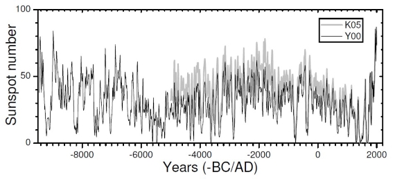
Fig. 1: Long-term sunspot-number reconstruction from C14 data. All data are decade averages. The Maunder Minimum is visible near the far right of the reconstruction. Source: Usoskin (2017).
Marked deviation from the norm in Solar activity may be expected to have effects on the climate. The Maunder Minimum, a long period when the Sun was particularly inactive, lasted from 1637 to 1719 (Owens et al. 2017). If the 1350 onset of the LIA is accepted, it cannot have been initiated by the Maunder Minimum, although it may well have helped prolong it.
Volcanic activity was high during this period of history. We know from modern studies of volcanism that major eruptions can have strong cooling effects on the climate, albeit for a limited number of years. Notably violent eruptions occurred during the LIA, such as that of Laki in Iceland in 1783 and Tambora, on the island of Sumbawa in present-day Indonesia, in 1815. These were big enough to be detected in ice-cores as sulphate-rich layers caused by sulphuric acid aerosol fall-out. They cannot have caused the LIA but they would almost certainly have prolonged it.
Going further back in time, the Samalas eruption, on the Indonesian island of Lombok, was colossal. It too left a sulphate-mark in ice-cores. The only thing is that the Samalas eruption occurred in 1257, almost a century before the accepted start of the LIA.
Socioeconomic factors may be relevant. Sudden and major population decreases occurred at this time, due to the Black Death and other pandemics. In turn, that would have resulted in a decrease of agriculture and reforestation of agricultural land. Such changes might have had a role, but how big is uncertain.
Since the original version of this rebuttal was published, advances in tracking the former extent of Arctic sea-ice have been dramatic. They are starting to provide important clues regarding the onset of the LIA. Miles et al. (2020) presented a reconstruction of sea ice export from the Arctic Ocean over the past 1400 years, using a spatial network of proxy records. They found robust evidence for a previously unknown period of extreme export of sea ice that commenced abruptly around the year 1300 and terminated in the late 1300s. The pulse of ice along East Greenland resulted in downstream increases in polar waters and ocean stratification that was sustained during subsequent centuries. Such an intense injection of fresh water into the North Atlantic Ocean could have so disrupted the ocean's circulation that the warm water currents of the Gulf Stream were weakened. That would have inhibited their moving so much heat around the Northern Hemisphere. Such a change would in turn have cooled countries adjacent to the North Atlantic, in a regional cooling phenomenon - which the LIA certainly was.
Can We Draw a Conclusion?
To some extent, the climatic shift of the LIA remains subject to speculation. Variable output from the Sun was most marked long after the LIA onset. From the end of the LIA to the 1950s, the Sun’s output increased, so its role may have been important. But since then, the Sun has slowly grown quieter, yet the temperature on Earth has continued to go up (fig. 2). This shows that whilst the Sun has an obvious role as an external climate forcing agent, it's not the only one out there. Modern global warming is mostly the result of adding manmade greenhouse gases to the atmosphere as the result of fossil fuel combustion.
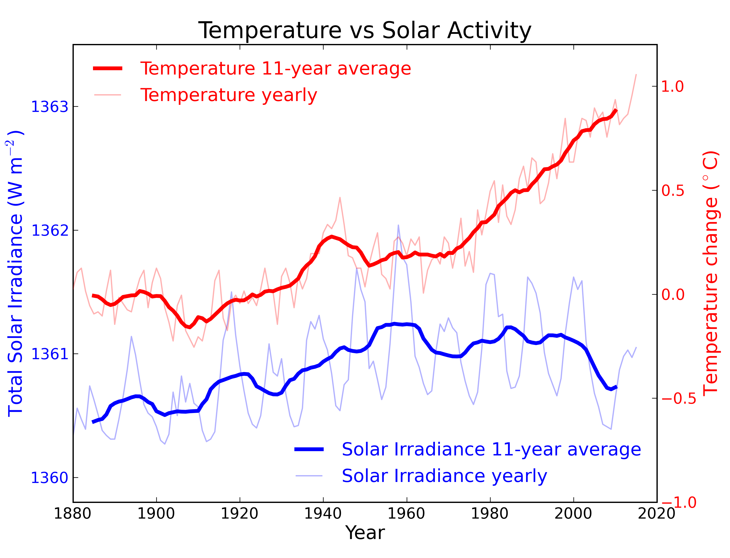
Fig. 2: Annual global temperature change (thin light red) with 11 year moving average of temperature (thick dark red). Temperature from NASA GISS. Annual Total Solar Irradiance (thin light blue) with 11 year moving average of TSI (thick dark blue). TSI from 1880 to 1978 from Krivova et al. 2007. TSI from 1979 to 2015 from the World Radiation Center (see their PMOD index page for data updates). Plots of the most recent solar irradiance can be found at the Laboratory for Atmospheric and Space Physics LISIRD site.
Instead, internal climate variability, driven by abrupt and drastic changes to Arctic sea-ice, are increasingly being pointed at as the trigger for the LIA. Such an event has now been detected and will come under further scrutiny in the coming years. The end of the LIA coincided with recovering Solar output plus increasing greenhouse gas emissions with growing industrialisation. Like many changes in climate, there's no single cause and different mechanisms can dominate at different times. Today, there's no doubt about the chief agent of rising temperatures and it's not the Sun!
Last updated on 5 May 2024 by John Mason. View Archives


Re Akasofu's assertion that "global warming has essentially stopped since 2000", presumably, this is based on the HadCRUT surface temperature record which omits areas of the globe of extreme warming in recent years. A more comprehensive analysis of the Earth's energy imbalance finds the planet continued to accumulate heat past 2000 right up to the end of 2008 (where the analysis ends). Global warming has not stopped.