


 Arguments


Explainer: how surface and satellite temperature records compare
Posted on 18 February 2016 by Guest Author
This is a re-post from Roz Pidcock at Carbon Brief
The news that 2015 was the hottest year on record has made headlines around the world over recent weeks. But a less-discussed detail is what is meant by “on record?”
Usually, scientists talk about the surface record, namely, readings from thermometers dotted over the Earth’s land and ocean surface. But satellites can be used to infer temperature, too.
Both methods have their own advocates and critics. But, in reality, the two records are very different beasts. Here’s a rundown of what they can and can’t tell us about climate change.
Twin approach
To work out the temperature at the Earth’s surface, scientists combine measurements of the air above land and the ocean surface collected by ships, buoys and sometimes satellites, too.
There are three major datasets of global surface temperature. The UK Met Office Hadley Centre and the University of East Anglia’s Climatic Research Unit jointly produce HadCRUT4. In the US, the GISTEMP series comes via the NASA Goddard Institute for Space Sciences (GISS), while the National Oceanic and Atmospheric Administration (NOAA) creates the MLOST record.
As well as the surface record, satellites circle the Earth over the poles looking at part of the atmosphere up to 10km above our heads known as the troposphere. They carry microwave instruments that measure how much heat is given off by oxygen molecules, from which scientists can work out the air temperature.
Two groups of scientists work on the data that satellites relay back to the Earth. The University of Alabama in Huntsville (UAH) and Remote Sensing Systems (RSS), a group of scientists based in California. Both use the same data, but have different approaches to analysing it.
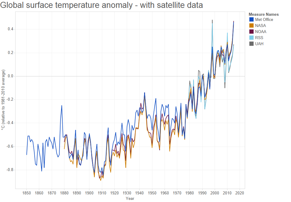
You can read more about how scientists put together the satellite and surface records in Carbon Brief’s in-depth explainers. But below is a chart comparing them all side by side.
While the satellite and surface instruments measure fundamentally different quantities, all data series clearly show a consistent warming signal. The trend in the satellite data is 0.11C per decade since 1979, compared to 0.16C per decade in the surface record.
Spotlight on El Niño
While the surface and satellite records all show a similar warming trend, there are some notable year-to-year differences.
One reason for this is El Niño – a Pacific weather phenomenon occurring once every five to seven years, which tends to give a boost to global temperature. El Niño’s signal is much more pronounced in the troposphere than at the Earth’s surface, giving rise to higher peaks and lower troughs.
Towards the end of 2015, we saw the peak of one of the biggest El Niño events in history. But how it played out in the different temperature records is a bit more complicated to unpack.
In the surface record, 2015 became the hottest year by quite some distance. This is despite only seeing a “small” contribution from El Niño. Scientists, speaking to Carbon Brief last week, suggested El Niño boosted global surface temperature by less than 0.1C, or around 10%.
But while 2015 was the warmest in the surface record, it only took the third spot in the UAH and RSS records. This is partly because El Niño has a delayed effect in the satellite record. Prof Geert Jan van Oldenborgh, from the Netherlands Meteorology Institute, tells Carbon Brief.
The instrument does not see the heat of El Niño along the equator at all. The El Niño signal is visible in the satellite dataset as the warm areas north and south of the equator. This is the heat from the upper tropospheric warming due to the extra rainfall over the Pacific.
The water condenses too high for the satellites to measure, van Oldenborgh explains. But as it is transported away from the equator, it enters parts of the atmosphere that the satellite is sensitive to:
Because the satellite measures a fundamentally different quantity than the near-surface temperature, it did not record a record in 2015, while the near-surface network did.
What to expect in 2016
We haven’t seen the last of the El Niño signal in either the surface or satellite records, says van Oldenborgh. The impact on global temperature is always higher in the year following the emergence of an event as the atmosphere finally catches up with the ocean. That means we should expect global temperature to keep rising through 2016, van Oldenborgh says:
I expect 2016 to be a record high temperature in both datasets, with a more pronounced peak in the satellite observations.

Global surface air temperature in HadCRUT4.4 (middle) and lower tropospheric temperatures (RSS; bottom) in 1982-3, 1997-8 and 2015-6. Credit: Dr Ed Hawkins, Climate Lab Book.
One way scientists know what to expect is to look at how temperatures evolved in previous El Niño years. Dr Ed Hawkins at the University of Reading has done some workcomparing 2015/6 global temperatures with those in 1997/98 and 1982/3, which also saw strong El Niño events.
The middle panel shows the comparison between different years in the HadCRUT4 surface temperature record, while the bottom panel is the satellite record assembled by the RSS group.
You can see how 2015 (red) was warmer than 1997 (black) or 1982 (blue) in both series, reaching a new high in the surface record. You can also see how global temperature continued to rise in 1998 and 2010, after their respective El Niño events peaked. Hawkins tells Carbon Brief:
The greatest response to El Niño in the satellite record has previously been the year after theEl Niño peak. If there is a jump…from 2015 to 2016 of the same size as seen in either 1982-3 or 1997-8, then 2016 will be the warmest year on record.
In other words, anyone currently pointing to the satellite record in an attempt to downplay climate change should be prepared for the distinct possibility of a new record in 2016.
Looking beyond 2016, the Met Office’s new decadal forecast expects the recent run of record hot years in the surface temperature record to end in 2017 as El Niño dissipates. However, global temperature will remain high between now and 2020, each year falling somewhere between 0.28°C and 0.77°C above the 1981-2010 average (blue shading below).
It’s worth noting that the Met Office is forecasting much higher temperatures than it was this time last year. Expressed as a rise above preindustrial temperatures, the expectation now is for warming 0.88-1.37°C between 2016-2020, compared to 0.76- 1.04°C from 2015-2019.
It’s also worth noting that even at the lower range of the Met Office’s range, the global surface temperature forecast in 2020 is above what it was in 2015.

Combined observed global surface temperature (black) from the Met Office, NASA and NOAA datasets relative to 1981-2010 and the new prediction of average global surface temperature in 2016-2010 (blue). Source: Met Office decadal forecast, Jan 2016.
Different records, different purposes
Once it’s understood that the satellite and surface record tell us different things, we can start to consider which is most useful for a given purpose.
The surface temperature record goes back more than 135 years, which makes it better for separating trends from short-term fluctuations, says van Oldenborgh. The NASA and NOAA records both begin in 1880, while the UK Met Office/UEA’s goes back an extra 30 years, to 1850.
Both the UAH and RSS satellite records, on the other hand, have only been going since the late 1970s. Thirty years tends to be the minimum length of time scientists use to assess climate change.
The benefit of the satellite records, however, is that they offer near global coverage. The surface record, on the other hand, has some well-documented gaps. Measurements are few in remote places, such as the Southern Ocean, Antarctica and the interior of Africa, for example.
“Adjustments”
A criticism sometimes levied at the surface temperature record is that it goes through a series of adjustments to correct for issues, such as missing data, changes in instrumentation, movement of stations, and human or technical error.
This process is known as homogenisation and, despite being a well-understoodscientific practice, has been used by some climate-skeptic commentators as evidence that scientists are “fiddling” the data to overstate the amount of warming we’ve seen.
But while the surface data routinely receives interrogation, the fact that the raw satellite data goes through a far more extensive “adjustment” process often goes undiscussed, says Zeke Hausfather from Berkeley Earth, a group set up in in 2010 to independently assess the surface temperature record. He tells Carbon Brief:
Adjustments to the satellite data to account for these issues are just as necessary as those to the surface record, says Hausfather. But the uncertainty in the measurements is much higher and varies between the two different groups collecting the satellite data. He explains:
Correcting for these biases is not straightforward, and different choices in correction parameters (adjustments, if you will) can lead to very different trends during the period from 1979-present.
Historically, the satellite record has changed much more than the surface record ever has, Hausfather tells Carbon Brief. In other words, he says:
If you don’t like adjustments, you really shouldn’t use the satellite record.
In the video below, you can see Dr Carl Mears, who runs the RSS satellite time series, explaining the process of stitching together different satellite records. The many processing steps means the satellite record is probably less accurate than the surface record, he says.
Snapshot
Arguments over which is most reliable – the surface or satellite record – is perhaps beside the point. Neither gives a complete picture of climate change, only a snapshot of one element of it.
Writing about new research in Nature Climate Change published last week, the Met Office’s Dr Matt Palmer and Dr Doug McNeall explain in a blog post for Climate Lab Book:
Surface temperature rise is often thought of as synonymous with climate change…[But] the various elements of global warming that we are familiar with – including global surface temperature rise, reductions in snow and ice cover, and sea level rise – can be thought of as symptoms of Earth’s energy imbalance.
Since more than 90% of the heat that the Earth retains ends up in the ocean, it’s how much the oceans have warmed that will tell us most about climate change. Dr Karina von Schuckmann, lead author on the Nature Climate Change paper, tells Carbon Brief:
We conclude that the most robust way of doing this is through estimates of global ocean heat content. It is an important scientific message to highlight the role and the need for in situ ocean observations.
Ultimately, surface thermometers and satellites measure different things. They are both imperfect ways of measuring a single aspect of climate change – although, as a direct and longstanding metric, the surface data record does seem to have more utility.
But taking a wider view of how climate change manifests itself shows how, like any good diagnosis, an insight into as many different elements as possible offers the best understanding.


UAH 6 for Feb. 2016 is available. Whoops.
To save clicking on Tom Dayton's link (unless you want the detailed discussion):
In that detailed discussion, Roy Spencer draws attention to the fact that the new monthly record is not entirely due to El Nino, given that it was not a record for the tropical anomaly. Rather, the El Nino warmth was boosted by some other (unnamed by Spencer) factor, which boosted the NH extratropical land temperatures to unprecedented values:
There were actually signs of something happening in the high-latitude NH satellite data for January. Both UAH v5.6 and RSS TLT post anomalies for the Arctic, with UAH further split into Land & Ocean. Both these data sets show a big record-breaking January for the Arctic.
Have you seen the latest from Tamino?
Carl Mears & Co have published a new paper describing a revision of the RSS data with focus on the diurnal correction. This revision increases the trend for the middle troposphere (TMT) from 0.078 to 0.125 K/decade over the period 1979-2014.
If the increase of the lower troposphere trend (TLT) is comparable to this (60 %), it should equate to about 0.2 K/decade – pretty close to or even slightly more than the surface data!
So, are we seeing the end of the satellite pause in more ways than one?
The revision of the RSS data I mentioned in my last post has now been updated to include February -16. That changes the TMT trend from 0.125 to 0.133 K/decade. This revision (v4.0) has also been applied to the TTT channel (temperature total troposphere), with the revised trend now being 0.172 K/decade. The TLT channel has not been revised yet, but when it is, it will probably show an even bigger trend than the TTT, as it is less influenced by the stratosphere than both TMT and TTT.
It seems that at least one satellite record is starting to agree pretty well with the surface records!
Many of the updates to the satellite records, in particular updates with large changes to trends, have been over diurnal cycle corrections. Looks like the most recent paper (Mears and Wentz 2016) involves a big one, replacing GCM estimates of the diurnal cycle drift with internal consistency checks from the satellites themselves.
The new temperature record is now more consistent between satellites, as well as more consistent with total column water vapor over the tropics, so it seems well supported.
It will be interesting to watch the UAH group (Drs Christy and Spencer) react to this - UAH is now the extreme outlier with its low trend, the unverified V6 being much more so than V5.6.
HK @5.
Are you sure about those TMT trends? I get the +0.133ºC/decade for TMT v4.0 but I get +0.083ºC/decade for TMT v3.3. As I'm tapping this comment out, I have a thought that the +0.125ºC/decade could be TLT v3.3.
MA Rodger:
The +0.125°C/decade trend I gave for TMT v4.0 is from a graph by Mears et. al (presented by Tamino here), which doesn’t include data after 2014. That figure grows to +0.133°C/decade once you add the last 14 (very hot!) months. I guess this also explains the difference between the figure in that graph for TMT v3.3 (+0.078°C) and yours (+0.083°C).
It is worth noting that TMT has a significant contribution from the stratosphere. The TTT channel is less influenced than TMT, but still more than TLT. In spite of that, the trend for TTT v4.0 is as high as 0.172°C/decade, so I’m really eager to see what TLT v4.0 will be like.