


 Arguments


February 2013 Arctic Sea Ice Death Spiral Update
Posted on 16 March 2013 by dana1981
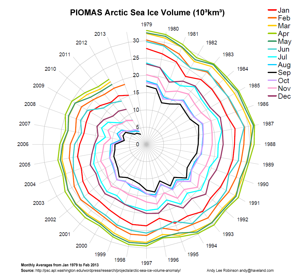
Andy Lee Robinson is the creator of several excellent graphics illustrating the rapid decline in Arctic sea ice volume. He has recently updated his Arctic sea ice volume spiral to include data from February 2013:
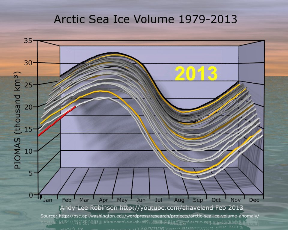
Here is another depiction of the same data:
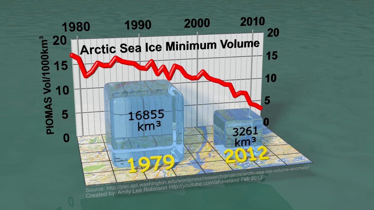
He also created a graphic to illustrate the incredible loss of Arctic sea ice volume between 1979 and 2012, representing them as ice cubes on a 10 kilometer grid map of New York, and in spiral form, illustrating that the sea ice volume has dramatically declined in every calendar month since 1979.
And Robinson is also the creator of this video illustrating the Arctic sea ice mass loss, from the second figure above.
We expect to have many more updates from Robinson in the future as he incorporates new data into his excellent existing graphics and creates new ones.


The first Death Spiral graphic is visually striking and clearly shows the loss of sea ice in all seasons. Another permutation that might complement it and more clearly show the differences between seasons is for the radial scale to show, rather than absolute volume in km3, the percentage of the volume in 1979 that remains. I think it would show that the summer/fall ice is disappearing exceptionally fast.
Nice graphics and the loss of volume is an eye popping if not heart stopping bit of information
In fairness, the perspective in the second figure exaggerates values below 30 thousand km3 in more recent years.
But the circle (spiral) graph is stunning. It even provides a tidy disappearing point for when months start hitting zero. If not for that, I imagine some people might take the flat segment on a non-circular graph between September 20X0's zero and September 20X1's zero as "evidence" of no warming.
I have a "purist's" objection to the spiral graphic, in that polar plots are for representing cyclic data.
However what the spiral does really well is brings the beginning and end of the series together to show how much they differ. So while it's not the way a mathematician would use such a plot, it is an excellent way to communicate the changes to a wider audience.
I guess this highlights the fact that communicating data to specialists and non-specialists are different problems and so require different approaches.
Golly, Kevin, what a GOOD point! I see *no* cyclical nature, at all, of a graph showing *seasonal* ice averages from 1979 to 2013. How could I have NOT seen that wasn't cyclical?...;)
@Kevin C, communicating scientific information/data/concepts to laypeople is always difficult and the use of simple graphs accompanied with simple explanations is the only way to go with this sort of informtaion. I always shudder though at encouraging people to get out their trusty eyecrometer to examine a graph as that is the common practice at all the denier dens. I think the big difference though is where all the experts in those places eyeball complicated published graphs (or fake graphs generated by the usual suspects, sometimes with yellow highlighted trendlines) people like Andy Robinson are producing good quality accurate graphics that are designed for general consumption as they are simple, and eyeballing them won't produce erroneous conclusions. So, "purists" could maybe take a leaf out Andy's book and consider the necessity to communicate science to non-scientific people. After all, they are in the vast majority and need to be informed about what's going on, not just in climate science either, but across all disciplines.
So from a purist's perspective, the polar plot should be one turn around the circle = one annual cycle, with twelve spokes for the months? Yeah, I could see that. It'd produce a different shaped spiral, but I bet it'd be just as striking and informative.
Quick and dirty gnuplot, using the same data, for the (no pun intended) polar plot purists out there. Thanks to Kevin C and of course Andy Lee Robinson for the idea.
One point of confusion (on my part) that hopefully someone can clear up. In the second figure, it appears that the last 3 years are all at the same level for February (the points overlap), yet in figure 1, the February line appears to be decreasing for the past 2 years? If this is representing the same data, obviously this can't be, so correct me where I've gone wrong interpretting the second figure.
Kevin, here's the average, using PIOMAS, for the first 28 days of Feb since 2000:
Linear trend is roughly -500 km3 per year.
Figure 2 plots daily values. Figure 1 simplified the data to monthly averages. A single day could be about the same three years in a row, but the average for that entire month would not necessarily be the same as well.
There is also an interesting graphics on EPI (Earth Policy Institute, Lester Brown):
http://www.earth-policy.org/data_highlights/2012/highlights31
(can also be found here on sks: http://www.skepticalscience.com/record-arctic-sea-ice-melt-to-levels-unseen-in-millennia.html ):
Then there is this graph from Wipneus at Arctic Penguins. He has looked at a number of regression curve fits to the data on ice volume and found exponential fits are the closest. Here is the data for each month and overlayed on top, the exponential curve fits. If things continue on their current trend, Santa drowns in 2015. And by 2016 the Arctic is ice free for 3 months of the year.
It doesn't matter which variation of a graphic you use, they all show the same thing. The Arctic sea ice is exiting stage left...
Then there is the huge arc of ice fractures building up acros the Canadian arctic as we speak. This has been developing for several weeks, starting in the Chukchi and then Beaufort seas. It has now spread across the top of the Canadian Arctic islands and is now fracturing above Greenland, starting to merge with the existing fracturing around the Fram strait. And some of those fractures are within kilometers of the pole.
Some fracturing always occurs but this is extensive and perhaps unprecedented. And importantly, it is virtually all of the remaining Multi-Year Ice that is now fractured. With the right weather conditions over the next 6 months a lot of the remaining MYI could get moved to warmer waters.
Neven is covering this in more detail on his Arctic Sea blog crack-is-bad-for-you-and-sea-ice
Here are some images:
This is above Greenland(right) and Ellesmere Island (left)
I thought so, too, so drew up the following very telling graph:
And for kicks, I also created one showing the same data in a normal line chart. It's also very telling--if not perhaps even more so. (Click either image to enlarge):
As Mr. Tamblyn worded it so eloquently and succinctly above: "It doesn't matter which variation of a graphic you use, they all show the same thing. The Arctic sea ice is exiting stage left..."
Indeed...
Kevin wrote: "If this is representing the same data, obviously this can't be, so correct me where I've gone wrong interpretting the second figure."
Did you notice that figure 2 shows smooth curves while figure 1 shows sharp angles? That's because figure 1 has one data point per month (the monthly average) while figure 2 has one data point per day. Hence the difference.
Nice graphs Jim! ;-)
Kevin, the spiral lines in fig1 are the contours of averaged months in fig2, moving from back to front, or what you see in the animation when the graph rotates.
CBD, re sharp angles.. the lines are virtual, because they can't exist - halfway between Jan 2012 and Jan 2013 is Jun 2012 - another series!
I hope to make it clearer in a future animation.
It is my understanding that sattelite data overestimate the total ice cover. Ships that have been sent to the arctic by Greenpeace report that at points that the sattelites report total ice cover it is found to be burger bits for miles around. Enough reflection from the burger bits looks from space like solid ice cover: i.e. it is worse that we thought
weekly areal data over the years in graphical: http://forum.arctic-sea-ice.net/index.php/topic,194.msg5554.html#msg5554 I don't have the volume numbers.