


 Arguments


Global warming not slowing - it's speeding up
Posted on 12 March 2014 by James Wight
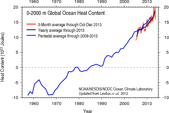
Figure 1: Global ocean heat content 1955-2013. (Source)
The Earth is gaining heat faster than ever
In 2013 the Earth’s oceans accumulated energy at a rate of 12 Hiroshima atomic bombs per second, according to global ocean heat content records from the US National Oceanographic Data Center (NODC). This rapid heating in 2013 compares to an average of 4 Hiroshima bombs per second since 1998, and 2 bombs per second since records began in 1955.
This is not the usual way to begin an article about global warming observations, but I have chosen to do so because ocean heat content is objectively the most important piece of evidence. The vast majority of heat from global warming goes into the oceans, so ocean heat content is a more reliable indicator of climate than surface or atmospheric temperature. This data shows global warming has accelerated in the last 15 years, contrary to denialist claims that global warming has “slowed”, “paused”, or “stopped” because the upper ocean, atmosphere, and surface have warmed more slowly in recent years. Warming oceans fuel hurricanes, raise sea level, melt sea ice, devastate coral reefs, and force fish to migrate to cooler waters.
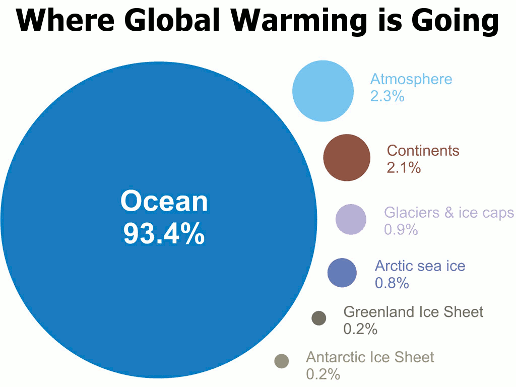
Figure 2: Where global warming is going.
Satellite measurements confirm Earth is gathering heat at the rate indicated by ocean heat content. This can be expected to continue as atmospheric CO2 is currently at 400 ppm and rising (its highest level in at least 13 million years and well above the estimated safe level of 350 ppm).
More evidence of acceleration
Some of the heat also goes into melting ice. The disappearance of Arctic sea ice has accelerated dramatically, hitting record low minimum volume in 1999, 2002, 2003, 2004, 2005, 2006, 2007, 2010, 2011, and 2012. At its 2012 minimum, Arctic sea ice volume was a mere 20% of the 1979 minimum volume. In 2013 it was 30% of the 1979 volume, which deniers spun as a “recovery” from 2012, but in reality the trend remains sharply downward. The melt is proceeding much faster than predicted in the models used by the Intergovernmental Panel on Climate Change (IPCC). If the trend is extended forward into the future, the Arctic Ocean in September will soon be entirely liquid.
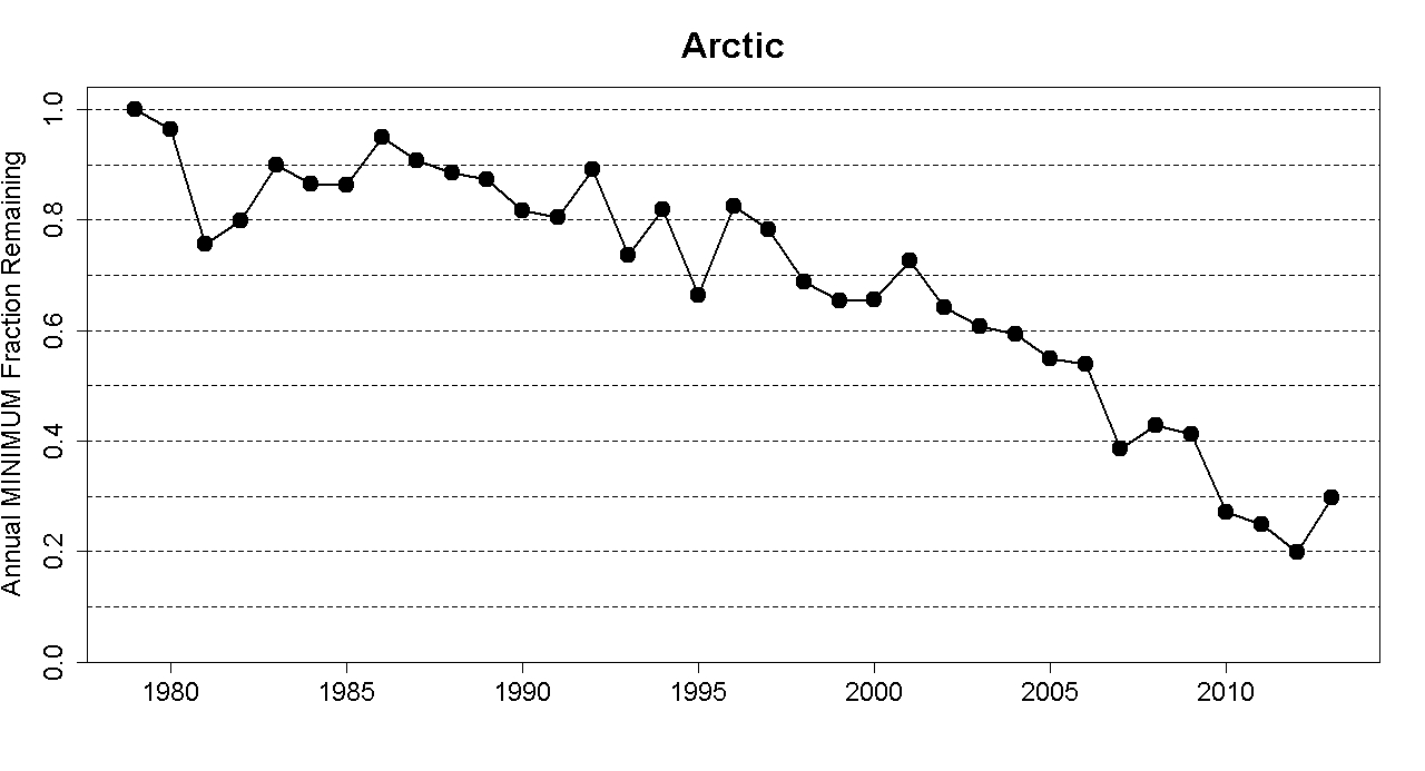
Figure 3: Fraction of 1979 minimum Arctic sea ice volume remaining at each minimum from 1979 to 2013. (Source)
The disappearance of Arctic sea ice is reducing the northern polar region’s surface reflectivity from very high to very low. This is a feedback that amplifies global warming and threatens to set off a chain reaction of tipping points, including large-scale release of carbon from melting permafrost and collapse of the Greenland ice sheet. Already permafrost is starting to thaw and emit carbon, and ice sheet mass loss is accelerating exponentially.
Several studies found climate scientists have systematically underestimated the impacts of global warming. New results are more than 20 times more likely to be worse than predicted than they are to be better. It appears scientists are overcorrecting in response to the deniers’ accusations of alarmism. One study concluded:
If the intention is to offer true balance in reporting, the scientifically credible ‘‘other side’’ is that, if the consensus estimates such as those from the IPCC are wrong, it is because the physical reality is significantly more ominous than has been widely recognized to date.
The surface is still warming
So contrary to what the denialists claim, there is no “slowdown” in global warming and certainly no “pause” or “cooling”, as the Earth continues to accumulate heat faster than ever. It’s true the rate of surface warming appears to have slowed slightly in the last 15 years. However, 2013 was still the 5th warmest year in the 164-year global temperature record, according to the University of York.
Figure 4: Comparison of global surface temperature trends during 1979-1997 and 1998-2013 in the University of York analysis. (Source)
The global temperature during 2013 was 0.54°C above the 1961-1990 average. (Climatologists usually give temperatures as anomalies relative to an average, because they are easier to compare than absolute temperatures.) 2013 also included the warmest September and November, 4th warmest June, 5th warmest July and December, 6th warmest August, 7th warmest January, 8th warmest April, 9th warmest May, and 10th warmest October. If you remove the seasonal cycle, November 2013 was the 6th warmest of all months.
The four warmest years were 2010 (0.63°C), 2005 (0.59°C), 2007 (0.56°C), and 2009 (0.55°C). Every one of the 13 years so far in the 21st century is one of the 14 warmest (the other year being the oft-cherry-picked outlier 1998). The 2010s to date are warmer than the 2000s, the warmest complete decade on record (followed by the 1990s and 1980s). The last year with an annual temperature cooler than average was 1985.
The University of York dataset is a new analysis (too new to have been included in the recent IPCC report) which interpolates temperatures in regions with few weather stations. In particular it covers the Arctic, which is warming faster than the rest of the planet because of the regional amplifying feedback described above. It is considered more accurate than older analyses which do not use interpolation, and reveals the rate of global warming since 1997 has been twice as fast as previously believed, identical to the trend since 1951 and only a quarter less than the trend since 1980.
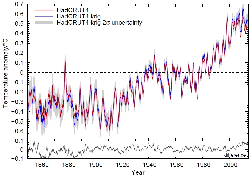
Figure 5: Global surface temperatures 1850-2013. Blue line shows temperatures corrected to cover the entire globe. Red line shows uncorrected temperatures. (Source)
But you don’t have to trust the University of York. In all analyses, 2010 is the warmest year; 2013 is among the warmest (though its precise ranking varies); there is a warming trend since 1998; each of the last three decades has been successively warmest on record; and the Earth has warmed ~0.8°C since the preindustrial era. Even a reanalysis by a team of skeptics confirms the warming trend.
Temporary factors are masking surface warming
While surface warming may have slowed(a result that looks more significant in datasets excluding the rapid Arctic warming), describing this as a “slowdown” is misleading because its causes are merely temporary.
Ocean cycles
The main cause of slower atmospheric warming is an ocean circulation cycle called the Interdecadal Pacific Oscillation (IPO). Ocean cycles periodically redistribute heat within the Earth’s climate system (particularly between the ocean and the atmosphere), and are unrelated to long-term climate change caused by heat entering and leaving the system. This sort of internal variability is the reason climate scientists focus on long-term trends instead of short-term ones, and the total amount of heat building up rather than the rate of surface warming.
The IPO controls the relative frequency of phases in the shorter Southern Oscillation, which alternates between El Niño (warm), La Niña (cool), and neutral. In an El Niño phase, the trade winds slow and the surface of the tropical Pacific Ocean is warmer than usual. The anomalous warmth of 1998 was due to a super El Niño. In a La Niña phase, the trade winds accelerate and warm water is pushed to the western Pacific, bringing cold water to the surface behind it. 2011 and 2012 were cooler than the surrounding years because they occurred during a La Niña. The warmth of 2013 occurred in neutral Southern Oscillation conditions, in contrast to most warm years which tend to occur during an El Niño. Years with comparable Southern Oscillation conditions tend to be getting warmer.
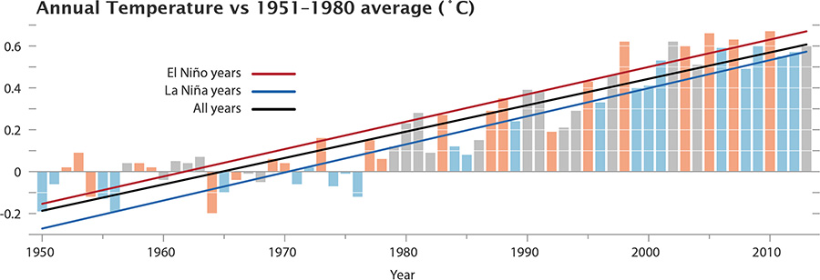
Figure 6: Annual global surface temperatures 1880-2013 from NASA, with El Niño years in red, La Niña in blue, and neutral years in grey. (Source)
Since 2001, the IPO has been in a cool phase (each phase lasts about 20 years) in which trade winds speed up and La Niña prevails. In this way, the IPO is temporarily burying much of the incoming heat from global warming in the depths of the ocean.
Temporary cooling influences
The buildup of heat has continued despite natural influences having had a net negative effect on the amount of heat coming in. The most important natural factor in the last decade has been the 11-year solar cycle, which had an unusually extended minimum during 2005-2010. The cumulative effect of reflective particles emitted by small volcanic eruptions may have contributed another cooling influence. These natural factors have temporarily offset part of the warming that otherwise would have occurred due to human-emitted greenhouse gases.
Another possible reason for slower surface warming is particulate air pollution (which, in contrast to greenhouse gas pollution, temporarily cools the Earth by reflecting sunlight). The amount and effect of these particles is poorly measured at present due to a lack of research funding, but emissions from increasing industrial activity in Asia may be cancelling out reductions from developed countries. This represents yet another potential factor helping to temporarily conceal global warming.
Explaining the apparent slowdown
The rate of surface warming remains within the range of model projections. Climate models were never designed to predict 15-year trends because the timing of ocean cycles is unpredictable. Instead they ran many simulations with random ocean fluctuations, and some of those simulations indeed predicted periods where atmospheric warming appeared to pause while the deep ocean warmed more rapidly.
Furthermore, new climate models are able to explain the surface temperatures observed in recent years by accounting for the observed ocean and solar cycles. Adjusting the surface temperature record to remove all natural factors (oceans, Sun, and volcanoes) again reveals global warming has continued, and if anything accelerated, since 2000.
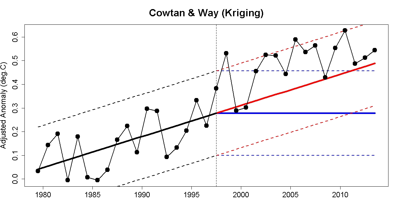
Figure 7: University of York surface temperature record with natural influences removed. Blue line = 1979-2000 trend. Red line = expected temperatures if 1979-2000 trend extended to present (note actual observed temperatures are mostly above this line). (Source)
Almost everywhere was hot in 2013
Most of the world was hotter than average during 2013:
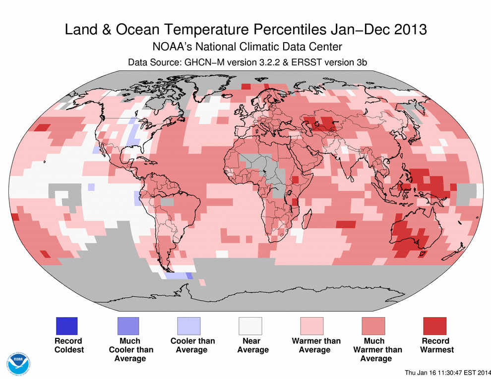
Figure 8: Map of temperature anomalies in each region of the world during 2013. (Source)
Australia’s hottest year
The most extreme heat was in Australia, which suffered its hottest year on record (1.20°C above the 1961-1990 average), frequent heatwaves, and warmer than average temperatures throughout the year. Again, the Australian heat occurred despite the neutral Southern Oscillation. Australia broke all of the following records in 2013:
- Hottest national average daily maximum temperature (40.30°C on 7 January)
- Seven consecutive days of national average maximum temperature over 39°C (2–8 January)
- Hottest January
- Hottest month ever (January)
- Hottest January sea surface temperature in surrounding seas
- Hottest February sea surface temperature in surrounding seas
- Hottest summer (December 2012–February 2013)
- Record-breaking March heatwave in Melbourne
- Tasmania’s hottest March
- Hottest northern wet season (October 2012–April 2013)
- South Australia’s 3rd warmest autumn (March–May)
- 2nd hottest first half of a calendar year (January–June)
- 3rd warmest winter (June–August)
- Warmest winter day (29.92°C on 31 August)
- Warmest September
- Warmest month after removing the seasonal cycle (2.75°C above average in September)
- South Australia’s previous record warm September exceeded by an unprecedented almost 2°C (5.39°C above average)
- Hottest 12-month period (record broken three times: September 2012–August 2013, then October 2012–September 2013, then November 2012–October 2013)
- 2nd hottest November sea surface temperature in surrounding seas
- Warmest spring (September–November)
Yet another Australian heatwave began on 27 December, continuing into January 2014 and breaking records in many places. It was soon followed by one of southeast Australia’s most significant heatwaves (13–18 January 2014), killing almost 400 Australians and rivalling the 2009 heatwave that caused the Black Saturday bushfires.
Beyond Australia
Parts of central Asia, Ethiopia, and Tanzania suffered record heat. Greenland recorded its warmest air temperature (25.9°C on 30 July). In August, China saw one of its worst ever heatwaves, killing over 40 people. Russia experienced its hottest November and December (with Siberia 9°C above average in December). Few parts of the world were cooler than average, and nowhere experienced record cold.
Arctic, Atlantic, Indian, Southern, and western Pacific surface temperatures were all warmer than average. The warm oceans helped fuel an above-average North Pacific typhoon season. Typhoon Haiyan was the strongest tropical cyclone ever to make landfall, killing over 5,700. Although global precipitation was near-average, extreme flooding and drought occurred in many parts of the world.
The most notable cold weather that occurred in 2013 was actually a side effect of global warming. The unusual Arctic warmth led to a record negative phase of the Arctic Oscillation in which cold Arctic air moved south (like a freezer door being left open). This in turn caused a cold northern spring in the US and Europe. This “warm Arctic, cold continents” phenomenon has occurred in several recent years and may be a permanent shift in weather patterns. Unfortunately this means North America, the hub of climate change denial, is experiencing consistently cold winters while the rest of the Earth’s surface cooks.
How climate change drives extreme weather
All the extreme weather we experience today is occurring in the context of a climate system containing much more heat than it did 50 years ago. An increase in average temperature increases extreme hot weather:
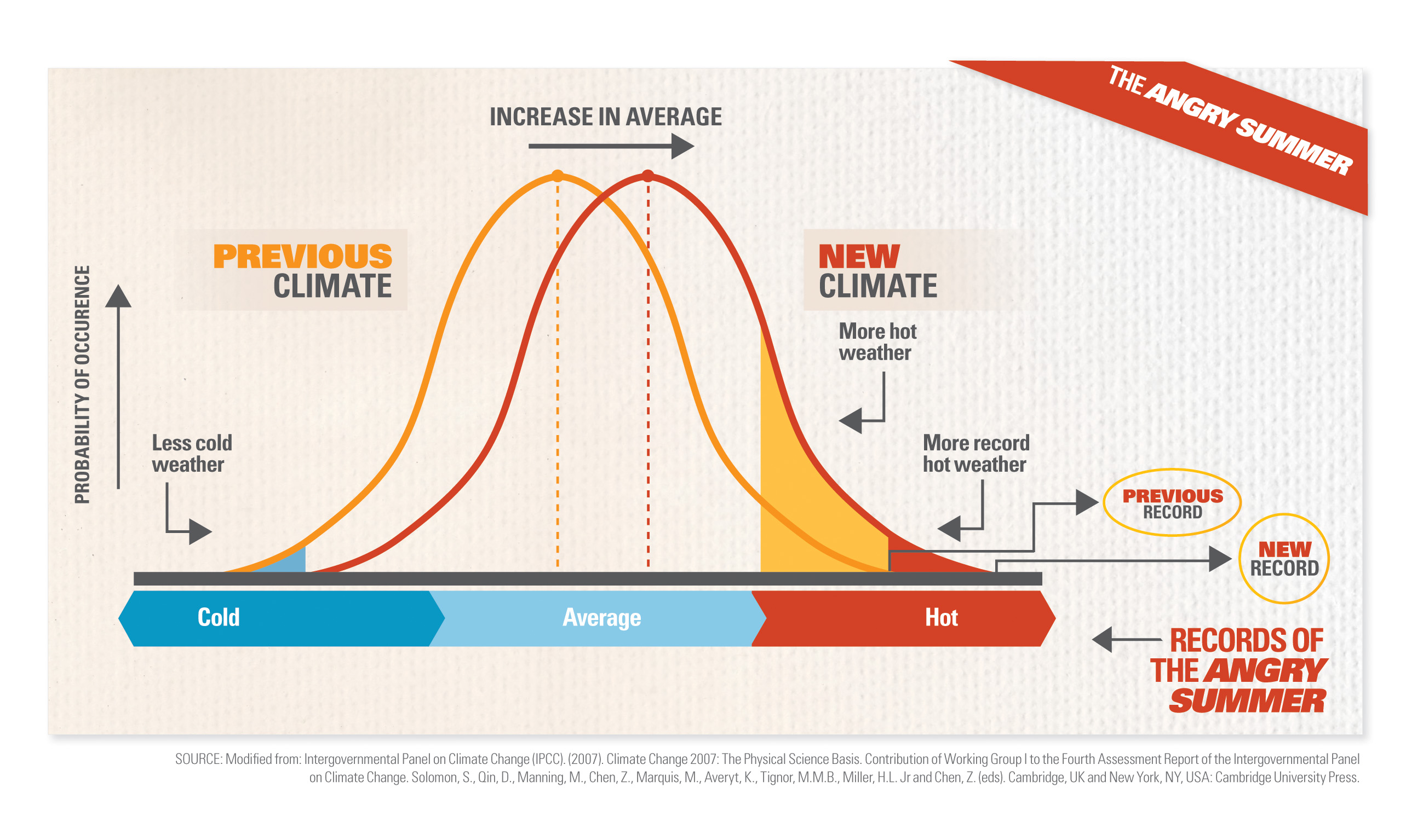 Figure 9: Illustration of how increasing average temperature increases extreme high temperatures. (Source)
Cold weather doesn’t contradict a warming trend, just as an athlete taking steroids will improve their average strength and break more records but still have moments of weakness. Observations confirm the distribution of hot and cold temperatures is shifting as shown in the graph above. For example, heat records in Australia are now happening three times more often than cold ones.
The increase of energy in the climate system also causes the water cycle to intensify: more water evaporating from the ground; more water being held in the air; more water falling as rain. The combination of hotter temperatures and drier soils leads to more frequent and worse bushfires.
Why has the “pause” myth gained so much publicity?
The central conclusion from last year’s IPCC report was that human-caused global warming is more evident than ever, though the report neglected to highlight key evidence suggesting the climate is already reaching dangerous tipping points. Yet as I complained at the time, media coverage of the IPCC report was dominated by the false narrative of the warming “pause” and accusations of an IPCC conspiracy to exaggerate warming. Why did this happen?
Deniers have been claiming since 2006 that global warming has stopped, but until recently the myth was confined to the right-wing echo chamber (already a vast sphere encompassing the News Corp multimedia empire, talkback radio, and much of the business press). Its profile was raised considerably last April, when Reuters began promoting the idea with an article titled “Climate scientists struggle to explain warming slowdown” (I won’t dignify it with a direct link). This is indicative of a broader trend in Reuters’ climate coverage. The reason became clear in July, when Asian climate correspondent David Fogarty quit Reuters and revealed:
From very early in 2012, I was repeatedly told that climate and environment stories were no longer a top priority for Reuters and I was asked to look at other areas. Being stubborn, and passionate about my climate change beat, I largely ignored the directive…
In April last year, Paul Ingrassia (then deputy editor-in-chief [since promoted to managing editor]) and I met and had a chat at a company function. He told me he was a climate change sceptic. Not a rabid sceptic, just someone who wanted to see more evidence mankind was changing the global climate.
Progressively, getting any climate change-themed story published got harder. It was a lottery. Some desk editors happily subbed and pushed the button. Others agonised and asked a million questions. Debate on some story ideas generated endless bureaucracy by editors frightened to take a decision, reflecting a different type of climate within Reuters – the climate of fear.
By mid-October, I was informed that climate change just wasn’t a big story for the present, but that it would be if there was a significant shift in global policy, such as the US introducing an emissions cap-and-trade system.
Very soon after that conversation I was told my climate change role was abolished.
IPCC authors knew the supposed slowdown was a non-issue, but according to coordinating lead author Dennis Hartmann:
it became more and more of a public issue, so we felt we had to say something about it, even though from an observational perspective, it’s not a very reliable measure of long-term warming.
In August, a draft of the report’s Summary for Policymakers was leaked to Reuters, containing a statement that “Models do not generally reproduce the observed reduction in surface warming trend over the last 10-15 years.” This sentence was easy to take out of context to support the denialist narrative of a slowdown scientists can’t explain. The language was moderated for the final report in September (which the IPCC made the mistake of releasing on a Friday), but the damage was done. All the journalists wanted to talk about the supposed pause
(Source)
Rapid surface warming will be back with a vengeance
In summary, the Earth is gaining heat faster than ever before. Arctic sea ice is melting at an astonishingly accelerating rate and could soon be all gone. Most indications of climate change are proving worse than scientists predicted. When you include the fast-changing Arctic, surface warming in the last 15 years has continued at only a slightly slower rate. This apparent “slowdown” in surface warming is temporary and can be explained by a combination of ocean and solar cycles, with a possible contribution from reflective particles emitted by volcanoes and/or Asian industry. Global warming is driving an increase in extreme weather, with almost everywhere warmer than usual during 2013. The idea of a global warming “pause” is a false narrative promoted by ideologically motivated deniers, uncritically propagated by journalists, and unwittingly reinforced by the IPCC.
The apparent slowdown of surface warming is not only giving us a false sense of security; it actually indicates warming will accelerate in the future.
The “slowdown” of surface warming will not continue forever because natural cycles are just that: cycles. Although currently they are counteracting the underlying greenhouse warming trend, sooner or later the cycles will turn around and reinforce it, causing surface warming to catch up to where it would otherwise be. Solar activity is already ramping up again. And when the IPO inevitably shifts back into a warm phase, all the heat now being stored in the deep oceans will be released back into the atmosphere. Even if the cycles somehow get stuck, they will be overwhelmed by rising greenhouse gases as emissions continue (even if solar activity fell to its 17th-century low, the effect would be outweighed by just seven years of greenhouse gas emissions). Natural cycles are now merely waves on the rising tide of greenhouse warming.
Particulate air pollution also cannot continue sustainably because (by definition) it causes other harmful effects. In any case, it remains in the atmosphere for a much shorter timeframe than CO2, and cannot counter its ocean acidification impacts.
Temperatures over the next couple of years will be largely determined by the Southern Oscillation. Short-term models project it will either remain neutral or shift to an El Niño phase by mid-2014. In the latter case, 2014 will probably be warmer than 2013, and 2014 or 2015 is likely to be a record-smashing hot year.
Total cumulative CO2 emissions will be the main factor in the magnitude of long-term global warming. Under the world’s current climate policies we’re headed for >4°C warming by 2100, a temperature unprecedented for the human species and probably beyond our capacity to adapt. If we want global warming to truly pause, we must hit the pause button. We need to leave the vast majority of the Earth’s fossil fuel reserves in the ground, even just to have a good chance of limiting global warming to the unsafe level of <2°C. To have any hope of stabilizing the climate, we urgently need to phase out global greenhouse gas emissions as quickly as possible. Most importantly, we must phase out the largest and longest-lived cause of global warming, fossil fuel CO2 emissions.
There is no time to lose. Rapid global surface warming will be back – faster than ever before.
This post was originally published at Precarious Climate.


excellent post -
seem to be some broken links, where href comes out as
http://www.skepticalscience.com/%5C
The links problem was my fault. Sorry about that, but it's fixed now. - James
Most excellent article. The deniers carefully ignore the oceans, but just wait till the next Nino and a likely new surface record. Then the ''skeptics'' will be all over the ''missing rapid increase'' in ocean heat content in that Nino year.
However, it will be hard for them to spin away a new surface record and likely record low Arctic sea ice in the same year. They will try, though, be sure of that.
Yes, the "beyond our capacity to adapt" link doesn't work for me, and I'd be interested to look. Does it link to an article on wet bulb temperatures, or to something else?
Want to echo KeenOn350's comment: lots and lots of broken/dead links in the OP.
The guys are onto it....
After September's "recovery," Arctic sea ice area is now at a record low for the date and has possibly hit winter max. If so, it would be a record low winter max for area.
Nice post, Jim, but from here it appears that all the "(Source)" links just point back to SkS main page. Fixable, I hope.
One more point about Arctic sea ice this year: according to the interactive chart on Cryosphere Today, ice area peaked on Day 53 at 13.08 million km². Not only is this the earliest peak on record (I believe), but last year area didn't drop that low until Day 104, a whopping 51 days later. So in effect we've gained an additional 7 weeks of melt season this year compared to last year.
Nice post
I have argued for years that the IPCC are too cautious and the reality is likely to be a lot worse. Good to see Kevin C's paper getting such a prominent mention. Most scientists are not that media savvy, unlike the right wing press who know how to brainwash the gullible. I have no clue here but many like to live in a comfortable alternative reality
article with live links:
http://precariousclimate.com/2014/02/11/global-warming-not-slowing-its-speeding-up/
Links should be fixed now. Apologies for the delay.
Sorry, I see a point that should be corrected in the article. At one point it is mentioned that "In a La Niña phase, warm water sinks, bringing cold water to the surface." That is not accurate.
During a La Niña, easterly trade winds at the equator increase causing increased upwelliing along the coast of South America and eventually spreading to the west. Due to the change in the easterly trade winds, warm water "piles up" in the western Pacific. So warm water sinking does not bring cold water to the surface. From a first prinicples perspective, we have the opposite occuring.
However, the combination of a negative phase IPO and more neutral/La Niña events since 2000, it is not suprising to see the results in figures 1 and 4. More energy is required to warm the cooler waters, so the rate of atmospheric warming will be reduced. Still warming, but at a lower rate. Much as we talk about the energy balance at the top of the atmosphere, this is an energy imbalance at the ocean/atmosphere boundary. So the result in figure 4 has a good physical explanation.
In addition, the cooler water in the Pacific is being warmed, and the warm water "piled up" in the west must go somewhere. Yes, some energy will go to the atmosphere, but I believe this is part of the mechanism for increased ocean heat content observed more recently. Not sure of the exact mechanism (some combination of conduction and convection with regards to heat transfer) but seems to fit the data correctly. So, the impact is increased ocean heat content, at a higher rate than before, as seen in figure 1.
I've tried to concisely amend my original post; hopefully it's now more accurate. As an amateur I sometimes get confused about these circulation patterns, but the important point is that heat is cycling through the atmosphere and ocean. - James
First, an excellent post allround. I do have a slight niggle, however, about attributing Cowtan and Way to the University of York. Unless the University has endorsed Cowtan and Way as an official dataset, which would be most unusual, the data should be referred to as Cowtan and Way, ie, by the names of its publishers. In that context, I note that the dataset is hosted at Dr Cowtan's personal page at the University, rather than by the University directly. Indeed, the page links to a disclaimer (legal information), which states:
For completeness, it should be noted that "HadCRUT4 krigging", Cowtan and Way, and the "University of York" data sets are all the same data set, or at most slight variations from the same authors. I am certain the different labelling is purely an accident from using existing resources in which the data was differently labelled.
Keithpickering at #8, thanks for the interactive link. Check out 2011. It peaked very similarly to this year, but it hung on near the peak for quite some time.
Duplicate paragraph starting: "But you don’t have to trust the University of York"
Fixed. - James
This was an excellent post and a great resource for discussions with the few remaining honest skeptics (as opposed to the fake kind). Earth's climate system appears to be on the doorstep of undergoing a change such as it has not seen in many millions, or possibly tens of millions of years.
One key part of the climate energy puzzle integral to ocean heat content and a key driver of the climate is the Indo-Pacific Warm Pool. The IPWP has been gaining energy steadily since the 1950's. As the source energy for El Ninos, it can be thought of a spring that has been slowly compressing and is now full of potential energy. If it releases a big part of this energy all at once as it did in the mega El Niño of 97-98, the entire globe will experience the kind of past year the Australia had in 2013 with temperatures literally off the charts.
I think there is a repeating para under fig 5.
Here's my nitpick to this excellent all round article.
Among the list of Australian records:
I stare in disbelieve: no, cannot be... that would mean some 5-sigma event, perhaps more than the recent heatwave in Moscow, which would not escape wolrd's attention. So I found & verified the source: BOM - SA in 2013. And surely, the relevant statement sais:
Still very, very unusual, but unlike the article above, probable. Obviously, the article text is a misunderstanding/typo. So, please fix the typo accordingly, it could say for example:
to reflect the source accurately. Thanks.
Fixed. - James
Another typo (although trivial) in Australian record:
date is incorrect. I think you mean this source: Northern Territory in October 2013. The relevant statement:
so the correct (and perhaps sounding stronger) statement would be:
The original statement incorrectly suggests the record is applicable to the large (Australia-wide?) context, while in fact it is only about local (Alice Springs) context.
I have to ask about this statement:
My first reaction was to suggest that the statement is incomplete, and that it should continue "...in the summer months". Then again, is there any evidence that if all multi-year ice disappears, there will be no surface ice at all in winter?
Fixed. - James
Last night I got the chance to read the entire article. I really enjoyed it.
The essay is essentially a review, bringing together a great deal which to some extent has may have been said before, but giving the reader an organized, more manageable overview of the topic. It does a good job of explaining the masking, the apparent slowdown and the so-called "pause"in warming, that the warming in the climate system is still taking place and why we should expect to see a great more of it in the future. The essay also does a good job of explaining how the meme of the "pause" in warming gained currency.
One question occured to me, though. Is the accelerating melt of Arctic sea ice actually evidence of accelerating warming?
Given that ice undergoes a phase transition at fixed temperature, if temperature were increasing at a constant rate, it would seem that melting would accelerate over time. If so, it would seem that observing melt accelerate over time cannot in itself be regarded as evidence of an increase rate at which the system warms.
Regarding the section title "Temporary factors are masking surface warming"...
I think that at this point there is a tension between "masking" as it might be commonly understood versus "masking" as it get technically used in climate science. Someone with a non-technical background, such as myself, may find it relatively easy to understand how temporary factors may mask warming, that is, in the sense that the warming is still taking place, but simply not visible to us but will later be unmasked. In this sense, they are understanding the term as a metaphor.
For example, during a La Nina more heat is absorbed by the deep ocean, so the warming is still taking place, just not at the surface, where we would experience it. But later on, during an El Nino, the heat is brought back to the surface, where we experience it, and after the El Nino temperatures tend to remain higher than they were before.
However, when you say "Temporary factors are masking surface warming" I believe you have already stepped beyond this common, metaphorical understanding, although at a certain level you are still relying on metaphor. As such, for someone with a non-technical background, it might make more sense to say that temporary factors are masking "future surface warming."
As the term "masking" is technically understood, including the word "future" is redundant. However, for someone with a non-technical understanding it is suggestive of how our expectations of how high or quickly temperatures will rise are built upon what we have already experienced. Yet it also suggests that appearances may be misleading due to temporary factors. These factors, including the volcanic aerosols or cooler phases of the solar cycle, where there is little warming of any part of the climate system, hide or "mask" the warming that will actually take place in the near future.
As such, while the term "future" is technically redundant, implicit for someone with a technical background, it would be helpful for the rest of us if you were to say "mask future surface warming."
One last detail: the link to Precarious Climate actually goes back to Skeptical Science.
In any case, I believe the article is quite good. I am looking forward to going back, re-reading it for my own understanding, and linking to it for other people. It brings things together on a variety of levels. I consider it a valuable addition to the Skeptical Science corpus.
Is ocean heat content increasing faster in the southern hemisphere? If so would this add weight to the idea that the northern hemisphere is experiencing increased dampening due to aerosols?
Not that easy to get NH/SH data and I would guess ocean mixing would blur the signal anyway, but that "reliable" source of information, Bob Tisdale, seems to have done the work and produced this:
He uses this as argument against GHG warming, but assuming he has got the numbers right, then yes, SH is warming faster than NH. However, OHC rises mostly in the tropics and I dont think there is much difference between 0-10N and 0-10S.
[RH] Reduced image width.
scaddenp... It also seems like Tisdale's chart is, to a certain extent, just telling us the southern oceans are larger than the northern oceans.
Good point!
Rob, Scaddenp, if you actually run the numbers, then based on the trends in the graph, the NH oceans are gaining energy at a rate of 21 million Joules per meter squared per decade. In contrast the SH oceans are gaining energy at 271 million Joules per meter squared per decade. That is, the SH is gaining heat 13 times faster than the NH per unit area, which would definitely seem to support Hyperactive Hydrologist's suggestion. I suspect, however, that there are other major factors involved. One such factor could be that the Indian Ocean is almost entirely a SH ocean, with heat gained in the NH portion of the Indian Ocean being directed to the SH be geography.
In addition to 27, Tisdales graph only plots heat gain since mid-2005. That means he only plots it over a period in which the SOI has shown a distinct, and very strong trend towards record high levels (ie, from record high El Ninos to record low La Ninas). The tongue of water that is modulated by ENSO lies, primarilly, just south of the equator. Large changes in ENSO, therefore, may well have significantly different effects in either hemisphere, so that may be another major factor in the difference.
This is another great presentation of the 'fuller story', the type of presentation of information that actually leads people to better understand what is actually going on. However, many in the skeptical side do not wish to consider the fuller story, or prticipate in developing the best understanding of what is going on.
I personally prefer to follow a rolling 30 year average of the global surface temperature (a new average every month), and I see no significant change in the rate of warming. The 30 year average in the NASA GISTemp data set is still rising. And the 30 years ending in January 2014 are 0.166 degrees warmer than the 30 years ending in January 2003.
A benefit of following 30 year averages is that the longer average is likely to include, by averaging in, the significant and random fluctuations of the global average surface temperature due to things like ENSO, volcanic particles and solar cycles.
However, when I discuss this with a skeptic I am clear about not waiting for another 30 years to find out if the trend continues. Though the presentation of the decades (1980s, 1990s, 2000s), makes a clear point, it can lead some skeptics to claim they need to wait until 2020 to be convinced...or 2030 to really be convinced...or 2040 to almost be certain to be convinced. The minds of many skeptics seem to be locked in an instinct to protect their maximum personally benefit which is threatened by better understanding this issue (or immorally try to obtain benefit by trying to keep others from better understanding this issue for the benefit of immoral wealthy benefactors). That instinct or motive leads them to another instinctive animalistic response, aggression when rationally cornered.
An interesting 30 year average tid-bit.
In the NASA GISTemp global average surface land-sea data set, all of the monthly averages since November 1993 have been warmer than the monthly average 30 years earlier, except January 2011 which was very slight (0.07 C cooler) than January 1981.
I wonder about the following statement, taken from the fifth last paragraph (the paragraph starting with "The “slowdown” of surface warming")
"And when the IPO inevitably shifts back into a warm phase, all the heat now being stored in the deep oceans will be released back into the atmosphere"
I would have thought that the heat going into the deep oceans will mix in and cause a miniscule increase in temperature to that massive body of water. When the IPO shifts back won't it be a case that the surface temperature rises will more stay at the surface with the consequent effects - higher global temperatures, the world wide effects of El Nino etc. It just doesn't seem plausible that the heat stored in the deep oceans will be released back into the atmosphere. But then I'm not a scientist so I'm interested in comments from people who know what they are talking about.
Hmm, I guess that was a badly worded sentence. What I meant to say is that the heat that is in the oceans that would otherwise have been in the atmosphere will be released back into the atmosphere when the ocean cycles turn around. Obviously, not *all* the heat will go into the atmosphere. - James
James, I understand my comment (21) was a bit long and for that reason you may be skipping over it. However, at the end of the comment I mention a bad link. You might want to correct that.
BC, you write:
"And when the IPO inevitably shifts back into a warm phase, all the heat now being stored in the deep oceans will be released back into the atmosphere"
I would have thought that the heat going into the deep oceans will mix in and cause a miniscule increase in temperature to that massive body of water. When the IPO shifts back won't it be a case that the surface temperature rises will more stay at the surface with the consequent effects - higher global temperatures, the world wide effects of El Nino etc.
If I might add my two cents (not sure what the exchange rate is, though)....
I believe we may be thinking largely along the same lines, but I am not so sure about your first sentence:
I would have thought that the heat going into the deep oceans will mix in and cause a miniscule increase in temperature to that massive body of water.
If you look at the sea surface temperature distributions of ENSO (the El Nino Southern Oscillation), the Pacific Decadal Oscillation (PDO) and the Interdecadal Pacific Oscillation (IPO) they are quite similar, each with North and South components, but with the ENSO being more pronounced near the equator, the PDO more pronounced in the North Pacific, and with the IPO being roughly equally pronounced in both areas.
Each of these have their atmospheric and oceanic components, where there will be changes in air pressure, winds, air temperature, water temperature and water salinity. However, I will focus principally on water temperature, and to a lesser extent, salinity.
With regard to water temperature, I don't have a comparison map for all three, but here are the PDO and ENSO:
In essence, they appear as standing waves, and they may constructively or deconstructively interfer with one another. And as such, when the IPO is in its positive phase El Ninos are more common and more pronounced, La Ninas less common and less pronounced, but this is reversed when the IPO is in its negative phase. So we can focus primarily on ENSO at this point.
ENSO is an oscillation associated with the thermohaline circulation, where what determines the density of water will be a product of both its temperature and salinity, and denser water sinks below that which is less dense. As such, warmer water may sink below cooler if the salinity of the warmer water is sufficiently greater than that of the cooler water.
Furthermore, while over the long-run, when the climate system is quasi-stable, heat going into the ocean must balance heat coming out of the ocean, over shorter timescales the net flow of heat will be into the ocean with a reduction in moist air convection due to cooler water being at the surface, warming the ocean, and at other times the net flow of heat will be into the atmosphere through greater moist air convection due to warmer water being at the surface, cooling the ocean.
Now you don't actually see that great a rise in global surface temperature during an El Nino. The rise in global surface actually occurs when the El Nino begins to dissipate. The reason is that "pool" of warmer water rises to the surface, spreads out as it begins to mix with the ocean surface, exposing a larger surface area over which moist air convection can take place, carrying more heat into the atmosphere.
Thus when the IPO is in its positive phase, this promotes stronger and more frequent El Ninos through constructive interference with ENSO and results in weaker and less frequent La Ninas through deconstructive interference. Consequently, during the positive phase, the net flow of heat will tend to be from the ocean to the atmosphere due to increased moist air convection, but during the negative phase the net flow of heat will tend to be from the atmosphere to the ocean due to reduced moist air convection.
Anyway, my apologies if this is more detail than you need, but it helps me to spell things out so that I have a better handle on what I am discussing.
[RH] Reduced image width to preserve page formatting.
Re OHC, I remembered that 5 or 6 years ago (or more) RP Snr was consistently saying that ocean heat content is a much better metric to measure global warming than surface temps (I agree). Around that time he was pointing out that OHC for 2003 - 2006 had not risen, and prior warming was not homogenous across the oceans. A few years later with more data, and we see OHC has continued to increase, so I wondered how RP Snr had interpreted that. I found a post citing him at WUWT, where he advises that the problematic OHC data is not robust enough to rely on.
I haven't followed RPS as much as I used, but I long respected him for being a qualified alternative voice on climate science, whether or not I agreed with him. Do I have the narrative right, here? Did he really promote OHC as the best metric, then use it to emphasise little or no warming (or cooling), and then when warming continued called the data into question?
Good post, BTW. Thanks.
Barry - I think that pretty much sums up contrarians - they're not really interested in science, i.e. how the physical world really works, but simply jump from dataset to dataset in order to affirm their wishful thinking. As you point out, ocean heat content is a classic example - all the contrarians thought it the greatest thing since sliced bread when the 0-700 metre layer exhibited cooling in the mid 2000's.
Since then we've discovered that that was largely due to more heat being pumped down into the deep ocean via the subtropical ocean gyres, and that the 0-2000 metre layer has been warming strongly. With a longer record we have more confidence that the trend is robust, but contrarians have abandoned the ocean heat content data because it doesn't affirm what they'd like to believe. Hardly a surprise.
.....Meanwhile back in the real world the Earth continues to build up heat, and a return to the positive phase of the IPO (strong surface warming) draws ever closer.......
Timothy Chase at 32 and Moderator comment at 30. Thanks for the detailed response. It's obviously more complicated than I thought and pretty interesting too. What I hadn't realised was the idea of the quasi-stability with heat going in to oceans (IPO negative, La Nina) having to balance heat going out of oceans (IPO positive, El Nino) over time. That makes sense.
One further question/comment about 32. You mention the thermohaline effects but not the subtropical ocean gyres - see comment 34 from Rob Painting, who did a post on this topic a few months ago. I suspect I had this in mind when I made my comment at 30. Would this heat transfer and the strong warming of the 0-2000m layer be why the stability you mentioned is only quasi?
BC, I have little doubt Rob Painting has more background in this area than I do, and would defer to him in this.
Personally, while I was aware of the existence of the gyres, I thought of their motion as being principally horizontal and hadn't considered their vertical effects. However, it makes sense that they would involve that as well, similar to hurricanes, the latter of which involve a vertical pumping action and are responsible for some of the poleward circulation of heat in both the atmosphere and ocean.
However, what I was refering to in terms of "quasi-stability" was simply the tendency of the system to chaotically move about a mean state where the mean state itself remains unchanged and the system has no overall trend. In this sense, I was refering to the system's tendency to regress towards the mean. When a trend is involved you would have regression towards the trend.
But typically the term gets used in climatology to refer to the tendency of the system to remain within any one of several states that are "stable" for only a finite time, typically according to a characteristic time scale. With ENSO the quasi-stable states would be the El Nino, La Nina and neutral states. Other oscillations may have only positive and negative quasi-stable states.
There is however one point that I would like to touch on, a potential misunderstanding, basically where I speak of constructive and destructive interference between ENSO, PDO and IPO. When one looks at how they overlap, one possibility that suggests itself is that they are essentially independent of one another, independent modes that are superimposed and simply additive in their effects.
However, one indication that this is not the case is that a correlation with lag-time exists between El Ninos and the the positive phase of PDO. The positive phase of PDO will often follow an El Nino within a matter of three to six months, thus the El Nino appears to act as a trigger for the PDO flipping states. The reason, it would seem, is that their existence and consequent interaction involves various feedbacks.
Anyway, you might find some value in a comment I made in an earlier thread several years ago that goes into things in more detail. It includes both references and links. Frankly, I do a better job there than I would be capable of at present without more review. However, at one point it refers to a piece by Atmoz that has since been taken down. This is still in the Wayback Machine.
Timothy Chase @ 36. Thanks again - lots of interesting reading there.
This excellent post points to a fundamental shift in global warming from the trivial 7% in air to the majority 93% in oceans. Indeed is heat captured over 70% of earth’s surface that includes the 8.5% in shelf seas <200m where most impacts are found.
Climatologists deal in anomalies in 30-year records as James Wright pointed out. Moreover, they rely on records collected by others and never go to sea to collect verification ground truth data. Their data at the surface are not to ocean standards that require >3,000 times more accuracy to account for the higher heat capacity (specific heat seawater: air). Moreover, salinity in the ocean surface has never been routinely collected. Seawater density is critically important because fresh warm water floats over saltier cool water.
The Levitus et al (2012) data incorporates the unverified SST data from 1955-1995 that has only sparse coverage as they show in their paper. It has only complete surface temperature coverage over rough degree grid where surface data is averaged over the top 100m from 1995.
The conclusion, that Earth is warming faster than ever before, is very securely based on ocean data. The huge heat capacity smoothes out the great swings in heating and cooling observed on land and in air. Moreover, as James states the main factor is greenhouse gas heat imbalance at the top of the atmosphere.
However, the 93% in the oceans is trapped by the almost completely unstudied top 2m of the ocean as was pointed out in a recent discussion paper (http://www.ocean-sci-discuss.net/11/C54/2014/osd-11-C54-2014-supplement.pdf).
Using rare daily timeseries, the authors quantify ocean warming as currently more than 1ºC in twenty years. This is strong confirmation of dangerously accelerating global warming.
Moreover, it is based on real ground truth data un-modified by models or statistics. They go on to show the post-1986 accelerated temperature rise coincides with a rapid decline in solar radiation. I suppose these are two hockey sticks in opposite directions. This strongly suggests that greenhouse gas contribution to heat imbalance now outweighs not only volcanic variations but also variations in solar activity from the Maunder Minimum to the modern 20th Solar High.
It also suggests that it masks all the global ocean indices such as ENSO, PDO, and NAO that are known to depend on the 22y Hale Cycle and the more familiar 11.6y sunspot cycles. This suggests that predictions, based on atmospheric statistical assumptions, of changes of El Nino/La Nina are unlikely to be accurate. ENSO cycles in the 21st century have been far less predictable. The ocean warming due to greenhouse gases is a good physics-based reason for the observed changes.
It will be very difficult to change climate deniers opinions.
As Alistair Fraser pointed out on his website on Bad Science “Be very, very careful what you put into that head, because you will never, ever get it out.” Thomas Cardinal Wolsey, (1471-1530). (A. B. Fraser, (http://www.ems.psu.edu/~fraser/BadScience.html)
Fraser also pointed out that evaporation does not depend on relative humidity as assumed in many ocean models, but on sea surface temperature. In practice that means evaporation increases by 7% per degree rise in temperature (Precipitation rises by 2-3%). The presence of air is not relevant to vapour pressure that determines evaporation (http://fermi.jhuapl.edu/people/babin/vapor/index.html).
The Matthews and Matthews (2014) discussion confirms and quantifies James Wright’s alarming findings. They present the first measurement of evaporation free from precipitation. They show evaporation and heat sequestration is critically dependent on salinity. The north Pacific ocean heat is trapped in the top 2m and is twice that of the southern ocean with salinity >35.5‰ (the authors use parts per thousand as appropriate at the surface). Moreover, they show from long-timeseries data that North Atlantic/Arctic heating has been buffered by basal icemelt in three phases. The post-1986 accelerating temperature rise they suggest is due to decreasing amounts of floating ice.
Indeed, they suggest, on the basis of real ground truth data and basic physics, that the warming will continue as long as we have the top of the atmosphere heat imbalance. It is not enough to stop adding greenhouse gases. Climatologists assume that if you do that, the heat balance will eventually be restored by back radiation. However, there is no back radiation from 2m below the sea surface. They point out that hurricanes can draw cooling water from below if they linger long enough. It is the storm’s speed over the ground that determines whether it grows into Hurricane Force 5 (fast moving), or is downgraded to tropical storm (slow moving). That could account for the first hurricanes seen in UK this spring.
Pacific warm pools have seen sustained temperatures of 32ºF from more normal 28ºC. That implies an increase in evaporation and precipitation of almost 30% above long-term averages. This is the likely explanation for excess precipitation in 2011 over SE Asia, Australia and S America that lowered global sealevels by 3mm. It could also explain why container shipping companies in the western Pacific now use two Beaufort classes above Hurricane force 12 to describe Pacific Typhoons.
James, you have presented a fundamental shift in our understanding of global warming.
There needs to be a major shift in funding to focus on the top 2m of ocean.
Unfortunately, the manned weatherships and other monitoring programs were discontinued just before the rapid warming began. Manned weatherships would have been very useful for seeing first hand what is really happening. They could be quickly deployed to help aircraft or ships in distress. Even if the aircraft turned off its tracking devices, I suspect weatherships could track them.
Manned ocean programs have been savagely cut in the everywhere including UK, US and Canada.
We need to lobby to get funding restored to counter the devastating cuts shown in this video:
Silence of the Labs http://www.youtube.com/watch?v=Ms45N_mc50Y.
Congratulations! You have made a major contribution to science of importance to all mankind. SKS has a great record in countering false arguments and bad science. You now have the mother of all battles to fight. No one has argued that we must actually reduce greenhouse gases to former stable levels. But that is what is demanded if ocean warming and acidification is to managed and mitigated.
"In 2013 the Earth’s oceans accumulated energy at a rate of 12 Hiroshima atomic bombs per second"
An utterly irrelevant metric. From a dataset downloaded from this link:
LINK
...you can see that the delta ZJs for the world ocean between 1959 and 1960 are -8.7 - (-5.5) = 3.2ZJs or approximately 16 Hiroshima's per second. Please check my math, but even if it is wrong, the use of one year's data to show how serious global warming is verges on the absurd.
[RH] Hotlinked URL that was breaking page formatting.
I have only been able to find 1 graph showing ocean surface temperature and it showed that from about 2005 to present the ocean surface temperature has dropped slightly. This does not jive with increased ocean surface energy. Does anyone know of any additional information available?
Micawber
A smal correction. Although around 93% of heat is going into the oceans, that does not mean the remaining 7% is warming the air. The 7% is split between melting ice, warming the ground and warming the air, in roughly equal proportions. So air warming is only about 2-2.5% of the total heat.
41 Glenn Tamblyn
The whole point of the paper cited is that most of the 93% AGW trapped by the surface ocean in the Northern Hemisphere goes into melting floating ice from the bottom up.
For the past century the ocean heating has been buffered by the Arctic basal ice melt. The rapid warming at the beginning of the 20th century melted deep tidewater glacier keels of the type that sunk Titanic.
The mid-century cooling period saw the melting of multi-year ice and deep keels of ice islands as suggested in 1955 as a major climate change impact. The bottom-up melting of Arctic ice was so great that the result was an overall cooling of sea surface temperatures!
That mid-century cooling was removed from SST records because it did not fit with the 30-year statistical trends. Apparently this is a common practice in atmospheric physics as noted by Kinsman (1957) and Aberson (2012) according to the authors.
The rapid warming post 1986 that James Wright cites is a direct result of the decline in floating ice. This is the major contribution from the authors cited by the Matthews papers. I consider them definitive because they are based on real ground truth timeseries data unaltered by models or statistics.
Scientific method demands the verification by repeated experimental ground truth as the nearest we can get to the 'truth'. I believe the experiments reported by the Matthews papers were the first measurements at sea of surface temperature, evaporation and heat sequestration. Climatologists never go to sea. That is a major problem if the bulk of the heat is there!
So, it is simply not true to say the 7% is split between melting ice, warming ground and air in roughly equal proportions. Where is the ground truth scientific evidence for that?
The work they report was done in 2008 in the Pacific and salinity measurements stopped in 2006 at Port Erin. The scientific response surely should be to resume the timeseries ASAP to verify or modify these catastrophic findings.
Surely the loss of the Malaysian 777 in the Antarctic divergent surface gyre shows how little we know of the surface of the Blue Planet?
This calls for a major shift to ocean surface studies to understand what is going on inn this unstudied surface. James Wright's article could not come at a better time.
I think Glynn, we would be better off forgetting the trivial 7% in air until we know much much more about the 97%.
Heat from the ocean with its more than 3,000 times greater heat capacity than air will show up as rapidly warming air after is thaw a few glacial icesheets in any case.
Concerning post #23 scaddenp at 08:25 AM on 14 March, 2014
According to the graph presented, the energy content of the southern hemisphere went from 4.5e22 J to 9e22 J in about 5 years. Since temperature is simply 3/2 kT would this not indicate that the temperature of the southern hemisphere ocean area has doubled in the last 5 years?
Note: k = Boltzman constant
T = Temperature (average)
Sorry, you are saying T = 3/2 kT?? that doesnt make sense. The temperature change from a given no. of joules is divide by volume of water and volumetric heat capacity (4.15MJ/m3 approximately). OHC is actually calculated from the deltaT by same formula.
There may be another source of confusion - the OHC shown is change in OHC compared to 1955-2006 baseline period not the absolute OHC.
scaddenp@44
I understand your confusion. I meant to say energy content is simply 3/2 kT. And since the energy content doubled, the temperature doubled. Mathematically that would be E_k = 3kT/2 therefor T = 2E_k/(3k) and since 2,3, and k are constatnts, the E_k doubled so the temperature doubled.
scaddenp@45
The graph Y axis is Joules, not delta Joules. And there are no zero point dates anywere on the graph. Also, the graph does not annotate that the values are change.
The heading on the Graph specifically says it is:
"NODC Annual Hemispheric Ocean Heat Content (0-2000 Meters)" which is an absolute value heading, not a change heading.
Based on all of this I would tend to disagree with you that the graph represents the change from a date range but rather is the total calculated energy content just as the heading says.
Bruce, the graph was off Tisdale's blog, not from a published reference, so you would have to check with Tisdale to be absolutely sure. However, his data source can really only be NODC where their metadata explicitly state that it is delta from baseline. Furthermore, if you add NH + SH values, you will see that they range roughly 10 in 2005 to 16 in 2012 - the same values for the total OHC at those time periods shown in graph at the top of article. This graph does have a zero (and negative values), and paper it is based on say delta.
I am also rather intrigued as to how you would define the total heat content of anything as an absolute number.
scaddenp @49.
If you perhaps restricted an Absolute Ocean Heat Content to thermal & latent energy, a figure for global oceans would be something like 1,000,000 ZJ (assuming the decimal point has behaved itself). That would be half to raise it to 0ºC and half to melt it. (I'm assuming the coefft of heat capacity at temperatures below -100ºC doesn't suddenly drop off more quickly.) There shouldn't be a lot more energy required than that. To raise a 100m mixed layer to an assumed average of 14ºC would be something like a trivial (wrt AOHC) 200 ZJ & I'd guestimate 40,000 ZJ for the rest of the ocean.
Tisdale's graph shows OHC rising from 110 ZJ to 170 ZJ and thus even for a daft-as-a-brush interpretation it has to be ΔOHC of some form. Likewise the graph at the head of the post that shows a pentadal rise of -90 ZJ to (guess what) +170 ZJ.
I'm finding the relevance to OHC of the equasion presented @43 which is for the average translational kinetic energy of a gas molicule (derevation here if you're interested) is a bit more difficult to nail down.