Climate Science Glossary

Term Lookup

Enter a term in the search box to find its definition.

Settings

Use the controls in the far right panel to increase or decrease the number of terms automatically displayed (or to completely turn that feature off).

Term Lookup

Settings


All IPCC definitions taken from Climate Change 2007: The Physical Science Basis. Working Group I Contribution to the Fourth Assessment Report of the Intergovernmental Panel on Climate Change, Annex I, Glossary, pp. 941-954. Cambridge University Press.

Home Arguments Software Resources Comments The Consensus Project Translations About Support

Twitter Facebook YouTube Mastodon MeWe

RSS Posts RSS Comments Email Subscribe


Climate's changed before
It's the sun
It's not bad
There is no consensus
It's cooling
Models are unreliable
Temp record is unreliable
Animals and plants can adapt
It hasn't warmed since 1998
Antarctica is gaining ice
View All Arguments...


Username
Password
New? Register here
Forgot your password?

Latest Posts

Archives

Hansen 1988 Update - Which Scenario is Closest to Reality?

Posted on 17 June 2012 by dana1981

Note: Jan-Erik Solheim has just recently made some very incorrect claims about Hansen 1988, which we will debunk later this week.  Consider this post a brief primer.

Earlier this year in a post Patrick Michaels Continues to Distort Hansen 1988, Part 1, we compared Patrick Michaels' claims about Hansen et al. (1988) in his 1998 testimony before US Congress to reality.  As Figure 1 shows, we found that Michaels had distorted reality, telling Congress that Hansen's Scenario A was closest to reality, when in fact the actual 1988 to 1998 radiative forcing changes weren't even quite as large as in Scenario C.

hansen forcings

Figure 1: Radiative forcing contributions from 1988 to 1998 from CO2 (dark blue), N2O (red), CH4 (green), CFC-11 (purple), and CFC-12 (light blue) in each of the scenarios modeled in Hansen et al. 1988, vs. observations (NOAA).

Michaels had claimed Scenario A was accurate because at one point Hansen described it as "business as usual" (BAU).  However, between 1988 and 1998 some major events occurred, such as passage of the Montreal Protocol international agreement to reduce chlorofluorocarbon (CFC) emissions, and the collapse of the Soviet Union.  Thus, while it is debatable whether Scenario A truly represents a BAU scenario (we argued that it would be more accurate to describe Scenario B as BAU - see Figure 2 below), we did not follow a BAU path over this timeframe anyway.  But more importantly, in terms of the greenhouse gas (GHG) radiative forcing (which is what Hansen's model responded to), Scenario C was the closest to reality as of 1998.

However, this post focused primarily on the radiative forcings as of 1998, and only briefly touched on the up-to-date radiative forcing data (Figure 2).

Hansen vs. Skeie forcings

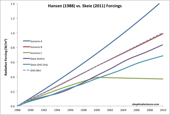
Figure 2: Radiative forcing changes (1988 to 2010) for the three emissions scenarios in Hansen et al. 1988 (dark blue [A], red [B], and green [C]) vs. Skeie et al. (2011) GHG-only (light blue) and all anthropogenic forcings (purple), and business as usual (BAU) GHG based on a rate of increase consistent with the Skeie et al. estimate for 1978 to 1988 (gray, dashed).

We recently received a request to update Figure 1 to essentially break out the light blue curve in Figure 2 for the various individual GHGs.  This update is shown in Figure 3.

updated GHG forcings

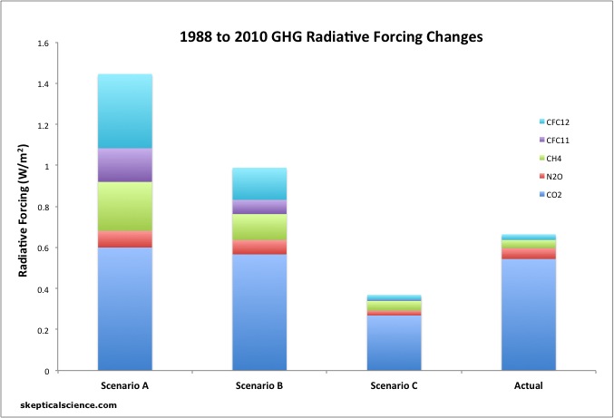
Figure 3: Radiative forcing contributions from 1988 to 2010 from CO2 (dark blue), N2O (red), CH4 (green), CFC-11 (purple), and CFC-12 (light blue) in each of the scenarios modeled in Hansen et al. 1988, vs. observations (NOAA).

As Figures 2 and 3 show, the net GHG forcing has fallen smack dab between Scenarios B and C.  The CO2 and N2O increases have been closest to Scenario B, whereas the methane and CFC increases have been closest to Scenario C, though even somewhat lower.  The Montreal Protocol has been a major success, as the CFC increases over the past 22 years have been almost zero.  In fact, the 2010 atmospheric CFC-11 concentration was actually slightly below its 1988 level.

As noted above, this analysis only considers long-lived GHGs.  According to Skeie et al. (2011), the radiative forcings associated with ozone (another GHG) and land use change have also increased.  The direct aerosol cooling effect also decreased during the 1990s.  Therefore, the net 1988-2010 radiative forcing has increased at a rate closest to Scenario B, but approximately 16% lower, as illustrated by the purple curve in Figure 2.

In short, claims that actual emissions have followed a Scenario A path are wrong, and usually based on rhetoric (i.e. 'Hansen said Scenario A was BAU' - Michaels' argument) or an undue focus on CO2 (i.e. 'CO2 emissions have accelerated, as expected in Scenario A - the Solheim argument we will see later this week).  In fact, CO2 concentrations and forcings don't start to differ significantly between Scenarios A and B until after 2020.  The main difference between the various scenarios, as Illustrated in Figure 3, is in CFCs and methane  The real-world emissions of these GHGs have been quite low - even lower than in Scenario C.

Overall in order to evaluate which scenario has been closest to reality, we need to evaluate all radiative forcings.  In terms of GHGs only, the result has fallen between Scenarios B and C.  In terms of all radiative forcings, the result has fallen closest to and about 16% below Scenario B.  Scenario A is the furthest from reality, which is a very fortunate result.

0 0

Printable Version  |  Link to this page

Comments

Comments 1 to 11:

  1. I was thrown off for a second by the seemingly smaller methane contribution over the longer period, then noticed the scales of the graphs are different. So, just a heads-up to anyone wanting to do comparisons between the two time periods.
    0 0
  2. Oh yeah Alex, longer timeframe = larger forcings = larger y-axis in the updated version.
    0 0
  3. Dana1981 - it might be worth a combined graph, 1998 values first, then 2010 values to the right, to give some perspective under the same scale. Might even add some actual lines connecting the bars, although that could be a little busy visually. I would completely agree - arguing about differences from Scenario A is a complete strawman fallacy - one often tied to a "CO2 is the only forcing" error. I really find it odd that the 'skeptics' keep cycling back to such a bad argument.
    0 0
  4. From a purely psychological perspective it's not odd. James Hansen is one of the world's foremost climate scientists, one who has been making very good climate model-based predictions for decades, and one who actively advocates for moving away from fossil fuels immediately. Thus it's easy to see why "Hansen was wrong" is a psychologically appealing argument for those who are in denial about AGW. And the further he was 'wrong', the more it supports their denial, which is why they argue for Scenario A, even though it's actually the furthest from reality. For those of us who are climate realists it's very strange that they keep making this obviously wrong argument. But that's because it's difficult for a realist to understand the psychology of a person who's in denial.
    0 0
  5. Good stuff, Dana. Looking forward to the debunking of Solheims ridiculous claims. He is like our (Norwegian) local version of Pat Michaels, ie. a serial disinformer. Got a free pass to the press, while the realists, like Rasmus (Benestad) who submit a written debunking of the misinformation usually won't get their rebuttal printed. This is more often than not the case in Norways major newspaper, Aftenposten. Once upon a time, it reported the science, but has turned into a bona fide denialist rag, unfortunately. I sense that the disinformers are getting rather desperate these days. Could it have something to do with the fact that their own favorite dataset (UAH AMSU) is at an all time high level right now, indicating that 2013 could likely be the hottest on record, just like Hansen predicted years ago. Contrast that to the deniers forecast of dramatic cooling. Just like we saw back in 08 when Hansen predicted a record in 2010 while the denier choir were sure the temps would continue to drop.
    0 0
  6. This post at RealClimate does a good job of discussing model-data comparisons more generally.
    0 0
  7. Why use predicted forcings instead of predicted/observed temperature change for IPCC scenario C? Predicted forcings assume what is being debated. I don't understand the reasoning here, please see IPCC scenario C.
    0 0
  8. thepoodlebites @7 - I don't follow what you're trying to say. There is no Scenario C in the IPCC SRES, and we're talking about Hansen's emissions scenarios here anyway.
    0 0
  9. thepoodlebites - The discussion here is regarding the Hansen 1988 scenarios, A, B, and C, not the more recent IPCC scenarios. Aside from that, I cannot make out what your objection is.
    0 0
    Moderator Response: [DB] Poodle has pursued this agenda before, back in July and in December (comment deleted due to moderation complaints) of 2011.
  10. What exactly are the "Actual" forcings based on in Figure 3? What climate sensitivity to CO2 doubling are you using, 3C? My point is that the satellite-based observations are clearly not following Hansen's Scenario A or B, even falling below Scenario C through May 2012. The empirical evidence suggests that model-predicted forcings are too high. (-snip-).
    0 0
    Moderator Response: [DB] Moderation complaints snipped.
  11. poodle - forcings are independent of climate sensitivity. The actual forcings are based on GHG concentration observations, linked in the Figure 3 caption. I suggest you read the Solheim post because the concepts you are confused about are explained more there, particularly in the last section.
    0 0

You need to be logged in to post a comment. Login via the left margin or if you're new, register here.


The Consensus Project Website

THE ESCALATOR

(free to republish)


© Copyright 2024 John Cook
Home | Translations | About Us | Privacy | Contact Us