


 Arguments


Interactive online map shows over 100 years of local US weather
Posted on 6 September 2012 by simonf
Summary
How is climate change experienced by people in their own particular part of the world? To help answer this question, I've developed an online tool that shows exactly how temperatures and rainfall have changed in every region of the continental US. You can see the map and graphs of yearly changes in temperature and precipitation. But usually people are interested in something more concrete than annual statistical averages. So my tool also shows how weather has changed across each month and season of the year.
Example map views
Let us look at how the summer temperatures have changed (2012 summer data will be available by about mid-September, so only data points up to 2011 are included).
The summer warming since 1895 is not uniform: many areas in the West have warmed, but there are places in the Southeast experiencing a cooling long-term trend: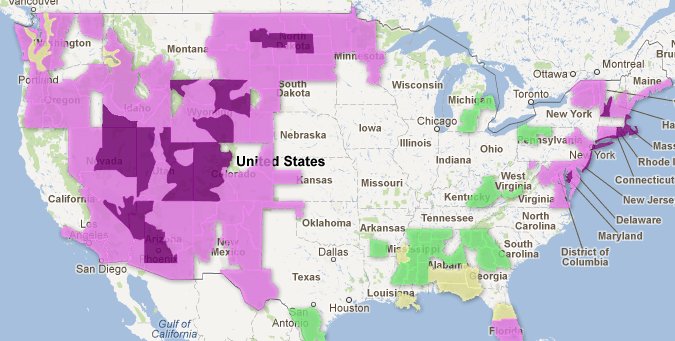
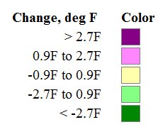
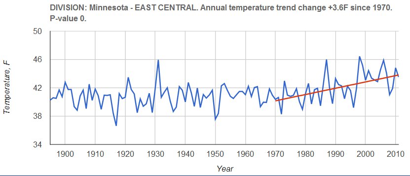
The short-term warming picture (since 1970) is easier to characterize - there is warming all across South, Southeast and Northeast.
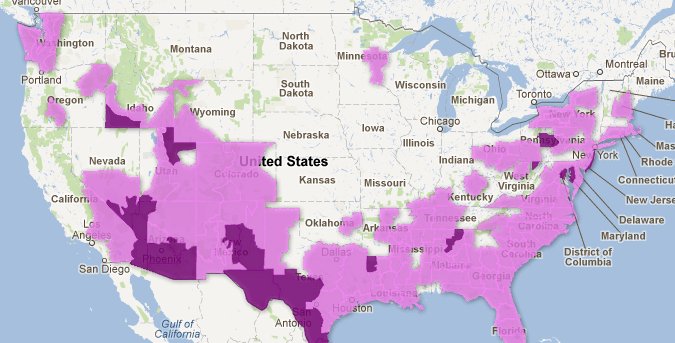
This is what station data on November precipitation change since 1895 looks like (the station points may take a few seconds to load the first time). Note a large increase in the Southeast.
All data points for every division or station can be seen in the graph view:
Map instructions
The main novelty about the map is that it does not show data if there are no significant changes. Such data is not completely hidden - you can still see it if you want to, but it is not distracting the viewers who are usually mostly interested in what has really changed.
The three map parameters you can alter are:
- observation type: temperature or precipitation.
- the time period: whole year, one month, or a season.
- the time range: 1895-present or 1970-present.
You can also switch between metric and imperial units.
To display the division graph view below the map, click anywhere on the map. The division you have clicked on will be outlined in red.
To get the station graph view, move the cursor over a weather station dot and click when it changes to a shape with a pointing finger. The station you have clicked on will get be marked with a red marker shape.
You can turn station and division layers on and off by checking or unchecking buttons under "Show layers". To switch between Map and Satellite map modes, click on one or the other option in the upper right-hand corner of the map.
To save or share a particular map view, just copy the address from the browser address bar. The state of the map is encoded in the address, so someone else opening this link will see the exact same map.
Comment layer
Note the comment layer which for now has just a single comment.
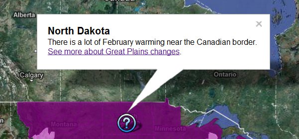
This layer was created separately from the map as a KML file (the easiest way to do this is go to maps.google.com and create a custom map under "My Places", but any KML file would work). It's possible to add multiple layers of this kind to collect comments authored by different people. I'm not a scientist and not able to provide detailed commentary on why we see certain patterns on the map, so I would be grateful if people with more knowledge about the subject matter could write such comments. They can be submitted in any form that can be converted into a map - KML files, spreadsheets or even free text format.
Data sources and processing
The dataset of continental US observations is provided by NOAA. The individual monthly station records going back to the end of the 19th century are known as United States Historical Climatology Network (USHCN). NOAA also calculates aggregated statistics for 344 climate divisions.
Some areas or stations don't really have a warming or cooling trend - for our purposes we would like to ignore such areas. We can detect presence and amount of the trend using an advanced version of linear regression (specifically, the Mann-Kendall test to find if a timeseries has a trend and the Theil-Sen method to calculate the slope of the line).
Comparisons
Climate divisions as defined by NOAA follow state boundaries, so they don't always represent the most natural way of detecting large-scale geographic patterns, but looking at both division and station data gives the viewer a fairly clear picture. We can compare this picture with what climatologists have been saying - for example, with the 2009 US Global Change Research Program report on climate change impacts in the US. See detailed analysis here.
We find the expected warming trend across most of the country - but the NOAA data on the map does not fully agree with the report about temperatures in the Southeast. Quote from the report: "The average annual temperature of the Southeast did not change significantly over the past century as a whole. Since 1970, however, annual average temperature has risen about 2°F." However, the map shows a cooling long-term trend in parts of the Southeast over the last century and about 1F warming since 1970. Hansen 2001 also mentioned the long-term cooling trend. It would be interesting to track down the source of this discrepancy.
Future directions
The NOAA station data also contains average minimum and average maximum temperatures for each month with uncertainties that would be interesting to show.
The comparable European dataset is E-OBS, provided by the ECA&D project.


 0
0  0
0


Comments