


 Arguments


Is Earth’s temperature about to soar?
Posted on 10 December 2014 by Guest Author
This is a re-post from tamino's Open Mind, showing that there's no statistical evidence the short-term slowing of global surface warming is a change in the long-term warming trend
A recent blog post on RealClimate by Stefan Rahmstorf shows that when it comes to recent claims of a “pause” or “hiatus,” or even a slowdown in global surface temperature, there just isn’t any reliable evidence to back up those claims.
Yet for years one of the favorite claims of those who deny the danger of global warming has been “No global warming since [insert start time here] !!!” They base the statement on the observed data of earth’s surface temperature or its atmospheric temperature. Then they claim that such a “pause” or “hiatus” in temperature increase disproves, in one fell swoop, everything about man-made climate change.
They seem a bit worried lately because it is very likely that the data from NOAA (National Oceanic and Atmospheric Administration) will record this year as the hottest on record; we won’t know, of course, until 2014 is complete. A single year, even if the hottest on record, has only a little to do with the validity of such claims, but a lot to do with how hard it is to sell the idea. Perhaps they dread the prospect that if the most recent year is the hottest on record — in any data set — it will put a damper on their claims of a “pause” in global warming. If they can’t claim that any more, it deprives them of one of their most persuasive talking points (whether true or not). Still the claims persist; they’ve even begun preparing to ward off genuine skepticism spurred by the hottest year on record.
I seem to be one of very few who has said all along, repeatedly and consistently, that I’m not convinced there has been what is sometimes called a “pause” or “hiatus,” or even a slowdown in the warming trend of global temperature — let alone in global warming.
And it’s the trend that’s the real issue, not the fluctuations which happen all the time. After all, if you noticed one chilly spring day that all that week it had been colder than the previous week, you wouldn’t announce “No more summer on the way! No more seasons since [insert start time here]!!!” You’d know that in spite of such short-term fluctuations, the trend (the march of the seasons) will continue unabated. You wouldn’t even consider believing it had stopped without some strong evidence. You certainly wouldn’t believe it based on weak evidence, and if the evidence is far too weak …
Why am I not convinced? Because the evidence for claims of a “pause” or “hiatus” or even slowdown is weak. Far too weak.
Let me show you just how weak their case is.
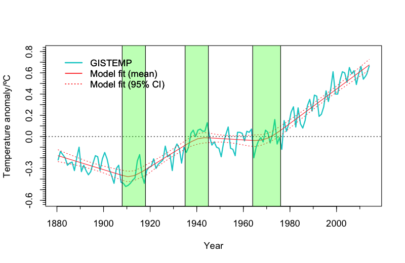
Rahmstorf’s post is based on a mathematical technique known as “change point analysis” (with the kind assistance of Niamh Cahill, School of Mathematical Sciences, University College Dublin) applied to data from GISS (NASA’s Goddary Institute for Space Studies). The result is that the most recent change point (the most recent change in the trend) which is supported by the data happened back in 1970, nearly 45 years ago. As for a change in the trend more recently than that (which is the basis of claims about a “pause”), there’s just no evidence that passes muster.
Of course, the data from GISS isn’t the only well-known data for global surface temperature; there’s also the aforementioned NOAA data, the HadCRUT4 data (from the Hadley Centre/Climate Research Unit in the U.K.), the data from Cowtan & Way (an improved — in my opinion — version of the HadCRUT4 data), the CRUTEM4 data which cover only earth’s land areas (also from the the Hadley Centre/Climate Research Unit), and the land-only Berkeley data (from the Berkeley Earth Surface Temperature project). There’s also data covering, not earth’s surface but its lower atmosphere (often called “TLT” for “temperature lower-troposphere), one from UAH (University of Alabama at Huntsville), another from RSS (Remote Sensing Systems).
With so many data sets to choose from, sometimes those who deny the danger of global warming but don’t like the result they get from one data set will just use another instead, whichever gives the result they want. Then again, some of them might accuse Rahmstorf, in his blog post, of choosing the NASA GISS data because it was most favorable to his case; I don’t believe that’s true, not at all. We can forestall such criticism by determining the result one gets from different choices and compare them. In fact, it’s worth doing for its own sake.
Let me state the issue I intend to address: whether or not there has even been any verifiable change in the rate of temperature increase — and remember, we’re not talking about the up-and-down fluctuations which happen all the time, and are due to natural factors (they’re also well worth studying), we’re talking about the trend. If there’s no recent change in the trend, then there certainly isn’t a “pause” or “hiatus” in global warming. I’ll also apply a different technique than used in Rahmstorf’s post.
First a few notes. Those not interested in technical details, just skip this and the next paragraphs. For those interested, I’ll mention that to estimate the uncertainty of trend analysis we need to take into account that the noise (the fluctuations) isn’t the simple kind referred to as white noise, rather it shows strong autocorrelation. I’ll also take into account that the noise doesn’t even follow the simplest form of autocorrelation usually applied, what’s called “AR(1)” noise, but it can be well approximated by a somewhat more complex form referred to as “ARMA(1,1)” noise using the method of Foster & Rahmstorf. This will enable me to get realistic estimates of statistical uncertainty levels.
I’ll also address the proper way to frame the question in the context of statistical hypothesis testing. The question is: has the warming rate changed since about 1970 when it took on its rapid value? Hence the proper null hypothesis is: the warming rate (the trend, not the fluctuations) is the same after our choice of start year as it was before (basically, since 1970). Only if we can contradict that null hypothesis can we say there’s valid evidence of a slowdown.
Spoiler alert: there’s no chance whatever of finding a “slowdown” that starts before 1990 or after 2008. Therefore for all possible “start of trend change” years from 1990 through 2008, I computed the best-fit statistical model that includes a change in trend starting at that time. I then tested whether or not the trend change in that model was “statistically significant.” To do so, we compute what’s called a p-value. To be called “significant” the p-value has to be quite small — less than 0.05 (i.e. less than 5%); if so, such a result is confirmed with what’s called “95% confidence” (which is 100% minus our p-value of 5%). Requiring 95% confidence is the de facto standard in statistics, not the universal choice but the most common and certainly a level which no statistian would find fault with. This approach is really very standard fare in statistical hypothesis testing.
So here’s the test: see whether or not we can find any start year from 1990 through 2008 for which the p-value is less than 0.05 (to meet the statistical standard of evidence). If we can’t find any such start year, then we conclude that the evidence for a trend change just isn’t there. It doesn’t prove that there hasn’t been any change, but it does lay bare the falsehood of proclamations that there definitely has been.
I’ll also avoid criticisms of using some data set chosen because of the result it gives, by applying the test to every one of the aforementioned data sets, four for global surface temperature, two for land-only surface temperature, and two for atmospheric temperature.
I can graph the results with dots connected by lines showing the p-values for each choice of start year, with the results from different data sets shown in different colors. The p-values are plotted from highest (no significance at all) at the bottom to lowest (statistically significant) at the top, with a dashed line near the top showing the 5% level; at least one of the dots for at least one of the data sets has to rise above the dashed line (dip below 5%) to meet the “Statistical Significance for Trend Change” region in order to claim any valid evidence of that (think of it as “You must be this tall to go on this ride”). Have a look:
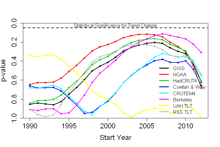
In no case does the p-value for any choice of start year, for any choice of data set, reach the “statistically significant” range. Therefore, for no choice of start year, for no choice of data set, can you make a valid claim to have demonstrated a slowdown in warming. As a matter of fact, in no case does the p-value for any choice of start year, for any choice of data set, get as low as the 10% level. To put it another way, there’s just no valid evidence of a “slowdown” which will stand up to statistical rigor.
Bottom line: not only is there a lack of valid evidence of a slowdown, it’s not even close.
But wait … there’s more! Imagine you roll a pair of dice and get a 12 in some game where that’s the only losing roll. You might suspect that the dice are loaded, because if the dice were fair then the chance of rolling a 12 is only 1 out of 36, or 2.8% (hence the “p-value” is 2.8%). You can’t prove the dice are loaded, but at least you’ve got some evidence.
Now suppose you roll the dice 20 times, and at least once you got a 12. Do you now have evidence the dice are loaded? Of course not. You see, you didn’t just roll once so that the p-value is 2.8%, instead you gave yourself 20 chances to get a 12, and the chance of rolling a 12 if you get to try 20 times is much much higher than the chance of rolling a 12 if you only get to try once. In fact the chance is 43%, so the p-value for all the rolls combined is 43%. That’s way way way higher than 5%. Not only do you have no valid evidence based on that, it’s not even close.
In the above tests, we didn’t just test whether there was valid evidence of a trend change for a single start year. We did it for every possible start year from 1990 through 2008, 19 choices in all. That means that the actual p-value is much higher than the lowest individual p-value we found — it’s just too easy to get results that look “significant” when you don’t take into account that you gave yourself many chances. The conclusion is that not only is there a lack of valid evidence of a change in trend, it’s nowhere near even remotely being close. Taking that “you gave yourself multiple chances” into account is, in fact, one of the strengths of change point analysis.
I repeat: not only is there a lack of valid evidence of a slowdown, it’s nowhere near even remotely being close. And that goes for each and every one of the 8 data sets tested.
A hottest-on-record for 2014 will dampen the enthusiasm of those who rely on “No global warming since [insert start time here] !!!” Yet, in my opinion, this never was a real issue because there never was valid evidence, even of a slowdown, let alone a “pause” or “hiatus.”
Based on the best estimate of the present trend, using the data from NASA GISS (as used in Rahmstorf’s post), this is what we can expect to see in upcoming years:

Of course there will still be fluctuations, as there always have been. But if future temperature follows the path which really is indicated by correct statistical analysis, then yes, Earth’s temperature is about to soar.
Does the data prove there’s been no slowdown? Of course not, that’s simply impossible to do. But the actual evidence, when subjected to rigorous statistical analysis, doesn’t pass muster. Not even close. Those who insist there definitely has been a “pause” or “hiatus” in temperature increase (which seems to include all of those who deny the danger from man-made climate change) either don’t really know what they’re doing, or — far worse — they do know what they’re doing but persist in making claims despite utter lack of evidence.
I will predict, however, with extreme confidence, that in spite of the lack of valid evidence of any change in the trend, and even if we face rapid and extreme warming in the near future, there’ll be no “pause” or even slowdown in faulty claims about it from the usual suspects.


Hi,
Great post, however no matter what you say or how sound the math, science or data is you are dealing with the political extreme who will never listen. I will add though that this is great ammo for me when I stand up to such extremists out there on the Internet. Can but hope we win this....for all our sakes.
DId I miss something? Where do you address the question that is the title of the article? Or is that supposed to be ironic in some way?
In any case, I would like anyone's opinions on whether there are reasons to expect an increase in the rate of GW in the coming years and decades? Another inflection point, as happened in about 1970.
The linear red lines and dashes on the last graph suggest not. But aren't lots of people talking about hitting 2 C above preindustrial levels well before 2050?
If so, when should we expect to see an increase in the rate of warming, exactly?
will - The underlying trend is not expected to suddenly change slope in the next few decades, certainly not as it did in the early '70s. But that underlying trend heads to ~2C by 2100, with a trajectory largely determined by our emissions path; it could be as high as 4°C if emissions follow the high-end RCP8.5 "business as usual" path, or as low as 1°C if we aggressively cut emissions. I would suggest reading IPCC AR5 WG1, Chapter 12 (12.4, to be more specific) for some of those details.
However, we appear to be near the bottom of possible short term variations right now with a combination of ENSO, low insolation, and (relatively) high volcanic aerosol injections into the stratosphere. As these variations regress to the mean I fully expect any sign of a short term (and statistically insignificant) 'hiatus' to vanish as a fairly sharp upward variation. Leaving the pseudo-skeptics to search for a later short term low variation to start chanting about their fantastical upcoming Ice Age...
I'll be curious how the satellite data sets play out as we move into a phase more dominated by El Nino. I could imagine UAH/RSS might actually over play the rise in temperature.
That might be a pretty pickle for a number of climate denial blogs.
Thanks, KR, for the pointers, and for this:
That's pretty much what I was thinking, plus perhaps some feedbacks kicking in.
Don't worry about denialists ability to deny, though. If the data doesn't do what they want it to, they just make stuff up or reinterpret it in ways so insane it will make your head spin.
According to NOAA and GISS datasets, the temperature trend since the mid-70s has been about 0.165C increase per decade. if that conitnues we can expect the temp at 2050 to be about 0.57C warmer than now, which will be about 1.5C warmer than the 1880's values.
On the topic of the 1998 temp, it was about 0.175C higher than the trend value for that year. So that equals the trend value for 2009. By 2020, on its current trajectory, the trend value will be 0.175C higher than the 1998 temp. So if the current trend continues, after 2020 we are unlikely to see a temperature as cool as 1998 again during our lifetime (unless you are currently very young and live a long life). If there are no La Nina events or large volcanic eruptions over the next few years, we won't see a temp as cool as the 1998 temp again this decade either.
[PS] I suspect you mean 1997. 1998 was a hot monster El Nino year.
WRyan,
I agree. The unusually warm for its time 1998 will be cooler than most years in the near future and possibly all years after 2020. In the not too distant future even an extreme La Nina event won't temporarily produce an annual average as low as the 'high' of 1998.
Very interesting analysis. Statistics is not my forte but I have a few observations and comments.
The test seems to be set of as a two tailed test determining whether the later period is different, not slower. I think this is justified on a purely impartial scientific basis but may not be as convincing if one is biased to believe in the slowdown.
I don't think the dice analogy is valid. Whether the dice are loaded or not, each roll is independent of the others. However, in your analysis, 1999 shares 94% of its data with 2000. That is why the plots have a smooth curve instead of the jagged pattern you would see if you plotted throws of an honest die.
It would be expected that the probabilities drop off as time approches the present becasue ther is less and less data. If tomorrow were the coldest day globally on record by a full degree, it wouldn't constitute a significant trend.
My thoughts on the 95% confidence standard are that, in a lot of areas, being right 90% of the time is pretty darn good. The NOAA graph gets close to that but that is just cherry picking from the data sets. (Hate to give the deniers ideas).
Looking at the curves, the most striking thing is the similarity of the three surface data sets, the RSS satellite data(!) and the Berkely land data. These are also the sets showing the highest probability of a slow down. Doing an eyeball average of these five, it may be as high as 80% in 2006. Not terrible, but not too convincing either.
Interesting that the C&W and the land-only CRUTEM curves are so similar. I think C&W made a good case for their improved handling of missing data and it is no surprise (based on the trend they demonstrated when it was published) that this data set shows the probability of a slowdown at 60% or less.
UAH? Ironic that it shows essentially zero probability since it is the denier's darling data set. Of course what it really shows is that this data is just noise. If the lower atmosphere caught fire, would UAH notice?
Very nice post! That said, I want to repeat Rocketman's concern about the dice analogy. Adjacent years are not independent of each other. But there's probably a way to take that partial annual interdependence into account when calculating the statistical implications of the whole series of years not exceeding the significance limit--a modified dice calculation.
I also have one question. In the second graph, why are data points shown for years after 2008?
For those who are not familiar with Tamino (who wrote this post), he is a statistician. These analysis are his specialty. He accounts for the autocorrelation (the modified dice calculation mentioned above) in the OP by:
"I’ll also take into account that the noise doesn’t even follow the simplest form of autocorrelation usually applied, what’s called “AR(1)” noise, but it can be well approximated by a somewhat more complex form referred to as “ARMA(1,1)”
95% confidence is the normal choice in science (discussed in the OP just under the spoiler alert). If you do not understand the jargon ask a question.
I am not a statistician so I do not question Tamino when he does an analysis. I have seen a lot of people question Tamino's choices, mostly people who are not statisticians, and he always has a good rational for his choices.
And best of all, Tamino simply does not suffer run of the mill false-skeptic fools. At all.
The blog link pointed to a graphing tool at the University of York, Chemistry Dept of all things, that is a useful addition to the woodfortrees site I usually visit for charts. It is interesting that most of the warming in the datasets appears to be from ocean temperatures, since land only data is a bit flatter.
As for the moderator's comment that 1998 was a hot monster year, that is true. However, plots show that its El Nino effect was mostly from Jan through Aug 1998. Also NOAA says 1998 was only 3rd warmest, soon to be 4th. So it may be that WRyan did in fact mean 1998 will soon fall out of the top 10. That's a rather sobering thought.
The skeptics are already reacting, by finding another data set.
On his site ICECAP, joe D'Aleo claims: "Using the actual data that goes into the forecast models used for the 7 day forecasts you see on TV and the internet, we find the global anomaly was a mere +0.07C in November and for the year to date a measly +0.11C, far short of the +0.68C warmest ever anomaly that NOAA claimed last month. One modeler told me “It was obvious to me since about April that NOAA had decided that 2014 was going to be the hottest year ever. The White House needed this for their political objectives.”"
[Rob P] - Resorting to conspiracy theory isn't a cogent argument. Don't worry, if 2014 does in fact end up the warmest year in surface temperature data sets we can expect a lot of lame excuses from the anti-science brigade.
Sailingfree,
The forecast models undoubtedly use a different baseline than NOAA does. Joe D'Aleo is smart enough to know this. NOAA uses the average of the 20th century. Forecast models probably use the last decade (I could not find their baseline in a quick Google), although they might use a longer time period. Since the difference is so small that suggests they use a recent baseline.
Michael Sweet... "Joe D'Aleo is smart enough to know this."
I wouldn't be too sure about this. He's certainly capable of knowing this, I'm not so sure, once he's found a point that he prefers, that he's capable of moving past it to actually admit an error.
michael sweet @14, D'Aleo's claim is based on this plot from NCEP, which indicates a 1981-2010 baseline:
The NOAA 2014 eleven month mean (Jan-Dec) is 0.263 C using a 1981-2010 baseline. That is 0.414 C less than the value using their standard baseline, so the difference in baseline accounts for most, but not all of the difference.
I downloaded the NCEP montly reanalysis to Nov 2014 from here (timeseries). Converting to anomaly data I found that 2014 to the end of Nov (0.328 C) is currently ranked 3rd warmest compared to other full years, behind 2005 (0.355 C) and 2010 (0.343 C). For Jan to Nov temperatures, 2014 is also ranked 3rd, behind 2010 and 2005. This is the NCEP reanalysis, not the version 2 reanalysis used in the graph by D'Aleo, for which I could not find the raw data past 2012.
One key difference between the NCEP product and the global temperature products is that the NCEP data is the 2 meter air temperature, whereas the global temperatures products show the 2 meter air temperature* over land, and the surface water temperature at sea. That will result in a lower global temperature anomaly for the NCEP product because the air is, on average cooler than the ocean (as fake skeptics never tire of telling us). That, by itself may account for the remaining discrepancy between the NOAA global temperature anomaly and the NCEP reanalysis. What does not account for it is the input data, which should be essentially the same between the NCEP reanalysis and the v2 (where the difference in rankings in negligible, and may be entirely accounted for by their not measuring the same things).
Finally, a question. Am I alone in being struck by the irony of a fake skeptic preferring the product of a computer model (the NCEP reanalysis) over the observations?
(* The observations are for two meters above the actual land surface. The reanalysis may give the temperature that the air would be for 2 meters above sea level regardless of topography. This difference, if it exists, should not make any appreciable difference to the rankings.)
[DB] ICECAP's website does not appear to be working, as the image will not load nor does the main site load.
[DB] Working now, it seems.
Sorry, I forgot to include the link to the NCEP data source. DB, Icecap and the image are loading for me just fine. If it does not for you, the only relevant information is the baseline period, and the anomaly for Jan 1 to Dec 4th of 0.108 C. The data is listed as NCEP CFSv2, and the graph was prepared by Ryan Maue of Weatherbell (ie, Barstardi and D'Aleo's company).
As an addendum to my comment @16, having looked at the NCEP v2 data available to me (1871-2010). Over the period of overlap (1948-2010), the v2 data is typically cooler than the NCEPv1 data (mean 0.023, St Dev 0.1). Over the last six years of overlap, it is consistently cooler (mean 0.14, st dev 0.017). If that difference is maintained for this year, that would indicate a temperature anomaly of 0.188 C for the v2 data. Why Ryan Maue's figure is 0.08 C below that I do not know. According to his figure, we are heading for the coolest year since 2011, even though there is no difference in temperature adjustment over the period and hence it is not a consequence of the homogeneity adjustment.
I agree with this post
even if not completely.
Regarding long-term (I mean > 30 years) trend, the global surface T data from approx 1970 shows a clear and stable rise, with good approximation linear.
Of course it is difficult to see it on the rough data with the average global T for months or years, but if we look at the trend with even if with a short smoothing (i.e. 6 months)
(using Cowtan“calculator” http://www.ysbl.york.ac.uk/~cowtan/applets/trend/trend.html is easy)
the uphill is still recognizable while the fluctuations (which are real, non merley noise) are disturbing our eye.
It is better for this reason use longer moving average (I suggest at least > 96 months): if you try (again starting from 1970), the whole trend will be very close to the linear regression, as showed by Tamino in his smoothed trend. But if you look at some smaller details (on the line with a long moving average but not on Tamino trend) you can see a little increasing of the slope just before 2000 and a small deceleration on the late ’00.
We can call this behaviour a short-term (I mean approx. 10 years) slow-down? I think yes,
as a matter of fact decreasing th moving average to 48 months (because we are looking for short-term trend) and starting from 1985 (in this way we are using the calculator as a magnifier) we found the same behaviour:
faster warming after 1995 ( we know that 1998 was a record year) and deceleration after 2005 but also a steady increasing from approx. 1997 to 2005 as well as a detectable cooling from 1990 to approx 1995.
Of course the moving average itself introduce some disturbance because we are at the border of the series and we don’t know the data regarding T for the next months and years.
But don’ t worry, the recent short-term slow-down is not significative on the long-term and it is easy t o foreseen for the next 25-30 years (and after) a general increasing (smoothing the fluctuations that in every case will happen) of the T with an average slope of approx. 15 hundredths of degree per decade or more.
Unfortunately the warmer is not always the better.
P.S: if you want to find a long term slow-down or pause (of course with short-term slope changing due to fluctuations, a sort of warming and cooling small waves) you can lok at the data from 1940 to 1970 with a moving average of approx. 48 months (not surprisingly you can see the same general trend on Tamino model fit for this span but the fluctuations are flattened).