Climate Science Glossary

Term Lookup

Enter a term in the search box to find its definition.

Settings

Use the controls in the far right panel to increase or decrease the number of terms automatically displayed (or to completely turn that feature off).

Term Lookup

Settings


All IPCC definitions taken from Climate Change 2007: The Physical Science Basis. Working Group I Contribution to the Fourth Assessment Report of the Intergovernmental Panel on Climate Change, Annex I, Glossary, pp. 941-954. Cambridge University Press.

Home Arguments Software Resources Comments The Consensus Project Translations About Support

Twitter Facebook YouTube Mastodon MeWe

RSS Posts RSS Comments Email Subscribe


Climate's changed before
It's the sun
It's not bad
There is no consensus
It's cooling
Models are unreliable
Temp record is unreliable
Animals and plants can adapt
It hasn't warmed since 1998
Antarctica is gaining ice
View All Arguments...


Username
Password
New? Register here
Forgot your password?

Latest Posts

Archives

Lessons from Past Climate Predictions: IPCC AR4

Posted on 22 September 2011 by dana1981

Note: SkS commenters identified a flaw in this post, and it has now been updated.  This version is out of date - the updated post is here.

In 2007, the IPCC published its Fourth Assessment Report (AR4).  In the Working Group I (the physical basis) report, Chapter 8 was devoted to climate models and their evaluation.  Section 8.2 discusses the advances in modeling between the Third Assessment Report (TAR) and AR4.

"Model improvements can...be grouped into three categories. First, the dynamical cores (advection, etc.) have been improved, and the horizontal and vertical resolutions of many models have been increased. Second, more processes have been incorporated into the models, in particular in the modelling of aerosols, and of land surface and sea ice processes. Third, the parametrizations of physical processes have been improved. For example, as discussed further in Section 8.2.7, most of the models no longer use flux adjustments (Manabe and Stouffer, 1988; Sausen et al., 1988) to reduce climate drift."

In the Frequently Asked Questions (FAQ 8.1), the AR4 discusses the reliability of  models in projecting future climate changes.  Among the reasons it cites that we can be confident in model projections is their ability to model past climate changes in a process known as "hindcasting".

"Models have been used to simulate ancient climates, such as the warm mid-Holocene of 6,000 years ago or the last glacial maximum of 21,000 years ago (see Chapter 6). They can reproduce many features (allowing for uncertainties in reconstructing past climates) such as the magnitude and broad-scale pattern of oceanic cooling during the last ice age. Models can also simulate many observed aspects of climate change over the instrumental record. One example is that the global temperature trend over the past century (shown in Figure 1) can be modelled with high skill when both human and natural factors that influence climate are included. Models also reproduce other observed changes, such as the faster increase in nighttime than in daytime temperatures, the larger degree of warming in the Arctic and the small, short-term global cooling (and subsequent recovery) which has followed major volcanic eruptions, such as that of Mt. Pinatubo in 1991 (see FAQ 8.1, Figure 1). Model global temperature projections made over the last two decades have also been in overall agreement with subsequent observations over that period (Chapter 1)."

AR4 hindcast

Figure 1: Global mean near-surface temperatures over the 20th century from observations (black) and as obtained from 58 simulations produced by 14 different climate models driven by both natural and human-caused factors that influence climate (yellow). The mean of all these runs is also shown (thick red line). Temperature anomalies are shown relative to the 1901 to 1950 mean. Vertical grey lines indicate the timing of major volcanic eruptions.

Projections and their Accuracy

The IPCC AR4 used the IPCC Special Report on Emission Scenarios (SRES), which we examined in our previous discussion of the TAR.  As we noted in that post, thus far we are on track with the SRES A2 emissions pathChapter 10.3 of the AR4 discusses future model projected climate changes, as does a portion of the Summary for Policymakers.  Figure 2 shows the projected change in global average surface temperature for the various SRES.

AR4 projections

Figure 2: Solid lines are multi-model global averages of surface warming (relative to 1980–1999) for the scenarios A2, A1B, and B1, shown as continuations of the 20th century simulations. Shading denotes the ±1 standard deviation range of individual model annual averages. The orange line is for the experiment where concentrations were held constant at year 2000 values. The grey bars at right indicate the best estimate (solid line within each bar) and the likely range assessed for the six SRES marker scenarios.

We digitized Scenario A2, the red line in Figure 2, and compared it to the observed global surface temperature change as measured by NASA GISS (Figure 3).

AR4 projections

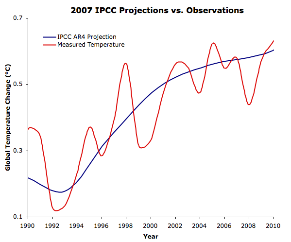
Figure 3: IPCC AR4 Scenario A2 model projections (blue) vs. GISTEMP (red) since 1990

The shape of the model projections is simply a result of the model averaging.  However, the linear global warming trend since 1990 is 0.22°C per decade for the models, vs. 0.19°C per decade for the observational data.  The model projections actually begin in 2000.  The trends over that period are 0.12°C (projected) vs. 0.15°C (observed) per decade.

What Does This Tell Us?

The IPCC AR4 was only published a few years ago, and thus it's difficult to evaluate the accuracy of its projections at this point.  The Scenario A2 simulations do show that over periods as short as a decade, it's not unusual for climate models to project a slowed rate of global surface warming.  In fact, while climate "skeptics" have made a lot of fuss over the slowed warming over the past decade, the IPCC AR4 model average actually projected an even lower rate of warming for the period 2000 to 2010 with Scenario A2.  Although this slowed projection was merely coincidental, it shows once again that we must evaluate long-term trends longer than a single decade.

Section 10.5.2 of the report discusses the sensitivity of climate models to increasing atmospheric CO2.

"Fitting normal distributions to the results, the 5 to 95% uncertainty range for equilibrium climate sensitivity from the AOGCMs is approximately 2.1°C to 4.4°C and that for TCR [transient climate response] is 1.2°C to 2.4°C (using the method of Räisänen, 2005b). The mean for climate sensitivity is 3.26°C and that for TCR is 1.76°C."

Thus the accuracy of the IPCC AR4 projections thus far provides yet another piece to the long list of evidence that equilibrium climate sensitivity (including only fast feedbacks) is approximately 3°C for doubled CO2.  However, it will take at least another decade of data to adequately evaluate the accuracy of the 2007 IPCC projections.

0 0

Printable Version  |  Link to this page

Comments

Comments 1 to 49:

  1. You say "The model projections actually begin in 2000. The trends over that period are 0.12°C (projected) vs. 0.15°C (observed) per decade." Are we to understand that 0.12C/decade is the trend for the projection for A2 scenario from 2000 to 2010 ?? 0.12C/decade is obviously 1.2C/century, so it is easy to draw a straight line from the year 2000 point on the graph to a point at year 2100 that is 1.2C higher. That line falls well below the red A2 slope for 2000 to 2010. Your claim that the AR4 A2 projection is 0.12C/decade also disagrees with the text statement in AR4 that said there is little difference between the different scenarios for the first 20 years or so, and that the slope of all projections is about 0.2C/decade. Please clarify how you came up with 0.12C/decade.
    0 0
  2. Charlie, the climate model projections are quite clearly not linear (see Figure 2), so I don't know why you're projecting a linear trend out to 2100. As the post states, we digitized the IPCC's multi-model average for scenario A2 (the red line), and the short-term trend was simply calculated in Excel. As the post notes, it's too short of a timeframe to say anything meaningful.
    0 0
  3. I project the 0.12C/decade out to 2100 simply to be able to compare the slope with the projections of Figure 2. I do not see how it is possible that the slope from 2000 to 2010 is 0.12C/decade. I see a slope of 0.2C/decade, not the 0.12C that you see. IPCC AR4 Synthesis report says "For the next two decades a warming of about 0.2°C per decade is projected for a range of SRES emissions scenarios." AR5 SPM Chap 3 and 3.2 I note that the only line in Figure 2not having a 0.2C/decade trend in 2000 to 2020 is the "year 2000 constant concentrations" scenario, which is described by the IPCC as "Even if the concentrations of all GHGs and aerosols had been kept constant at year 2000 levels, a further warming of about 0.1°C per decade would be expected." In your Figure 3, you claim that the blue line is a depiction of the AR4 projection for Scenario A2. I say that it is not correct. Others reading this post can read your claims, look at the figures, can look at what the IPCC and I say vs what you claim, and make their own judgements.
    0 0
  4. Charlie, please read the post more carefully. It's not 0.12°C per decade, it's 0.12°C for one single decade (2000 to 2010). The data is shown quite clearly in Figure 3. It's not 2020 yet. That's the point, and why I've repeatedly said it's too early to draw any major conclusions from this assessment.
    0 0
  5. This looks very close to the stated 0.19 per decade.
    0 0
  6. Indeed it is muoncounter, because it's multiple decades! I suspect the 2000-2020 global surface temperature trend will be very close to the expected 0.2°C per decade trend as well. Oh and for the record, the AR4 Scenario A2 projection for 2000 and 2020 is indeed just about 0.2°C per decade, as stated in the report. It just happens to be lower from 2000 to 2010 in the model mean.
    0 0
  7. Thanks, Dana Maybe I'm slow, but how was the observed 0.15°C per this decade calculated? What's the trend with more datasets, using same calculation? Perhaps a link in the post could help.
    0 0
  8. I am a little puzzled by the stated observed value also. From where are you getting your temperature data? Calculations using GISS monthly data yield a linear slope of +0.015C / decade for the past 60 months. Perhaps there was a decimal error. Averaging over a tweny-year period to obtain a value for the previous decade seems questionable, especially when the warming occurred in the first decade.
    0 0
  9. Jonathon #8, The GISS trend from 1990-2000 (about .17*C/decade) is actually smaller than the trend for 1990-2010 (.19*C/decade). The warming did not stop in 2000. "Calculations using GISS monthly data yield a linear slope of +0.015C / decade for the past 60 months." That's only the last 5 years. And the number given is trend per year, not decade. That comes to about .15*C per decade.
    0 0
  10. Jonathon, so... you are disputing the claim that the observed temperature trend over the period from 2000 to 2010 was 0.15 C by citing the past 60 months. You really can't see the flaw in your reasoning there?
    0 0
  11. Robert, My mistake. I meant to say 120 months, and the number is correct in degrees / decade. The value of 0.15 / decade is not supported by the GISS data. Even a cursory look at figure 3 above will tell someone that the first decade experienced much greater warmer than the second.
    0 0
  12. "My mistake. I meant to say 120 months, and the number is correct in degrees / decade." Well, I just looked at Wood For Trees, put in 2000-2010 (which is what was discussed, not the last 120 months, btw), and the linear trend came up as 0.0128317 per year, which comes to about .13*C/decade. I'm not sure of what I need to do to get the .15*C, but it certainly isn't close to .015*C/decade. Edit: 2000 thru the end of 2010 comes to .15*C/decade, so that might be what was implied (though that is 11 years, not ten). "Even a cursory look at figure 3 above will tell someone that the first decade experienced much greater warmer than the second." And yet adding the last ten years of data actually raises the linear trend; 1990-2000 has a linear trend of 0.0167924*C per year while 1990-2010 has a linear trend of 0.0189468*C per year. The eyecrometer doesn't always tell the truth.
    0 0
  13. Jonathon#11: 120 months (10 years) is not long enough a period to establish a meaningful trend.
    0 0
  14. Dana1981 -- We now agree that the 2000-2020 IPCC projection for scenario A2 is 0.2C/decade. You also assert that the projection is 0.12C/decade for 2000-2010. Does this mean that the IPCC projection for 2010-2020 is 0.28C/decade ? In case you don't understand where the 0.28C/decade comes from, I'll point out that IPCC projection 2000-2020 is 0.2C/decade or 0.4C rise. You claim the projection (or in a later comment "the model mean") is 0.12C for 2000-2010, for a rise of 0.12C. This leaves a required rise of 0.28C in the coming decade to match the IPCC projection.
    0 0
  15. I am still trying to figure out how Figure 3 was generated. Dana1981: "We digitized Scenario A2, the red line in Figure 2, and compared it to the observed global surface temperature change as measured by NASA GISS (Figure 3)." But Figure 3 shows an IPCC "projection" starting in 1990. On figure 2, the projections don't start until 2000. Did you use some other source for the data besides Figure 2 to generate the 1990-2010 IPCC projection in your Figure 3 ?
    0 0
  16. As the text notes, I used GISTEMP and calculated the trends since 1990 and since 2000. Because it's such a short timeframe, I wanted to maximize the signal to noise ratio, so I included the data through most recent available month, but still provided the trend as °C per decade for comparison. Charlie - yes, the AR4 Scenario A2 model mean trend between 2010 and 2020 is close to 0.28°C. Figure 3 includes the Figure 2 data between 1990 and 2000.
    0 0
  17. Robert, I guess it depends on your start and end points. Using the 10 years from 2000-2009, the trend is 0.13 (as you state). Using 2001-2010, the trend is 0.067, and using the past 120 months, the trend is 0.015. Using either sets of numbers, the measurements are less than the projection (0.2). In order to meet the projection of 0.2C / decade between 2000 and 2020, GISS temperatures would need to increase at 0.05C / year from now until 2020. It could happenm and as Dana says, it is not 2020 yet.
    0 0
  18. "I guess it depends on your start and end points." Of course; we're dealing with very short time scales. One year's temperature can make a huge difference with the trends when you are only looking at 10 years of data. That is why scientists look at longer timeframes. Linear trends for short timescales can be very deceptive; one would think that adding the ten years from 2000 to 2010 would lead to a smaller long term linear trend for 1990 to 2010 than for 1990 to 2000. It doesn't (for GISS anyway); the trend actually goes up. This despite the fact that the trend from 1990-2000(about .17*C/decade) is bigger than that from 2000-2010 (about .13*C/decade). Our first intuitions can lead us astray.
    0 0
  19. Robert Murphy wrote: "Our first intuitions can lead us astray." indeed, which is why we have statistical tests, which give us an indication as to whether out intuiutions have a solid evidential basis. Although frequentist hypothesis testing as it is actually used in science is arguably not fit for purpose!
    0 0
  20. I was wondering a bit about this trend stuff myself, so I set up a bit of code that tries various different values for start year and trend time and calculates a linear regression slope in the gistemp or any other temperature data set. My resulting plot is displayed (hopefully) below: Although it's not a statistical test, it can inform one's intuition for how sensitive to trend the pick of a start date is. Sure enough, it's trivial to cherry pick a recent ten-year trend to give values as low as between -0.05 and zero or as high as 0.3 degrees per decade for ten year trends from 1998 and 2001. The 15 year trends, however, are much pretty stable in IPCC compatible ranges. I like to call this a "cherry checking chart."
    0 0
  21. Of course for previous IPCC report projections (particularly the FAR), there is much more data available, and they have turned out to be quite accurate.
    0 0
  22. Paul from VA#20: "15 year trends, however, are much pretty stable in IPCC compatible ranges." A very interesting display; I'd like to hear a little more about what you did. Is there a way to thicken the lines so they do not fade quite as fast? Perhaps a more detailed color bar, with a smaller range, would help.
    0 0
  23. Paul from VA#20: I find that to be an extremely useful graph to visualize the trends based on start date and length of measure... Excellent!
    0 0
  24. Dana-- Consider downloading the data from the IPCC's own site, averaging over all models to create the multi-model mean, and then recompute your projected trends for the A2 model projections. If all you need is annual averages, the IPCC's version of their data is here Links to monthly data are available on that page.
    0 0
    Moderator Response: [grypo] Thank you. Fixed link.
  25. Lucia, You don't even need to average them; the IPCC provides the global multimodel mean average temps here Just use 20C3M data for 1990 to 1999 and A2 data from 2000 to 2010. Checking the slopes, I get 0.236 C per decade from 1990-2010 and 0.177 C per decade from 2000 to 2010. You might want to check your figure for the last decade Dana.
    0 0
    Moderator Response: [grypo] Thank you. Fixed link.
  26. Thanks Zeke and lucia. If I have time, I'll try that approach and update the post.
    0 0
  27. #20 - Paul, lovely chart! A very original way to demonstrate an important principle about cherry-picking trends. Some less- and more-experienced visitors to this site (including me) could learn a thing or two from it.
    0 0
  28. dana-- Will your update acknowledge that Charlie A was correct and you were incorrect about the correct magnitude of the trends?
    0 0
  29. lucia - Charlie's comment was about the 2000 to 2020 trend. This post doesn't address the trend beyond mid-2011. I got the data from Zeke's link, and have a new figure. Will post an update shortly.
    0 0
  30. Dana
    ucia - Charlie's comment was about the 2000 to 2020 trend. This post doesn't address the trend beyond mid-2011.
    Charlie specifically askes you about the trend from 2000-2010 and does so repeatedly. In comment 1:
    Are we to understand that 0.12C/decade is the trend for the projection for A2 scenario from 2000 to 2010 ??
    The correct answer should be "whoops. No. The trend for the projection for the A2 scenarios from 2000 to 2001 is NOT 0.21 C/decade. In his second comment (numbered 3 here) he writes
    I do not see how it is possible that the slope from 2000 to 2010 is 0.12C/decade. I see a slope of 0.2C/decade, not the 0.12C that you see.
    Note the dates: 2000 to 2010. The correct response is that the slope from 2000 to 2010 -- the dates charlie mention quite specifically-- is not 0.12 C/dec. Charlie is correct to not "see" this slope. Charlie-- who, I should say appears to be being stupendously polite for a blog visitor even asks you to check the trend from 2010-2020 and you answer
    Charlie - yes, the AR4 Scenario A2 model mean trend between 2010 and 2020 is close to 0.28°C. Figure 3 includes the Figure 2 data between 1990 and 2000.
    Your answer is incorrect. The A2 trend from 2010-2020 is not close to 0.28C. You bungled this. You waved away charlie. I don't know where you went wrong, but you messed up. I should think your re-write should acknoweldge that charlie a) was correct b) was obviously asking about the trend from 2000-2010, specifically calling out these years. Or course, you are not required to do this. But, your notion that Charlie was only discussing 2000-2020 is absurd.
    0 0
  31. Dang-- No preview or edit function on comments. "is NOT 0.21 C/decade." should read "is not 0.12 C/decade".
    0 0
    Response:

    [DB] "No preview or edit function on comments"

    A 'Preview' button may be found immediately to the right of the 'Submit' button.  The Previewed comment will then appear below the comment box.

  32. lucia, if you read the next line in Charlie's comment, he's referring to the text in the AR4 stating that the trend from 2000 to 2020 is 0.2°C per decade. I will say that if I'm misinterpreting Charlie's comments, and if he was saying the trend from 2000 to 2010 in Figure 2 looked closer to 0.2°C per decade, then he was approximately right (and if that's the case, he's got some impressive eyesight). That's just not how I read his comments, but I could be wrong. As I note in the updated post, our digitization of the graph was unfortunately not very accurate, due to the small scale of Figure 2. That's my mistake - I should have thought to look for a data file, since the AR4 was published so recently, rather than relying on the digitization. Mea culpa on that one, and again, thanks to you and Zeke for pointing me to the data.
    0 0
  33. DB--Thanks.
    0 0
  34. Dana-- to 2010 ??" I really don't know how you misunderstood this. But blog comments being what they are, I'm willing to believe you did. My interpretation is that he also points out that your trend also disagrees with the trend for the longer period. This additional information ought to have given you pause and motivated you to double check your digitization or computation. Even just reviewing figure 10.4 which you digitized and noticing the small curvature ought to have given you pause. As for the recentness of the AR4: It was published in 2007-- four years ago. I don't know if that's counted as recent or ancient these days. My understanding is it will be superceded by he AR5 pretty darn soon. The age of these things needs to be translated into dog-years.
    0 0
    Response:

    [DB] "As for the recentness of the AR4:  It was published in 2007-- four years ago. I don't know if that's counted as recent or ancient these days."

    Dana1981 was speaking from the perspective of having published posts recently on the FAR, SAR and TAR.

  35. Dana, I think you should acknowledge Charlie A in the updated post as well as Lucia and Zeke. My reading of Charlie A's comments is that he was correct in his observations, pertaining to the 2000-2010 part of your Figure 3. The data provided by Zeke and Lucia merely confirm that. As I've found to my cost before, digitising images is a tricky business, especially if the scale of the original is small! Obviously, it doesn't alter several facts - first, that the AR4 projection is so far doing a perfectly reasonable job of estimating warming, though as you say it is very early to judge; and second that the trend present through the 1990s actually increases if you include the last 10 years of data, even though the trend for the last 10 years alone is slightly lower (as Robert notes in #18) - highlighting the caution with which one should apply value to short-term trends and the strength of longer-term trends.
    0 0
  36. skywatcher - fair enough, I've added a hat tip to Charlie as well, though I still don't interpret his comments in the same way. But I don't mind adding an acknowledgment that he raised initial concerns about the quality of the digitization, and have done so in the updated post. lucia - please tone it down. The quote you reference is in regards to Figure 3. Charlie questioned the accuracy of the 0.12°C trend, and rightly so. His claims of a 0.2°C trend, however, were in reference to the 2000 to 2020 trend. I've acknowledged and corrected the problem. Can we move on now please?
    0 0
  37. All good by me, thanks Dana! You've done a great job on a lot of posts here, and I didn't want to see you lambasted for any problems with this one.
    0 0
  38. Thanks skywatcher - I'm sure I'll be lambasted anyway! It seems like certain parties are looking for any excuse to lambast SkS and myself these days. I view the increased scrutiny as a sign that SkS is becoming more effective, and the lambasting as a sign that we're viewed as more of a threat. It's a compliment really :-) It will be interesting to wake up tomorrow and see how many 'skeptic' blogs have posts about me making a minor (I mean, ginormous!) error.
    0 0
  39. Wow I didn't even have to wait until morning. Lucia sure is quick on the draw.
    0 0
  40. From another thread here at SkS: "Sadly I see that this incident is already being distorted and spun in certain quarters-- and that after Dana graciously thanked them for their feedback. Must be desperate times and/ or a slow week for "lukewarmers" and 'skeptics' if this is something that gets them so excited. "
    0 0
  41. Crosspost: The text in my above post @ 40 should probably read: "Sadly I see that this incident is already being distorted and spun in certain quarters-- and that after Dana graciously thanked them for their feedback." Regardless, it certainly seems that some people are trying to use the situation to their advantage.
    0 0
  42. I wonder if we'll see similar corrections for errors in posts at places like WUWT, when spectacular errors are pointed out. Say... like the errors in arctic temperature data presented at WUWT pointed out by Tamino here, here and here in the past few days, for example? Or perhaps a post or two by Lucia exposing and damning those very large errors and damning the lack of correction or retraction of teh associated claims? It's a serious problem that when relatively minor errors are pointed out in places where the consilience of evidence is accepted, there is a massive fuss about them, whichever direction the errors go, and regardless of whether the errors are pointed out by those who agree with the consensus or those who disagree. Alternatively, complete garbage is regularly published in places that disagree with the consensus on AGW, and yet we hardly hear a cheep from those who obviously should know better.
    0 0
  43. Charlie A was on the right track, and asked the key question, but his reasoning wasn't quite right, and that may have caused Dana to chase a red herring. "I see a slope of 0.2C/decade, not the 0.12C that you see." IPCC AR4 Synthesis report says "For the next two decades a warming of about 0.2°C per decade is projected for a range of SRES emissions scenarios."" "Seeing" isn't too precise, and 0.2 C per decade is only the quoted decadal rate through 20 years. Zeke's post (#25) was the most useful, Lucia's over-dramatic point-scoring not particularly useful, but I'm pleased to see a variety of blogs paying attention to SkS now.
    0 0
  44. skywatcher - agreed, there's a serious difference in the standards each "side" is held to. We make a minor error and it's immediately a "-gate". "Skeptics" make huge errors misrepresenting research or doing bad statistics, and basically aren't even held accountable.
    0 0
  45. I'm reminded of this one just a few days ago, Dana. Anthony Watts: "Oh dear, now we have three peer reviewed papers (Lindzen and Choi, Spencer and Braswell, and now Richard P. Allan) based on observations that show a net negative feedback for clouds, and a strong one at that. What will Trenberth and Dessler do next? Maybe the editor of Meteorological Applications can be persuaded to commit professional suicide and resign?" Bart summarized the incident here. What's remarkable is the above line by Watts remains in the post, shrillness and all, long after some, including the author of the paper he's botching, corrected him. Strange.
    0 0
  46. dana1981
    Wow I didn't even have to wait until morning. Lucia sure is quick on the draw.
    dana is being personally singled out for attention by the 'lukewarmers'. It is their modus operandi.
    0 0
  47. Here is what I would consider the ideal version of Dana's Figure 3: It uses all three major surface temp series as well as the 1980-1999 baseline generally used by the IPCC for instrumental record/model comparisons.
    0 0
  48. That's pretty good Zeke. My only concern is the choice of baselines - my thought being that since the IPCC model projections begin in 2000, for the best comparison (if you're trying to evaluate the model accuracy), that's when the models and data should match up. My approach was to take the 5-year running average for both models and data, and adjust the baseline such that they match in 2000.
    0 0
  49. @Muoncounter #22, I created a new temperature trend chart with thicker lines. Updated graph link Y axis is start year. X Axis is length of data in years fit. This is all monthly GISTEMP data, but one can get similar results for HADCRUT or UAH data sets. I got all of my data from wood for trees. Years with a disproportionate influence on temperature trend show up as a diagonal down and/or horizontal line. Pinatubo for instance, shows up as a cool diagonal (trends ending on it are cooler) and a warm horizontal (trends starting from it are warmer).
    0 0

You need to be logged in to post a comment. Login via the left margin or if you're new, register here.


The Consensus Project Website

THE ESCALATOR

(free to republish)


© Copyright 2024 John Cook
Home | Translations | About Us | Privacy | Contact Us