


 Arguments


Real-world measurements contradict paper claiming little global warming
Posted on 3 June 2015 by MarkR
Our new paper in Science Bulletin (Richardson et al. 2015) explains why a recent study (Monckton et al. 2015) calculated less warming than others that used the same basic technique (e.g. Otto et al. 2013). We found that the differences could be explained because, while most other studies use physics and real-world measurements where possible, Monckton et al. relied a lot on a narrative approach.
For example, instead of testing their prediction against real world data records, they invented their own "observations" up to 2050. While their prediction looks good when compared with the future they made up, they look bad compared with the past that we've already measured.
Monckton and team versus reality
Monckton et al. modify a simple equation called an "energy balance model" (e.g. Budyko 1969). This tries to calculate how much warming or cooling we should expect if something changes on Earth, such as when a volcano erupts or we put greenhouse gases into the air. The result that you get depends on two main factors: how quickly the Earth reacts to warming and its so-called "sensitivity".
Monckton et al. come up with a value for sensitivity that is different from other studies, but while other research combines physics, measurements and statistics to calculate it, Monckton et al. prefer a different approach. They come up with a small value by pointing out that their simple equation works like the equation for a certain type of electronic circuit. They say that electrical engineers would design such a circuit and make sure that it is not very sensitive. Therefore they decide that Earth is not very sensitive and future global warming will be small.
Normally researchers test their calculations against measurements if possible, and since Monckton et al. estimate temperature change then it would make sense to check against measurements of temperature change. We have global temperature records since 1850, but Monckton et al. didn't do this comparison. This is what it looks like, consistently calculating temperatures that are cooler than measurements:
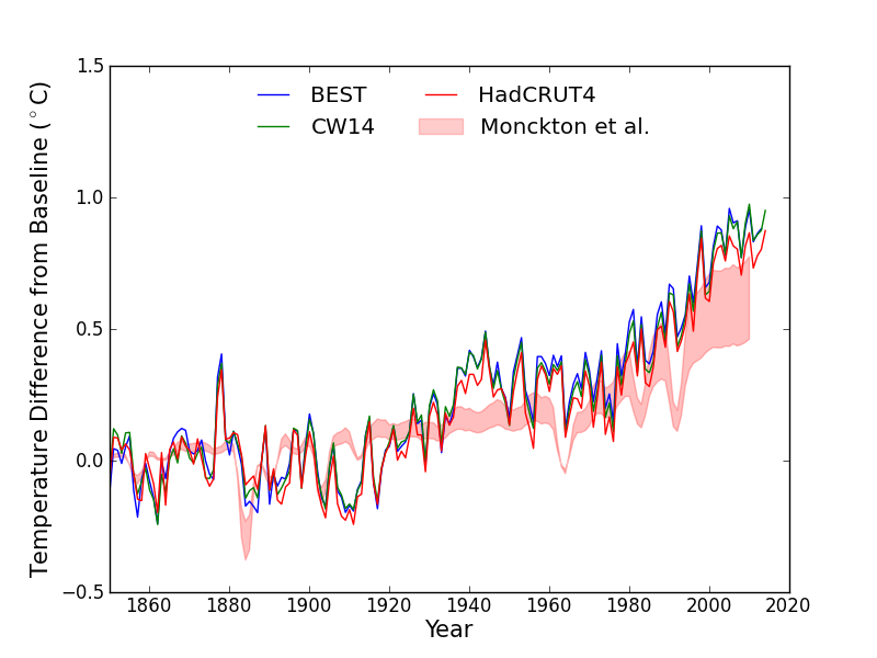
Figure 1 Three different records of global temperature are shown as lines and the red shaded area shows the Monckton et al. 2015 expected temperature changes given a record of heating changes on Earth (Otto et al. 2013). The temperature records are Cowtan & Way (CW14), Berkeley Earth (BEST) and HadCRUT4. All temperature records and projections from a baseline of 1850-1900.
Monckton et al. talk about the results of the computer simulations used by the Intergovernmental Panel on Climate Change (IPCC). They say that these models are "running hot". Here is what that comparison looks like:
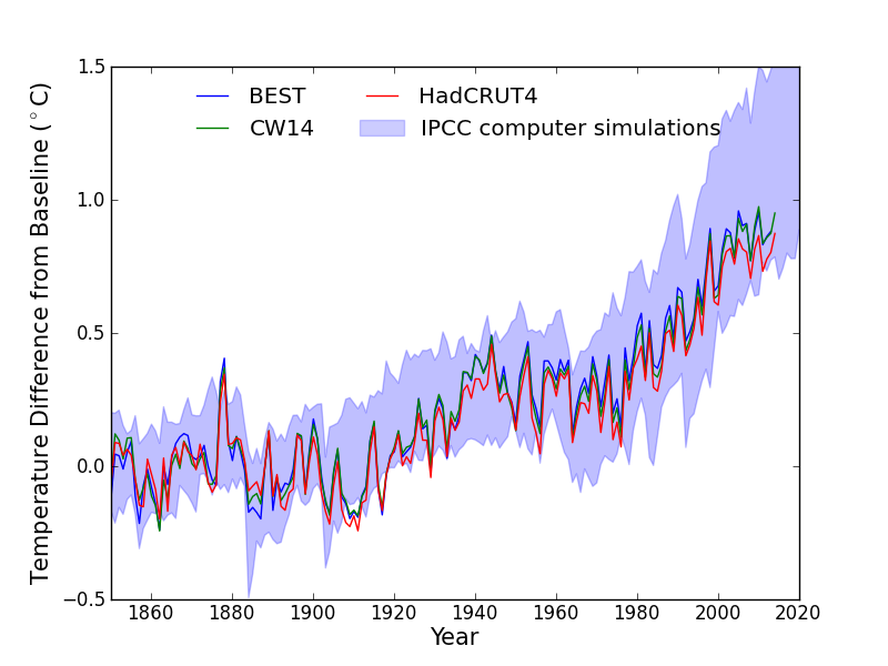
Figure 2 Three different records of global temperature shown as lines (BEST, CW14, HadCRUT4) against the range of temperature changes projected by computer simulations used in the 5th IPCC report.
We compared the IPCC and Monckton et al. projections over 2000-2010. We focussed on the Berkeley Earth and Cowtan & Way temperature records because they estimate the global temperature, while HadCRUT4 misses out some key areas. We found that the IPCC computer simulations ran a little hot: 0.07-0.08 C over 2000-2010. Meanwhile, Monckton et al.'s projections ran cold by 0.27-0.28 C. Monckton et al.'s projection had a bias that is about 350% larger than the IPCC computer simulations for these datasets.
Measured temperatures are toward the lower end of the computer simulations. Lots of studies have looked into this and it seems to be explained mostly by ocean circulation changes that appear to be natural and temporary (e.g. Meehl et al. 2011; Kosaka & Xie 2013; England et al. 2014; Risbey et al. 2014). Monckton et al. don't talk about this research, and you might also wonder why they criticise the IPCC calculations then produce their own estimates that do much worse. The reason they thought they were doing well was that they compared their projections with "observations" up until 2050.
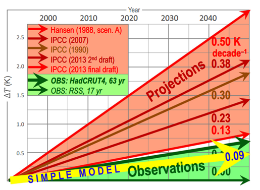
Figure 3 The Monckton version of comparing models and observations. Note that the "observations" go up until 2050.
Monckton et al. don't have any real measurements from 2050, of course. Instead they chose two periods from 2 different temperature series and assumed that those rates of change will continue until 2050.
They select 17 years of data from one satellite record and 63 years from a surface record, but making random choices like this can lead to accidental "cherry picks" that don't represent the real world. It just so happens that Monckton et al. managed to choose periods with lower rates of warming because of well-known reasons.
We cut the risk of cherry picking by using the full temperature records back to 1850, and when compared against real world data rather than Monckton et al.'s future storyline, their model does badly.
Other warning signs
There are many other warning signs littered through the Monckton et al. paper. During their argument that climate sensitivity is low because electronic engineers design circuits in a certain way, they used records of past climate change to make their point. They said that past climate has been relatively stable, so a small number should be picked for future global warming. They didn't talk about how studies used these records of past climate to calculate what the real value should be, and that the results contradict Monckton et al. (e.g. Hoffert & Covey 1992; Covey et al. 1996; Crucifix 2006; Rohling et al. 2012)
Another contribution to Monckton et al.'s low calculated value of future global warming is that they assume that Earth reacts very quickly to climate change. Plenty of studies have looked at this, and they conclude that the oceans suck up plenty of heat: just like how it takes time for a pot full of water on top of the stove to boil, it takes time for Earth to warm up as well.
Right now we haven't finished warming up and there is "warming in the pipeline", which adds to our expected future global warming. Monckton et al. disappear this heat in a sentence or two. We can see whether their assumption is good by looking at measurements of heat in the ocean. If they are right then it hasn't increased recently and the result will be a horizontal line on the graph. This is what the measurements say:
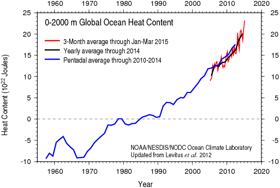
Figure 4 Changes in the amount of heat in the ocean in units of 10-billion-trillion Joules from NOAA NODC. This shows that Earth is still gaining heat at a rate about 4 nuclear explosions per second: we haven't finished warming up yet.
Conclusions
The Monckton paper is packed full of interesting things so this post is just a taster. But this taster is enough to explain why we were surprised that this paper made it into a scientific journal. A scientific paper goes through a round of "peer review", where anonymous experts are supposed to check the methods and make sure that relevant other research is included.
It seems the reviewers of the Monckton et al. paper either didn't know about a lot of climate research, or they didn't think it was relevant. They apparently weren't bothered about the global temperature record, the Argo buoy network or studies on climate sensitivity and recent temperature changes. They didn't ask for the model to be tested against real-world data, and seemed happy with a model manufactured on wordplay rather than scientific methods. This is why we argue that its results simply aren't credible.
NOTE: This post represents the personal views of Dr. Mark Richardson and does not represent the position of the University of Reading, California Institute of Technology or NASA Jet Propulsion Laboratory.
NOTE 2: This work was unfunded and so we were not able to pay for the open access fee. We are working on getting a publicly accessible version of the accepted paper.


"For example, instead of testing their prediction against real world data records, they invented their own "observations" up to 2050. While their prediction looks good when compared with the future they made up, they look bad compared with the past that we've already measured"
That's hilarious.
mmmm.... Indicative of the desperation of deniers to match their "science" to actual science?
It's worth to recall M15 is not the first piece where Monckton's "fantasy".
Fig 3 in M15 show "Observations" until 2050, whereas Fig 2 in this RC post by Barry Bickmore (dated & Aug 2010) show Monckton's Fantasy IPCC "Prediction" of CO2. Two pieces complement each other nicely.
I don't realy need to remind it, but those who may not seen it before, look how M compares scientists and his opponents to Nazis here and here. The guy is simply a lunatic nutter and the best way to deal with such nutter is to simply ignore him. Everyone, even AGW deniers, can agree that tying to bring him from his "fantasy world" back to earth is simply a waste of time.
Unforfunately, Science Bulletin opened their forum for his spin to reach peer reviewd literature. That's is simply fuel for his fire: he won't stop proudly arguing his case, no matter how unreasonable his arguments are shown to be.
[PS] right over the line. Please respect the comments policy and particularly note "Personally attacking other users gets us no closer to understanding the science. For example, comments containing the words 'religion' and 'conspiracy' tend to get moderated. Comments using labels like 'alarmist' and 'denier' as derogatory terms are usually skating on thin ice."
I noticed in figure 3 that IPCC projections have dropped from .38 deg/dec in 2007 to .13 deg/dec in 2013, which seems like a very big change. And the Monckton "simple model" shows 0.09 deg/dec. Despite all the mentioned flaws in the Monctkton paper, their model is still predicting warming, although less than current IPCC values. But the difference between the two doesn't seem that large, especially compared to how much the IPCC projections have dropped since 2007.
At least from the figure, it looks to me like the IPCC values are converging toward the simple model value of 0.09 deg/dec. Is that an incorrect assessment?
Figure 3 appears to be comparing projections, which only makes sense if those projections assume the same forcings.
I also can't find the IPCC projection for a 0.13c/dec increase till 2050 in WG1 closest I get is:
Furthermore, IPCCs 2007 WG1 doesn't seem to support a claim of a 0.38c/dec increase.
#4 rkrolph:
If figure 3 is from the Monckton paper, it seems that they have misrepresented IPCC, because figure (a) on page 11 in IPCC’s Summary for Policymakers tells another story.
In the most extreme emission scenario (RCP8.5) the estimated warming in 2050 (average for all model runs) is about 1.75°C relative to the period 1986-2005. If we use 1995 as a midpoint, this gives a warming rate of 0.32°C per decade, or 2.5 times more than 0.13°C. Even the most moderate emission scenario (RCP2.6) gives a warming of about 1°C in total or 0.18°C per decade until 2050 – nearly 40% more than Monckton’s number.
In the RCP2.6 scenario the temperature is estimated to level off and stay nearly constant after 2050, so we will get 0.13°C of warming per decade if we extend the period to about 2070. It’s worth noting that the RCP2.6 scenario requires the CO2 emissions to peak within 5 years and gradually drop to zero within the next 50-60 years. (see figure a on page 9)
Tristran @5&6, HK @7, Monckton determines the trends from Fig 11.25 of AR5 in the published edition, and the corresponding Fig 11.33 in the 2nd Order Draft.
In Fig 11.25, the mean temperature for 2016-2035 is given as 0.3 - 0.7 C above the 1986-2005 mean. That represents a 0.5 C median increase over three decades, giving a trend of 0.167 C per decade. In Fig 11.33 of the 2nd order draft, the mean temperature for 2016-2035 is given as 0.4 - 1 C, giving a trend increase of 0.233 C per decade. Monckton states that these graphs are the source of his estimates in a blog post that preceded his paper on WUWT (dated Jan 1, 2014). On the blog post he produces the following graph, which is an obvious precursor of Fig 6 in his paper (the third figure in the OP).
I do not know why he switched from the marginally justifiable 0.17 to the totally unjustifiable 0.13 C shown in the paper.
As a side note, the final version of AR5 shows a lower trend solely because they start the predicted trend from 2012 rather than from the mean of 1986-2005. As such, the difference does not represent a disagreement about the trend which is the same in both cases. Rather it represents a preference for using the most recent historical value (at time of publication) as the start point of the trend prediction rather than the mean over a 20 year period. Monckton is wrong, therefore, to represent it as a different predicted trend. In fact, of the two factors that determine the mean predicted temperature for 2016-2015 (ie, stard point and trend) he ascribes it to exactly the wrong cause.
That point speaks to rkrolph's question (@4). Specifically, there is no difference between the predicted trend between the 2nd order draft and the final version of AR5. Rather, there is a difference in start point in predicting a mean value that Monckton misrepresents as a difference in trend. From past performance, it is likely that Monckton also misrepresents the trends on earlier IPCC reports (and Hansen scenario A), but he does not detail how he determined the values, and he is not worth the leg work to try and work out how he did it.
Hansen88 has Emission scenario A going from ~+0.44c at 1990 to +3.4c at 2050, for a ~.49c/dec trend, so the number itself is 'accurate' in some sense.
Of course, it's still an egregious misrepresentation to include it on that graph.
This is the figure I was talking about in my post #7 (top):
Tristan @9, Monckton et al say of their Fig 6:
Thus they claim that the model output in Fig 6 are extrapolated in the same way as observations in Fig 6. Ergo, it is not correct to simply take the 2050 projections. Rather, the model projections to 2012 should be extrapolated to 2050 in the same way as are the temperature projections. So, Monckton et all's technique of extrapolating the 1996-2025 mean temperature increase exagerates the model trends relative to the observed trends. Using temperature increases to 2050 exagerates it even more, something I suspect they have done for all stated trends prior to AR5. (Their final version AR5 trend is not the model trend, contrary to their claimed technique, as previously noted.)
On this point, I digitized the Hansen 88 Scenario A temperatures from 1988-2012 from this graph:
The trend over that period was 0.293 C per decade. That is substantially less than the trend to 2050 as used by Monckton et al (and calculated by you), yet following their stated method it is the value they should have used. (That leaves aside the point that forcings have in fact been less than those of scenario B, so that using scenario A rather than scenario B or even C is itself a gross misrepresentation.)
For what it is worth, digitizing the first decade of temperature increase from HK's graph @10 yields a temperature increase of 0.23 C/decade.
to all responses at #5 thru #11:
Thanks for answering and clarifying for me.
It sure makes me realize how data can be misrepresented to easily mislead people to the wrong conclusions, especially if you are not an expert in the field.