


 Arguments


Contrary to Contrarian Claims, IPCC Temperature Projections Have Been Exceptionally Accurate
Posted on 27 December 2012 by dana1981
 There is a new myth circulating in the climate contrarian blogosphere and mainstream media that a figure presented in the "leaked" draft Intergovernmental Panel on Climate Change (IPCC) Fifth Assessment Report shows that the planet has warmed less than previous IPCC report climate model simulations predicted. Tamino at the Open Mind blog and Skeptical Science's own Alex C have done a nice job refuting this myth. We prefer not to post material from the draft unpublished IPCC report, so refer to those links if you would like to see the figure in question.
In this post we will evaluate this contrarian claim by comparing the global surface temperature projections from each of the first four IPCC reports to the subsequent observed temperature changes. We will see what the peer-reviewed scientific literature has to say on the subject, and show that not only have the IPCC surface temperature projections been remarkably accurate, but they have also performed much better than predictions made by climate contrarians (Figure 1).
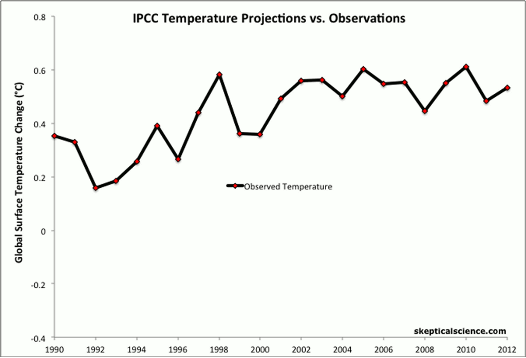
Figure 1: IPCC temperature projections (red, pink, orange, green) and contrarian projections (blue and purple) vs. observed surface temperature changes (average of NASA GISS, NOAA NCDC, and HadCRUT4; black and red) for 1990 through 2012.
1990 IPCC FAR
The IPCC First Assessment Report (FAR) was published in 1990. The FAR used simple global climate models to estimate changes in the global mean surface air temperature under various CO2 emissions scenarios. Details about the climate models used by the IPCC are provided in Chapter 6.6 of the report.
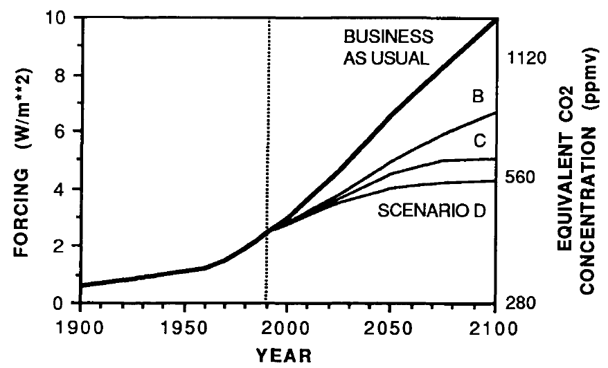
The IPCC FAR ran simulations using various emissions scenarios and climate models. The emissions scenarios included business as usual (BAU) and three other scenarios (B, C, D) in which global human greenhouse gas emissions began slowing in the year 2000. The FAR's projected BAU greenhouse gas (GHG) radiative forcing (global heat imbalance) in 2010 was approximately 3.5 Watts per square meter (W/m2). In the B, C, D scenarios, the projected 2011 forcing was nearly 3 W/m2. The actual GHG radiative forcing in 2011 was approximately 2.8 W/m2, so to this point, we're actually closer to the IPCC FAR's lower emissions scenarios.
As shown in Figure 2, the IPCC FAR ran simulations using models with climate sensitivities (the total amount of global surface warming in response to a doubling of atmospheric CO2, including amplifying and dampening feedbacks) correspoding to 1.5°C (low), 2.5°C (best), and 4.5°C (high). However, because climate scientists at the time believed a doubling of atmospheric CO2 would cause a larger global heat imbalance than today's estimates, the actual climate sensitivities were approximatly 18% lower (for example, the 'Best' model sensitivity was actually closer to 2.1°C for doubled CO2).
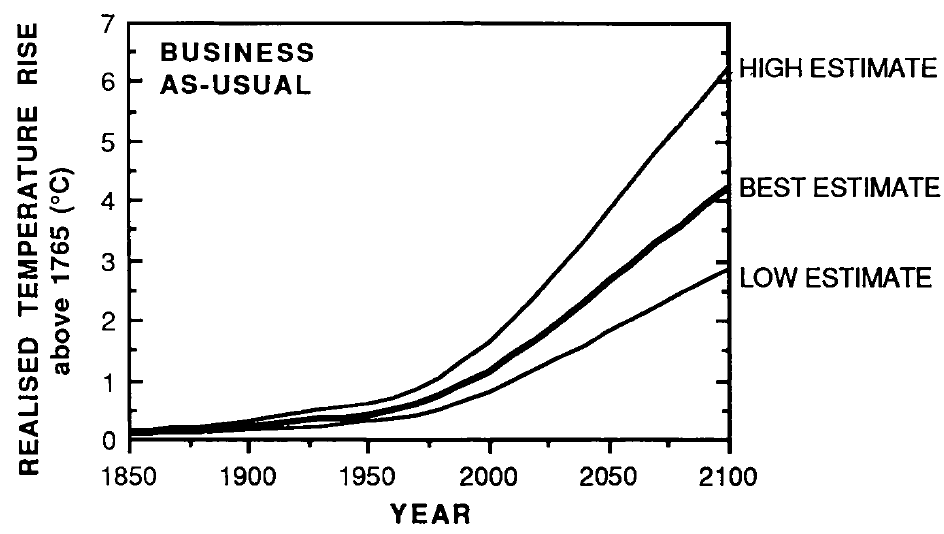
Figure 2: IPCC FAR projected global warming in the BAU emissions scenario using climate models with equilibrium climate sensitivities of 1.3°C (low), 2.1°C (best), and 3.8°C (high) for doubled atmospheric CO2
Figure 3 accounts for the lower observed GHG emissions than in the IPCC BAU projection, and compares its 'Best' adjusted projection with the observed global surface warming since 1990.
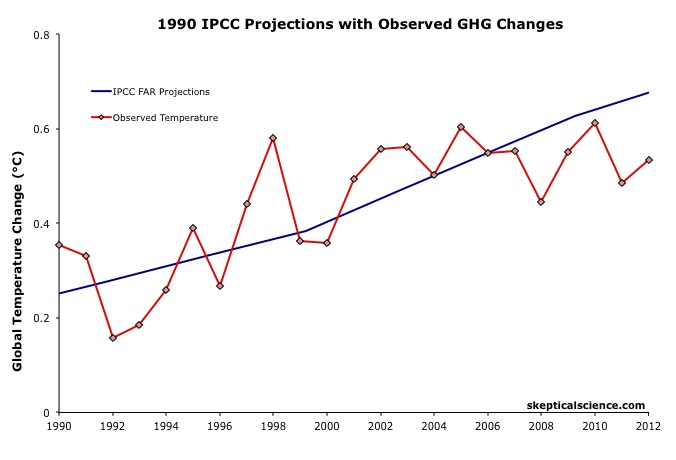
Figure 3: IPCC FAR BAU global surface temperature projection adjusted to reflect observed GHG radiative forcings 1990-2011 (blue) vs. observed surface temperature changes (average of NASA GISS, NOAA NCDC, and HadCRUT4; red) for 1990 through 2012.
The IPCC FAR 'Best' BAU projected rate of warming from 1990 to 2012 was 0.25°C per decade. However, that was based on a scenario with higher emissions than actually occurred. When accounting for actual GHG emissions, the IPCC average 'Best' model projection of 0.2°C per decade is within the uncertainty range of the observed rate of warming (0.15 ± 0.08°C) per decade since 1990, though a bit higher than the central estimate.
1995 IPCC SAR
The IPCC Second Assessment Report (SAR) was published in 1995, and improved on the FAR by including an estimate of the cooling effects of aerosols — particulates which block sunlight and thus have a net cooling effect on global temperatures. The SAR included various human emissions scenarios; so far its scenarios IS92a and b have been closest to actual emissions.
The SAR also maintained the "best estimate" equilibrium climate sensitivity used in the FAR of 2.5°C for a doubling of atmospheric CO2. However, as in the FAR, because climate scientists at the time believed a doubling of atmospheric CO2 would cause a larger global heat imbalance than current estimates, the actual "best estimate" model sensitivity was closer to 2.1°C for doubled CO2.
Using global climate models and the various IS92 emissions scenarios, the SAR projected the future average global surface temperature change to 2100 (Figure 4).
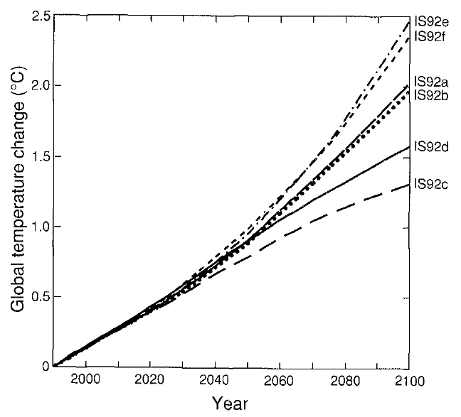
Figure 4: Projected global mean surface temperature changes from 1990 to 2100 for the full set of IS92 emission scenarios. A climate sensitivity of 2.12°C is assumed.
Figure 5 compares the IPCC SAR global surface warming projection for the most accurate emissions scenario (IS92a) to the observed surface warming from 1990 to 2012.
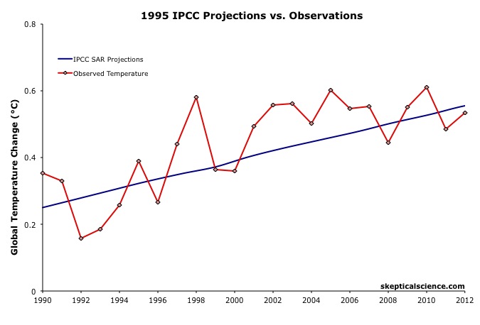
Figure 5: IPCC SAR Scenario IS92a global surface temperature projection (blue) vs. observed surface temperature changes (average of NASA GISS, NOAA NCDC, and HadCRUT4; red) for 1990 through 2012.
SAR Scorecard
The IPCC SAR IS92a projected rate of warming from 1990 to 2012 was 0.14°C per decade. This is within the uncertainty range of the observed rate of warming (0.15 ± 0.08°C) per decade since 1990, and very close to the central estimate.
2001 IPCC TAR
The IPCC Third Assessment Report (TAR) was published in 2001, and included more complex global climate models and more overall model simulations than in the previous IPCC reports. The IS92 emissions scenarios used in the SAR were replaced by the IPCC Special Report on Emission Scenarios (SRES), which considered various possible future human development storylines.
The IPCC model projections of future warming based on the varios SRES and human emissions only (both GHG warming and aerosol cooling, but no natural influences) are shown in Figure 6.
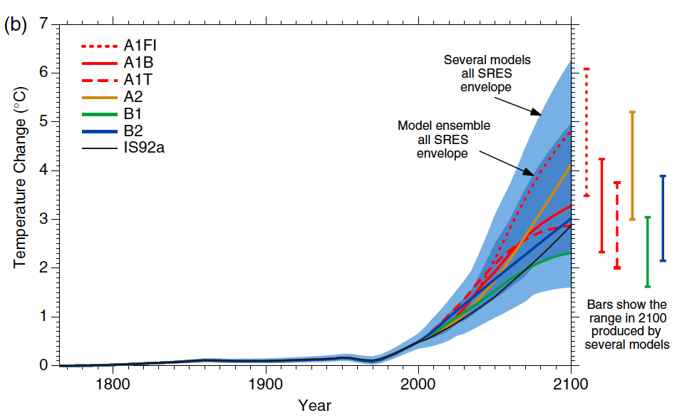
Figure 6: Historical human-caused global mean temperature change and future changes for the six illustrative SRES scenarios using a simple climate model. Also for comparison, following the same method, results are shown for IS92a. The dark blue shading represents the envelope of the full set of 35 SRES scenarios using the simple model ensemble mean results. The bars show the range of simple model results in 2100.
Thus far we are on track with the SRES A2 emissions path. Figure 7 compares the IPCC TAR projections under Scenario A2 with the observed global surface temperature change from 1990 through 2012.
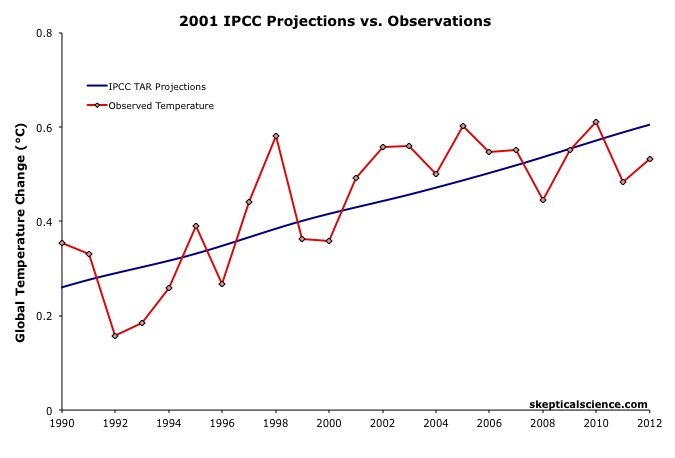
Figure 7: IPCC TAR model projection for emissions Scenario A2 (blue) vs. observed surface temperature changes (average of NASA GISS, NOAA NCDC, and HadCRUT4; red) for 1990 through 2012.
TAR Scorecard
The IPCC TAR Scenario A2 projected rate of warming from 1990 to 2012 was 0.16°C per decade. This is within the uncertainty range of the observed rate of warming (0.15 ± 0.08°C) per decade since 1990, and very close to the central estimate.
2007 IPCC AR4
In 2007, the IPCC published its Fourth Assessment Report (AR4). In the Working Group I (the physical basis) report, Chapter 8 was devoted to climate models and their evaluation. Section 8.2 discusses the advances in modeling between the TAR and AR4. Essentially, the models became more complex and incoporated more climate influences.
As in the TAR, AR4 used the SRES to project future warming under various possible GHG emissions scenarios. Figure 8 shows the projected change in global average surface temperature for the various SRES.

Figure 8: Solid lines are multi-model global averages of surface warming (relative to 1980–1999) for the SRES scenarios A2, A1B, and B1, shown as continuations of the 20th century simulations. Shading denotes the ±1 standard deviation range of individual model annual averages. The orange line is for the experiment where concentrations were held constant at year 2000 values. The grey bars at right indicate the best estimate (solid line within each bar) and the likely range assessed for the six SRES marker scenarios.
We can therefore again compare the Scenario A2 multi-model global surface warming projections to the observed warming, in this case since 2000, when the AR4 model simulations began (Figure 9).
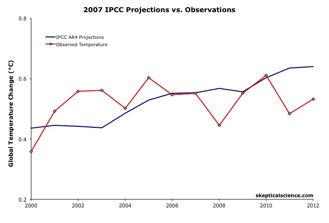
Figure 9: IPCC AR4 multi-model projection for emissions Scenario A2 (blue) vs. observed surface temperature changes (average of NASA GISS, NOAA NCDC, and HadCRUT4; red) for 2000 through 2012.
The IPCC AR4 Scenario A2 projected rate of warming from 2000 to 2012 was 0.18°C per decade. This is within the uncertainty range of the observed rate of warming (0.06 ± 0.16°C) per decade since 2000, though the observed warming has likely been lower than the AR4 projection.
As we will show below, this is due to the preponderance of natural temperature influences being in the cooling direction since 2000, while the AR4 projection is consistent with the underlying human-caused warming trend.
IPCC Projections vs. Observed Warming Rates
Tamino at the Open Mind blog has also compared the rates of warming projected by the FAR, SAR, and TAR (estimated by linear regression) to the observed rate of warming in each global surface temperature dataset. The results are shown in Figure 10.
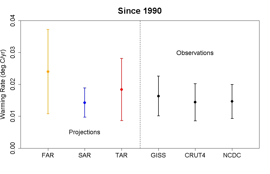
Figure 10: IPCC FAR (yellow) SAR (blue), and TAR (red) projected rates of warming vs. observations (black) from 1990 through 2012.
As this figure shows, even without accounting for the actual GHG emissions since 1990, the warming projections are consistent with the observations, within the margin of uncertainty.
Rahmstorf et al. (2012) Verify TAR and AR4 Accuracy
A paper published in Environmental Research Letters by Rahmstorf, Foster, and Cazenave (2012) applied the methodology of Foster and Rahmstorf (2011), using the statistical technique of multiple regression to filter out the influences of the El Niño Southern Oscillation (ENSO) and solar and volcanic activity from the global surface temperature data to evaluate the underlying long-term primarily human-caused trend. Figure 11 compares their results with and without the short-term noise from natural temperature influences (pink and red, respectively) to the IPCC TAR (blue) and AR4 (green) projections.
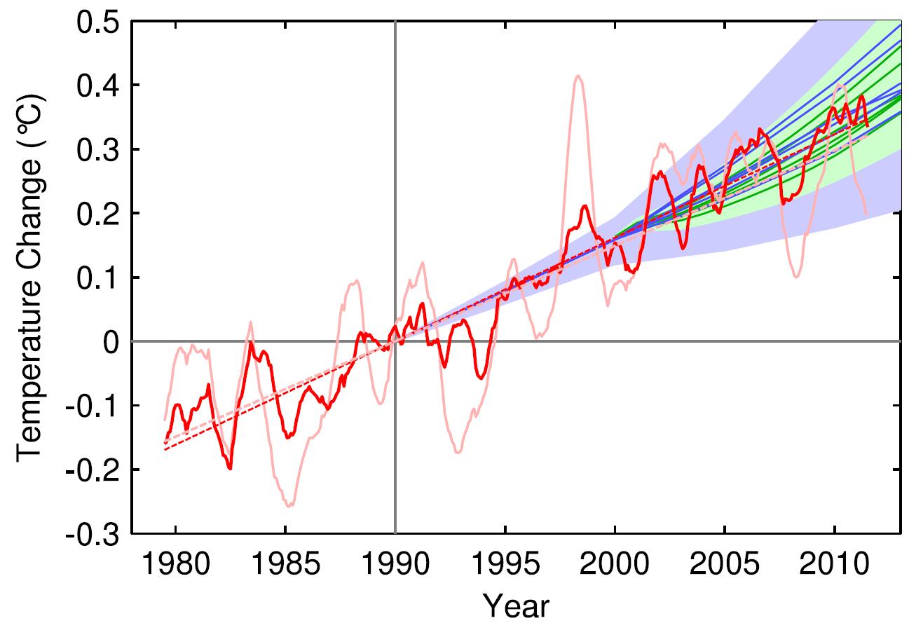
Figure 11: Observed annual global temperature, unadjusted (pink) and adjusted for short-term variations due to solar variability, volcanoes, and ENSO (red) as in Foster and Rahmstorf (2011). 12-month running averages are shown as well as linear trend lines, and compared to the scenarios of the IPCC (blue range and lines from the 2001 report, green from the 2007 report). Projections are aligned in the graph so that they start (in 1990 and 2000, respectively) on the linear trend line of the (adjusted) observational data.
TAR Scorecard
From 1990 through 2011, the Rahmstorf et al. unadjusted and adjusted trends in the observational data are 0.16 and 0.18°C per decade, respectively. Both are consistent with the IPCC TAR Scenario A2 projected rate of warming of approximately 0.16°C per decade.
AR4 Scorecard
From 2000 through 2011, the Rahmstorf et al. unadjusted and adjusted trends in the observational data are 0.06 and 0.16°C per decade, respectively. While the unadjusted trend is rather low as noted above, the adjusted, underlying human-caused global warming trend is consistent with the IPCC AR4 Scenario A2 projected rate of warming of approximately 0.18°C per decade.
Frame and Stone (2012) Verify FAR Accuracy
A paper published in Nature Climate Change, Frame and Stone (2012), sought to evaluate the FAR temperature projection accuracy by using a simple climate model to simulate the warming from 1990 through 2010 based on observed GHG and other global heat imbalance changes. Figure 12 shows their results. Since the FAR only projected temperature changes as a result of GHG changes, the light blue line (model-simuated warming in response to GHGs only) is the most applicable result.

Figure 12: Observed changes in global mean surface temperature over the 1990–2010 period from HadCRUT3 and GISTEMP (red) vs. FAR BAU best estimate (dark blue), vs. projections using a one-dimensional energy balance model (EBM) with the measured GHG radiative forcing since 1990 (light blue) and with the overall radiative forcing since 1990 (green). Natural variability from the ensemble of 587 21-year-long segments of control simulations (with constant external forcings) from 24 Coupled Model Intercomparison Project phase 3 (CMIP3) climate models is shown in black and gray. From Frame and Stone (2012).
Not surprisingly, the Frame and Stone result is very similar to our evaluation of the FAR projections, finding that they accurately simulated the global surface temperature response to the increased greenhouse effect since 1990. The study also shows that the warming since 1990 cannot be explained by the Earth's natural temperature variability alone, because the warming (red) is outside of the range of natural variability (black and gray).
IPCC Trounces Contrarian Predictions
As shown above, the IPCC has thus far done remarkably well at predicting future global surface warming. The same cannot be said for the climate contrarians who criticize the IPCC and mainstream climate science predictions.
One year before the FAR was published, Richard Lindzen gave a talk at MIT in 1989 which we can use to reconstruct what his global temperature prediction might have looked like. In that speech, Lindzen remarked
"I would say, and I don't think I'm going out on a very big limb, that the data as we have it does not support a warming...I personally feel that the likelihood over the next century of greenhouse warming reaching magnitudes comparable to natural variability seems small"
The first statement in this quote referred to past temperatures — Lindzen did not believe the surface temperature record was accurate, and did not believe that the planet had warmed from 1880 to 1989 (in reality, global surface temperatures warmed approximately 0.5°C over that timeframe). The latter statement suggests that the planet's surface would not warm more than 0.2°C over the following century, which is approximately the range of natural variability. In reality, as Frame and Stone showed, the surface warming already exceeded natural variability two decades after Lindzen's MIT comments.
Climate contrarian geologist Don Easterbook has been predicting impending global cooling since 2000, based on expected changes in various oceanic cycles (including ENSO) and solar activity. Easterbrook made two specific temperature projections based on two possible scenarios. As shown in Figure 1, neither has fared well.
In 2009, Syun-Ichi Akasofu (geophysicist and director of the International Arctic Research Center at the University of Alaska-Fairbanks) released a paper which argued that the recent global warming is due to two factors: natural recovery from the Little Ice Age (LIA), and "the multi-decadal oscillation" (oceanic cycles). Based on this hypothesis, Akasofu predicted that global surface temperatures would cool between 2000 and 2035. Akasofu's prediction is the least wrong of the contrarian predictions examined here, but with a 0.02°C per decade cooling prediction between 2000 and 2012, has not matched the 0.06°C per decade warming trend, despite the fact that according to Foster and Rahmstorf, natural climate influences have had an approximately 0.1°C cooling effect since 2000.
John McLean is a data analyst and member of the climate contrarian group Australian Climate Science Coalition. He was lead author on McLean et al. (2009), which grossly overstates the influence of the El Niño Southern Oscillation (ENSO) on global temperatures. Based on the results of that paper, McLean predicted:
"it is likely that 2011 will be the coolest year since 1956 or even earlier"
In 1956, the average global surface temperature anomaly in the three datasets (NASA GISS, NOAA NCDC, and HadCRUT4) was -0.21°C. In 2010, the anomaly was 0.61°C. Therefore, McLean was predicting a greater than 0.8°C global surface cooling between 2010 and 2011. The largest year-to-year average global temperature change on record is less than 0.3°C, so this was a rather remarkable prediction, and not surprisingly turned out to be very wrong.
IPCC vs. Contrarians Scorecard
Figure 1 at the top of this post compares the four IPCC projections and the four contrarian predictions to the observed global surface temperature changes. We have given Lindzen the benefit of the doubt and not penalized him for denying the accuracy of the global surface temperature record in 1989. Our reconstruction of his prediction takes the natural variability of ENSO, the sun, and volcanic eruptions from Foster and Rahmstorf (2011) (with a 12-month running average) and adds a 0.02°C per decade linear warming trend. Note that this was not a specific prediciton made by Lindzen, but rather is our reconstruction based on his 1989 comments. All other predictions are as discussed above.
Not only has the IPCC done remarkably well in projecting future global surface temperature changes thus far, but it has also performed far better than the few climate contrarians who have put their money where their mouth is with their own predictions.
Conservative IPCC Errs on the Side of Least Drama
Although the IPCC climate models have performed remarkably well in projecting average global surface temperature warming thus far, Rahmstorf et al. (2012) found that the IPCC underestimated global average sea level rise since 1993 by 60%. Brysse et al. (2012) also found that the IPCC has tended to underestimate or failed to account for CO2 emissions, increased rainfall in already rainy areas, continental ice sheet melting, Arctic sea ice decline, and permafrost melting. Brysse et al. concludes that the on the whole the IPCC has been too conservative in its projections, "erring on the side of least drama" — in effect preferring to be wrong on the conservative side in order to avoid criticism.
Note: this post has been incorporated into the rebuttal to the myth "IPCC overestimate temperature rise"


Where does this come from? I'm looking at the IPCC FAR and it says "Under the IPCC Business-as-Usual (Scenario A) emissions of greenhouse gases, the average rate of increase of global mean temperature during the next century is estimated to be about 0.3°C per decade (with an uncertainty range of 0.2°C to 0.5°C) This will result in a likely increase in global mean temperature of about 1°C above the present value by 2025." (page xi). Furthermore, the graph on page xxxiv appears to show almost constant CO2 emissions until 2020 in the BaU scenario, whereas it is reported that CO2 emissions have actually increased since 1990.
In the IPCC's defense, their second report in 1995 greatly reduced projections (SAR page 39), and the first report had said, in bold, “There are many uncertainties in our predictions particularly with regard to the timing, magnitude and regional patterns of climate change, due to our incomplete understanding” (page xii).
"Where does this come from" - page xxii of summary for policy makers of FAR. (pg 30 of the PDF version found here).
Could this post be updated, particularly the prediction gif, to 2018? 2012 isn't as impressive as that would be.
Thanks