


 Arguments


Met Office decadal forecasting explained: the reality
Posted on 11 January 2013 by John Mason
"Decadal forecasts provide essential information about ocean ‘weather’ and how it will evolve in the next few years in the context of a globally warming world, but they do not tell us anything about long-term climate sensitivity (i.e. how much the planet will warm for a specified increase in radiative forcing related to greenhouse gases)."
UK Met Office, January 2013
In 2012, the Hadley Centre (the climatology section of the UK Met Office) introduced its latest multi-year forecast model, HadGEM3, into the decadal forecasting system, replacing the earlier HadCM3 (figs. 2 and 3, below), developed in the earliest years of the 21st Century. HadGEM3 represents the product of many years of detailed research and involves a better understanding of the many variables that work together to bring us the climate we experience. Running the model involves a phenomenal amount of number-crunching, to such an extent that it is only run out to T+ 5 years — to run it out further would hog too many computing resources. It is the first of these five-year runs that has attracted so much media attention of late. But what kind of forecast is it, exactly? Here lies the source of much of the misunderstanding. Having spoken at length to the Met Office about this subject on January 10th, I'll try to explain.
Earth's climate system is made up of four basic elements. These are the atmosphere, the oceans, the land and the cryosphere, each of which have their own intrinsic properties in terms of heat capacity, energy balance and hydrological balance. Landmasses determine where ocean currents can or cannot flow; mountain ranges have marked effects on atmospheric currents and thereby exert a strong influence on weather, in places on continental scales. Ice-caps refect energy that would otherwise be absorbed by bare earth or rock. But on normal (non-geological) timescales, it is only the atmosphere and oceans that are obviously in free circulation. Even there we see a difference: because the density and heat capacity of the oceans are orders of magnitude greater than that of the atmosphere, their circulation patterns (currents) evolve at a much slower rate and are long-lived compared to those of the atmosphere (winds). And herein lies the difference between forecasts of weather, run out for a matter of days, and decadal forecasts, run out for years. Decadal forecasting is essentially a prediction of ocean 'weather', i.e. how the oceanic circulation is likely to evolve in the coming years, and its subsequent impact on what goes on in the atmosphere.
We know perfectly well that oceanic pattern-changes can have major impacts on weather and, indeed, on global temperatures, either upwards or downwards: ENSO, the El Nino/La Nina oceanic oscillation, can by itself swing global average temperatures in a single year more than the longer-term anthropogenic greenhouse warming signal can currently manage in a decade, as our recent animation clearly demonstrates. Those who, using the phenomenally warm 1997-8 El Nino as a starting-point, like to pretend that global warming has stopped, are merely (if perhaps unwittingly) demonstrating this very same point. The bottom line is that when making decadal predictions, we need to try to figure out how the oceans are going to behave.

Fig.1: the forecast ensemble generated by HadGEM3. Graphic - Met Office.
Ensembles - what are they?
The forecast itself (fig.1) consists of an ensemble of ten runs. All models consist of ensembles - for example, weather forecast models such as the Global Forecasting System (GFS) produce an operational run but experienced forecasters will also examine the ensemble members of that run to see to what extent the operational run is favoured before coming to their conclusions. The reason why ensembles are used is in order to better reflect the chaotic nature of what we are dealing with on such climatologically short timeframes, bearing in mind that major, long-term climatological trends are multidecadal in nature. The testing of HadGEM3 is done by running it to hindcast previous five-year periods over the past fifty years, which do show that the model has demonstrable skill, although it does not catch every twist and turn in the evolution, as fig. 2 (below) reveals. This is not surprising, given that El Nino/La Nina predictability is limited to — at best — a year or so in advance.

Fig. 2: the latest (December 2012) decadal forecast, produced using the new HadGEM3 model, with annotations by author explaining what's what. The black lines are observational records from the HadCRUT3, NCDC and GISS datasets. Graphic: Met Office.
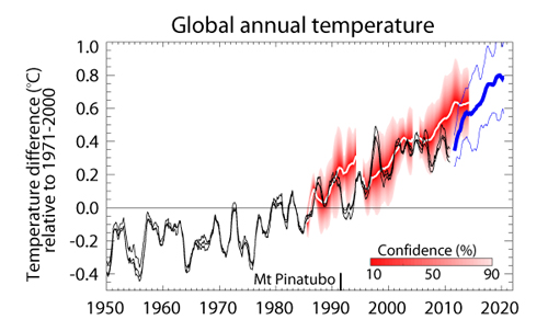
Fig. 3: the previous decadal forecast, using HadCM3. Note that, because this used less computer resources, it was possible to run it out further, to well beyond 2017. Graphic: Met Office.
The reaction
So, onto the reaction. As Dana has already pointed out, the release of this new forecast has been spun to death by various activists and elements of the media. Some of the spinning is quite ironic: this, from David Whitehouse writing for the self-styled Global Warming Policy Foundation, for example:
"We were also told that the recent temperature standstill was unimportant and that the underlying rate of global temperature increase continued at a constant 0.2 deg C per decade. This, as we pointed out, is only true if one considered decadal averages. If one considers 5-year averages then one arrives at a very different conclusion."
Exactly, David! 5-year averages contain so much natural variability (remember that a single ENSO cool-warm transition in 12 months can outdo ten years of anthropogenic decadal trend) that this forecast is more about natural variation than the longer-term, multidecadal signal. However, irony aside, there has been a lot of stuff like the following (fig. 4), the very first comment posted at the start of a discussion thread following an article by George Monbiot on the extreme heat and bushfires in Australia, published in The Guardian on January 8th:

Fig. 4: another day in the climate wars! Monbiot's article went online at 8pm and the irrelevant anti-Met Office talking points started cascading in within a matter of minutes.
Within just six minutes of the article appearing online, someone had time to find it, extract one sentence and bang in a completely inaccurate talking-point. That's impressive. And it is going on all over the place. It is the face of organised climate change denial: take something, twist it until it fits the political narrative then, as quickly as possible, echo it far and wide. Meanwhile, the Met Office themselves have taken the opinionated columnist James Delingpole to task on a risible screed of nonsense he churned out for the UK's Daily Mail, a newspaper that apparently takes the editorial stance that right-wing politics are above the laws of physics!
Back to reality
Back to the real story, the forecast itself. The maps in fig. 5 (below) detail the ensemble mean and lower and upper values for regional temperature anomalies, relative to the 1971-2000 global average, up to 2017. All three show greater warming over most land areas than over the oceans plus something we have become used to, enhanced warming over the Arctic, scene of 2012's record sea-ice meltdown. One thing of interest is that all the ensemble members show a change to much cooler ocean temperatures in the NW Atlantic: do these suggest that we may be seeing a change in the Atlantic Meridional Overturning Circulation? In the Pacific, there is a forecast cooling in the NE & SE, similar to that observed in the Pacific Decadal Oscillation, suggesting a continued cool phase here, similar to that of the last decade. But oceans, dense and with tremendous heat capacity, change only slowly and this, being an oceanic-based forecast, tends to reflect such characteristics. Of greater concern is the continued, unabated warming of the shallow seas off Canada and Siberia, with their vast stores of frozen methane trapped in vulnerable subsea permafrost.

Fig. 5: regional 2012-2017 temperature anomalies, relative to the 1971-2000 global average temperature (in degrees C) from the HadGEM3 model. Graphic: Met Office.
So finally: what's the take-home? Simply that this is a forecast of how things will likely develop in the world's oceans and the effects that will have on the atmosphere over a period of five years, a timeframe within which natural variability can outpace or cancel out a decade's worth of the multidecadal anthropogenic signal and that it is an experimental forecast based on ten ensemble-members that attempt to reflect the chaotic nature of these very short-term natural variations - or, to reiterate what the Met Office themselves say:
"Decadal forecasts provide essential information about ocean ‘weather’ and how it will evolve in the next few years in the context of a globally warming world, but they do not tell us anything about long-term climate sensitivity (i.e. how much the planet will warm for a specified increase in radiative forcing related to greenhouse gases)."
Acknowledgement: my thanks to Dan Williams of the UK Met Office for helpful discussions prior to the writing of this piece.


 0
0  0
0 This Knutti and Hegerl graphic from 2008 is getting dated, there's been so much work on this in the past 5 years which it doesn't cover.


Comments