


 Arguments


The two epochs of Marcott and the Wheelchair
Posted on 26 March 2013 by JosHagelaars
This is a re-post from OurChangingClimate
The big picture (or as some call it: the Wheelchair): Global average temperature since the last ice age (20,000 BC) up to the not-too distant future (2100) under a middle-of-the-road emission scenario.
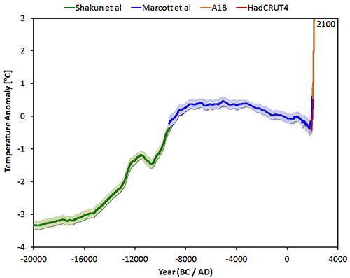
Figure 1: The temperature reconstruction of Shakun et al (green – shifted manually by 0.25 degrees), of Marcott et al (blue), combined with the instrumental period data from HadCRUT4 (red) and the model average of IPCC projections for the A1B scenario up to 2100 (orange).
Earlier this month an article was published in Science about a temperature reconstruction regarding the past 11,000 years. The lead author is Shaun Marcott from Oregon State University and the second author Jeremy Shakun, who may be familiar from the interesting study that was published last year on the relationship between CO2 and temperature during the last deglaciation. The temperature reconstruction of Marcott is the first one that covers the entire period of the Holocene. Naturally this reconstruction is not perfect, and some details will probably change in the future. A normal part of the scientific process.
The temperature reconstruction ends mid-20th century, so the rapid temperature rise since 1850 is clearly visible in the graphs presented in their study. And what do we see?
Again something that looks like a hockey stick as in the graph from Mann et al 2008.
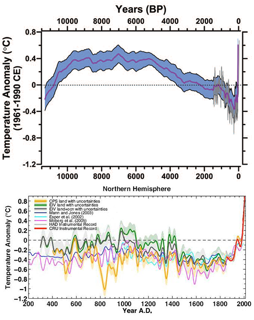
Figure 2: The temperature reconstruction of Marcott 2013 (past 11,000 years) and a collection of reconstructions (past 1800 years) as presented by Mann 2008.
Are the results from Marcott et al surprising?
Not really. The well-known graph of Holocene temperature variations on Global Warming Art, which is often encountered on the internet, is actually a comparable image. One could say that Marcott et al managed to scientifically confirm the average thick black line of the Global Warming Art image. See figure 3.
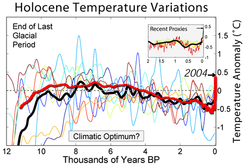
Figure 3: Holocene temperature variations from Global Warming Art, with the average in black, combined with the reconstruction of Marcott 2013 in red.
Patterns in temperature reconstructions which resemble a hockey stick, are fervently contested on climate skeptic websites. The Marcott et al reconstruction is no exception. For example, it is hard to keep track of the number of posts WUWT dedicated to this study, and the statistical wonderboy McIntyre is also energetically producing blog posts. Otherwise the general public might get the impression that humans are strongly influencing the climate and apparently that is not a desirable impression.
The study of Marcott suggests that the earth is warming rapidly from a historical perspective, though the authors warn that the low time resolution of about 120 years and subsequent smoothing preclude a hard statement on whether it is truly unprecedented. The study is about the Holocene, the geological period of 11,700 years ago until now. From the main image of Marcott 2013 it can be deduced that after the last ice age, earth's temperature has risen to about 7000 years ago, followed by a slow decline. The cause of the gradual cooling in recent millennia is a change in the distribution of solar radiation over the earth and over the seasons, known as Milankovitch cycles, which are responsible for the initiation and termination of ice ages.
After the year 1850, the influence of man-made emissions is clearly visible in Marcott's figure. The average temperature of the last decade was higher than the temperatures have been for 72% of the past 11,000 years:
Our results indicate that global mean temperature for the decade 2000–2009 has not yet exceeded the warmest temperatures of the early Holocene (5000 to 10,000 yr B.P.). These temperatures are, however, warmer than 82% of the Holocene distribution as represented by the Standard5×5 stack, or 72% after making plausible corrections for inherent smoothing of the high frequencies in the stack.
Epochs have a beginning and an end. From the main image of Marcott's study you could deduce that, regarding climate, a new epoch has begun about 150 years ago. A clear break in the trend over the past 11,000 years. The end of the Holocene was reached in 1850 and the Anthropocene has started, the epoch in which man asserts its influence on climate. This leads to disbelief in certain parts of the population, which was predicted at the start of the Anthropocene by Charles Dickens, who wrote in 1859:
It was the best of times, it was the worst of times,
it was the age of wisdom, it was the age of foolishness,
it was the epoch of belief, it was the epoch of incredulity
Figure 1 at the beginning of the blog post clearly shows that mankind is creating a new world with a climate that human civilization has never encountered before. If human greenhouse gas emissions continue unabated, the temperature will go up even further. According to the IPCC 2007 A1B scenario we will probably have temperatures in the year 2100 that are about +3.0 degrees above the average of 1961-1990. The expected jump in the atmospheric temperature from 1850 to 2100 is of the same order of magnitude as the rise in temperature from the last ice age to the Holocene, as derived from the Shakun 2012 data. The difference is that current and future increase in temperature occurs orders of magnitude faster.
Marcott et al also refer to the climate model projections of IPCC 2007:
Climate models project that temperatures are likely to exceed the full distribution of Holocene warmth by 2100 for all versions of the temperature stack, regardless of the greenhouse gas emission scenario considered (excluding the year 2000 constant composition scenario, which has already been exceeded). By 2100, global average temperatures will probably be 5 to 12 standard deviations above the Holocene temperature mean for the A1B scenario based on our Standard5×5 plus high-frequency addition stack.
i.e. unprecedented, as many as 5 to 12 standard deviations above the mean of the temperatures in the Holocene. Welcome to the Anthropocene!
A famous SF series from past times always began with:
"To boldly go where no man has gone before"
Indeed, we are boldly entering a new epoch where no man has gone before. I have some doubts whether our descendants will be so delighted about it.
[UPDATE 31 March 2013]
A summary and FAQ related to the study by Marcott et al (2013, Science), prepared by the authors, can be found at RealClimate.


Our Changing Climate, not Our Climate Change ...
OK, Wheelchair it is.
Wheelchair?!? Are you serious? One of the most lame names imaginable für this clear depiction of manmade desaster in the making....
I prefer the "scythe", at least for the part Marcott/emission-scenario
I prefer "bee smack."
"Wheelchair" is a bad nickname; 'scythe' is much, MUCH better a descriptor.
I think this short (5s) video describes the curves of the graph better:
http://www.youtube.com/watch?v=GFaK2RQcx_M
Or simply: brick wall
Wheelchair, and we are in it.
The post above refers to the "...he rapid temperature rise since 1850 ..." that "...is clearly visible in the graphs ...". The problem is that most of that rapid rise is an artifact rather than a valid reconstruction. This is clear if you look at the supplemental data, which shows a "reconstructed" temperature of 0.6 C above the 1961-1990 average in 1940. That is, it shows a temperature approximately 0.1 C higher than the 2000-2009 average in 1940. You can see this if you have a close look at Fig 1 A of Marcot et al:
(Note that the Mann08/HadCRUT splice is NH temperatures only, and shows a 0.2 C greater increase than the global temperatures).
The majority of this artifact is the result of the drop out of colder proxies in the 19th and 20th centuries, as explained with typical clarity by Tamino. He uses a method of differences to eliminate the artifact:
He also shows that the differenced method and the RegEm method (used as a robustness check in Marcott el al) show very similar results, and hence results consistent with the modern temperature record:
(Source)
I note that Steve McIntyre is suggesting that the redating of some proxies by Marcott et al is also a major factor in the uptick. I think he has made a sound case that Marcott's redating of some of the proxies is not jus a consequence of the use of the Calib6.0.1 calibration of C14 dates (which is justified), but also of some mistaken assumptions about the relationships of core tops to the actual sea floor for some cores. Specifically, Marcott et al appear to believe that the core tap is the sea floor, whereas (apparently) in fact the upper most sections of the core are often lost, presumably due to being less compacted and hence unable to withstand the mechanical stresses from being cored. Craig Loehle goes so far as to suggest this is grounds for withdrawing the paper.
What neither McIntyre nor Loehle appear to discuss is the difference it makes:
(Source)
As can be seen, the difference is negligible. This apparent error surely requires no more than a corrigendum. I do not expect that to be recognized at Climate Audit, however, where the focus is always on one sidedly nitpicking errors (even those that don't exist), rather than on actually discovering facts about the world.
Very importantly, the comparison between modern (2000-2009) temperatures and Holocene temperatures is not based on the uptick, which Marcott et al described as not robust. Rather, they are based on the HadCRUT3 instrument record for 2000-2009 which is compared statistically to the probability distribution of Holocene temperatures are reconstructed in Marcott et al. Thus, the most important graph in Marcott et al is not Figure 1 B (the figure normally shown, and shown above), but Figure 3, which shows the comparison:
Marcott et al comment:
(My emphasis.)
I note that when JosHag published this post on his own blog, the uptick in the Marcott reconstruction had not been discussed significantly, so it is understandable that he did not pick up the problem. That is no longer the case, and an addendum clarrifying the issue should be added to the post (as not all readers will read as far as my comment).
What Tom Curtis said. In the interest of providing sound and intangible information, a clarification which addresses the confusion between the (unreliable) uptick and Marcotts conclusion based on Fig.3 (rather than the uptick) should be added in my opinion. Thanks Tom!
Correction to my post 8. In it I say that the comparison is made to the NH temperatures from Mann 08 EIV plus HadCRUT3. On closer examination it appears more probable that the comparison is with the global land temperatures. Certainly the global land ocean reconstruction does not show the same pattern, nor so high a rise in temperatures in the instrumental record. (See figure S6 e and f)
Tom Curtis - While the Marcott et al 2013 paper takes a bit of reading for this, they state that they aligned to Mann et al 2008 "over the interval 510-1450 yr BP (i.e. 500-1440 AD/CE)", which was itself aligned to the CRU-EIV temperatures, or HadCRUT3 (Supplemental, starting at line 98).
cynicus, lol to the video. see also this image
The Anthropocene uptick as represented in Marcott Figure S3 (Supplemental Materials) is confirmed almost perfectly with the data of Anderson et. al. 2013, "Global warming in an independent record of the past 130 years”, GRL 40:1, 189-193.
Anderson's data is 173 recent temperature proxies covering 1730-1995 at (typically) annual resolution. Derating this data (and HADCRUT4) to 20-year means shows almost perfect overlap between Anderson and HADCRUT4 on the recent end, and almost perfect overlap between Anderson and Fig. S3 on the older end.
As Eli has been pointing out, the uptick at the end of Marcott to the Wheelchair, (new version here) is about as relevant as the proxy reconstructed part of the Hockey stick. They are both covered by the instrumental record, which is reliable and the CMIP5 models.
@Tom Curtis #8
After reading Marcott's paper a couple of weeks ago and looking at their data (supplemental info), it was quite clear to me what they meant with the phrase 'probably not robust'. It was also quite obvious to me that the 1940 data point has a value of 0.6 °C. It is even visible in the graph in figure 1: the blue 'uptick' line of Marcott et al is placed before (on the left side) of the red line of HadCRUT4. Also, the uncertainty of the Marcott 1940 data point is given by its 1-sigma value of ~0.3 °C, the 68% range. The 95% range comes down to 0 to 1.2 °C. As comparison, the 1-sigma value of the year 6010 BP is ~0.13 °C, quite a bit lower. You should plot the 1-sigma values against time to get an impression.
So, in my opinion I did pick up the uncertainty, I just don't see this as a problem. There is a large scientific uncertainty regarding this so-called uptick, it is clearly presented in the data of Marcott et al (the 1-sigma) and it is mentioned in their paper.
However, scientific uncertainty is not the same as 'now-we-know-nothing'. When I look at their graph I still see a rise in temperature and it still corresponds to Mann 2008. I see no reason to change that after reading all the blogs that go into some of the details and were the uncertainty is based upon. Besides that, I think there is proof that shows us that the uptick is not an aberration: the instrumental data.
About your 'Very importantly' part.
Of course this comparison of Marcott et al with the 2000-2009 decade and ICPP A1B is not based on the uptick. This is my text:
- "The average temperature of the last decade was higher than the temperatures have been for 72% of the past 11,000 years"
- "i.e. unprecedented, as many as 5 to 12 standard deviations above the mean of the temperatures in the Holocene."
No reference to the uptick at all, only to the Holocene data. The text you copied from the paper is also present in my text.
When referencing to the 2000-2009 decade, Marcott et al mention Brohan et al 2006 (ref 34).
http://www.st-andrews.ac.uk/~rjsw/papers/Brohan-etal-2006.pdf
This paper is about HadCRUT3, but about the sea and land surface temperatures.
Regards,
Jos Hagelaars
Jos Hagelaars @15, I will accept your word that you were aware of the uncertainties, and presumably lack of robustness, of the uptick at the end of the Marcott graph. The question then becomes, why did you not communicate those uncertainties and lack of robustness? Given that there are serious issues about the robustness of the reconstruction over the last few centuries, why is that issue never canvassed in your article? Why is the word "robust" not even mentioned?
In your article you write:
"[S]omething that looks [as much] like a hockey stick as in the graph from Mann et al 2008." Really?
(Source)
Everything beyond the uptick visible in the RegEM reconstruction is an artifact of the drop out of proxies with time. Therefore the hockey stick like appearance of the graph that you are focussing on is an illusion - an artifact of a poor statistical technique.
As it happens the mean uptick in the resconstruction using the method of differences and simple averaging only reaches an anomaly value relative to 1961-90 of -0.04 C. (That is not clear from Tamino's graph, as he uses a different baseline.) That lies outside the lower range of the 2 sigma error margin of the Standard 5x5 method shown in the main graph. The mean uptick using original published ages for the proxies is only -0.1 C relative to 1961-90, or 2.5 Standard Deviations below the uptick actually shown. That is probably the best estimate of the mean temperature from 1930-1950 using the Marcott proxies, and is a value exceeded by greater than 50% of Holocene temperatures. It compares well with the HadCRUT3v value of approximately -0.06 C for the same period.
Again, this is not an issue of uncertainty, but of robustness. The Marcott et al uncertainty estimates do not capture the effect of averaging without regard to the drop out of proxies. More precisely, the show the influence of the reduced number of proxies, but do not account for the influence of the relative temperatures of the proxies that drop out. That is why Marcott et al indicated the twentieth century temperatures were not robust (ie, that they were likely to change significantly as the result of improved or different methods), rather than that they are uncertain (ie, that improved proxy sets are likely to narrow the estimate within the current estimated uncertainty range).
This can be seen with the table of values and 1 sigma uncertainties for the different methods tried in Marcott et al:
Method
1940 Anomaly
(Degrees C)
1 sigma
(Degrees C)
The values which all estimates overlap within 2 Sigma is 0.1-0.31, well above the probable values for the period. Further, only half of the methods (Standard, RegEM, RegEM 5x5, and Jack50) have 2 sigma uncertainty ranges that overlap the probable values.
Further, it is not true that the "After the year 1850, the influence of man-made emissions is clearly visible in Marcott's figure". First, this is not true because the rise in temperature to 1940 is primarilly (though not exclusively) due to natural causes. Second, it is not true because the rise to 1940 is well within the range of variability demonstrated by Mann et al 2008's reconstruction over the preceding 2000 years. Third, it is not true because even the start of the rise is not a robust feature of the analysis carried out by Marcott et al., as seen in Fig 1 C of the paper:
In that figure, depending on which of several plausible methods you use, the rise starts as early as 1650. That is because the rise in those methods is primarilly an artifact of the drop out of proxies, and hence cannot be used to determine the timing of the real rise.
Using the differencing method, a better estimate can be obtained, but then the rise starts 1750 or 1800 depending on whether you use original published ages or Marcott's redating of the proxies. (See the fourth figure in my post @8.)
Finally, although you did quote some of the passage I quoted from Marcott et al, you did not explain the reasoning behind the quote. You did not show how the analysis by Marcott et al allowed them to reach their conclusions.
This is crucial. By leaving people with the impression that Marcott's conclusion was based on the spurious spike, you also leave them vulnerable to believing McIntyre has refuted Marcott when all he has done is quibbled about some fringe issues. More generally, by not showing the why of the reasoning, you have left people reliant on authority, or there own ability to interpret Marcott et al (which is not the clearest paper when it comes to describing methodology).
I do not know you or your blog. You may write for scientifically trained or technically minded people who can be rellied on to look up the paper for themselves, and examine the ins and outs of reasoning. Skeptical Science, however, is aimed at the general audience. In principle, most blogs should be readable and understandable by a person with only ten years of schooling, and a moderate facility with science. For those readers, in cross posting, the basics of Marcott's reasoning and the pitfalls in his method should have been explained.
The still need to be, in an addendum to the post.
Eli @14, I agree. However, when the graph of the reconstruction is not robust (in the last two centuries), we should clearly stat that rather than focussing of trivia of shape. It is a matter of clear science communication. If we do not do it, we create hostages for the deniers. People whose understanding of the graph is superficial, and hence who are likely to be persuaded by superficial criticisms.
KR @11, that is correct. However, as Marcott et al show (Fig 1E), there results are fairly robust to choice of recent reconstruction; and as Tamino shows, are robust even for direct matching to the instrumental over the period of overlap provided the method of differences is used rather than simple averages.
Tom Curtis - "The question then becomes, why did you not communicate those uncertainties and lack of robustness?"
I believe that uncertainty was sufficiently stated in the original paper, with "...this difference is probably not robust."
Personally, after examining both the paper and in particular Tamino's analysis, my initial response is confirmed - the size of the uptick is to some extent an artifact of the processing. The RegEM processing (which would have been my preference, quite frankly, with infilling rather than increasingly limited spatial data) and the Tamino differencing methods are far more likely to reflect the ground truth.
And, of course, the alignment with current temperatures was done over 500-1500AD, not over the last 500 years, with the Mann 2008 and HadCRUT3 data aligned as per overlap.
Which leaves the deniers frantically looking for some possibility of current temperature swings being natural (good luck with that!) rather than the result of our actions.
KR @19, I am certainly not arguing that the original paper did not adequately communicate the lack of robustness in the reconstruction over the last two centuries. In addition to the passage you quote, they showed several graphs emphasizing the point.
Nor am I necessarilly criticizing the article above. If that article was written as an introduction to the paper for a scientifically literate audience who could be expected to understand about uncertainty and robustness, and to look up the paper for themselves, it is quite appropriate.
Here, however, because SkS is trying to reach not just the scientifically literate, SkS needs to explicitly canvas the issues regarding robustness; and also the method actually used by Marcott et al to determine their headline result. This is particularly the case in that the interpretation of the uptick as representing the twentieth century warming, and Marcott et al as another hockey stick is being widely played around the web. Both interpretations are false, and easilly shown to be false. Not providing the correct information, therefore, merely allows "skeptics" to score cheap points on the paper without addressing the substantive issues that it raises, ie, that:
1) Temperatures now are in the upper range of Holocene temperatures and will rapidly exceed temperatures experienced throughout the Holocene in this century; and
2) Temperatures at the start of the 20th Century where close to minum Holocene values, such that temperatures have gone from near minimum to close to maximum Holocene values in just one century, thus reversing 4 thousand years of temperature decline in just one year. That rate of change is likely unprecedented throughout the Holocene.
@Tom Curtis
I think you want much more from this short post than it was intended to be.
For me the graph of Marcott et al, as presented in figure 2, makes it visible that the decreasing trend in temperatures starting around ~7000 BP was reversed somewhere before 1900 and this is backed up by the instrumental record. The same applies for the graphs of Marcott et al and the graphs of Tamino you copied here, they also show that this long-term decreasing trend did change.
That's the main message of my post.
I had no intention whatsoever to go into the details, like uncertainties, robustness, different algorithms or calibration methods as present or used in the Marcott et al reconstruction. I think I clearly state that the study is about the Holocene and if you don't want to call that graph a hockey stick that's OK with me.
Other graphs with same message:
http://www.skepticalscience.com/pics/c4u-chart7.png
http://www.arcus.org/synthesis2k/synthesis/2k_Arctic_temperature.jpg
In my opinion the slow decline since ~7000 BP would not have changed without the human influence. According to the CMIP5 data the total anthropogenic forcing in 1940 with reference to 1765 is 0.6 W/m². With a TCR of ~0.5 °C/(W·m²) this equates to ~0.3 °C. Certainly substantial.
Data from PIK-Potsdam. See also this SkS post.
The other message of my post is that if humans continue on this path we will generate a change in temperatures of the same order of magnitude as from the last deglaciation to the Holocene maximum according to the Shakun data and that this change will be very fast on a geological timescale.
You may be right that my posts (this post is a translation of a Dutch original) at the Dutch version of ourclimatechange do take some, or a lot, scientific knowledge for granted. Something worthwhile discussing with Bart and the other co-bloggers.
Please write your own post if you are not happy with mine. Reading your last comment #20, I certainly have the impression that your opinion about global warming is about the same as mine, we probably only differ in opinion about the presentation and/or the level of detail needed.
I'd call it the "Magnon Line" as a play on the Magnot Line since it embodies the beginning range of time that modern humans have taken dominance over Neanderthal and projects out to the end of humanity's pre-eminence on the planet (if we continue on this line).
I think the A1B data should be dotted, and they should be using A1FI since it is the best fit to current emissions trends.
Thanks for reposting this article by Jos Hagelaars.
Now I'm able to repost it, yippy ;)
"Marcott et al. 2013 - A Collection of Examinations and Reviews"
http://whatsupwiththatwatts.blogspot.com/2013/03/marcott-et-al-2013-collection-of.html
Thanks for all the hard work you folks do !
Cheers
"Magnon Line"
hmmmm...
Tragically, we won't be able to do an end run around it.
I should have written
... around this Maginot Line
Marcott et al. have responded to their critics with an FAQ.
This discussion has been cited by Andrew Revkin in his Dot Earth post, Fresh Thoughts from Authors of a Paper on 11,300 Years of Global Temperature Changes
An insight into how Anthony Watts regards discussion of this question in his latest installlment:
http://wattsupwiththat.com/2013/03/31/quote-of-the-week-bad-eggs-in-the-marcott-et-al-omelete-recipe/#comment-1262484
Here is his response to a comment of mine:
Anthony Watts says:
April 1, 2013 at 11:22 pm
Ah jeez Shehan, give it up, the Marcott study is toast and your focus minutiae is a waste of everyone’s time . Stop defending the indefensible and get your head out of your posterior so you can see the mess they created. Start by reading Ross McKitrick’s essay on the main page.
And here are my responses (the second is yet to be posted):
Philip Shehan says:
April 2, 2013 at 2:33 pm
Mr Watts. Well pardon me for focussing on “minutae”. So much easier to make a general smear without examining the “minutae” The accusations against Marcott were based on the “minutae”, and I have examined them. That’s what scientists do. That’s what science is about. If you can’t hack having the claims in your articles examined, don’t put them up.
REPLY: Oh I can hack it, I just find your hacks tiresome and pointless- Anthony
Mr Watts, This section contains complaints by Pielke and commentators of some specific points Marcott’s thesis and the Science article he coauthored. These complaints and alleged inconsistencies are used to claim that Marcott and others are guilty of fraud, misconduct deceit lying etc etc.
I recognize that there are many commentators who think that comments should be confined to unexamined cheering agreement, mutual backslapping and rounds of “Boo Hiss Marcott Sucks and Shehan too LOL.”
I take the attitude that on what is billed as The World’s Best Science Blog”, there are actually some here who have the interest, scientific understanding and or intellectual ability to actually examine these claims in a scientific manner.
I know from experience that if I don’t go into “minutae” I have to keep coming back to correct misinterpretation or plain pigheaded stupidity and explain things in further detail.
For example. I pointed out that contrary to the rumour started by one of McIntyre’s readers and accepted without examination and repeated everywhere as established fact, Marcott’s thesis contains seven graphs with an uptick. I also pointed out that McIntyre’s puzzlement at the differences in the two graphs is in plain sight for anyone who wished to spend more than a few seconds looking at it.
I then get asked for a link. I provide it, but knowing people will still not read it before hitting the keyboard, nor after (ferd berple take note), I briefly quote from the thesis to explain what the graphs are showing. This is not pointless, but for those who are to stupid , lazy or ignorant to engage in a truly scientific debate and who do not want their prejudices challenged it may well be tiresome.
If people wish to critically examine my assessment of the evidence, they are welcome to do so with a clear reasoned argument with enough “minutae” to establish their case. Politely. That is how real scientific discussion is supposed to work
An update on my previous post. My second comment has been posted without further reply from Mr Watts.
Apologies for the typo in previous post, 'bebored' should be 'became'
(Rob P) Sorry, but I deleted your previous comment by mistake. Would reinstate if I knew how. Feel free to repost.
Not to worry Rob P, I didn't word it right anyway!
The intention of me posting this link is to show how the basic science is being misrepresented, basically the 'hockey stick', which has been extended to cover the whole of the Holocene has been deliberately cropped to remove the last 100 years of AGW, with what looks like a deliberate misquote of Bjorn Lomborg...
'3 weeks ago, a paper in Science showed the last 11,000 years of temperature. The claim, that went around the world was one of “an abrupt warming in the last 100 years”, as the New York Times put it.
Today, the researchers admit this claim was wrong. The last hundred years is not only below the resolution of the reconstruction, but also not representative:
“the 20th century portion of our paleotemperature stack is not statistically robust, cannot be considered representative of global temperature changes, and therefore is not the basis of any of our conclusions.”'
You can find this on the link below.
http://www.stoptheaclu.com/2013/04/02/the-marcott-abrupt-warming-meme-dying-a-slow-death/
I personally find the evidence for AGW both consistent and compelling, and it's implications for the future of our civilisation disturbing. I am no scientist myself, however I do understand the difference between science and politics. Denial of the evidence is firmly in the latter category. I would appreciate to read further comments debunking what is posted in that link.
Dissident, the link you provide goes to the usual nonsense from Pielke and Lomborg. McIntyre has been pushing the same denials and sadly Revkin continues to give undue credence to the deniers.
Essentially, they are playing the same old 'data resolution' game that they do with every proxy study. The proxies used to generate the data in the Marcott study cannot give us temperature values in each and every year. There are gaps. Thus, it is theoretically possible that during one of those gaps there could have been a massive temperature increase, similar to the one we are currently experiencing, which then immediately reversed course and dropped back down to 'normal' in time for the next available data point. Note that they don't even try to provide an explanation of what could cause such a massive warming spike and then immediate cooling back to the prior temperature... because it is ridiculous. Nothing remotely like that has ever been seen or imagined. Further, they know full well that the warming spike we are currently experiencing will not be quickly reversed... rather, the temperature will rocket up and then stay there.
This boils down to one of the most common fictions of the deceivers... 'we do not know everything, therefor we are free to continue believing things we do know to be false'. We don't know exactly what the temperatures were in the 'gaps', so we can pretend that massive brief warming spikes happen all the time for no apparent reason and the current warming will quickly reverse... even though we know from basic physics that it won't.
Tamino has evidence that if there were any spikes in the Marcott original data, they almost certainly would have been visible even after Marcott's processing: http://tamino.wordpress.com/2013/04/03/smearing-climate-data/
So much for the fake skeptic argument that the recent warming spike seen in the instrumental record might merely match or be less than spikes in that older record.
Tom Dayton @33, Tamino has not shown what he claims.
Specifically, if you look at Tamino's reconstruction of Marcott et al, whether by averaging or by the difference method, it shows far greater short term variation than does Marcott et al:
It follows that his method preserves far more short term information than does Marcott et al's. That by itself is sufficient to show that his experiment is not directly comparable. However, we can go further than that. Look at the sharp downtick at approximately 6.25 thousand years ago (Kya) on Tamino's reproduction of the Marcott reconstruction, we can use it to see how well adding temporal jittering reduces it:
By my eyeball estimate, with taking the mean of 100 reconstructions temporally perturbed proxies, the 6.25 Kya downtick is about halved, ie, about the same reduction as the artificially introduced upticks. Even taking the mean of 1000 reconstructions with temporally perturbed proxies scarcely reduces it further:
Clearly there remains something different about Tamino's method that better preserves short term variation than does Marcott et al's.
If we extrapolate the additional reduction in short term structure reqired for Tamino's reconstruction to match Marcott et al at 6.25 Kya, it probably requires a further quartering of the perturbations. The problem is that a further quartering of Tamino's introduced spikes would leave them with about the same amplitude as the "spikes" at about 1.1 and 7 Kya on Marcott's reconstruction. That is, extrapolating the necessary reduction in short term variation shows that Marcott's reconstruction may contain the remnants of spiked of similar amplitude to those that would be produced by his artificial spikes. I don't think such spikes exist, but Tamino has not shown it.
One key difference between Tamino and Marcott's reconstruction is that Marcott et al not only perturbe the proxies temporally, but also in terms of amplitude. That difference may be the difference in the respective ability to reproduce short term variation. If so, then Tamino's artificial spikes may not be detectible in a full Marcott et al reconstruction. So while an interesting attempt, Tamino has not shown that such spikes would be detectable.
Dissident @ 31, the issue of whether or not Marcott et al's reconstruction could detect large short term temperature spikes, or whether or not it did detect the modern spike is completely irrelevant to their paper.
The crucial part of their paper is where they jitter the age and temperature data of their proxies based on the known errors in both, and produced 1000 reconstructions from the jittered proxies:
They then plotted the distribution of all temperatures within the Holocene for all 1000 reconstructions (see their figure 3 reproduced in my post 8 above). The distribution then shown is not actually the distribution of Holocene temperatures, but rather the distribution of possible Holocene temperatures given the data from Marcott et al. The plotted distribution is then a Probability Density Function (PDF) of Holocene temperatures. When compared to that PDF with modern temperatures as determined by the instrumental record, it turns out that less than 5% of potential Holocene temperatures are as low as those found at the start of the 20th century (1900-1909), whereas 82% of potential Holocene temperatures are less than temperatures at the start of the 21st century (2000-2009). If they introduce additional variability to allow for variability lost by their method of reconstruction, that figure falls to 72% (Figure S22 in the supplementary material).
That 72% figure is not very remarkable by itself, but it is when considered against the very low temperatures at the start of twentieth century. In one century, temperatures have increased by 67% of the full range of temperatures possibly achieved over the last ten thousand years. That is disturbing.
Even worse, IPCC projected temperatures for the end of the twentieth century are likely to be "... 5 to 12 standard deviations above the Holocene temperature mean"! That is, they will be well oustide anything humans have ever experienced. That also is remarkable, and very concerning. That is the very robust finding from Marcott et al that the usual suspects wish to distract you from.
many thanks for the explanations CBDunkerson, Tom Curtis and Tom Drayton. I thought random spikes would have made a visible trace in the record of past temperature, but didn't know how it could be shown.
Philip Shehan, why bother going on WUWT? Except perhaps as a comedy venue...
[JH] Phillip Shehan's most recent comment was deemed to be "off topic" and hence was deleted.
Further to Tamino's attempt to show that spikes in temperature would show up in Marcott et al's reconstruction, it turns out that high energy physicist, Clive Best has attempted to refute Tamino. He introduces Tamino like spikes into his own replication of Marcott et al, and finds a detectible but small responce:
He writes:
Unfortunately is his over optimistic. HIs replication of Marcott et al procedes converting ally proxie data to anomallies, and then dividing the time span into 50 year bins. Then for each bin, if a proxy date falls in that bin, it is included but excluded otherwise. The anomaly temperature for each 50 year interval is found by taking the "geographic average" by which he possibly means an area weighted average for 5x5 cells. Crucially, he does not introduce any interpolation between data points. Thus, proxies with 300 year time resolution will only be found, on average, in every sixth bin. That is, the number of proxies in each successive bin varies considerably. As he takes a (possibly area weighted) mean of each bin rather than using the mothod of differences, the result is that the average jumps around a lot every fifty years, introducing a large amount of spurious short term variability.
Because he introduces so much spurious short term variability by his method, he is certainly mistaken to claim examples of that variability as possible large spikes in the temperature data as smoothed by Marcott et al.
Importantly, the failure to linearly interpolate is not the cause of Best's reduced spike. Had his bins included linearly interpolated values of proxies that did not have a date within the bin range (and included a mean of the data of poxies with multiple data points in the bin range, instead of all data points), the result would be to introduce additional data that was unperturbed by the spike, thereby reducing even the small spike he shows.
Best's method will also include some proxies with high resolution multiple times in each bin. In his first attempt at this method he used 100 year bins, which would have included some proxies five times in each bin, and others only once every fifth bin. The inclusion of multiple data points from a single proxy in the bin has the effect of giving that proxy additional weight. This probably accounts for the slight difference in the overall shape of his reconstruction when compared to that of Marcott et al, and is definitely inferior to Marcott et al in that regard. His crude method does confirm, however, that the overall shape of the Marcott et al reconstruction is a product of the data, not an artifact:
Returning to the issue at hand, what of Best's reduced peak? I believe that is because he did not add the full spike to each data point in the relevant bins. Specifically, he "simply increased all proxy temperatures within 100 years of a peak by DT = 0.009*DY, where DY=(100-ABS(peak year-proxy year))". That is a reasonable proceedure. I have asked Tamino whether he did the same in a comment; but as he declined to post that comment or an answer I do not know whether he did likewise, or added the full value to each proxy within the timespan.
Assuming Tamino did not make so egregious an error (a wise assumption), the second relevant factor is the temporal perturbing of proxy dates. If Tamino added a spike linearly adjusted by year to each proxy within 100 years of the peak of the spike, and then temporally perturbed the proxies before linearly interopotating etc, that would tend to smear the spike out. If instead he temporally perturbed the proxy dates, then introduced the spike based on linear interpolation he would produce a very distinct spike. That is because the time of the spike would remain fixed across all temporal perturbations. After taking the mean, a strong signal would emerge. Indeed, if this is indeed what he has done, the method is analogous to a process used by amateur astronomers to take pictures with much finer resolution then the cameras they use to take the pictures.
If this is his procedure, it is, however, a mistake. We are not in the position of amateur astronomeurs who can take a 1000 photo stack and convert it into a single high resolution photograph. Rather, we have a single low resolution photo (the 73 proxies) and cannot get a greater resolution than provided by those 73 proxies.
The correct method to test whether a short, high amplitude spike would be detectable is to first perturb the proxies temporally once, then introduced the linearly extrapolated spike to perturbed proxies what fall within the 200 year history of the spike. Then, taking the resulting pseudoproxies, apply the full Marcott procedure to them. That is, for each pseudoproxy, make one thousand perturbed proxies, perturbed both in date and anomaly temperature. From these thousand realizations of each proxy, create a thousand reconstructions, then take the mean of those thousand reconstructions. Only if the introduced spike is visible and distinct at the end of that process have you proved that a large short term spike would be visible in the Marcott et al reconstruction.
[RH] Fixed image width.
Tom Curtis, while obviously it would be nice to be able to 'conclusively prove' that there were no brief temperature spikes, comparable to the current rate of warming, over the entire period of the Marcott study... but I have to ask whether that is really even necessary?
I think you would agree that both of the following are easily proven;
1: The recent warming will not be a brief spike. Rather, temperatures will continue their precipitous rise until we get greenhouse gas emissions under control and then they will stay at that high temperature, decreasing only very slowly, for thousands of years.
2: The Marcott data does provide enough detail to conclude that there has been no similar 'new high temperature plateau' over the period of the study.
Who cares if it is theoretically possible that some never observed or imagined phenomena could have caused a temperature spike comparable to current warming, which then immediately reversed back down to roughly the pre-warming temperature such that the change could be undetected by the Marcott study? Aside from being rampant speculation with absolutely no basis in evidence and seeming highly unlikely to even be possible... whatever might cause such a brief spike would also be completely irrelevant to what is happening today.
Tom Curtis - Tamino added the spike to a single instance of the dates (best estimate, I expect), then the Monte Carlo procedure perturbed those dates causing the smearing he saw in his analysis. If the time of the spike in each proxy did not change then neither would the spikes change from the shape initially introduced - the +/- uncertainties in the data would average out entirely. He did not add the spike after perturbations.
One very important point about the Marcott et al discussion on resolution is that they calculated that resolution from a frequency point of view - evaluating power spectra at various frequencies.
[Marcott et al 2013 supplemental]
This does mean that a frequency-limited signal such as a 300-yr sinusoidal variation would be removed entirely. However, a spike of 200 years duration (0.9 C in the Tamino analysis) contains many frequencies - from the 0 frequency average value added to the full signal by the spike, down to the ~decadal sharp edge transitions that are completely lost. Their Monte Carlo analysis is in effect a low-pass filter, which would not have removed that large a spike - just blurred it. In that regard I feel the authors are under-rating their own procedures; a spike like modern warming, even if reversed by non-physical gremlins, would still show in their final data.
What's more - given the nature of Monte Carlo analysis, some of the perturbed realizations would include such a spike in full (if it existed), others would not, resulting in blurring. Some peturbations, by shifting unrelated data under the spike, would actually increase it in that realization.
But if you examine the full 1000 realizations that Marcott et al ran:
There are no such spikes visible in any realization. It is my opinion that Marcott et al have down-played their own work - that a warming like the one we are currently experiencing, if it had occurred in the Holocene, would have shown up in this analysis.
CBDunkerson, you wrote:
This statement is not so easily proven. The fact that it is not proven is why so much is being invested to discover the answer. We certainly can't make that assumption in a paper that's supposed to help us understand whether that statement is true or not... that would be presuming the conclusion, ie circular logic.
MrPete - The fact that our current temperature rise will take thousands of years to reset is not from the Marcott et al paper, but rather from basic physics and the atmospheric concentration lifetime of CO2 (Archer 2005, as but one resource). Even once the atmosphere and oceans equilibrate in CO2, it will take thousands of years for CaCO3 reactions and silicate weathering to draw down the excess.
The only circular arguments being made in regards to this paper are those claiming that short-term spikes could have been missed by the Marcott analysis (despite there being no physical basis for such up/down spikes, nor evidence for them, and despite high-resolution proxy evidence against such spikes), and that therefore current warming is natural and nothing to worry about. That's entirely circular, unsupported, and nonsensical.
KR @39, I can accept your first point. However, consider the spike above the cloud at about 5.75 Kya on the 1000 realization spaghetti graph. Just what were the mean values for the thousand years before and after that spike in that realization? Clearly you cannot say as its hidden in the spaghetti. So, for all we know it could be a spike of about 0.45 C that would be all that is shown of a 0.9 C spike based on Tamino's analysis. Indeed, given the attenuation of the spike simply from the low resolution of some proxies, if that spike is a fluctuation from the mean of the series, it reproduces Tamino's "uperturbed" example.
That is the problem.
Unfortunately, I still do not know why Tamino's examples produce greater variability than do Marcott et al's actual reconstruction; and not knowing that, I do not know that the difference which causes it would not also smooth away a brief, high amplitude spike.
Tom Curtis - I see a single 0.45C spike at ~5.75 Kya, a few more at ~7 Kya; a Monte Carlo perturbation of proxies with an embedded spike of 0.45C would show (in the space of all possible realizations) a distribution of realizations with spikes at (nominal unperturbed realization), below (blurred by perturbations that reduced overlay) and above (where unrelated short term spikes get perturbed under the larger one) that value.
Hence I would consider that a single realization at that point represents a value that is too high for the data, an outlier, that consists of perturbations that happen to overlay variations in a reinforcing fashion at that point.
A more interesting period IMO is the range of ~1.8-0.2 Kya; showing a distribution of realizations that result in an approximately 0.15 C rise and a following drop. That is the kind of blurred pattern (although rather small) I would expect from previous Holocene reconstructions indicating a variation of ~0.3 C at that point - encampassing the MWP and LIA.
Again: In perturbed Monte Carlo reconstructions the possible space of realizations must include original level excursions, plus realizations below (many of these due to blurring) and above (a few due to stacking, which in fact permits full level realization in the presence of date errors) - a distribution. Again, I do not see any possible century-level 0.9 C spikes in the Marcott realization set.
The only possible way for such a spike to be missed is if it wasn't in the data at all - and given the data (proxy sampling minima: 20 years, maxima: 530, median: 120) a two century excursion would have been sampled.
---
But this is all really a side-show. We have proxies down to decadal and near-annual resolution (ice cores and speleotherms, in particular), and none of them show a global 'spike' signal of this nature. The only reason the question was raised in the first place, IMO and as noted here, is as obfuscation regarding global warming. Current warming is unprecedented in the Holocene, and it is due to our actions - it's not a 'natural cycle'.
Here's a question. Sorry if someone else brought this up already. So, part of the idea here is whether or not there could be spikes in global temperature over the course of the holocene, somewhat proportionate to what we see in the 20th c, that do not show up in the Marcott graphs due to methodology. Right?
If there were such spikes, would that not be an indication of extremely high climate sensitivity?
Rob Honeycutt - "If there were such spikes, would that not be an indication of extremely high climate sensitivity?"
Yes, that would. Which is one more reason I find the 'skeptic' postulation of such spikes very odd - extremely high sensitivity means AGW would be even worse than predicted. But hey - "A foolish consistency is the hobgoblin of little minds" - given the dozens of posts denigrating this paper on the 'skeptic' blogs, a wee bit 'o self-contradiction is apparently no impediment to trying to undermine a paper they don't like. One clearly and graphically showing that we've changed the climate...
KR... They also lack any sort of mechanism that might actually cause such spikes.
I've only been watching this discussion in a passing manner but the arguments against Marcott seem to me to be something akin to fanatical navel gazing (i.e., rather meaningless).
Actually KR, the argument from the fake skeptic side seems rather to be that there could be spikes at any time that were due to yet unknown forcings such as leprechauns, ballybogs or grogokhs...
These of course are powerful enough to make temps rise very fast. Then they are also of such nature as to suppress feedbacks so temperatures can also come down very fast when they decide to go to bed after a hard half century of work, thus leaving no trace whatsoever in the proxy records. Sha-zam...
You can't make this stuff up...
Steps to Denial:
So, the deniers deny:
For deniers to support their position, they must prove:
And yet they seem to be having a rather hard time with proof #1.
Does anyone else see how ludicrous this is?
KR @ comment 43 gave the best debunkment of these 'magic spikes' in temperature, the fact that there are other proxies from ice cores which show (in polar regions) there have been no such variations - if there were, where are the peer reviewed papers demonstrating such. Or would a 'magic spike' occur everywhere else except polar regions? Something, which from my relatively limited yet growing understanding of the Earths climate would require the total decoupling of polar regions from the rest of the Earths climate systems (even down to a physical barrier reaching to the mesosphere, since those proxies are based upon the isotope ratios of oxygen, carbon dioxide etc) it would be nice to see a comparison between them. Are there any that can be cross linked to?
Dissident - NOAA has a great number of climate reconstructions here, most with the data tables. Others can be found with a simple Google Scholar search, such as on "Holocene temperature reconstruction".
Available Holocene reconstructions include those based on ice cores, pollen deposition, speleothems, alkenones, benthic foraminifera, corals, and so on.