The many lines of evidence for global warming in a single graphic
Posted on 30 December 2010 by John Cook
I've added another pic to the high-rez Climate Graphics. This one is a graphic summary of just some of the evidence for global warming. When someone tells you global warming isn't happening, this serves as a visual reminder that you need to consider all the evidence to understand what's happening to our climate. Signs of warming are being found not only all over the globe but in many different systems. Ice sheets are shrinking. Tree-lines are shifting towards the poles and up mountains (eg - to cooler regions). Glaciers are retreating. Spring is coming earlier. Species are migrating to cooler regions. And so on...

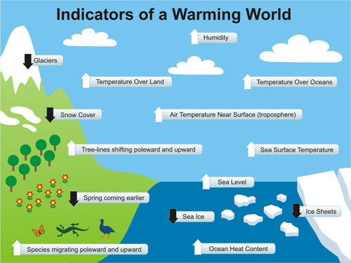
This pic is adapted from The Guide to Global Warming Skepticism, stretched to 1024 x 768 pixels for powerpoint presentations. The attentive reader may have noticed it bears more than a passing resemblance to a pic from the NOAA State of the Climate Report. Yes, I borrowed the concept from them but hey, in the NOAA Report (page 4), they borrowed my graphic on where global warming is going so we're even! :-)
However, I did think the NOAA graphic could use some fleshing out. There is a fantastic paper A globally coherent fingerprint of climate change impacts across natural systems (Parmesan & Yohe 2003). This paper looks at changes in a whole range of systems, including more than 1700 species. What they find is the distribution of plants and animals are shifting towards the poles around 6 kilometres per decade. Spring events are advancing just over 2 days per decade. Animals are also mating earlier and I'm fairly sure this is because of warming, not because they're getting randier.
There are a number of other indicators of warming that I considered including in the graphic. For example, lake and river ice cover are freezing later and breaking up earlier (Magnuson 2000, Hodgkins 2005, which would've made a good visual inclusion. Arctic permafrost is warming at greater depths (Walsh 2009) but how do you depict that? Lakes are warming (Schneider & Hook 2010) and the growing season is lengthening (Christidis 2007). But there was only so much room to fit in the graphic before it gets too crowded. Maybe I'll do a poster version one day.
As with all our Climate Graphics, this one is under a Creative Commons license so you're welcome to reuse it. It's available in a number of formats:

Arguments


May be it should be 'mixed' with the fingerprint graph http://www.skepticalscience.com/its-not-us.htm in order to obtain a comprehensive overview of observations and fingerprints. One could tell the whole story on the basis of one graph only!
Jan Paul van Soest
Sadly, there are still many people who still deny global warming is happening. All it takes is a snow storm somewhere for the knee-jerk reaction "aha, global warming has stopped". But if you're able to take a step back, peruse all the evidence for a warming world and acknowledge that yes, the planet is building up heat and warming, then all credit to you.
John: is it worth adding pH increase in the ocean? That is not a result of warming, but it is one of the major problems caused by increasing CO2.
TOP: how could you possibly use this graphic to sugggest non-AGW? These are all results predicted 20 years ago in James Hansens' testimony in congress. The skeptics said it would never happen. Unsupported trash talk like your comment is so lame. Are you just demonstrating how bankrupt the skeptic argument is?
Like Tenney Naumer, however, I do have a bit of a problem with the white vs black arrows. Perhaps all the arrows should be red or orange or amber - some kind of "warning" colour.
Maybe then an arrow should be added next to each arrow with Hansen's prediction to scale with what has happened.
I've posted in other places why this graphic could be construed as non-AGW.
Isn't the graphic just what the title implies:Indicators of a Warmng World". It doesn't any show evidence specifically related to either AGW or Non-AGW. It seems a good basic graphic summary for the sub-catogory of "skeptic" that agrues against GW.
michael sweet suggests adding ocean pH increase to the graphic, but if I understand the climate experts, pH increase is more of an indicator of increased CO2 than of GW in general, which is what the graphic shows... Maybe a companion graphic (yeah,I know, it's much easier to just suggest stuff for someone else to produce)for negative impacts from GW and another for evidence of human causes for GW.
Great site - thanks, Roger
Agree with psweet - species are "shifting ranges", or "moving" or "being dislocated".
Agree with m. sweet - Ocean pH is a pretty serious problem, an aspect of the CO2 problem, and one to which we need to draw more attention.
Which makes me wonder about the title:
I really don't like the term "global warming". It is too comfy and cuddly feeling. John Holdren has tried to promote "climate disruption", which is a bit better. If you do include ocean pH and other factors, then we are really looking at symptoms of Biosphere Disruption - but maybe that is tending towards OT for the main SS theme...
Also construed as AGW in many places on SkS. Use Search to find 'It's not us', 'The human fingerprint', etc. If you do not believe there is human influence on climate, please explain what causes and then mitigated acid rain and ozone depletion. Then explain why there are urban CO2 domes, a close seasonal correlation between CO2/CO/CH4, soot in the Arctic, etc -- all on a thread like 'It's not us'.
I'm talking about the graphic, not "It's not us". For instance, do you see any mention of those green house gases in the graphic. I only see one.
I understood the article to be about effect (what is happening) rather than cause (what made it happen). Nevertheless, I'll go back and re-read it to be absolutely sure.
......Yup! Second reading gives me the same impression. Perhaps you can point out what I'm missing.
Cheers!
Just curious: where does the SVG work? I tried Fx4, Chrome11 and Opera11 - none display correctly.
P.S. You can trim down the size of PNGs with http://www.pngoptimizer.com/ or http://optipng.sourceforge.net/
In the context of the AGW "debate", it seems that the graph is neutral, that it provides no attribution to causes of the warming... just to the effects of the warming. Even so, the scientific research depicted in the graph has added considerable knowledge of how all living things adapt to changing climates. The graph provides as succinct a summary as one could ever find.
xmlns:xlink="http://www.w3.org/1999/xlink"
to the svg element solved it for me.
http://www.bishop-hill.net/blog/2010/12/30/a-hundred-years-of-freezing.html
I knew this was a denier blog, but not aware of veiled threats, thanks for the insight. The link takes you to the video that was on channel 4 news. If you Google "Lockwood a-hundred-years-of-freezing" you can see it on a different website. If you shelter yourself to just blogs that agree with your present view, how will you ever know if you have the whole picture, or challenge thought with opposing views?
In case you hadn't noticed, the 'opposing views' often drop in for a visit; some try to apply for permanent resident status. And even the people who agree don't hesitate to correct a faux pas.
It is better to get scientific knowledge from primary sources, or sources which directly link to such, than from a "balanced spread" of opinion blogs.
"Not getting the whole picture" is perilously close to conspiracy notions of vast malicious deceit and incompetent groupthink.
It is best to trace new publishings back to the primary source so that the full context can be understood.
http://climate.rutgers.edu/snowcover/chart_anom.php?ui_set=0&ui_region=nhland&ui_month=11
Cultural lesson learned. Would it now be possible to get some critical thoughts on Dr Lockwood's statement in the referenced interview? There is no alterior motive, but to learn and understand with inputs from both sides of the climate debate. If the blog is not accepting visitors that is fine too.
I received this information from an actual interview with Dr. Lockwood. You cannot get any more primary than that.
Here is the link to the news org. The interview video is the last one on the page. http://www.channel4.com/news/uk-snow-strands-air-travellers
"There is no alterior motive, but to learn and understand with inputs from both sides of the climate debate"
The scientific debate/questioning surrounding anthropogenic climate change/disruption happens daily at conferences, in a myriad of journals, and amongst academics, and has been happening for many, many decades. Framing this issue as a "debate" between two equally valid/qualified/credible "sides" is highly misleading and just plain wrong. The situation with anthropogenic global warming is in many ways similar to that endured in the faux "debates" fabricated surrounding issues such as evolution and tobacco. The 'skeptics' camp is a mire of misinformation, distortion and politics, with little or no interest in the science or advancing of science per se, if anything they seem to be largely preoccupied with being obstructionist and attacking the science and scientists. There are plenty of examples to support that statement.
Paul, there is really three 'holy grails' left in the science of anthropogenic warming and they are (1) equilibrium climate sensitivity for doubling (or more of CO2), and even the current best estimate of +3C was derived over the course of many decades using multiple, independent lines of evidence. It is not a question of when or if it will warm, but rather of how much and in what time frame, and what the impacts will be; (2) Sea level rise; and (3) Improving regional impacts. That is where the biggest advances still need to be made, at least IMHO.
Science will continue to advance though (without the help of Montford et al.), regional impacts will be improved, decadal predictions will improve etc.
Like others here, I urge you to avoid some of the more notorious politically-motivated climate science misinformation (and conspiracy) sites. The one being discussed here is one of those. If you would like a list of other "offenders", then I or someone else can post one for you.
The best course of action is always to go to the original source, such as a journal paper (even reading the abstract can often tell you whether or not what you have been told is wrong, distorted or being spun), or a vetted site/source (such as NASA, NOAA, BOM, Met Office or NIWA).
A quick perusal of any thread on this science blog will show that dissenting and controversial views are openly accepted and entertained. The house rules are strict, but it is because of that that SS is perhaps the most pleasant place to discuss the science on AGW on the web, and has been for some time. I have learnt much on this site, ironically much of it by chasing down red herrings from contrarians and 'skeptics'.
Now we have drifted off-topic any thoughts/comments on the post and or featured figure?
I appreciate your comments and advice. This site, RealClimate, and others are extremely valuable to me as I gain greater understanding of Climate Science. Visiting denier sites is also important to me so I can collect the pros and cons, and as a lay person, make the most informed decision. Skepticalscience has provided a wealth of knowledge for which I am truly grateful. I have not commented much as facing the rath of the regulars here is not very wise unless you have all of your facts straight. The interview with Dr. Lockwood ignited some questions that I thought you guys might be able to shed some light on. I am not trying to provoke or take a stand either way, just wanted your thoughts.
Lockwood's research is off-topic on tis thread. So avoid the wrath of the moderators it should probably be discussed here or perhaps here or maybe even this one.
Just re-post it there (with a hyperlink here) and I'm sure people will hop over to the relevant thread to discuss it.
Who said I sheltered myself? I know exactly where to go if I want to hear different opinions. The problem is that science isn't about opinion, it's about fact. Powerful economic interests may have turned it into a political issue, but in the end the question remains a scientific one, and the amount of evidence supporting AGW leaves little room for doubt.
Contrarians and deniers already get much more exposure than their relatively small numbers (and dubious logic) would normally get them. They have transformed an old journalistic concept - there's two sides to every story - into a way to manipulate the scientific discourse to their advantage.
The reality is that, in science, there is only one side to every story. Sure, sometimes it's inaccurate, or false, but science has a way of correcting itself (publication in peer-reviewed journals, for example).
The romantic idea that deniers are underdogs are rightly fighting for what they believe is a mirage. Deniers oppose AGW theory on principle, because it disagrees with their political position.
Now, I want to apologize if I came down a bit hard...this site is attracting an ever greater number of anti-science trolls, and it can sometimes cause some of us to jump the gun a bit. I encourage you to continue reading the articles on this site, and to make your own judgement. Just remember this isn't a debate between two equally valid ideas, but of current science vs. theories that aren't supported by evidence or observations.
Looking at your link for North Hemisphere snow cover I really can't see a change in arrow after 1988, basically a flatline in snow cover for 22 years, so the snow cover arrow in the graphic should be horizontal.
Sea surface temperatures have risen but if you look at the rates of past increases and decreases it seems SST change can happen in relative short time span.
Here is a link to a SST graph
SST graph.
1910 to 1940 rose 0.6 C. 1940 to 1950 dropped 0.25 C 1980 to 2005 rose 0.5 C.
But the last ten years of SST have flatlined, not going up. Consider this line of thought. If we lived in 1905 and were monitoring SST at that time we could conclude the Globe was rapidly cooling and we could have all types of terrible climate change effects. I cannot say for certain if the SST will continue to rise or not, but it is certain it has not risen in 10 years so that arrow should also be horizontal.
Sea level is continuing to rise but the rate is not accelerating so that arrow is a good one.
Sea level graphs.
I looked at a few others and from what I could tell the rest are valid as shown.
Since CO2 levels are still rising but some of the arrows are not currently rising an alternate explanation may resolve this issue. Latest observation on warming temps (which could explain why some arrrows have stopped).
Dust in the Wind.
The fact that we do not observe monotonic rise/fall in some indicators does not mean that CO2 is not the cause. There is a lot of noise in some indicators so they seem to flatten out if you look at a short enough time frame.
False. The last ten years (too short a period to draw statistical significance, but let's forget that right now) show a temperature increase of about 0.12C/decade. No flatlining by any measure of the imagination.
Since your basic premise is wrong, it then follows the rest of youra argument falls apart as well. It doesn't help to quote denier blogs as if they were actual reliable source.
I really wish so-called "skeptics" weren't so credulous of oft-debunked pseudoscientific arguments. It seems all of their skepticism vanishes when they find something that reinforces their preconceived opinion.
Your subjective interpretation of the N. Hemisphere snow cover is not correct. Please read this new paper by Brown and Robinson (2010), in which they conclude:
"Trend analysis of the updated SCE series provided evidence that NH spring snow cover extent has undergone significant reductions over the past 90 years and that the rate of decrease has accelerated over the past 40 years. The rate of decrease in March 15 and April NH SCE over the 1970–2010 period is 7–8 million km^2 per 100 years which corresponds to an 8–11% decrease in NH March and April SCE respectively from pre-1970 values. In March, most of the change is being driven by Eurasia (NA trends are not significant) but both continents exhibit significant SCE reductions in April."
Not surprisingly an independent analysis of the data by Tamino back in 2008 came to a very similar conclusion-- N. Hemisphere snow cover is decreasing significantly in spring and summer.
Yes, you said it. If you wanted to say otherwise, you would've written nonA-GW.
I looked at both graphs you linked to and neither show a decrease in snow cover since 1988. There is a snow cover loss from the the starting point of 1970 to today, and that was not the point I was making. In 22 years snow cover has not decreased. Start your trend line in 1988 and see if it indicates a decrease in snow cover.
I did not make the claim that the arrow for sea level rise was not correct. I agreed, the sea level is still rising. The sea level graph I linked to was the same one that appeared on other sites I was looking at.
I was not making a blind skeptic conclusion that the chart was not a valid work. I was researching it on my own to test the validity of the chart, this is what all should do, test, research and form one's own conclusion on the matter. One should never assume any information is correct without checking it out.
What part of this graph:
That requires something many fail to notice: If each year's snow season (from summer min to winter max) starts lower but ends at about the same area, there must be more (and thus heavier) snowfall during each successive season. And if each year's melt season (winter max to next summer min) starts at about the same area, but reaches a deeper minimum, there must be more (and thus more rapid) melt during the season.
Can a cooling world produce more snow? Perhaps. But it cannot melt more rapidly. However, a warming world does melt rapidly and also has a higher evaporation rate - which leads to more precipitation as snow.
Look at it from an energy point of view: There is more energy in the climate system to both evaporate water and melt ice. An oscillator with a higher energy state has higher amplitude.
Yes, you said it. If you wanted to say otherwise, you would've written nonA-GW.
Huh? Didn't know you could hyphenate AGW that way and don't know why I would want to. Roger D in post #43 also hyphenated the way I did. And you say "would've". I don't know you and you don't know me well enough to make such a statement. "could've" would have been more civil.
AGW and GW are two different concepts. The first places man as the controller of the environment, both good and bad and the other is just an observation that the planet's surface is getting warmer.
#4 Daniel Bailey (who, sadly, has now removed his name from the response)
Sadly, there are still many people who still deny global warming is happening. All it takes is a snow storm somewhere for the knee-jerk reaction "aha, global warming has stopped". But if you're able to take a step back, peruse all the evidence for a warming world and acknowledge that yes, the planet is building up heat and warming, then all credit to you.
Don't use me as a foil for something I never said. I am not "many people". GW and AGW are two different things. The term AGW carries a lot more baggage than GW.
[John Cook] Sorry for the confusion, I did overwrite Daniel's moderator response. From now on, I'll do what I'm doing here - append any additions to existing moderator responses so there's less confusion.