


 Arguments


How much will sea levels rise in the 21st Century?
What the science says...
| Select a level... |
 Basic
Basic
|
 Intermediate
| |||
|
Sea levels are rising faster now than in the previous century, and could rise between 50cm to 1.5 metres by 2100 |
|||||
Climate Myth...
Sea level rise predictions are exaggerated
"Professor Niklas Mörner, who has been studying sea level for a third of a century, says it is physically impossible for sea level to rise at much above its present rate, and he expects 4-8 inches of sea level rise this century, if anything rather below the rate of increase in the last century. In the 11,400 years since the end of the last Ice Age, sea level has risen at an average of 4 feet/century, though it is now rising much more slowly because very nearly all of the land-based ice that is at low enough latitudes and altitudes to melt has long since gone." (Christopher Monckton)
Measuring Sea Levels
Sea levels are rising due to thermal expansion and melting of land-based ice. Global warming is causing the oceans to absorb a lot of extra heat (up to 90%). This makes the volume of water expand, and sea levels rise. The Greenland and Antarctic ice caps, and many of the world’s glaciers, are all slowly melting. The runoff feeds into rivers and directly into the oceans. This too adds to sea levels.
Prior to the use of satellite systems, measurements were taken using tide-gauges, devices that measure the height of a water level relative to a fixed point on land. Global estimates of sea level rise were subject to substantial differences in measurement from different parts of the world.
Sea levels change all the time. They are affected by seasons, astronomical tides, storm surges, currents and density, among other influences. Tidal gauges reflect these short term influences, introducing a large margin of error.
The IPCC Fourth Assessment Report described studies that estimated sea level rise for the 20th century between 0.5 and 3.0 mm a year. The most likely range, according to the IPCC, was between 1.0 and 2.0 mm a year.
Satellite altimetry since 1993 provides a more accurate measure of global sea level rise. Three different satellites take measurements: TOPEX/Poseidon (launched 1992), Jason-1 (launched 2001) and Jason-2 (launched 2008).
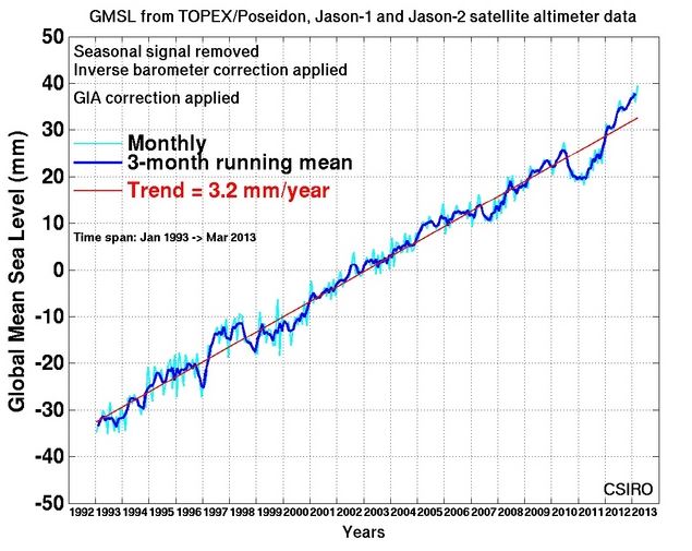
Figure 1: Source - CSIRO
The IPCC projections are derived from climate models. Using both tide gauge and satellite data, we can see that sea levels are rising. Unfortunately, sea level rise is already tracking the worst-case projections, as this graph shows:
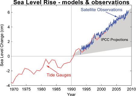
Figure 2: Sea level change. Tide gauge data are indicated in red and satellite data in blue. The grey band shows the projections of the IPCC Third Assessment report (Allison et al. 2009).
In fact, the climate models underestimated the rate of sea level rise because the rapid melting of the ice sheets and glaciers was not incorporated in the last IPCC report. (It was left out because the data were not considered sufficiently robust).
Damaging Potential
Rising sea levels are widely considered to be the greatest threat posed by climate change. They threaten low-lying countries with inundation, forcing inhabitants to migrate. Coastal cities and ports could be flooded, as could cities sited near tidal estuaries, like London. Many nuclear installations are built by the sea so they can use sea water for cooling.
The potential for sea level rise is enormous. This is because the ice caps - Greenland and Antarctic - contain huge amounts of fresh water - around 70% of all the freshwater on Earth. Estimates suggest that if the Greenland ice sheet was to melt away to nothing, sea levels would rise around 6 metres. To put that a different way, a loss of just one per cent of the Greenland ice cap would result in a sea level rise of 6cm.
If the West Antarctic Ice Sheet (WAIS) were to melt, this would add around 6 metres to sea levels. If the East Antarctic Ice Sheet (EAIS) were to melt as well, seas would rise by around 70 metres.
In a process that is accelerating, all three ice caps are losing mass. While nobody is suggesting any of the ice caps will melt away to nothing, only a small amount of melting would cause great problems.
A 1% loss of ice from these three sources would produce a likely increase in sea levels of around 76cm. With the thermal expansion implied by such melting, and contributions from melting glaciers, the oceans would actually rise far more.
Predictions for future sea levels
Future sea level rises depend on a number of factors. The amount of CO2 emitted will determine how much global warming takes place. The amount of ice that melts will vary according to the amount of global warming. The same is true of thermal expansion.
Previous estimates of sea level rise have been based on a set of possible outcomes called emissions scenarios. These theoretical scenarios range from emissions which fall very quickly, to emissions that continue to rise even faster than they have already. Scientists then calculate possible outcomes for each scenario.
In the next IPCC report (AR5), due in 2014, a new method has been used. Emission scenarios have been replaced by Representative Concentration Pathways (RCP). Four trajectories were chosen, based not on emissions, but possible greenhouse gas concentrations in the year 2100. From the concentrations, the RCPs project a ‘forcing’ for each pathway (the amount of warming); 2.6, 4.5, 6.0, and 8.5 Watts per metre squared. Each pathway is named after it’s forcing e.g. RCP4.5. The lowest emission scenario is also referred to as RPC3PD, because it posits a peak warming of 3 w/m2 by 2070 (~490 ppm CO2 and equivalents), and a reduction to 2.6 w/m2 by 2100. (PD stands for Peak/Decline).
A draft version of the next report from the IPCC (AR5), due for publication in 2014, was recently leaked. Although the information is subject to change, the draft report says sea levels are likely to rise by between 29 and 82 centimeters by the end of the century, (compared to 18-59 centimeters in the 2007 report).
Other recent studies have projected comparable sea level increases. Jevrejeva (2011) for example modelled sea level rise using RPC scenarios. This table shows best and worst cases (RPC3PD and RCP8.5), with two in between. The figures for each projection are listed in this table:
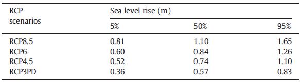
Table 1: Projected sea level rise (m) by 2100 for the RCP scenarios. Results presented as median, upper (95% confidence interval) and lower (5% confidence interval) limits, calculated from 2,000,000 model runs. Sea level rise is given relative the period 1980–2000. (Jevrejeva 2011)
Another study (Rahmstorf 2011) obtained much the same results:
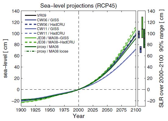
Figure 4: Sea level hindcasts and projections for different models calibrated with different temperature and sea level data. The error bars on the right indicate 90% confidence intervals (5–95 percentile, using the GISS temperature dataset); for the proxy-based projection the uncertainty is as presented in Kemp et al., 2011. (Rahmstorf 2011)
What's in the pipeline?
The 'pipeline' is a term used to describe the slow reaction of the oceans to heating (inertia). Even if we were to stop emitting greenhouse gases tomorrow, the oceans would continue to rise, driven by the heat already stored. (90% of all the sun's energy falling on the surface of Earth is absorbed by the oceans as heat). This sea level rise is said to be 'in the pipeline'.
A paper published in PNAS - Levermann (2013) - has found that greenhouse gases emitted today will cause sea levels to rise for several centuries. For every degree of warming, sea levels will rise by more than 2 meters in the next few centuries. The Earth's temperature has already risen 0.8 degrees C over pre-industrial temperatures.
Jevrejeva (2011) also found increased rates of sea level rise, even if emissions were to stabilise at 490 ppm by 2070 following the scenario in RPC3PD (RPC2.6):
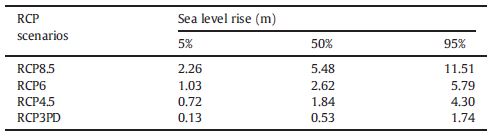
Table 2: Projected sea level rise (m) by 2500 for the RCP scenarios. Results presented as median, upper (95% confidence interval) and lower (5% confidence interval) limits, calculated from 2,000,000 runs of the model. Values of sea level rise are given relative the period 1980–2000.
Conclusion
Based on the new mid-range IPCC RCP4.5 scenario - around 650 ppm CO2 and equivalents producing a forcing of approximately 4.5 watts/metre2 - the most likely sea level rise by 2100 is betweem 80cm and 1 metre. Longer term, sea levels will continue to rise even after emissions have been reduced or eliminated.
Basic rebuttal written by GPWayne
Update July 2015:
Here is a related lecture-video from Denial101x - Making Sense of Climate Science Denial
This rebuttal was updated by Judith Matz on September 13, 2021 to replace broken links. The updates are a result of our call for help published in May 2021.
Last updated on 12 July 2015 by MichaelK. View Archives


Zoltan @ 3 -"He does seem to be a very experienced expert on sea levels." And water divining too. Which doesn't really say much for his credibility either. In fact he wrote some garbled paper trying to scientifically provide evidence for water divining, thereby effectively ending all credibility. But why rely on the word of one rather confused man, when we have satellite altimetry data and tidal gauges?:
[DB] Updated graphic from this url:
http://sealevel.colorado.edu/files/2014_rel3/sl_ns_global.png
[DB] Note: This comment was moved from the Climate and Sea Level: An Emerging Hockey Stick thread to this one.
[DB] Graphic updated.
So, you have a prediction for sea level rise of between 750mm and 2,000mm, but have observed rates of 3.2 mm/yr. 100 yrs X 3.2 mm/yr = 320 mm. So, essentially, you are predicting a substantial increase in the rate of rise.Looking at the graph of sea level rise for years 1880-2000,there does not seem to be much chance of your prediction coming true.
A gradual, steady increase from 3.2 to 11.8 mm/yr by 2100 would give you an increase of 750 mm after 100 years, but it would take a steady increase to 36.8 mm/yr by 2100 to give you a 2 M rise. I realize you are not advocating for a linear increase, but the math is simpler and the principle remains the same.
Bottom line, I don't see any evidence that these increases are occurring, so I don't see the predictions happenning.
Kevin @22:
Um, you did look at figure 2, that shows the rate of change increasing? Tamino's blog also has a recent post discussing some of this. And you realize how the rate of increase is going to depend on both warming of the oceans and increased loss of land ice, and future predictions of this don't depend on the past trend alone?
First, you ignore the fact that the rate of increase has gone up over the last hundred years, then you do a linear extrapolation, then you admit that a linear extrapolation is not appropriate, but then you claim that the principle is the same and go ahead and do it anyway, because "the math is simpler"????
Bottom line: you don't see any evidence because you're working so hard not to see it.
Kevin @22, unless serious efforts to reduce carbon emissions are in place soon, the temperature difference between the end of this century and now will be approximately that between the coldest period of the Last Glacial Maximum and the Holocene average. That temperature difference was enough to cause a 100 meter rise in sea level in 8,000 years, the equivalent of a 12.5 mm per year rise. Given that, a rise of 0.785 meters (increase of annual rate to average rate of deglaciation over the century), or 1 meter (increase to deglaciation rate over fifty years, and constant thereafter) are likely.
Given that the Earth warmed gradually after the LGM so the actual differential in temperature during the last deglaciation was less than what we will experience, and given that periods of much faster melting occurred durring the last deglaciation, sea level rises of 2 meters are a distinct possibility.
I would agree with the Post 14 statement that the rate of rise - using a consistent measurement method - is constant. What tidal guage data set/type, or satelite data, do give different estimates, but none appear to show a change in rate. Can't take one data set in C and then go to F and say you have a temp acceleration, as an example of the same..