


 Arguments


Roy Spencer on Climate Sensitivity - Again
Posted on 1 July 2011 by Chris Colose
 Whenever some of the more credible "skeptics" come out and talk about climate change, they usually focus on a subject known as climate sensitivity. This includes Dr. Roy Spencer, who has frequently argued that the Earth’s climate sensitivity is low enough that global warming should only be very mild in the future (for example, in his 'silver bullet' and 'blunders', as Dr. Barry Bickmore described them). He has recently done so again in a post here (which Jeff Id then talked about here). Naturally, the "skeptics" have uncritically embraced this as a victory, a turning over of the IPCC, a demonstration that global warming is a false alarm, and all that. The perspective on how easily a blog post overturns decades of scientific research is at best, amusing.
Of course, claims of a relatively high or low climate sensitivity need to be tested and evaluated for how robust they are in the context of Earth’s geologic record and in models of varying complexity. My hope is to briefly lay out a context for the body of evidence behind climate sensitivity and then to briefly talk about Roy Spencer’s “model” (which is really not a model at all). Here, I will review a bit about climate sensitivity and then talk about Spencer's post toward the end.
What is Climate Sensitivity?
Climate sensitivity is a measure of how much the Earth warms (or cools) in response to some external perturbation. The original perturbation will take the form of a radiative forcing which modifies either the solar or infrared part of the Earths energy budget. The magnitude of the forced response is critical for understanding the extent to which the Earth’s climate has the capacity to change.
As an example, if we turn up the sun, then the Earth should warm by a certain amount as a response to that increase in energy input. Greenhouse gases also warm the planet, but do so by reducing how efficient the planet loses heat. Of course, we are interested in determining just how much the planetary temperature changes. A higher climate sensitivity implies that, for a given forcing, the temperature will change more than for a system not as sensitive.
Determining the Climate Sensitivity
Determining climate sensitivity is not trivial. First, we must define what sensitivity we are referring to.
The most traditional estimate of climate sensitivity is the equilibrium response, which ensures that the oceans have had time to equilibrate with the new value of carbon dioxide (or solar input) and with various “fast feedbacks.” These include the increase in water vapor in our atmosphere with higher temperatures, changies in the vertical temperature structure of the atmosphere (which determines the outgoing energy flow), and various cloud or ice changes that modify the greenhouse effect or planetary reflectivity.
There is also the transient climate response, which characterizes some the initial stages of climate change when the deep ocean is still far out of equilibrium with the warming surface waters. This is especially important for understanding climate change over the coming decades. On the opposite end of the spectrum, there are even longer equilibrium timescales scientists have considered that include a number of feedback processes that operate over thousands of years.
Unfortunately, there is no perfect method of determining climate sensitivity, and some methods only give information about the response over a certain timescale. For instance, relatively fast volcanic eruptions do not really give good information about sensitivity on equilibrium timescales. Researchers have looked at the observational record (including the 20th century warming, the seasonal cycle, volcanic eruptions, the response to the solar cycle, changes in the Earth’s radiation budget over time, etc) to derive information about climate sensitivity. Another way to tackle the problem is to force a climate model with a doubling of CO2, and then run it to equilibrium. Finally, Earth's past climate record provides a diverse array of climate scenarios. These include glacial-interglacial cycles, deep-time greenhouse climate transitions, and some exotic events such as the Paleocene-Eocene Thermal Maximum (PETM) scattered across Earth’s past.
Dr. Richard Alley discusses a number of independent techniques to yield useful information about paleoclimate variables, including climate sensitivity, in his AGU talk here (highly recommended, it's one of the best videos you'll see in this field). Estimates of climate sensitivity have been studied for many different events or time frames in Earths climate history, and through a variety of very clever ways.
A vast number of studies have focused on the glacial-interglacial cycles as a constraint on sensitivity (such as many of Jim Hansen’s papers, the most recent of which we discussed here), but also based on Earth’s more distant past. Dana Royer has several publications on this (e.g., Park and Royer, 2011), including an interesting one entitled “Climate sensitivity constrained by CO2 concentrations over the past 420 million years” where he constrains sensitivity based on the CO2 concentration in the atmosphere itself. The idea here is that rock weathering processes regulate CO2 on geologic timescales as a function of temperature and precipitation (see the SkS post on that process here) – an insensitive climate system would make it difficult for weathering to regulate CO2; in constrast, a system too sensitive would be able to regulate CO2 much easier than is observed in the geologic record, making large CO2 fluctuations impossible. The authors find a best fit of doubling CO2 sensitivity of ~2.8 °C and that a sensitivity of "...at least 1.5 °C has been a robust feature of the Earth’s climate system over the past 420 Myr..." (Figure 1). The authors cannot exclude a higher sensitivity, however.
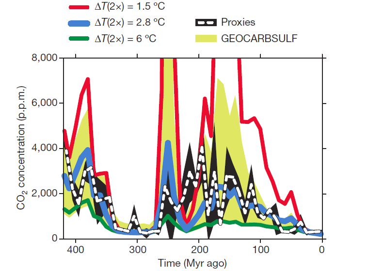
Figure 1: Comparison of CO2 calculated by GEOCARBSULF for varying Δ T(2x) to an independent CO2 record from proxies. For the GEOCARBSULF calculations (red, blue and green lines), standard parameters from GEOCARB11 and GEOCARBSULF12 were used except for an activation energy for Ca and Mg silicate weathering of 42 kJ mol21. The proxy record (dashed white line) was compiled from 47 published studies using five independent methods (n5490 data points). All curves are displayed in 10 Myr time-steps. The proxy error envelope (black) represents 61 s.d. of each time-step. The GEOCARBSULF error envelope (yellow) is based on a combined sensitivity analysis (10% and 90% percentile levels) of four factors used in the model.
There are many other similar studies. Pagani et al (2010) compared temperature and CO2 changes between the present day and the Pliocene (before four million years ago), just before the onset of major Northern Hemisphere ice sheets. Based on Bayesian statistical thinking, Annan and Hargreaves (2006) constrain sensitivity based on data from the 20th Century, responses to volcanoes, and the Last Glacial Maximum data. There are other estimates based on Maunder Minimum forcing.
A review by Knutti and Hegerl (2008) examines a vast number of these papers and concludes:
"studies that use information in a relatively complete manner generally find a most likely value between 2 and 3.5 °C [for a doubling of CO2] and that there is no credible line of evidence that yields very high or very low climate sensitivity as a best estimate."
There conclusions are summarized in Figure 2. This also shows the limitations of various methods, for example, the inability of volcanic eruptions to constrain the high end of climate sensitivity. In general, the high end of sensitivity is more difficult to chop off from the available evidence, and there are also theoretical reasons why a more sensitive climate system corresponds to more uncertainty, as Gerard Roe has argued frequently.

Figure 2: Distributions and ranges for climate sensitivity from different lines of evidence. The circle indicates the most likely value. The thin coloured bars indicate very likely value (more than 90% probability). The thicker coloured bars indicate likely values (more than 66% probability). Dashed lines indicate no robust constraint on an upper bound. The IPCC likely range (2 to 4.5°C) and most likely value (3°C) are indicated by the vertical grey bar and black line, respectively.
Of course, varying techniques are subject to inherent model and/or data limitations. Using modern observations to constrain sensitivity is difficult because we do not know the forcing very well (even though it is positive, aerosols introduce a lot of uncertainty in the actual number), the climate is also not in equilibrium, there are data uncertanties, and a lot of noise from natural variability over short timescales. Similarly, models may be useful but imperfect, so it is critical to understand their strengths and weaknesses. Convincing estimates of sensitivity need to be robust to different lines of evidence, and also to different choices that researchers make when constructing a climate model or interpreting a certain record.
One of the criticisms of Lindzen and Choi’s 2009 feedback paper was that the authors compared a number of intervals of warming/cooling over ~14 years with the radiation flux at their endpoints, but the conclusions were highly sensitive to the choice of endpoints, with results changing if you move the endpoints by even a month. Results that are too choice-sensitive such as this are not robust, and even if mathematically correct, will not convince many researchers (or reasonable policy makers) that several decades of converging lines of evidence got it all wrong.
Roy Spencer on "More Evidence that Global Warming is a False Alarm: A Model Simulation of the last 40 Years of Deep Ocean Warming"
So what about Spencer’s “model”, where he uses a simple ocean diffusion spreadsheet setup and creates a profile of recent warming with depth in the ocean? It turns out in this case that there is no physics other than assuming the heat transport perturbation between layers depends linearly on the temperature difference. His “model” is just an ad hoc fitting of an ocean temperature profile from a particular atmosphere-ocean general circulation model (AOGCM), and yields no explanatory or predictive power.
Spencer models his ocean as a pure diffusion process. This is insufficient. You also need to include an upwelling term (Hoffert et al., 1980), which in the global ocean amounts to about 4 meters per year in order to compensate for the density-driven sinking of water in the Atlantic (Wigley, 2005; Simple climate models. Proc. International Seminar on Nuclear War and Planetary Emergencies). In a somewhat more complex model, you can separate the land from the ocean in each hemisphere to account for the higher climate sensitivity over land and because radiative forcing may differ between hemispheres (for example, sulfate aerosols are more concentrated in the North), and the interaction between these reserovirs. These are still simple, as they have no 3-D ocean dynamics, no hydrologic cycle, etc. Simple and early steps toward a systematic approach to this problem (as in Hoffert et al., 1980) have already been done many decades ago.
Spencer also "starts" his model in 1955, but this is problematic because of the pre-1955 intertia and an out of equilibrium climate at this time. He does not consider alternative issues, such as the possibility of increased (negative) aerosol forcing, and only considers possibilites that reflect his pre-conceived notions.
One model of low complexity (albeit much more complex than Spencer’s model) is the MAGICC model (Tom Wigley, personal correspondence) ,which can be downloaded on any Windows platform and used to play a similar game as Spencer is playing here. This produces results for ocean heat content or vertical temperature profiles (although not displayed as an output); this model can be easily tuned to match any AOGCM with a small number of parameters, and it fits the observed data well with a sensitivity of ~3°C per doubling of CO2. There are other Windows-based user friendly GCM’s that can be downloaded. One which offers a more diverse interface than MAGICC, is EdGCM (developed by Mark Chandler) where forcing inputs can be specified and a standard laptop can run a ~100 year simulation in 24 hours or so. EdGCM is known to produce sensitivity on the high end of the IPCC Fourth Assessment Report (AR4) range.
More modern and sophisticated models describing climate feedbacks and sensitivity (e.g., Soden and Held, 2006; Bony et al. 2006) provide much more complexity and realism and agree with paleoclimate records in that Spencer is too low in his estimates. There is a certain irony in those that think Spencer's model explains climate sensitivity and heat storage processes, while readily dismissing more sophisticated models as unreasonable lines of evidence for anything.
It is also worth noting that only the transient climate response can be affected by observations of ocean heat content change, since this has no bearing on equilibrium climate sensitivity. Spencer agrees with this in one of his comments, but dismissed its relevance by saying “the climate is never in equilibrum,” yet in his article he directly compares his result with “the range of warming the IPCC claims is most likely (2.5 to 4 deg. C)” which is an equilibrium response.
If Spencer creates and publishes a model that has a very large negative feedback and can explain observed variations, then we have a starting point to debate which model (his, or everyone else’s) is better. But for now, comments by Roy Spencer such as
“These folks will go through all kinds of contortions to preserve their belief in high climate sensitivity, because without that, there is no global warming problem”
are extremely ironic. Comments such as those by Jeff Id that “Roy’s post is definitely some of the strongest evidence I’ve read that the heat from climate feedback to CO2 just isn’t there” are only an indication that he hasn’t really read any other evidence.
There is still much to be said about the "missing heat" in the ocean. A couple of papers recently (Purkey and Johnson, 2010; Trenberth and Fasullo, 2011; Palmer et al. 2011, GRL, in press), for example, highlight the significance of the deep ocean. These show that there is an energy imbalance at top of the atmosphere and energy is being buried in the ocean at various depths, including decades where heat is buried below well below 700 meters, and that it may be necessary to integrate to below 4000 m. Katsman and van Oldenborgh (2011, GRL, in press) use another model to show periods of stasis where radiation is sent back to space. It is also unsurprising to have decadal variability in sea surface temperatures.
There is clearly more science to be done here, but Spencer´s declarative conclusions and conspiracy theories really have no place in advancing that science (or for that matter, Roger Pielke Sr., who thinks everything stopped in the early 2000s). Nor do absurd attacks on the IPCC's graphs (which were realy based on graphs from other papers). In fact, the AR4 actually discusses how models may tend to overestimate how rapidly heat has penetrated below the ocean’s mixed layer (see here and the study by Forest et al., 2006), which is Spencer's explanation for his results. Spencer is thus not adding anything new here, and he further criticizes the graphs for not labeling the "zero point" or suggesting we should not include the uncertainty of natural variation in plotting model output. This is not convincing.
This must be why he knows the climate sensitivity to be 1.3°C per doubling with no uncertainty.
Acknowledgments: I thank Kevin Trenberth and Tom Wigley for useful discussions on this subject.


 0
0  0
0 This was apparently created by John Abraham and sent to them by Andrew Dessler. In any case, I hadn't seen it before and it really brings home just how many serious problems there have been with Spencer & Christy's work and how they have consistently been biased in one direction.
The temperature trend Spencer & Christy show now is more than 0.2 C per decade higher than their original claims. If we apply that as a 'demonstrated uncertainty range' around their current claim then the possible spread on their current value includes warming much greater than any of the mainstream projections.
This was apparently created by John Abraham and sent to them by Andrew Dessler. In any case, I hadn't seen it before and it really brings home just how many serious problems there have been with Spencer & Christy's work and how they have consistently been biased in one direction.
The temperature trend Spencer & Christy show now is more than 0.2 C per decade higher than their original claims. If we apply that as a 'demonstrated uncertainty range' around their current claim then the possible spread on their current value includes warming much greater than any of the mainstream projections.
 (h/t to Eli)
Together with the correction of 5th Dec 2006 (listed here, they sum to a total correction of + 0.079 degrees C per decade, ignoring some minor corrections whose effects are not given. That means by Spencer and Christy's own account, corrections represent 39% of the total change in reported trend from 1994 to 2011. Adjustments post 97/98 El Nino amount to 0.049 degrees C per decade, meaning the El Nino itself contributed 0.052 degrees C of the trend in 2000. That is, the 97/98 El Nino, which Spencer and Christy call the largest effect, is approximately equal in effect to adjustments since 1998, and less in effect than total adjustments which they consider not worthy of mention. I need only add that the significance of the 97/98 El Nino declined with time given the warm years that followed.
(h/t to Eli)
Together with the correction of 5th Dec 2006 (listed here, they sum to a total correction of + 0.079 degrees C per decade, ignoring some minor corrections whose effects are not given. That means by Spencer and Christy's own account, corrections represent 39% of the total change in reported trend from 1994 to 2011. Adjustments post 97/98 El Nino amount to 0.049 degrees C per decade, meaning the El Nino itself contributed 0.052 degrees C of the trend in 2000. That is, the 97/98 El Nino, which Spencer and Christy call the largest effect, is approximately equal in effect to adjustments since 1998, and less in effect than total adjustments which they consider not worthy of mention. I need only add that the significance of the 97/98 El Nino declined with time given the warm years that followed.


Comments