


 Arguments


Telegraph wrong again on temperature adjustments
Posted on 24 February 2015 by Kevin C
There has been a vigorous discussion of weather station calibration adjustments in the media over the past few weeks. While these adjustments don't have a big effect on the global temperature record, they are needed to obtain consistent local records from equipment which has changed over time. Despite this, the Telegraph has produced two highly misleading stories about the station adjustments, the second including the demonstrably false claim that they are responsible for the recent rapid warming of the Arctic.
In the following video I show why this claim is wrong. But more importantly, I demonstrate three tools to allow you to test claims like this for yourself.
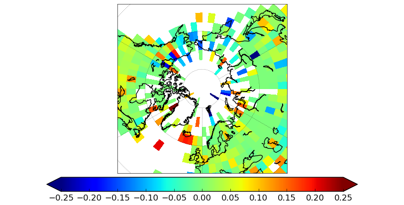
The central error in the Telegraph story is the attribution of Arctic warming (and somehow sea ice loss) to weather station adjustments. This conclusion is based on a survey of two dozen weather stations. But you can of course demonstrate anything you want by cherry picking your data, in this case in the selection of stations. The solution to cherry picking is to look at all of the relevant data - in this case all of the station records in the Arctic and surrounding region. I downloaded both the raw and adjusted temperature records from NOAA, and took the difference to determine the adjustments which had been applied. Then I calculated the trend in the adjustment averaged over the stations in each grid cell on the globe, to determine whether the adjustments were increasing or decreasing the temperature trend. The results are shown for the last 50 and 100 years in the following two figures:

Trend in weather station adjustments over the period 1965-2014, averaged by grid cell. Warm colours show upwards adjustments over time, cold colour downwards. For cells with less than 50 years of data, the trend is over the available period.
Trend in weather station adjustments over the period 1915-2014, averaged by grid cell. Warm colours show upwards adjustments over time, cold colour downwards. For cells with less than 100 years of data, the trend is over the available period.
The majority of cells show no significant adjustment. The largest adjustments are in the high Arctic, but are downwards, i.e. they reduce the warming trend. This is the opposite of what is claimed in the Telegraph story. You can check these stations using the GHCN station browser.
The upward adjustments to the Iceland stations, referred to in the Telegraph, predate the late 20th century warming. They occur mostly in the 1960's, so they only appear in the centennial map. Berkeley Earth show a rather different pattern of adjustments for these stations.
Iceland is a particularly difficult case, with a small network of stations on an island isolated from the larger continental networks. The location of Iceland with respect to the North Atlantic Drift, which carries warm water from the tropics towards the poles, may also contribute to the temperature series being mismatched with records from Greenland or Scotland. However given that the Iceland contribution is weighted according to land area in the global records, the impact of this uncertainty is minimal. Global warming is evaluated on the basis of the land-ocean temperature record; the impact of adjustments on recent warming is minimal, and on the whole record it is small compared to the total amount of warming. As Zeke Hausfather has noted, the land temperature adjustments in the early record are smaller than and in the opposite direction to the sea surface temperature adjustments.
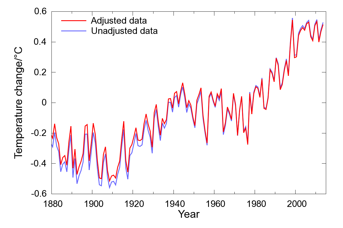
Impact of the weather stations adjustments on the global land-ocean temperature record, calculated using the Skeptical Science temperature record calculator in 'CRU' mode.
Manual recalibration of the Iceland records may make an interesting citizen science project. Most of the stations show good agreement since 1970, however they diverge in the earlier record. The challenge is to work out the minimum number of adjustments required to bring them into agreement over the whole period. But the answer may not be unique, and noise and geographical differences may also cause problems. To facilitate this challenge, I've made annualized data available for the eight stations as a spreadsheet file.
In the video I demonstrate three tools which are useful in understanding and evaluating temperature adjustments:
-
A GHCN (global historical climatology network) station report browser. GHCN provide graphical reports on the adjustments made to each station record, but you need to know the station ID to find them. I have created an interactive map to make this easier.
-
The Berkeley Earth station browser. The Berkeley Earth station reports provide additional information to help you understand why particular adjustments have been made.
-
The Skeptical Science temperature record calculator. This allows you to construct your own version of the temperature record, using either adjusted or unadjusted data for both the land and sea surface temperatures.
Data for the temperature calculator may be obtained from the following sources:
-
The GHCN station data. For daily average temperature data, look for the 'tavg' files. The 'qca' files are adjusted temperatures, and the 'qcu' files are unadjusted temperatures. The files are stored in '.tar.gz' archives, and may be extracted using most freely available unzip software.
-
The Hadley sea surface temperature data. Look for the files HadSST.3.1.1.0.median.zip, or HadSST.3.1.1.0.unadjusted.zip for the unadjusted data.
Finally, here are some interesting papers discussing why adjustments are required.
-
Menne et al (2009) The U.S. historical climatology network monthly temperature data, version 2.
-
Bohm et al (2010) The early instrumental warm-bias: a solution for long central European temperature series 1760–2007.
-
Brunet et al (2010) The minimization of the screen bias from ancient Western Mediterranean air temperature records: an exploratory statistical analysis.
-
Ellis (1890) On the difference produced in the mean temperature derived from daily maximum and minimum readings, as depending on the time at which the thermometers are read


This is beautiful, lucid and dedicated work! It will be invaluable to have these tools in the public sphere as China's economic slowdown and air pollution reduction programs continue to impact Aerosol emissions. We are already seeing the precursor of this effect on globally averaged temperatures and in a potential PDO shift to a positive state. Subsequently temperatres are set to rise, possibly at an extreme rate not seen since the mid 1970's.
I would ask all to consider that the Public Relations industry works in concert with ideologically aligned media outlets to cultivate a common narrative. This has been well documented. This narrative is one that has been developed through scientific analysis of future trends and their potential impacts to client's business models. In this realm, then, it is clear that the current coordinated attack on station-level adjustments is an attempt to define the narrative in preperation for this near-term rapid warming.
In view of this, a rapid response, backed with similar narrative placements, is absolutely vital if there is going to be any successful mitigation efforts in the next decade. The rate of warming that will be experienced in the near term will show whether the indirect cloud forcing and ECS values were both understated in the models.
Nice work Kevin.
And wow! The earliest research into Time of Observation Bias goes back to 1890!
IMO, those trend maps are not presented ideally.
Particularly,
Use of Blue-Green-Yellow-Orange-Red means its hard to easily determine the regions with smaller values.
Blue and Red are associated with temperature. This graph measures something related to, but not, temperature. I.e., Blue on this graph doesnt mean its cold, or even decreasing temperature.
Describing the colours are warm / cool, similar issues to the use of blue / red. We're not really talking about temperature here, so temperature related adjectives to decribe the colours isnt ideal.
Suggested alterations:
Colors other than Blue/Red. Perhaps pink and purple.
Going colour (-) ->white (0)- colour (+) (eg Pink - light pink - white - light purple - purple) makes it easier to determine relative and absolute differences.
uprightsquire: Here's a different version of te 50 year plot. White centred does highlight the zeros nicely, although I have to make a missing cells grey to distinguish them, which I think is less intuitive. I stuck with blue-red, because I want to see whether the adjustments shift the trend towards cooling or warming.
You can now see the predominantly upward adjustments as soon as you enter the US (I presume due to the change from glass to electronic thermometers), in contrast to the mixed changes elsewhere and the predominantly downward adjustments in the Arctic.
That gives a good view of distribution of adjustment effect. I made a Google Maps gadget here, where you can color stations according to adjustment trend effect, though you don't get the color shading picture. It also lets you link to the GHCN data pages.
[DB] Activated link.
I have just posted a complaint on the Telegraph website on this article. We will see how it is taken.
This was the response from the Telegraph - now on to IPSO:
Thank you for contacting us about this article.
As you are aware, climate change is a complex and controversial topic. A newspaper is not a scientific journal, and is not required to represent all the possible shades of evidence and interpretation that might have a bearing upon any given topic.
This is clearly an opinion article and identifiable as such. Against the background described above, readers can be expected to understand that any evidence offered is almost certainly contestable. It follows that in an opinion article of this nature only the most egregious inaccuracy could be significantly misleading. The point you raise does not qualify as such.
The article is based on material published by Paul Homewood on his weather blog. The writer is entitled to cite Homewood's interpretation of temperature data and comment upon it. Although I understand you disagree with his views, the existence of contrary interpretations does not negate Christopher Booker's right to offer his own. There is nothing that would engage the terms of the Editor's Code of Conduct.
I trust this is of some assistance.
Thank you Kevin, very helpful article.
fyi. Since it's a great rebuttal to some of Jim Steel's Crazy-making over at WUWT I've decided to mirror this post over at my blog. http://whatsupwiththatwatts.blogspot.com/2015/02/exposing-ushcn-homogenization-insanity.html
Regarding the tiff with the Telegraph might I offer: Political leaders and the public have a right to learn without malicious interference! ~ ~ ~ Serious science is not about "tolerance of diversity", Science is about pinning down the facts as well as possible and always learning. ~ ~ ~ It's not about relying "only on what others are telling us." It's about trusting a huge community of experts who keep each other honest ! http://whatsupwiththatwatts.blogspot.com/2015/02/florifulgurator-denial-scienceofdoom-1c.html
Jubble @7 - You may wish to compare notes with the response we got from The Telegraph. We have been talking to IPSO about this sort of thing for quite some time!
A Letter to the Editor of the Sunday Telegraph
Whats the scientific definition of "egregious inaccuracy"?!
Jubble @7 - You may also wish to click through my alter ego "Snow White's" latest Tweet, to "her" latest article, in which "she" was most ably assisted by Dr. Kevin Cowtan:
https://twitter.com/GreatWhiteCon/status/571297273159786496