


 Arguments


Lots of global warming since 1998
Posted on 15 March 2016 by dana1981
This is an update to the rebuttal to the myth 'it hasn't warmed since 1998'
Even if we ignore long term trends and just look at the record-breakers, 2015, 2014, 2010, and 2005 were hotter than 1998.
The myth of no warming since 1998 was based on the satellite record estimates of the temperature of the atmosphere. However, as discussed in the video below by Peter Sinclair, even that argument is no longer accurate. The satellites show warming since 1998 too.
To claim global warming stopped in 1998 also overlooks a simple physical reality - the land and atmosphere are just a small fraction of the Earth's climate (albeit the part we inhabit). The entire planet is accumulating heat due to an energy imbalance. Theatmosphere is warming. Oceans are accumulating energy. Land absorbs energy and ice absorbs heat to melt. To get the full picture on global warming, you need to view the Earth's entire heat content. More than 90% of global warming heat goes into warming the oceans, while less than 3% goes into increasing the atmospheric and surface air temperatures. Nuccitelli et al. (2012) showed that the Earth has continued to heat up since 1998.
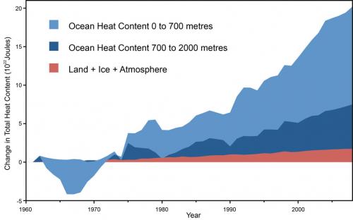
Figure 1: Land, atmosphere, and ice heating (red), 0-700 meter OHC increase (light blue), 700-2,000 meter OHC increase (dark blue). From Nuccitelli et al. (2012).
In 1998, an abnormally strong El Niño caused heat transfer from the Pacific Ocean to theatmosphere. Consequently, we experienced above average surface temperatures. Conversely, the 2000s saw predominantly La Niña conditions, which had a cooling effect on global temperatures. As a result, the warming of atmosphere and surface temperatures temporarily slowed. They've now started to speed up again, and the planet as a whole has kept on heating up the whole time.
Using moving averages to discern the long-term trend
With so much internal variability, scientists employ statistical methods to discern long-termtrends in surface temperature. The easiest way to remove short-term variations, revealing any underlying trend, is to plot a moving average, performed in Waiting for Cooling (Fawcett & Jones 2008) . Figure 3 displays the 11-year moving average - an average calculated over the year itself and five years either side. They've used three different data-sets - NCDC,NASA GISS and the British HadCRUT3. In all three data-sets, the moving average shows no sign that the warming trend has reversed.
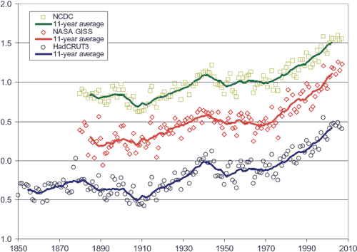
Figure 2: Globally-averaged annual mean temperature anomalies in degrees Celsius, together with 11-year unweighted moving averages (solid lines). Blue circles from theHadley Centre (British). Red diamonds from NASA GISS. Green squares from NOAANCDC. NASA GISS and NOAA NCDC are offset in vertical direction by increments of 0.5°C for visual clarity.
The linear trend since 1997 or 1998
Next, Fawcett and Jones look for a cooling trend in the 10 years since 1998. They find the linear trend over 1998 to 2007 is a warming trend in all three data-sets. Note thatHadCRUT3 displays less warming than NASA GISS and NCDC. This is most likely due to the fact that HadCRUT data doesn't cover parts of the Arctic where there has been strong warming in recent years.
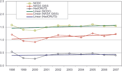
Figure 3: Linear trends (solid lines) in the three global annual mean temperature anomaly time series over the decade 1998-2007.
Cowtan & Way (2013) also evaluates global surface warming across the globe by using a statistical method known as 'kriging' andby using satellite data to fill in the gaps where there are no temperature stations. Their study shows that the global surface warming trend for 1997–2015 is approximately 0.14°C per decade.
Removing El Niño and other Exogeneous Factors
In addition to removing the ENSO signlal, Foster and Rahmstorf (2011) used multiple linear regression to remove the effects of solar and volcanic activity from the surface and lowertroposphere temperature data. Their results are shown in the animation below.
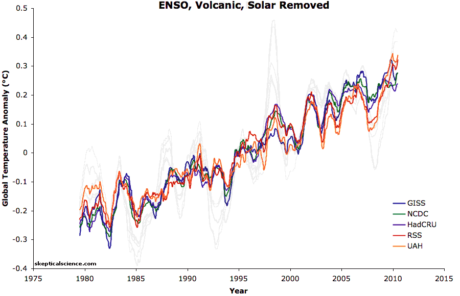
Figure 4: Five data sets (GISS, NCDC, HadCRU, UAH, and RSS) with and without the effects of ENSO, solar irradiance, and volcanic emissions removed. Data from Foster and Rahmstorf 2011, animation created by Dana Nuccitelli.
When removing these short-term effects, the warming trend has barely even slowed since 1998 (0.163°C per decade from 1979 through 2010, vs. 0.155°C per decade from 1998 through 2010, and 0.187°C per decade for 2000 through 2010).
Summary
To sum up, every component of the Earth's climate has continued to warm since 1998. The myth of no warming during that time was based on the satellite record of atmospheric temperatures, which now shows warming. Surface and ocean temperatures have risen, as have sea levels, while ice has melted, spring is starting earlier, and so on. 2015 was hotter than 2010, which was hotter than 2005, which was hotter than 1998. A monster El Niño event made 1998 relatively hot at the surface and in the atmosphere, but Earth has continued warming rapidly over the past 18 years.
Update July 2015:
Here is a related lecture-video from Denial101x - Making Sense of Climate Science Denial


Dana: Thank you for updating this important set of rebuttal articles.
PS: One down, 175 more to go. :)
Typo: first paragraph 2004--> 2005. Please delete this note.
I applied a LOESS regression to the RSS data from 1998 on to both the old and new RSS data. LOESS regression is a better type of analysis than a moving average. Both analyses show temperatures climbing with a slight slowing from 2003 to 2009.
The main reason given for the slight slowdown in surface temperatures since about 1998 until recently was more heat energy going into the oceans. Last years el nino seems to have released a lot of this, and caused a large temperature record. Doesn't this validate the research?
The satellites show warming since 1998 too.
This comment - and the article - lacks uncertainty estimates. Red flag. None of the global temperature datasets have statistically significant warming since 1998. You'd be on firmer ground showing that the temps since 1998 have not deviated from prior warming to statistical significance.
Should have checked before I spoke. NOAA and GISS have statstically significant warming since 1998 (to year-end 2015). But not HadCRU4, and definitely not RSS and UAH satellite records, no matter which version you use.
Barry @ 6. I will take your word that the satellite record does not have statistically significant warming since 1998. I suppose it gives you climate change sceptics some straw to hold onto.
I think my mind is pretty made up. There is now a mountain of evidence that we are altering the climate, and at a significant rate.
The surface is warming strongly according to nasa giss. The satellites measure the atmosphere, and this may be heating more slowly, but its the surface that dominates weather patterns and rates of ice melt.
barry,
What do 'your' statistics say about the data since 1997 or 1999?
barry @5 & 6, the trends are:
HadCRUT4: 0.107 +/- 0.111 C/decade
NOAA (Karl 2015): 0.107 +/- 0.123 C/decade
GISTEMP: 0.154 +/- 0.113 C/decade
BEST: 0.125 +/- 0.104 C/decade
HadCRUT4 krig: 0.142 +/- 0.117 C/decade
Karl 2015 Global: 0.134 +/- 0.141 C/decade
RSS*: 0.002 +/- 0.185 C/decade
UAH: 0.106 +/- 0.186 C/decade
RSS is not explicitly out of date, with a recent improvement of the diurnal drift adjustment which significantly increaste the 1998-2016 trend having been applied to the TMT channel, but not yet carried through to the TLT channel. I do not know if the UAH data used in the trend calculator is vs 5.4 or the as yet un peer reviewed vs 6.
The key thing to note is that the only dataset in which the approx 0.2 C per decade model predicted lies outside the uncertainty interval is RSS, which is explicitly acknowledged by its author to be less accurate than surface thermometer records, and in its current version, to be biased low by inaccurate correction for diurnal drift. That means there is better statistical grounds to say that recent temperature trends are following the models than there is to say that they have paused, or are in a hiatus. Insisting that not showing a statistically significant difference from zero is important, but not showing a statistically significant difference from model trends is irrelevant amounts to special pleading. I amounts to forcing your preferred story on the data because you like the narrative.
Deniers try to avoid the charge of special pleading by insisting that a trend of zero is the null hypothesis. The correct response to that claim is neither polite, nor in keeping with the comments policy.
Being more polite, the null hypothesis depends on the theory you are testing. If you are testing the theory that the temperatures are following model trends, the null hypothesis (ie, that which you are trying to falsify) is that the trend is that of the models, and only trends showing a statistically significant difference from the model trends are relevant in that only they can contribute towards falsifying the model.
More naively, if we do not have a specific model in mind, the null hypothesis is that nothing interesting will happen, ie, that the trend will continue as it was doing before. More precisely, the trend will remain the same as it has been since the last stastically determined 'breakpoint' in the trend (which happens to be about 1970). In other words, unless the trend shows a statistically significant difference from 0.165 C/decade (for GISTEMP), the correct assumption is that the trend is continuing at 0.165 C per decade. As it happens, the GISTEMP trend differs by about a tenth of the error from the ongoing trend.
Hi Tom,
I didn't metion models or IPCC predictions.
When the skeptics talk about short-term trends, their critics - rightly - scold them for ignoring statistical uncertainty. When Tamino criticises papers on temp trends that lack uncertainty estimates he is right to do so (as he did recently with a paper Mann co-authored, while commending other parts of the paper).
The statement in the OP was clear. "The satellites show warming, too." Not to statistical significance. It's inconsistent to correct 'skeptics' for this oversight and then do the same thing.
"...unless the trend shows a statistically significant difference from 0.165 C/decade (for GISTEMP), the correct assumption is that the trend is continuing..."
As I said to begin with, it would have been better to lay the case out this way.
"You'd be on firmer ground showing that the temps since 1998 have not deviated from prior warming to statistical significance."
"I do not know if the UAH data used in the trend calculator is vs 5.4"
More likely v5.6. Strongly doubt it's beta6.
@ nigelj,
you can use the SkS trend calculator to check the trends/uncertainty yourself if you'd like.
www.skepticalscience.com/trend.php
Simply, if the uncertainty (+/-) is larger than the trend, then the trend fails statistical significance (is not statstically distingishable from 0).
OPOF,
You can also run the trends/uncertainty there to check for 1997/99 (run it for full years to avoid intereference from annual cycle). Last time I looked, the longest time-period lacking statistical significance was RSS - 23 years. Not that that means too much. Failing to disprove the null doesn't mean that there is no trend, just that you can't demonstrate it statistically.
I'll check just now for the logest period without statistical significane in the sat records - just for curiositiy's sake...
RSS - No stat sig warming since 1992: 24 yrs
UAH - No stat sig warming since 1995: 21 yrs
This doesn't 'prove' no warming, of course. That's not how the null hypothesis works. But it does mean you cannot say there has definitely been warming. Not according to those data sets. A broader lok at the climate system tells a different story.
Tom,
"RSS is not explicitly out of date..."
V4 TLT is supposedly coming out in about 6 months. I strongly doubt it will change my point for trends run to Dec 2015. I also doubt we'll have statistical significance in v4 TLT 1998- 2016 (inclusive) trend. The relatively large variability will still be there, which is why the satellite data sets need longer time periods to reach this threshod than the surface records, as you know.
A few details:
Neither of the Karl 2015 trends are to the present - they both omit 2015. Include 2015 and both would be statistically significant.
The period from 1998 has presented several problems:
I expect the picture to become a lot clearer over the next 12 months at least on the first 2 points, with new versions from NOAA, UKMO and JMA. We've identified the issues, they are being addressed as we speak, and we have a good idea what the changes are going to look like. In the mean time I would be cautious of drawing conclusions from records with known biases.
We can say 'there has, unambiguously been warming'. We just can't say it if we know nothing more than certain temp records. That would be a pointless condition to hold ourselves to.
Fair points, but not addressing the criticism. The unqualified cliam is;
<i>The satellites show warming since 1998 too.</i>
They do not. Not to statistical significance.
We wouldn't give this a free pass if a skeptic used the same period to say no warming "because it's not statistically significant," or if they claimed a 'pause.' We frequently remind them of this ommission in their 'analysis'. I'm doing the same here. Neither of those claims are justfied. Neither is a claim of warming for that period for the satellite data.
It's about integrity, whether in 'messaging' or in accurate science.
An eye-opening article by Dan Satterfield at the American Geophysical Union blog:
=> NASA- February Temperatures Hottest Ever
It's not only the 5th month in a row that is topping temperature records by a big margin. Dan is also cleaning up some myths.
Gary and Keihm 1991 showed that natural variability in only 10 years of UAH data was so large that the UAH temperature trend was statistically indistinguishable from that predicted by climate models.
http://science.sciencemag.org/content/251/4991/316.short
Hurrell and Trenberth 1997 found that UAH merged different satellite records incorrectly, which resulted in a spurious cooling trend.
http://www.cgd.ucar.edu/cas/abstracts/files/Hurrell1997_1.html
Wentz and Schabel 1998 found that UAH didn’t account for orbital decay of the satellites, which resulted in a spurious cooling trend.
http://www.nature.com/nature/journal/v394/n6694/abs/394661a0.html
Fu et al. 2004 found that stratospheric cooling (which is also a result of greenhouse gas forcing) had contaminated the UAH analysis, which resulted in a spurious cooling trend.
http://www.atmos.washington.edu/~qfu/Publications/nature.fu.2004a.pdf
Mears and Wentz 2005 found that UAH didn’t account for drifts in the time of measurement each day, which resulted in a spurious cooling trend.
http://science.sciencemag.org/content/309/5740/1548.abstract
Depends what you're controlling for and what published data you're using. The language should be more precise. It isn't however, merely wrong.
barry@12,
I understand that when you push the data values at the begining of a time period up to the maximum of the uncertainty band and push the data values at the end of the time period down to the bottom of the uncertainty band you may be able to claim that the result is a trend line that is not increasing.
However, understanding that those potential 'no increase' trend values are 'less likely among the total range of possible trend values' means it would be inappropriate for a person who actually understands things to declare that finding an extreme value of 'no warming' means that it is more correct to state that the data set does not indicate (with statistical significance or whatever other term is wished to be use) that 'warming has occurred during that period'.
Of course there will always be some people who will resist better understanding something when they sense that understanding it better will be contrary to their personal interest (that type of sense is clearly far too common in much of the USA and other places in the so called 'advanced or developed nations' like Alberta). And it is highly likely that such minds will look hard to find extreme examples that justify what they prefer to belive and desire to have others believe. But any success of that type of extremely irrational unreasonable type of thinking is clearly a political marketing problem, not a scientific presentation issue.
Though you have tried to explain your preference for phrasing that implies no warming since 1998, you are relying on having identified a few extremes in all of the available information as the basis for the claim, or said anoyther way, you are wanting to make a statement that you actually could understand is highly unlikely to be correct.
barry,
Please comment on the predictive accuracy of the 'statistical' trend you have been preferring to promote (no significant warming since 1998) regarding the expected values of the temperature data in the past months.
What I am asking you to do is to honestly answer what your preferred trend value wold have predicted for the February 2016 temperature data set values relative to February 1998. And then go back month by month and identify how many previous months you have to be looking into to get a ststistically significant number of months where there has been 'no warming between the recent monthly value and the monthly value 18 years prior'. You can even go the other way and investigate how many years you need to reduce your range to to find a sstistically significantly number of prior year months that are warmer than the current monthly values.
And while you are at it, please comment on the likelihod that the 'no warming trend' will correctly predict that March 2016 will not be warmer than March 1998 (or any other March value).
OPOF,
Though you have tried to explain your preference for phrasing that implies no warming since 1998, you are relying on having identified a few extremes in all of the available information as the basis for the claim
I have no preference for such language. Only accuracy.
I didn't choose the data set/s or the time period. I only commented on how it was described in the OP.
What I am asking you to do is to honestly answer what your preferred trend value wold have predicted for the February 2016 temperature data set values relative to February 1998.
No analysis of such chaotic data could predict a single month's value, but one could give a probabilistic estimate. For the satellite data on such a short time frame, the estimate would be pretty wide. Looking at the whole system, warming has continued, and physics tells us it will continue. A spike like Feb 2016 was bound to happen sometime.
...go back month by month and identify how many previous months you have to be looking into to get a ststistically significant number of months where there has been 'no warming between the recent monthly value and the monthly value 18 years prior'.
It's not possible, as far as I'm aware, to determine 'no trend' to statistical significance - at least just by applying a linear regression; they're not made to detect 'no trend'. But one can make a reasonable assumption of no trend after a long time with a small trend. Eg, 100 years of temps may be 0.0002C/decade +/- 0.0004. The trend is negligible, as is the uncertainty, so you'd be on solid ground saying there was no trend.
Jan 1998 - Feb 2016 has a trend of 0.02C +/- 0.185 in the RSS data set. Claiming this is a warming, flat or cool trend is statistically illegitimate. With the uncertainty, the trend could be anywhere between -0.183 to 0.187C/decade (95% confidence level).
That's exactly why I commented in the first place.
Somewhat similar to your suggestion, I checked the longest period for a non-statistically significant tend (UAH/RSS) in a post above.
Add one more year to those results and you have statistically significant warming derived from the ARMA (1,1) model used the the SkS app. So, for the satellite data sets, you need to start a regression in the early '90s before you can say there is a legitimate warming trend. Not from 1998.
My criticism is of the 'analysis' (or lack) of the satellite data sets in this post (and there's more to it, like blurring the line between rcently revised mid-tropospheric trends and the lower tropospheric data), not of the bigger picture. I don't think it serves the message well to fudge these details.
Reckon I've said my piece long enough. Have a good one.
I have to start off by saying that I am no statistician. However, I do get upset when people start quibbling about “statistical significance" when I'm not sure if they know what it means. Firstly, it does not mean that there is no trend if it does not meet statistical significance criteria. After all, 95% for statistical significance is just an arbitrary decision. I much prefer p values, since they represent chance. Thus if data have a p value of <0.05 we can claim statistical significance. However what is the real difference between P=0.04 and p=0.06. In real terms there is really no difference just that in the former case we can claim “statistical significance” and in the second case we can’t. Remember that p=0.05 is just an arbitrary choice; there is no real meaning to it, in terms of the data.
barry@22,
Your ability to identify and present political marketing points is duly noted.
barry:
Barry, being a stickler about statistical significance sometimes amounts to deliberate obfustication. We saw that from the deniers when 2014 set a global record annual temperature and they started claiming it was 'statistically indistinguishable' from prior records, and therefore not in fact a record.
In fact, calling the record 'statistically indistinguishable' was a lie. That is because the set of years whose mean estimated global average temperature was within the error margin for 2014 was different to the equivalent set for 2010, or for 1998. Therefore, those years could be distinguished by statistical criteria, ie, were not 'statistically indistinguishable' from each other. More directly the likelihood that 2014 was the warmest year since records began was greater than the likelihood that 2010 was the warmest year since records began, and much greater than the likelihood that 1998 was the warmest year since records began, but the probability that 2014 was the warmest year on record (as of 2014) was 1, because the recorded annual mean for 2014 was greater than the recorded means for any other year (and the interval betweeen error margins was greater than the interval between error margins for any ohter year, and so on).
If you think there is a contradiction between the claim that "the likelihood that 2010 was warmer than 2014 is greater than 0" and the claim that "the probability that 2014 was the warmest year on record (as of 2014) was 1", you are failing to distinguish between the record and the reality. The former is a statement about the reality, while the later is a statement about the record.
Now, by the same token, it is a matter of record that UAH 5.6 shows warming from 1998 to 2015; and likewise a matter of record that the current RSS TMT record shows a warming trend from 1998-2015. That is, 'The satellite [records] show warming since 1998 too'. End of story. You do not refute that claim by expostulating, 'but error margins'.
What you can legitimately say is that, given the error margins, the satellite records from 1998 to 2015 do not conclusively show that it warmed in fact from 1998-2015. But then, so what? Why do we need to restrict ourselves to just one or two minimally accurate data records? When we talk about reality, we should consider all relevant records, and all relevant records taken together show with probablility >99% that it warmed from 1998 to 2015 in reality.
Raising the issure of error margins without looking at all relevant data amounts to obfustication.
This does not mean you should not raise error margins. But when you do you should realize you are greatly reducing the clarity of the discussion for (often) very minimal gain. And if you do raise the error margins, you had better make the distinction between the multiple individual records, and the reality they attempt to describe - and not try to restrict the discussion to just one or two records (and a carefully truncated interval).
On the other hand, when deniers misuse error margins to argue that, the error margin on the trend includes zero so therefore it has not warmed simpliciter (as they tacitly, and sometimes explicitly argue) it is perfectly valid to actually discuss what error margins actually mean without it being incumbent on you to introduce error margins into every post you make aimed at a grade 10 reading comprehension. The cases are not alike.
So, folks are trying to argue that "warming since 1998" doesn't have "statistical signficance"?
News flash: If you have to cherry pick the starting date, then you have already lost the argument. Claiming that statiscial significance has anything to do with it is pure fantasy at that point.
Never assume that someone who uses 1998 as the starting date for their argument is attempting to have a serious discussion with you; they are not. Your best option is to tell them their argument is invalid from the start and refuse to engage in any further discussion. They simply want to waste your time. Do not let them.
BBHY@26 I think you may have missed the point of Dana's piece which is entitled "Lots of global warming since 1998". The thrust of the piece, to show there has been warming since 1998, is encapsulated in the first few sentences. These are "The myth of no warming since 1998 was based on the satellite record estimates of the temperature of the atmosphere. However, as discussed in the video below by Peter Sinclair, even that argument is no longer accurate. The satellites show warming since 1998 too".
One should add to Ryland's comment that the myth of no warming since 1998 was born indeed of cherry picking the only date that skeptics could find to attempt making the point that there was no recent warming. Because this had not been true of late for most measures, they had to double up on the dishonesty by also cherry picking a given satellite record, plagued by more problems than they are even aware of. So BBHY is in fact correct, anyone who attempted to select 1998 of all years to try to make a point was trying to take you for a ride and should have been ridiculed. Dana's point in the OP is that even such a grotesque cherry pick can no longer be defended because it has become inaccurate on its face. Barry may have had a minor technical point, briefly, because the March anomaly could make the whole conversation moot.
In any case, cherry picking 1998 was always a crock of you know what, it has just become more so, so a point that's rather obvious. There never was a real pause in the either the surface temp or ocean heat content.
Tom,
If you think there is a contradiction between the claim that "the likelihood that 2010 was warmer than 2014 is greater than 0" and the claim that "the probability that 2014 was the warmest year on record (as of 2014) was 1...
Once again you are presenting a different argument to the one I made.
What you can legitimately say is that, given the error margins, the satellite records from 1998 to 2015 do not conclusively show that it warmed in fact from 1998-2015.
That is exactly what I said. Could you not just have agreed in the first place?
Why do we need to restrict ourselves to just one or two minimally accurate data records?
We don't. A point I also made. You're shadow-boxing. My criticism was very specific. We are, in fact, not in disagreement about any of the above points. Perhaps you think I'm attacking the overall message?
Ian Forrester,
However, I do get upset when people start quibbling about “statistical significance" when I'm not sure if they know what it means. Firstly, it does not mean that there is no trend if it does not meet statistical significance criteria.
I wrote above:
"RSS - No stat sig warming since 1992: 24 yrs
UAH - No stat sig warming since 1995: 21 yrs
This doesn't 'prove' no warming, of course. That's not how the null hypothesis works. But it does mean you cannot say there has definitely been warming. Not according to those data sets. A broader lok at the climate system tells a different story."
As others have pointed out, starting from 1998 is a cherry-pick. But that was the cherry-pick raised in the OP, and the claim that followed re satellite records was statistically illegitimate.
As for being a stickler, blame Tamino for my insistence. He's my stats 'guru.' And comments above kind of make my point. We criticise skeptics in fine detail based on statistical analysis, including stat sig. It surprises me when we start suggesting that this is pedanticism.
The problem is that people who have no knowledge of statistics believe that "not statistically significant" means "no warming". That was shown with the interview with Phil Jones a few years ago. Just use a p value, knowledegable peope know what it means and others can ask. Let's get rid of the term "statistical significance" since it allows deniers to mislead.
barry,
There is a difference between 'being particular in an effort to help others better understand something' and 'being particular in an attempt to misrepresent something'.
I am sure you understand that. Misleading political marketing point makers understand how to make 'their points' to drum up popular support for something they understand does not deserve to be popular.
barry @29:
No! I am presenting my own argument in relationship to the claim that you made. If you were not so busy trying to call strawman or agreement, you might have learnt something - possibly realized that what you already knew but weren't thinking about made your original claims misleading and obfusticatory.
Very briefly, once more, had Dana said:
and you objected:
Your claim would be simply false, representing a category error. You would have interpreted a claim about the data as a claim about reality.
Conversely, had Dana said:
and you had objected:
you would have been correct.
Dana, of course, said nothing so precise as either of those statements. He wrote:
The question is then, which of the more formal statements above most closely conveys Dana's meaning. It think it is the first, and clearly the first. That is (firstly), because it was made to a popular audience, and popular audiences do not trouble themselves with error margins. Therefore, it is invalid to interpret the claim in a way that requires understanding of error margins to be understood unless dictated by necessity. It is also because Dana would, if challenged as to whether or not the satellite record by itself shows the warming to be real (ie, statistically significant), be genuinely puzzled as to why you would ask that question to the exclusion of the majority of the data, and to the exclusion of physics. Why, in fact, in a popular discourse, are you discussing a purely academic question.
Perhaps you are confused on this point because the 'no warming since 1998' has gone through several incarnations. It started in 2005 with Bob Carter pointing out that the annual temperature of no year to 2005 was higher than 2005 (totally ignoring trends). Overtime, it started bringing in discussion of statistical significance, but over the last year the argument has reverted to Carter's fraudulent basis. In particular, the deniers have countered the fact that 2014 and 2015 were record setting years in the surface record by pointing out that they were not in the satellite record. And, that simplistic argument no longer works. Indeed, given that Spencer and Christy know about the lag in satellite temperature response to ENSO as well as anybody else, they knew it was only a matter of time before that argument would stop working when they made it. That is, they knew the argument to be deceptive as they spoke.
I think there is possibly a more fundamental issue here than the semantics, which relates to the meaning of 'statistical significance'. Statistical significance is not an indicator of whether there is a trend or not, it is an indication of whether a trend can be detected by a particular approach under a given set of assumptions.
So what is being identified as a 'lack of statistically significant trend' in some datasets does not mean that there is no trend. It means that under a particular set of assumptions using a particular method of diagnosing a trend, the diagnosed trend could not be confidently distinguished from zero. However, the assumptions affect the answer. These include features such as the nature of the noise, the noise model, the variable used, the presence of a residual annual cycle and other factors. And the assumptions in the method have no bearing on whether or not there is a trend in the data, only on whether we diagnose one.
To illustrate the problem, would anyone care to speculate on which of the following datasets contain a trend? Is the trend significant in each case?
Ok Kevin, I will give my visual assessment. I would say that all datasets show a trend. I would guess that if you put these datasets into an excel spreadsheet and applied linear trend lines to each, the trendlines would all match closely to the slope of the top blue line. In order of most to least statistical significance I would say blue, red, cyan, and green.
Well done for giving it a go! As you may have guessed, the examples were set up to expose a misconception, and so the answers are rather counterintuitive. Here are the actual trends and uncertainties:
Blue: 0.2 +/- 0.0Green: 0.2 +/- 0.07
Red: 0.2 +/- 0.15
Cyan: 0.2 +/- 0.12
So something interesting is going on here. All the trends are the same. You correctly identified the straight line as being most significant. But you identified the trend+seasonal cycle (red) as next most significant when it was least significant. And the trend+noise as least significant, when it was second.
We can see the trend in the red line very clearly, and yet it isn't significant. It's very hard to spot the trend in the green line, and yet it is. What's going on?
It's easy, on the basis of common discussions on the web, to imagine that linear regression is some magical tool which can spit out objective answers concerning the existance or non-existance of a trend. But it isn't.
Linear regression is a model which we can use, and which may help our understanding. However if it is used blindly, then it can also lead to completely invalid conclusions. Most importantly are the answers it can give, which can be characterized roughly as:
In the latter case we don't know whether there is no trend, or whether there is a problem in the model or the data. Even in the former case, we may detect a non-existant trend if our model is wrong. So the results are in no way objective, and are contingent on a number of other factors.
In other words, testing the statistical significance of a trend may be helpful, but it can't settle an argument.
So let's go back to the examples and try and understand them some more. Linear regression involves an implicit model: that the data consist of a constant, a linear trend, and noise. The green data fit that model exactly. And the noise is not too large, so the calculation correctly identifies the presence of a trend
In the other two cases, the model isn't really representative of the data. In the case of the seasonal cycle, the deviations from linearity aren't noise-like. If we used a better model which included a seasonal cycle, the trend would have come out clearly. Linear regression tells us it can't detect the linear trend because the data aren't linear, even when the trend is totally clear to us.
Of course the application to real data arises because we know the real data also contains contributions which are not remotely linear - in particular very strong El Ninos at either end of the period (and indeed significant La Ninas just in from them). Since this non-linearity is not accounted for in the linear model, it inflates the uncertainty such that the underlying trend is not detected. (That's not a stupid - if we didn't happen to have El Ninos at both ends of the study period, they would also distort the trend as well as inflating the uncertainty.)
Kevin C @36, I would guess that all have the same trend by construction, although the second (green) looks to have had its trend reduced slightly by random variability. Clearly the first is statistically significant, while the following three are not, which look to have approximately the same standard deviation by construction, with the linear trend being approximately 0.75% of the error margins. Not sure if they would have the same error margin useing an autocorrelative model though. If not, order as per rkrolph.
Tom: I adjusted for autocorrelation in every case, but I thought that was too much detail!
Kevin, am I correct in assuming the fourth curve involves the superpostion of 3 or 4 sine curves of different amplitudes plus linear trend? Also, is the noise model for the second curve white noise or red noise?
I am surprised at the ordering of error margins (obviously), but not surprised that I guessed wrong given that I was trying to eyeball the 95th percentile range of variation from the trend. Although 2 and 4 have the greater peak amplitude, over much of their range the amplitude of the residual is much less than in 3.
The fourth curve is actually chaotic - it's a cubic spline fit through a logistic equation.
There's an error in my analysis though, because I only checked for short range autocorrelation. If I'd corrected for longer autocorrelations (specifically 12 months), then the autocorrelation correction would have corrected for the annual cycle, and given a somewhat lower trend uncertainty for the red curve in line with out expectations.
I should have used a pseudo-periodic function where the period varies over time. The trend would still be plainly apparent to the human eye, but would still give a large uncertainty even with long range autocorrelation correction.
I've got another example where the trend uncertainty tells us the wrong thing which doesn't depend on uncertainty - I'll try and work up some pictures later.
Tom,
Had Dana said something more nuanced regarding 1998 sat trends I almost certainly would not have commented. As it is the statement is unambiguous, whatever the intention.
Why, in fact, in a popular discourse, are you discussing a purely academic question.
SkS straddles the line between the academic and the popular. Maybe I set too much store in what the words in the blog title actually mean (no sarc intended).
Stephen Schneider's famous quote is apropos:
"Each of us has to decide what the right balance is between being effective and being honest. I hope that means being both."
I put in my 2 cents with that idea in mind. The ongoing has been a bit more expensive!
[I read up on Carter's article about 4 years ago (written in 2006, not 2005, I believe). There's plenty of dross just like it around the skeptiverse]
Kevin C,
Nice tester!
I've read the answers - I would have picked Green as having the most uncertainty, though it actually has the least.
Couple of queries/clatifications:
Blue:  0.2 +/- 0.0
Green: 0.2 +/- 0.07
Red:   0.2 +/- 0.15
Cyan:  0.2 +/- 0.12
...We can see the trend in the red line very clearly, and yet it isn't significant.
1. Red is (statistically) significant isn't it? (I'm red green colour blind, so I assume the order of the values matches the order of the charts).
2. Anomalising the seasonal data would decrease the uncertainty, right?
BTW, 2nd chart looks like satellite temp anomalies, 3rd looks like Antarctic, 4th looks like global sea ice mean (+trend), though they are artificial.
...testing the statistical significance of a trend may be helpful, but it can't settle an argument.
Technically yes, though I think it can if the cofidence interval is mutually agreed upon as a robust degree of uncertainty. Ie, a centennial temp trend of 2.3C +/-0.04, 95% confidence interval, would settle that there is a warming trend for all but the most reclacitrant (eg Lubos Motl).
Whenever discussion of linear regression and related statistics comes up, I always like to refer to Anscombe's Quartet. Although the four datasets result in very similar statitical results (of the ones listed on the wiki page - follow the link), it is abundantly obvious from the graphs that the four data sets are not at all similar.
I won't embed the graphs (spoiler), so look at the wiki page.
https://en.wikipedia.org/wiki/Anscombe%27s_quartet
Bob@45,
That's great. I hadn't seen them, though I have seen people chases mirages based on variations of the third and fourth graphs - I once was silly enough to start a PhD with some scientists (bad ones, obviously) who had not looked at their raw data in a scatterplot. In the end, they were basing a major project on something like the 4th graph, and the whole thing was spurious.
From a guest post on RealClimate a while back, by Stephan Lewandowsky, James Risbey and Naomi Oreskes, Hiatus or Bye-atus?:
Answering the first question requires careful construction of the null hypothesis being examined, leading directly to the second question. That was addressed in another RC post, by Stefan Rahmstorf: Recent global warming trends: significant or paused or what? Using the appropriate statistical technique of "change point analysis", Stefan showed there was no statistically significant divergence from the long-term warming trend based on GISTEMP data, and tamino showed no statistically significant divergence in any the commonly-used datasets .
The answer to the third question, by working climate scientists as well as AGW-deniers, is usually 'yes', leading naturally to the fourth question. The best peer-reviewed response, IMHO, is the 2014 Nature Geoscience Commentary by Schmidt et al., Reconciling warming trends, discussing how the CMIP family of models can better resolve short-term “noise” to forcing by greenhouse gasses, solar irradiance, ocean circulation, and anthropogenic and volcanogenic aerosols. This is science working as expected.