


 Arguments


Was 1934 the hottest year on record?
What the science says...
| Select a level... |
 Basic
Basic
|
 Intermediate
| |||
|
1934 used to be the hottest year on record in the USA. However, the USA only comprises 2% of the globe. What about the other 98%? According to NOAA temperature records, as of 2024, the hottest years on record globally were 2016 and then 2023, the latter year's temperature smashing the record by a wide margin. |
|||||
Climate Myth...
1934 - hottest year on record
Steve McIntyre noticed a strange discontinuity in US temperature data, occurring around January 2000. McIntyre notified NASA which acknowledged the problem as an 'oversight' that would be fixed in the next data refresh. As a result, "The warmest year on US record is now 1934. 1998 (long trumpeted by the media as record-breaking) moves to second place." (Daily Tech).
At a glance
Let's not shy away from the fact that in the contiguous United States, the year 1934 was particularly warm. It was among a cluster of years marked by the notorious droughts known as the 'Dust Bowl' years, during which huge dust-storms were frequent and did great damage to the soils of the Prairies.
But how significant is 1934 in the bigger, global picture? Let's take a look.
The background to this tale involves the NASA GISS temperature dataset. In August 2007, blogger Steven MacIntryre noticed a series of sudden temperature leaps in that dataset. They had occurred early in the year 2000, leading some to speculate that the Y2K computer bug must have been behind them.
NASA investigated. The data used for the NASA GISS record are from the National Oceanic and Atmospheric Administration (NOAA). NOAA had adjusted the data to filter out spurious excess warming. Sources of such biases are well-known. They include time of observation, non-ideal siting of weather-stations, relocation of them and urban heat island effects.
The specific error was nothing to do with Y2K. It was simply that, from January 2000, NASA were mistakenly using unadjusted data, so all those spurious anomalies were still in there and it looked warmer than it should.
Nobody's perfect and that includes scientists, but science is a self-correcting process. Errors that do occur are corrected when found. Correcting this specific error meant that some six years of temperature data had to be adjusted downwards. That meant that the order of the warmest years was also affected and after adjustment, 1934 and its Dust Bowl heat once again stood out prominently.
That's what happened back then, in a nutshell. Now to look at 1934 in context, with the added benefit of another 17 years of hindsight, of course.
Firstly, the corrected temperature record covered only the Lower 48 - the states of the USA excluding Alaska and Hawaii - where 1934 was indeed a very hot year. Zooming out of the USA - making up around 2% of the world's surface - to the whole globe, however, shows that 1934 was in fact a rather chilly year. In order to understand what's happening to global temperatures, the whole globe - the other 98% - also needs to be considered, year in year out.
Secondly, it may have been possible to attempt crudely dressing-up 1934 as another 'final nail' in the 'global warming coffin' in 2007, but no longer. If you now look at the global league-table of warmest years, the ten hottest of them have occurred since 2010, with 2023 being just the latest record-breaker.
The year 1934 was a very warm one in the United States. No-one disputes that. In fact, it's meteorologically quite interesting. The Dust Bowl years are thought to have been at least partly human-caused - by poor agricultural land-management. But the way temperatures have gone now, 1934 is merely of local, historic importance: a curio to look back at from time to time - and a warning to look after your topsoil!
Please use this form to provide feedback about this new "At a glance" section. Read a more technical version below or dig deeper via the tabs above!
Further details
In the NASA GISS temperature dataset, for the period 2000-2006, unadjusted NOAA records were erroneously included, thereby incorporating sources of bias making the record warmer than it should have been. This error was spotted by blogger Steve McIntyre in August 2007 and after investigation it was corrected by NASA. But the error immediately got people talking in certain quarters, with a particular focus on one year: 1934.
The year 1934 was a very hot year in the United States: in 2017, it still ranked sixth behind 2012, 2016, 2015, 2006, and 1998. It was in fact part of a series of hot dry years that are referred to as the time of the Dust Bowl. This severe crisis of historic proportions was caused by a combination of natural factors, especially severe drought, and human-made ones. In particular, it was the widespread failure to apply farming methods appropriate to dry elevated plains, such as ways to prevent wind erosion, that made a bad situation worse. Nature did the rest.
Natural topsoil is a precious resource indeed and they managed to lose much of it in a series of huge dust-storms. Strong winds are not uncommon over the Great and High Plains and land use has to be designed with resilience to them born in mind. The drought occurred in three main waves that took place in 1934, 1936, and 1939–1940. Some regions of the High Plains experienced drought conditions for as long as eight years.
As bad as the Dust Bowl years were, global warming takes into account temperatures over the entire planet, including the oceans. In any case, the land area of the U.S. Lower 48 accounts for only 2% of Earth's total surface area. Despite the U.S. sweltering in 1934, that year was not especially hot over the rest of the planet, as you can see on the 1934 map in fig. 1 (below). Globally, 1934 temperatures were actually cooler than average for the 20th century.
1934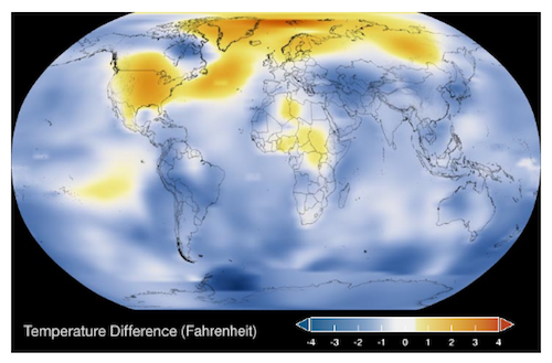
2022
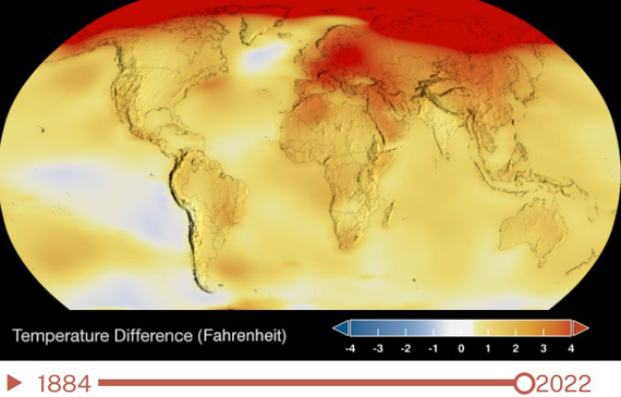
Figure 1. Global temperature maps for 1934 (top) and 2022 (bottom). Source NASA.
Science deniers pointing at 1934 as 'proof' that recent hot years are not that unusual are wrong, for several reasons. Apart from anything else, science does not set out to prove things: it presents evidence and develops hypotheses to explain things. That aside, the key sin here was the choosing of a single warm year (1934) in a single country (USA Lower 48) to make a talking-point about a phenomenon that is global in its nature and reach. That is an obvious example of the fallacy of 'cherry-picking' - waving around a single fact that supports a dubious claim and thereby ignoring the rest of the data (i.e. the rest of the world - fig. 2). It's essential to step back and look at the bigger picture at all times. Anyone failing to do that by cherry-picking out single years in single places is not behaving in a scientific manner.
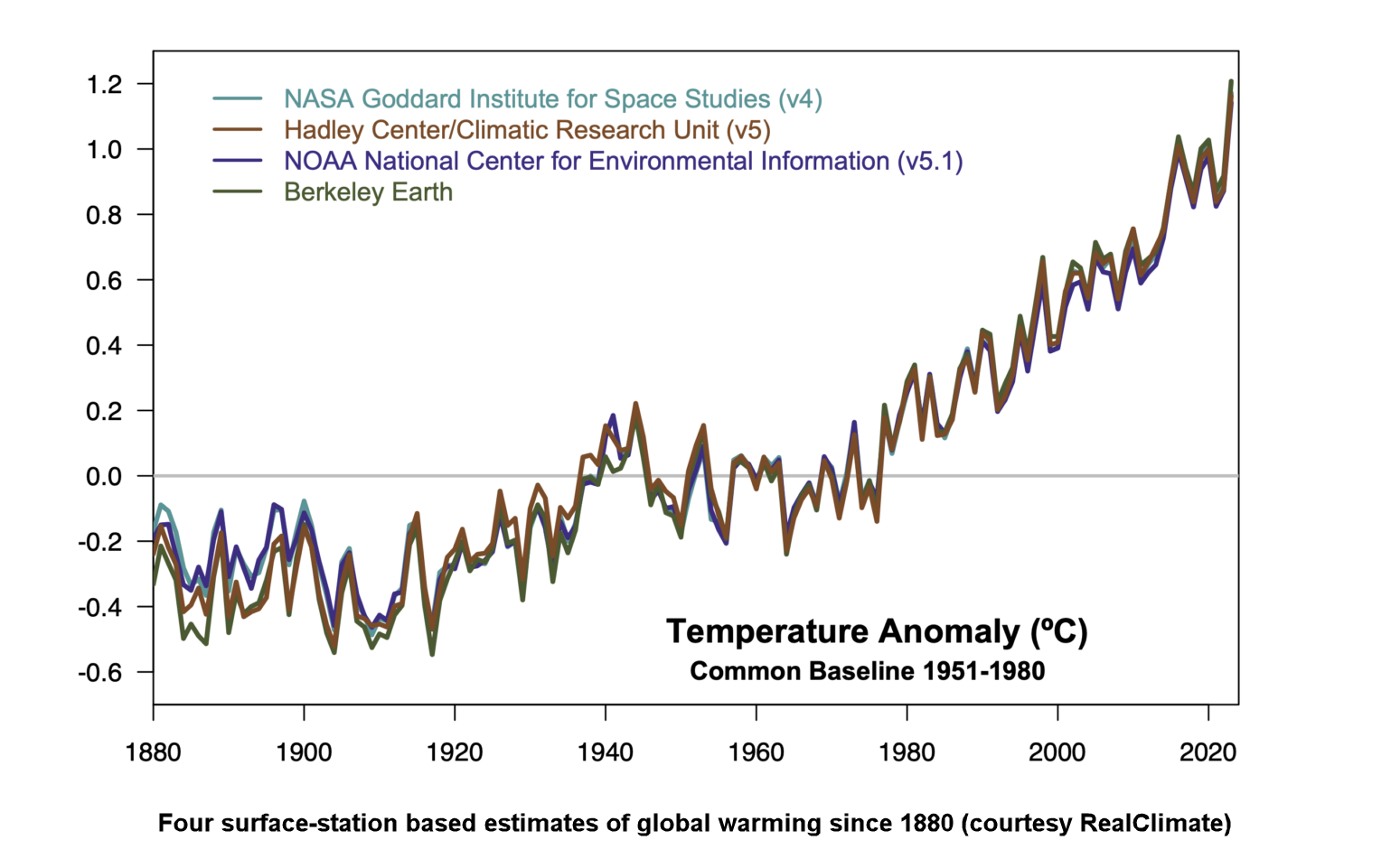
Figure 2: Multiple independent global surface temperature products show a very coherent pattern of temperature change over the 1880-2023 period. While there is overlap in the weather station inputs and ocean data, the methods for correcting for missing data, inhomogeneities, spatial sampling etc. are independent. Graphic: Realclimate.
Regional and year-to-year temperature variations will always occur. Our climate is noisy like that. The reason we are so worried about climate change is not because of a single extreme in one place on one date. It's the long-term average trend, over the entire world. That trend shows an undeniable increase in global surface temperatures and global ocean temperatures. As of the time of writing (May 2024), the years 2023, 2016, 2020 and 2019 are the hottest on record. So far.
This rapid global heating is dramatically altering the planet we live on and we don't have a spare. If there's one thing 1934 should always remind us about, though, it is the consequences of not looking after our home. That's what the history books will recall about the 1930s on the prairie-lands.
Last updated on 9 June 2024 by John Mason. View Archives


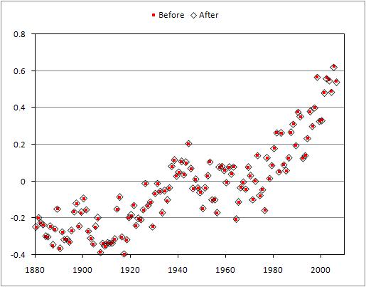
The difference between the temperature record before the Y2K correction (red dots) and after the correction (black diamonds) is insignificant anytime before 2000 and still barely noticeable after 2000. The change has had practically no detectable impact on the global warming trend over the past 30 years. As for the zero point, temperature anomaly graphs take an average over a specified period (eg - 1960 to 1990) - the temperature anomaly is the difference from this average. The period selected is arbitrary (GISS and CRU use different time periods) as the trend will be the same regardless.