Record high temperatures versus record lows
Posted on 19 November 2009 by John Cook
Since the mid 1970s, global temperatures have been warming at around 0.2°C per decade. However, weather imposes it's own dramatic ups and downs over the long term trend. So we expect to see record cold temperatures even during global warming. Nevertheless, who hasn't heard someone on a cold day mutter "what happened to global warming?!" Okay, I'll admit it, even I've been guilty of it. It's human nature to remember unusual events: record heat waves and freezing cold spells. Mentally calculating long term statistical trends doesn't come quite as easy as recalling that cold morning a few winters ago or that sweltering heat wave last summer. However, we can learn something about climate trends from those record hot and cold days.
Consider a record daily high to mean that temperatures were warmer on that day than on the same date throughout a weather station's history. As time passes, the number of record high and low temperatures will diminish. This is because as the years roll on and records accumulate, it becomes increasingly difficult to break a record. A new paper (Meehle 2009, see press release) examines the record highs and lows since 1950. Figure 1 shows the number of record high temperatures (red dots) and record low temperatures (blue dots). If temperatures weren't warming, we would expect the number of record highs and lows to be roughly equal. Instead, the highs and lows diverge over time with gradually more record highs than lows.

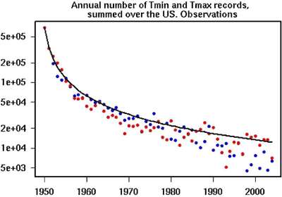
Figure 1: Annual numbers of record high maximum temperatures (red dots) and record low minimum temperatures (blue dots) averaged over the entire US region. Black line is the theoretical values assuming no global warming or cooling.
To examine this further, the ratio of record highs versus record lows were calculated for each year. Figure 2 shows the yearly ratio as black dots. The solid green line is the smoothed trend. During a period of global cooling in the 1960s, there were more record lows than highs. However, when the global warming period began in the 1970s, the ratio of highs to lows began to increase. Over the last decade, daily record high temperatures occurred twice as often as record lows.

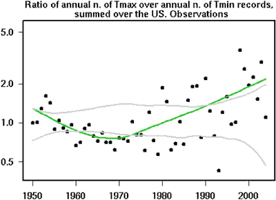
Figure 2: observations of the ratio of record highs to record lows each year (dots), solid line is a smoothed curve fit.
So we see that even during global warming, cold days are expected. However, there's a much greater chance of daily record highs instead of lows. This tendency towards hotter days is expected to increase as global warming continues into the 21st Century.

Arguments


I see Figure 1 and I first notice that the data appear to be distributed below the modeled expectation. Is there less stochasticity now (better measurements, for example), or is this just an artifact of the ln scale? Looks to be real to me.
Also, is the number of stations constant throughout the study period? In Figure 2 there seems to be more interannual variation in later years (even excluding the obvious effect of Pinatubo). Perhaps when dealing with ratios, that's expected too, since it should be relatively easy to return to 1 or even less after a really hot year in the US. Or, hmmm, actually it would be interesting to remove the effect of Pinatubo from the trend, because that one cold year might really mute record cold temperatures going into the future. Sorry for the messy comment.
Just point your father-in-law to this site--it worked for me with my father!
PS -- thanks cbrock, I just need to translate these pages. Any interest in translating your work, John? (Or maybe the common skeptic arguments are actually different ones in other languages.)
1) Global Climate stays the same.
2) Global Warming.
3) Ice Age.
It was stated years ago that...
"Nothing endures but change."
http://en.wikiquote.org/wiki/Heraclitus
If true, there are actually only two possibilities. And ironically, if we were heading for an ice age, the demand for burning wood and and fossil fuels would be on the increase.
I wrote two posts too quickly, and have messed up a blockquote here:
http://www.skepticalscience.com/An-overview-of-Greenland-ice-trends.html
post #31
and a bold text closure here:
http://www.skepticalscience.com/An-overview-of-glacier-trends.html
post #24
my very bad!
Is there any way of resetting the formatting to the default at the end of each post so that careless numpty's like me don't keep messing up the formatting?
BTW, I've tried emailing you several times with no reply. Do you no longer use the o2.co.uk email address you signed up with or are you just ignoring me?
What would be especially interesting would be to see the data on record high maxima versus record low maxima, and particularly record high minima versus record low minima.
Matt @7, do you mean you'd like to see record high daily minima and record low daily maxima? I think I agree -- let's look at nighttime and daytime temperatures separately.
Wonder if I can dig up the raw data and do that myself...
Given that temperature isn't a random system is there anything to be gained from looking for randomness. As can be seen from the graph highs and low do diverge after the 1980s to suggest warming but they also diverge in the 1960-1970 but in the opposite direction suggesting cooling for that period, statisical significance for both period would be interesting.
To add to that I wonder what happens when, following a cold snap (1970s), you look for randomness in the distribution of highs and lows? Common sense would suggest you'd see more highs.
An alternative analysis might be to analyse the data from the begining of each period (warming and cooling) to look for trends within that period although this would have the disadvantage of shorter time course.
This maybe unrelated but there is certainly a link between El Nino and Eastern Australian weather. I've got a question on El Nino. Have they been more frequent since 1980? Does this graph from Santer suggest two El Nino in the 1980's and 4 in the 1990s?
https://www.llnl.gov/str/JulAug02/gifs/Santer5.jpg
This fact was apparent in an earlier post that pointed to a link containing historical data from Greenland. It showed milder winters, with summer temperatures generally unchanged.
2) While you cannot know by the red or blue dots what extreme temperatures are behind them, this may not be important. The graph is useful and portrays what is really going on (given sound interpretation).
3) As far as father in laws, maybe it would be interesting to see a plot of belief in global warming (on a scale of 1 to 10) vs age. My sense is that younger people would tend to be more concerned, since they are more likely to be affected in their lifetimes.
My father-in-law doesn't believe in much these days RIP!
Regards,
John
Nobody has either agreed or disagreed with me regarding whether ratios or percentages are a better way to summarize the information. I'm surprised because I thought that might be the most substantive thing I've written in a while.
I have not looked into the specifics, but I was wondering if anyone has determined whether or not there has been a statistically significant shift in the probablility distribution function/s (PDF)for the min. and max. temperatures?
It is my recollection that AGW is going to manifest itself (or rather already has) in the shift of the PDF of temperatures, especially the tails, rather than each day being +2C warmer, for example, as many people tend to think.
Anyhow, a PDF analysis might be more robust and insightful than the data contained the figures here.
I think this is interesting because the expectation of "more extreme weather" that comes with AGW might be interpreted as a flattening of the density function. I would be curious to learn whether or not the data as summarized above are actually relevant to the notion that weather will become more extreme. Is there a contradiction or, if not, what is the disconnect?
http://www.env.duke.edu/people/faculty/hegerl/hegerlextremesresub.pdf
There is probably better info out there now. I found the following enlightening, though:
"daily station data are not readily comparable with daily model output." The model works on larger spatial scales and, despite what this sentence implies, longer temporal scales are also better for comparison (according to text shortly following the quotation). How poorly comparisons work will depend on how the shape of the distribution changes (can be read as how the extremes relate to the mean as the climate changes).
The abstract summarizes how the mean and extremes are expected to change: "The estimated signal-to-noise ratio for changes in extreme temperature is nearly as large as for changes in mean temperature. Both models simulate extreme precipitation changes that are stronger than the corresponding changes in mean precipitation."
I've glossed over a lot of detail here, and probably the issue deserves better investigation than I've given it. But I think a safe summary is that (1) station data don't make great comparisons to model outputs and (2) increases in extreme weather may be manifest more strongly in precipitation than in temperatures.
Yes, point values are not really/easily comparable grid tile data from models, especially AOGCMs b/c they have pretty large grid spacing (although the grid spacing is being reduced as computing power increases). This will translate into higher resolution, which will allow for better representation of ocean currents and moist convection etc..
What you say about precip may be true-- precip. is the integrator and net result of many physical processes. Unfortunately, measuring precip. accurately over long time periods even using an official gauge network is problematic. Fortunately, many national now have radar networks, and satellite microwave technology is improving, then there is TRMM of course (only to mid latitudes though). Anyhow, I am not aware of any papers out there which investigate **large-scale** trends in precip. (using the same data platform) the last 30 years. There are, of course, papers which discuss site-specific changes.
There are also lightning detection networks (proxy for convective precip.), but reliable data for N. America only goes back to 1999. I'm presently using those lightning data to explore land-atmosphere feedbacks. Very interesting.
Regarding changes in the rainfall, the IPCC update which was released today includes a couple of references to large-scale trends in precip. in the 20th century (e.g.., Zhang et al., 2007, Nature). Check it out at:
http://www.copenhagendiagnosis.com/
PS; Also try this one for lightning land use interactions.
Kilinc and Beringer 2007, J. Climate (AMS)
There are more on this topic (land use lightning).
Unfortunately I won't be able to look at it or the diagnosis any time soon (too many deadlines!).
The ratio of highs to lows over any time period is an indication of trends.