Climate Science Glossary

Term Lookup

Enter a term in the search box to find its definition.

Settings

Use the controls in the far right panel to increase or decrease the number of terms automatically displayed (or to completely turn that feature off).

Term Lookup

Settings


All IPCC definitions taken from Climate Change 2007: The Physical Science Basis. Working Group I Contribution to the Fourth Assessment Report of the Intergovernmental Panel on Climate Change, Annex I, Glossary, pp. 941-954. Cambridge University Press.

Home Arguments Software Resources Comments The Consensus Project Translations About Support

Twitter Facebook YouTube Mastodon MeWe

RSS Posts RSS Comments Email Subscribe


Climate's changed before
It's the sun
It's not bad
There is no consensus
It's cooling
Models are unreliable
Temp record is unreliable
Animals and plants can adapt
It hasn't warmed since 1998
Antarctica is gaining ice
View All Arguments...


Username
Password
New? Register here
Forgot your password?

Latest Posts

Archives

9 Months After McLean

Posted on 25 October 2011 by dana1981

In our previous post, The Day After McLean, we examined the 2011 global surface temperature prediction made by data analyst and climate "skeptic" John McLean.  McLean's prediction was rather extreme, calling for the 2011 temperature anomaly to return to (or below) 1956 levels:

"it is likely that 2011 will be the coolest year since 1956 or even earlier"

To be blunt, this was an unwise and uninformed prediction.  For example, Figure 1 shows the monthly global surface temperature anomalies (from NOAA NCDC, whose accuracy the BEST project has confirmed) for the past decade (2001-2011) and for 1956.

McLean Monthly

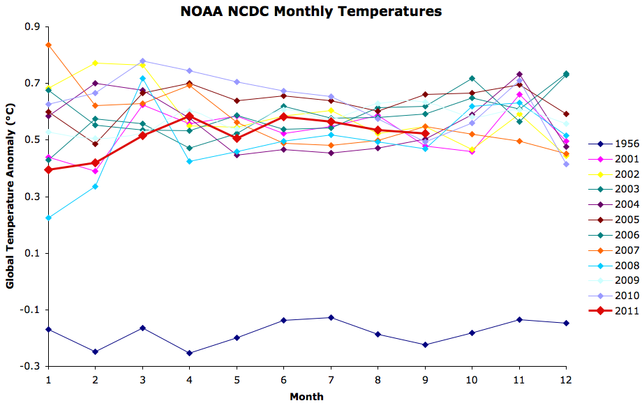
Figure 1: NOAA NCDC monthly temperature anomalies

Every single month over the past decade has been at least 0.35°C warmer than the hottest month in 1956.  And not surprisingly, every month in 2011 has been much warmer than the hottest month in 1956 as well, by 0.52 to 0.71°C through September.  The annual data tells a similar story (Figure 2).

McLean Annual

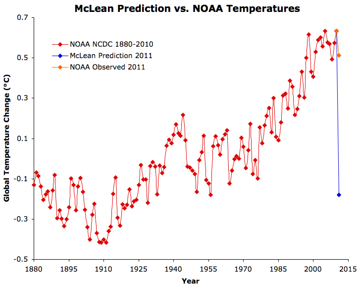
Figure 2: McLean 2011 prediction vs. NOAA annual global surface temperature anomalies, including 2011 anomaly through September.

As we discussed in The Day After McLean, average surface temperatures simply don't change from one year to the next by anywhere near the magnitude McLean predicted.  The largest year-to-year temperature change from 1880 to 2010 according to NOAA data was 0.26°C (1963 to 1964).  The average annual change was 0.078°C.  McLean has predicted a 0.81°C cooling from 2010 to 2011 - more than 10 times the average change, and more than 3 times the largest year-to-year change on record.

Standing Behind Wrongness

Halfway through 2011 the NOAA global surface temperature anomaly was 0.50°C, on track to be 0.63°C hotter than McLean had predicted.  I encountered McLean commenting on an article on the Australian website The Conversation, which publishes articles written by academics and researchers.  I confronted McLean with his prediction and the fact that the planet was not on its way to freezing over, to see if he would admit his error.  On the contrary, McLean stood behind his initial prediction:

"Last time I looked 2011 wasn't over yet. It's a bit premature of you to be crowing about an annual average when the year isn't complete."

Seeing an opportunity to cash in on his false bravado, I offered him a wager.  If McLean’s prediction were wrong by less than half a degree Celsius at the end of 2011, he would win.  If it winds up being incorrect by a least half a degree Celsius, I would win.  Given that the average global surface temperature has not changed by more than 0.26°C from one year to the next, I thought that giving him a 0.5°C margin of error was a generous offer, but alas, McLean did not respond to my offer.

Figure 3 shows an example of how temperatures in the second half of 2011 would have had to change in order for McLean's prediction to be accurate at that point, and how they will have to change over the last 3 months.

McLean failure

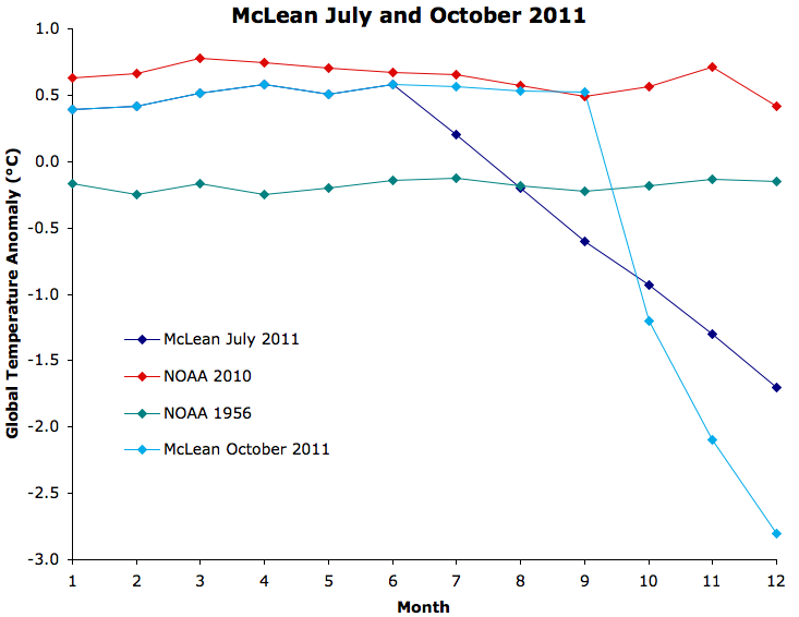
Figure 3: Example of how the average global surface temperature would have had to change in the second half and third quarter of the year for McLean's 2011 temperature prediction to become accurate.

Such a radical temperature change would literally send us towards a new ice age, and yet McLean refused to admit in July 2011 that his prediction was wrong.

Basis for McLean's Wrong Prediction

So what possessed McLean to make such a radical prediction to begin with?  The basis of the prediction was a paper we have previously examined, McLean et. al (2009).  In their paper, McLean et al. found that the El Niño Southern Oscillation (ENSO) has a large influence on global temperature variability (i.e. short-term changes), but they also slipped a conclusion into their paper which was not supported by their research:

"Overall the results suggest that the Southern Oscillation exercises a consistently dominant influence on mean global temperature"

This claim is simply incorrect, and could not be supported by their research, because the first step in the McLean et al. analysis removed any long-term trends from the original temperature data.  Thus their analysis was incapable of determining the dominant influences on long-term temperature changes.  Although Foster et. al (2010) made this point, McLean apparently continues to believe that ENSO is the dominant driver behind global temperature changes.  However, ENSO is an oceanic cycle which merely moves heat around between oceans and the surface, and thus cannot cause a long-term warming trend.

The failure of McLean’s prediction proves that the conclusion of his paper was wrong.  2011 has indeed been slightly cooler than 2010 because the former was influenced by a La Niña cycle, while the latter was influenced by an El Niño.  However the difference between 2010 and 2011 has only been 0.12°C thus far, nowhere near McLean's predicted 0.81°C, because man-made global warming hasn’t disappeared, and ENSO (and other ocean cycles) aren’t really the dominant effect on global temperatures.  They certainly have large short-term effects on temperatures on the order of a couple of tenths of a degree, but nowhere near as large as McLean seems to believe.

We contacted McLean for a comment on this post, and his only response was to say

"I'll be posting a comment on my web pages after the December data is available."

It will be interesting to see how he defends this ill-conceived prediction.

0 0

Printable Version  |  Link to this page

Comments

1  2  Next

Comments 1 to 50 out of 57:

  1. I offer up some speculation on how McLean will defend his indefensible prediction. 1. The la Nina wasn't as strong as we thought it would be and was subsided by mid-year. 2. The solar cycle really picked up. 3. A supposedly predicted volcanic eruption didn't happen. 4. Data was fudged and can't be trusted. 5. The prediction was for what the surface record would be without all the urban heat influences, siting issues, and land use changes that is responsible for much of the warming. 6. The prediction is meant to be validated against the most reliable UHA satellite record, using methodology from 1997 and before. 7. The prediction was only for parts of the tropical Pacific. 8. It was an imposter who wrote that prediction.
    0 0
  2. NewYorkJ - your speculation #1 is probably the most likely excuse. I can see McLean claiming that his prediction was wrong because La Nina wasn't as strong as he expected. It will be fascinating to see his explanation, because as the above blog post (particularly Figure 2) shows, his prediction was utterly ludicrous and completely indefensible. I don't know what he can possibly say to save face after getting a one-year prediction wrong by ~0.6°C.
    0 0
  3. He's probably hoping that one month this year will drop below the 1956 level so that he can say that he meant one point during 2011 will be colder than 1956, not that the entire year would be. Even there he is facing long odds, but it verges closer to rationality than any other explanation I can think of.
    0 0
  4. No surprise. 'Skeptics' never consider themselves to be wrong. It will be fun to ask him about his prediction on January, though. If he ever answers that, of course.
    0 0
  5. This is why scientist should not speculate.
    0 0
  6. CBD - maybe, but Figure 1 shows there's virtually zero chance of even a single month falling anywhere near 1956 levels. But I guess climate 'skepticism' is a very hopeful and optimistic mindset in general.
    0 0
  7. Hyperactive: On the contrary, real scientists make predictions about the future to show their predictive powers. Four years ago Dr. Hansen predicted that in the next three years one would set a new record high. He was proven correct in 2010 when it set a new record. That shows the his methods have skill. McLean has shown how much skill his methods have.
    0 0
  8. michael sweet, I disagree scientist should not speculate. Yes I agree they can make predictions based on current knowledge and scientific evidence but speculation, especially by sceptics, just feeds the denial PR machine. I'm pretty sure Hansen's prediction wasn't speculative but based on the vast quantity of data being generated by models. Also we were overdue a strong El Nino.
    0 0
  9. When I first read the post, it struck me that the largest annual change (a decrease) occuring between 1963 and 1964, just happened to coincide with the Mt. Agung eruption. Coincidence? (Granted, there are other large decreases that do not seem to correspond to volcanic eruptions, and large increases of simlar magnitude, too.) Re: speculation. Without speculation, scientists would never develop new research questions. Scientists speculate all the time. It's just that they should identify it as speculation, and follow it with data collection and analysis to show whether it is reasonable or not. The denial PR machine will take it out of context whenever they can, but speculation is part of life.
    0 0
  10. I cannot fathom how that 1956 prediction could emerge from any, even wildly incorrect, assumptions. I can only presume that he was looking at a regional (arctic, US?) record where 1956 is closer to present and was interpreting it as a global prediction. Or he hadn't bothered looking at a global record at all but had just plugged numbers into some SOI->global temp equation he had incorrectly derived and hadn't bothered to even question the plausibility of the result.
    0 0
  11. winding: If you remove the long-term (rising) trend from the data, then it is indeed possible that 2011 may be at or below 1956 levels. In that case, though, what you're plotting is the variation about the trend, rather than actual anomalies. But that's not what was predicted, as far as anyone can tell. Bob Loblaw: Scientists don't speculate, they hypothesise... :-D But seriously, yes, I agree, speculation is good, so long as it's followed up by investigation and analysis.
    0 0
  12. Being picky I could argue that McLean's predictions being for 'coolest year since 1956 or even earlier' means he only has to be colder than 1964 to be correct. That makes him out by about 0.45 degrees so far instead of 0.5. I can't help wondering whether he knew his prediction was absurd, and was just trying for a sensational hook to get maximum media exposure for his claims that AGW was false.
    0 0
  13. I think wingding's second hypothesis is plausible:
    "Or he hadn't bothered looking at a global record at all but had just plugged numbers into some SOI->global temp equation he had incorrectly derived and hadn't bothered to even question the plausibility of the result."
    0 0
  14. Figure 1 is startling. I'm so used to seeing monthly variations overwhelming year-on-year variations, that a comparison to 50 years ago comes as a bit of a shock.
    0 0
  15. Yeah, Figure 1 really shows that the norm now is much warmer than the norm 50 years ago.
    0 0
  16. I like excuse 9. Impersonation. Yeah, impersonation of a scientist.
    0 0
  17. Excuse me, excuse 8, and imposter. Even more so.
    0 0
  18. Excuse 9: Did I say 2011? I meant 3011!
    0 0
  19. Yikes! That's embarrassingly wrong. Arguing with your wife wrong. Beat your dog 'til it howls wrong. Mustache on the Mona Lisa wrong ... He must have been looking at last year's BP stock chart ...
    0 0
  20. So McLean's website states that he's a "computer consultant and occasional travel photographer", but no matter. He is a "climate realist" after all, and published with Bob Carter another "nail in the coffin of manmade global warming" or what not. His arguments deserve scrutiny. His website has lots of cute blurbs, some of them highly ironic. "The science simply does not add up, predictions do not match observations and the whole issue is loaded with a huge number of unproven assumptions, distortions of facts and outright lies." McLean on global warming Predictions...or...projection?
    0 0
  21. What a pity Mr McClean did not base his bet on the Central Engand Temperature Record, The longest in the wirld measured by thermometers. When it began in 1659, the average temperature for the year was 8.83 degrees Centigrade. In 2010, 351 years later, after the industrial revolution, de-forestation, a ten-fold increase in population and vast urban growth, at the end of the warmest global decade on record, the average temperature was 8.83 degrees Centigrade.
    0 0
    Response:

    [DB] "The longest in the wirld measured by thermometers"

    Which is nice, for Central England.  But not of any substantive use when working out global trends.

    Apples-n-oranges.

    But then again, the CET pretty much agrees with BEST:

    CET

    [Source]

    (Note to self: Don't ever link directly to images in the Archive)

  22. Fred Staples this is the way you look at trends: Really great, no questions.
    0 0
  23. Very nice Riccardo. BTW, do you know when the last data value occurred?
    0 0
  24. Hans @23, Not to get too distracted by the red herring introduced @21 above, but some key points: 1) McLean made his forecast for 2011, not 2010. 2) He also made it for global surface temperatures not any specific location, certainly not for Central England. 3) Regardless, the CET data for 2011 (up to 25 October) are almost +1 C above the 1961-1990 average, and contrary to what Fred says, since 1974 the data have been adjusted to allow for urban warming. 4) As Riccardo and Daniel showed, Fred needs to calculate trends properly. 5) The long-term upward trend continues. So five strikes against that red herring.
    0 0
  25. Fred Staples wrote: "When it began in 1659, the average temperature for the year was 8.83 degrees Centigrade." I'm sure there is a logical explanation for this, but... how exactly can the CET record show an 8.83 C temperature in 1659 when Anders Celsius wasn't even born until 1701? Presumably the values were converted from some other 'scale', but what? There weren't any remotely detailed / accurate temperature scales prior to Daniel Fahrenheit's in 1724. Heck, Fahrenheit also invented the modern mercury thermometer. There were devices for 'measuring' temperature before then, but they typically had only a handful (e.g. 6) of 'degrees' (not quite detailed enough to determine an 8.83 C reading) and were sensitive to barometric pressure and other non-temperature factors. What exactly is the source for this claim? Because it doesn't seem to hold up without assuming some form of time travel.
    0 0
  26. The 8.83 C figure comes from the 'Monthly_HadCET_mean.txt (1659 on)' data available here. But it has been mentioned on WUWT, which reckoned that the Met Office were trying to hide the decline, so to speak - of course, it's the usual WUWT rubbish but it's amazing what some people will accept and post on SkS...
    0 0
  27. 21, Fred Staples, 26, JMurphy, JMurphy... you are correct, but the value is a mean, so of course it can be computed to any precision. Here is the actual data from the two years in question (note that all readings in 1659 were to a precision of just one degree, as well as the anomalously cold January and December in 2010): YEAR JAN FEB MAR APR MAY JUN JUL AUG SEP OCT NOV DEC MEAN 1659 3.0 4.0 6.0 7.0 11.0 13.0 16.0 16.0 13.0 10.0 5.0 2.0 8.83 2010 1.4 2.8 6.1 8.8 10.7 15.2 17.1 15.3 13.8 10.3 5.2 -0.7 8.83 Here are the next ten years after 1659: 1660 0.0 4.0 6.0 9.0 11.0 14.0 15.0 16.0 13.0 10.0 6.0 5.0 9.08 1661 5.0 5.0 6.0 8.0 11.0 14.0 15.0 15.0 13.0 11.0 8.0 6.0 9.75 1662 5.0 6.0 6.0 8.0 11.0 15.0 15.0 15.0 13.0 11.0 6.0 3.0 9.50 1663 1.0 1.0 5.0 7.0 10.0 14.0 15.0 15.0 13.0 10.0 7.0 5.0 8.58 1664 4.0 5.0 5.0 8.0 11.0 15.0 16.0 16.0 13.0 9.0 6.0 4.0 9.33 1665 1.0 1.0 5.0 7.0 10.0 14.0 16.0 15.0 13.0 9.0 6.0 2.0 8.25 1666 4.0 5.0 6.0 8.0 11.0 15.0 18.0 17.0 14.0 11.0 6.0 3.0 9.83 1667 0.0 4.0 2.0 7.0 10.0 15.0 17.0 16.0 13.0 9.0 6.0 3.0 8.50 1668 5.0 5.0 5.0 8.0 10.0 14.0 16.0 16.0 14.0 10.0 6.0 5.0 9.50 1669 1.0 4.0 5.0 7.0 11.0 15.0 17.0 16.0 14.0 10.0 6.0 2.0 9.00 And the ten years before 2010: 2000 4.9 6.3 7.6 7.8 12.1 15.1 15.5 16.6 14.7 10.3 7.0 5.8 10.30 2001 3.2 4.4 5.2 7.7 12.6 14.3 17.2 16.8 13.4 13.3 7.5 3.6 9.93 2002 5.5 7.0 7.6 9.3 11.8 14.4 16.0 17.0 14.4 10.1 8.5 5.7 10.60 2003 4.5 3.9 7.5 9.6 12.1 16.1 17.6 18.3 14.3 9.2 8.1 4.8 10.50 2004 5.2 5.4 6.5 9.4 12.1 15.3 15.8 17.6 14.9 10.5 7.7 5.4 10.48 2005 6.0 4.3 7.2 8.9 11.4 15.5 16.9 16.2 15.2 13.1 6.2 4.4 10.44 2006 4.3 3.7 4.9 8.6 12.3 15.9 19.7 16.1 16.8 13.0 8.1 6.5 10.82 2007 7.0 5.8 7.2 11.2 11.9 15.1 15.2 15.4 13.8 10.9 7.3 4.9 10.48 2008 6.6 5.4 6.1 7.9 13.4 13.9 16.2 16.2 13.5 9.7 7.0 3.5 9.96 2009 3.0 4.1 7.0 10.0 12.1 14.8 16.1 16.6 14.2 11.6 8.7 3.1 10.11 So Fred et al succeeded in cherry picking one year of many that averages out conveniently to make a salient, yet dull and empty, point. Here is the daily updated graph from Hadley: Click on the image to link to the Hadley page, where you can download the actual data. It's a bit difficult to see the exact cherries the Fred selected as his equivalence points, particularly when they are masked by the clear and unambiguous rise in temperatures. Don't you just love "skeptics" and their games? Concerning the precision of those readings (8.83C, precisely), from Wikipedia:
    The earliest years of the series, from 1659 to October 1722 inclusive, for the most part only have monthly means given to the nearest degree or half a degree, though there is a small 'window' of 0.1 degree precision from 1699 to 1706 inclusive.
    0 0
  28. I dug around for the source of the data JMurphy identified and it comes from a 1974 analysis by a G. Manley. Apparently he estimated monthly temperatures for the region from descriptions of snowfall, wind direction, et cetera in weather diaries and some early instrumental readings. So, not (as Fred claimed) "measured by thermometers"... which seemed fairly clear given that it pre-dated the invention of accurate thermometers.
    0 0
  29. 28, CBDunkerson, To elaborate on your points, Manley's paper is available here. From that paper:
    For the first six decades to 1720 the figures are printed in italics as an indication that they must be considered less reliable, based as they are on extrapolation from the results of readings of highly imperfect instruments in uncertain exposures at a considerable distance, generally in south-east England; or on estimates based on interpretations of daily observations of wind and weather. Until June 1666 and from October 1667 to October 1668 daily observations are largely lacking. Before 1671 instrumental readings are few.
    0 0
  30. Fred Staples - What a fantastic and illustrative cherry-pick! 1659 had the same temperature as 2010, a difference of 0C Hey, look, I can do it too: 1740 had a temperature of 6.84C, while 2006 had a CET temperature of 10.82C - a difference of 3.98C! Of course, neither Fred's difference of 0C or mine of ~4C is an accurate representation of a noisy signal. Going from 1800 (reasonable accuracy on the records) to 2010 using a 30 year moving average, I get a temperature increase of ~1C in the CET values. That's a reasonable, statistically supportable estimate, based on a sufficient amount of the (noisy) data. Fred - Thank you, you have clearly demonstrated the skeptic/denier tactic of cherry-picking (and the skeptic/denier willingness to do so) for anyone reading. It's always better to show a demonstration of such tactics rather than just describing them - and you have just provided that demonstration.
    0 0
  31. Sphaerica#27: "a salient, yet dull and empty, point." Fred's is indeed a very robust result, especially when something as straightforward as a five year moving average makes it go away. Skeptics are dedicated to scientifically robust results, aren't they?
    0 0
  32. 21, Fred Staples, Let us recap the series of clearly skeptical points made by Fred et al (fill in your own definition of "skeptical" in that sentence):
    1) Longest record in the world measured by thermometers
    Except it's not. The actual measurement he quotes wasn't even a measurement at all by an instrument of any sort, but rather a guess by reading weather diaries. No thermometer involved, in spite of his implication to the contrary.
    2) 1659, 2010
    The numbers work quite well for him, but by looking at surrounding years, we find that 1659 was roughly average, with the ten year average from 1659 to 1668 being 9.11), while 2010 was anomalously low, with the the ten year average from 2001 to 2010 being a whopping 10.22.
    3) Central England
    As always, location, location, location. Central England has the marvelous attribute of being so civilized that it could include temperature readings that far back in time, which is supposed to impress us and add weight to the selection. Unfortunately, too, Central England enjoys a climate that is anomalously warm for its latitude, being heavily influenced by the Gulf Stream and warmth brought in from the tropics. More importantly, it is only one location when we're talking about the entire globe -- the most favoritest cherry pick of all for skeptics citing temperatures. But this is all far too far off topic for as much time and words as I've put into it, so my apologies. I got carried away.
    0 0
  33. Yet another "silver bullet" against AGW turns out to be a dud (or a can of Coors Light). And really, Fred Staples: you think John McLean would be better served by cherry-picking two data points from a cherry-picked regional dataset (in lieu of a global dataset) to attempt to disprove a global phenomenon? (If Fred Staples is satirizing the "skeptic"/denier position in an ironic, non-obvious way (e.g. Poe-ing the comment thread), consider me fooled.)
    0 0
  34. @ Composer99 @ 33 No, I think you pretty much have the right of it. Iams trying to turn over a new leaf and NOT deal with ALL of the softball-sized tender vittles served up by some of our visitors like Fred, thus leaving ample fancy feast for the rest of y'all. If anyone wants to partake, full portions of Fred-speak are served up on the glorious "2nd Law" thread, starting about here. Meow.
    0 0
  35. Defense number 10: But you weren't supposed to followup with my prediction. You are supposed to get distracted by the next pseudo scientist claiming global cooling for 2012.
    0 0
  36. You are, of course, quite right Composer, 33, but you can often learn much about peoples’ attitudes from their jokes. I debated seriously the CET record with Tamino on his Open World blog several years ago, when he thought he detected a rate of increase through the last decade of 0.05 degrees pa. This would have brought the closing temperature to more than 11 degrees C, a level which had never previously been reached. Needless to say, it did not happen (the trend across the decade was actually negative). The CET record is a reasonably close proxy for the Northern hemisphere, and it is useful because it runs across the little ice age. The average from 1800 to date is 9.36 degrees C. The average in the decade ending 1949 (before CO2) was 9.67 degrees C. Only the two decades ending 1999 and 2009 were higher, 10.1 and 10.36 respectively. You can see this effect in all the long-run indexes, including DB’s response, 21. Is it cherry-picking to base AGW on the last two or three decades? My comments on the G and T thread, Daniel Bailey, 34, (the second law) were also serious - an attempt to demonstrate that most of what is written about AGW is non-physical. In any energy transfer the quantity of energy will be conserved, but the quality will deteriorate (entropy will increase). That is why heat transfer is always source to sink – earth to atmosphere, atmosphere to space, never the other way round. The only plausible explanation of AGW is the “higher is colder” theory, but that and the relevant data is another story.
    0 0
    Response:

    [DB] "This would have brought the closing temperature to more than 11 degrees C, a level which had never previously been reached. Needless to say, it did not happen (the trend across the decade was actually negative)."

    Visual inspection of the temperature graphics posted above shows you wrong on this, even for just the CET.  You compund your error by conflating that into the global arena.

    "My comments on the G and T thread, Daniel Bailey, 34, (the second law) were also serious - an attempt to demonstrate that most of what is written about AGW is non-physical."

    As for the G&T/2nd Law threads, you were shown to be wrong there as well, repeatedly.  Which you again compound by repeating your unfounded errors.

    "The only plausible explanation of AGW is the “higher is colder” theory, but that and the relevant data is another story."

    Well, it's nice to see that you're at least consistent - albeit consistently wrong.  If you wish again to take up your quest, and have something new to bring to the discussion, to tilt at the windmills of the 2nd Law/G&T, take it to the appropriate thread, not here.

  37. Maybe Fred needs to follow Dikran's excellent step-by-step lesson on how the presence of a cooler body can add heat to a warmer body. Can't recall which thread it was on though? Fred, I dread to wonder how you got on debating timeseries Tamino (couldn't locate your handle there?), given the depth of your understanding shown here. The latest 30-year trendline, including the last decade, for the CET shows a slope of 0.03C p.a. in my graph. Evaluating trends over short time periods, e.g. a decade or less, is a fool's errand as you'll get the slope of the noise, not the signal, especially in a very noisy dataset like the CET. The departure that the CET moving average makes from the Northern Hemisphere moving average over the past few years, notably 2010, is large, driven in part by the anomalously cool winters that occurred locally to the CET. There are some interesting possible reasons for that (local cooling during global warmth), one idea being the loss of sea ice affecting early winter weather patterns. But using a short timeseries (last decade) and a small region (CET area) is classic cherry picking. Here's my cherry - the warmest CET anomaly... April 2011. And we didn't start emitting CO2 in 1949!
    0 0
  38. 37, skywatcher, Maybe Fred needs to stop taking his "free pass" and instead admit to cherry picking in order to warp the discussion in his favor. [Sorry, I've grown very tired of outright, outrageous denial. Coming up with something resembling a remotely decent argument is one thing. Cherry picking distortion of this sort by this point is just plain unacceptable.]
    0 0
  39. Fred @36:
    "The CET record is a reasonably close proxy for the Northern hemisphere"
    Wow, you have a very different definition of "reasonably close" than me. I wouldn't call any one geographic location a reasonably close proxy for an entire hemisphere. That's kind of whacky.
    0 0
  40. Fred Staples wrote: "The CET record is a reasonably close proxy for the Northern hemisphere". You obviously don't know that the temperatures in the U.K. are strongly buffered by the thermal inertia of the Altantic ocean due to the gulf stream and due to the prevailing wind direction being from the west. This means that Central England Temperatures are not even representative of Central European Temperatures, nevermind the Northern Hemisphere!
    0 0
  41. Fred, why would anyone take anything you say seriously when you come in with nonsensical claims about a detailed thermometer record dating back a century before the invention of thermometers capable of generating it... and then don't even admit to the mistake? Just continue on with the same ridiculous claims as if they weren't founded on pure fiction. Sorry, but you ignoring your mistakes (to preserve a fictitious belief system) does not mean that everyone else will.
    0 0
  42. The casual reader is invited to consider the absurdity of Fred's position, and to take this into account when reading any brand of denial tripe. No matter how good it looks at first, if you dig just a little, you find the man behind the curtain, telling you to ignore that man behind the curtain.
    0 0
  43. No, Skywatcher, and you won't find the CET thread either. Tamino is ruthless with errors. Speaking of which, DB, glance again. The trend from 2000 to 2009 is marginally (not significantly) negative.
    0 0
    Response:

    [DB] "No, Skywatcher, and you won't find the CET thread either. Tamino is ruthless with errors."

    Actually, I linked to the CET thread earlier in my response to you.  That post, and many more, are available from The Archives.

    And Tamino is only ruthless with those who so lack a grip on the science that they cannot even understand that they are wrong.  "Not even wrong" wrong.

    "The trend from 2000 to 2009 is marginally (not significantly) negative."

    And what of it?  That is like noting that "the air is cool today".  You yourself note that there is no significance to it.  You are simply and tediously wasting everyone's time here.  Desist.

  44. 43, Fred, Really? You're just going to continue as if nothing has happened?
    0 0
  45. Fred Staples wrote "The trend from 2000 to 2009 is marginally (not significantly) negative." This is not in the least surprising; If the magnitude of the long term trend is small compared to the variability, then one ought to expect to be able to cherry-pick short term trends with a negative slope. This is even more true of sub-regional datasets (e.g. CET) than it is for global datasets as the variability becomes larger the smaller the spatial scale you look at. This is "analysis of climate data 101". If you want to show that this is interesting, then you need to show that such an observation is unlikely assuming that warming has been taking place at the same rate as the long term trend. This basically amounts to estimating the statistical power of the test, see the discussion with Prof. Pielke on this issue.
    0 0
  46. With regards to the short-term trend (whether you refer to it as marginally cooling or a warming hiatus), a nice summary of the competing theories is summarized here: http://www.eenews.net/public/Greenwire/2011/10/25/1
    0 0
  47. Very well DB,(36) I will return to the G and T Second Law thread and present a back-radiation case for greenhouse warming, without comment. Perhaps afterwards we can revisit perpetual motion (joke again, Composer99, 33). As far as the CET/Tamino projections the thread has vanished (sadly missed) but I kept a note of the comments: Tamino, with at auto-regressive polynomial fit claimed to see a really substantial and significant trend of 0.5 degrees per centigrade towards the end of the record (2007). Dismissing my humble (but rigorous) linear regression, Tamino wrote: ““Oh My, the trend over the last ten years is 0.5 degrees per decade” I replied :” Since the previous decade finished at about 10.5 degrees, Tamino, you presumably expect this one to finish at an unprecedented 11 degree centigrade. Now that would be surprising.” The following years came in at 2008 – 9.96 and 2009 – 10.11, and the trend for the decade was not significantly different from zero.
    0 0
    Response:

    [DB] "As far as the CET/Tamino projections the thread has vanished  (sadly missed) but I kept a note of the comments"

    I, too keep track of things.  Such as the location of the supposedly-missing Central England Temperature thread.  Here are your comments on the CET thread you maintain has vanished:

    May 3, 2008
    May 8, 2008
    May 12, 2008
    May 13, 2008
    July 7, 2008
    July 8, 2008
    August 7, 2008
    August 22, 2008
    September 7, 2008
    September 9, 2008
    October 3, 2008
    November 12, 2008

    The astute reader will note both the responses to you and the posting behavior you employ.

  48. I return from the G and T thread with the suggestion that the only plausible theory of AGW, the “higher is colder” theory, might be tested against the available data. “Higher is colder” is an effect high in the troposphere whereby increasing CO2 reduces outgoing emissions to space, allowing the sun to warm the system, and shift the atmospheric lapse rate to the right. The relevant data, satellite and radio-sonde temperatures, is collected far above the complications of urban development, and in the case of satellites covers the globe. The satellite data has been collected since 1979, a date when the CO2 effect, if any , should have been well established. The Mauna Low average then was 309ppm. Before that, the available data, will all its uncertainties, shows a steady rise from the little ice age, peaking in the forties, and a slow fall thereafter to 1979, the start of the satellite era. So, global temperatures than showed no significant sign of AGW, and temperatures were somewhat below the previous peak in the forties, which were well above the Little Ice Age minimum. Over the next 19 years, in the satellite era, CO2 increased steadily to 363ppm, or by 18%. What happened to the troposphere temperatures? Nothing happened to the troposphere temperatures. The average anomaly over the period was -0.12 degrees, and the averages for the first and last five years periods were -0.10 and -0.092 respectively. The least squares trend line was 0.038 degrees C per decade, and the probability of this having been registered by chance was 49%. That takes us to 1997 without observing AGW. What happened next? The famous 1998 peak increased the annual average by half a degree, to 0.43 degrees C. The fall in 1999 reversed this increase, to – 0.05 in 1999 and -0.06 in 2000. No one, so far as I know, attributes these changes to CO2, so we arrive at year 2001 without the CO2 increases in the 20th century having made any discernible difference to troposphere temperatures. CO2 at the end of the century had reached 370ppm. Then something really strange happened. The average global temperature moved up suddenly by about 0.2 degrees, which is substantial by climate science standards. Apart from the year 2008 (when it fell back to -0.04, you see why McClean had a chance) it has stayed up from 2002 to date. That step change is entirely responsible for the positive trend in the data from 1997 to date, which is 0.139 degrees per decade, and highly significant (the calculated 5% confidence limits are 0.85 to 1.92 degrees C per decade). Are the temperatures still rising? No. Although the period this century is short you can get an idea by asking how far back we must go to see a significant trend. The answer is 17 years, to 1994. The years from 2001 are nowhere near significance. So, to sum up, the UAH evidence for any global warming trend rests on the step increase from 2000 (-0.06degrees C) through 2001 (0.11 degrees C) to 2002 (0.22 degrees C). Are we really certain that that change had anything to do with rising CO2 levels? Would you like to try to persuade the Chinese to give up their industrial revolution on that evidence? Will the American shut off their air conditioning?
    0 0
    Response:

    [DB] "Before that, the available data, will all its uncertainties, shows a steady rise from the little ice age, peaking in the forties, and a slow fall thereafter to 1979, the start of the satellite era."

    Incorrect.  For convenience, I have demarcated the point at which all the wheels fell off your logic-wagon by striking out the subsequent logical fallacy avalanche. 

    Please use the Search function (really, as a participant in this forum since 2010, you should have learned to use this valuable resource long ago) to find out more about the multiple errors in your statement I've quoted above, not to mention those in the fallacy cascade that follows.

  49. 48, Fred, Go back to the G&T thread where I have replied to you, with a link to someone who has explicitly and very clearly, step by step, taken your failed model one step further, added the missing elements and corrected the misconceptions, and arrived at the correct theoretical earth mean global surface temperature -- and he explains very clearly how he does so. After you absorb that, you can then admit that you jumped the gun, that you have failed to disprove GHG theory, and that the remainder of your discussion and points therefore require more thought and consideration, and will take you in an entirely different direction than the flawed and indefensible path that you are currently following.
    0 0
  50. Fred Staples @48 indulges in some serious misrepresentation of the temperature record which requires a serious response. He begins by characterizing "all available data" as showing "a steady rise from the little ice age, peaking in the forties". The best available data set for that period is the HadCRUT3v temperature index which commences in 1850. (BEST is land only, while GIStemp starts in 1880, making neither suitable.) The plot of HadCRUT3v below (from woodfortres.org)shows the trends from 1850 to 1910, 1910 to 1940, 1940 to 1975, and 1975 to 2010. Trends where plotted to encompass known inflection points, and to ensure that they were at least 30 years long to ensure statistical significance: Fred correctly describes the period from 1940 to 1975 (actually '79) as a slow fall. Given that, his description of the period between 1850 and 1910 as part of "a steady rise" is not only false, but shows clear bias in interpretation of the data. This fall in temperature from 1850 to the early twentieth century is a feature of almost all temperature reconstructions over the last 1000 years: Indeed, most also show a rise in temperature from the end of the Little Ice Age to a peak around 1790 which is as hot as, or hotter than 1850, before a sharp fall for the Dalton Minimum and Mount Tamora Eruption, before a further rise to 1850 (actually closer to 1865 on HadCRUT3v). The temperature record is anything but a gentle rise from the LIA to 1940. Rather, it staggers around like a drunken miner under the influence of known changes in forcings - while post 1975 it rises sharply under the influence of other known changes in forcings, primarily due to changes in Green House Gas concentrations. Fred's characterization of the period from the LIA to 1940 as "a steady rise" is, of course, an attempt to feed into the fake "skeptic" meme of a "recovery" from the LIA. That idea is nonsense as an explanation, and contradicted by the data. Turning to more recent times, Fred immediately changes his data source. If you look at my first figure, you will see why. Desperate to avoid clear evidence, Fred Cherry Picks the UAH data set, which he characterizes is containing to flat intervals separated by "step change". In other words, having cherry picked his data set, he also needs to cherry pick his intervals. He tries to go down the up elevator. Tamino has dissected similar nonsense from Bob Tisdale: (Note, Tamino's second trend is from 1999, whereas Fred cherry picks 2002 as the start date for his second trend. That does not prevent the trend from being towards increased warmth, but it does reduce it.) Given the extent of Fred's cherry picking, the obvious thing to do is to check alternative sources of data to see whether the low trend from 1979 to 1997 is just a result of short term variations. Fortunately radiosondes have taken temperature series from approximately the same altitude that is measured by the TLT "satellite" channel: Clearly the rise in temperatures around 1981-3 is just a short term fluctuation, and the long term trend from the mid 1970's to 1997 is rising. In addition to his explicit cherry picking, Fred is highly dependent on the truncated nature of the satellite record to make his case. Finally, we are frequently told that posting here is a privilege, not a right. Abusing data as Fred does shows his clear intent to abuse that privilege.
    0 0
    Response:

    [DB] Fixed html hash tag.

1  2  Next

You need to be logged in to post a comment. Login via the left margin or if you're new, register here.


The Consensus Project Website

THE ESCALATOR

(free to republish)


© Copyright 2024 John Cook
Home | Translations | About Us | Privacy | Contact Us