Climate half-truths turn out to be whole lies
Posted on 28 June 2011 by John Cook
The Age have published an opinion piece I wrote in response to Bob Carter's An Inconvenient Fallacy. My response is Half the truth on emissions and explores how Carter uses half-truths and cherry picked data to mislead and distort climate science. I also included a graph that wasn't included in the article (either due to space or because it was just too geeky for a broadsheet). So I've included an excerpt plus the graph below:
To understand what's happening to the global climate, we need to look at temperature change over the entire planet. Two scientific teams - NASA Goddard Institute for Space Studies and the European Centre for Medium Range Weather Forecast - have constructed temperature records spanning the whole globe. Both find consistent results, using independent methods, with the two hottest years on record being 2010 and 2005. Both find the Arctic is warming faster than the rest of the planet, with melting sea ice acting as a positive feedback that amplifies the warming.
Enter Bob Carter and his deliberate brand of climate cherry-picking and false, but plausible, assertions. He has long hung his hat on the proposition the climate has been cooling since 1998. But with 2005 and 2010 being the hottest years on record, he resorts to cherry-picking which dataset to use. Rather than use temperature records that cover the entire globe, he opts for datasets that do not include the Arctic region, where warming is the strongest. These temperature records underestimate recent warming and are the darling of those who wish to deny global warming is happening.
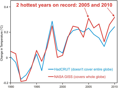
Note: I've added the NASA comparison to HadCRUT graph to our ever growing list of Climate Graphics so a high-rez version, freely available under a Creative Commons licence, is now available for those not afraid to use geeky graphs.

Arguments


[DB] And yet they are STILL the hottest years on record, during a period in which the anthropogenic forcing have been the dominant attribution to the rise in global temperatures.
... and while you are at it, do a line of best fit on the entire graph and tell us all the slope and intercept. For bonus points, include the standard deviation of the slope and intercept.
Really, the whole of SkS is an 'article' and research effort; of which this post is a part of a wide range of issues in which factors, including sun-related changes, are discussed.
One might suggest that after reading the article research here, you might become skeptical.
“... a very strong El Nino ...” In 2010, too.
... what does not change the fact that the delay in climate response to external forcing (usually estimated at the range 10 - 100 years) will bring us the new records in the next decade.
(-Snip-) ...
(-Snip-).
Eg:
... a drought ... precipitation ... IPCC report : “...the net expected effect on precipitation over land is especially unclear.”
(-Snip-)?
P.S. (-Snip-)
The temperature globally and regionally, reacts with several months delay (November / December 2010) at the end of El Nino.
“... when you factor in the Deep Solar Minimum of this last decade ...”
... which of course has no significant importance against: “... delay in climate response to external forcing (usually estimated at the range 10 - 100 years) ...”; and the fact that: “ If one computes the global and annual mean of solar forcing caused by the 100 kyr period of eccentricity one gets an amplitude of 0.12Wm~2 in the spherical mean. ", “But, despite the tiny global forcing value... ...The global mean temperature changes between glacial and interglacial periods are large: about 20C for polar (Johnsen et al., 1995) and 5 for tropical regions (Stute et al., 1995).” (Beer et al., 2000.).
Well ... partly the same thing ..., but in that case we can easily compare the 1998 - when there was (temperature) a more quickly decline - from 2010 - but remember that the temperature was far lower base in 1996.
I agree with you that now we can not otherwise explain the current temperature increase as the increase of GHG's in the atmosphere ...,
... but do not because, that - NOAA - “ Our understanding of the indirect effects of changes in solar output and feedbacks in the climate system is minimal ” ?
This really, so we do not know the functionality of:
„the near-centennial delay in climate in responding to sunspots indicates that the Sun's influence on climate arising from the current episode of high sunspot numbers ...”
Perhaps it is: “The observed variations may have occurred in association with internal climate amplification (likely, thermohaline circulation and El Niño–Southern Oscillation activity).”, but ..., there is, however, "hard" evidence.
Helama et al., 2010. - This is not "cherry picking" - I could cite at least dozens similar papers ...
P.S. Milankovic cycles is not present changes - consent - which does not affect the fact that changes in TSI were (probably) very small.
and here is the accompanying article.
"The Climategate files have demonstrated the scientific malfeasance of an influential and internationally well networked segment of the climate research community. A small group of scientists and computer modellers - with the aid of an enormous supporting cast of environmental activists and organisations, self-interested business groups, and crusading journalists - have managed to turn the global warming issue (which in 1990 was an entirely sensible matter to have raised) into the scientific scam of the century, if not the biggest ever."
Carter's "Kill the IPCC" article
So, Carter claims the people at HadCRUT are guilty of "scientific malfeasance" and "the scientific scam of the century"... and therefor he holds their results above all others?
Are we sure he knows what 'scientific malfeasance' means? Cuz... that'd be it.
"Are we sure he knows what 'scientific malfeasance' means? Cuz... that'd be it."
No. That is 'journalistic malfeasance' iz what that'd be.
not much science to be had there.
On an annual basis, all the indices were above their long-term trend lines. On a monthly basis, CRU fell below its long-term trendline in Dec. - likely start of the La Nina impact on temperatures, and has been below the long term average for 4 of the last 5 months (through April, 2011).
Yes, CRU does not cover the Arctic. On the flip side, its dataset is more consistent over the measurement period. The differences are not great. In the long run, which of these years, 1998, 2005, or 2010, is the hottest, will get lost in the noise.
National Security Implication, Climate Denial: Climate half-truths turn out to be whole lies
The warming for most is very present in the arctic. Might make this point as well.
The warming of the Arctic, due to climate change, has been twice as high as the world average since 1980. Surface air temperatures in the Arctic since 2005 have been higher than for any five‐ year period since measurements began around 1880. Arctic summer temperatures have been higher in the past few decades than at any time in the past 2000 years. Link
Summer snowfall decreases in Arctic because it changes to rain AGWObserver
National Security Implications: Key climate denier funded by big #oil, #coal for decade, plotted to take down #IPCC
Arctic warming was amplified in the early part of the 20th century also.
http://www.joelschwartz.com/pdfs/Chylek.pdf
http://polarmet.osu.edu/PolarMet/PMGFulldocs/box_yang_jc_2009.pdf
I was proceeding from the hypothetical that Carter believed his claims about the CRU were true... in such a case he'd be using data he 'knew' to be fraudulent to advance an argument about recent warming.
Stepping away from the hypothetical... yes objectively both of Carter's articles were clearly examples of journalistic malfeasance (i.e. reporting things which are obviously false).
It's just that if we 'give him the benefit of the doubt', that he believed what he wrote in the 'Kill the IPCC' article, then in the 'An Inconvenient Fallacy' article he deliberately based his 'scientific' argument on 'faked' data.
Sure
My post was a glib 'throwaway' but what I've been contemplating is the relation between Carter's behaviour and that analysed in the chapter referred to in this post.
The chart more accurately would be labeled:
CRU - doesn't extrapolate over large unmeasured areas such as the Arctic, Antarctica, and Africa.
GISS - extrapolates observations as distant as 1200 kilometers.
This extrapolation probably doesn't matter much in the longer term, though in the shorter term ( a few decades ), the large smoothing radius of extrapolation tends to exaggerate whatever anomalous trend exists at the periphery of the large unmeasured areas.
For example, in the early twentieth century warming, the GISS trend was less than the CRU trend by about the same amount that the recent GISS trend exceeds the CRU trend.
Why do you post a chart that does not represent measurement?
As long as you show no inclination at all to seriously assess the model fitting of the mainstream hypotheses you won't accept, it's really hard to consider your work of scientific merit. Yes, all kinds of alternative hypotheses might be true. No, Occam's razor prohibits the neglect or rejection of simple, well-fitting explanations.
@ClimateWatcher, 33:
I suggest you judge Taminos analyses by their content. (And if you are not compentent to do that, it might be good for you to attain that competence.) Also, rather than looking for publications, you would do yourself good to compare Tamino's analyses and results with peer reviewed papers on the same subjects.
Not sure I really wanted another reminder about WAIS.
Andrew Montford over at "Bishops Hill Blog" has posted a very weak cherry picked fact free ad hom reply here:- http://www.bishop-hill.net/blog/2011/6/28/thou-shalt-extrapolate.html
Thank you, very much.
Off the top of my head, there's this.
Which one do you think is more useful in understanding system under study?You may have overlooked my very brief post @20, which links a peer-reviewed publication showing that the same method over a much longer time frame gives a good reconstruction of the temperature record using the smoothly increasing GHG forcing instead of a linear term. And consequently, if you subtract out the solar variation, El Nino and volcanoes, what is left is a steady increasing function of time.
But the calculation is simple enough to do in a spreadsheet, and the data is all publically available. Try it for yourself.
[DB] And don't forget the copious quantities of human-caused global warming.
http://academic.research.microsoft.com/Publication/4061423
[DB] Pretty dated info there, Eric (data stops at 1997). Surely you can find something more contemporaneous than that?
BTW, full copy is here.
What you don't state is the reason why the correlation distance is lower in summer - it's because the energy present is being used to melt ice, and so high land temperatures means more rapid sea ice melt. The summer correlation coefficients will increase once all the arctic ice has melted...
The correlation may increase at that point. The question is whether they are valid now. As I stated previously, the correlation is poor during the summer. How accurate is the GISS extrapolation out to 1200 km, when the maximum summer correlation is only 500 km?
If stations are being extrapolated over too large a radius, then working with a subset of the data should make things much worse. So take something like clear climate code and throw out a lot of the stations. In fact they did exactly that here, throwing out all but 440 stations. It's noisier, but shows the same basic shape.
Nick Stokes goes further with TempLS and produces a global land and ocean reconstruction from only 60 land stations, chosen only on the basis of geographical distribution and longevity, by introducing a proper Vorenhoi area weighting term (compare GISS vs TempLS60):
Maybe I've overlooked something, but I don't at the moment see how you can get that good an agreement if the temperature record is being biased by poor sampling and over-extrapolation.
The difference between GISS and CRU is not that great. In fact, the trend since 1880 for both is ~0.6C / century. In your plot, CRU has a higher slope than GISS. The shapes are the same, and the overall statistics are similar, but show slight variations during specific timeframes due to data analysis.
The CRU curve is CRUTEMP, not HADCRUT. i.e. it is a land only index.
The GISS curve is GISTEMP - a land-ocean index.
The TempLS60 curve is based only on 60 land stations, but with those stations carefully selected to optimally cover the globe, and weighted according to the area of the globe (land and sea) closer to that station than to any other.
The point Nick was making with this figure, which I failed to pass on, was not just that he had a credible approximation to GISTEMP from just 60 stations, but that by weighting the land stations according to land-and-ocean coverage his land temperature record was closer to the GISTEMP land-ocean index than to a pure land index. So he's covering 3x the area with ~1% of the stations. (Admittedly they are carefully chosen stations, but they are chosen on the basis of coverage, not on the basis of value.)
That's a pretty startling result for several reasons.