


 Arguments


Of Averages & Anomalies - Part 2A. Why Surface Temperature records are more robust than we think
Posted on 4 June 2011 by Glenn Tamblyn
In Part 1A and Part 1B we looked at how surface temperature trends are calculated, the importance of using Temperature Anomalies as your starting point before doing any averaging and why this can make our temperature record more robust.
In this Part 2A and a later Part 2B we will look at a number of the claims made about ‘problems’ in the record and how misperceptions about how the record is calculated can lead us to think that it is more fragile than it actually is. This should also be read in conjunction with earlier posts here at SkS on the evidence here, here & here that these ‘problems’ don’t have much impact. In this post I will focus on why they don’t have much impact.
If you hear a statement such as ‘They have dropped stations from cold locations so the result is now give a false warming bias’ and your first reaction is, yes, that would have that effect, then please, if you haven’t done so already, go and read Part 1A and Part 1B then come back here and continue.
Part 2A focuses on issues of broader station location. Part 2B will focus on issues related to the immediate station locale.
Now to the issues. What are the possible problems?
Urban Heat Island Effect
This is the first possible issue we will consider. The Urban Heat Island Effect (UHI) is a real phenomenon. In built-up urban areas the concentration of heat storing materials in buildings, roads, etc. such as concrete, bitumen, bricks and so on, and heat sources such as heaters, air-conditioners, lighting, cars, etc. all combine to produce a local ‘heat island’: a region where temperatures tend to be warmer than the surrounding rural land. This is well-known and you can even see its effects just looking at reports of daily temperatures. If we have weather stations inside such a heat island they will record higher temperatures than they would if they were in the surrounding country side. If we don’t make some sort of compensation for this then this could be a real source of bias in our result, and since we never see ‘cool islands’, its bias would be towards warming.
This is why the major temperature records include some method for compensating for it, either by applying a compensating adjustment to the broad result they calculate, or by trying to identify stations that have such an issue and adjusting them. GISTemp for example seeks to identify such urban stations and then adjust them so that the urban station’s long-term trend is brought into line with adjacent rural stations. There is also the question of identifying which stations are ‘urban’. Previous methods relied on records of how stations were classified, but this can change over time as cities grow out into the country, for example. GISTemp recently started using satellite observations of lights at night to identify urban regions – more light means more urban.
What other factors might limit or exaggerate the impact a heat island might have?
Is the UHI effect at the station growing, changing over time? Has the UHI effect in a city got steadily warmer, or has the area that is affected by the heat island expanded but the magnitude of the effect hasn’t changed. This will depend on things like how the density of the city changes, what sort of activities happen where, etc. For a station that has always been inside a city, say an inner city university, it will only be affected if the magnitude of the heat island effect increases. If the UHI at a site stays constant, then that isn't a bias to the trend.
On the other hand, a previously rural station that has been engulfed by an expanding city will most definitely feel some warming and will show a trend during the period of its engulfing, although again how much will depend on circumstances. And this will look like a trend. If it has been engulfed by low density suburbia and its piece of ‘country’ has been preserved as a large park around it, the impact will be lower than if a complete satellite city has sprung up around it and it is on the pavement next to a 6 lane expressway.
But remember, the existing products include a compensation to try and remove UHI, UHI only impacts our long term temperature results if the magnitude of the effect is growing, and each station’s data still has to be added to the results for all other stations using Area Weighted Averaging. And since the vast majority of the Earths land area isn’t urban, UHI can only have a limited impact on the final result anyway. And the Oceans aren’t affected by UHI and they are 70% of the Earth's surface.
Airports
One particular example sometimes cited is the number of stations located at airports, with images being painted of ‘all those hot jet exhausts’ distorting the results. Firstly we are interested in daily average temperatures not instantaneous values. So the station would need to get hit by a lot of jets.
Think about a medium-sized airport. At its busiest it might have one aircraft movement (take off or landing) per minute. Each takeoff involves less than a minute at full power while the rest of the take off and landing, 10 minutes or so of taxiing, is at relatively low power. For the rest of the one to several hours that the aircraft is on the ground, its engines are off. So for each jet at the airport, its average power output over its entire stay there is a very tiny percentage of its full power. And many airports have night-time curfews when no aircraft are flying. So how much do the jets contribute to any bias?
Consider instead that the airport is like a mini-city – buildings and lots of concrete and bitumen tarmac. But also lots of grassed land in between. So the real impact of an airport on any station located there will be more like a mini-UHI effect. But how much does an airport grow? Usually they have a fixed area of land set aside for them. The number of runways and taxiways doesn’t change much. And the area of apron around the terminal buildings doesn’t change that much over time. So the magnitude of this UHI effect is unlikely to change greatly over time unless the airport is growing rapidly.
If an airport is located in a rural area then any changes to the climate in the airport is going to be moderated by effects from surrounding countryside since it after all a mini-city not a city. If an airport has always been inside an urban area such a Le Guardia in New York then it is going to be adjusted for by the UHI compensations described above. And a rural airport that has been enveloped by its city will eventually have a UHI compensation applied. So the airports that are most likely to have a significant impact need to be and remain rural, be so big that moderating effects from the surrounding countryside don’t have much effect, and be expanding so that their bias keeps growing and thus isn’t compensated out by the analysis method. Then they need to dominate the temperature record for large areas, with few other adjacent stations. And then there are no airports on the oceans. So any airport that is likely to have an impact needs to be near a large growing city to generate the large and increasing traffic volumes to cause the airport to be large and growing, in a region that is sparsely populated otherwise so there are few other stations. And most large growing cities tend to be near other such cities.
Islands
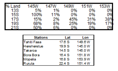
There is one special case sometimes cited in relation to GISTemp: islands. If the only station on an island in the ocean is at an airport or has ‘problems’, that islands data will then supposedly be used for the temperature of the ocean up to 1200 km away in all directions, extending any problems over a large area. This claim is missing one key point: the temperature series used to determine global warming trends is the combined Land and Ocean series. And when land data isn’t available such as around an island, ocean data is substituted instead.
This is some data from a patch of ocean in the South Pacific (OK, it's from around Tahiti, I’m a sucker for exotic locations). I calculated this by using GISTemp to calculate temperature anomalies for grids around the world for 1900 to 2010, using consecutively land only data, ocean only data and combined land & ocean data. I then calculated from the three values obtained from each grid point the percentage contribution to the combined land/ocean data of each of the two sources. The following graph shows the percentage contribution of the land data at each grid point. And for reference below I have listed the temperature stations in the area with their Lat/Long. Obviously this isn’t coming just from land only data and in grids too far from land the % contribution of land data falls to zero. Each 2º by 2º grid is approximately 200 x 200 km, much less than the 1200km averaging radius used by GISTemp.
There aren’t enough stations
A common criticism is that there aren’t enough temperature stations to produce a good quality temperature record. A related criticism is that the number of stations being used in the analysis has dropped off in recent decades and that this might be distorting the result. On the Internet comments such as ‘Do you know how many stations they have in California?’ – By implication not enough – are not uncommon. This seems to reflect a common misperception that you need large numbers of stations to adequately capture the temperature signal with all its local variability.
However, as I discussed in Part 1A, the combination of calculating based on Anomalies and the climatological concept of Teleconnection means that we need far fewer stations than most people realise to capture the long-term temperature signal. If this isn’t clear, perhaps re-read Part 1A.
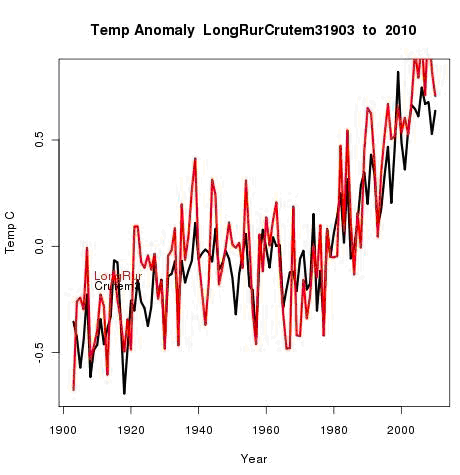
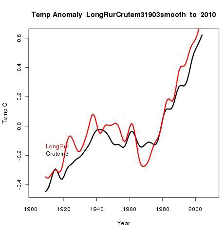
So how few stations do we need to still get an adequate result? Nick Stokes ran an interesting analysis using just 61 stations with long reporting histories from around the world. His results, plotting his curve against CruTEM3, although obviously much noisier than the data from the full global temperature still produced a recognisably similar temperature curve even with just 61 stations worldwide!
So even a handful of stations get you quite close. What reducing station numbers does is diminish the smoothing effect that lots of stations gives. But the underlying trend remains quite robust even with far fewer stations. What is perhaps more important is if the reduction in station numbers reduces ‘station coverage’ – the percentage of the land surface with at least one station within ‘x’ kilometres of that location. But as we discussed in Part 1A, Teleconnection means that ‘x’ can be surprisingly large and still give meaningful results. And with Anomaly based calculations, the absolute temperature at the station isn’t relevant; it is the long term change in the station we are working with.
The Thermometers are Marching!
A related criticism is that the decline in used station count has disproportionately removed stations from colder climates and thus introduced a false warming bias to the record. This has been labelled "The March of the Thermometers". With the secondary ‘conspiracy theory’ type claim that this is intentional, all part of the ‘fudging’ of the data. This can seem intuitively reasonable – surely if you remove cold data from your calculations the result will look warmer. And if that is the result then, hey, that could be deliberate.
But the apparent reasonableness of this idea rests on a mathematical misconception which we discussed in detail in Part 1A. If we average together the absolute temperatures from all the sites then most certainly removing colder stations would produce a warm bias. Which is one of the most important reasons why it isn’t done that way! Using that approach (what I called the Anomaly of Averages method) would produce a very unstable, unreliable temperature record indeed.
Instead what is done is to calculate the Anomaly for each station relative to its own history then average these anomalies (what I called the Average of Anomalies method).
Since we are interested in how much each station has changed compared to itself, removing a cold station will not cause a warming bias. Removing a cooling station would! The hottest station in the world could still be a cooling station if its long term average was dropping. 50 °C down to 49 °C is still cooling. Removing that station would add a warming bias. However, removing a station whose average has gone from -5 °C up to -4 °C would add a cooling bias since you have removed a warming station.
We are averaging the changes in the stations, not their absolute values. And remember that Teleconnection means that stations relatively close to each other tend to have climates that follow each other. So removing one station won’t have much effect if ‘adjacent’ stations are showing similar long term changes. So for station removals to add a definite warming bias we would need to remove stations that have or are showing less warming, remove other adjacent stations that might be doing the same, but leave any stations that are showing more warming. If this station removal was happening randomly, there is no reason to think that any effect from this would be anything other than random, not a bias.
If this were part of some ‘wicked scheme’, then the schemers would need to carefully analyse all the world's stations, look for the patterns of warming so they could cherry-pick the stations that would have the best impact for their scheme, and then ‘arrange’ for those station to become ‘unavailable’ from the supplier countries, while leaving the stations that support their scheme in place. And why would anyone want to remove stations in the Canadian Arctic for example as part of their ‘scheme’? Some of the highest rates of warming in the world is happening up there. Why remove them to make the warming look higher? Maybe someone is scheming. I’ll let you think about how likely that is.
But what if the pattern of station removals is driven by other factors – physical accessibility of the stations, operating budgets to keep them running etc.? Wouldn’t the stations more likely to be dropped be the ones in remote, difficult to reach, and thus expensive locations? Like mountains, arctic regions, poorer countries? Which are substantially where the ‘biasing’ stations are alleged to have disappeared from. If you drop ‘difficult’ stations you are very likely to remove Arctic and Mountain stations.
Could it also be that the people responsible for the ongoing temperature record realise that you don’t need that many stations for a reliable result and thus aren’t concerned about the decline in station numbers – why keep using stations that aren’t needed if they are harder to work with?
For example, here are the stats on stations used by GISTemp. The number of stations rose during the 60's and dropped of during the 90’s but percentage coverage of the land surface only dropped off slightly. Where coverage is concerned, its not quantity that counts but quality.
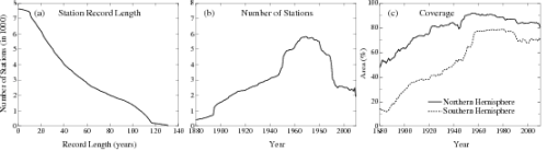
Station coverage from GISTemp
GISTemp 'extrapolates' 1200 kilometers
One particular criticism made of the GISTemp method is that 'they use temporatures from 1200 km away' usually spoken with a tome of incredulity and some suggestion that this number was plucked out of thin air.
 As explained in Part 1A and Part 1B, the 1200 km area weighting scheme used by GISTemp is based on the known and observed phenomena of Teleconnection; that climates are connected over surprisingly long distances. The 1200 km range used by GISTemp was determined emprically to give the best balance between correlation between stations and area of coverage.
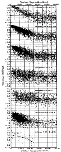
Figure 3, from Hansen & Lebedeff 1987 (apologies for the poor quality, this is an older paper) plots the correlation coefficients versus separation for the annual mean temperature changes between randomly selected pairs of stations with at least 50 common years in their records. Each dot represents one station pair. They are plotted according to latitude zones: 64.2-90N, 44.4-64.2N, 23.6-44.4N, 0-23.6N, 0-23,6S, 23.6-44.4S, 44.4-64.2S.
When multiple stations are located within 1200 km of the centre of a grid point, the value calculated is the weighted average of their individual anomolies. A station 10 km from the centre has 100 times the weighting of a station 1000 km from the centre. And as discussed under the section on islands previously, for small islands, the ocean data predominates not the land data.
One area of some contention is temperatures in the Arctic Ocean. Unlike the Antarctic, the Arctic does not have temperature stations out on the ice. So the neasest temperature stations are on the coast around the Arctic Ocean, Greenland and some islands. And ocean temperature data can't be used instead since this is not available for the Arctic Ocean.
Other temperature products don't calulate a result for theArctic Ocean. The result is that when compiling the Global trend, the headline figure most people are interested in, this method effectively assumes that the Arctic Ocean is warming at the same rate as the global average. Yet we know the land around then Arctic is warming faster than the global average so it seems unreasonable to suggest that the ocean isn't, Satellite temperature measurements up to 82.5 N support this as does the decline of Arctic sea ice here, here & here.
So it seems reasonable that the Arctic Ocean would be warming at a rate comparable to the land. Since the GISTemp method is based on empirical data regarding teleconnection, projecting this out seems to me the better option since we know the alternative method will produce an underestimate. Many parts of the Arctic Ocean are significantly less than 1200 km from land, with the main region where this isn't the case being between Alaska & East Siberia and the North Pole.
Certainly the implied suggestion that GISTemp's estimates of Arctic Ocean anomalies are false isn't justified. It may not be perfect but it is better than any of the alternatives.
In this post we have looked at some of the reasons why the temperature trend may be more robust with respect to factors affecting the broader region in which stations are located than might seem the case. The method used to calculate temperature trends does seem to provide good protection against these kinds of problems
In Part 2B we will continue, looking at issues very local to a station and why these aren't as serious as many might think...


[DB] What is the paternity of your furnished graphic?
[Dikran Marsupial] IIRC the projections have temperatures rising at an increasing rate, so an increase of 0.14 to 0.17 K/decade at the present time is perfectly consistent with a projected rise of 1.8 K/century. I suspect the projections have temperatures rising faster than 0.18K/decade towards the end of the century.[DB] Digging a little deeper gives an answer to that:
DMI presents us a tool; like any tool, it can be put to purposes other than intended. Like a direct comparison to GISS...
And around 96 to the present:
It's not entirely clear what to use for an offset (I used 0.25), but obviously GISS ran colder in the early 80's and/or warmer recently. Also GISS shows monthly spikes except for El Nino where UAH tends to spike above GISS.
[dana1981] I wouldn't say "unknown", necessarily. There have been several studies suggesting changes to the satellite data analysis, which would bring it more in line with what we expect as compared to the surface warming trend. Fu et al. (2004) is one, and Vinnikov & Grody (2006) was another. Tamino had a good discussion on this.