


 Arguments


DMI data on Arctic temperatures: Hide the Increase?
What the science says...
| Select a level... |
 Basic
Basic
|
 Intermediate
|
 Advanced
| ||||
| While summer maximums have showed little trend, the annual average Arctic temperature has risen sharply in recent decades. | |||||||
Climate Myth...
DMI show cooling Arctic
From DMI we learn, that Arctic 80N-90N temperatures in the melt season this year is colder than average. This was the case last year too, while earlier years in the DMI analysis period (1958-2010) hardly ever shows Arctic melt season temperatures this cold (Frank Lansner)
A recent WUWT article by Frank Lansner, August 5th 2010 has the heading “DMI polar data shows cooler Arctic temperature since 1958”. Peter Berenyi also posted a similar chart here on SkS.
If we look at the Danish Meteorological Institute (DMI) Arctic temperature records, we see that every year the Arctic Surface temperatures rise to a maximum of just above 0 degrees C in summer, before falling again to extremely cold temperatures in the long dark winters. As each summer advances, the ice surface temperature rises, until the melting point of ice is reached. At this point any further thermal energy is used to melt the ice, and the surface temperature (and the air just above it) can not increase while any significant amount of ice remains. At present there are still significant amounts of sea ice above 80 degrees North through the Summer melt season.
It is well documented that annual average Arctic air temperatures have increased over the past few decades, at a rate around twice the global average. How are these temperature records reconciled with the DMI summer data?
If we look at the entire official daily DMI data set, we can quickly see that the Summer temperatures do not vary much over the entire record (much as in the Lansner chart), but the Winter temperatures have significantly increased, visible even on this zoomed out vertical scale which includes the large seasonal variations.
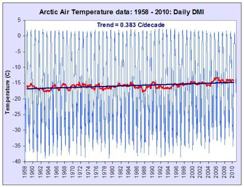
Figure 1: DMI daily temperature values, annual average and linear trend over the entire record period
Fitting a simple linear trend to the data, we see that the DMI trend over the recorded period is positive at 0.37 degrees C/decade, roughly twice the reported global average (from surface measurement data sets and satellite data), entirely in keeping with other reported Arctic temperature data from multiple sources (such as Bekryaev 2010, which gives 0.364 degrees C/decade over a similar 1958 to 2008 period).
If we look at the DMI 12 month anomaly trend (pink, offset for clarity) compared with the reported “fall” in “Melt season” temperatures (green), we see the Lansner chart in context. This chart is therefore highly misleading.
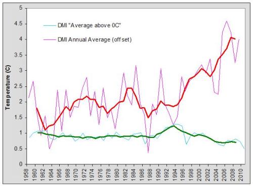
Figure 2: DMI summer melt season temperatures and annual DMI temperature anomaly as well as five year running averages
Last updated on 31 October 2010 by Peter Hogarth.


I think figure 1 gives the deniers some ammunition to work with.
bozzza, a little more argument would be helpful.
Ok, well i am making a general comment about the issue of document shock.
Many diagrams or charts only show a slight result. Some might show more but the point I am making is about getting to the guts of it otherwise the groupthink of democracy will never be convinced enough to vote for action.
This, I suppose, begets the idea of the necessity of responsible leadership.
Ah, OK: I suppose I am making the general point about document shock making people sick of reading documents properly.
Sorry,.(.. whoah is us!)
Please, stop measuring temperatures during the melt season! It's hidden, because it's latent heat . And the more ice melts the cooler the environment will be. Every kilo of melted ice cools 80 liter water with 1 degree C.
An, no Frank, melting ice does not cool the environment. No, melting ice does not cool water - unless you are adding ice to warmer water. In such a case (warm water + ice), the water will cool to zero in proportion to the amount of ice that melts (energy equivalence), and then the ice/water mix will remain at 0C. The ice.water proportions will then change depending on whether you are adding or removing energy from the mix.
In the natural environment, during the melt period, the ice/water mix is already at 0C, and adding energy causes the ice to turn to water - all at 0C. Once the ice melts, continued additions of energy will then warm the water.
...and during that period, knowing temperature is useful. In fact, it can tell you a lot about whether there is ice/snow or water or a mix.
You should seriously sit back and ponder the possibilty that people who have been studying these things for centuries actually might know a few things that you do not know.
Is the mean ocean temperature and/or mean air temperature at the e plat regions greater than the global mean (1.0-1.1 °C in the car of air temperature) or less than. I take it from this thread that it's the ice mass which determines the air temperature, rather than the other way around, acknowledging there must be a conservation of energy.
"e plate" → "polar"
"car" → "case"
Hi WEP,
The "freezing point" of salty sea water is below 0C. As luck would have it DMI "Arctic" temperature has just surpassed that temperature for the first time in 2021, and earlier than the climatology:
https://GreatWhiteCon.info/2021/06/facts-about-the-arctic-in-june-2021/#Jun-09
Note that the blue line at 0C is therefore actually above the "melting point" of ice floating in said salty Arctic sea water. Note also that air temperature above the ice won't rise very far above that line for the rest of the brief Arctic summer.