


 Arguments


Has the sun been cooling or warming in recent decades?
What the science says...
Various independent measurements of solar activity all confirm the sun has shown a slight cooling trend since 1978.
Climate Myth...
The sun is getting hotter
There is no single continuous satellite measurement of Total Solar Irradiance (TSI). Instead, the data is composited from various satellite measurements. The two most cited composites are PMOD and ACRIM. According to Nicola Scafetta, ACRIM more faithfully reproduces the observations whereas PMOD assumes the published TSI satellite data are wrong and need additional corrections. In particular, PMOD alters the data from the Nimbus7/ERB record from 1989 to 1991. Nimbus7/ERB data during such a short period show a clear upward trend while PMOD during the same period is almost constant. The alteration of the Nimbus7/ERB data is responsible for the different shape between the ACRIM and PMOD TSI composites (Shining More Light on the Solar Factor).
The ACRIM composite shows a slight increase in TSI - the PMOD composite shows a slight decrease. Regardless of which dataset you use, the trend is so slight, solar variations can at most have contributed only a fraction of the current global warming. Scafetta & West 2006 uses the ACRIM composite and finds 50% of warming since 1900 is due to solar variations. However, the warming from solar influence occured primarily in the early 20th century when the sun showed significant warming. As for the global warming trend that began around 1975, Scafetta concludes "since 1975 global warming has occurred much faster than could be reasonably expected from the sun alone."
ACRIM vs PMOD
While the argument over ACRIM vs PMOD has minimal bearing on the global warming debate, determining the more accurate TSI reconstruction is a significant piece in the climate puzzle. The major difference between the two composites is the handling of data between 1989 and 1991. There is a 2 year gap between ACRIM-I and ACRIM-II (tragically due to the Challenger space shuttle explosion). To fill the gap, both composites use the HF data but in dramatically different ways.
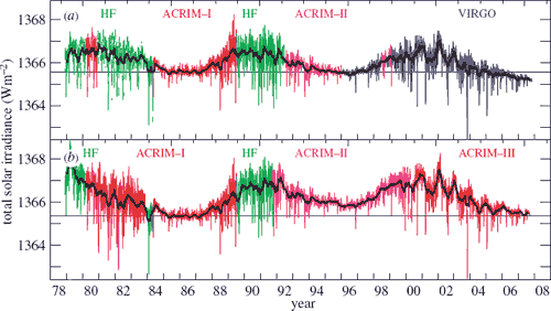
Figure 2: PMOD TSI composite (top) versus the ACRIM TSI composite (bottom). Coloured lines give the daily values with the black solid lines giving the 81 day mean.
PMOD applies corrections to the HF data, which has many sudden jumps due to changes in the orientation of the spacecraft and to switch-offs. Figure 2 demonstrates how the HF corrections are responsible for virtually all of the difference between the long-term drifts of the composites.

Figure 3: The difference between the ACRIM and PMOD composites. The grey line gives the daily values, the black line the 81 day running mean. The step in the ACRIM gap during 1989 is clearly seen and is about half the amplitude of the solar cycle variation.
Independent tests of the PMOD and ACRIM composites
So which composite correctly handled the HF data? Does TSI dramatically increase during the HF period as ACRIM supposes and the raw HF data indicates? Or did PMOD get their calibrations right when they adjusted the data to show slight solar cooling over the ACRIM gap? There are a number of independent measurements that can confirm the trend in solar activity over this period.
- Lee et al. 1995 compares the ERBS satellite data with the Nimbus HF data and found the HF data drifted significantly over the period of the ACRIM gap while the ERBS data shows a slight cooling.
- Krivova & Solanki 2003 compares TSI to UV levels. UV levels fluctuate more than TSI - a trend would be more visible. As UV correlates closely with TSI, Krivova concludes PMOD is more accurate and there has been little secular trend in TSI over the past few decades.
- A reconstruction of TSI using sunspot numbers (Krivova 2007) found the minimum of cycle 23 was lower than the minimum of cycle 22, in contrast to the ACRIM composite.
- Zurich sunspot counts during the ACRIM gap show a slight downward trend consistent with the PMOD recalibrated data.
- Ground based measurements of solar magnetograms (Wenzler et al. 2006) show higher correlation with PMOD than with ACRIM. More on magnetograms...
Scafetta & Willson and the SATIRE model
In March 2009, one study claimed the ACRIM composite was independently confirmed by the SATIRE model (Scafetta & Willson 2009). This is a model of TSI created by Krivova and Solanki. In response, Krivova and Solanki published ACRIM-gap and total solar irradiance revisited: Is there a secular trend between 1986 and 1996? (Krivova et al. 2009).
There are several versions of the SATIRE model, each developed from different data and optimised for different time scales. For periods after 1974, they calculate TSI values based on daily measurements of solar magnetograms. For longer periods going back centuries, they used sunspot numbers to reconstruct TSI. When parsing sunspot data, averages over several months must be used. Therefore, the sunspot model is significantly less accurate than the magnetogram model on short time scales.
Scafetta & Willson 2009 used the sunspot model in their analysis. By design, the sunspot model is suitable for decadal to centennial scales but significantly less accurate on time scales of months. The more appropriate model is based on daily measurements of solar magnetograms. Therefore, Krivova and Solanki take the next logical step and analyse the TSI results from the magnetogram model over the ACRIM gap. What they found was TSI does not increase over this period. Thus the SATIRE model is independent confirmation that the PMOD composite is the more accurate representation of solar activity.
To put things into perspective, the ACRIM vs PMOD debate is essentially arguing over whether the sun is showing a slight upwards trend or a slight downwards trend or if there's even a trend at all. This only underscores the sharp breakdown in correlation between sun and climate since temperatures started rising in the mid 1970's.
Last updated on 9 August 2010 by John Cook. View Archives


If the sun cooled, the effect on climate would be immediate, a drop in temperature - but it would take years to decades for the climate to eventually reach equilibrium at a stable lower temperature.
We are not observing this. There is no negative energy imbalance gradually reducing to equilibrium. Instead, we're observing a positive energy imbalance that is gradually increasing over time. We're moving further and further away from equilibrium. The increasing CO2 forcing is causing an increasing positive energy imbalance.
Got a question: have you heard of this one:
LINK
I'm sure it's rubbish; the premise is that Judith Lean, the lone solar physicist on the IPCC, had complete control over solar radiation readings. From what you've written above, this seems like tripe, but I'm not so familiar with the field to be sure.
Your comment?
[RH] Hot linked URL that was breaking page formatting
cstanyon69 @13, the chapter in question has just one out of 45 sections dealing with solar forcing. That section reads as follows:
Your linked blog post claims that Judith Lean was the only solar physicist among the lead authors of the chapter. That may well be true. There were in fact 15 Coordinating Lead authors or lead authors to the chapter. If membership in that group was coordinated based on relevant expertise by section, we would expect just 1 in 45 (or 1/3 rd of a lead author) to be solar physicists. Given the nature of the topics discussed, that means solar physicists are over represented among lead authors.
Of course, the blog is carefull to not point out that lead authors are not the only authors. In fact, in addition to the 15 Coordinating Lead Authors and lead authors, there are 37 Contributing Authors. Given an assumption of proportionality, we would therefore expect approximately 2/3rds of a Contributing Author to be a Solar Physicist. In fact, there is at least one in the form of S. K. Solanki (and may be others that I do not recognize). Apparently the existence of at least one other solar physicist was not considered worthy of mention by the author of the blog.
The author of the blog also claims the section was based primarilly on just one paper, of which Lean was a co-author. In fact 16 papers are cited, of which only two have Lean as co-authors (Lean et al, 1995; Wang et al, 2005). For both of these, they are cited in conjunction with another paper of which Lean was not an author to make the point being made - and the first of these is cited because it was previously cited in Assessement Report 3. None of Solanki's papers are cited in that section.
It should be noted that 7 other papers with Lean as a coauthor, and two with Solanki as a coauthor are also included in refferences, but if cited, are cited in other sections of the chapter.
Not content with misrepresenting or concealing the basic facts of the case, the paper also attempts to claim the sun is responsible for recent warming by trotting out the original graph from Friis-Christensen (1991), which has been resoundlingly rebutted by later work, as explained here. It also includes some slanderous personal communications that attempt to rebut the PMOD composite by ad hominen, but I'll not adress those.
The sun's heat is increased, but it is not the main factor for the increase in temperature. Even though the sun is burning, burning and spreading the sun, and the sun is expanding, it is hotter.
The world is being heated by the increase in greenhouse gases caused by the burning of fossil fuels and transportation or transportation. Why global warming does not depend on the green house effect.In spite of this, greenhouse gases have increased and global warming is due to the destruction of the ozone layer.
Chanut, the ozone hole does not cause global warming. Why did you say that?