Climate Science Glossary

Term Lookup

Enter a term in the search box to find its definition.

Settings

Use the controls in the far right panel to increase or decrease the number of terms automatically displayed (or to completely turn that feature off).

Term Lookup

Settings


All IPCC definitions taken from Climate Change 2007: The Physical Science Basis. Working Group I Contribution to the Fourth Assessment Report of the Intergovernmental Panel on Climate Change, Annex I, Glossary, pp. 941-954. Cambridge University Press.

Home Arguments Software Resources Comments The Consensus Project Translations About Support

Twitter Facebook YouTube Mastodon MeWe

RSS Posts RSS Comments Email Subscribe


Climate's changed before
It's the sun
It's not bad
There is no consensus
It's cooling
Models are unreliable
Temp record is unreliable
Animals and plants can adapt
It hasn't warmed since 1998
Antarctica is gaining ice
View All Arguments...


Username
Password
New? Register here
Forgot your password?

Latest Posts

Archives

Comparing Global Temperature Predictions

Posted on 18 October 2011 by dana1981

At this point in the Lessons from Past Climate Predictions series, we're running out of global temperature predictions to evaluate, so now may be a good time to summarize what we've seen thus far.  So let's just get right to the good stuff:

1976-2011 all predictions

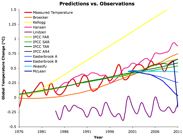
Figure 1:  Various best estimate global temperature predictions evaluated in the 'Lessons from Past Climate Predictions' series vs. GISTEMP (red).  The warmer colors are generally mainstream climate science predictions, while the cooler colors are generally "skeptic" predictions.

As you can see in Figure 1, the more mainstream climate science predictions (generally the warmer colors) have mostly done well (Kellogg in 1979 being the main exception), and the "skeptics" (generally cooler colors) have generally done rather poorly, universally predicting less warming than has been observed. 

Note that for simplicity and clarity, the figures in this post only include the best estimate predictions/projections of each paper we examined, although some included uncertainty ranges, and others didn't.  For details regarding each prediction, see the individual posts in the 'Lessons' series.

Figure 1 is a bit cluttered, but we can parse the predictions out by isolating the "skeptic" and mainstream predictions.

"Skeptic" Predictions

skeptic predictions

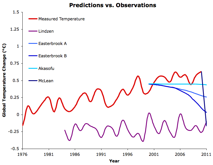
Figure 2: As in Figure 1, but just the "skeptic" predictions.

There are a few interesting things to note from these figures.  For example, we were unable to identify any "skeptic" or global cooling predictions prior to 2000 (note that the few so-called "1970s global cooling predictions" were based on aerosol emissions scenarios which did not occur, and thus are not worth evaluating).  The lone exception in Figure 2 is Lindzen's, which we reconstructed from comments he made in a 1989 MIT Tech Talk, but which is not a prediction he made himself.

Those few "skeptics" who have made predictions have not fared well thus far.  McLean's prediction that 2011 would return to 1956-level temperatures sticks out in particular - we will do a post updating the status of his prediction in the near future.  Akasofu, who predicted 0.5°C global surface temperature warming between 2000 and 2100, has thus far been the closest amongst the "skeptics".  However, his prediction completely ignores the warming due to the increased greenhouse effect, and in general fails to examine the causes of the temperature changes that he models and predicts.

Mainstream Predictions

mainstream predictions

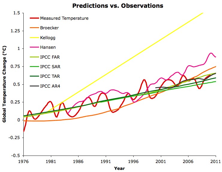
Figure 3:  As in Figure 1, but just the mainstream climate science predictions.

The global warming predictions made by mainstream climate scientists have all fared reasonably well, with the exception of Kellogg's in 1979, whose linear nature we found puzzling.  Hansen's 1988 prediction (we show his Scenario B with the observed greenhouse gas changes taken into account, as described in the Hansen Lessons post) has been somewhat high, mainly because the equilibrium climate sensitivity in the model he used was 4.2°C for doubled CO2, which is higher than today's best estimate of 3°C.  Overall, the IPCC projections have thus far been the most accurate.

It's also interesting to specifically examine the projections which applied their models to most or all of the instrumental temperature record (Figure 4).

models to 1890

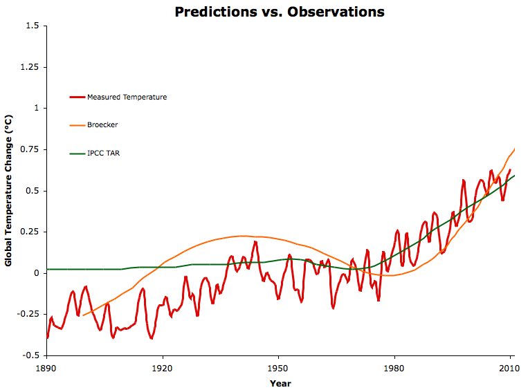
Figure 4: Broecker and IPCC TAR long-term model runs vs. GISTEMP (red).

The difference between the two models in Figure 4 is that Broecker attempted to incorporate 'natural cycles' (which he called 'Camp Century cycles', based on Greenland ice core records), whereas the IPCC TAR model only includes anthropogenic effects.  The IPCC TAR model-data comparison clearly shows that human effects had relatively little influence over the early-20th Century warming, but dominated the temperature change since the mid-20th Century.

What's in Store?

Since the IPCC projections have thus far been the most accurate, it's worthwhile to see what we have in store if their accuracy continues.  Currently we're on track with the SRES A2 emissions path, so we can consider this the 'business-as-usual' scenario. 

Skeptical Science contributor jg has done a great job putting each of the predictions and the combinations above into an animated GIF, finishing off with the AR4 future projections for Scenarios A2 and B1 (Figure 5).  Scenario B1 involves taking serious action to reduce greenhouse gas emissions.

jg gif

Figure 5 final frame: IPCC AR4 Scenario A2 multi-model average global temperature projection to 2100 (blue) and Scenario B1 (green) compared to the 'danger limit' of 2°C warming above pre-industrial levels (red).

If we continue on a business-as-usual path, the IPCC AR4 projects that we are most likely on track for 4°C warming above pre-industrial levels by 2100.  We will surpass the 'danger limit' of 2°C warming above pre-industrial levels by the mid-21st Century.  Even in Scenario B1 we pass the danger limit, but by a much smaller margin.  This is pretty strong evidence that we need to take action very soon to steer away from our current business-as-usual emissions path.

0 0

Printable Version  |  Link to this page

Comments

Comments 1 to 20:

  1. While I like the visibility of how wrong the "skeptic" predictions have been, it would be nice to see the mainstream model predictions start at the point from when they were published instead of how far back they reach in hindcast. So the first IPCC assessment's models should start at 1990, the second in 1996, etc.
    0 0
  2. Dana, you could make your hypothetical version of Lindzen's predictions look even worse if you moved them down another arbitrary 0.25C or so. Or you could use the same baseline adjustment method you used for the other lines, in which case is would be relatively close to the observed temperatures. It's really a moot point, though, since you are the one that generated the data you claim to be Lindzen's prediction.
    0 0
    Response:

    [DB] Please note that posting comments here at SkS is a privilege, not a right.  This privilege can and will be rescinded if the posting individual continues to treat adherence to the Comments Policy as optional, rather than the mandatory condition of participating in this online forum.

    Moderating this site is a tiresome chore, particularly when commentators repeatedly submit offensive or off-topic posts. We really appreciate people's cooperation in abiding by the Comments Policy, which is largely responsible for the quality of this site.
     
    Finally, please understand that moderation policies are not open for discussion.  If you find yourself incapable of abiding by these common set of rules that everyone else observes, then a change of venues is in the offing.

    Please take the time to review the policy and ensure future comments are in full compliance with it.  Thanks for your understanding and compliance in this matter.

  3. Charlie A - I would suggest looking at the Lindzen Illusion #2: Lindzen vs. Hansen - the Sleek Veneer of the 1980s, where dana1981 generated a prediction using Lindzen's numbers. Comments might be more appropriate there, with a link in this thread if desired. I will note that (IMO) your comments seem out of line, in that you appear to be accusing dana1981 of fudging the data to make Lindzen look bad.
    0 0
  4. 2, Charlie A, It would be great if so called skeptics would actually read and follow links for more detailed explanations (the relevant link is provided in the post above), rather than simply looking at the pretty pictures and jumping to unfounded conclusions (which seems to be pretty much how the skeptical mind consistently works on the subject of climate change -- it's oh so much easier to see what you want to see than to learn and consider the facts). Lindzen's proposal results in ridiculously inaccurate temperature predictions, even back to 1958, because that's how ridiculous his position is. A climate sensitivity as low as his requires that the climate be more stable than has been demonstrated in this entire century, let alone the last 30 years of AGW.
    0 0
  5. KR @3, Indeed, comments policy "No accusations of deception". CharlieA has done this before and is doing it again now. The origin of the offset is clear if one actually invests the time to read the relevant post, something CharlieA has apparently not done. Lindzen has not gone the trouble to make his own projection/s. He loves to berate his colleagues and their efforts to predict what the future holds for a doubling of CO2, but he is either incapable or not willing to make his own predictions. So one has to make a best estimate based on what information Lindzen has volunteered in terms of climate sensitivity and expected temperature change. If one does that, one obtains very little warming for doubling CO2 because Lindzen believes (or has convinced himself) that climate sensitivity is unrealistically low. The huge problem for Lindzen (and his supporters) is that his own arguments have been contradicted by observations-- in fact, his bold proclamation made at MIT in 1989 was wrong the moment he said it. Now if Charlie A has a problem with what Dana did and wants to try and defend Lindzen's refuted claims, then he (and others) can argue that on the relevant thread (link provided by KR), but without suggesting deception. But CharlieA should note the bolded caveats provided by Dana. This post very nicely demonstrates who has had the better track record when making predictions about global temperatures, and it is not the "skeptics" and those in denial about AGW.
    0 0
  6. There were several comments made by Lindzen which went into the reconstruction of what his temperature prediction might have looked like, as explained in the linked post in question.
    "The trouble is that the earlier data suggest that one is starting at what probably was an anomalous minimum near 1880. The entire record would more likely be saying that the rise is 0.1 degree plus or minus 0.3 degree....I would say, and I don't think I'm going out on a very big limb, that the data as we have it does not support a warming. Whether it contradicts it is a matter of taste...I personally feel that the likelihood over the next century of greenhouse warming reaching magnitudes comparable to natural variability seems small"
    In other words, Lindzen was both saying that the surface temperature had hardly warmed (~0.1°C) from 1880 to 1989, and that it would continue to hardly warm (~0.1°C) over the next century. The Lindzen reconstruction reflects both components.
    0 0
  7. Great post Dana. I particularly like the animation, as it makes abundantly clear just how wrong the "skeptic" predictions are.
    0 0
  8. Dana1981, please explain why Lindzen's 1989 prediction (as interpreted and generated by you) differs from measured global temperature anomaly by about 0.5C, even in the start year of the prediction. If you used the same technique to baseline(offset) your "Lindzen" data in the same way you adjusted the baselines of the IPCC projections, what would your hypothetical 1989 Lindzen prediction be in 1989?
    0 0
  9. Charlie A, please read the quote in comment #6 and the linked post. It's all explained there. Lindzen effectively predicted 0.01°C warming per decade, so if we ignore half of his incorrect comments (claiming 0.1°C warming from 1880 to 1989), he would have predicted about 0.02°C warming from 1989 to 2011, whereas GISTEMP observed about 0.4°C warming over that period. So Lindzen's would still be off by 0.38°C (in the ballpark of Easterbrook A).
    0 0
  10. Rob P - thanks, and thanks to jg for making the animation.
    0 0
  11. @#9 Dana -- you did not address the difference in how you offset the baseline for the various projections. It appears that you used a baseline of 1880 for your interpretation of Lindzen's prediction. Correct? It also appears that you have offset the IPCC projections to match more recently observed data. Correct? What would the Lindzen plot look like if you offset that data using the same adjustment procedure you used for the IPCC projection?
    0 0
    Response:

    [dana1981] I answered the question in comment #9.  It would be off by 0.38°C in 2010.

  12. Charlie @11, You are still on the wrong thread. I would suggest going to the other thread, reposting your question there and someone will answer.
    0 0
  13. Thanks for the article, Dana. And I love that animated GIF. Really tells the story. What would help, though, is to put that projected rise to 2100 in context - by, say, including the measured temps from 1900-2000 on the chart as well.
    0 0
  14. Bern, I will work on a variation of the animation that includes your suggestion. jg
    0 0
  15. How about Hansen's 1981 projections? - Unfortunately I'm not up to the task of adjusting these projections according to how emissions have actually panned out in the last 30 years, but it seems to me that Hansen did pretty well even that long ago.
    0 0
  16. Icarus#15: "Hansen's 1981 projections" Did it way back here.
    0 0
  17. 16, muon, The 2010 post to which you refer should be added to the Lessons from Predictions button search results.
    0 0
  18. muoncounter: Excellent! Many thanks.
    0 0
  19. Nice plots Icarus. It would be nice to include those data from Hansen's 1981 paper in the above figures.
    0 0
  20. Can you guys provide an update post 2016? How close is Hansen's prediction?

    0 0

You need to be logged in to post a comment. Login via the left margin or if you're new, register here.


The Consensus Project Website

THE ESCALATOR

(free to republish)


© Copyright 2024 John Cook
Home | Translations | About Us | Privacy | Contact Us