


 Arguments


The Consensus Project data visualisation - a history
Posted on 20 June 2013 by Paul D
Today we launch a new data visualisation app to display The Consensus Project data in a graphical interactive format. This is the story of how it was achieved.
A long time ago... and actually still in the past. It was a time of global upheaval...
The First Attempt
John Cook had set up a database containing the titles of thousands of climate science papers and wondered what on earth to do with it. Various projects had been developed, including a phone app and a firefox add-on allowing anyone to add or suggest new papers. It also let users view Skeptical Science myth busting information. Later Skeptical Science volunteers added more papers to the database.
Eventually it was suggested it would be a good idea to graphically represent this information so that it would be accessible to a wider audience, visually demonstrating the scientific consensus on anthropogenic global warming. How was it to be done, who was going to do it?
Foolishly I put my virtual hand up and volunteered to create something in Adobe Flash. However after some discussion and a lot of research into suitable software options, Flash was abandoned and the Raphael javascript/SVG/VML graphics library was chosen. HTML5/canvas was also an option, but at the time, some key browsers didn't support it to the degree that I was happy with.
Ideas were discussed. John Cook wanted a simple circle for each categorisation, others suggested graphs and other ideas. But I was aware that each research paper entered in the database had a year or date. So I decided to make life difficult for myself and suggested having a circle for each year and introduced the idea of some interactivity. Graphic mockups were created and everyone agreed my idea was best (well that's how I remember it).
So the real work began and I had no idea how to implement the circle packing to make the clusters of circles that I had mocked up. More research!
The examples of circle packing I found all had problems when attempting to render more than one pack of circles. So after a lot of pondering over theory and ideas, fresh circle packing code started taking shape.
After many hours of work, a lot of emails and testing, the data visualisation was ready.
The app was tested on everything to hand, including mobile devices on display in shops! It worked particularly well on Apple iPads.
Next came the grand publishing day/week. To my surprise Dana, John and others were all emailing blogs and newspapers and before long the web-o-net was alive with reviews and articles about the visualisation. They included Climate Progress, Grist, DeSmog and WCAI, a Cape Cod radio station.
The Consensus Project version
The Consensus Project created a new requirement for interactive graphics.
The new version of the data visualisation app includes a control panel allowing the selection of different data sets. The app also has the potential to display new sets of data.
Currently you can view the quantity of papers per year, the author-rated or TCP-rated papers or just view the totals for all papers and years.
Moving the slider changes the year and adds or removes circles as appropriate. The freeze button stops the animation temporarily until the slider is moved again.
As in the 'Interactive History of Climate Science' application, if you click on a circle the list of papers for that circle will be displayed. This is limited to the charts that display multiple years.
It should be noted that although the majority of papers listed have links to the original publications, in some cases it is not possible to provide a link.
There are plans for other options including additional chart types, a play button and other improvements. You can access the visualisation app by clicking on The Consensus Project menu link at the top of the page and selecting Visualization.
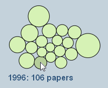
Here is a screen shot of the new datavisualisation in action:


OK, I'll bite. Nice project, but what really is the point of the exercise?
As, of course, paper don't care what you write on it.
Consensus or not, what is lacking is substantiation of the premise, that warming will be large, amplified through positive feedbacks and mostly caused by CO2.
See even here: http://www.climate.gov/. (-snip-)?
While increasing GHGs may or should, on net, warm the earth that is not the real question. The real question is, how much it will warm the earth. To date, I have not seen any “useful quantitative results” regarding that question.
Once those quantitative results are in, we can proceed to the next question: what should one do about it.
thank-you
[DB] Off-topic sloganeering snipped. See this thread for an on-topic explanation as to why your snipped statement is wrong. Lastly, review the Comments Policy of this site for an understanding of the rules of this venue.
James Madison @1, it takes a certain sort of perverseness to come to a site with hundreds of posts dealing with the questions you ask, find a post on another topic, and then ask the questions there. I suggest, in answer to your questions that:
1) CO2 is a greenhouse gas;
2) It is not saturated; and
3) Climate sensitivity is very likely to be in the IPCC range of 2-4.5 C per doubling of CO2.
Your further questions should be on those posts so that you comply with the comments policy.
Alternatively, on this topic, topic we can discuss the continuing misrepresentations by leading "skeptics" of the level of scientific agreement on AGW; which have made both the paper and this post necessary.
James Madison... Your position is internally contradictory (as well as off-topic, as Tom points out). You're ostensibly agreeing that 97% of pubished research agrees that AGW is real, and yet are saying that it's not proven. So, what is the 97% of research agreeing on?
Think of it this way: What are the chances that nearly all the published research has missed some critical element of climate that could explain everything we're ascribing to CO2? Are you really willing to bet the future on those odds?
And BTW, we can measure those elements we are ascribing to CO2. So, not only do these highly detailed measurements have to be wrong, we have to have something else that fully explains everything that CO2 explains.
Please consider that perhaps you do not yet fully comprehend the full body of reseach on this complicated issue. Those who do understand, and have spent their entire professional careers working in this field, are nearly all in agreement on the broad aspects of climate change.
Sorry for your misunderstanding Tom.
This goes directly to the Consensus Project, not to the other issues you mentioned.
1) yes, so what, I agree. what is to discuss?
2) yes, so what, I agree. what is to discuss?
3) maybe, maybe not. What is to discuss? If you look at the empirical data, it's simply not there.
As for misrepresentations or skeptics, etc., why would one waste the time? The data tells a much more objective story, now, doesn't it?
Now to revisit my question -
(-snip-)
[DB] Actually, Tom Curtis is spot-on with his assessment of you. You would do well to listen to any suggestion he takes the time to write up. Further, as others note, take the discussion of the Consensus Project to a more appropriate thread as noted (use the Search function). This thread is about the app visualization. More off-topic sloganeering snipped.
sloganeering, now there's a technical term. Got me lost on that one.
Re: James
The blog post is about the javascript app.
'The Project' in this case is the app.
If you want to discuss the data the app uses, then take your custom to another blog post.
Paul D,
whatsa "custom"?
ok, what's the purpose of the app if Post 1 is true?
James... I was paraphrasing this comment: "...what is lacking is substantiation of the premise, that warming will be large, amplified through positive feedbacks and mostly caused by CO2."
Rob,
@9, (now 8) well, if you have a large warming showing in the empirical data over say, the last twenty years, I'll take a look. We can leave out the % caused by CO2 vs amplification vs other for the moment to, you know, keep it simple. We should aask them to put this in the app. (just tryin to stay on topic, boss)
@10, looks like you've been snipped, guess it's time to move.
[DB] Yes, please stay on-topic. Literally thousands of other threads exist at this venue covering the near-entirety of climate science and the denial of it. Typo fixed.
James... The point here, as is amply shown in the graphic, as is demonstrated by Cook 2013, is that nearly every research paper being produced on the topic of climate change (which express a position) agrees that human emissions are causing warming.
This is shown through models, it's shown through empirical evidence of all kinds, and is through basic physics. It has been demonstrated nine ways to Sunday, and back again.
I will reiterate my previous point where I said, please consider that perhaps you do not yet fully comprehend the full body of reseach on this complicated issue. Those who do understand, and have spent their entire professional careers working in this field, are nearly all in agreement on the broad aspects of climate change.
James... When you make statements like this, "3) maybe, maybe not. What is to discuss? If you look at the empirical data, it's simply not there" you are clearly making a claim that is flatly untrue. You are making a statement from ignorance, and implying that the 30,000+ researchers who have done the hard work to explore the science of climate change don't know what they're doing.
James Madison persists in discussing anything but the topic of this post. The reason is transparently obvious. Where he to discuss climate sensitivity, for example, at the "climate sensitivity is low" rebuttal, and write " If you look at the empirical data, it's simply not there", readers would just scroll to the top of the page and see climate sensitivity estimates from emperical data (not models) from thirty different studies (see below). They would then know immediately that he had not read the article, or not understood it; and that his points were based on thoughtless mouthings of denier talking points rather than actual knowledge of climate science.
Not content with showing his ignorance on one topic, James Madison proceeds to show it on several. He brings up the "no warming in x years meme" (@9). In doing so, he ignores the fact that the rate of increase of GMST over the last twenty years (his chosen time period) is 0.134 +/- 0.105 C per decade, ie, more than 80% greater than the twentieth century average of 0.072 +/-0.01 C per decade (Gisstemp, determined on the SkS trend calculator). In denier speak, warming faster than the rate in the twentieth century is a "pause" in the warming.
Again, by keeping his discussion carefully of topic, Madison avoids the comparison between his talking points and the rebutals which show already that his blatherings are without substance.
Finally he flaunts the fact that he has not read the comments policy by indicating he does not know the meaning of "sloganeering", which is defined therein. And why, after all should he read the comments policy. Though posting here is a privilige conditional on compliance with that policy, he has now shown repeatedly that he has no intention of doing so.
James... If you wish to discuss the empirical evidence related to AGW you should do so on this thread.
Rob, thanks.
Rob and Tom, although we disagree, I appreciate your patience and civility.
Refreshing really.
I hope you do look around, JM< because you'll find that this site has more science-based discussion than any other site on the net -- by a long shot. When I say "science-based discussion" I mean arguments that are based on the published science, and that link directly to that science. The number of linked publications site-wide has to be approaching 10k. Several of the regular posters are published, and the site frequently gets guest posts from working scientists.
So when you post evidence-free rhetoric full of what you might think are sly insinuations, it really just comes off as sort of juvenile tough talk.
I am actually professionaly interested in how your current understanding of climate science has been developed, so I'd love it if you'd provide the evidence that led you to write the posts you've written so far. Who knows, maybe you know something that everyone here doesn't, at least where climate is concerned. I'd be willing to bet that everyone here will be more than happy to discuss any new evidence or fresh interpretations of existing studies.
Don't feed the troll.
After having fended off MD's trolls, everyone should be pleased with my perfectly on-topic question:
In 2011, when I was first looking at SkS (that's well before the consensus project) I've seen the "bouncing balls" visualisations here. The visualisation back then, was also about how many papers were "pro-global warming" vs. how many "against" and "neutral". I remember the visualisation very well (a testimony how good such visualisation is a teaching tool): the balls were grouped along the line rather than in triangle; although I don't remember the precise number nor if "pro" vs. "against" amounted to 97%. I cannot find that old visualisation anymore. looks like the consensus project visualisation superceded it.
So, this visualisation is not new. But certainly, the data is new coming from Cook 2013. Finaly the question: what is the relationship between those two? What data was the old visualisation based on and were its categories defined somewhat differently than those in Cook 2013?
chriskoz @18, click the "Interactive History of Climate Science" on the left bar (just under and to the right of the button for the "Consensus Project".
The interactive history starts with Fourier's classic in 1824, and runs through to 2012. In total, it has 266 Skeptic, 2376 Neutral, and 2493 Pro AGW papers, making the percentages 5.2% Skeptic, 46.3% Neutral, and 48.5% Pro AGW. Excluding Neutrals, that is 9.6% Skeptic, and 90.4% Pro-AGW.
From 1991-2012 inclusive, there were 252 Skeptic, 2100 Neutral, and 2355 Pro-AGW. That is 5.4% Skeptic, 44.6% Neutral, and 50% Pro-AGW, or excluding Neutrals - 9.7% Skeptic, and 90.3% Pro-AGW
On categorization, the Interactive History of Climate says:
So, it differs from the Consensus Project in that it classified based on evidentiary contribution, whereas the Consensus Project classified based on endorsement. Further, it categorized based on support of any of 174 climate myths listed at SkS, so that many of the "skeptic" papers in fact are perfectly consistent with AGW.
Chriskoz@18, yes the original had the clusters of circles in a line.
We decided to reduce the width of this app to fit the current web site layout, which meant re-arranging the positions of the clusters.
I'm working on a bar chart option in addition to the circles, although I can't say exactly when it will be available.
Tom&Paul@19-20,
Good to know the original app is up running, thanks guys. It's a very useful cross check. So, we can say that while AGW causation is 97% according to Cook 2013 poll, the validity of myth climate debunking by SkS on the left margin is 90% on average (as calculated by Tom above) according to the publications known to SkS. Well, it maybe biased, based on the SkS' choice of articles but I guess it is not. 90% is underestandably lower given the brad spectrum of myths, but still strong.
Recent comments posted by James Madison have been dleted because they were off-topic. One comment by scaddenp was also deleted for the same reason.
In the interests of keeping discussion on topic, I have answered JM here.
[TD] There's no there "here," I assume because that post is still embargoed so non-moderators can't see it yet.
Great work on the app! This will be another success similar to "The Escalator" as it shows data quickly, visually and succinctly which is very important in communicating unwieldy information to lay audiences. Very "Hans Rosling" too which is cool!
Hans Rosling - TED Talks
[RH] Fixed link that was breaking page format.
Maybe I'm the only one getting this, but scaddenp's response to James Madison is turning up as "File not found" when clicking directly on the hyperlink (at least for me) but shows up fine in the general Comments stream.
Arrgh! In my efforts to move conversation to a more suitable forum, I have commented in an unpublished article! Sorry admins. I will try to find a more suitbable place.
Reply to JM is now here.
Mods perhaps a clean up of thread with my mistake and follow ups? Very sorry about that. And perhaps move RH comment as well?
The consensus project is good work. Just a couple of comments - late to this post.
(1) I'm not sure everyone loves interactive or animated graphics. Many people find animated graphics a little annoying and prefer to see all of the data in a simple static graph or chart. Animated, novel graphics appeal to people who perhaps are unused to examining data and graphs, but others prefer to look at old-fashioned, "professional-looking" static graphs (think of all those analysts who look at economic and financial data) that don't move about. It would be very useful to provide some nice static graphics using other formats too: trend lines, bars etc. which could be reproduced and published elsewhere easily.
(2) Many with a scientific bent (if not necessarily a good understanding of the science) will be more curious about the 3% of the papers expressing an opinion which rejected the consensus - the "outliers".
Of the 11944 abstracts analysed in the Cook paper, these amount to 0.3% or 36 papers. 36 might even sound like a significant number of papers to some who may adopt what they believe to be a Popperian approach believing that just one paper is all that is required to "falsify" the consensus!
It would be nice to get more information on these papers. How many people are behind them? Are they they the usual suspects? It could be useful too to compile some data on them answering questions like the following:
(1) How many of these papers had their findings refuted or superceded subsequently by others? (2) What arguments/evidence do they papers put forward to contradict the consensus on climate change (3) To what extent to they deviate from the consensus position.
There being only 36 of them, it should not be too difficult to do this kind of analysis. Perhaps someone already has?