


 Arguments


But what’s really remarkable is that 2014 set this record without the aid of an El Niño event. El Niño events create conditions in which sea surface and hence global surface temperatures are anomalously hot. We call this part of the Earth’s “internal variability” because these events just temporarily shift heat around between the ocean surface and its depths.
As this graphic shows (click here for an animated version), the last five record hot years of 2010, 2005, 1998, 1997, and 1995 were all assisted by El Niño events.
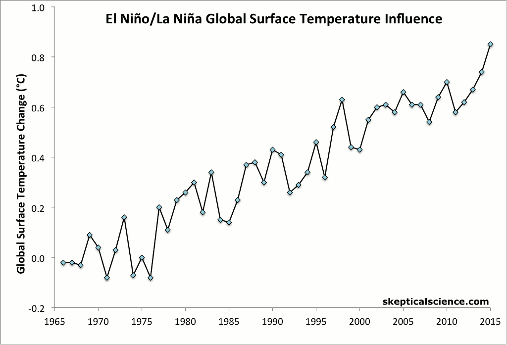
In contrast, 2014 had a slight cooling influence from La Niña-like conditions at the beginning of the year, a slight warming influence from El Niño-like conditions toward the end, and no net temperature influence from the El Niño Southern Oscillation (ENSO) for the year as a whole. 2014 was by far the hottest ENSO-neutral year on record, and the first year since 1990 to set a record without influence from El Niño.
1998, which saw the strongest El Niño on record, now falls to 5th-hottest year on record. The intense El Niño event made global surface temperatures in 1998 about 0.2°C hotter than they would have otherwise been. Due to human-caused global warming, ENSO-neutral years are now hotter than even the most intense El Niño years a decade or two ago. As NASA GISS director Gavin Schmidt said,
This is the latest in a series of warm years, in a series of warm decades. While the ranking of individual years can be affected by chaotic weather patterns, the long-term trends are attributable to drivers of climate change that right now are dominated by human emissions of greenhouse gases
As the above graphic shows, over the past 50 years, there has been the same 0.15–0.16°C per decade warming trend for La Niña years, for ENSO neutral years, and for El Niño years. So for example, an ENSO-neutral year today is about 0.25°C hotter than a similar year would have been in 1998. That’s why 2014 was hotter than 1998 despite the big difference in El Niño temperature influences between the two years.
This is all happening during a time when we’re constantly being bombarded with inaccurate claims of a global warming “pause.” These mistaken claims stem from the fact that the rate of global surface warming has slowed a bit over the past 15 years, in large part because we’ve seen more La Niña events and fewer El Niño events during that time, and also due to heightened volcanic activity.
In fact, at any point over the past five decades we can find a period during which global surface warming “paused.” Yet each such period was hotter than the last. That’s because each is just a temporary effect caused by a period with a predominance of La Niña events and other short-term cooling temperature influences. As this figure shows (click here for an animated version), underneath the short-term noise, human-caused global warming continues unabated.
Following the global surface temperature records set in 2005 and 2010, a new record in 2014 is right on schedule. A 2011 paper by Stefan Rahmstorf and Dim Coumou found that as global warming continues, we should expect to set new records about once every four years.
Indeed, if we only use the data of the past 30 y, these show an almost linear trend of 0.017°C/y, yielding an expected 2.5 new record hot temperatures in the last decade [1 per 4 years].
Given that we may see an El Niño event in early 2015, there’s also a chance that this record could be short lived, and 2015 might break it once again.
On top of the record global surface temperatures, we also saw a record amount of heat accumulating on Earth, mainly in the oceans. According to NOAA, in 2014 the oceans accumulated an amount of heat equivalent to about 200 million atomic bomb detonations (13 zettajoules, or 13 billion trillion Joules). That’s about 6 to 7 atomic bomb detonations per second, on average, throughout 2014. That’s a lot of heat, likewise reaching record levels.
Climate Nexus summarizes some other notable climate facts from 2014 in this video,


I have used some of your graph for my blog. I think they are refered correctly, but if there is any issue let me know.
voir.ca/yvan-dutil/2015/01/16/une-pause-quelle-pause/
Good article Dana. It would be interesting to see how 2014 measures to previous warm years with respect to other natural cycles, and to see how it stands in a reconstructed temperature record that removes all of the natural signals (I know I've seen that somewhere before...)
Record setting temp in an ENSO neutral year should send a rather clear message to the hordes of gullible MSM journalists that they have been duped by the deniers, but waiting for them to realize that is sort of like waiting for Godot.
Wonder what happened to the cooling that the ''skeptics'' (like Svensmark) promised us back in 2009 and even before that. Wasn't it something about cosmic rays, negative PDO, record low solar and other minor drivers?
I have asked the ''skeptics'' for years about what natural driver would be the cause when 2014 or 15 would break the record. ''Not gonna happen, it is cooling'', was the default response. However, don't be surprised when they come up with all kinds of excuses and how the record was ''expected'', though''. Sorta like when the BEST results came out.
Will the MSM buy those excuses and ''explanations''? Most likely.
Here's another animated graphic that does an excellent job of putting the temperature trend into perspective -
2014 On Pace for Hottest Year - Climate Central
https://www.youtube.com/watch?v=F5ymM00tR9o
dana,
The following statement does not seem to be correct. Perhaps it was meant to indicate the years of strong El NIno influence.
"As this graphic shows (click here for an animated version), the last five record hot years of 2010, 2005, 1998, 1997, and 1995 were all assisted by El Niño events."
The order of warmest J-D year averages in the GISSTemp data set are: 2014; 2010; 2005; 2007; 1998; 2002 and 2013 (tied); 2003 and 2006 and 2009 (tied).
The order of warmest year averages in the NOAA data set are: 2014; 2010 and 2005 (tied); 1998; 2003 and 2013 (tied); 2002; 2006; 2007 and 2009 (tied).
Reviewing the NOAA ONI data set (here) shows that the significant El Nino events were: 2010-11; 2006-07 (weak); 2004-05; 2002-03; 1997-98; 1994-95.
Knowing that increased surface temperatures lag behind the ONI 0.5C El Nino anomoly date it can be seen that except for 2013 and 2014 the record years were El Nino influenced. It also indicates thta the 1994-95 El Nino event did not produce an annual average surface temeprature result high enough tobe among the top 10 years. In fact, 1995 was only the 16th warmest in the GISTEMP data, and 17th in the NOAA data set.
One Planet Only Forever @5 - the ones I listed are years that were records at the time, i.e. 1997 was the hottest year on record as of 1997.
The deniers I know all just say the UHA Sat. data doesn't show it as the warmest year, the sateleite data is more accurate and the conversation ends their.
I don't actually know anyone amongst my peers or friends who aren't deniers.
Trevor, try pointing out to them that UAH (and RSS) does not measure surface temp. Not that it will make any difference to them, mind, but it may keep the conversation going a bit longer.
Trevor: In addition to what Jim pointed out, I recommend reminding your peers that UAH satellite data shows a long-term trend of +0.14 degrees per decade, which aligns pretty closely with the rate of temperature increase for the surface data sets.
I personally don't see the point of obsessing over which year has the highest temperature in which data set, because the ranking of specific years varies across them. We have known this for some time now. Much more important to me is that *all* reliable data sets show a steady temperature increase (behind a noisy year-to-year signal) and the rate of increase is indeed comparable across all of them.
Trevor_S @7, a few things you may want to point out to your friends:
1) "Skeptics" are often dubios about surface temperature records because adjustments need to be made for time of observations (which has not been constant), change of site conditions, and change of instruments. Satellite temperature data, however, have come from a succession of 12 different satellites, requiring a site adjustment for the entire Earth at once for each transition. Further, the orbits of satellites decay over time, requiring a continous "site move" adjustments for the entire data set. Finally, satellites do not pass over a given point on the Earth at the same time each day (let alone punctually at the time of minimum and maximum temperatures), thereby requiring a continuous Time of Observation adjustment every day. (I have used the names for the equivalent surface adjustments rather than those used for the satellite adjustments.)
The fact that these adjustments need to be made for the entire record at the same time, rather than for individual instruments as with the surface record, means there are no nearby stations without the adjustments which allow comparisons to check for biases introduced by the adjustment. Consequently the story of the satellite record is a history of major errors corrected after some time in successive versions:
There is currently a peer reviewed paper pointing out a purported additional error that has not been publicly accepted by the authors of the UAH temperature set. They have, however, given notice that a new version is forthcoming which will make a significant difference.
2) The TLT record is not based on a single set of instruments but on the differences between two sets of instruments, meaning it compounds the errors of each seperate set of instruments. As Carl Mears (of RSS) says:
(My emphasis)
UAH uses a different method, but the same problem applies.
3) As noted by Jim Eager, satellites do not measure surface temperature. In fact, they do not even measure the same portion of the atmosphere over different locations of the globe. RSS has provided the weighting functions for the TLT channel over land and water:
Thus, the altitude from 0 - 300 meters of the atmosphere provides around 4.5% of the signal over ocean, but only 4% over land. Of course, the amount provided over land depends on the altitude of the surface, so that the weightings over Denver, for example, would be different to the weightings over the qattara depression. The reason satellite records do not show temperatures over the Himalayas is not because the satellites won't clear the mountains, but because the difference in weighting is so great that it would make inclusion of the data nonsensical. Changes in surface pressure (the presence of highs or lows) will also change the weightings slightly.
The actual surface also contributes some of the signal (about 5% over land, and 3.8% over ocean), but that contribution also varies depending or surface type.
For what it is worth, about 50% of the signal comes from the first 3000 meters of the atmosphere (including the surface), and 50% from above. Because each altitude band above (approx) 2400 meters contributes less an less, that means the mean altitude of the temperature measurement in the TLT channel is close to, but above 3000 meters.
4) Actual attempts to measure the actual surface temperature using satellites have been made, with the current benchmark for accuraccy being +/- 1 K. For comparison, surface instruments read by eye have an accuracy of +/- 0.25 K for mercury thermometers, and 0.05 K for electronic thermometers. UAH can report greater accuraccy than that, but only by not actually reporting surface temperatures and not specifying too closely what part of the Earth/atmosphere system they are reporting the temperature of (as it varies by time, season, and geographical location).
Thanks for all the replies but I think you suffer from the misguided thinking that data and science is what interests them :) It doesn't matter what Science is presented to them, they will keep denying.
As I have pointed out several times, it's not these people I am concerned about, they will deny in their grave. I was just answering the rhetroical question as to what deniers would use now. Just as an aside, none of them take this site seriously... sigh. If you want a reasonable synopsis of the nonsense they use, go to reddit
What concerns me is those that understand and accept the Science aren't doing anything. A recent example, the AGU conference, the LIMA comference, Dr Abrahams doing Aid work in Africa. All massive emitters. I know you think this is important work, which is the exact same reason everyone else gives and nothing is done. Everyone is waiting for everyone else, if you guys won't cut emissions, who will ? Causal Inefficeacy isn't a good reason. Yes, we have personally cut back enormously.
As to Dr Abrhams Aid work. I used to fly to Cambodia to do Aid work but now I rely on the support network in country and transfer funds electronically from here to fund the projects I support. So I can empathise with how hard it is not to be involved but the emissions are not justified. Once we've chewed away that emissions budget, there's no realistic way of going back.
Could someone point out if there is online documentation of what seem to be adjustments to previously reported annual temperatures? Presumably there are good reasons for the adjustments but it would be helfpul to know the basis of them.
For example the NOAA 2010 Global Analysis reported the 2010 global land and ocean anomaly as +0.62 ± 0.07ºC (above the 20th century average of 13.9°C)
the NOAA 2011 Global Analysis reports the 2010 global land and ocean anomaly as +0.64ºC
the NOAA 2012 Global Analysis reports the 2010 global land and ocean anomaly as +0.66ºC
the NOAA 2013 Global Analysis reports the same.
the NOAA 2014 Global Analysis reports the 2010 global land and ocean anomaly as +0.65ºC
Thanks.. david
davidsanger - A quick Google search on "NOAA temperature data adjustments" finds this NOAA FAQ, linking details such as the NOAA pairwise homogenization methods. Menne et al 2009 may also be of interest in this regard.
Actually KR those are not much help. I am aware of the general processing of temperature data. My question is about reprocessing of data already reported. It seems that each year (at least in the past 5 years reports) the global average for some of the previous years has changed.
I did some more searching and found documentation of an update to GHCN Monthly to version 3 and then up to version 3.2.0, and some reference to a planned version 4.
Is there some timeline, then, of the updates? Are there others?
They do seem minor but every year the top 10 shift around a little bit as one or more years' average is updated.
davidsanger @12 & 14, GISS keeps a running log of updates to their temperature series, which is, I suspect, what you are looking for. NOAA may do the same, or may simply relly on the technical reports from the GHCN to provide the relevant information. I doubt either is very usefull to the layman. That is, unless you run your own software to generate temperature series as per the reported methodologies (as done by Nick Stokes and others), the updates will not inform you as to why the alteration is as it is because you will be missing too much context.
Trevor_S:
No doubt you've studied Environmental Economics. Individual voluntary sacrifices (that is, choosing to enjoy less benefit, or expend extra time and/or money, in order to reduce one's own emissions) shouldn't be discouraged, but they won't drive effective abatement of AGW. Economics will. There's a reason it's called "the dismal science" 8^(.
The key economic concept is "externality". As long as the climate-change cost of using fossil fuels is kept out of the prices we pay for them, rational economic actors will use fossil fuels. Hitherto, Americans have been able to hold climate change external to our individual energy-consumption choices. When climate change costs start showing up whenever we fill our gas tanks or pay our utility bills, we will switch to alternative energy sources with alacrity.
dana@6,
Got it. It may be clearer to say:
"As this graphic shows (click here for the source of this animated graphic), the last five times that record hottest years occurred (2010, 2005, 1998, 1997, and 1995), they were assisted by El Niño conditions."
It may help to add horizontal lines for each record hottest year.
p.s. I also changed the wording for the graphic since it is now animated
David, KR, Tom:
It's possible for past temperature estimates to change even without any change in the methodology, so looking for such changes won't necessarily anwer your question.
Suppose that last 6 months of a station record shows unexpectedly high temperatures. The most likely explanation at this point is that the data are faulty, or at least require an unknown correction, and those records are rejected.
Then two years later, the station has reported 30 months of temperatures which look sensible compared to neighbouring stations, but are systematically warmer than the previous period. Now, with the same data for the year of interest, it look as though there was an undocumented station move. The station data get adjusted to remove the discontinuity rather than being removed, and you get a different final answer.
So NOAA temperatures for recent years can vary just from adding extra months of data after the year concerned. The trailing end of the temperature record tends to wag for a few years.
GISTEMP and Berkeley show the same behaviour, but slightly more so, because isolated stations can be upweighted to cover larger regions - Berkeley in particular.
Are the adjustments more likely to be one way that the other? I've not done a systematic survey, but in the cases I've looked at NOAA seem to be more likely to reject change (which is a good conservative approach), and so in a warming world are likely to have to adjust upward as more evidence comes in. However that conclusion is based on a handful of stations - it's little better than guesswork.
Regarding Hottest Year since 1880!
Why don't you say how much warmer 2014 actually is?
It's .01C warmer, and you all are getting excited by this!
The actual measuring points on the earth's surface cover much less than 1% of the planets surface. What is the temperature of the area that is not recorded?? And these scientists act like they are measuring the temperature of a cup of coffee.
They process and "cook" the data so that it agrees with what they promoting. These number crunchers that call themselves scientists should go out and look at the world a little.
How the hell can you measure tree rings and claim to know the temperature they represent? Then they cobble this data onto actual readings and make a "prediction" that looks like a hockey stick.
[PS]
Please note that posting comments here at SkS is a privilege, not a right. This privilege can be rescinded if the posting individual treats adherence to the Comments Policy as optional, rather than the mandatory condition of participating in this online forum.
Please take the time to review the policy and ensure future comments are in full compliance with it. Thanks for your understanding and compliance in this matter.
Your comment suggest you have multiple levels of misunderstanding which hopefully this site can help you with. Please see in particular the Temp Record is unreliable myth. Any comment on the paleo-climate record (determined from tree ring and many other proxies) should go on an appropriate thread. (eg here ). Off topic comments will be removed. Just because you dont understand something does not make it wrong. Please take the time to read and understand the science before attempting to criticize it.
tom@15 kevin@18 thanks. that's what I was looking for, along with finding out a bit more about the updated versions of GHCN.
It looks like ther next version (Version 4 due in 2015) will have a big jump to 30,000 stations. Sounds like an improvement. I wonder if that will cause much to change
davidsanger, records sometimes arrive late from some stations that are remote, or from which communication has been disrupted. I imagine some stations deliver records chronically late, such as ones that accumulate records for months before a courier takes them. That doesn't happen in the U.S. very often, of course, but in many other parts of the world I bet it does.
madkatz
"The actual measuring points on the earth's surface cover much less than 1% of the planets surface". Actually, no they don't. 70% of the earth's surface is oceans, and sea surface temperatures (which is the ocean component of the temperature record) are measured by satellites now so actually most of the earth's surface is sampled.
" What is the temperature of the area that is not recorded?? "
Think about it madkatz. These are average temperature anomalies. So the land stations are supplying the average of many readings for each station for periods of a month or longer. And the weather patterns that pass over each of those stations also pass over all those other nearby regions that don't have a station. So the average for those other locations is much the same. And the records deal in anomalies; how much the local average has changed from a past, longer term average. And these long term averages are very stable over long time periods - that's what climate is.
"How the hell can you measure tree rings and claim to know the temperature they represent? ". By understanding how the growth patterns of trees are affected by temperature and other factors. Basic botany really.
Just as understanding how the physics of why water that contains the heavier isotope of oxygen (Oxygen 18) doesn't evaporate as easily and condenses more easily than Oxygen 16 water which leads to changes in the proportions of Oxygen 18 in snow in the polar regions depending on the temperature when the water first evaporated. So we can measure the Oxygen isotope ratios in ice from ice cores (old snow) and infer from that what past temperatures were like.
madkatz. Your comments suggest you don't know much about these subjects. Yet your tone is of incredulousness and anger. Surely if you are incredulous of things you don't know very well, then that incredulousness is misplaced. If one does't understand a subject surely the best course of action is to defer to those who do, or gain an understanding of the topic oneself. Incredulousness of something one is ignorant of just makes one look foolish.
So, '...these scientists...'. They are the experts who understand this stuff far far better than you or I. To doubt them we first need to be as knowledgeable as them.
[PS] Please keep discussion of paleotemperature records off this thread.
madkatz @19.
The increase above the previous record year (2010) was 0.017ºC (GISS) or 0.035ºC (NCDC) if monthly averages are used for the calculation. And unlike 2010, that is without an El Nino.
I for one don't consider this 'exciting'. It is hardily unexpected just as the next record breaker can be expected in coming years.
As the Moderator Response suggests, perhaps you should take a little time to get some understanding of where humanity is pushing our planet's climate system and the implications of that change for our kids & grand kids. Displaying your gross ignorance is quaint but actually unhelpful to man nor beast.
Jim Eager:
Manmade CO2 is just 4% of the total CO2, in the atmosphere which is only .04% of the total gas in the atmosphere. This little amount is going to bring on a climate catastrophe?!
Common sense should tell you otherwise
Yes, you have to have faith to believe this.
Any global warming is probably coming from sunspot activity.
Also don't forget we have been coming out af an ice age for the past
5000+ years. (Snip)
[RH] Gish gallop deleted. You need to go back and read all the relevant sections of this site and place your comments in the proper sections. We have no tolerance for these sorts of baseless assumptions. Everyone here is open to honest discussion on any climate related issue, but you're going to have to up your game (significantly) in order to retain your posting privileges.
[TD] There are several posts that directly address your assertions. On each of the following, after you read the "Basic" tabbed pane, read the "Intermediate" and "Advanced" tabbed panes, when those exist.
Human activity has caused 100% of the rise of the atmospheric level of CO2 in the past many decades. Please read the rebuttal to the myth "Human CO2 Is a Tiny % of CO2 Emissions." For more about the mass balance evidence see "The Independence of Global Warming on Residence Time of CO2." See also "New Study by Skeptical Science Author Finds 100% of Atmospheric CO2 Rise Is Man-Made."
The CO2 (totaled across all sources) level as a percent of all the gases in the atmosphere is no more relevant than is computing the CO2 mass as a percent of the mass of all the sandwiches ever made. That's because the vast majority of gases in the atmosphere do not absorb the infrared radiation that the Earth radiates. The gases that do absorb that IR are called greenhouse gases. What matters is the percentage by which greenhouse gases have increased, and how fast. See "How Do We Know More CO2 Is Causing Warming?"
Regarding sunspots: See the counterargument to the myth "It's the Sun."
As RH told you, any comments on those topics must be put on those threads, not here where they are off topic.
madkatz, if you want to be taken seriously, you should probably come to an understanding of the physics involved. Roughly 98% of the atmosphere is transparent to thermal infrared radiation. What's left--H2O, CO2, CH4, etc.--manages to keep the planet about 33C warmer than it would be without those "trace" gases.
You might also want to look at the PETM event to understand what can happen when the surface temperature of the planet increases .00417C per decade over 12,000 years. Keep in mind we're warming at about 30x-40x the rate of PETM warming.
Also, human-sourced CO2 comprises about 40% of the current 400ppm in the atmosphere. Using the total C cycling through the system each year is misleading, since the system was near long-term equilibrium before human emissions and land use changes began in earnest. What matters is how much change is occurring in the atmosphere as a result of disturbing that equilibrium.
[RH] If madkatz returns for more please move individual discussions to relevant threads. Thx.
By the way, "faith" is the distance between evidence and reality. Everyone has faith. There's no other option, unless you can show me absolute truth. A fool is someone whose faith outdistances their evidence. I'll take science over your common sense. The two aren't mutually exclusive, but trusting to common sense alone without continually challenging it is a sure bet for looking like a fool from time to time.
Sorry I didn't see madkatz' reply, but judging from the in-line moderator response from RH and TD and DSL's reply, it sounds like he pretty much proved my point. Repeating long-debunked assertions and selective half-truths based on a poor understanding of the science is not making a scientific argument.
[RH] Yup. You got it.
@Madkatz,
"Manmade CO2 is just 4% of the total CO2, in the atmosphere which is only .04% of the total gas in the atmosphere..."
On the tentative assumption that you merely have an unfortunate communication style, rather than simply being a troll, shall we try one or two little thought experiments?
1) Instead of jumping straight into atmospheric physics, why don't we kick off with some simple plumbing? Imagine that one has a 200 litre open-topped reservoir that starts off approximately half full. If there is a daily inflow of 100 litres, and that is matched by an equivalent extraction rate, the reservoir would remain about half full. Agreed?
Now, if some unrelated pipework develops a leak and drips an additional 4 litres per day (i.e. an additional 4%) into said reservoir, what happens after about 25 days? It should be obvious that about 4 litres per day will end up overflowing. Agreed?
Now, since the leak only accounts for (approximately) 4% of the new input rate of 104 litres/day, it is indeed true that only about 0.16 litre/day comes from the leak. But here's the $64,000 question: ask yourself "what mysterious agency prompted the other 3.84 litres to start overflowing at the same time"? It had been extracted quite naturally in the past without any problem, so what has changed?
2) It is probably a reasonable assumption that you would not care to be afflicted by severe sunburn or melanoma. The agency in the atmosphere which quietly goes about protecting you is stratospheric ozone (O3). The mean concentration of ozone across the globe is in the order of 600 parts per billion - as compared to our current CO2 levels of around 400 ppm and counting.
You may be aware of the 1987 Montreal Protocol on Substances that Deplete the Ozone Layer. Chemicals such as chlorofluorocarbons (CFCs) and hydrochlorofluorocarbons (HCFCs) were finger printed as being responsible for the infamous Ozone Hole, and have been (and are still being) progressively phased out. (You could look at the 1995 Nobel Chemistry Prize citation.)
The total atmospheric concentration of CFCs and HCFCs is currently somewhere in the region of 2 parts per trillion, but that was enough to wreak havoc come spring time in the Antarctic. To put this in some perspective, approximately every 8 hours, the amount of extra CO2 added to the atmosphere is roughly equal to the total concentration of CFCs and HCFCs that has built up since their introduction about 85 years ago.
Getting really cheerful, the botulinum toxin has a median lethal dose (LD-50) at a concentration of somewhere just over 1 nanogram per kilogram of body weight. That's just over one part in a trillion! Were you to ingest such a dosage, you'd have a 50-50 chance of shuffling off this mortal coil.
Just because you appear to have trouble comprehending the fact that a small concentration does NOT perforce correspond to a small effect, doesn't make it any less real.
@ Moderator(s)
Apologies for my Post #28
Whilst I was writing the above response to the appropriately named Madkatz, you obviously were doing much the same thing. When I had finished - at around half past midnight - I hit the Submit button and then went to bed. Had I waited until this morning, I would have seen the action you had taken and would not have bothered writing #28.
Cheers Bill F
[DB] Madkatz has opted out of participating further at SkS.
Oops! Typo alert - never work with very big (or very small) numbers when tired.
In #28, the overall concentration of CFCs + HCFCs should have read "2 parts per billion" not per trillion. These numbers were taken from the Trace Gas section of the Carbon Dioxide Information and Analysis Centre (CDIAC) at Oak Ridge National Laboratory.
Tamino just added his two cents to the hottest-year discussion: https://tamino.wordpress.com/2015/01/20/its-the-trend-stupid-3/
“It’s the Trend, Stupid”
” The reaction of the “pausemaniacs” to the record hottest year has mostly been protest. Breakin’ some temperature record just don’t mean a gosh-darn thing worth payin’ no attention to. It only broke the record by a little bit. And besides, it ain’t the individual years, record hot or not, that count, it’s the pause that counts — a record hottest year don’t end the pause!
Methinks they do protest too much. Perhaps they fear that a record year really does threaten their beloved “pause.” But that’s not the real threat at all, it’s the fact that the data have followed the global-warming-continues-without-slowing-down pattern just about as closely as one could have expected, because all the while they’ve been bellowing about the pause that never was.
But the record year does do this: it makes it harder to sell the whole “pause” idea…”
I'm somewhat surprised to see it hasn't appeared here as yet, in what seems like the obvious place. However I've now added my two cents to the two cents Rob Honeycutt added to Tamino's two cents in my deconstruction of David Rose's report on recent global temperature news:
http://GreatWhiteCon.info/2015/01/was-2014-really-the-warmest-year-in-modern-record/#BullChannel
 Bull markets in global surface temperature certainly look to be far more predictable than they are in stocks and shares.
Here's Rob's animation of Tamino's charts.
So, I am puzzled. All the skeptics now are saying that 2014 may not be the warmest on record because Dr. Gavin Schmidt is "only" 38% sure it is. And accoring to NASA (Schmidt) the probability is ~38%. See here page 5:
http://www.ncdc.noaa.gov/sotc/briefings/201501.pdf
How can I explain that the 38% is the best probablity of all the possible warmest years? I looked and looked and looked and I can't find anything that will help me explain and understand that somehow 38% is a high probability? Is it? I also wrote to Schmidt but have not hear back yet.
Thanks!
David
[PS] Fixed link
DavidPalermo, HotWhopper addressed the probabilities.
This graphic does a pretty good job...
DavidPalermo @33, Gavin Schmidt published this table:
These results are implicit in the stated temperatures for the various years, together with the stated uncertainty. There is nothing new in this, and nothing in it contradicts the fact that the global mean surface temperature as determined by NASA GISS was higher in 2014 than in any prior year. The near universal (SFAIK) portrail of the release of these figures as being a veversal of prior claims by NASA about 2014 show either a total lack of comprehension of basic stastics by their authors, or a deliberate intent to deceive.
The real story in those figures is that the claim that 1998 was not the hottest year on record is statistically significant. The "skeptics" favourite cherry pick just became obsolete and they are trying desperately to draw attention away from that fact.
TomDayton, thanks for the link to Sou's excellent article. I particularly enjoyed the link to the slides for Schmidt's presentation of the data of for 2014, from which the table above comes. (I had previously only seen it in a tweet.) That the table was included in that presentation shows the cluelessness or chicanery of the "skeptics". They first complain that Schmidt claimed 2014 was a record with no mention of uncertainty. They then, seperately claim that Schmidt has retracted the prior claim. They make no mention that both events occured in the same press presentation, and that the "retraction" was just Schmidt's presentation of the uncertainty in a way that is easier to understand. So, both the earlier claim that Schmidt did not present uncertainties is incorrect, and the claim that he later retracted is incorrect - and both display incompetence or dishonesty.
Gavin Schmidt has a new article up over at RealClimate:
http://www.realclimate.org/index.php/archives/2015/01/thoughts-on-2014-and-ongoing-temperature-trends/
His conclusions after all the brouhaha?
The excitement (and backlash) over these annual numbers provides a window into some of problems in the public discourse on climate. A lot of energy and attention is focused on issues with little relevance to actual decision-making and with no particular implications for deeper understanding of the climate system.
In my opinion, the long-term trends or the expected sequence of records are far more important than whether any single year is a record or not. Nonetheless, the records were topped this year, and the interest this generated is something worth writing about.
David @33 - With HadCrut4 still to come ECMWF have thrown a curve ball:
http://www.ecmwf.int/en/about/media-centre/news/2015/ecmwf-releases-global-reanalysis-data-2014-0
ERA-Interim’s reanalysis confirms that 2014 was indeed a warm year, but indicates that it was probably not the warmest. This discrepancy is mainly due to differences in data coverage in the Arctic and Antarctic, which are enough to affect the ranking of different years.
Read Gavin and Tamino though!
David Palermo, the deniers want the public to think that the lack of 100% certainty about whether 2014 was the warmest year, means that any year easily could have been the warmest--any year including 1998, 1895, .... They want the public to extrapolate that scientists have no idea what year was warmest.
In fact, those 38% and 48% probabilities are relative to the set of four or five years that are in that table, and all of which are recent years. It doesn't really matter which individual year was the warmest, because it's the trend that matters. The warming trend is supported by that table's inclusion of only very recent years in the set of years in which lies the warmest year--with near 100% certainty. Interpreting those individual year probabilities properly as being relative within that set, as HotWhopper pointed out 2014 is by far the most likely to be the warmest.
Tom Dayton et al...
THANK YOU. Yes I understand it's the trend that matters. The thing that I am still struggling with is that the deniers will indeed say "38% probabilty is not very certain". My mathemetician friend explained it to me but I am not sure yet I can explain it very well to someone. I will read Schmidt's new article.
Thanks all,
David
[Rob P] - I wouldn't worry too much by how climate contrarians frame things, nor of trying to convince them of anything. You can't reason someone out of a position they never reasoned themselves into in the first place. As for probabilities, maybe a simple graph might help?
The probability of 2014 being the warmest year (due to margin of uncertainty and the small differences between years) is almost ten times that of 1998. And the contrarians were very certain that year was warm!
Nick Stokes has a very technical discussion of uncertainty at Moyhu. Gavin Schmidt from NASA Goddard explained in response to Nick's question at RealClimate:
[Nick commented:] It’s not clear how you then went to the odds of 2014>2010. Because 2010 basically wasn’t sampled in different places. So it seems there is a major component of variation missing. How is that handled?
[Response: Nothing sophisticated. These estimates are based on a 1 sigma of 0.05ºC, increasing backwards in time, and assuming independence for any one year which seems reasonable. If you have something better and tractable, let me know. – gavin]
Nick Stokes also has created useful plots of the durations of record temperature years. Click the little arrow buttons to switch across different temperature datasets. But note that many of those lack 2014 records so far.
From the UK Met Office release on Jan 26th It may be that 2014 was not in fact the warmest ever. The Met Office stated:
The HadCRUT4 dataset (compiled by the Met Office and the University of East Anglia's Climatic Research Unit) shows last year was 0.56C (±0.1C*) above the long-term (1961-1990) average.
Nominally this ranks 2014 as the joint warmest year in the record, tied with 2010, but the uncertainty ranges mean it's not possible to definitively say which of several recent years was the warmest.
Colin Morice, a climate monitoring scientist at the Met Office, said: "Uncertainties in the estimates of global temperature are larger than the differences between the warmest years. This limits what we can say about rankings of individual years.
"We can say with confidence that 2014 is one of ten warmest years in the series and that it adds to the set of near-record temperatures we have seen over the last two decades."
ryland @44, the HadCRUT4 dataset shows 2014 to have had a temperature anomaly of 0.563 C (final column). That beats 2010 (0.555 C), 2005 (0.543 C), 1998 (0.535 C) and 2003 (0.507 C). As a matter of curiousity, 2014 is the only one of those top five years not to fall on an El Nino year. So, clearly 2014 is the record year in the HadCRUT4 dataset. It is possible that the actual global temperature was warmer in another year, but the probability of being the record year is stronger for 2014 than for any other year. Therefore, while that it is not statistically certain that 2014 was the warmest should be noted simply on the basis that we should always note uncertainties in observations; it is not relevant. Making a big deal about it shows signs of desperation by people whose message is coming unstuck in the face of new data.
I note that if you (or anybody else) decide that 2014 is not the record year because it is not statistically certain that it was the hotest, you are simply declaring that no year is the record year, for the same was true of 1998, 2005, and 2010 when they set the records; and the same will almost certainly be true for every new record into the future. That should show how empty is the denier rhetoric on this point.
Tom Curtis I'm not making any decisions at all about whether or not 2014 was or was not the hottest year but the UK Met Office certainly is. The scientists there are making the point that as the uncertainties in the estimates of global temperatures are greater than the difference in temperatures between years then it is not possible to say definitively that 2014 was the hottest year ever. Are they wrong in this?
With regard to your point "because it is not statistically certain that it was the hotest, you are simply declaring that no year is the record year" again I'm not declaring anything but again, the UK Met Office certainly is. Their comment "Nominally this ranks 2014 as the joint warmest year in the record, tied with 2010, but the uncertainty ranges mean it's not possible to definitively say which of several recent years was the warmest" Are they wrong to make this statement?
And as for making a big deal of it surely the Met Office are to be commended for making a statement that is correct based on the statistical analysis of their results. Should they have ignored that analysis?
And as these statements are coming from the UK Met Office itself your comment they are "signs of desperation by people whose message is coming unstuck in the face of new data" is perhaps not entirely appropriate.
[Rob P] - Whether or not 2014 was the warmest year recorded in the Hadley surface temperature data is not the really the most interesting aspect. The main takeaway is that global surface warming is still continuing. This is very obvious in the Hadley data:
And of course 93% of global warming actually goes into the oceans, and the oceans are soaking up heat faster than before. The image below (from the IPCC AR5) stops at 2010, but ocean warming in the last two years has been rather spectacular - equivalent to 12 Hiroshima bombs per second in 2013 and 7 Hiroshima bombs per second in 2014.
ryland, 2014 has the highest probability of being the warmest year.
This complaint reminds me of the denier Paul Merrifield (aka "mememine") who has filled the internet with the claim that since the IPCC was not using the language of certainty, then they weren't really sure at all. They were just guessing. As long as the public understands uncertainty in the crudest way, the denier program is in control.
Let's hope that GMST remains in that complainable gray area where the uncertainty is greater than the difference between years. Unless it goes down, of course, and that doesn't seem probable . . .
Ryland's way of arguing is common and unfortunately typical of a certain mindset. Looking at temperatures in recent years, it is painfully obvious that there is no pause in the warming, and never was. This argument was only made possible by the 1998 whopper year and every drop of nonsense has been squeezed out of it by fake skpetics. Because the trend is still there, every 5 years the argument becomes more stupid. Now they turn the stupid argument inside out and squeeze it the other way to get more out of it. Inevitably, there will be a year in the near future that will be statistically significant way above 1998, but not 2014, so we'll have more quibbling about words and ridiculous hair splitting, just like here. All because the reality based people are actually being honest and describing facts accurately. You can't win with dishonest people. Even if you do, they'll say you didn't. Wrestling in the mud with pigs...
Every record year makes me more disgusted with the reality of this "debate."
As I tried to make plain in my response to Tom Curtis, I personally, do not have any particular stance on the record heat or otherwise of 2014. The text in my first post (@44) was taken directly from the UK Met Office. Your comments should be directed to the UK Met Office, possibly to Dr Colin Morice, as it is their words to which you take exception. All I did, mistakenly it seems, was to draw attention to a statement by a very reputable institution full of "reality based people" that was somewhat at odds with the title of this particular topic. Why do you and others not address what the Met Office is saying?
ryland... You may take note that the Met Office was the last to report the 2014 record. They waited (as far as I can tell) to see what responses came out from the other data sets.
In my opinion, the Met Office is taking an overly cautious approach to their statement. The NASA/NOAA folks took the extra step to point out the relative likelihood of each year being a record. In both sets 2014 stands out as being the most likely to be the warmest year. The Met Office soft peddled and merely stated that 2014 is "one of the warmest years" whereas, per Tom's comments above, it's quite clear that 2014 is by far the most likely to be the warmest.
The only thing you're managing to point out is the fact that the Met Office has been more restrained in their definition. That's fine if that's how they want to approach the issue.
The biggest point remains that 2014 was a ENSO neutral year and still managed to statistically beat all the other previous El Nino forced record years.
That... is huge!!