


 Arguments


4 Hiroshima bombs per second: a widget to raise awareness about global warming
Posted on 25 November 2013 by John Cook, Bob Lacatena
This is a working version of the widget, as it would appear on the sidebar of a blog. To use it, just click the buttons.
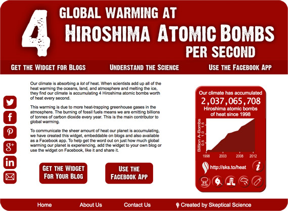
Our planet is building up a lot of heat. When scientists add up all the heat warming the oceans, land, atmosphere and melting the ice, they calculate that our planet is accumulating heat at a rate of 2.5x10¹⁴ Watts. This is equivalent to 4 Hiroshima bombs worth of heat per second.
When I mention this in public talks, I see eyes as wide as saucers. Few people are aware of how much heat our climate system is absorbing. To actively communicate our planet's energy imbalance, Skeptical Science is releasing the Skeptical Science Heat Widget.
The widget can be added to just about any blog or web site. You can customise the colour of the widget, the style of the design and even the year from which the heat graph begins. It's the result of months of diligent programming and testing by SkS team member Bob Lacatena (Sphaerica). If you have a webpage or blog, here's an opportunity to help raise awareness of global warming.
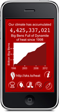
If you don't have a website but are on Facebook, Bob has also put together a Facebook app and an app for the iPad and iPhone. For complete instructions on how to get and install the widget on your blog or web site, visit the Skeptical Science Widgets page.
The widget shows the amount of energy that has been and continues to be added to the earth's climate system, expressed in ways that non-scientists can more easily relate to. Meanwhile, the counter actively increases with time, showing exactly how much and how fast the planet continues to warm.
For more information on the science behind the heat in the climate system, visit the widget's companion site, 4hiroshimas.info. This website was put together by Bob, in collaboration with the SkS team.
Why Show the Widget?
It is important to communicate the incredible scale of the planet, the climate, and what our ongoing dependence on fossil fuels is doing to the climate system. You can contribute to that awareness simply by adding the widget to your blog or sharing it with people you know through Facebook, Twitter, Linked In, Google Plus, and Pinterest. You can easily do so with the buttons on the back of the widget (click the "info" button on the front) or the buttons at 4hiroshimas.info.
 The iPad and iPhone App
You can use the iPad/iPhone app to show the counter to friends, family and co-workers. To get the iPad/iPhone app, visit 4hiroshimas.info on your device and look for the big red "Get..." button or click here to go to the instructions. Please note that you must use an iPhone or iPad to see the instructions page, and it is the only way to get the app. The app is not available on the Apple App Store, it's distributed as a "Web App."
Why Make the Widget?
When Dana Nuccitelli and John Cook first conceived of the widget, it was to counter a misconception that has gained in popularity over the last year - that global warming has stopped since 1998 (or sometime around then). People who deny global warming fail to take one simple fact into account - our planet continues to build up heat. In fact, the heat build-up hasn't slowed down at all over the last few decades - it has increased. The laws of physics did not cease to operate after 1998 and the greenhouse effect continues to blaze away. Our widget demonstrates this in strong, clear, visual terms.
The Numbers
![]() Every day the planet adds the equivalent, in heat, of the energy released by the detonation of 343,008 atomic bombs of the size dropped on Hiroshima.
Every day the planet adds the equivalent, in heat, of the energy released by the detonation of 343,008 atomic bombs of the size dropped on Hiroshima.
Every day the planet adds the equivalent, in heat, of the energy needed to power 153,792 hurricanes of the magnitude of Hurricane Sandy.
Every day the planet adds the equivalent, in heat, of the energy released by 43.2 billion lightning bolts.
According to one study (Levitus et al, 2012):
"We have estimated an increase of 24x1022 J representing a volume mean warming of 0.09°C of the 0-2000m layer of the World Ocean. If this heat were instantly transferred to the lower 10 km of the global atmosphere it would result in a volume mean warming of this atmospheric layer by approximately 36°C (65°F)."
The total heat content data used in the widget has been taken from Nuccitelli et al (2012), which in turn took the atomsphere, land and ice melt data from Church et al (2011), and the ocean temperatures above 2000 meters from Levitus et al (2012).
Get On Board
If you are frightened by recent developments (Japan reneging on its prior emissions targets, record global emissions, repeated extreme weather events, and others), then you can help to spread the message about climate change, and the science behind climate change, by both hosting the widget itself and using social media to help it spread.
Get involved, and help to spread the knowledge that our climate is warming at the rate of 4 Hiroshima atomic bombs per second – and we're doing very little to stop it.
![]()


Hi Bob,
Brilliant work! Take a bow, you deserve it.
Heh, synchonicity...
A while back I was talking with one of my colleagues in the staff tea room and, after a bit of back-of-the-journal-envelope arithmetic, we worked out that at the rate that the human population is currently growing, if one started from around the time that the Keeling curve data began to be collected the rate of Hiroshima energy accumulation would follow pretty closely the human population clock as it ticks over today.
Except that the accumulation of energy is about 4.6 bombs/second using the value for Little Boy was actually a little greater than the rate of turning over of the human population clock, so the HPC would run too slow...
Dang, deleted some text in that last paragraph. The gist is apparent, I hope.
Hi, I like the idea of using metaphors in order to get the message to the public....but. To use the image of Hiroshima bombs to instruct people about global warming seems to me a little over the edge. Scientifically the comparison is like 5 pears equals 5 appels. And I do not really think that the public gets the message except that naming Hiroshima is like naming the Holocaust. It is intended to shock people. I think people should be shocked about Global Warming, but for the right reason.
I would encourage people who have concerns about the Hiroshima bomb unit of energy to read John Cook's post from a few months ago, 4 Hiroshima bombs worth of heat per second. This wasn't a spur of the moment decision, we put a great deal of thought into it.
And if you're uncomfortable with that unit, the widget offers others like Hurrican Sandys, lightning bolts, etc.
What about 25 hair dryers (1500 watts each) for every human on Earth running 24/7?
Or 2 or 3 electric cars?
Wonder if it would be a good idea to have it configurable so that the default comparison can be changed by setting a parameter in the embedding code?
Nice idea on ocean warming. I have another comment on communicating the science to the average person. Firstly I think the mainstream climate science community has done a fine job with the IPCC reports, and on sites like this.
However there are problems as well. The issue is that the public mostly gets its information from the popular media and the sceptics tend to manipulate that and dominate it well. I have rarely heard the IPCC or leading climate scientists full force in the popular media pushing their case and refuting the sceptics.
The few occassions I have heard the climate scientists in the press or on television, they over complicate things. I know scientists want to do science, but communication is essential people. Dont leave it to journalists or Al Gore he has too much political baggage. The public will only respect climate scientists or the IPCC.
@Dana1981 Thanks for the link to the original discussion. I missed that one.
As I mentioned on another blog recently, there is another precedent for the Hiroshima as a unit of energy that appeared on our national broadcaster a month before the original discussion: YouTube
At the 9:50 mark, the host says:
With such a huge area alight, a massive amount of energy was released into the atmosphere.
In fact, in the peak 10 minutes of flaming, more energy was released than the Hiroshima atomic bomb.
The reason is because people have an idea of what an atomic bomb looks like. We’ve all seen footage of them on TV, and pictures of the devastation they caused. We have some idea of the awesome amount of energy involved. And equating ten minutes of that fire to one Hiroshima atomic bomb emphasises just how big that fire was.
So Australia’s national broadcaster had already, without fuss, used the Hiroshima atomic bomb as a unit of energy to try to help people conceptualise something that is inherently hard to grasp.
For some reason my comment on that blog post about this prior art was ignored. Instead now there are additional comments relating to this widget and stolen SkS forum messages. Go figure.
I am an avid reader here, though I rarely comment...I'm not a scientist per se. But one of the comments above really caught my attention with regard to the 4 hiroshima bombs; that the scale of eath's systems can absorb this kind of heat - with consequences of course. The eye openner here is analogoous to spinning a huge metal disk...it takes an awful lot of energy to get it going but once in motion watch out. This makes me think that even the most current radical measures to reduce warming won't be enough to slow warming...?
meb58 @11 "huge metal disk" is itself a famous metaphor for climatic inertia; see the 1979 "Charney Report":
"[T]he ocean, the great and ponderous flywheel of the global climate system, may be expected to slow the course of observable climatic change. A wait-and-see policy may mean waiting until it is too late."
http://www.skepticalscience.com/nrc-report-on-ocean-heat.html
...and all of earth's systems seem to be connected via rubber bands; each in synchronous tension...until, when a few very important rubber bands become stretched to their yield point! Snap! Letting the huge wound up flywheel spin out of control.
Apologies for the non-scientific perspectives.
Here's an interesting statistic. Global warming is causing the Earth's surface to accumulate energy (heat) at 248 times the rate at which the total human population is consuming food energy. Put another way, global warming is storing 4.14 minutes worth of the total human food energy consumption every second. That is an impressive figure. But does it scare you? Probably not. The reason is that human food consumption is a difuse energy. Because it is scattered across all continents, and over seven billion people, it is not concentrated enough to do harm. It has high entropy.
In that respect, the energy accumulation due to global warming is more like food consumption, and less like atomic bombs (or hurricanes, or earthquakes). Indeed, the energy accumulating from global warming has a much higher entropy than that found in food. Atomic bombs have very low entropy. As a result, the energy in atomic bombs are capable of doing a lot of work, by rearranging buildings, cars, bridges, and humans. An equivalent amount of energy with very low entropy would not do the same damage.
To illustrate this, consider that the kinetic energy of the first kilometer of the Earth's atmosphere is approximately 7.1*1022 Joules, or about 1 billion atomic bombs. That is two atomic bombs per square kilometer of the Earth's surface. That does not trouble us for the energy is diffuse and disorganized. It has very low entropy. Where the energy gathered into a pinpoint and then allowed to expand outwards in all directions, it would be as devestating as an atomic bomb. But because it is diffuse it is no more dangerous than a summer breeze.
That is the difference between low entropy and high entropy energy - and the energy accumulated at the surface of the Earth has very high entropy. That is why the widget is scientifically misleading. It compares very high entropy energy to very low entropy energy. Without explanation, casual observers (the people at whom the widget are aimed) will assume the energy accumulated also has the properties of all its comparators, ie, the raw destructive power from the very low entropy. However it does not. A moments thought shows that it does not have the destructive force of a billion atomic bombs rained down on the Earth's surface per decade. And people who have that thought will feel misled by the analogies used.
Finally, although the energy accumulating at the Earth's surface is high entropy, never the less it is decreasing the Earth's overall entropy. It is not harmless. Very far from it. But its harm will be played out over decades and is far less than suggested by the atomic bomb analogy.
Tom@14,
Your closing comment "its [decreased Earth's overall entropy harm] is far less than suggested by the atomic bomb analogy" is highly subjective and depends on the definition of "harm".
I can define harm as: "destructions of entire ecosystems, e.g. from phytoplankton decline and ocean anoxia" which is quite possible scenario in BAU, similar to that experienced by Earth in PETM. With such definition of harm, I argue that 4HB/s fired sequentially and evenly in round robin fasion over land surface would not be hamful to ocean ecosystems at all. Therefore your comment is wrong.
But that's not my point here. My point is that while I agree with you in general, I note that in your closing comment you're comparing the "harm" of high and low entropy events, which is not comparable per se without context, according to your own discourse above. Therefore you are contradicting yourself here.
Personally, I think the HB analogy is directed at non-scientists, therefore its scientific accuracy is not important here. It's meant to say: "have you realised, this is a lot of heat? If not you'd better learn more about it". As such, it is less "scary" than my example above.
Tom@14,
Here's an interesting statistic. Global warming is causing the Earth's surface to accumulate energy (heat) at 248 times the rate at which the total human population is consuming food energy. Put another way, global warming is storing 4.14 minutes worth of the total human food energy consumption every second. That is an impressive figure. But does it scare you?
Actually, I think that's an excellent comparison. Thinking about it like that made me go "Wow!". Perhaps that could be added to the widget as well. (Another one: the Earth is accumulating energy at a rate 15 times the total rate used by all of human civilisation combined.)
But I think "scare" is misplaced. In the Catalyst example I showed, the host wasn't trying to scare anybody, she was trying to help conceptualise the enormous quantity of energy involved. I also don't share your concerns with comparing high-entropy energy with low-entropy energy — nobody is seriously going to look out their window and wonder where all the mushroom clouds are, are they? Is anybody actually going to mistake one for the other?
The planet is accumulating heat at a rate of 0.5 W/m2 over the entire surface area of the earth. But the surface area of the Earth is very hard to visualise, so it's natural to try to scale down that area to something that you have a hope of visualising. But any attempt to do that will necessarily lead to the problem you describe. What is better? Describe the rate of accumulation averaged over an area too large to visualise, or averaged over an area that gives you a chance of visualising it? I quite liked all of the different representations, as well as yours, because it helps to put it into perspective. But if changing the entropy is not allowed, then we're stuck with 0.5 W/m2 over the entire surface area of the earth, which I don't find much easier to grasp than "2.5x10¹⁴ Watts". Seriously, how do you envisage 2.5x10¹⁴ Watts without putting it terms of something you're familiar with? And how do you do that without running afoul of your entropy concern?
TC @ 14
That was well written.
Cook and Lacatena,
I do not like the Hiroshima bomb connection. I am convinced it is meant to create a state of fear within the ignorant. This only leads to further divisiveness amongst the very people you should wish to make think about what is happening in the natural world. The math to compare the energy generated by an atomic bomb in a localized area to the energy received by the Earth from the sun every second of every day is not that difficult, and not at all that scary to someone with a working science background.
you are entitled to your opinion, but are you also claiming that the extra energy being received by earth as a result of increased GHG is not scary? What do you think of the numbers in the Stern report?
Add an option to that widget that shows the known human contribution in percentage to "heat" gained.
scaddenp @ 18
The earth does not receive extra energy due to GHGs, but it does retain energy due to GHGs. But, no, at this point I do not find it neither scary, nor much less worrisome. And, the Stern Report is frought with issues that need to be addressed before it can be taken seriously.
chriskoz @15, that is a very narrow definition of harm. Never-the-less you raise a valid point. Not all harm comes from the flows of energy per se, and therefore the inverse of entropy is a limited measure of potential harm. Life, for instance, is not just a heat engine, but also a complex set of chemical reactions in solution. As a result temperatures significantly below freezing, by freezing the solvent (ie, the liquid in which the chemicals are dissolved) prevents the continuation of life. As a result, a massive loss of energy from the Earth's surface as in a glaciation, is also harmful.
Never-the-less, to the extent the gain of energy is harmfull, it is largely due to the loss of entropy with that gain. And given the destructive nature of the units in the widget - atomic bombs, hurricanes, earthquakes, lighting strikes, 6,900 tonnes of dynamite (a Big Ben full) - are all destructive, there is no question that the widget emphasizes the destructive nature of the energy. It does so regardless of the intentions of the creators of the widget simply because of the chosen units. And given that, the issue of entropy is central as to wether the widget, in an attempt to communicate one part of the science very clearly inadvertently misleads on another.
In passing, by the way, I think you seriously underestimate the destructiveness continuing high frequency rain of nuclear weapons. A rain of atomic bombs at 4 per second means that everywhere on Earth, on average falls within the area of total destruction from an arial blast twice a year. Continued over a century (the minimum time frame for potential ocean anoxia) that would certainly exterminate all surface life. If bombs falling over the ocean detonated at 250 meters depth (or the bottom, whichever is deeper), it would also exterminate most ocean life, including all corals. In all, it would release 40,000 times the energy of a total nuclear exchange (at slightly higher entropy). It would only avoid ocean anoxia because it would create a nuclear winter sufficient to bring back, in all probability, snow ball Earth.
Okay, earth retains heat, but in practical terms the effect is that surface radiation is increased. Elsewhere ("its not bad"), is probably best place to discuss this but I would contend that your belief that this much energy doesnt matter is completely uninformed by science. Sealevel rise doesnt matter? Or by what have you convinced yourself that Dai doesnt matter?
I have a simple question which I guess should go to Bob,
SkS and Guardian setup the widget to count from 1998.
However some other blogs e.g. this one managed to set the count from 1970. I cannot find the UI settings to change that parameter. Where is the setting for the starting year and can you set it to any year of your choice? Then, how does the widget calculate the baseline #HBs to start counting from? Based on the heat uptake history from some known publication, e.g. Nuccitelli 2012?
[Bob] Any host can choose any start date (starting from 1970) when they configure the widget for their own web site or blog.
Tom, I think you are over-interpreting the widget. It records the amount of heat in multiples of Hiroshima bombs, not the amount of harm. Common sense ought to suggest that this is not the intended message as the harm of 2 billion atomic bombs is fairly easy to visualise, and would have left a rather more noticable effect on the planet!
The widget is intended to convey the amount of energy that has been added to the planet due to the imbalance in the energy budget to a general audience not to scientists, so some analogy is needed. For me the the food analogy doesn't work either because most people don't have a good conception of how much energy there is in a food calorie, it is actually quite a lot, but the body is rather inefficient in turning it into work, so it doesn't seem all that much.
As for whether things are scary, I don't see anything in the article that suggests that we should be alarmed or scared by this figure, just surprised.
Incidentally, I am sure there are blogs out there that will attack the widget as being "alarmist" (even though it isn't*). However I suspect there will be rather fewer of them that attack it as being factually incorrect (i.e. there is a significant disparity in joules on each side of the equation).
As John Cook says:
"The only downside of this metaphor is it is emotional - the Hiroshima bomb does come with a lot of baggage. However, this metaphor isn't used because it's scary - it's simply about communicating the sheer amount of heat that our climate is accumulating. I've yet to encounter a stickier way of communicating the scale of the planet's energy imbalance."
*even the "impacts" tab of the widget website only goes so far as to say that it presents a "clear and worrying danger", and provides references to the literature to justify that assertion. I agree we should be worried about climate change, but that does not mean we should be frightened, scared or alarmed by it, that is hyperbole. There is still time to do something about it, but one thing is for certain, which is that bloviating about alarmism whilst being unable to accept scientific truths is not part of the solution.
Dikran@24,
Most scientifically correct and "least hyperbolic" way to realise the effects of AGW is to run David Archer's slugulator model:
climatemodels.uchicago.edu/slugulator/
Ignore (or get rid of) the methane spike which does not apply here and leeave the default CO2 spike. Then look to the top right to compare Energy Yield From Fossil Fuel to Energy Trapped (in Joules). Just with the default model settings (modest 1GtC emissions) and over just 100y (your theoretical lifespan), the numbers are already staggering:
3.75e+19 vs. 1.58e+22
i.e.: the "bad" energy due to GHG is 500times more than the "good" or "useful" energy we can get by burning FF. The actual number is like 1000 times due to efficiency of FF machines.
If you setup the longer time (e.g. million y) the number will be beyond imagination (~e+5 times) because a fraction (some 5-10%) of CO2 you've burned will last in the atmosphere more than 100,000y, essntially forever on any human timescale. As David said: "this is going to be the longest lasting legacy you will leave behind - think about it every time you fill in your gas tank"
That comparison is the best, better than Tom's comparison with food, because it compares apples to apples exactly and creates the right feeling - not scare or shock - but guilt. However, that comparison is inadequate if directed to the ignorant public who does not care to understand the science. That unfortunately includes the nast majority of piliticians, who perhaps do not even understand exponential notation. In such ignorant cases, the only analogy lest is a shocking analogy of #HB/s.
chriskoz @26, the slugulator is a very simple model. It's "energy trapped" is the "time integrated readiative forcing", not the time integrated TOA energy imbalance. This creates three distortions for the use you want to put it to. First, the TOA energy imbalance is much less (currently about a third of) than the radiative forcing. Second, as temperature stabalizes (approximately 40 years in the slugulator) the TOA energy imbalance falls to near zero, while the radiative forcing remains significant for near 1 million years. Third, the slugulator introduces CO2 in a single slug, thus seeing CO2 concentrations (and radiative forcings) that will never occur with the gradual emissions from anthropogenic sources. The difference is that with the slugulator, initially atmospheric CO2 rises by the full value of the emissions, before falling to about 25% of that over a few hundred years. With gradual emissions, atmospheric CO2 never rises above 50% above initial emissions, before falling to 25% of initial emissions over the timescale of emissions plus a few hundred years.
It is difficult from that to determine an actual ratio of "good" and "bad" heat from fossil fuels. Integrated over 50 years (the time for near stabilization of temperature in the slugulator), "bad" heat is approximately 100 times "good" heat; and allowing for corrections for the difference between TOA energy imbalance and radiative forcing is approximately a third of that. I shall assume that the difference between the spike and gradual emissions (which extend the time to near energy balance) cancel each other out, which give a very approximate estimate that "bad" energy exceeds "good" good energy by about a factor of 33.
The slugulator, however, does illustrate one of the problems of focusing on the energy imbalance. The energy imbalance approximates to zero from about 50 years after the cessation of net emissions. The temperature consquences persist for hundreds of thousands of years. It is the temperature difference that does the damage. Therefore integrating TOA energy imbalance over time (let alone radiative forcing) is a very poor index of potential damage from global warming. It, however, does progressively less damage with time after stabilization as first society, and then ecosystems adapt to the new temperature. Consequently even integrating temperature difference overtime (which the slugulator also does) gives little indication of likely damages from global warming.
Jason B @16 and Dikran Marsupial @24 & 25, here are some more interesting statistics for you. The Earth is accumulating energy due to global warming at a rate equivalent to 0.19 times that of the average energy of a thunderstorm every second. It is also accumlating energy at the rate of 2 milliseconds of global sunshine per second. Or of twelve Saturn V rockets per second.
Intentions are complex things. I am certain that the primary intention of John Cook and Bob Lacatena with the widget is to find a direct counter to the "global warming pause" nonsense being spouted by deniers; and one that will stick in peoples memories, and get their attention. But we often have more than one intention with regard to things we do, particularly complex things - and we are also often not clear in our mind as to what those intentions are. In this case, while the text of the widget is about energy accumulation, the subtext is about damage, and disaster.
This is made clear by the choices of comparators for the widget; all of which involve damage, and very great significant damage. It is telling that not one comparator that does not involve the risk of damage is used. Even with the atomic bomb comparator, the choice was made to not leave the risk of damage abstract, by choosing a comparator from a bomb test, eg, the Trinity device, but rather to make it very specific by comparing to Little Boy.
John Cook lets slip the subtext when he describes the reason for the widget:
There is, of course, no general difference between the energy of a lightning bolt that does, or does not strike somebody. There is a big difference in the harm. In this instance, this is a mere slip of words - but it is a slip that reveals an underlying intention. Note, underlying, not primary. Given the range of choices made in designing the widget - the choice of harmful comparators, the preference for an atomic detonation in war over a civilian population to a test device, and John Cooks slip of the pen, the subtext of the widget is very clear. So clear that when I simply described the comparators of the widget to my mother (without mentioning any of my objections), she exclaimed, "They're trying to scare people silly!"
I believe that John Cook and Bob Lacatena and the rest of the SkS team are so focussed on the primary intent that they may well be missing the subtext. But it is there. And because it is there it is necessary to draw attention to the fact that the rate of energy accumulation is a poor index of potential harm from global warming.
Finally, and specifically, Dikran draws attention to how difficult it is to concieve the amount of energy involved. That is correct, but the comparators do not help much in that regard. Can you really conceive of the energy involved in an atomic explosion? Your are familiar with scientific notation and units of energy. Does that allow you to look at an image of an atomic explosion you have not seen (or read about) before and guess with reasonable accuracy its energy in joules? All you really appreciate is that it is a lot of very destructive energy. The same applies to varying degrees to the other comparators. And as for Big Ben's full of dynamite, just how much dynamite is that? And how do you tell from appearances the amount of energy released per stick of dynamite? All that conveys is that it is a lot of energy, with a nice visualization of a massive explosion in central London.
Tom@28 I think you are reading too much into what has been written about the analogy, especially the existence of a subtext. It is hard to think of examples of large amounts of energy that most in the general public will appreciate that do not have some element of destructiveness. You yourself suggest thunderstorms, which have a clear detsructive element (and I would suggest the total amount of energy in a thunderstorm is not something the general public will easily appreciate). Likewise Saturn V rockets, how close to one would you want to be when it lifts of?
People are not very good with large numbers, so an example is needed where the individual components themselves are obviouly very large and then show that even for those large components you still need a large number of them. Almost evey object that has a large amount of energy assiciated with it wil have some element of danger when viewed in a particular way.
In discussing science (or indeed anythin) it is better to stick to what is actually said, rather than "reading between the lines" as it may be that you end up attacking an argument that nobody actually intended to make. I am a big fan of Hanlon's razor, although I like to reword it along the lines of
"always interpret the actions [or words] of others in the best light that is consistent with the observations".
Human being are only too good at inventing motives for others (I suspect an evolutionary adaption facilitating living as a member of a society), in the same way we are only too good at seeing patterns in noisy signals. None of us are mind readers, and if you think there is a subtext, it is better to ask for clarification rather than assume that it is genuinely there.
The real problem is that most people can't grasp the amount of heat we recieve from the sun (a large nuclear device that will one day destroy the Earth completely), which is why a very small change in atmospheric constituents can have such a large effect on the energy balance as it is modulating a very very large flow of energy. The widget helps to put the amount of energy into context without involving scientific units that will me meaningless to most people. Hopefully it will surprise people and make them think.
Would you agree that the text provided on the widget website on the impacts is moderate and well justified?
I have been looking at why Roscoe Braham's 1952 estimate of the energy of an average thunderstorm (cited @28 above) is so much larger than the energy assigned to Hurricane Sandy by the widget. Part of the explanation is that there are two ways to measure the total energy of a storm.
The first, used by Braham, is to determine the total amount of water that condenses in the storm, and determine the amount of energy released by that condensation. It is that energy which, of course, powers the storm, and hence that energy is the total amount of energy produced by the storm. Emmanual (1999) cites a text book by Anthes et al (1978) to the effect that an average Hurricane produces 10^14 watts of energy by this process. R A Anthes did a lot of early work on hurricane energy, so can be taken as an authority on the subject.
Using this estimate, and the the approximate lifetime of Sandy of seven days, Hurricane Sandy would have generated a total energy of 60.5 x 10^18 Joules of energy. This is probably a significant underestimate due to Sandy's large size, but I will use it as a working value. That is 46,000 times the energy of an average thunderstorm, or 900,000 times the energy of the Little Boy bomb, or the equivalent of 2.8 days worth increased energy storage by the Earth due to global warming.
Most, however, of that energy is disspated harmlessly. Much of it is dissipated as increased gravitational potential energy of wind and air carried to high altitude at the hurricane's center (or the powerfull updrafts of a thunderstorm). A sizable fraction is used as the storm disperses and the clouds evaporate, thereby reversing the process which made the energy available in the first place. Consequently there are other methods of estimating a hurricane's energy.
The second way is to measure the dissipation of energy in the form of wind. Over its life time, the energy dissipated as wind equals the energy used to generate the winds, so that the two are equal. Therefore this represents the total kinetic energy of the hurricanes winds. Emmanuel gives the formula in Emmanual (1999). As it turns out, this energy is linearly proportional to the cube of windspeed; and hence forms the base of the Power Dissipation Index (PDI). The later, however, is just an index. It is a linear function of storm energy, but is not in units of energy.
Emmanuel calculates the power of a representative Atlantic hurricane as 3 x 10^12 watts. Taking that value, and applying Sandy's durration, we have a total kinetic energy estimate of 1.8 x 10^18 Joules. Again, this is probably a significant underestimate, but I shall use it as a working figure, lacking the detailed data on Sandy. That values is equivalent to 2 hours energy storage at the Earth's surface as a result of global warming.
These figures are obviously much larger than those ascribed to Sandy by the widget. The reason is that the widget used the figures for the Integrated Kinetic Energy (IKE), an index of hurricane destructivity. The IKE of Sandy was indeed reported as being 140 terajoules, the figure used in the Widget. The integrated kinetic energy, however, is not the kinetic energy. To see this, we need only imagine a 2 Kg wait traveling without any forces being applied at 1 meter per second for 10 seconds. Its kinetic energy, give by 0.5mv^2 is 1 joule. In contrast its integrated kinetic energy over the ten seconds is 10 joules. Although the unit of "joules" is retained by integration, the IKE is not the energy of either our example weight, or of a storm. The retention of that unit, however, has lead to confusion both at the Washington Post, and in the creation of the widget.
As a side note, the very much greater actual energy of the storm compared to the IKE shows that there are very strong forces resisting the storm as it travels; which explains why hurricanes dissipate so quickly when their fuel (ie, condensing water) is cut of when they travel over dry land.
Tom@28,
The centrepiece of your critique is the alleged John Cook's "slip of a tongue" that you bring in here in the form of a long citation in the middle of your comment. Specifically, you emphasize the five bullet points & argue that the harm implying words therein should not be used in the description of the widget. However you do not provide any link as the evidence of the validity of your claim. Can you provide one? Thanks. Myself, I cannot find that text with google, so I'm confused where your citation comes from...
Tom@30 The subtlety/complexity rather illustrates why thunderstorms are not a good analogy as most of us won't have a good conception of just how powerful a thunderstorm is. In fact the comparison with the Little Boy bomb puts it nicely into context - I find that a rather surprising comparison.
Dikran @29:
First comparators.
To date I have included mutliple different comparisons in my discussion, including human food take; the kinetic energy of air in the lower atmosphere; thunderstorms, Saturn V rockets and, now Hurricanes. I believe it is necessary to include multiple comparisons of different types like this if you truly want people to get a feel for large numbers. It is necessary that they understand the very large amount of energy involved in a thunderstorm, and compare that to atomic bombs as well as to the heat gain at the Earth's surface. It is necessary to also appreciate the heat gain in terms of human food intake, and to realize that the total energy of human food intake in a minute and six and half seconds equals the energy of Little Boy when making the comparison. Only in that way, by comparing energy levels across a wide range of forms and entropy levels that they will appreciate the energy in itself, as distinct from its destructive capacity or its presence in low entropy states.
It is also usefull to make different forms of comparison, like the example of how hot the atmosphere would become if all the world's gain of heat had been confined to it. Or the fact that over the last ten years, the Earth has accumulated energy equivalent to seven days and eight hours worth of sunlight over the total of the Earth's surface.
But most important of all, the comparisons should be given scientific context.
I have tried to do all three with my multiple comparisons and discussion of entropy. The figure I have heard is that only 1% of internet discussions result in changing somebodies mind; and I have no reason to think this discussion will be even that successful given that the presentation of the widget means I was unable to change peoples minds in the discussions on the SkS private forum which led, eventually, to my resignation. I figure at least this discussion will give the scientific context, and multiple appropriate comparisons even if the widget does not.
You try to make the point that it is hard to think of non-destructive comparators for large amounts of energy. Most of my examples demonstrate that is not so. Unless, of course, you consider food intake and summer breezes destructive. You might reasonably point out that we do not appreciate the energy in the lower atmosphere, and of course we do not. But when it is compared to that from a nuclear weapon, and to that accumulated due to global warming, we are no longer tempted (if we have understood the comparisons) to treat the explosive, destructive features of the nuclear weapon as being essential, or even significant in the comparison. The nuclear comparison makes the energy evident, but the "summer breeze" comparison makes us aware that energy need not be destructive in any way; and that it is only the energy that is central to the comparison.
In contrast to my diverse comparisons, the widget focuses exclusively on destructive examples. Given a choice among these, it chooses the more destructive examples (Little Boy rather than Trinity), and when describing three of these it personalizes them, imaginatively placing the reader in the position of being the focus of the energy. It is as if in my comparison to Saturn V's I had compared it to the energy of being underneath a Saturn V at blast of - thereby taking the focus of the energy and onto personal destruction.
Indeed, you try that maneuvre yourself to suggest that my examples are also destructive. I very nearly included an example of the Hoover Dam power generation for a comparator. Would you have suggested also that it was destructive because we cold imagine it short circuiting through me?
Second, the website.
To start with, I hate the name of the website. It has entirely the wrong focus, and may well be offensive to Hiroshima survivors. Further, the discussion is too limited, not including any discussion of entropy, nor extended examples which defocus the attention on destruction. Rather, it personalizes it, bringing the focus onto the destruction by the three words highlighted in my quote @28. Beyond that, the links back to SkS are too non-specific. It tries to isolate the message by not linking to blog posts such as this one, and that linked to by Dana above. Beyond that, and the comparators chosen for the widget itself, no I have no significant problem with it (I have not read all of it in detail).
Third, motives.
I can understand not wanting to second guess motives, but sometimes it is necessary. That is particularly the case in that the widget is not science - it is an attempt to communicate part of a complex fact in as simple a form as possible. When you do that, it is very easy for you to identify factors as important to clarity when they are only important to secondary messages. One clear example of just that was the choice of the Little Boy over Trinity (or a host of alternative suggestions). Consequently, I think in this case the identification of secondary motives is appropriate. (I certainly disagree with any suggestion that alarming people is the primary motive involved, such as those raised by Terranova @17, both because it is not parsimonious with the evidence, and because I have participated in related internal discussions and know it is not true.
However, let us leave aside the issue of motives. That does not end the issue of the subtext of the message. Subtexts can be involuntary and even accidental. The simple fact is that people do read subtexts into communications. Given that, what subtext will people read into the widget? And if, as I maintain, it is one of alarmism, how can the SkS team alter the widget to avoid that subtext and bring the focus back to your primary message?
chriskoz @31, you will find it at the widget's home site, under "understand the science". I disagree that it is the centerpiece of my critique. The centerpiece of my critique of the choice of comparators is that they are all examples of destructive forms of energy, in most cases very destructive; added to the fact that I know that less destructive comparators were suggested (including Trinity rather than Little Boy) prior to publication and rejected because they did not have enough "impact". That "impact" comes at the cost of distorting the scientific message. It is only seen as not a cost if, at whatever level, the alarm engendered is part of the message you want to include.
Dikran @32, I'm not sure what you are trying to say. As to the choice of comparator to put thunderstorms into context, I have chosen Little Boy only because that is the chosen benchmark for "Atomic Bombs" in the widget. Introducing Trinity (which I would prefer) would only create confusion due to the different yields of the two devices.
I will add, re thunderstorms, that a thunderstorm comparison appears to me to be an almost perfect. It is a common phenomenon, particularly for people in the tropics, subtropics and the USA. Further, it has a very large amount of energy, only a very small part of which results in destruction. By comparions with a suitable atomic bomb, the raw power of the storm can be appreciated, while recognizing that most of that power is in a non-damaging form. Once readers realize this, the comparison with thunderstorms becomes very informative.
Tom@35 with regard to my point @32 the fact that there is not a single obvious way to measure the energy of a storm amongst scientists suggests that it isn't a straightforward matter for the general public. The comparison with Little Man (or indeed Trinity) made it clearer to me that *I* was underappreciating the amount of energy in a storm, which shows how effective it is as a means of communicating very large amounts of energy. Trinity/Little Boy doesn't make much difference to me as the difference in yield was not orders of magnitude different.
Dikran @37, there is not any dispute TIAAO among scientists about how to measure the energy of storms or hurricanes. Rather, the total energy is given straightforwardly by the energy generated by condensation of water vapour. Very little or that energy, however, goes into a form that will cause damage by whipping up waves, increasing the storm surge and simply blowing things down. Therefore there are two measures of energy - one for the total energy, and another for the potentially destructive energy. That later is simplified into an index which makes it easy to calculate. There is, of course, significant dispute among scientists as to which is the best index for determining the probable destructive effect of hurricanes, but that is a seperate issue.
Further, I do not object to the use of atomic bombs as an energy comparator per se. I object to the sole use of destructive forms of energy. As I said above, only a range of such comparison truly gets the scale of energy across.
Tom@33 I was going to write a detailed response to your post, however I found that I could not, after seeing that you had written
"Indeed, you try that maneuvre yourself to suggest that my examples are also destructive. ".
I am very dissapointed to read this, as I consider you a friend, but this is essentially an accusation that I was being disingenuous. I was being serious when I asked how close would someone want to be to a Saturn V rocket at take off, and perhaps you should consider your answer to that question. I shall leave the discussion there I think. I understand that you feel strongly on this point, but that does not mean you have the right to make that kind of insinuation.
Dikran, I apoligize for offending you, but I was not in anyway trying to suggest that you were disingenous. I was suggesting that you were using a debate tactic that was fallacious. I was not suggesting you believed the tactic to be fallacious at the time you used it (which is required for you to be disengenous).
Tom, you are focusing on a subtext, i.e. the destructive nature of the metrics used, and as such appear to be completely missing the actual message, i.e. the amount of accumulating energy. The problem I have with your line of argument that that your subtext is subjective. In my experience, people are mainly surprised or even shocked at the amount of energy being added as a result of climate change. So as such the widget is fulfilling its role, namely that not only has global warming not stopped, but also that the amount of energy involved is huge. What I'm trying to say is that it's important to understand who the target audience is and whether the message is being communicated effectively with that audience in mind. I guess only time will tell.
But with regards to the notion of destruction, is it necessarily incorrect to tie it with climate change? Again opinions can differ here, but some, such as this article in the Bulletin of the Atomic Scientists, argue that the Hiroshima metaphor is justifiable. To quote a few paragraphs:
So it seems that a case can be made that the comparison between Hiroshima and climate change is both accurate, which is the key point, and justifiable. Climate change is "loading the dice" in terms of extreme weather, and these events have a destructive nature about them.
Finally I think the point Dikran Marsupial makes about Hanlon's razor is an interesting one in this context. The majority of people "reading between the lines" when it comes to the widget are contrarians, who often have spent a lot time and effort keeping the pause myth alive. Does this mean we should avoid situations where they can "read between the lines"? I think in view of their attempts to keep the pause myth alive, that would be quite futile.
Tom, no problem. I don't view this as a debate, but a discussion, there are I think valid criticisms that can be made about the widget, but also there are plenty of good things about it as well. One thing that won't help the discussion/evaluation though is considerations of motives (I consider both you and John Cook to be my fiends, and I have as much difficulty in imagining John being Machavellian as I would imagining that of you, i.e. rather a lot).
I also disagree that the argument was fallacious; Saturn V rockets are examples of highly focussed, rather than diffuse, energy in much the same way that an atomic bomb is (although ideally less temporally focussed). Would the minimum safe distance for a Saturn V rocket be orders of magnitude less than that for e.g. the Trinity device? I wouldn't have thought so.
Dikran @42, I considered the argument to be fallacious because in order to demonstrate that " It is hard to think of examples of large amounts of energy that most in the general public will appreciate that do not have some element of destructiveness", you ignored examples I had given that were entirely non-destructive and accentuated the potential for destruction in one example that has never been used for destruction. If that is a legitimate argument, then no example could be considered "safe" not because no samples are safe, but because, by change of circumstances, any example can be made unsafe. Even food, which burns quite well, and the summer breeze (which would be very destructive released suddenly into a vacuum) can with sufficient contrivance be rendered into examples of unsafe energy.
As to safe distances, the minumum safe distance for a Saturn V launch was 5 km, but that was the distance at which you are safe from any likely failure, including an uncontrolled launch and rapid impact with the Earth. It is not comparable to blast radiuses. A better comparison is that the complete and instantaneious detonation of the fuel of a Saturn V rocket (not achievable in practise) would have a yeild of 5.3 Ktones, ie, 1/3rd of Little Boy. So consequently its blast radius would not be orders of magnitude smaller. Of course, in practice, the two fuels were kept seperate, and the far slower propogation rate of the explosion would mean most of the fuel would be forced away from the explosion and not detonated, so that Saturn V was orders of magnitude safer than Little Boy.
Tom, the not-possibly-destructive examples don't work well in communicating the scale of energy involved becase the general public (me for example) don't have a particularly good feel for the amount of energy involved in food or summer breezes, or even thunderstorms (which are much more energetic than I had realised). I did not ingnore these examples, in fact I commented on the food example in my very first post @24
For me the the food analogy doesn't work either because most people don't have a good conception of how much energy there is in a food calorie, it is actually quite a lot, but the body is rather inefficient in turning it into work, so it doesn't seem all that much.
An average western daily diet is about 2,000,000 calories - the amount of energy required to raise 2000kg of water by 1 degree K. It sounds like rather a lot when put that way, but is that the way the general public generally think about their food?
O.K. so we could agree that a Saturn V rocket is an order or perhaps two of magnitude safer than little boy (the probability of one exploding on the launch pad was I suspect not that low for it to be more). But even then is the harm that would be caused by several billion Saturn V rockets taking off a substantially better representation of the harm caused by the equivalent imbalance of the Earth's energy budget than of two billion atom bombs? I would say they were both hyperbolic statements, if the purpose of the widget was to communicate the harm caused by anthropogenic climate change to date, but it isn't; the purpose is to help visualise the vast amount of energy involved.
At the end of the day, large amounts of energy are always potentially dangerous, unless they are highly diffuse, in which case most of us can happily lead our lives without pausing to think how much energy they actually involve - in which case they are not useful analogies.
Anne-Marie Blackburn @41, perhaps I can be charged with focussing on a subtext. I am not sure that criticism is fair, given the focus of my first response was on the science. Nor do I think it fair given the large number or energy equivalents I have noted. But assume it is true. Is it not right, in this forum, to focus on and correct errors where they exist? I think it is, and that my focus is justified because the widget is not wrong about the absolute magnitude of the energy gain, but regarding the scientific relevance of that, and the subtext.
And subtext there is! You quote extensively from Dawn Stover, who says, "The most common reaction to the meme is surprise, not fear". However, she also says, "The Hiroshima meme frames climate change as something catastrophic", and "the mushroom cloud has become a cliche image for conveying disaster". That is, she accepts the subtext to be there, and real (regardless of the intentions of John Cook).
She also, the point you were trying to make, draws attention to the fact that global warming is already disasterous. The World Health Organization reports that by 2004, global warming causes 140,000 excess deaths annually. Coincidentally, that is very close to the 90-166 thousand killed at Hiroshima. Of those deaths, 85% are children, so there is no issue here of heat waves causing early deaths to the very elderly who only survived the winter because of global warming (there were 12,000 included in that category, but they are not included in the overall statistic because it is not clear that they are in fact excees deaths). Nor are they deaths from extreme weather events, as you would have*. Rather, they are the result of the estimated 3% increase in diarrhoea, the 3% increase in malaria, and the 3.8% increase in dengue fever. Further, those deaths are only 0.2% of excess deaths, well down on Urban Outdoor Pollution (2%), Unsafe water (3%), and indoor smoke from solid fuels (3.3%), leaving Global Warming tied for fifth with lead poisoning among environmental hazards, and well below the top ten risks (the 10th being indoor smoke from fuels, and the first being high blood pressure which causes 7.5 million excess deaths per annum)**.
So in 2004 global warming was, in terms of deaths, the equivalent of the bombing of Hiroshima; albeit because the deaths were global and diffuse rather than concentrated in one city and (mostly) in one minute they appear almost invisible. It was not, however, the equivalent of 118 million Hiroshimas, ie, the equivalent energy gain relative the Little Boy bomb. OK, nobody expects an exact correspondence of mortality and loss from a simple similly, still less a subtextual one. But we expect some correlation. If we are told that global warming is like four atomic bombs per second, we do not expect mortality from global warming to be like 3 hundred millonth of an nuclear bombing per second.
This problem can mostly be corrected by taking Stephen Schneider's advice:
"I tried to explain to Schell how to be both effective and honest: by using metaphors that simultaneously convey both urgency and uncertainty, and also by producing supporting documents of all types and lengths (see the "scientist popularizer"). Unfortunately, this clarification is absent from the Discover article, and this omission opened the door for fifteen years of subsequent distortions and attacks."
Schneider would in fact be proud of the simple metaphores (strictly similes) of the widget. They are effective. The convey the urgency of the issue. But they do not meet his definition of being honest*** - of backing up the metaphore by producing supporting documents that clarrify the metaphore, to what extent it applies, and which lead the reader (if they will follow the path) to a sound and well rounded understanding of the issue. At least they do not with regard to the sub-text.
The widget would be greatly improved by adding a page to its supporting site directly addressing the issue of harm from AGW. Something, at least, that addresses it less abstractly than does its current page on "impacts".
However, it would only be greatly improved. It still faces the fundamental problem that it is not the increase in energy stored at the surface, but the increase in temperature that represents the true threat of global warming. To see that, consider what would happen if emissions where reduced to a low enough level to keep forcing constant. Then over time the energy stored at the surface each year would decline towards zero. At the same time the danger from global warming would increase, for the temperature would increase. When the energy stored each year fell to zero, the danger from global warming would reach its peak (in this scenario). That also needs to be explained on the widget's website; and the website also needs examples of energy increase from high entropy sources as well as low to avoid the mistaken assumption that equates mere energy with danger.
(*There is probably also an increase in deaths due to extreme weather, but again, only a percentage increase on what is a minor cause of excess deaths world wide.
** It is of course true that global warming will become an increasing cause of excess deaths with time, and with BAU will rise inexorably towards being the primary cause of excess deaths with time.
*** It should be noted that Schneider's definition involves a supererogatory duty, far in excess of simple honesty; and that you can be, and Cook is, simply honest while still falling short of the standard Schneider sets. )
I back up Tom@45. Although I disagreed with him at the begining of this discussion (i.e. the widget is directed at non-scientifically literate public therefore its subtext accuracy does not matter); in retrospsct, Tom's suggestion in the last two paragraphs reconciles the issue and add value to the widget. Specifically, those people previously ignorant on AGW and victims of "warming has stopped in ..." myth, looking at the widget, they find not only the myth debunked but also learn more about "bad" vs. "good" or "useful" vs. "destructive" forms of energy, depending on the energy entropy, and why the GHG energy is bad not within microseconds but on the long term, straight from the widget.
Dikran @44, I do not think many people realize that the energy of Little Boy was enough to raise 16 million tonnes of water by 1oC in temperature. Put differently, I do not think many realize that Little Boy had only enough energy to boil dry 71 olympic swimming pools, with an initial temperature of 15oC. Do we attribute the fact that people do not understand these equivalencies to the fact that they don't understand the scale of energy involved in Little Boy, or in heating water? This is the problem, IMO, with your argument that people to not recognize the scale of energy in "not-possibly-destructive examples". People do not recognize the scale of energy involved in Little Boy either, still less in a Hurricane, or an Earthquake. They just recognize it as a stupendous amount of energy.
In fact, asked to place on a scale the amount of energy released by Little Boy, that contained in a Hurricane, and that contained in a cubic kilometer of water at 15oC, they will almost certainly get it wrong, showing that they are equating destructiveness with energy. That being the case, the widget without "not-possibly-destructive examples" is teaching a lesson about destructiveness, not the lesson about energy you want to teach.
Further, I disagree that non-violent examples are necessarilly not memorable. For instance, the Earth's surface is storing 2.4 Niagra-days of energy per second; ie, the potential energy released by an average days flow over Niagra Falls. I am certain that for those who have seen Niagra Falls, that fact will convey as good a feel for the amount of energy involved as can any single example.
This is likely to be my last post on this topic. I feel we have canvassed the subject fairly thoroughly. As you know, or can easilly check, when John Cook first proposed the widget, I was an enthusiastic endorser. As a result of internal discussions, I moved to a position, first of caution, and then of passionate opposition. One benefit of this discussion for me has been that I can now see ways in which my objections can be allowed for, making the widget a genuinely class example of science education.
As mentioned previously, the first change I would recommend is expanding the "impacts" section of the widgets website to include an explicit discussion of the human toll of global warming, but current and potential future. That page should discuss the tragic fact that with sufficient effort and funding (and not much of either in global terms), almost all the current impacts in terms of lives and disabilities could be negated; but that that will not always be true with BAU. It should also draw attention to the fact that rellying on adaption in the future is a fools game when we cannot cope with the minimal adaption required now.
The second change, unsurprisingly, is an additional page explaining the science of energy and entropy. That page could include some examples of the very large levels of energy stored in ordinary matter as thermal energy, but because the entropy of which is not much different from that in human bodies, are largely harmless - thereby placing the other examples in perspective.
The third change I would recommend is replacing some of the current widget examples with other examples with more difuse energy. In particular, the thunderstorm example is particularly good, including as it does much energy at high entropy, but some at lower levels that can cause significant destruction and potential harm (much like global warming). I think the Niagra-days and Saturn V examples are also good. Regardless of what is felt about my general point, the Hurricane Sandy example does need to be replaces as it is factually incorrect.
Tom@47 I don't think the widget in itself is intended to provide a scientific appreciation of the amount of heat involved, just to attract peoples attention to the fact that a stupendous amount of energy has been added to the climate system in a way that makes it easy to appreciate the stupendousness of it. I think the widget is likely to achieve that quite well. Once they are interested, they can then find out more about the science, e.g. by reading articles/comments at SkS.
As for Niagra, I would disagree that this is a non-dangerous example, I for one would not wish to stand uderneath it and be the recipient of some of that potential energy! Niagra falls is safe if viewed from a safe distance, as is a Saturn V rocket as is an atomic bomb, because the distance protects us from the concentrated release of energy. It is only a matter of scale, not of substance, because large amounts of energy are always potentially dangerous, unless very diffuse (Naiagra is more diffuse than an atomic bomb, but less diffuse than e.g. food intake).
The addition of some information on the harm caused by global warming to date seems a reasonable suggestion, althought the current impacts page is very moderate, which contradicts the idea that the widget communicates the level of harm.
At the end of the day, there isn't a one-size-fits all approach to communicating science, and not every attempt at communicating science will be to our liking.
I have been reveiwing my analysis @30, and have found that I made a crucial error. It turns out that IKE integrates air density times wind speed squared over volume, not as I mistakenly claimed the kinetic energy over time. The result of the integration is the kinetic energy of the hurricanes winds at a particular time rather than the total energy released by the hurricane. It still considerably understates the energy of the hurricane as it does not include changes in internal energy, changes in gravitational potential energy, and the kinetic energy of waves (and no doubt other factors), but is a measure of the energy of part of the hurricane. As such, its inclusion in the widget is not a mistake, contrary to my claims. I still maintain there are prefferable indices for the widget.
Note to the widget programmer. It misbehaves on Firefox. The widget in the sidebar is smaller than the one in the post, and the smaller one repaints only half of the right-most digit as the number climbs. If the number ends on a 3 when first displayed, for instance, the right half of a 3 will stay in place while the left half climbs. It is often not possible to make out what number is intended. The larger in-post version behaves as intended.
It is not simply a total-screen-real-estate issue, because I have Firefox open on a massive screen at present. It may be related to squeezing the widget into the side bar, which is fairly narrow. Happy to send screenshots if needed.