


 Arguments


Lessons from Past Climate Predictions: Syun-Ichi Akasofu
Posted on 7 July 2011 by dana1981
 In 2009, Syun-Ichi Akasofu (geophysicist and director of the International Arctic Research Center at the University of Alaska-Fairbanks) released a paper which argued that the recent global warming is due to two factors: natural recovery from the Little Ice Age (LIA), and "the multi-decadal oscillation". The paper was trimmed down and published in 2010 by a new journal called Natural Science, which is published by Scientific Research Publishing, which has been called "what may be the world’s strangest collection of academic journals." Most of the following discussion focuses on the unpublished version of the paper.
Akasofu argues that the current warming trend of approximately 0.5°C per century actually began in the early 1800s, and that:
"This trend (0.5°C/100 years) should be subtracted from the temperature data during the last 100 years when estimating the manmade contribution to the present global warming trend. As a result, there is a possibility that only a small fraction of the present warming trend is attributable to the greenhouse effect resulting from human activities."
He also argues that the "multi-decadal oscillation" can explain some of the warming over the past 35 years:
"This particular natural change had a positive rate of change of about 0.15°C/10 years from about 1975 (positive from 1910 to 1940, negative from 1940 to 1975), and is thought by the IPCC to be a sure sign of the greenhouse effect of CO2. However, the positive trend from 1975 has stopped after 2000. One possibility of the halting is that after reaching a peak in 2000, the multi-decadal oscillation has begun to overwhelm the linear increase, causing the IPCC prediction to fail as early as the first decade of the 21st century."
Akasofu presents his argument graphically (Figure 1). Basically he argues that there is a linear warming trend caused by "recovery from the LIA", with natural oscillations superimposed upon it.
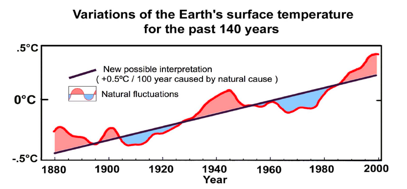
Figure 1: Akasofu's interpretation of the global warming trend and causes since 1880
In order for this to be a physically sound argument, Akasofu must explain the physical mechanism behind the "LIA recovery", and why this 0.5°C global warming trend continues to persist. What is the underlying cause? Surely a geophysicist will examine this question.
Akasofu's Physical and Logical Failure
Unfortunately, nowhere in the 55 pages of his unpublished paper does Akasofu examine the physical cause of his purported 0.5°C per century warming trend since 1825. Most of the paper is spent looking at various regional temperature proxies, as well as ice data, to show that the purported warming trend exists.
"Obviously, the LIA was caused by a natural change or changes. Further, the fact that an almost linear change of the temperature rise had been progressing until 2000 suggests that the linear change is a natural change, because the rapid increase of CO2 began only after 1946 (Figure 2c). The linear change began from 1800~1850, at least one hundred years before the rapid increase of CO2 in the atmosphere."
In the published version, Akasofu devotes a section to a discussion about galactic cosmic rays, but does not attempt to quantify their effect. In fact he begins the section by stating:
"It is not the purpose of this section to discuss any major causes of climate change."
Well that's a relief, I was afraid he was going to sneak some science in there! Instead, Akasofu appears to assume that the planet will naturally revert back to its previous state after a significant climate change as in the LIA. However, Rea et al. (2010) found that the climate does not behave in this manner:
"we present a new way of looking at long memory in these reconstructions and proxies, which gives support to them being described by the non-stationary models. The implications for climatic change are that the temperature time series are not mean reverting. There is no evidence to support the idea that the observed rise in global temperatures are a natural fluctuation which will reverse in the near future."
Not only does Akasofu fail to examine the physical causes of the warming since 1825, but he also fails to consider the possibility that a number of different factors are at play. For example, increased solar activity and low volcanic activity (and even human greenhouse gas emissions) contributed to the early 20th Century warming, but solar and volcanic activity have not contributed significantly to the warming since the mid-20th Century. It is a logical failure to assume that a warming over nearly two centuries must have the same physical cause throughout the 200 years, and this argument is contradicted by the observational data (i.e. increasing solar activity in the early 1900s, but no increase since mid-century).
Unsupported Linear Warming Assumption
A further failure of Akasofu's analysis is that while the linear warming trend over the past two centuries is approximately 0.5°C per century, nearly all of that warming has occurred over the past 100 years, as Akasofu's own Figure 7a shows (Figure 2).
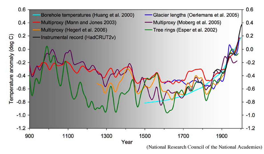
Figure 2: Various temperature reconstructions in Akasofu Figure 7a, showing that most of the temperature increase over the past 200 years has occurred since 1900.
Akasofu also fails to justify his assumption of a linear warming trend over the past two centuries. A slight warming in the 1800s, followed by faster warming in the early 1900s, followed by even faster warming over the past few decades - sounds rather like an exponential trend, doesn't it? If you're going to fit a certain trend to the data, you first need a physical justification - what's the cause? Akasofu does not have this justification, and without a physical reason the choice of trend is essentially arbitrary.
Indeed, in a previous post, Riccardo fitted various trends to the global temperature data (Figure 3), and found that whether the residuals form a clear cycle depends on the choice of trend. In fact, the residual is more cyclical for an n=2 exponentlal fit than a linear fit (Figure 4). Therefore, Akasofu's argument for fitting the data with a trend plus multi-decadal oscillations makes more sense for an exponential trend.
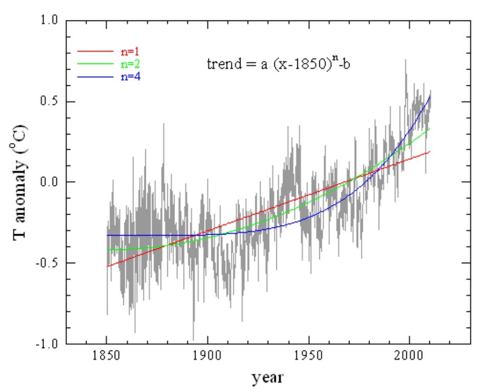
Figure 3: HadCRUT3 monthly data (grey) and the fits for n=1 (red), 2 (green) and 4 (blue).
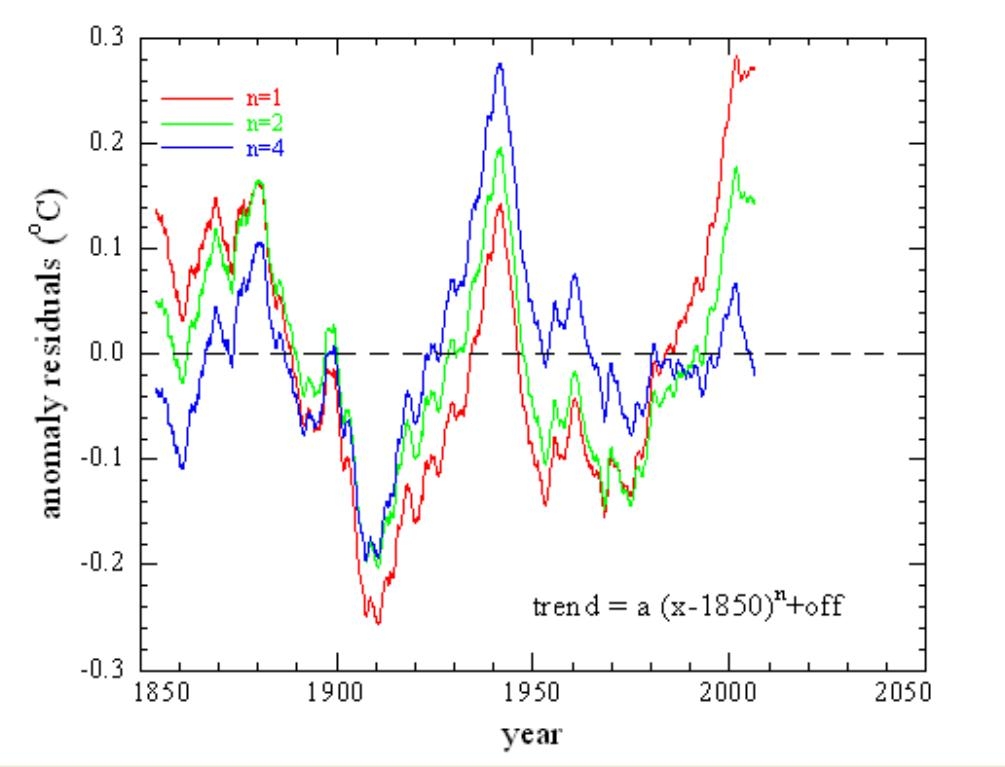
Figure 4: Residuals calculated with the Figure 3 trend curves shown with n=1 (red), 2 (green) and 4 (blue).
Thus we find that Akasofu's entire premise is faulty on many different levels: physical, logical, and statistical.
Natural Variability
Akasofu does finally address the issue of physical causality later in his paper, when he states that the multi-decadal oscillations such as the Pacific Decadal Oscillation (PDO) can explain the acceleration in global warming from approximately 1977 to 2000. While it's true that a positive PDO can explain some of the warming of surface temperatures, PDO and natural variability cannot explain either the ocean warming at the same time, or the long-term warming trend, whose cause Akasofu has still failed to address.
Akasofu's Prediction
Considering that Akasofu's paper almost entirely neglects physics and fails to address the causes of the observed warming trends, one might expect very little accuracy in his predictions of future temperature changes. However, although he does not explain its cause, Akasofu does assume that the 0.5°C per century warming trend discussed in his paper will continue into the future. So if the anthropogenic + natural warming trend is limited to 0.05°C per decade, Akasofu will have stumbled onto a correct prediction (Figure 5).
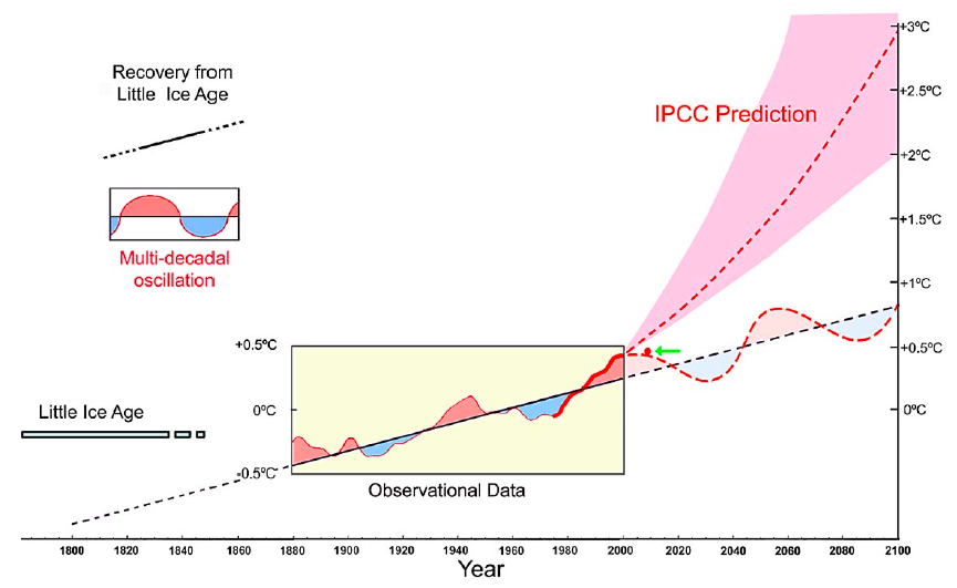
Figure 5: Akasofu vs. IPCC global temperature predictions
In order to evaluate the accuracy of Akasofu's prediction so far, we digitized Figure 5 and compared it to the Wood for Trees Index, which is a composite of the global temperature datasets compiled by NASA GISS, HadCRU, UAH, and RSS (Figure 6).
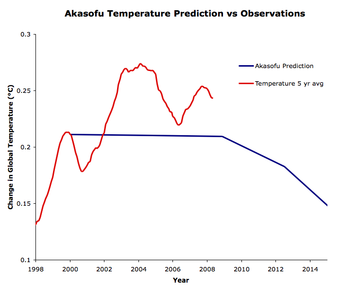
Figure 6: Akasofu's prediction from 2000 to 2015 (blue) vs. the Wood for Trees Index five year running average (red).
Akasofu's Results
As you can see, Akasofu predicted a very slight cooling (approximately 0.02°C) between 2000 and 2011, whereas the Wood for Trees Index has warmed approximately 0.1°C over that period. So his prediction has not been terribly inaccurate yet - there hasn't really been sufficient time to evaluate its accuracy.
However, given the expected atmospheric CO2 increase over the next century, in order for Akasofu's predicted 0.05°C per decade warming trend to hold true, climate sensitivity would have to be in the range of 0.5 to 1.5°C for doubled CO2, depending on how rapidly CO2 continues to increase. Coincidentally, this is approximately the same low climate sensitivty range that his fellow "skeptics" like Spencer, Lindzen, and Christy argue is accurate.
However, it's also important to note that as in Don Easterbrook's temperature predictions, Akasofu has completely ignored the warming effects of increasing atmospheric CO2 in his predictions, assuming that whatever caused the pre-industrial warming is also causing the current warming. Thus Akasofu is really arguing that the climate sensitivity to CO2 is effectively zero, and that the observed and projected warming is due to some other 'natural' effect which he has not identified, but describes as "LIA recovery". This is not a physical argument; Akasofu implies that extra heating from CO2 (which we've directly measured with satellites) isn't causing any warming - the heat somehow magically disappears. So even if his fellow "skeptics" are somehow correct about low climate sensitivity and Akasofu's prediction turns out to be accurate, it will simply be due to sheer luck.
Any temperature prediction like Easterbrook's and Akasofu's which totally ignores the warming effects of CO2 is fundamentally physically incorrect. Akasofu assumed a linear trend of unknown cause, an unknown periodic variability, and assumed that these two unknown phenomena will continue in the future, while disregarding what we know about the physics of the climate system. Unfortunately there's no knowledge to be gained from Akasofu's paper, except how not to predict future climate change.
NOTE: As you can see at the top right corner of this post, John Cook has created a snazzy new button for the Lessons from Past Climate Predictions series. We have also added some older posts which analyzed climate predictions, which you can see if you click on the button.


[dana1981] Using HadCRUT is a cherrypick. It shows the least amount of warming since 2000 because it excludes the Arctic. Frankly I'd prefer to use GISTemp because I think it's probably the most accurate, but then 'skeptics' would accuse me of cherrypicking as well. I chose the WfT Index because it's a composite of the four most popular global temp datasets. Using a composite eliminates all accusations of cherrypicked datasets.
[dana1981] No you're missing the point. Akasofu's prediction is inaccurate because it's not based on physics. As I noted in the article, even if Akasofu gets lucky and his prediction turns out to be close to the actual temperature change, it won't be because he was right, it will be because he was lucky.
I think it is quite possible to spot a pattern and project results into the future based on it without knowing that pattern's cause. For example it had long been established that there was a solar sunspot cycle of approximately 11 years long before the physics was known.
Akafosu thinks he has spotted a 60 year cycle in the temperature data but he does not have an explanation. He has simply projected the data forward as if the cycle he has spotted existed. That is a perfectly valid, if rather limited, thing to do. I am sure the early solar astronomers did the same sort of thing and projected pretty accurately even though the science behind the cycle was unknown, and could not have been discovered with the technology available at the time.
Just because a cause is unknown does not mean that it does not exist, and it is unfair to say that if he is right it is just down to luck. He may have spotted a cycle that the current state of climate science has no explanation for.
Out of interest I have (rather crudely) extended his projection to today against the WfT index below. So far his 'luck' is holding out (or maybe he is correct!).
Support for the 60 year cycle idea is also available from plotting the annual rate of change using long term linear regression analysis. The graph linked to below shows 60 and 30 year linear regression curves for the monthly HadCrut4 data. I used that series because it goes back to 1850.
This seems to support a rough 60 year cycle in the rate of change of temperatures, although it does seem to show accelleration in the rate of change over the last century and a half that Akafasu does not mention. I have put each data point at the centre of the 60 years so that the latest figure is plotted as at 1983. Similarly the 30 year curve is offset -15 years. Currently the 60 year linear regression line shows a rate of change equivalent to just over 1c a century. So where will it go from here?
The graph below superimposes the 15 year linear regression line (centred at -7.5 years). This has taken a steep drop down to a rate equating to around 0.4c a century, a rate not seen since the early 1970s. So unless this 15 year line makes a sudden move in an upward direction (quite possible of course!) Akafasu's projection might carry on being closer to the actual temperature line than the IPCC Model Mean.
Personally I think the CO2 warming signature in this data is in the accelleration in the rate of change rather than the absolute rate at any particular point in time. Just a thought!
I agree with you that this is hardly cutting edge science, more an interesting blog post. As you say, the real science would be finding an explanation for a 60 year cycle in global temperatures. Not one for me, the extent of my expertise is fiddling around with numbers in Excel!
Oops! My sincere apologies to Mr Akasofu for spelling his name so comically wrong, twice, in the above post.
Matthew, I think you're being rather generous to Akasofu's prediction, which was one of about 0.03°C surface cooling from 2000 to 2013, whereas we've actuallly seen about 0.07°C surface warming despite a preponderance of La Niña events and increased heat storage in the deeper oceans. Even with nature doing everything it can to help him out, Akasofu still hasn't done very well, off by a tenth of a degree after just 13 years.
I examined Akasofu's work last year as he was being used to support denialist argument presented by the GWPF. Was I being rather generous?
Before responding to Matthew L @35, I checked a few details, which themselves raise additional issues. The least important of these is that the graph of the running five year average of the Wood for Trees (WfT) temperature index is offset by about - 4 months. Because of the steep slopes in the area, that offsets the start point of the prediction by about 0.005 C. Having noted that, that seems inconsequential to me. I note it, howeve, in case anyone else finds the same discrepancy.
Also of little consequence, Matthew L's extension of the WfT observed index is too low. On WfT, the low point around 2010 is no lower than that around 2007. Matthew, however, places it around 0.005 C lower.
The most important issue, however, is that Akasofu's prediction is incorrectly stated by Akasofu. In all his figures, Akasofu shows a sine like wave in representing his 60 year cycle. That is consistent with the various indices (AMO, PDO) that he presents as evidence of that oscilation. Therefore, his prediction is of a sine like oscilation superimposed on a linear 0.5 C per century trend.
In a sine like oscilation, however, as the wave approaches the peak or trough, the slope of the sine like component of the wave approaches zero. That means, at the peaks and troughs, the underlying 0.5 C per century trend should be evident. Given that Akasofu states that the most recent peak was in 2000, and the most recent trough in 1970, he should predict a 0.05 C per decade trend for the ten years (or indeed, any symetrical interval) bracketing those years. So, his predicted trend from 1995-2005 is 0.05 C per decade. It is actually 0.213 C per decade (GISTEMP; NOAA: 0.212; HadCRUT3: 0.234; HadCRUT4: 0.222). 1970 fairs a little better, with trends ranging from 0.087 to -0.016 C per decade (GISTEMP and HadCRUT4).
Of course, with a sine wave fluctuation, the maximum negative trend is predicted to be reached in 2015, so the trend from 2000-current is predicted to be significantly negative (0.075 C/decade). In fact, it is positive (GISTEMP: 0.072 C/decade; NOAA: 0.044 C/decade; HadCRUT3: 0.008 C/decade; HadCRUT4: 0.043 C/decade).
However, Akasofu can only avoid refutation of his hypothesis by the recent data by acknowledging that over the short term, the impact of ENSO and volcanism dominate over long term trends.
That does not save him, however, for his prediction, with a sine like oscilation, shoud be for a maximum positive trend at around 1985, with the trend gradually developing to that point, before gradually falling back to 0.05 C per decade 15 years later. In fact, the trend from 1970 to 2000 is indistinguishable from a linear trend plus noise (as shown by the plateau in the trend, see graph below). The same can also be said of the trends from 1940 to 1970, and from 1910 to 1940. Indeed, the model of a sine wave superimposed on a linear trend performs very poorly in predicting trends:
(Successive 217 month trends for GISSTEMP and linear plus sine wave models. Click on graph for larger image.)
It should be noted that Matthew L's apparently sine like rate of change graphs are purely a function of using trend lengths approximately equal to, or greater than a half cycle. Doing so guaranttees a sine like graph for any underlying regular wave function (although the amplitude of the wave function approaches zero as the trend length gets large relative to the full underlying wave length.)
As previously noted, Akasofu can accomadate this discrepancy by allowing for large short term fluctuations related to ENSO. If he does so, however, he must explain why he makes no attempt to remove the ENSO signal, and why the underlying trend with the ENSO signal removed is so strongly positive.
Finally, it could be reasonably argued that I am being too kind to Akasofu. In modeling his prediction, I have used a regular sine wave with an amplitude of 0.2 C and a wave lenght of 60 years. In fact, in his only direct presentation of the wave I am aware of, he shows two full cycles, with no cycle having the same duration, amplitude or shape of any other:
(From Akasofu, "On the recovery from the LIA", Natural Science, 2010, Fig 4d)
Allowing this, essentially freehand modification means Akasofu could have fit any sine like pattern in the tempeature data, regardless of its cause. It also means the pattern he fitted is not predictive, for no information is contained about the lengths or amplitudes of future "cycles", given that these parameters are allowed to vary freely.
Tom, thanks for the comments. My extension of the WfT graph was simply to run the WfT graph again, take a screen cap and overlay it on the SkS graph. It was just to give an idea of how things had gone since this article rather than to be figure accurate. I think some of the problem is that when the article was written the WfT series would have been using HadCRUT 3 whereas it is probably now using HadCRUT 4.
I note your comment "It should be noted that Matthew L's apparently sine like rate of change graphs are purely a function of using trend lengths approximately equal to, or greater than a half cycle. Doing so guarantees a sine like graph for any underlying regular wave function".
Surely that is the whole point? The graph is trying to reveal the "underlying regular wave function". I am not sure it is the case with scientists, but certainly the climate blogging community go out of their way to deny any kind of "regular wave function" exists in the climate and that it is purely an illusion caused by noise and that there is no physical cause known - as is clearly stated by Dana in this article. And my retort was that just because a cause is not known does not mean that there is no cause or that the apparent pattern does not exist - using the example of early solar astronomers seeing the sun spot cycle.
I am not really trying to defend Akasofu in his prediction of the future trend which, as Dana stated in his reply to my post, is running cold relative to the actual figures. However it is running cold rather less than the IPCC predictions are running warm. I think he is "on to something" in that there does appear to be an "underlying regular wave pattern". However, what I think he has missed, is that there is an upward trend in that wave pattern which is causing an increase in the underlying rate of change.
What I see in this graph is that the short-term rate of warming may be lower than the IPCC was predicting, leading to a lower temperature in 2100, but that the rate of warming is gradually increasing which means a delayed but possibly larger warming subsequently. Obviously that is reading an awful lot into one chart, and it would be interesting to build a hypothesis for what might be going on.
Matthew L @40, there is no question that the GMST is initially flat at the start of the twentieth century, rises sharply, before being flat again, then rising sharply again. This means it can be approximately modelled by a linear trend plus a regular wave (saw tooth or sine). It is a far different thing to be able to show that it is better modelled by such a pattern than, for example, the global forcings resulting from solar, volcanic, GHG and aerosols. Even if you could accomplish a superior fit with the linear trend plus regular wave (dubious, but possible if you add in extra parameters), that does not show a physical basis for your theory, which of course the explanation in terms of forcing has in spades. Your graph showing an "underlying regular wave function" does no more than show the first point, ie, that the temperature trend in the twentieth century is not a simple straight line or parabola. It tells us less than we knew just looking at the temperature graph.
As to how Akasofu's predictions are fairing, if we consider this graph of the linear trend plus regular sine wave, not very well:
For comparison, this is the fit between temperatures and known forcings:
You should pay attention to the end of the graph. There is sufficient discrepancy between the Akasofu prediction and actual temperatures that he must relly on the effect of short term events to explain the discrepancy. But then he is left struggling to explain why La Nina years such as 2008 and 2011 are above his prediction rather than below it. Indeed, we can test his prediction by removing ENSO as a factor by comparing temperatures El Nino years, La Nina years and La Nada years. Once this confounding factor is removed, if there is anything to be said for Akasofu's theory, the pattern he predicts should be evident:
Doesn't seem to work for him.
I think making any kind of prediction of future global warming from such a simplistic statistical analysis is a rather foolhardy exercise. Akafosu would have been better to have pointed out the approximate 60 year cycle and left precise temperature predictions to the gambling fraternity! I know you will stick to your point about his prediction being wrong, but I will stick to mine that it is proving closer to the actual figures than the IPCC predictions. But that is all beside the point.
Personally I think prediction of any kind of the overall GMST is a dangerous thing to do as, over short (non-climatic) time periods of less than 30 years, it can very easily go wrong for the sorts of reasons you highlight (ENSO, volcano activity, quiet sun etc).
Making predictions such as those in the IPCC reports can lead to hysterically misinformed articles in the press such as the one in today's Mail on Sunday in the UK.
Ultimately the only way we will know if such a 60 year cycle does exist is if it continues to show up in the temperature record. What is clear from the figures though is that the climate is warming, and that the underlying rate of that warming is accellerating.
Matthew L
The Rail On Sunday article you mention. A strange article. Myself, I would have thought for a "95% certain estimate" to be "spectacularly wrong" it would have at least to stray outwith the zone of 95% certainty. The Daily Rail being such an informative newspaper doesn't bother to wait for the actual event but informs us it is "about to crash out."
The data appears to be HadCRUT4 annual data, so now we have the "foolhardy" Rail predicting the HadCRUT4 2013 average will be below the IPCC 95% confidence limit, which is what? About 4.7 deg C?
BTW - If there is a 60 year cycle, why is it so scrunched up within the BEST record in years before 1900?
Matthew L @42, the current temperature trend from 1997 is 0.074 +/- 0.175 C. That strikes me as being pretty much midway between the IPCC prediction of "about 0.2 C per decade" and Akasofu's prediction of "a halting of warming after 2000". Indeed, that overstates the accuracy of Akasofu's prediction, which should show a trend of (at most) -0.075 C per decade since 2000. Last time I looked, the difference between the Akasofu "prediction" and the trend ( 0.149 C/decade) was greater than the difference between the IPCC prediction and trend ( 0.126 C/decade).
(Out of time, more later.)
Matthew L @42 (Cont)
The real problem with articles like that in the Mail on Sunday is not that the IPCC makes predictions, but that the Mail on Sunday's reporting is atrocious.
For a start, the IPCC's actual predictions are stated in terms of the expected difference in average temperatures over twenty year periods. Thus, the AR4 predicts that the average Mean Global Surface Temperature over the period 2011 to 2030 will be 0.64 C (A2 scenario) greater than the average over the period 1980 to 1999, assuming no major volcanic events and changes in solar activity. As there where two major volcanic events between 1980-1999, that represents a prediction of just less than 0.2 C per decade in periods not significantly influenced by volcanic activity (as now) and only over multi-decade time scales. This nuance is important, but completely lost in normal reporting (let alone the Mail).
Further, the supposed 95% confidence interval shown by the Mail is nothing of the sort. Rather, it is the envelope in which 95% of model runs are found. The two things are related but not the same.
Pressing on, the HadCRUT4 temperature series has only 2/3 rds of the reporting stations of the NOAA or GISS products; and what is worst, they have a biased distribution which understates warming. Use of HadCRUT4 rather than the GISS L/O index is unjustified, and makes large difference in short term comparisons.
As noted above, it is absurd to consider a prediction falsified because it has not yet crashed out of the 95% confidence interval, Indeed, by definition, we expect accurate predictions to spend 5% of the time outside the 95% confidence interval.
Further, Roses' panel of experts are a very biased selection, and not particularly expert in the particular topic. (Curry's area of specialization, for example, is Hurricanes - not GMST.)
In fact, it is safe to say the only thing true or not massively distorted in the article is the name of the author.
In the face of overwhelming incompetence, or in Rose's case, probable deliberate malfeasance, by reporters; it is absurd to blame climate scientists for the poor state of climate science communication; or in this case the total misrepresentation of the nature and state of play of the IPCC predictions.
Tom Curtis @45
We should of course make clear - you do actually agree with Matthew L @42 in that you amply demonstrate that "the Mail on Sunday's reporting is atrocious" while he calls it "hysterically misinformed." Interestingly Rose's "analysis" was fantastic enough to be re-transmitted verbatum by the GWPF but it only managed to appear as a Newsbyte on Wattsupia (which adds further to the argument that GWPF stands for Gentlemen Who Prefer Fantasy).
Your disagreement with Matthew L is that he sees this journalistc nonsense as a consequence of people "making predictions such as those in the IPCC reports" while you consider it "absurd to blame climate scientists for the poor state of climate science communication."
Beyond the trivial argument that without the IPCC, without the scientific concensus, it is unlikely Rose would be given any column-inches for his climatological clap-trap, is there any further reason for Matthew L's view that making relatively precise predictions of future temperature is "foolhardy"?
In such context, the point as to which prediction is looking the more sensible or correct (Akasofu or IPCC) is pure theatre but hay-ho.
The Akasofu graph (figure 5 in post) scales for 2012 as IPCC(central value) = 0.63, IPCC (range min) = 0.57, Akasofu = 0.39. Recorded temperature for 2012 are NCDC (which matches Akasofu's 'record' plotted back to 1976) = 0.56 (2008-12 average = 0.54).
And for 2013, Akasofu's graph yields a prediction of 0.37. Does anybody else care to make a prediction for the NCDC 2013 average? (So far, the Jan/Feb average stands at 0.58.)
I agree that climate change is real, but the comments on this article show even less thought than akosofu's original article.
I find it hysterically ironic that the person who finds it patently offensive to use the term tree hugger, even saying it is elitest, then uses the term climastrology, and gets high fives from Dana for using it. Also interesting that the terms denialist and denier were used, but does not seem to offend Dana the way tree hugger did. Pot, meet kettle.
Labelling is always something of a problem, but calling someone a denialist seems accurately descriptive. Its a term for someone who denies the scientific evidence. Tree hugger is an epithet for an environmentalist. Its a bad error to confuse concern about the changing climate for environmentalism, especially when you mean environmentalism as a value system. Furthermore claiming use of WfT index as tree-hugger or cherry-picking is plain bizarre. On the other hand, "eric the red" and his other sock-puppets havent exactly been beacons of clear thinking here.
Climatastrology is a term for predicting future climate without a physical basis. Yes, its an another insulting epithet, but are you really supposed to take seriously theories that ignore the physical factors affecting past climate in preference for some wishful "natural cycle". Its bad maths, bad science and needs to be labelled as such.
On the hand I agree that I am quite sure akosofu put a lot more thought into his original article than the commentator or me into the comments, but its shame his talents were not more usefully employed.
Ah - code-phrase alert: I'm going to wonder if you believe <i>anthropogenic</i> climate change is real, and, further, whether you accept that those anthropogenic emissions are the chief cause of the current warming.
Finding something 'hysterically ironic' and damning all the comments on the article seems more than a little over-wrought.
That's right - I'm not in html land anymore!... ;-)