Climate Science Glossary

Term Lookup

Enter a term in the search box to find its definition.

Settings

Use the controls in the far right panel to increase or decrease the number of terms automatically displayed (or to completely turn that feature off).

Term Lookup

Settings


All IPCC definitions taken from Climate Change 2007: The Physical Science Basis. Working Group I Contribution to the Fourth Assessment Report of the Intergovernmental Panel on Climate Change, Annex I, Glossary, pp. 941-954. Cambridge University Press.

Home Arguments Software Resources Comments The Consensus Project Translations About Support

Twitter Facebook YouTube Mastodon MeWe

RSS Posts RSS Comments Email Subscribe


Climate's changed before
It's the sun
It's not bad
There is no consensus
It's cooling
Models are unreliable
Temp record is unreliable
Animals and plants can adapt
It hasn't warmed since 1998
Antarctica is gaining ice
View All Arguments...


Username
Password
New? Register here
Forgot your password?

Latest Posts

Archives

Modeled and Observed Ocean Heat Content - Is There a Discrepancy?

Posted on 25 May 2012 by dana1981

Recently there have been a number of claims of a large discrepancy between modeled and observed ocean heat content (OHC), for example by Roger Pielke Sr., David Evans, and Bob Tisdale.  All of the associated analyses by these individuals focus on a paper by Hansen et al. (2005)Earth's energy imbalance: Confirmation and Implications, published in Science.  In this paper, Hansen et al. ran a NASA Goddard Institute for Space Studies (GISS) climate model to, among other things, simulate the change in OHC of the upper 750 meters of global oceans from 1993 to 2003 (Figure 1).

Hansen 2005 OHC 700

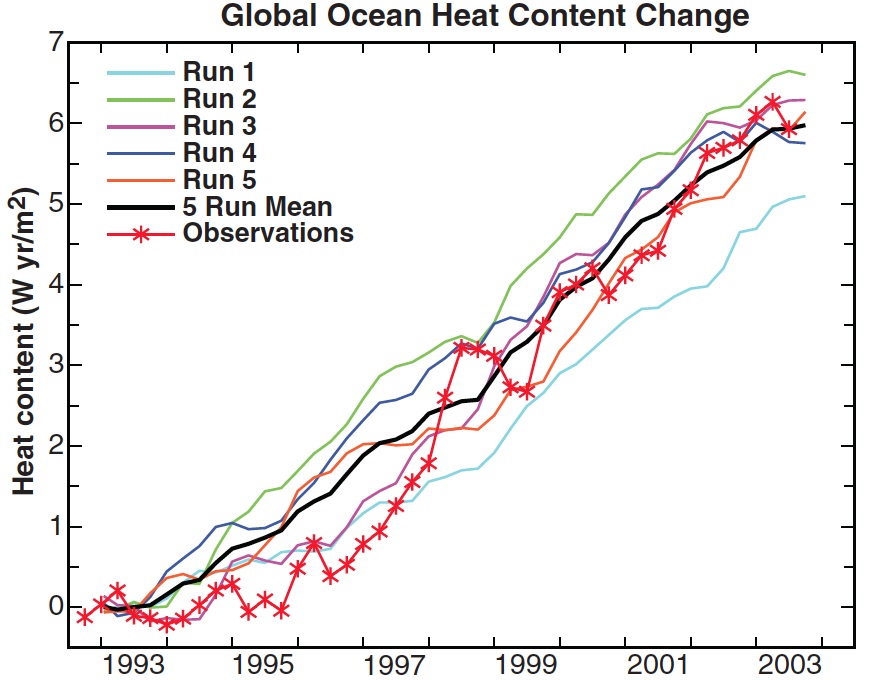
Figure 1: OHC change between 1993 and 2003 in the top 750 meters of world ocean. Observations are from Willis et al. (2004). Five model runs are shown for the GISS coupled dynamical ocean-atmosphere model.  From Hansen et al. (2005).

As you can see, from 1993 to 2003 the 0-750 meter OHC increase was close to 6 Watt-years per square meter (W yr/m2), accounting for an energy accumulation of approximately 0.6 W/m2 over that period.

We recently discussed the newest OHC results from Levitus et al. (2012), who estimate the 0-2000 meter OHC increase from 1990 to 2009 at about 14 x 1022 J, accounting for an energy accumulation of about 0.45 W/m2 (Figure 2).

levitus OHC

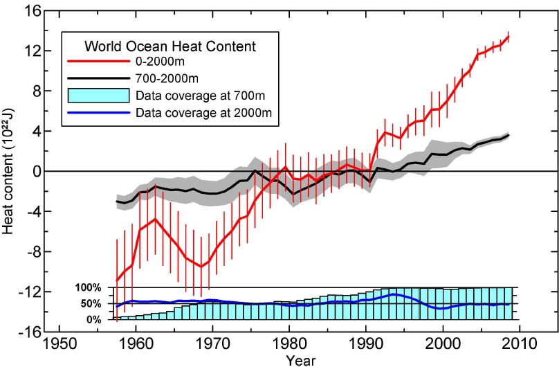
Figure 2: Time series for the World Ocean of ocean heat content (1022 J) for the 0-2000m (red) and 700-2000m (black) layers based on running pentadal (five-year) analyses. Reference period is 1955-2006. Each pentadal estimate is plotted at the midpoint of the 5-year period. The vertical bars represent +/- 2 times the standard error of the mean (S.E.) about the pentadal estimate for the 0-2000m estimates and the grey-shaded area represent +/- 2*S.E. about the pentadal estimate for the 700-2000m estimates. The blue bar chart at the bottom represents the percentage of one-degree squares (globally) that have at least four pentadal one-degree square anomaly values used in their computation at 700m depth. Blue line is the same as for the bar chart but for 2000m depth.  From Levitus et al. (2012)

So Hansen et al. predicted a 0.6 W/m2 energy accumulation in the upper 750 meters of oceans from 1993 through 2003 (and approximately the same accumulation through 2011), whereas Levitus et al. observe a 0.45 W/m2 accumulation in the upper 2000 meters.  Thus the three individuals above conclude that we have a significant model-data discrepancy here.  Are they right?

Unfortunately, the answer is not a simple one.

Problematic OHC Data

The first challenge in answering this question lies in the difficulty in measuring OHC, which prior to the implementation of the ARGO float network around 2003, was measured with instruments like expendable bathythermographs (XBTs), which have biases that are difficult to correct for.

Estimates of the OHC increase are not very consistent.  For example, Levitus et al. (2012) estimate the 0-700m increase from 1993 to 2003 at 0.44 W/m2, while Lyman et al. (2010) estimate it at approximately 0.6 W/m2.  If the Levitus estimate is correct, then Hansen's model overestimated the OHC increase.  If the Lyman estimate is correct, so was the model.

Recent Data, Deeper Oceans

Although the model run in Hansen et al. (2005) did not project OHC changes beyond 2003, we can estimate that they would continue increasing roughly linearly, and thus that the associated post-2003 energy accumulation should continue to be close to 0.6 W/m2 if the model mean is correct.

A second challenge involves the fact that over the past decade, the 0-700m OHC increase has slowed primarily because more heat has gone into the 700-2000m layer.  This short-term deeper ocean heat storage is consistent with the "Hiatus Decades" predicted by Meehl et al. (2011).  During "Hiatus Decades," there is less warming of the surface air and shallow oceans, and more warming of the deeper oceans (Figure 3), precisely as we've observed over the past decade, as Levitus et al. (2012) found.

Meehl hiatus warming

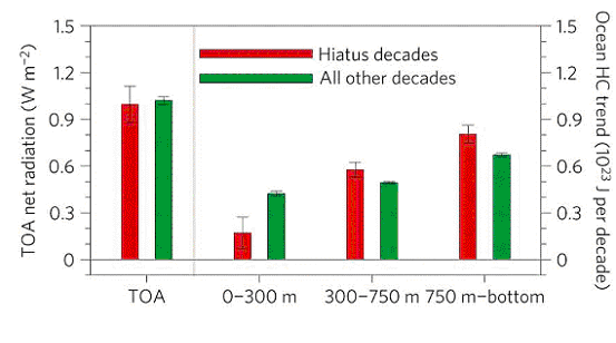
Figure 3: Left: composite global linear trends for hiatus decades (red bars) and all other decades (green bars) for top of the atmosphere (TOA) net radiation (positive values denote net energy entering the system). Right: global ocean heat-content (HC) decadal trends (1023 J per decade) for the upper ocean (surface to 300 m) and two deeper ocean layers (300–750m and 750 m–bottom), with error bars defined as +/- one standard error x1.86 to be consistent with a 5% significance level from a one-sided Student t-test.  From Meehl et al. (2011)

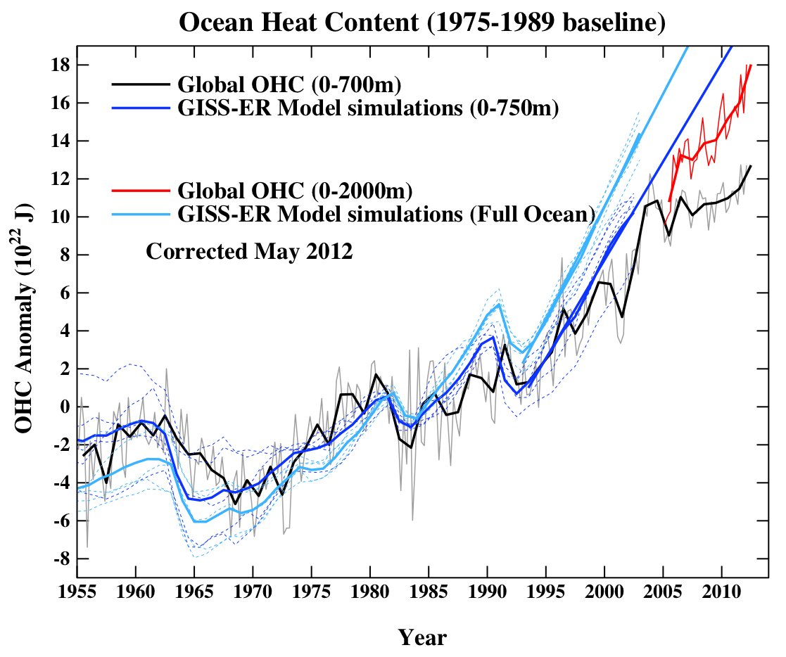
This does create a model-data discrepancy for the 0-700m ocean layer in most instances.  However, the 0-2000m OHC measurements are fairly consistent with GISS model predictions.

These observational estimates predominantly over the ARGO era are somewhat lower than the GISS-EH model predictions (approximately 0.7 W/m2 for the whole ocean).  However, note that thus far we have only examined one model OHC estimate (GISS-ER), but there are of course many other climate models.  The other GISS model used in the 2007 IPCC report, GISS-EH, estimates the 0-700m OHC increase at closer to 0.5 W/m2 and 0-2000m closer to 0.6 W/m2, which is probably more consistent with the observations listed above.  Domingues et al. (2008) also show the OHC simulation results from a number of climate models in their Figure 2.

Inaccurate, Unskeptical Graphs

One problem amongst the various OHC model-data comparison graphs created by some of the contrarians listed above has been the most popular of the 5 characteristics of scientific denialism: cherrypicking.  In fact, several cherries have been combined into an über-cherrypick.

The first cherrypicks have already been discussed above - ignoring OHC below 700 meters, and ignoring the OHC increase prior to 2003.  The latter cherrypick is particularly egregious considering that the model results being examined from Hansen et al. (2005) were from 1993 to 2003.

Tamino identifies the third cherrypick, which he describes as a misrepresentation.  This one involves shifting the OHC anomaly data downward and/or the modeled OHC trend upward such that they align in 2003 (in other words, cherrypicking the anomaly baseline).  In reality, there was a large spike in OHC from about 2001 to 2003, so 2003 was well above the long-term trendline.  Tamino illustrates the third cherrypick in Figure 4 below.

reality vs. Tisdale

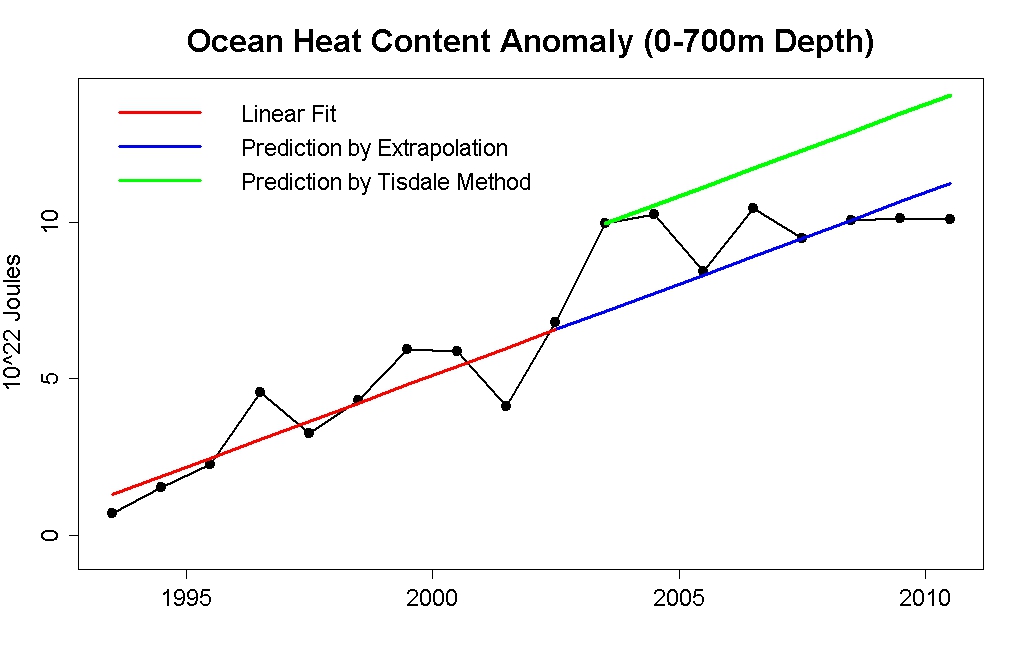
Figure 4: OHC data from NODC (black) and linear fit from 1993 to 2002 (red), linear extrapolation of that trend (blue), and Bob Tisdale's depiction of the predicted trend (green).  David Evans created a graphic almost identical to Tisdale's as well.

By choosing the baseline such that the models and data are equal in 2003, Tisdale and Evans have graphically exaggerated a model-data discrepancy.

Accurate Graph

I discussed the purported model-data OHC discrepancy with Gavin Schmidt of NASA GISS and the RealClimate blog; many thanks to Gavin for his helpful responses to my inquiries.  Our discussions resulted in a correction and update to model-data comparisons at RealClimate (Figure 5).

Schmidt model-data comparison

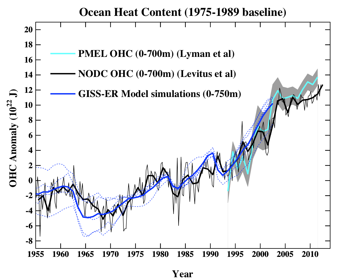
Figure 5: Individual GISS-ER climate model OHC simulations (blue dotted lines) and the ensemble average (heavy blue line) vs. OHC annual average (thick black line) and OHC seasonal variability (data point for every 3 months; thin black line).

As noted above, the GISS-ER model simulations are fairly consistent with the Lyman OHC reconstruction, but expect a greater OHC increase than in the Levitus reconstruction, including over the last decade (if the model simulations are extrapolated forward).

Remaining Unresolved Questions

OHC changes remain uncertain in both models and observations.  As Figure 1 shows, the Hansen et al. (2005) five 1993-2003 OHC simulations varied from energy accumulations of 0.5 to 0.65 W/m2.  There is also a 0.1 W/m2 difference between the mean OHC accumulation in the two GISS models discussed here, and of course there are also many other global climate models.  There is too much uncertainty to say for certain if there exists an OHC model-data discrepancy, but it is a possibility.

Hansen et al. (2011) provides a very interesting discussion of this issue.  In this paper, the authors note that there is a continuum of possible combinations of human aerosol forcing strength and OHC mixing efficiency.  The strength of the aerosol forcing remains a large uncertainty, potentially ranging anywhere from -1 to -2 W/m2 at present.

On the one hand, we have good measurements of global surface temperature, and climate models have accurately projected global warming of the surface, indicating that the climate sensitivity in those models is accurate, as confirmed by paleoclimate data.

On the other hand, we have these two significant uncertainties regarding the actual radiative forcing and the efficiency of OHC mixing.  For example, if the aerosol cooling effect is stronger than we think, but oceans don't mix heat as efficiently as we think, climate models will still accurately simulate the surface warming.  The same is true if the aerosol forcing is weaker, but ocean heat mixing is more efficient than in climate models.  Hansen et al. (2011) weighed in with their conclusion on this matter:

"We conclude that most climate models mix heat too efficiently into the deep ocean and as a result underestimate the negative forcing by human-made aerosols. Aerosol climate forcing today is inferred to be -1.6±0.3 W/m2, implying substantial aerosol indirect climate forcing via cloud changes."

The Hansen et al. inferred aerosol forcing is about 33% larger than the 2007 IPCC best estimate of -1.2 W/m2. 

Remaining Uncertainties - Good News and Bad News

The good news here is that if Hansen et al. are right, there is less of an OHC energy imbalance than we think, and thus less "warming in the pipeline" from the CO2 we've already emitted.  Hansen describes the bad news as a "Faustian Bargain" in which more warming results as we inevitably reduce human aerosol emissions.  Overall the good and bad news should roughly offset in terms of future surface warming.

In any case, while the OHC issue is not entirely settled in either models or observational data, climate contrarians have exaggerated the possible disrepancy between the two through their standard scientific denial practice of cherrpicking data.  It will be interesting to see how this issue is resolved in the coming years as observational data and climate models improve, and in the forthcoming IPCC Fifth Assessment Report, but in the meantime exaggerating the possible discrepancy is neither constructive nor truly skeptical behavior.

0 0

Printable Version  |  Link to this page

Comments

Comments 1 to 36:

  1. Also kudos to Gavin Schmidt for so quickly noting and correcting the mistake in his prior model-data comparison posts. That's how true skeptics behave.
    0 0
  2. Dana, In addition to the disinformation that "skeptics" are spreading on this issue, Roger Pielke Senior continues to try and undermine Levitus et al. (2012) (and James Hansen's research) by making unsubstantiated and subjective assertions/challenges. Pielke Senior claims that "This is a discrepancy of ~2 between his prediction and the analysis of Levitus et al 2012 if the latter observational analysis is correct." This is incorrect. One has to compare the data for the same time windows and for the same depth range. Comparing a rate for 1955-2010, with one for 1993-2003 as Pielke does is ludicrous. Pielke Senior then goes on to try and defend his (incorrect) conclusion by claiming that "While one possibility is that the rate increased after 1993 compared to earlier in the 1955-2010 period, but visually (using the eyecrometer) this does not seem to be the case." I do not know why Pielke chooses to rely on the notoriosly innacurate and subjective "eyecrometer" method when one can download the Levitus et al. (2012) data and calculate some statistics. Additionally, Pielke is applying his eyecrometer to the 0-2000m data here (the image from Levitus et al in his post) while actually making reference to the 0-700 m data. So instead of using the "Pielke eyecrometer™" let us look at the 0-700 m data for Levitus et al. shall we? The slope for 1955-2011 for 0-700 m is 0.26x10^22 J/yr, while for 1993-2011 the slope is 0.58x10^22 J/yr. So the slope from 1993 to present is more than double that for 1955-2011. Pielke Senior also alleges that "Levitus et al 2012 may be overstating the magnitude of recent upper ocean heating as clearly seen in the figure below from NOAA’s Pacific Marine Environmental Laboratory" This is simply not true. Analyzing the Pacific Marine Environmental Laboratory (PMEL) data (available here) we get a rate/slope of 0.78x10^22 J/yr between 1993 and 2011, which is greater than the rate (0.58x10^22 J/yr) obtained using the Levitus et al. data for the same depth range and the same period. So reality is again the complete opposite to Pielke's assertion and his "Pielke eyecrometer™" is telling him. Pielke Senior is engaging in very bad scientifc practice when he makes grandiose (and as it happens incorrect)proclamations based on nothing more than subjectively eyeballing graphs.
    0 0
  3. Albatross @2 - I certainly agree that relying on one's eyecrometer is rarely a good idea. Particularly when comparing data across different timeframes or different parameters (i.e. 0-700m vs. 0-2000m) - in that case the eyecrometer is essentially useless. That's why I wanted to try and do the analysis properly, to see if the numbers show there really is a discrepancy. As the post notes, it's hard to say, but it's possible (the uncertainties are just too large to say for sure either way). Certainly nowhere near a factor of 2 discrepancy though.
    0 0
  4. There is a corrected graph that is very ugly: The "skeptics" will surely use it everytime they can. What answer can be given to them (and specially to the true skeptics that are victims of the disinformation that the fake skeptics spread everywhere)? There are any models that, unlike the ones shown in the figure, follow reality?
    0 0
  5. From Peru @4, that figure is drawn from the Real Climate post of Feb 8th, 2012. Unlike the other RC posts in which an OHC chart has been updated, the currently displayed chart does not note the update. Further, on visual inspection, I can find no difference between that chart and the chart you find if you follow the link to the uncorrected chart. This strongly suggests to me that the chart you show is not a corrected chart, but rather than Gavin has accidentally linked to the old chart when making his update. In any case, the chart you show shows essentially no discrepancy between model and data for 0-2000 m, and good correlation for 0-700 (750) m. The only real problem is that the model does not predict a hiatus period. As hiatus periods are associated with ENSO activity, this is not entirely surprising.
    0 0
  6. From Peru @4 - the answer is that particular graphic only shows GISS-ER vs. Levitus data. As noted in the post above, GISS-EH matches most OHC reconstructions better than GISS-ER, and Domingues (2008) shows several other models as well.
    0 0
  7. Tom @5 - that graphic is updated. The previous version showed a better match between GISS-EH and Levitus data, but that was due to a mistake on Gavin's part, treating the model simulation as being in units of ocean rather than global surface area. There is a modest discrepancy between both 0-700 and 0-2000 (vs. full ocean) data and models there, but as I said, it's just one model (and in fact just an extrapolation of the mean of 5 simulations with that model), and just one OHC data set. Gavin's light blue line represents the ~0.7 W/m2 full ocean OHC GISS-EH mean model run, vs. the OHC observations generally being around 0.5-0.6 W/m2.
    0 0
  8. dana@7, in FromPeru's chart, the final intersect between the extension of the 0-750 m predicted OHC and the 0-700 m observed from Levitus is in approximately 2007. In contrast, in the figure you show, the predicted 0-750 m OHC does not intersect the Levitus 0-700 m OHC after approx 1997. By visual inspection, there is no obvious difference in the baselining. That being the case, I am fairly certain FromPeru's chart is not an updated chart, even though it is listed as such in the RC post. Regardless, the chart shown on the RC post is the same chart as that shown if you follow the link to the "uncorrected" chart. So, either Gavin has accidentally displayed the uncorrected chart in the post, or accidentally linked to the corrected chart instead of the uncorrected chart. (Or I need to see an optometrist.)
    0 0
  9. Tom Curtis: "The only real problem is that the model does not predict a hiatus period. As hiatus periods are associated with ENSO activity, this is not entirely surprising." The hiatus is a situation where the heat from radiative forcing is transferred to the deep ocean more efficiently, mainly because the ENSO system is dominated by the La Niña phase, with the consecuence that there is less heat in the upper ocean to warm it. It explains the slowdown of the upper 700 m increse in OHC (or at least part of it) and the flatness of sea surface temperature timeseries in the last decade. However, ENSO do not create or destroy heat (nor any other oceanic oscillation), just redistribute it. So, if the radiative forcing remains constant, and the upper ocean warms less, the deeper ocean must warm more. (By the way, Bob Tisdale might have discovered just this when he blames all global warming on the big El Niños (and their aftereffects) of the last 40 years. Too bad he do not consirered the law of conservation of energy when he claims that ENSO can warm the Earth without an external forcing) However, even going to 2000 m deep, the warming appear in some datasets to have slowed. This could be due to measurement errors, but is likely true because in the last decade there was a deep solar minimum and an increase in cooling aerosols emissions from Asia
    0 0
  10. From Peru @9, with one important quibble, I agree with all that you say. However, the graph you showed shows a 0-2000 m GISS-ER predicted OHC that is well within error of the 0-2000 m OHC observed by Levitus et al. Consequently, I am unsure why you call it "ugly", nor why you think fake "skeptics" would like to use it. I suspect in the updated chart, the the predicted change in OHC will exceed the observed, but unfortunately do not have an updated graph to directly confirm it. That said, Dana extensively discusses this issue in the original post. He surveys a variety of observational estimates, most showing change in OHC of around 0.5 W/m^2, which compares to the 0.6 W/m^2 (GISS-EH)or 0.7 W/m^2 (GISS-ER). Given the differences in volume and time periods involved, it is difficult to assess if, and to what extent either model is in error, all though GISS-EH appears to do quite well. The important quibble is that, by changing the temperature of the Earth's surface, oceanic oscillations will change the radiative balance through changes in cloud cover and humidity (and other feedbacks). Specifically, if climate forcings have a positive feedback compatible with IPCC predicted climate sensitivities, decreasing global temperatures will result in a lower reduction in OLR than would otherwise be the case. In contrast, if feedbacks are negative, decreasing global temperatures will result in a larger reduction in OLR than can be accounted for by temperature differences alone. In the former case, a transition from El Nino to La Nina conditions will result in a reduction in the expected TOA energy imbalance.
    0 0
  11. Further to my comment @8, here are the updated and original graphs showing the GISS-ER predictions and extension using the same baseline as the chart produced by From Peru @4: Updated: Original: Clearly the model extension in the chart reproduced by From Peru matches the original rather than the updated version.
    0 0
  12. Tom Curtis @10 said: "the graph you showed shows a 0-2000 m GISS-ER predicted OHC that is well within error of the 0-2000 m OHC observed by Levitus et al." Hmmm, what I see is a shocking divergence in the curves. I will try to guess an explanation, but is just that: a guess. Using just the (infamously inaccurate)"eyecrometer" there it seems that a good portion of that divergence is not a difference in the slope of the line (i.e. the warming rate), but in absolute value (i.e. total OHC anomaly) so that the two "diverging lines" are actually close to parallel. Do you have the values of the slopes of that lines? And if the warming rates are close, why the difference maybe a too "warm starting point"? "Consequently, I am unsure why you call it "ugly", nor why you think fake "skeptics" would like to use it. Tom Curtis, they already have.
    0 0
  13. From Peru @12, I see that Bob Tisdale does in fact have the updated graph, which is no being displayed at Real Climate as well: Again, I do not see a "shocking divergence" in the curves. Consider solely the 0-2000 m data, to eliminate any issues with the divergence. Below I have placed a copy of that data so as to overlay the whole ocean model prediction: As you can see, when so overlaid, there is little divergence between them. The trend of the OHC data will be very similar the model prediction, something we already knew from the data cited by Dana. The large apparent divergence in the graph is simply the product of a small divergence in slope carried forward for a significant period. By comparing the prediction and data over just the interval 2000-2010 while using a baseline from 1975-1989, we effectively add each divergence from 1982 (the baseline midpoint) to 2000 to the divergence over the period from 2000-2010, thus exaggerating it. If we wanted to compare the trend over the entire period, we should baseline the observed data over the entire period as well. If we to do so, much of the separation between prediction and observation would disappear. This is because the observed 0-2000 m OHC would follow a steeper slope than the 0-700 m OHC from the baseline period: So far as I can see, once we use a correct base lining, the divergence issues become the minor issues discussed already by Dana. Of course, Tisdale will continue to use incorrect baselines, and not discuss the full range of observational data sets and model results because, quite frankly, he can't afford to allow his blind men to access more than just a trunk, or a leg, or a tail, lest they realize recognize the elephant of global warming in the data.
    0 0
    Moderator Response: TC: HTML edited to show correct first image.
  14. Ah, I think From Peru@12 and Tom@13 have nailed it! I was also seeing FP's shocking divergence, but FP correctly observes that for energy imbalance we are only interested in the gradient. Which Tom then shows by offsetting the 0-2000m curve in #13.
    0 0
  15. Tom, Your curve-sliding exercise is nice, but why not take this tack? What is the origin of the large departure of data from models which appears to occur in 2001-2002? This short-term 'event' is clearly not a part of the models. If the model runs are offset to include it, they're back in better alignment with the data. It is a lot like saying that we cannot predict the date and severity of an explosive eruption. We know they will happen, just not where and when - and so they cannot be expected to occur on schedule in a forecasting model.
    0 0
  16. Muoncounter, the "large departure" is a feature of the 0-2000 m data, only of the 0-700 m data. It is, as you note, a short term feature and probably related to the hiatus which follows it, and which Dana discusses in the OP. As to sliding the model observations across to match it - the 0-700 m data and 0-750 meters model predictions do have a common baseline which is displayed in the graph. Therefore it would be incorrect, IMO, to readjust the model prediction to show a better fit. The divergence between the 0-750 m model data, and 0-700 observed data is a genuine divergence in need of explanation. Much of that explanation has, of course, been provided by Meehl et al.
    0 0
  17. Note from the first graphic showed by Tom @11, there is not a significant divergence between GISS-ER and Lyman (2010). I prefer looking at the trends rather than the graphs, because as Tisdale and Evans showed, improper baselining can lead to a very wrong conclusion when relying solely on graphs, or just on one piece of data, i.e. Levitus 0-700m.
    0 0
  18. Gavin's final comment on his post is interesting: "Analyses of the CMIP5 models will provide some insight here since the historical simulations have been extended to 2012 (including the last solar minimum), and have updated aerosol emissions. Watch this space." So instead of just extrapolating from 2003 with CMIP3, it will now be modelled out to 2012 with CMIP5. Watch that space.
    0 0
  19. Pielke Sr. has a response blog post to this one. Suffice it to say Pielke Sr. is very, very confused, and he would do well to read Gavin Schmidt's explanations at RC. Note that we don't plan to respond to Pielke's post, but I thought it would be worth mentioning, since it's a direct response to this post, albeit a very confused one.
    0 0
  20. Please help me to understand something about this. If CO2 is the Heating Culprit, and CO2 is still rising, what exactly is causing the 0-700m layer to flatten out like it has since 2003? As showin in Tom's post above
    0 0
  21. BMAONE23 - the fact that more heat is being stored in the deeper ocean layers, particularly 700-2000m. Notice the 0-2000m OHC data has not flattened.
    0 0
  22. BMAONE23 @20, the following graph is from the OHC data from Levitus 2009: (snip) The graph was produced by Bob Tisdale, whose analysis is normally massively flawed, so I am not providing a link. However, SFAIK he does not misrepresent data. Looking at the graph, it is very clear that the hiatus in 0-700 meter OHC (Ocean Heat Content) is a result of events in the Pacific, which as been declining since 2002, and the Atlantic, which has been declining rapidly since 2003. The decline in the Pacific is, I believe, fairly well understood. The Peak and decline around 1998 give the clue that the decrease in surface OHC is related to ENSO. Basically, in the tropical Pacific, trade winds blow cold water brought to the tropics by the Humboldt Current across the surface of the Pacific. If the trade winds are particularly strong, they are pushed over warm water from the Pacific Warm Pool, forcing those waters to depths of up to 300 meters. Because warm water is much deeper, there is a much stronger temperature gradient between that water and the depths, resulting in much greater conduction of water to the depths, and hence an overall cooling of the surface waters (0-700 meters). Other members of SkS have read up on this more carefully than me, and so no doubt they can supplement or correct my details, but that is the basic story. The situation in the Altantic is quite different, and I am not aware of any peer reviewed discussion of the mechanism as yet. Never-the-less, I think the reason is readily apparent. Specifically, the large reduction surface OHC is much stronger in the far north Atlantic: (snip) Again the explanation seems ready to hand. Specifically, fresh water is not as dense as sea water, and has its peak density at 4 degrees C (which is the reason ice floats): Given this, an increased ice melt from Greenland would result in a pool of very cold nearly fresh water on the surface of the North Atlantic. The result would be that the warmer, but very salty water flowing north would sink earlier than it had, resulting in warmer water being taken to the abyss by the Meridional Overturning Circulation, while the surface and near surface water would have remained colder. This analysis is consistent with observational reports that the North Atlantic Drift has accelerated; but contrary to analyses that suggest large melt water pools would have the opposite effect. Further, no study has examined correlation between surface OHC and Greenland ice melts. So while this seems like an obvious explanation, I cannot be entirely confident that it is correct. I would certainly be interested if anybody else has better information.
    0 0
    Moderator Response: TC: Tisdale graphs removed as he apparently objects to the free use of graphs he made from free data.
  23. It should also be noted that rising CO2 isnt the only thing going on. There are also changes in solar and aerosols.
    0 0
  24. Tom Curtis says at 09:16 AM on 31 May, 2012: “The graph was produced by Bob Tisdale, whose analysis is normally massively flawed, so I am not providing a link.” You presented obsolete NODC OHC data from a 3-year-old May 13, 2009 post. The NODC has updated their dataset twice since then. Is there any reason you presented obsolete data? Also, my website requests that you provide a link to the post when using a graph. You failed to do that. (snipped link to graphs no longer displayed) Your claim that my “analysis is normally massively flawed” is baseless. And you’ve expressed your misunderstandings in the rest of your comment. The variations in tropical Pacific OHC are in fact a function of ENSO, but there is no difference in tropical Pacific OHC for depths of 0-700m and 0-2000m: http://i46.tinypic.com/dbi51j.jpg The data contradicts your claim of “greater conduction of water to the depths, and hence an overall cooling of the surface waters (0-700 meters).” BTW, 0-700 meters is not the surface. And did you mean subducted? Also, you must not have looked very hard for a paper that discusses the additional variability of the North Atlantic OHC. Lozier et al (2008) “The Spatial Pattern and Mechanisms of Heat-Content Change in the North Atlantic” identifies the NAO as the driver of decadal North Atlantic OHC variability. Link: http://www.sciencemag.org/cgi/content/abstract/319/5864/800?rss=1 Have a nice day!
    0 0
    Moderator Response: TC: Link snipped as the graphs have been removed and the link is no longer required for copyright reasons.
  25. Bob, Glenn Tamblyn has pointed out perhaps the most egregious flaw in your posts. You complain that the models don't match reality over the period in question, and yet you present no evidence of the GISS simulations over that period. Consider for a moment the global aerosol trend for much of that interval, from Hatzianastissou (2011): A large dimming is apparent in the Southern Hemisphere, which of course is predominately ocean. If these aerosol estimates are the basis for GISS modeling over the period in question, we'd expect a noticeably slower rate of ocean warming in the upper 700 metres in the model runs. Thus far you seem to be arguing a strawman.
    0 0
  26. Rob Painting: Regarding your 22:59 PM on 31 May, 2012 comment, Glenn Tamblyn’s comment at WUWT reflects his lack of understanding of the subject at hand. My reply to him is here: http://wattsupwiththat.com/2012/05/30/dana-nuticellis-skeptical-science-ohc-grapple-down-for-the-count/#comment-997765 It reads: Glenn Tamblyn says: “When in fact you have no idea what the GISS model predicts for 2004-2012. They haven’t modelled it. you are simply assuming that if they were run for that latter period they would predict exactly the same trend as they did for the previous decade.” Of course they have modeled it as part of the models they submitted to the CMIP3 archive. Gavin simply elects not to include it in his presentation at RealClimate. Why? His answer from this post: http://www.realclimate.org/index.php/archives/2009/12/updates-to-model-data-comparisons/ There he writes, “Another figure worth updating is the comparison of the ocean heat content (OHC) changes in the models compared to the latest data from NODC. Unfortunately, I don’t have the post-2003 model output handy, but the comparison between the 3-monthly data (to the end of Sep) and annual data versus the model output is still useful.” And he continues, “(Note, that I’m not quite sure how this comparison should be baselined. The models are simply the difference from the control, while the observations are ‘as is’ from NOAA). I have linearly extended the ensemble mean model values for the post 2003 period (using a regression from 1993-2002) to get a rough sense of where those runs could have gone.” And what does the GISS Model-ER mean look like through 2010? It looks like a trend extrapolated from 1993-2003: http://i52.tinypic.com/3536rsm.jpg Refer to the discussion of Figure 3 in my post here: http://bobtisdale.wordpress.com/2011/06/14/giss-ohc-model-trends-one-question-answered-another-uncovered/ Rob, with respect to the graphs you provided, do you have a link to the paper? Google provides zero returns for the name Hatzianastissou.
    0 0
  27. Bob, See here (correct name is N. Hatzianastassiou)
    0 0
  28. Sphaerica: Thanks for the link. Rob Painting: Thanks for suggesting I look into Hatzianastassiou et al (2012). Somehow you missed the fact that the aerosol contribution to surface solar radiation (the SSR in the graphs you posted) was considered by the authors to be secondary to clouds. And you also missed the fact that the authors concluded it was a two way street, with the increase in surface solar radiation during the 1990s contributing to the warming then.
    0 0
    Moderator Response:

    [DB] Somehow you missed the link to the Updated Comments Policy, with its strictures against inflammatory tone being especially relevant.

    Note that dialogue here is best-considered a two-way street, with an observance of the Comments Policy being given more than a passing nod.

  29. Rob @25, Gavin Schmidt did show those model data through 2010 in a presentation, but those model output data after 2003 were not generated using the updated forcings. Note how well the GISS-EH model does for most of the record (up until 2003), but that is when it was run using the best estimates of the actual forcings for 1880-2003. So the model output after 2003 did not take into consideration the recent extended and deep solar minimum, nor did it take into account the significant increase in aerosol loading, for example. And that is ignoring for the moment the dicey practise of making sweeping generalizations (as certain contrarians are doing) based on the analysis of
    0 0
    Moderator Response:

    [Albatross] Somehow the second half of my post disappeared. I'll do my best to reproduce the original.

    [DB] Text and graphic restored. And don't ask how. ;)

  30. Hi Rob @25, To continue from where the post went missing: ....and that is ignoring for the moment the dicey practise of making sweeping generalizations (as certain contrarians are doing) based on the analysis of less than 10 years of data when we are dealing with an inherently noisy system. Even though the model output after 2003 has not been using the most up to date forcings, the descrepancies are actually not nearly as large as claimed by some. The amount of disagreement also depends on the depth range being considered, and which analysis one is using whether it be the method of Lyman et al. (2010), Levitus et al. (2012) or Hamon et al. (2012). Yet, the "skeptics" choose to take one analysis product as "truth". Regardless, this strawman argument that have been getting some people so excited may very likely be moot once the models are run using the latest forcings for CMIP5 (i.e., the model runs for the next IPCC asessment report). Not only that, but it seems that this red herring that "skeptics" are floating is to try and distract people from the fact that the climate system is continuing to accumulate heat. I am also very curious why contrarians are so reluctant to use the 0-2000 m data from Levitus et al. (2012) [which incorporates the ARGO data] when they are freely available on the web, [Source]
    0 0
    Moderator Response: [DB] I was able to restore your missing portion of your previous comment.
  31. Daniel, Thank you very much! I'm almost too scared to ask how you did that ;)
    0 0
  32. Bob Tisdale@ 28 - No I did not miss either of those points, in fact upcoming posts make those issues very explicit because they help elucidate the observations. The most significant effect human pollution aerosols have is their influence on cloud formation processes. And yes, I fully expect the global brightening trend over the 1990's played a part in the faster rate of ocean warming over that interval. It seems to be consistent with both the observations and our physics-based understanding. For instance, how does one explain the near-linear trend in sea level rise over the last two decades? The contribution of meltwater from both the Greenland and Antarctic icesheets has accelerated yet sea level rise hasn't - this implies the thermal component (ocean warming) has slowed when compared to the decade prior to 2003. I, for one, do have reservations about the ocean models, but it's for other reasons. They are after all imperfect, but useful, approximations of the real world.
    0 0
  33. Alby @30 - Yes there is a great deal of difference between the Levitus and Lyman methodologies. This was discussed in one of Lyman's papers, and touched upon in Von Schuckmann & Le Traon (2011). Levitus infills missing data with the average, whereas Lyman interpolates from adjacent measurements. Levitus' method will tend to underestimate changes as the anomalies relax toward zero. AFAIK there is no agreement yet on which is the better approach.
    0 0
  34. Bob Tisdale: Your graph of the tropical Pacific is not accurate, and I find it strange you would think anyone would think that two different datasets would have *identical* anomalies, even taking into account the guaranteed offset since the 0-2000m dataset must necessarily have higher OHC than 0-700m. Where are you getting your data? I have obtained it from the exact same source you referenced me to at WUWT, here: 700m: http://climexp.knmi.nl/data/ien3_ohc700_120-280E_-24-24N_n.dat 2000m: http://climexp.knmi.nl/data/ien3_ohc2000_120-280E_-24-24N_n.dat These are the two datasets plotted against each other over the time frame you have given. I zeroed both to a 1970-1995 baseline. http://i47.tinypic.com/2aflv0h.png 0-700 is in red, 0-2000 is in blue. They are not the same datasets, contrary to what you posted. You posted the exact same data overlaid, I'm curious why.
    0 0
  35. Bob Tisdale: I've been looking through the interwebs to see if I could find anything on the GISS Model ER simulations past 2003 to see whether or not the straight-line extrapolation is an accurate estimation of what the models actually said would happen. I came across a post at Troy's, you commented there so I think you might be familiar: http://troyca.wordpress.com/2011/10/06/giss-er-and-ocean-heat-content/ I think that, in the absence of a more formal showing of the model output (and since I don't see any reason to suspect Troy has done anything wrong in his plotting), this should serve as a useful tool for all of us to see how the models predicted the past decade. The straight-line extrapolation that you use (and RealClimate and others) appears to be a pretty accurate estimation of the model output over the last decade, so I don't see any reason to stand by the opinion that you're misrepresenting the model output. However, the model output starting after 2004 does not appear to actually be based on known data, but the A1B scenario specifications. To compare the model output to the observations makes the assumption that our climate system has seen comparable forcing to A1B, which isn't obvious is the case since again we had an increased aerosol effect, a prolonged solar minimum through 2008/2009, for instance. I can't see how the model's A1B output is any better than the linear extrapolation, because it is just as physically unrepresentative of the past decade. Feedback on this of course appreciated, from anyone that might have anything else to add on to this as well.
    0 0
  36. It seems to me that earth energy imbalance is not driven by forcings only but also by earth temperatures itselves. I.e. during episodes of enhanced oceanmixing, which makes deeper ocean warmer and upper ocean cooler, the latter lowers surface/atmosphere temperature reducing OLR. While insulation remains the same planetairy radiation budget becomes positief. This means that, also without any forcings, a change in vertikal heat distribution causes radiative imbalance as well. An 'internal forcing'. During the past hiatus decade, with less surface warming as before, there should be an extra heat accumulation above on that of the forcings. I'm wondering in what way this is incorporated in the listed studies and in the extrapolation from Hansen et al.(2005). Regarding fig 3, during hiatus decades TOA net radiation is roughly equal to common decades where you expect a significant higher imbalance due to (relatively) reduced OLR. Also note that TOA net imbalance of Meehl 2011 is much higher in both cases as mentioned elsewhere in this post. Or did I missed something? An explanation for the lack of internal imbalance is the presence of strong positieve feedbacks. But this means, in cases of the same (or even higher imbalance, shown by the errorbars in figure 3) that theoretically the planet could be at radiative equilibrium at any temperature. This makes the determination of ocean heat gain compared to models more complicated. Have we found here a third challange in solving model discrepancies?
    0 0

You need to be logged in to post a comment. Login via the left margin or if you're new, register here.


The Consensus Project Website

THE ESCALATOR

(free to republish)


© Copyright 2024 John Cook
Home | Translations | About Us | Privacy | Contact Us