Climate Science Glossary

Term Lookup

Enter a term in the search box to find its definition.

Settings

Use the controls in the far right panel to increase or decrease the number of terms automatically displayed (or to completely turn that feature off).

Term Lookup

Settings


All IPCC definitions taken from Climate Change 2007: The Physical Science Basis. Working Group I Contribution to the Fourth Assessment Report of the Intergovernmental Panel on Climate Change, Annex I, Glossary, pp. 941-954. Cambridge University Press.

Home Arguments Software Resources Comments The Consensus Project Translations About Support

Bluesky Facebook LinkedIn Mastodon MeWe

Twitter YouTube RSS Posts RSS Comments Email Subscribe


Climate's changed before
It's the sun
It's not bad
There is no consensus
It's cooling
Models are unreliable
Temp record is unreliable
Animals and plants can adapt
It hasn't warmed since 1998
Antarctica is gaining ice
View All Arguments...


Username
Password
New? Register here
Forgot your password?

Latest Posts

Archives

Making Arctic Sea Ice Loss Real

Posted on 24 December 2011 by Daniel Bailey

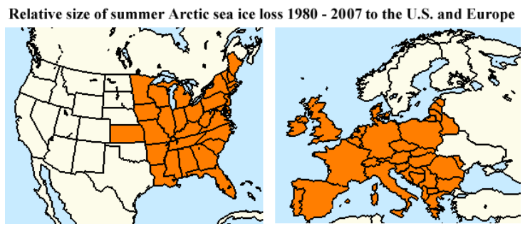
It is said that a picture can tell a story that a thousand words can't.  When it comes to the ongoing demise of Arctic Sea Ice, the ice-loss numbers have gotten quite large.  Here's a graphic taken from Dr. Jeff Masters' Wunder Blog, that quite elegantly puts the big numbers into visual context:

Click to enlarge

The extent of Arctic sea ice loss in the summer July - August - September period in 2007 was about 1.4 million square miles (3.6 million square kilometers) greater than in 1980, according to the University of Illinois Cryosphere Today. For comparison, the lost ice coverage (orange colors) was equal to an area about 44% of the size of the contiguous U.S., or 71% of the non-Russian portion of Europe.  Image reproduced courtesy of Wunderground.com and the University of Illinois Cryosphere Today.

0 0

Printable Version  |  Link to this page

Comments

Comments 1 to 11:

  1. And for the Land down under: (Original map from wikipedia) The shaded area is actually 3,740,000 km^2 (give or take)or about 4% oversize for the comparison. {That's the disadvantage of not having nice small states like Texas for fine tuning ;)} The area of lost ice represents 47% of Australia's territory including Tasmania, but not the Australian Antarctic Territory.
    0 0
  2. For further comparison, that is: 8% of the area of Asia, or equal to the combined territories of India, Nepal, Bagnladesh and Buhtan; 31% of the area of Africa, or equal to the area of Sudan, South Sudan and Libya; and 20% of the area of South America, or equal to the combined areas of Brazil and Colombia. Sorry, no maps.
    0 0
  3. Good visualisation of area lost. What about mass lost? Presumably this would be even more dramatic.
    0 0
  4. @ Doug H The mass loss is indeed dramatic. Being volumetric (non-existing in 3-dimensions), it is more difficult to make that volume loss relational. Here are 3 attempts: Click to enlarge


    Click to enlarge


    Click to enlarge


    Note that this final graphic reveals that Arctic sea ice volume has declined in every month of the year, not just the summer minimums.

    0 0
  5. Less technical, but more tasty: Late 1970's minimum volume ~16k km^3, on the left; current minimum volume ~4k, on the right: Our Arctic ice is now 'pint-sized.' Apologies to you metric folks; there are 2 pints in a quart and 2 quarts in a half-gallon.
    0 0
  6. Great graphic, thanks. On the picky side: I find 1980 to be a poor choice of start point as it is the highest summer ice area on record and therefore leaves the graph open to the (barely valid) criticism of being cherry-picked. Better IMO to have used 1979. The graphics would not be much different and the choice could be defended in 2 ways: 1979 was the first year available, and 1979 was closer to (only slightly less) than the average summer area from the first 10 years available. A similar comment applies to the choice of 2007 v 2011 as an end point. No point in giving the contrarians a valid but insignificant angle to exploit. Happy Holidays to everyone. arch
    0 0
  7. Happy Christmas to the Skeptical Science team !!! [Ok, its off topic, but stretch a point :)]
    0 0
    Moderator Response: [DB] 'Tis the season...Merry Christmas to all!
  8. I liked the explanation in that article of how arctic ice loss affects the jet stream and hence the climate AND weather in the mid-latitudes. Another arrow in the quiver...
    0 0
  9. @ arch stanton One can go much further back in time than 1979: Red is September min, blue is March max (From the Walsh dataset, courtesy muoncounter) Or this image from Cryosphere Today: And the following graphic from L. Hamilton shows area and extent declining in every month of the year (back to 1978), again:
    0 0
  10. Wow! Great graphics. Thanks to all who contributed to furthering my understanding: the picture is clear and frightening.
    0 0
  11. DB (and mouncounter) @9 - Thank you, I had not seen the Walsh dataset before.
    0 0

You need to be logged in to post a comment. Login via the left margin or if you're new, register here.


The Consensus Project Website

THE ESCALATOR

(free to republish)


© Copyright 2024 John Cook
Home | Translations | About Us | Privacy | Contact Us