


 Arguments


Has Arctic sea ice returned to normal?
What the science says...
| Select a level... |
 Basic
Basic
|
 Intermediate
| |||
|
Thick arctic sea ice is in rapid retreat. |
|||||
Climate Myth...
Arctic sea ice has recovered
"Those who have been following NSIDC and JAXA sea ice plots have noted that this has been an extraordinary year so far, with Arctic sea ice hitting the “normal” line on some datasets. ...
As of today, JAXA shows that we have more ice than any time on this date for the past 8 years of Aqua satellite measurement for this AMSRE dataset." (Anthony Watts, 22 April 2010)
At a glance
One of the great metrics of climate change, because it is easy to visualise, is sea-ice in the Arctic. Every year, the ice margins retreat in the northern summer, reaching a minimum extent some time in September. It then refreezes through the long, dark cold winter months, until its maximum extent is reached in March.
Arctic sea-ice has a seasonal component - so-called 'first year ice' - and the more perennial 'multi-year ice'. First-year ice is relatively thin - 30-40 centimetres is typical. Multi-year stuff is thicker - 2-4 metres and much of it is situated between the north coast of Greenland and the North Pole.
Most of the annual, seasonal decline in ice extent, observed by satellites for more than 40 years, is due to first-year ice melting: the more robust multi-year ice takes more energy to remove, but nevertheless it is in decline, too. Calculations of sea-ice volume reveal that trend.
How does sea-ice form? We all know the freezing temperature of saltwater is lower than that of freshwater, hence the spreading of rock salt on the roads on frosty winter nights. Similarly, the ocean temperature needs to fall below -1.8°C (28.8°F) for sea-ice to form. In the freezing season it starts freezing over once the upper 150 metres or so of the ocean are close to that temperature.
Melt varies a lot from one year to another. This should come as no surprise: sea-ice, being on an ocean, moves about a fair amount. Variations in ocean-currents are particularly important since if sea-ice can be 'exported' out of the Arctic, it enters what is basically a hostile environment, where it melts away to nothing. Incidentally, such floes are a lot smaller than icebergs like the one that famously destroyed the Titanic in April 1912. Such ice behemoths originate where glaciers 'calve' upon reaching the sea.
Weather is a highly variable driver of sea-ice melt. Prolonged strong winds from the right direction can cause mass-export of ice into warmer waters. Then again, winds from the south transport warm air over the Arctic Ocean, causing the melting to intensify. But they may also bring in extensive cloud-decks, blocking a lot of incoming Solar energy. No surprise then that melt seasons vary a lot from one season to another.
As in most things related to climate change, it's the multidecadal trend that is key and that is unequivocally downwards, both in terms of extent and volume. Sudden spurts of growth are interesting, as are record meltdowns such as that in 2012. But that's it. Trend is the critical bit. The data clearly show that since 2010, when the statement in the box above originated, eight out of the ten lowest Arctic sea-ice minima have occurred. The only two melt-seasons outside of that time-frame were in 2007 and 2008. For the big picture regarding Arctic sea-ice, ignore the noise from one year to the next and look at all the data. It's heading one way - down.
Please use this form to provide feedback about this new "At a glance" section. Read a more technical version below or dig deeper via the tabs above!
Further details
Discussions about the amount of sea ice in the Arctic often confuse two very different measures of how much ice there is. One measure is sea-ice extent which, as the name implies, is a measure of coverage of the ocean where ice covers 15% or more of the surface. It is a two-dimensional measurement; extent does not tell us how thick the ice is. The other measure of Arctic ice, using all three dimensions, is volume, the measure of how much ice there really is.
Sea-ice consists of first-year ice, which is thin, and older ice that has survived one or more melt seasons, so that it has accumulated volume. This thicker multi-year ice is particularly important because it makes up most of the volume of the sea-ice. Volume is also the important measure when it comes to climate change, because it is the volume of the ice – the sheer amount of the stuff – that science is concerned about, rather than how much of the sea is covered in a thin layer of ice*.
Over time, sea ice reflects the fast-changing circumstances of weather. It is driven principally by changes in surface temperature, forming and melting according to the seasons, the winds, cloud cover and ocean currents. In 2010, for example, sea ice extent recovered dramatically in March, only to melt again by May.
Because sea-ice is subject to such powerful short-term effects, we cannot conclude anything about the health of the ice from just a single year’s data. It is over multiple decades that an obvious trend emerges. According to the National Snow and Ice Data Center, the overall trend in Arctic sea-ice minimum extent from 1979 to 2022 is down - by 12.6 percent per decade, relative to the 1981 to 2010 average (fig. 1). The average loss of sea ice works out at about 78,500 square kilometres per year. That's like losing an area the size of the state of South Carolina or the country of Austria - every year!
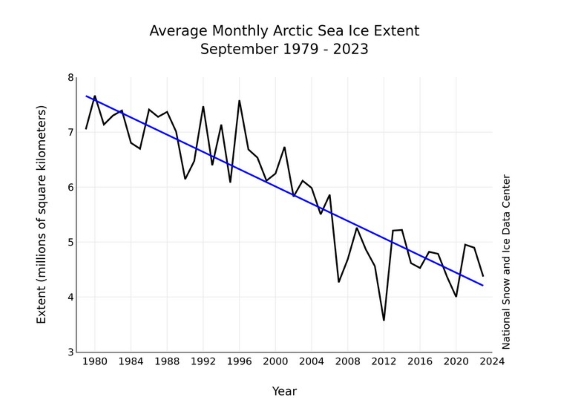
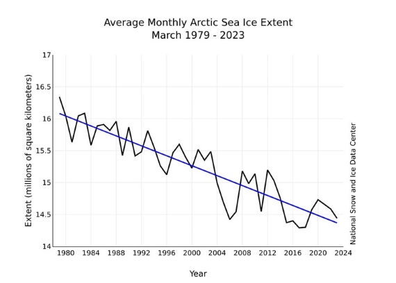
Fig. 1: Sea-ice extent in a) September, at the seasonal minimum (top panel) and b) March, at the annual maximum (bottom panel), for the period 1979-2023, . The trend is clear. Source: NSIDC
Multi-year ice volume is in steep decline. As you might imagine, thick ice takes a lot more heat to melt, so the fact that it is disappearing so fast is of great concern (fig. 2).
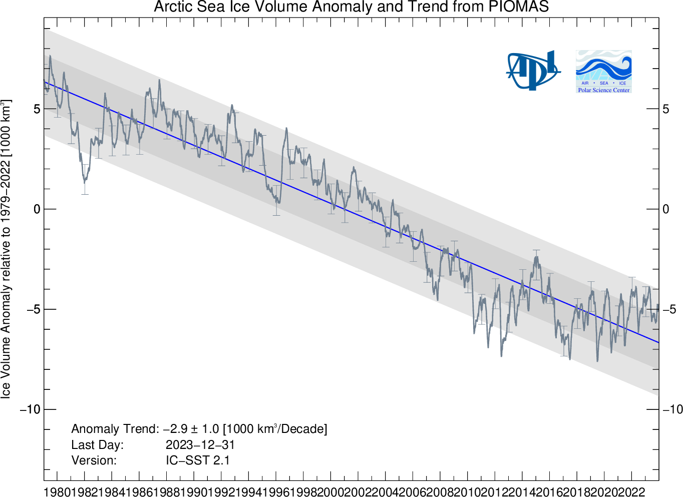
Fig. 2: Arctic sea-ice volume anomaly from PIOMAS. Daily sea-ice volume anomalies for each day, computed relative to the 1979 to 2022 average for that day of the year. Tick–marks on the time axis refer to the first day of each year. The trend for the period 1979- present is shown in blue. Shaded areas show one and two standard deviations from the trend. Error bars indicate the uncertainty of the monthly anomaly plotted once per year. Source: Polar Science Center, University of Washington.
It is clear from the various data sets, terrestrial and satellite, that both the sea ice extent and multi-year ice volume are reducing decade by decade. The full extent of annual ice reduction is seen in September of each year, at the end of the Arctic summer, and is on a long-term downward path. Multi-year ice volume has not recovered at all, and is showing a steeply negative multidecadal trend.
* Footnote: Although a thin layer of ice doesn’t tell us much about the overall state of ice loss at the Arctic, it does tell us a great deal about Albedo, the property of ice to reflect heat back into space. When the sea ice diminishes, more heat passes into the oceans. That heat melts the thick ice and speeds up the melting of thinner sea ice, which in turns allows more heat to accumulate in the oceans. This is an example of positive feedback.
Last updated on 4 February 2024 by John Mason. View Archives


The volume chart above relies on the PIOMAS model. The model seems fine for predicting the summer minimum near the beginning of the melt season. See for example, the predictions for 2008: http://psc.apl.washington.edu/IDAO/seasonal_outlook.html Here they made an essentially correct prediction of substantially higher ice in Sept 2008 than Sept 2007. During the previous winter (2007-2008) they wrote a paper predicting the 2008 summer ice extent: LINK In this paper they predicted less ice than 2007 (a new record low) provided that weather forcings (not part of their model) remained substantially similar to 2007. Apparently they did not because the prediction was wrong. Unfortunately I have yet to find a followup paper explaining why the prediction was wrong. The paper emphasizes the use of thickness in the model as a major part of the prediction of extent. But if the thickness is wrong, then the predicted extent would also be wrong. Likewise, if the thickness is wrong in hindcasts when thickness was not measured extensively, then hindcasts of volume would also be invalid. I believe that caveat belongs on fig 2 above.