


 Arguments


Monckton Myth #16: Bizarro World Sea Level
Posted on 14 April 2011 by dana1981
") We have a new entry in the contest for most bizarre "skeptic" argument. The "Science" and Public Policy Institute ("S"PPI) Monthly CO2 Report for January 2011, edited by everyone's favorite "skeptic", Christopher Monckton, contains some astonishing claims pertaining to global sea level rise.
We have a new entry in the contest for most bizarre "skeptic" argument. The "Science" and Public Policy Institute ("S"PPI) Monthly CO2 Report for January 2011, edited by everyone's favorite "skeptic", Christopher Monckton, contains some astonishing claims pertaining to global sea level rise.
First, on page 12, the document claims "Sea level continues to rise more slowly than the UN predicts." This is of course the opposite of reality. Sea level is rising faster than the IPCC predicts (Figure 1).
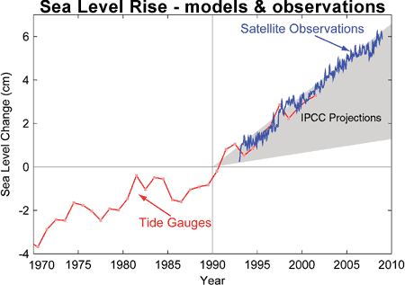
Figure 1: Sea level change. Tide gauge data are indicated in red and satellite data in blue. The grey band shows the projections of the IPCC Third Assessment report (Allison et al 2009).
On page 29, the "S"PPI document contradicts its previous statement, claiming "Sea level is not rising." This is of course also false. In fact, as we recently discussed sea level is not only rising, but the rise is accelerating. Immediately below this false claim, the document contains the following figure:
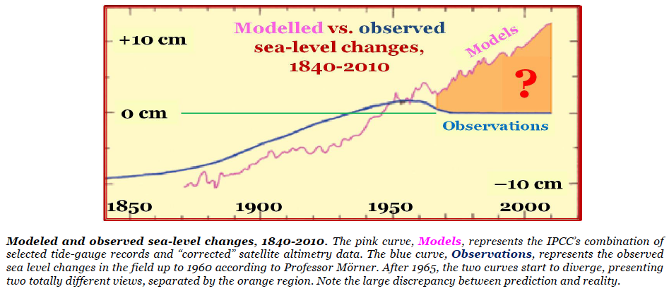
How quickly we went from 'rising slower than predicted' to 'not rising' to 'falling'! Notice that the caption claims the blue curve is observational sea level data "up to 1960 according to Professor Morner." Of course, after 1960 (when the "observations" are apparently just made up) is not only when the "observations" supposedly diverge from the models, but also when they diverge from reality! Ah, but it gets even worse from here. On page 33, the document presents what may be my favorite figure of all time:
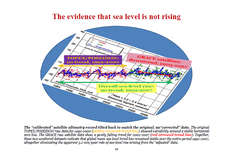
Monckton and "S"PPI have taken the sea level graph from the University of Colorado at Boulder which shows a 3.2 milimeter per year sea level rise trend (as is still visible in the bottom right of the graph), rotated it to make the trend look flat, and claimed that this is what the "unaltered" and "uncorrected" data looks like.
It boggles the mind that Monckton and the "S"PPI think they can convince people that sea level has dropped since 1950 based on nothing more than their own unsubstantiated claims and blatantly doctored graphs which are completely contradicted by the actual observational data. Monckton has really outdone himself here. How long will it be before these "skeptics" try to convince us that global warming is over because positive temperature trends signify cooling?


 0
0  0
0 The caption is as follows "Mean rise in the sea level observed by TOPEX/POSEIDON between October 1992 and April 2000
(about 1 mm/year)"
So Morner has redrawn the plot from the newsletter, claiming that it shows no trend, when the caption of the figure in the article clearly states that there is a trend of 1 mm/year and a trendline is clearly depicted on the plot! Does Morner mention that? No, in fact in his comment on the comment, he reiterates that there is no trend in the data.
Morner then says the figure reappears later with a greater tilt, and asks why that is. He then answers his own question by saying that the data in his figure include the adjustments described in a paper by Mitchum, but not later adjustments described in several other papers describing later adjustments to the data. He rejects these as being "subjective interpretations", which is about the weakest rebuttal of a criticism I have seen in a journal!
So in otherwords, Morner redrew data from a newsletter (rather than actually getting the data and replotting it), ignored the fact that the original caption and diagram explicitly showed a non-zero trend, ignored even the existence of a set of adjustments made to the data due to known issues with the instruments, rejected them as "subjective interpretation" when this was pointed out. Says the "calibrations" (quotes his) are "very strongly debated" without giving a reference to a paper questioning the calibration. Does any of this inspire confidence? I'd say "no".
Monckton outght to have checked out his source on this one a bit more carefully.
The caption is as follows "Mean rise in the sea level observed by TOPEX/POSEIDON between October 1992 and April 2000
(about 1 mm/year)"
So Morner has redrawn the plot from the newsletter, claiming that it shows no trend, when the caption of the figure in the article clearly states that there is a trend of 1 mm/year and a trendline is clearly depicted on the plot! Does Morner mention that? No, in fact in his comment on the comment, he reiterates that there is no trend in the data.
Morner then says the figure reappears later with a greater tilt, and asks why that is. He then answers his own question by saying that the data in his figure include the adjustments described in a paper by Mitchum, but not later adjustments described in several other papers describing later adjustments to the data. He rejects these as being "subjective interpretations", which is about the weakest rebuttal of a criticism I have seen in a journal!
So in otherwords, Morner redrew data from a newsletter (rather than actually getting the data and replotting it), ignored the fact that the original caption and diagram explicitly showed a non-zero trend, ignored even the existence of a set of adjustments made to the data due to known issues with the instruments, rejected them as "subjective interpretation" when this was pointed out. Says the "calibrations" (quotes his) are "very strongly debated" without giving a reference to a paper questioning the calibration. Does any of this inspire confidence? I'd say "no".
Monckton outght to have checked out his source on this one a bit more carefully.
 (Speaking of Watts; should we await the Tidal Stations Project with bated breath?)


Comments