Climate Science Glossary

Term Lookup

Enter a term in the search box to find its definition.

Settings

Use the controls in the far right panel to increase or decrease the number of terms automatically displayed (or to completely turn that feature off).

Term Lookup

Settings


All IPCC definitions taken from Climate Change 2007: The Physical Science Basis. Working Group I Contribution to the Fourth Assessment Report of the Intergovernmental Panel on Climate Change, Annex I, Glossary, pp. 941-954. Cambridge University Press.

Home Arguments Software Resources Comments The Consensus Project Translations About Support

Twitter Facebook YouTube Mastodon MeWe

RSS Posts RSS Comments Email Subscribe


Climate's changed before
It's the sun
It's not bad
There is no consensus
It's cooling
Models are unreliable
Temp record is unreliable
Animals and plants can adapt
It hasn't warmed since 1998
Antarctica is gaining ice
View All Arguments...


Username
Password
New? Register here
Forgot your password?

Latest Posts

Archives

Tracking the energy from global warming

Posted on 18 April 2010 by John Cook

The most striking feature of Climategate is how readily people assumed dark, sinister conspiracies from isolated email quotes without trying to understand the actual science being discussed. This is apparent in the "hide the decline" quote which many took (and continue to take) to mean a nefarious hiding of a decline in temperature. What it actually refered to was a decline in tree-ring growth that has been openly discussed in the peer-reviewed literature since 1995. Similarly, Trenberth's "travesty that we can't account for the lack of warming" was an issue openly discussed in the peer-reviewed literature (Trenberth 2009). The issue of Trenberth's missing heat is now further discussed in a new Science perspective by Trenberth and John Fasullo, "Tracking Earth's Energy".

The article examines the planet's energy imbalance. This can be measured by satellites which measure both the incoming sunlight and outgoing radiation. The absolute energy imbalance is too small to be measured directly. However, the satellite measurements are sufficiently stable from one year to the next so it's possible to track changes in the net radiation. What has been observed is an increasing energy imbalance.

Another way to calculate the energy imbalance is to add up all the heat accumulating in the various parts of our climate. This includes all the heat building in the oceans, warming of the land and atmosphere, melting of the Arctic sea ice, Greenland and Antarctic ice sheets and glaciers. There is fairly good agreement between the satellite imbalance and total heat content leading up to 2005. However after 2005, there is a discrepancy between the two metrics. A divergence problem, if you will.


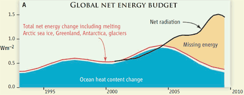
Figure 1: Estimated rates of change of global energy. The curves are heavily smoothed. From 1992 to 2003, the decadal ocean heat content changes (blue), along with the contributions from melting glaciers, ice sheets, and sea ice and small contributions from land and atmosphere warming, suggest a total warming (red) for the planet of 0.6 ± 0.2 W/m2 (95% error bars). After 2000, observations from the top of the atmosphere ( 9) (black, referenced to the 2000 values) increasingly diverge from the observed total warming (red).

Figure 1 has many interesting features. The blue area shows the rate of ocean warming. Note that when it falls after 2005, this doesn't mean the ocean is cooling but that the rate of warming slows. The red line is the total amount of net energy change. This means that all the energy going into the melting of sea ice, ice sheets and glaciers plus the warming of land and atmosphere is the tiny gap between the blue area and the red line. However, the most interesting feature of this graph is the divergence after 2005. From this point, the satellite data (black line) continues to show a growing energy imbalance. But the ocean seems to be accumulating less heat.

Why the discrepancy? Some of the heat seems to be going into melting the ice sheets in Greenland and Antarctica which are losing ice mass at an accelerating rate. However, this doesn't add up to anywhere near the measured energy difference. There are two possibilities. Either the satellite observations are incorrect or the heat is penetrating into regions that are not adequately measured. The satellite observations also agree with model results that expect a growing energy imbalance as CO2 levels increase. These model results have had quantitative confirmation in independent satellite measurements of outgoing infrared spectrum (Harries 2001, Griggs 2004, Chen 2007).

This would indicate the missing heat is the more likely option. If so, where has the missing heat gone? Is the ocean sequestering heat deep below where the ARGO buoys measure water temperature? I had my own Dunning-Kruger moment after reading this paper. My theory was we already had observational proof that the heat must be sequestered in the deep ocean waters. While measurements of ocean heat going down to 700 metres have showed declining heat accumulation, von Schuckmann 2009 shows that measurements of ocean heat going down to 2000 metres find the oceans have been steadily accumulating heat at 0.77 W/m2 from 2003 to 2008.


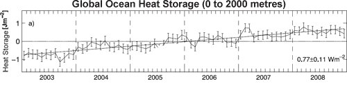
Figure 2: Time series of global mean heat storage (0–2000 m), measured in 108 Joules per square metre.

I emailed Kevin Trenberth, asking if von Schuckmann's result was evidence that the missing heat was being sequestered in deeper waters. Trenberth replied promptly (the guy is a class act), informing me that von Schuckmann's energy imbalance of 0.77 W/m2 was for the ocean only and when you average it out over the whole globe, it gives a net energy imbalance of 0.54 W/m2. This is still insufficient to meet up with the satellite data and there are unresolved issues with how von Schuckmann handles the deep water heating.

In fact, after reading Roger Pielke's blow-by-blow with Trenberth, I have to credit Trenberth for his patience - I wonder how many bloggers contact him each day, saying "Hey Kevin, you heard of this paper?!" or "Hey Kevin, did it ever occur to you that the heat is in the deep ocean?!" Hopefully, Trenberth won't get bothered too much by nagging bloggers such as myself and he can get on with the important work of better tracking the flow of energy through our climate.

0 0

Printable Version  |  Link to this page

Comments

Prev  1  2  

Comments 51 to 65 out of 65:

  1. 43.dhogaza I’m not sure you quite represent the position of each of the scientists accurately in the Pielke/Trenberth/Willis discussion. Trenberth notes that estimates of energy content of the ocean in the literature based on Argo data has a quite wide spread. Willis points out that early results contained errors, since these errors where identified estimates are all now in agreement. Willis thinks coverage is now good and the likelihood that further large errors are unlikely, like a good scientist he doesn’t completely rule out further adjustments. Ultimately Willis seems to think the Argo data is robust while Trenberth thinks it still contains large error. The degree to which both scientists think the Argo data contains errors is very important here. Given Willis is the expert on Argo data it does appear Trenberth is having his own Dunning-Kruger moment. But further experience will undoubtedly resolve this. 49.Marcel Bökstedt I agree we haven’t focused enough on the TOA estimates, thanks John for the reply. Do you have the references for any of this work?
    0 0
  2. It's worth reading about the confidence the IPCC had in the ocean data back in 2007 when the present divergence wasn't obvious. Fig 5.1 is enlightening in that the confidence intervals narrow over time representing an improvement in the data. Trenberth's analysis would have it that those confidence limits have widened again even though we have greater data coverage. I guess figure 5.4 also emphasises why the ocean heat content is so important to this issue. I'd be interested in seeing an undated Figure 5.4 covering 2003 to 2008. (You could read from this page onwards) http://www.ipcc.ch/publications_and_data/ar4/wg1/en/ch5s5-2-2.html
    0 0
    Response: Here's Figure 5.1 that you refer to:


    Note that this refers to ocean heat from 0 to 700 metres deep. The issue here is the ocean heat measurements at deeper levels - both down to 2000 metres for which there is ARGO data and deeper, for which the data is more sparse. Figure 5.4 is even more interesting (in fact, has inspired an idea for a nifty graphic and a blog post), so here it is:


  3. #32 frogstar, it looks like one of your questions was never answered. There are many examples of quantities where we can measure Q(t2) - Q(t1) much more accurately than either Q(t2) or Q(t1). All it takes is for there to be some poorly known factor that contributes to both of the absolute levels Q(t1) and Q(t2), but cancels out when you take the time difference. This is actually a very common situation in all areas of science.
    0 0
  4. #49 Moderator's comment to Marcel Bökstedt at 05:31 AM on 20 April, 2010 what we're finding is the satellites are measuring an increase in the energy imbalance Are we? I am avare of an online analysis up to 2005: It does show that the alleged huge 2003 step-like increase in OHC is probably an artefact due to changing instrumentation (mass deployment of ARGO floats). However, I could not find s similar analysis for the last five years. I agree with you on satellite net TOA radiation imbalance measurement's precision being better than its accuracy, especially since CERES started. Unfortunately the NASA Radiation Budget Data Products page is a mess. Can anyone find recent data preprocessed enough to be shown here?
    0 0
  5. You can access were Trenberth gets TOA data for figure 1 at BAMS State of the Climate 2008. Go to page S33. Read to the end because it discusses some of the issues with the dataset. It seems the quality of the data has reduced over time in this series with the early data seeming to have better stability than later material. Trenberths smoothed black line must be based on Figure 2.26 but I don't immediately see the connection. I also hunted down this presentation by the same guys. Page 20 shows Figure 2.26 while page 21 shows an updated version.
    0 0
  6. John> Thanks for comment! And above all, thanks for this great site! I believe that you are right in that we should only consider change in energy imbalance, not the imbalance it self. The sign (positive or negative) of the second time derivative of the energy. A second derivative is clearly a priory something which is hard to measure. This also means that in figure 1, the relative height of the blue and the the black curve is arbitrary. We could as well shift the (entire) black curve downwards by a fixed amount to give a better fit. I'm not sure that Trenberth states as clearly as you do that the satellite data show that there is an increasing energy imbalance, but maybe I just haven't found where he does so. HumanityRules> From reading your links, I get the impression that the satellite data have not really arrived yet. At present there is a huge year to year variability and also a huge uncertainty, and in addition to that there is a suggestion that there might be systematic errors (instrument drift). On the other hand these measurements will eventually arrive, and become very important once they do. It seems to me that the black line in figure 1 is pretty close to a smoothing AND upwards shift of the green line in Figure 2.26 from the "presentation" you mention. As usual, I could be wrong about all this.
    0 0
  7. #55 HumanityRules at 23:43 PM on 20 April, 2010 I also hunted down this presentation Thank you. It is useful. I have copied the 2000-2010 TOA radiation imbalance figure here. Also, I took NODC Global Ocean Heat Content for the same period, computed its derivative and made a figure. figure 1 figure 2 If all went well, the lower graph in figure 1 would be proportional to that of figure 2. It is clearly not, they are not even similar. Fluctuations in OHC as measured by floats are almost an order of magnitude larger than in net radiation imbalance at TOA as measured by satellites. Sometimes not even the sign comes out right.
    0 0
  8. Trenberth wasn't kidding when he says figure 1 is heavily smoothed and simplified. The other thing that confuses me is that it is meant to in some way relate to this figure. Now I realise this is in some way also a simplified graphic. But with no volcanic activity since 2000 to give those great spikes then a simple increasing nett radiative forcing and energy budget should be on the cards but it obviously isn't. There is obviously an extraordinary amount we don't know when it comes to the natural variation in radiative forcing and energy budget.
    0 0
  9. BP, HR and John Cook - great discussion, and lots of effort in posting the graphs - congrats on facilitating it John. A few points which my reading over the past year has produced: 1) Incoming radiation at TOA is generally quoted as TSI of 1366 W/sq.m divided by 4 = 341.5 /sq.m. The latest SORCE TIMS satellites give a figure for TSI of 1361.5W/sq.m - 4.5W/sq.m less. Divided by 4 this is 1.1W/sq.m less incoming at TOA than the accepted figure from previous satellites. This has been unexplained by the TIMS people since 2005. Check out their website: http://lasp.colorado.edu/sorce/data/tsi_data.htm To justify their -4.5W/sq.m lower figure, the TIMS people then produced an adapted Trenberth diagram of the total energy flux of the earth system using their reduced TSI/4 as the incoming radiation. I ran their graph past Dr Trenberth and he responded (he is a class act) that the TIMS graph did not make sense. Point: We don't have an accurate figure for TSI - only relative satellite figures for 30 years. The latest TIMS (4 satellites) read 4.5 W/sq.m low on previous numbers - so how do we know what incoming solar radiation figure 'balanced' the earth's outgoing longwave radiation in pre-industrial times and therefore what is the true 'equilibrium' temperature of the planet? 2)OHC - the von Schukmann paper has been introduced to the layman on this website. It is the only one which finds most of Dr Trenberth's missing heat down to 2000m. The sharp slopes of the bumps in von Schukmann's global OHC graph has been pointed out by BP and indicated huge rates of heat transfer down to 2000m in a matter of weeks to months. This hardly seems credible by air-water radiative or convective transfer nor even conduction of the warmed water to cooler water. The 'tiling' of the oceans and permanent tethered buoys reporting from the same tile at the same time would seem the only way to get an accurate snapshot of the whole ocean at Times 1 and 2 in order to calculate the change in OHC. The Argo buoys number 3255 for ocean area of 3.62E8 sq.km averages one buoy for every 111000 sq.km or a square of ocean 330km x 330km. There are practicaly no buoys above 60 degrees N or S latitude. I invite comment on the errors involved in one Argo buoy temperature column reading (not all reading down to 2000m) for on average every 111000 sq.km of ocean.
    0 0
  10. Well, I think I have found the solution. OHC reconstructions before mid 2003 are simply wrong. Otherwise satellite TOA energy imbalance measurements have low accuracy but reasonable precision while ARGO OHC measurements are just the opposite. Therefore I have calculated the integral of CERES FLASHFlux net TOA radiation imbalance between the fourth quarter of 2003 and third quarter of 2009. The linear component of this integral is arbitrary due to low precision. So I have calculated a least square fit linear approximation to the difference of the integral above and the NODC OHC reconstruction for the same period. It gives the correct offset for TOA net radiation imbalance. With this correction we get the graph below: The match is pretty good. I think the fluctuations of OHC around the TOA energy accumulation curve are not real, it's just measurement noise. Thermal energy content of the climate system has decreased in this 6 years long period at a 0.19 × 10²² J/year rate. It corresponds to a -118 mW m-2 radiative imbalance at TOA.
    0 0
  11. BP #60 That's interesting. But I want to see it on a more appropriate time scale. 30 years is a good minimum for looking at climatic effects (rather than weather effects). Is this possible, or is that data not available?
    0 0
  12. #61 kdkd at 12:48 PM on 22 April, 2010 Is this possible, or is that data not available? CERES FLASHFlux only goes back to 2000. If I take all ten years and apply the same procedure it looks like this: The fit is awful because of the huge step-like change of OHC in early 2003 and also the high noise level before. I guess these features are measurement errors due to changing coverage & instrumentation.
    0 0
  13. BP #62 Thanks. What's the cause of the difference between the TOA line in the first graph compared to the second graph? Is a csv file of the raw data available anywhere? I wouldn't mind doing some crude resampling stats on the time series.
    0 0
  14. #63 kdkd at 19:43 PM on 22 April, 2010 Is a csv file of the raw data available anywhere? I could not collect proper data files, so re-digitized both NODC OHC & CERES FLASHFlux (pp. 21) graphs. You can find the csv here. The dimension is 1022 J for both columns, offsets arbitrary, slope of TOA radiation imbalance as well (being the temporal integral of a function with offset unknown). Time resolution is three months.
    0 0
  15. BP #60, #62, #64 Can you explain why the 2003-2009 TOA line from your Post #60 chart does not match the TOA line for the same period from the Post #62 Chart. The values on the energy axes (E22 Joules)are vastly different and so is the shape of the TOA curve, The OHC curve seem roughly the same for both charts.
    0 0
  16. BP #60, #62, #64 I forgot to add - the NODC OHC data in your charts is only the top 700m of the oceans, Yes? If so, the hot topic is what is happening in Dr Trenberth's deeper oceans down to 2000m and beyond. With an average ocean depth of 3700m - there seems plenty of un-explored depth for more 'hidden heat' or is it 'hidden cold'.
    0 0
  17. #65 Ken Lambert at 23:04 PM on 22 April, 2010 Can you explain Of course I can. However, I think I have already explained it, just give it some thought on top of reading sentences. The two TOA curves are essentially the same. The difference is a linear trend with a slope. The reason behind it is that TOA fluxes as measured by satellites (recently CERES mission) have large sytematic errors but reasonable interannual precision. At least as long as instrumentation does not change much and intercalibration issues are resolved. On the other hand, net TOA flux should be very close to proportional to the time derivative of OHC, because there is no other heat reservoir in the climate system with comparable storage capacity. Rapid large scale (back & forth) heat exchange between the upper 700 m of oceans and the abyss has no know mechanism, turnover time being several millenia. If climate system heat content is calculated from net TOA fluxes, only the second derivative is measured by CERES with reasonable accuracy, therefore heat content history has a free additive linear term. With OHC, on the other hand, the temporal inegral itself is measured. What I did was to choose the free term for best fit. It can be done for the last six years, but not before first half of 2003. This is the same period when ARGO float deployment was still at an early stage with poor global coverage and rather few floats compared to the target of 3000. At the same time older systems were already phased out almost completely.
    0 0
  18. 67.Berényi Péter The OHC variablity looks seasonal. Have you tried averaging over a year? "On the other hand, net TOA flux should be very close to proportional to the time derivative of OHC, because there is no other heat reservoir in the climate system with comparable storage capacity." I started to think about the ability of the ocean to release energy. It's easy to imagine that at different times the rate at which energy is lost from the ocean varies allowing build up or loss of energy on a short time period which doesn't always match the incoming energy.
    0 0
  19. I'm still not sure that I understand this TOA/OHC stuff properly. So here's what I've done to BP's spreadsheet though: First to get OHC and TOA in the same units, I standardise them so that the mean is 1 and the standard deviation is 1. Now I run a linear regression model which comes out as: std(OHC) = 0.5 X std(TOA) + 1.4 E10-16 So for every unit that OHC increases, TOA decreases by 0.5. The adjusted R squared for this regression model is 0.22 indicating that TOA predicts 22% of the variance of OHC. The F statistic for the regression is 11.8 (df=1,37) indicating that the regression predicts better than chance. Next I move over to correlation because for a single variable correlation, it's equivalent, and slightly easier to understand. So the correlation between the two variables is -0.49 (p < 0.01) which is strong enough to convince me that autocorrelation isn't an especially big problem, although I lack the knowledge to examine that formally. The 95% confidence interval of the corelation is between -0.70 and -0.21. So what I want to do next is compare the performance of this regression against the UAH satellite data for tropospheric temperature anomaly. Again using standardised data for the 29 years data I have for the satellite record, the formula for predicting standardised temp anomaly from standardised atmospheric co2 is: std(temp) = 0.62 * co2 + 0.3E16 F(df=1,27) = 16.79, p < 0.001 Adjusted R squared is 0.36 The correlations are: 0.62 (95%CI = 0.32 - 0.80) So with 30 data points we're getting a similarly good prediction of some measures of the response to some climate variables to the OHC/TOA data. Now I don't have quarterly data easily to hand for the sattelite data or co2 levels, but I can just look at the final 10 years in the series to see how good that is. However for the data that I have to hand, with only 10 observations, the statistical power is so poor that the regression and correlation is not statistically significant. My conclusion is that the TOA/OHC data that BP presented is what we would expect for a moderately sensitive system with only a small number of data points - and thus limited statistical power. I don't think there's enough data to be able to draw conclusions about the relationship between OHC and TOA to global warming until quite a lot more data comes in. Meanwhile we need to rely on the temperature data, and the associated measures (e.g. ecosystem sensitivity etc) in order to use scientific data to formulate policy.
    0 0
  20. BP #67 Think I have got it. Excuse my slower engineer's brain. If we can name your charts Graph #60 and Graph #62, then am I right in assuming that your G#60 is the 'right' measure of OHC because the integral of the TOA flux fits the Argo 700m OHC? If so, then the diffence in slopes of the TOA integral between G#60 and G#62 represents the systemic error in the CERESflash flux. Taken over the last 6 years, your G#60 slope is -0.19E22J/yr and the G#62 slope is about +0.92E22J/yr with the difference being about 1.11E22J/yr. This converts to a systemic error of +0.69W/sq.m in the CERESflash flux. Could you then suggest why the 2000 - 2004 part of your G#62 TOA curve has a pretty flat slope of about 0.25E22J/yr, implying a much lower systemic error or if the error is constant at +1.11E22J/yr; a large decline in OHC for 2000-2004?
    0 0
  21. Just to confirm, if I annualise the TOA/OHC data rather than have it in quarters like at the moment (actually over 9 years), neither the regression nor the correlation give statistically significant parameter estimates due to the loss of statisical power.
    0 0
  22. #70 Ken Lambert at 23:45 PM on 23 April, 2010 This converts to a systemic error of +0.69W/sq.m in the CERESflash flux. I don't think so. The systematic error is large and unknown. Net flux at TOA is estimated to be 2 ± 5 W m-2, i.e. even the sign is doubtful. In this sense TOA flux is not measured at all by CERES. However, interannual variation is much better constrained. The large difference between figures in #60 & #62 comes from OHC. The transition around 2003 from MBT/XBT stuff to ARGO has a huge intercalibration problem. That is how the "missing heat" was produced. If the unknown offset of CERES FLASHFlux is aligned to the early 21th century OHC data, one gets a positive slope but poor fit with much missing thermal energy by the end of this decade. On the other hand, if it is done the other way around and FLASHFlux is aligned to the late part of OHC, the fit is excellent except before mid 2003. In this case we do not have any recent "missing heat", but excess heat before 2003. My guess is the thermal energy was there, in the upper 700 m of oceans, just was not measured properly (e.g. in southern Pacific). In this case one does not have to invent mysterious processes transferring heat into the abyss directly through a 700 m deep cooling layer. What is more, this process would only carry heat, but not dissolved carbon dioxide. After all CO2 deep mixing is supposed to be extremely slow. So far so good. However, we still have a problem. Not with measurement, but with theory. OHC and net TOA flux measurements can be made consistent, but at a price. We have a negative energy balance for the last six years. The climate system is not gaining energy, but losing it. A -118 mW m-2 rate may not sound much, but is enough to bring havoc to standard greenhouse theory. It is about the decrease in TSI (Total Solar Irradiance) due to weak and late cycle 24. But wait, CO2 has increased from 375 ppmv to 389 ppmv between 2003 & 2010. The change in radiative forcing during this period is about 5% of a CO2 doubling. Effective temperature of Earth as seen from space should have decreased by 0.15 °C if climate sensitivity is 3 °C for carbon dioxide doubling as claimed. It is equivalent to a positive energy imbalance of 560 mW m-2 at TOA, which is not seen.
    0 0
  23. I'm really not convinced of the validity of treating a stochastic system as if it deterministic. Seeing as the OHC/TOA system is certainly part of a stochastic system, we'd need a good bit more data than 9 annual cycles (the annual cycle should be the basic unit of analysis here) in order to understand properly the contribution to the climate system. Given the similarities with the global temperature record (another part of the system), around 30 years of data would be a bare minimum with which to reach robust conclusions.
    0 0
  24. BP #72 Your post #67 explains that the last 6 years (2004-2010) of the TOA curve in your G62 graph is the same shape as the G60 graph (slightly negative trend slope) except that the G62 is sitting on a linerr positive trend slope which represents a systemic offset error in the CERESFlash TOA flux. Right? I subtract the two trend slopes and come up with a positive slope difference which equates to 1.11E22J/year which equates to a TOA flux error of +0.69W/sq.m Is not that an estimate of the 'large and unknown' CERES TOA flux error, derived from your G60 and G62 graphs? We all agree that CERES tolerances of 2 +/-5 W/sq.m is a useless number for evaluating radiative forcing imbalances. You have said that CERES TOA is high precision but low accuracy, meaning that it is good for relative measures wrt time, but no good for absolute numbers. You claim that the 2004-10 Argo OHC measurements are the opposite - presumably no good for relative time series comparisons but good for absolute numbers. So if your G60 graph is meaningful - it does provide a way of calibrating the CERESflash TOA flux with an absolute number derived from assuming that Argo measured OHC heat (top 700m) energy absorbed equals the integral of the CERESflash TOA flux. Right? If that is not right, please explain why. Your last papagraph in #72 is confusing - "Effective temperature of Earth as seen from space should have decreased by 0.15 °C if climate sensitivity is 3 °C for carbon dioxide doubling as claimed." Did you mean 'increased by 0.15 degC' for a 5% CO2 increase and that equates to 0.56 W/sq.m extra energy flux imbalance at TOA? Was this a sardonic remark doubting the existence of the 0.56 W/sq.m of extra radiative forcing from 5% increase in CO2? You also have a major problem with von Schukmann finding lots of heat down to 2000m from the Argo buoys. I noticed that Dr Trenberth has already used this VS paper as evidence for his 0.45W/sq.m (0.9 postulated and 0.55 found)of missing heat in his email exchange with Dr Pielke Snr. What about mechanisms like the thermohaline circulation to get heat down to 2000m in these short timeframes?? BP, I think you are on the right track with your posts, so please expand your ideas into language more accessible to the non-expert climateer (dumber engineers like me). You might yet be the man to crack the AGW case..
    0 0
  25. Berenyi Peter> Interesting post! (1) How can we be sure that there is no CO2 deep mixing? I agree, if we do know that, it makes it harder to invent a mechanism for sending the energy down to Davy Jones. (2) I believe that the measured OHC has been increasing lately. The rate of increase has fallen though. If I understand your realignment of the OHC and the TOA measurements correctly, the model accepts the recent value of OHC. So why do you say that we have been loosing energy lately? But maybe this is not so important, it seems to me that the main point you are making is that - as you stated earlier - this is not a disagreement between two datasets, its a disagreement between data and theory. I agree, something has to give, either the data or the theory. It will be interesting to see who will win. We should remember that all of this is a higher order question. The first theoretical question to ask about AGW is "how would a given amount of CO2 affect climate". This is essentially a question of finding an equilibrium (yeah, I know I'm simplifying here). The second, more difficult one, is "how will we pass from the present climate to the one forced by the CO2". This is to ask for the path through which a system reaches the equilibrium. That was all theory, but if we can answer those questions, we can compare the result with observations. Well, we can't compare the answer to the first question with observations, but if we can figure out the more difficult second part of the theory, we can compare that. And at present this comparison with observations has difficulties.
    0 0
  26. Berényi Péter at 13:01 PM on 24 April, 2010 lots of problems with your argument Peter. 1. "We have a negative energy balance for the last six years. The climate system is not gaining energy, but losing it." That's almost certainly incorrect. Since sea levels are continuing to rise (see below), it's almost certain that the climate system continues to gain energy. You're making the logical error of equating uncertainty in measurement systems as an indication of a flaw in theoretical understanding. As always, we need to resolve the uncertainties in measurements before making interpretations about phenomena and our understanding of these. 2. "But wait, CO2 has increased from 375 ppmv to 389 ppmv between 2003 & 2010. The change in radiative forcing during this period is about 5% of a CO2 doubling." Yes the change in radiative forcing has gone up a tad since 2003. And global temperatures have risen through at least 2005 (e.g. here or here). Since around 2002 the solar output has descended through the decreasing part of the solar cycle to an abnormally extended minimum. Under normal circumstances we expect the downward part of the solar cycle to give around 0.1 oC cooling contribution to surface temperature (lagged by a few months). In other words it should temporally counter all the surface warming from CO2-induced greenhouse forcing during this period. We might expect a slightly larger effect of the proesent extended solar minimum. So there's nothing surprising about the fact that surface temperatures haven't risen very much since 2002/3.
    0 0
  27. whoops....I should have said: "Yes the radiative forcing contribution from [CO2] has gone up a tad since 2003"
    0 0
  28. Chris #76 We are all waiting for BP to respond to Posts #73 thru #76. Meanwhile your points ignore the 'missing heat' divergence over the last 5-6 years as exampled at the start of this discussion. BP's argument is that the OHC for the top 700m of ocean is a direct measure of the integrated TOA forcing imbalance WRT time because there are no other serious heat storages in the system other than the oceans. So far, only von Schukmann has found 'missing heat' down to 2000m - but we lack a convincing theory of a mechanism to get it there. It should be noted that sea level rise over the last 5-6 years on your above chart has flattened to a slope of 1-2mm/year consistent with flattening temperatures. The 11 year solar cycle varies the solar forcing by at most about 0.25 W/sq.m - when Dr Trenberth postulates a TOA imbalance of 0.9 W/sq.m due to CO2GHG and other heating and cooling effects. If you are claiming that a solar drop of 0.25W/sq.m or less has flattened the temperatures, and if the other heating and cooling effects (aerosols etc) forcings remain the same then the CO2GHG effects must be efectively negated by a 0.25W/sq.m drop in solar, which implies that they are nearer to 0.25W/sq.m than 0.9W/sq.m imbalance (mainly based on a CO2 component of about 1.6W/sq.m) Again the 'missing forcing' would be about 0.65W/sq.m.
    0 0
  29. Ken, From a big picture perspective, the "missing heat" of the last 5 or 6 years is most likely caused by measurement error in a large complex stochastic system. I previously showed you that the OHC/TOA trends were statistically indistinguishable from the Temperature Anomaly / CO2 level trends over similar time scales / number of data points. At the level we're analysing it here, as armchair scientists, this point is extremely important, as it clearly shows the limitations of the conclusions which we can draw from a fairly superficial examination of the data. In turn, this strongly suggests that your argument is based around confusing uncertainty in the measurement systems with flaws in theoretical understanding (thanks Chris!). Unless you can demonstrate some large, statistically robust support for your argument, it's an interesting footnote on how not to draw conclusions from statistical noise. A 30% error term is quite reasonable for systems of this complexity. In the social sciences where I come from, we deal with these kinds of error magnitudes all the time.
    0 0
  30. Ken Lambert at 00:15 AM on 28 April, 2010 That's not really right Ken. As kdkd says, measurement errors over very short periods of observations/data collection can easily confound interpretations. One needs to be confident of the measurements before making significant interpretations. That's a basic tenet of science. There's not much point in running free with calculations and various forms of numerology, unless one is fairly certain of the data; without that your interpretations are really only "theories" or hypotheses". That confidence (that the data is a true measure of the phenomenon under investigation) comes from (a) analysis of trends over sufficiently long periods that measurement and stochastic variations average to small values, and (b) having sets of self-consistent independent data (e.g. sea level rise and its mass and steric contributions; ocean heat measures; radiative imbalance etc.). So for example although the rate of sea level rise was apparently a bit slower for a couple of years, it's still smack on the 3.2 mm line now (see updated data in my post above), and there isn't really any evidence that the rate of sea level rise has slowed down. Your comments about solar and greenhouse forcings aren't quite correct. Remember that one can only interconvert forcings and temperature changes under equilibrium conditions. Otherwise one needs to factor in the various response times of the climate system. So the expectation that the effect of the solar cycle downturn on surface temperature on average temporarily (5/6 years) cancels the temperature rise from the enhanced greenhouse forcing doesn't say anything necessarily about the relative magnitudes of the forcings (solar and enhanced greenhouse). It just means that surface temperatures are rising near 0.15-0.2 oC per decade under the cumulative greenhouse forcing, and that the solar cycle opposes this by around 0.1 oC during the 5/6 years of the solar downturn and supplements this ( by a similar amount on average) during the 5/6 years of the solar upswing.
    0 0
  31. Just one more tiny bit of informations. A huge current originating in Antarctica and flowing northward in the Indian Ocean below 3000 meters has recently been discovered. It's volume transport is around 30 Sv. For those of you not familiar with this unit of measure (Sverdrup), 30 Sv are about 20% of the maximum transport of the Gulf Stream (which so nicely helps warming north-western Europe :)). There's much more in the deep ocean than we'd like to admit.
    0 0
    Response: Thanks for the link to the Nature article, that's a fascinating development. Considering the Southern Ocean is warming faster than the global trend, I wonder if this is a possible mechanism for transporting extra heat to the deep ocean. I noticed a comment posted repeating the common error of confusing sea ice with land ice and posted a follow-up comment.

    So one Sverdrup is equivalent to 30 million cubic metres per second. Hmm, I wonder how big that much water would compare to the Empire State Building...
  32. Chris #80 Forcings in W/sq.m are both positive and negative energy fluxes (power) which when summed; produce a theorized imbalance. If you integrate the forcing 'imbalance' WRT time you get the total energy over that time period added to or subtracted from the earth - atmosphere - ocean system. First law of thermodynamics says that this energy (Joules) must show up somewhere in the system either by warmer or cooler land, atmosphere, water; or phase changes into ice, melting ice and evaporation or condensation of water. This is not 'numerology'; it is long established scientific fact. If we see flattening of temperatures over the last 5-6 years or more, then less energy is being added to the system or due to thermal lags, this reduction has already happened some tme ago. Tell us Chris how long these lags (response times) are? If you look at your sea level graph, the Topex data follow the 3.2mm/year slope until 2002, and the Jason data follow a lesser constant slope from 2002-10 or if you stop linearizing a non-linear system - a curve fit would show pronounced flattening from 2005 onward. This is real evidence that sea level rise has slowed or flattened, and being such a giant reservoir of heat energy, indicates a reduced or non-existent uptake of heat. When the observation goes against the theory of increase forcing imbalance and greater energy uptake, have a hard look at the theory as well as trying to bolster the observation with better data.
    0 0
  33. Ken #82 Nobody is trying to dispute the first law of thermodynamics. However, it seems to be logically invalid to try to draw strong conclusions from the small amount of TOA/OHC data available. This is because the TOA/OHC data is only available for a small number of annual cycles, it represents measurements from a large, complex (and chaotic) system with an estimated measurement error or around 30%. So until either more data is available, and if possible the measurement error is reduced, it is not possible to reach strong conclusions about anthropogenic global warming from the OHC/TOA data. Is that clear now?
    0 0
  34. kdkd #83 No it is not clear now. The starting point of John Cooks blog is the OHC graph and discussion of the 'missing heat' over the last 5-6 years. Your argument is that this whole discussion is worthless without longer timescales (up to 30 years) and more annual data. If you can't draw strong conclusions against climate change based on warming from CO2GHG from *this* data, then neither can you draw strong conclusions *for* it.
    0 0
  35. Ken Lambert at 22:21 PM on 28 April, 2010 We're probably geting into the "arguing fruitlessly" stage, which often an indication that the data under discussion is inconclusive (not surprising when assessing temporal evolution of observables with large inherent stochastic short term variability and relatively large measurement error bounds). I'll just make two points: (i) numerology. Of course the first law of thermodynamics is obeyed (a "scientific fact"!). The "numerology" relates to playing with tentative numbers as if they were perfect representations of the phenomena of interest and then drawing incorrect conclusions. We've been here so often before (e.g. with apparently solid evidence that the troposphere wasn't warming c/o Spencer/Christy; that the troposphere would dry as atmospheric [CO2] increased c/o Lindzen...). It's usually best to lay off making profound conclusions (e.g. Peter's "the climate system is not gaining energy, but losing it") until the measurements are solid, or if one feels compelled to look at the numbers, to do so with a recognition of the uncertainties. (ii) Your comments re Topex/Jason sea level measurements are apposite. I'm clearly looking at the graph (my post 76 above) with different eyes than you!. If the 60 day smoothed delta mean sea level (MSL) was around 5 mm in 2002 and looks likely to cross the 2010 line at a delta MSL near 25-30 mm at 2010, then it's difficult to argue that sea levels haven't risen during the last 8 years. Overall they've continued to rise something like (30-5)/8 mm.yr-1; i.e. around 3 mm.yr-1. That's really difficult to square with Peter's conclusion. If Peter was right we'd have to assume that the rise was solely due to the mass component (melting ice); however we are pretty certain that's not true. Somethng is wrong with Peter's argument, beautiful numbers notwithstanding. Incidentally, the sea level rise did seem to flatten for a while ( from around 2006ish to 2008ish). That's interesting, yes? Does it, as Peter infers "bring havoc to standard greenhouse theory"? Not really.. and it would be surprising if the solar cycle down-turn and extended solar minimum didn't have some effect in reducing the rate of increase of thermal energy into the climate system.
    0 0
  36. Ken Lambert at 23:23 PM on 28 April, 2010 re your comment:
    If you can't draw strong conclusions against climate change based on warming from CO2GHG from *this* data, then neither can you draw strong conclusions *for* it
    Well yes Ken, but I don't think anyone is drawing "strong conclusions" for climate change from this small snippet of temporal evolution of the climate system. I'm sure people here are very interested in what it might mean in detail. No doubt in a few years we'll be somewhat better informed about the apparent misaccounting of the Earth's energy budget; we may well know whether it's real or an artefact of measurement problems.... ... and of course "Strong conclusions about climate change" follow from the vast wealth of scientific knowledge and empirical observations, and a recognition of the nature of unceretainties.
    0 0
  37. Ken, You've hit the nail on the head there (unable to draw strong conclusions). You're right, we can't draw strong conclusions from the OHC/TOA data at this point, for all of the reasons mentioned previously. However there is a vast wealth of other data available that shows us the nature of the problem and it's magnitude. One small divergence of data and theory based on too little data does not a paradigm shifter make.
    0 0
  38. Chris #86 We indeed have different eyesight. Your graph in #76 has two distinct sections - Topex to 2002 and Jason 2002-2010. If you average Topex you get a linear fit from +14mm to +26mm in the period 2003-2010 say 7 years. This is 1.7mm/year not 3.2mm/year. There is a jump from +6mm to +12mm at the transition between Topex and Jason, likely indicating a calibration error. 1.7mm/year is consistent with the number mentioned in Dr Trenberth's Aug09 paper. Interestingly the CSIRO paper cited in Dr Trenberth's discussion finds a much better fit of sea levels with a model including volcanic forcings than not; which indicates that these might be more significant than the transient effects hitherto assumed.
    0 0
  39. Typo in #88 "If you average *Jason* you get a linear fit from +14mm to +26mm in the period 2003-2010 say 7 years. This is 1.7mm/year not 3.2mm/year."
    0 0
  40. John, I did the math for you to convert 30 Sv in the new unit of measure you like, namely EST (Empire State Building). The EST turns our to be about 10^5 m3, so 30 Sv correspond to 300 ETS per second. Considering that it took 3 years to build one ETS, the new current flowing from Antarctica is almost 10^8 times as powerful as the USA. :)
    0 0
    Response: Thanks for converting the water flow to a unit I understand :-) 300 Empire State Buildings per second is pretty impressive!
  41. Ken Lambert, i looked at the data shown in chris #76 and could not see the jump, a quite huge one following your claim. Could you please clarify how did you detect it?
    0 0
  42. Ken Lambert at 23:04 PM on 29 April, 2010 Ken, your post illustrates pretty much my point about "geting into the "arguing fruitlessly" stage, which is often an indication that the data under discussion is inconclusive". That's exactly the case here. I've taken the raw Jason data from here and done a linear regression from 2002-(nearly) 2010. The slope is 2.3 mm.yr-1. No doubt you'll get a different answer by regressing the data between 2003 and 2010. It would be different again if we did 2004-2010...etc. These are very short time periods. The linear regression is biased "flattish" by the interesting period between 2006-2008 when the slope of sea level rise apparently decreased quite a bit. Short anomalies in very short time series have large effects on the regressed average change. That's why we don't make fundamental interpetations from analysis of very short time series. It's apparent from visual inspection (see sea level time series in my post 76 above) that sea levels have more or less "caught up" with the longer term trend. This is also apparent if one inspects the seasonally-adjusted data on the Univ. of Colorado sea level site. Clearly something interesting may have happened during 2006-2008. The period we're discussing corresponds to the slightly anomalous and extended down-turn in the solar cycle. So we aren't surprised if thermal energy into the ocean (and thus the thermal component of sea level rise) may have been a bit smaller than the long term trend for the last 6-7 years... At some point we need to be clear about what we're arguing over. I'm simply pointing out that the sea level rise over the last several years (e.g. since 2002) is incompatible with Peter's assertion that an energy balance analysis of a few years of data ""bring(s) havoc to standard greenhouse theory".
    0 0
  43. Just a thought... there is another possibility for where some of the heat could be hiding. Greenland and Antarctic ice melt is, I assume, estimated through the gravity measurements of the GRACE satellite, but that only measures mass change, i.e. ice that melts and then runs off into the ocean (I presume). Suppose the degree of ice melt is much greater than currently assumed, but large amounts of the melt sink into crevasses or seep down in other ways without an opportunity to escape? This is particularly likely in Greenland, where I believe there is a large basin below sea level that would ultimately trap melt water. Based on watching snow melt in my yard (probably not a good model for places like Greenland and Antarctica, where it is densely packed ice instead of loosely packed snow, but...) a lot of the melt water spreads through the depth of the snow and eventually seeps into the ground or runs off from underneath, where it can find an outlet like the edge of the plowed street. This also seems to melt a lot of snow "from the inside" away from the sun by transporting the heat downward in a form of convection. What might happen in Greenland or Antarctica, with kilometers of depth to penetrate before some of the water is redirected outward "toward the street"? Could large crevasses/channels/tunnels be accumulating the water, and melting and growing from the inside from the heat and pressure? I don't know the numbers, so I don't know how much melt would account for what percentage of the missing heat, but it's a scary idea, both in the thought that ice could be melting faster than we think, and that there could be sudden sea level rise events unleashed if some of that reservoir of trapped melt water is unexpectedly released.
    0 0
  44. Riccardo #91 I get two distinct linear trend lines rom the sea level graph. Topex from about -24mm up to +6mm over about 9 years giving about 3.3mm/year; and Jason from about +12 to +26mm over 7 years giving about 1.7mm/year from about 2002-03 onward. This seems to indicate about a +6mm jump in the 2002-03 transition period. On these very roughly cyclical charts it seems odd that the mid point of the end of Topex would match up with the low point of the Jason plot at the transition. Would also like to know if the IBP corrected global charts are much different from this non-corrected chart.
    0 0
  45. Sphaerica #93 From what I have read, lakes of water have been discovered under the ice sheet trapped between it and the bedrock. I believe that at these extreme pressures ice can transition to supercooled water. If that pressure was removed by leakage, the supercooled water would change back to ice at well below zero temperatures. On the other hand, Ice is also a very good insulator, so across its depth, it could sustain a temperature differential. How this would work with an under ice volcano or a geothermal heat source would be interesting.
    0 0
  46. Ken #94
    I get two distinct linear trend lines from the sea level graph.
    I think that's your imagination but would stand corrected if you demonstrated otherwise objectively. However my experience of graphs that look like that is that there's generally no significant difference between the regression slope at different points of the time series - the internal variability of the system is just too high.
    0 0
  47. Ken Lambert at 21:12 PM on 1 May, 2010 Ken, am I right in thinking this is what you've done: a. taken 7 years of the Jason data (2003-2010?; did you use the raw archived data or eyeball the plot in my post #76?)). b. done a regression and determined the slope (you've chosen a subset that apparently gives you 1.7 mm.yr-1; if you use the full Jason data set available from the link in my post #76, the linear regression is 2.3 mm.yr-1). c. used the regression fit and extrapolated this back to 2002 (+12 mm) and forward to 2010 (+26). Is that what you did? Perhaps you could clarify. Whatever, I hope you would recognise that that's a bogus analysis. One can't use a regresssion, and then assert that particular points on the regression (e.g. the start or end points) are the data. The data are shown in my post #76, and the Jason data clearly doesn't start at +12 mm (nor does it end at +26 mm). There clearly isn't an offset with respect to the Topex data. That's also apparent by inspection of the other data sets (with/without seasonal adjustment; with/without reverse barometer correction) available from the link in my post #76.
    0 0
  48. Ken's insinuation of an offset in the Jason satellite altimetry data relative to the Topex/Poseidon altimetry data is interesting, especially since it's rather obvious by inspection of the sea level graphs (see my post #76) and the raw data (see link in my post #76) that there isn't an offset. It's worth looking at the methods by which the Topex/Poseidon and Jason satellite altimetry data was merged into a continuous record of sea level rise [***]. This also helps us to understand that an offset of the sort that Ken is hunting for is both methodologically unlikely, and also doesn't in reality, exist. Three things were done to ensure a relatively "seamless" transition: (ONE) In the transition period (15 January through 15 August 2002), the Jason and Topex/Poseidon satellites flew in formation along the same ground-track, separated in time by only about 70 seconds. Thus they collected virtually identical data for a 6 month period, and this was used to intercalibrate the altimeters and verify that the data were correctly merged in the transition period. (TWO) Although Topex data is often not presented after 2002, data was collected from Topex (the Topex B altimeter) at least through 2004. The Topex B data match with the combined Topax A/B set and with the Jason altimeter set. (THREE) During the Topex and Jason missions the satellite data is continually calibrated against the sea-level tide guage sea level measures. While tide guage measures don't provide an absolue measure of global sea level, they are effective in identifying any step changes (of the sort that you infer from your regressions). There aren't any in the Topex-Jason transition period. ---------------------------- [***] Beckley, B. D. et al. (2004) Towards a seamless transition from TOPEX/POSEIDON to Jason-1 Marine Geodesy, 27, 373-389 link to abstract E. W. Leuliette et al. (2004) Calibration of TOPEX/Poseidon and Jason altimeter data to construct a continuous record of mean sea level change Marine Geodesy 27, 79 — 94 manuscript available here Beckley, B. D. et al. (2007) A reassessment of global and regional mean sea level trends from TOPEX and Jason-1 altimetry based on revised reference frame and orbits Geophys. Res. Lett., 34, L14608 link to abstract
    0 0
  49. Chris #97,98 You have the raw data - why don't you settle this by doing a curve fit - least squares should do so that we can see the continuous trends instead of picking average end points and drawing straight lines. Before you do so - here are some comparisons: The CSIRO paper by Domingues et al..comes up with a global average sea level rise of 1.6+/-0.2mm (published 2008) viz: http://www.nature.com/nature/journal/v453/n7198/abs/nature07080.html Dr Trenberth uses an ‘observed’ number of 2.5mm in his energy budget calculations made up of components with wide error bars eg. 0.8 +/-0.8mm. Both the above are well below the average 3.2mm of Chris’ graph. The CSIRO quotes the satellite sea level figures with error bars of +/-5mm.
    0 0
  50. Ken Lambert at 20:26 PM on 2 May, 2010 There's nothing to "settle" Ken. Why would one want to "curve fit" 8 years of noisy data? To what purpose exactly? Incidentally, why don't you be a little more explicit about how you came up with your rate of 1.7 mm.yr-1 for the Jason data? Let's simply state what we know: (i) If we feel like doing a linear regression of the Jason data, one may as well use the whole set. This gives a trend of 2.3 mm.yr-1. This is easily determined by downloading the Jason data from the site I linked to in my post #76 (ii) The Jason data covers a very small temporal period. If one regresses the full satellite data set, Jason data included, the Jason data is consistent with a continuing sea level rise of around 3.2 mm.yr-1. We can do this analysis ourselves (I've linked to the data in my post #76). The analysis has also been published several times; e.g. by: a) Beckley, B. D. et al. (2007) [*] who determine that the sea level trend is 3.36 mm.yr-1
    "We obtain a global rate of 3.36 ± 0.41 mm/yr over the 14 year period from 1993 to 2007."
    (b) Cazenave and Llovel (2010) who get ~ 3.4 mm.yr-1[**]
    "Accounting for the small correction of −0.3 mm year−1 due to global deformation of ocean basins in response to GIA (Peltier 2009), we thus get a rate of global mean sea level rise of 3.4 ± 0.4 mm year−1 over 1993–2008."
    (iii) You're mistaken about Domingues et al. 2008 who's analysis is barely relevant to the issue we're discussing. Their value you quoted is for sea level rise during the period 1961-2003. Since Domingues's analysis indicates virtually zero sea level rise between ~1960 - ~ 1980 it's not surprising that the net sea level rise over the 42 year period is biased low due to the 20 year contribution from a virtually zero sea level rise. Since this is stated in the abstract, I'm surprised you didn't notice this rather obvious point (see also their Figure 1):
    "We add our observational estimate of upper-ocean thermal expansion to other contributions to sea-level rise and find that the sum of contributions from 1961 to 2003 is about 1.56 +/-0.4mmyr-1, in good agreement with our updated estimate of near-global mean sea-level rise (using techniques established in earlier studies6,7) of 1.66 +/-0.2mmyr-1."
    (iv) overall the data (let's include your Domingues paper too) support the conclusions that sea level rise has accelerated in recent decades; the trend of the satellite era is around 3.2 mm.yr-1; the measured sea level rise is overlaid with stochastic variation that confounds meaningful analysis of trends during short periods; recent years may have seen an increase in the mass (land ice melt) component of sea level rise relative to the thermal component; there was an apparent slow down in the rate of sea level rise during a period 2006-2008 (especially apparent in the Cazenave and Llovel, 2010 data; see their Figure 2), but the sea levels seem to have "caught up" with the long term trend.... [*] Beckley, B. D. et al. (2007) A reassessment of global and regional mean sea level trends from TOPEX and Jason-1 altimetry based on revised reference frame and orbits Geophys. Res. Lett., 34, L14608 link to abstract [**] A. Cazenave and W. Llovel (2010) Contemporary Sea Level Rise Annu. Rev. Mar. Sci. 2, 145–73 link to abstract
    0 0

Prev  1  2  

You need to be logged in to post a comment. Login via the left margin or if you're new, register here.


The Consensus Project Website

THE ESCALATOR

(free to republish)


© Copyright 2024 John Cook
Home | Translations | About Us | Privacy | Contact Us