


 Arguments


Wow, was this a bad year for those who deny the reality and the significance of human-induced climate change. Of course, there were the recent flurry of reports that 2014 surface temperatures had hit their hottest values ever recorded. The 2014 record was first called on this blog in December and the final results were reported as well, here. All of this happened in a year that the denialists told us would not be very hot.
But those denialists are having a tough time now as they look around the planet for ANY evidence that climate change is not happening. The problem is, they’ve been striking out.
And just recently, perhaps the most important bit of information came out about 2014 – how much the Earth actually warmed. What we find is that the warming is so great, NOAA literally has to remake its graphs. Let me explain this a bit.
We tend to focus on the global temperature average which is the average of air temperatures near the ground (or at the sea surface). This past year, global air temperatures were record-breaking. But that isn’t the same as global warming. Global warming is properly viewed as the amount of heat contained within the Earth’s energy system. So, air temperatures may go up and down on any given year as energy moves to or from the air (primarily from the ocean). What we really want to know is, did the Earth’s energy go up or down?
The trick to answering this question is to measure the change in energy of the oceans. A thorough review of ocean heat measurement methods is found here; we paid the requisite fee to make the paper open access. Anyone can download and read it.
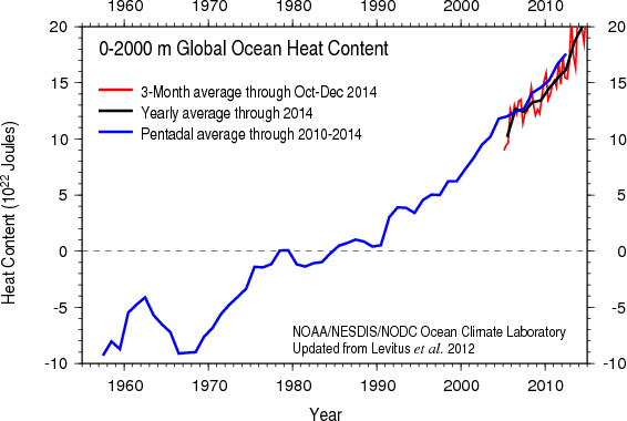
So what do the new data show? Well, it turns out that the energy stored within the ocean (which is 90% or more of the total “global warming” heat), increased significantly. A plot from NOAA is shown above. You can see that the last data point (the red curve), is, literally off the chart.
The folks at NOAA do a great job updating this graph every three months or so. We can now say that the 2014 Earth had more heat (thermal energy) than any year ever recorded by humans. We can also say that the folks at NOAA will likely have to rescale their graph to capture the new numbers. The NOAA site is updated by Dr. Tim Boyer and can be found here. Click on slide 2 to view the relevant image.
If people want to read a review of ocean heating that is written for a general audience, I suggest our recent peer-reviewed paper which can be found here.


Why is heat content before 1980 below 0? Is this chart reporting differences from an average?
gregcharles... The zero axis is a baseline average of the data, though I'd have to look up what time frame they use to calculate the baseline. With surface temperature data they generally use a 30 year baseline average of 1951-1980 (GISS). I imagine they're doing something similar with OHC.
gregcharies
"Is this chart reporting differences from an average?"
Yes. As with much climatological data, they are measurng an anomaly - how much something has deviated from the average from a baseline period. The baseline can be arbitrary since the data is all relative.
Anomalies are used since you can get a more accurate result. Any reading of anything includes some inaccuracies. And some of these inaccuracies can be fixed, present in every reading as biases. When we take the difference between 2 readings any of these fixed biases cancel out.
Since John put this post together, NOAA have updated the graph. The vertical scale now goes up to 25. At the curent rate of warming (10*1022 in 8 years) they won't have to do this again for another 4 years. Then the top scale will go to 30. Then 35, 40, 45.... You get the picture.
The interesting thing is that over the fast 5 or so years, the deniers have willingly painted themselves into a corner by forecasting anything from mild to dramatic cooling. I can't count the number of times that I asked deniers back in 11/12/13 what their explanation would be when 2014 or 15 would break the record. The answer was always the same: It is cooling.
Back in 2011 or 2012, Norways #1 newspaper ran an article that contained an interview with top ''skeptic'' Ole Humlum, regurgitating the same old denialist mantras, with the mandatory predictions of rapid cooling due to record low solar activity in the coming years, negative PDO and the other usual suspects. I emailed the journalist (and got a response) and told her to do a follow up interview with Humlum & co in 2014 or 15, when the record would likely be broken. I' m not holding my breath, though, even though she might start thinking when the very confident prediction of a layman beat the predictions of her assembled her hand picked panel of ''experts'' (Humlum and (AGW ''skeptic'') solar physicists).
With leading denialists having for years predicted rapid cooling due to natural drivers, but what we instead have seen is more warming, will this wake up at least some of the ''skeptics''? Of course not the paid, pro level guys who know perfectly well what they are doing, but will some of the useful idiots now slowly start to wake up, and what will the implications be?
Will they turn quiet, or will they stand their ground and keep on denying, or will they turn against those that have fooled them for so long?
Esop.
Yep, of course it's cooling. 'Cause sea level is rising and, you know, when the temperature drops the liquid in a thermometer goes .... um .....
These folks really are bizarre!
Just as an interesting calculation, if that heat going into the ocean (10*1022 Joules in 8 years) had all gone into the air instead then air temperatures would have risen 19.4 C in those 8 years.
Not warming My A**e!
If I haven't put the decimal point back to front, I calculate the Levitus OHC 0-2000m rise (using regression) over the last 3 to 4 years is running at 1Wm-2 globally = +16Zj pa.
Esop, I really wish newspapers would re-visit cold climate predictions they have made in the past, such as this one from The Australian in 2008. Alas they never do.
@Rob and Glenn
Yes, I know that surface temperatures are usually reported as difference from a mean, but generally (not always) the chart specifies what the baseline is. I'm not sure why they didn't do that here.
@gregcharles
I suspect there is no baseline heat content specified because it would be a rather meaningless number. The surface area of the planet is about 511 million square kilometres, of which around 70% is ocean. The mean depth is, if memory serves, around 4 kilometres, so the ocean volume would be somewhere around 1.43 x 10⁹ cubic kms, or 1.43 x 10¹⁸ cubic metres.
As a cubic metre of water weighs a bit over a tonne, we're talking about 1.5 x 10²¹ kgs. If the average temperature of the ocean was, say, 7 degrees Celsius, then that's about 280 Kelvin.
There is a variation of specific heat with temperature, but as a quick approximation (for at least part of the range between Absolute Zero and 7 degrees Clesius) one can use a figure of 4,000 Joules kg-1 k-1
Putting that lot together comes out at (if I can still do sums at half past midnight) - wait for it - around 1.7 x 1027 joules. (Obviously I've left out any contribution from phase change latent heat as well.)
That's why the starting figure is basically irrelevant.
Hope that provided some insight into the wacky world of energy calculations. (I also hope I didn't cock it up too badly!)
Cheers Bill F
gregcharles @10.
The refernce period used by Levitus et al (2012) on who's methods the data is derived use a reference period of 1995-2006 to base their anomaly.
That the graph represents an anomaly of some sort is surely obvious, unless you can explain a negative absolute heat content - an interesting concept.
@MA Rodger
I guess the choice of the reference period (climatology) is very important to the long-term trend, see the following paper.
http://journals.ametsoc.org/doi/abs/10.1175/JTECH-D-14-00169.1
jsd @13.
Any impact from choice of climatology depends on your data-gap-filling strategy according to Lyman & Johnson (2014).
@BillTheFrog and MA Rodger
All right, fair enough. Yes, it makes sense to report total heat as an anomaly, and based on the the negative values in the chart, it is obviously what they are doing. I'm still not sure why that can't be stated along with the chart for clarity, but I suppose it doesn't matter.
I will point out that the baseline used seems to be around the 1980 pentadal average, not 1995-2006.
I would like some confirmation that my understanding of what is going on is correct.
The accumulation of 6E22 joules in the earths oceans from 2010 to 2014 yeilds an average Top of Atmosphere energy imbalance of .932 Watts per Meter Squared. If this only represents 94% of the total energy deposited in the earth biosphere the average TOA value is .991 Watts per meter squared from 2010 to 2014.
I wonder what the effect of South East Asian aerosols is on the current TOA?
[JH] The use of "all caps" is akin to shouting and is prohibited by the SkS Comments Policy.
gregcharles @15.
Sorry. My bad typing. 1995 should have been 1955. If I cut & paste from Levitus et al (2012), then there'll be no mistake:-
One Planet Only Forever @16.
A couple of corrections.
In your first point. While the eventual home of the majority of our CO2 will be in the oceans, at present roughly 45% remains in the atmosphere, 30% in the oceans and 25% in the biosphere. So the atmosphere is presently still larger not smaller.
In your second point. It is the infra-red on the way out that is increasingly intercepted by CO2. Mind, at higher frequencies, CO2 does do a small bit of intercepting sunlight, but only a little. The big effect is in the infra-red at about 15 microns. (A little graphic of mine 2 clicks (usually) down here.)
In your fourth point. The SST & land temperature do not provide a direct indicator of the radiation imbalance at the top of the atmosphere, which is the forcing yet to be equalised by warming. What is good is ΔOHC as the thermal mass of the oceans is the big thing that needs warming.
In your fifth point. They call it the latent heat of fusion and 300Gt of ice (=300 cu km) requires about 10^20J to melt. So even with something like Greenland shedding 600Gt, the Arctic Ocean 300Gt, Antarctic 300Gt, other glaciers 300Gt, melting ice is small compared with ΔOHC.
OPOF @16, point by point:
jja @18, while such calculations are interesting, they are misleading unless strictly limitted to indicating the relative proportions of energy being stored in ocean and atmosphere. That is because, firstly, the situation described is thermodynamically impossible, and so of no relevance; and, secondly, because such calculations give no basis for estimating the final equilibrium temperature response, and hence cannot indicate whethere global warming will be catastrophic or benign, or something inbetween.
Not to denigrate the article, but this is pretty subtle science.
Check me:
Area of ocean 360,000,000 km2
Volume of top 2000 meters 7.2E+17 m3
Mass of top 2000 meters 7.2E+20 kg
Heat capacity of water 4187 J/kgK
1 degree delta T 3.01464E+24 Joules
Temp change of 10^22 J 0.003317145663 K
(WHY can't these editors do tables!)
If I've not screwed up somewhere, we're talking about 3 thousands of a degree per 10^22 J. So if we are at a measured increase of 25 * 10^22 joules we are talking about .075 degree. One begins to see why it's not expressed in the form of a temperature anomaly.
After reading the article about how deep ocean temperatures are measured, I'm not confident in the reality of this graph, and I'm used to dealing with science.
This article is NOT a good talking point with climate change deniers. There are too many layers of obfuscation on the derivation.
[Rob P] - No point in checking your calculations when your entire premise is flawed, and yes this particular contrarian myth has been circulating the internet ever since the strong warming of the ocean became impossible to handwave away.
Although the 0-2000 metre layer of the ocean has warmed, not all of it has. By dividing the measured OHC by the entire volume of the 0-2000 metre ocean layer, you're inferring something that never happened. It's a misrepresentation. Most of the warming of the subsurface layers are in areas of anomalous ocean ventilation - right where we'd expect them to be.
Much of the heat, however, remains in the upper layers of the ocean, especially the 0-100 metre layer. This is relevant to climate and ecology because that heat is exchanged with the atmosphere, more so during El Nino. Look at temperature anomalies in the upper 100 metres of the ocean during 2014 for instance.
Tom @22
Such calculations are an effective way to convey to the general public the actual scale of current global warming. Your argument against such discourse is hollow and would equally apply to the "hiroshima atomic bomb" icon in the upper right-hand corner of this page.
When the general public / common misinformed denier is made aware of the scale of warming that has been measured, directly and accurately, in the world's oceans, a light turns on in their darkened minds.
This explaination is much more accurate than the hiroshima bomb analogy, regardless if it is "thermodynamically possible or not" (in fact, that is the most common retort from the denialist community!).
The point isn't that it is thermodynamically going to happen, the point is that GLOBAL warming is happening, even if the atmospheric response is delayed.
sgbotsford @23
It is a commom misinterpretation that the NODC buoy data represents an average temperature increase, it doesn't.
In fact, it is the absolutely BEST metric to communicate the total incidence of global warming that is happening now. People can easily and clearly understand the ocean being warmed by the atmosphere and the results are extreme enough to induce a real wakeup.
@sgbotsford you're not the only one. Judith Curry says the same thing:
http://judithcurry.com/2013/09/26/the-relentless-increase-of-ocean-heat/
http://motls.blogspot.com/2013/09/ocean-heat-content-relentless-but.html#disqus_thread
I'm actually astounded that either of them thinks this is so suprising since this is known and as been said by the ARGO folk:
http://www.argo.ucsd.edu/global_change_analysis.html
But more to the point, it's like neither of them have ever heard of thermal expansion:
http://en.wikipedia.org/wiki/Current_sea_level_rise#IPCC_Third_Assessment
sgbotsford @ 23
In his moderator comment, Rob Painting pointed out that excess heat has not even come close to being evenly distributed across the vastness of the ocean. (I seem to recall reading somewhere that the estimated timescale for full scale abyssal mixing was >1,000 years.)
However, leaving aside Rob's very valid point...
In your comment, you state that the mass of the top 2,000 metres of ocean is ~ 7.2 x 10²⁰ kg and that its specific heat is 4,187 Jkg-1K-1
Now consider the lily, sorry, consider the atmosphere:
Given the planetary surface area is about 511 million sq kms, standard pressure at sea level is 1013.25 hectoPascals and that gravitational acceleration at sea level is 9.81 metres/sec2, it's pretty straightforward to show that the mass of the entire atmosphere is about 5.27 x 10¹⁸ kg.
The specific heat for air (across a fair range of temperatures centred around 280 Kelvin) is somewhere about 1,010 Jkg-1K-1. Combining these numbers (and forgetting about the Clausius Clapeyron relationship) would give a figure of roughly 5.32 x 10²¹ joules to bring about a 1 degree change.
As you quote a figure of 3.015 x 1024 joules to effect the same change in the top 2,000 metres of the ocean, then, still omitting Clausius Clapeyron, we are talking about a thermal capacity difference of 567 times! Are you seriously trying to compare these two things?
One is reminded of the glee of a Young Earth Creationist upon hearing that an intermediate fossil form had recently been unearthed. The rationale? There now existed two gaps in the fossil record where there had only been one before.
Cheers Bill F
In reading this article and the one about measuring ocean temps, a number that has come up a couple times is the approximate value of 1 watt per square meter. That in effect 1 watt less per square meter was radiated back to space than was being received.
This is another dangerous stat to use. First order analysis:
"Sunlight shines with 1000 w/m2. How big is 1 watt? Things will only have to warm a bit to make it balance."
Answer: The 1 watt is everywhere. Sunlight is on only half the planet, and for a good part of that it's slantwise. Consider a circle the size of the earth. It has 1/4 the area of the earth. That is the diameter of the chunk of sunlight being intercepted. So it's *really* 250 w/m2 if we are going to compare apples to apples. So it's not .1% it's .4% increase.
#2 Ok. But radiation increases with the 4th power of temperature.
So (T + dT)4/T4 =1.004
(T +dT)/T = 1.001 (pretty close)
dT = .001T
But the planet averages about 300K
So dT = .3 degrees.
Have I goofed up? It's hard to get worked up about this.
[Rob P] - Yes, it is hard to get worked up by a simple calculation that bears little resemblance to the world on which we live. Climate scientists understand that there are feedbacks in the climate system, and that the real world is much more complex - hence the design of climate models.
But changes in temperature, or ocean acidity, don't really tell us a great deal by themselves. How will this change in temperature (or acidity) affect precipitation patterns? The growing of agricultural crops? Glacier-fed rivers such as the Ganges, Brahmaputra and Mekong rivers? The ability of marine calcifiers to build their shells? The persistence of coral reefs with the strong warming of the surface ocean?
When one delves into scientific research in these areas, the prognosis is not good. Whether that's something to get worked up about is a judgement call. IMO it's ample motivation to rapidly decarbonize the global economy.
sgbotsford @ 28
For a 1st order calculation, I would say you have it mostly right. You forgot to include the albedo of the Earth, which reduces the SW radiation absorbed.
Re-doing your calculations, I get
dT = 0.43degK
The much bigger problem is: you seem to think the climate is easily modeled by a first order physics equation.
Do you think it is possible that the albedo might change after a 0.4K average temperature change? Global snow cover has already declined quite a lot, especially in late spring and early summer when the albedo effect is largest.
Ice sheets and sea ice might melt a bit more at higher temps, don't you think?
Higher air and sea surface temps mean more water vapor... more greenhouse effect.
Maybe these kind of effects are why we don't treat the climate as a 1st order physics problem.
Another way to look at it... you have essentially calculated the warming due to current net forcings without any feedbacks at all. I think your number is pretty close to the accepted no-feedback value, so we are all in violent agreement about the basic physics of the greenhouse effect. Once you include the feedbacks, you should be much closer to the actual expected warming.
sgbotsford: to add to wehappyfew's content, this is the warming we can expect without feedback if all GHG emissions stopped today. I hope we can agree, that's not going to happen.
even more to the point: the 1 watt per meter squared Top of Atmosphere energy imbalance is a permanent feature that will not go away until the earth reaches a new, warmer, equilibrium.
In addition, the cumulative work of Nuccitelli, Hansen & Sato, Levitus, and Duack all point to the fact that this energy imbalance is DOUBLING double at a period of every 6-9 years.
Finally, the fact that significant reductions in south-east asian aerosol emissions and arctic albedo conditions are looming, we will likely experience a rate of heat accumulation in the near future (5-7 years) that is nearly TRIPLE triple what we are currently experiencing.
Welcome to the new era.
[JH] The use of "all caps" is prohibited by the SkS Comments Policy.
This graphic shows a collection of Top of Atmosphere energy assessments derived from Hansen & Sato (2010), Nuccitelli et. al (2012), Allen et. al. (2014), Durack et. al (2014) and a simple average analysis of 2010-2014 OHC from the NODC.
http://postimg.org/image/iv4cty0df/
sgbotsford @28, the 1 Watt/m^2 is the energy imbalance after 2.3 W/m^2 (natural plus anthropogenic) of forcing has been partially offset by a 1 C increase in temperatures. That means 1.4 W/m^2 has resulted in a 1 C temperature increase. Ergo we have an expected temperature increase of 0.71 C per Watt/m^2 (or 2.64 C per doubling of CO2). That means we can expect an additional 0.67 C increase in temperature from the current energy imbalance assuming there is no further increase in radiative forcing. With the conservative BAU scenario of RCP 6, that indicates an eventual temperature increase of 4.3 C.
The difference between your and my calculated temperatures arises because my empirically based figure allows for the operation of feedbacks, which yours tacitly excludes. That is important, because some feedbacks are slower than others, and empiricaly data will be biased towards a low climate response because it will not include the full effect of those slow feedbacks. The result is that while uncertainty is large, such that the temperature increase could be larger or smaller than that projected by my simple calculation, it is more likely to be larger than smaller.
Tom @33
That is an excellent analysis but you should be clear, your 4.3C result is an intermediate step to the finale equilibruim temperature, the ESS value.
Your 4.3C value is a 2100 value that is a waypoint to a global temperature that will be reached in 2500 that has not been seen on this earth in 4.5 million years.
wehappyfew @29
Solar irradiance at our mean orbital distance of around 149.6 million kms, or the so-called "Solar Constant", is usually taken to be about 1,366 (+/- 0.5) watts/metre2
Therefore sgbotsford's quoted figure of approx 1,000 w/m2 at TOA does already account for an albedo value of ~ 0.3
PS I like the Henry V reference, did you do anything special on the 25th October?
Cheers Bill F
sgbotsford @28
It has been pointed out several times that your calculations omit any feedbacks, so there is no need to labour that point further.
However, it may be worth your while to note that NASA give a best estimate of 14 degrees C as the global average taken over the 1951-80 period. (See here, at the bottom of the page.) Theis would equate now to a global average of around 288 K, rather than your...
"But the planet averages about 300K"
Unless, of course, you think that 12 degrees is nothing to worry about?
;)
Cheers Bill F
jja #32:
The graph in your link gives the impression that the top of atmosphere energy imbalance has risen and will continue to rise more or less linearly, but that is not the case.
This graph from James Hansen’s Earth’s energy imbalance and implications shows several estimates of how the energy imbalance changed from 1980 to 2007.
As you see, there have been large ups and downs, but the overall trend seems to be positive. Interestingly, the energy balance was negative after the Pinatubo eruption in 1991 and possibly also after El Chichón in 1982.
If I should try to estimate the energy imbalance for the last 5 years (2009-2014), it would be something like this:
Change in OHC upper 2000 meters: +6.68 x 10²² J (Source)
Assuming non-ocean components make up 5% of the total and ignoring OHC deeper than 2000 meters, which is very uncertain, gives this change of global heat content:
6.68 x 10²² J / 0.95 = 7.03 x 10²² J
Dividing this by the number of seconds in 5 years and square meters of the Earth’s surface gives an average energy imbalance of +0.87 W/m2.
So the rate of warming seems to have increased since Hansen’s estimate of +0.58 W/m2 between 2005 and 2010, however I admit that the numbers in my calculation are far from certain.
HK @37
Do you realize that Hansen and Sato relied on southern hemisphere OHC values that were underestimated by up to 50% as shown by Durack et. al. (2014) (so was Nuccitelli et. al (2012).
Yes, I recognize that there is the possiblity of severe increases in asian sulfate emissions or another stratospheric volcanic eruption (the ones that produced your dips in the Hansen graphic).
Those events do not matter. Also, there is the distinct possibility that we will engage in statospheric geoengineering sometime in the next 10 years, that will also severely affect TOA.
However, the trend that I shared is consistent with the TOA values over a 35 year trend. With future albedo changes in the arctic and tropical forests, as well as the potential for reductions in Chinese sulfate emissions, the TOA trend is a severe underestimation of future anthropogenic forcing (with feedbacks) As we will very soon discover.
FYI Caldeira & Cvijanovic (2014) showed that the removal of all sea ice produced a global forcing factor of 3 watts per meter squared. If we attain an ice free condition by June 1st we will experience a significant portion of this forcing. I expect this to occur sometime in the next 25 years (absent of geoengineering).
MA Rodger@20 and Tom Curtis@21,
Thank you for the explanations. They help clarify things for me. I have only fully read the IPCC summary for policy makers and parts of the more recent report regarding the impacts. I have tried to understand the more detailed supporting parts of the IPCC reports but do not find them to be easy to turn into a basic understanding of what is going on. I find the people on this site, and those presenting information on sites pointed to from this one, help me get a clearer basic understanding of what is going on (though I admit that much of what is presented here can still be tough for me to follow or grasp the basics of).
I have been thinking more about this ocean heat content (energy content), and realize that for the basics related to it to make sense to me I need to think about what happens in a balanced energy case before human forced changes of CO2 in the atmosphere, then consider what happens when CO2 concentrations in the atmosphere are increased by human activity leading to the transition to a new balanced energy state.
I would like to know if the following is reasonably correct:
My basic understanding of the balanced energy case for our planet, no human impacts affecting CO2 in the atmosphere.
The result of human activity that produces excess CO2 in the atmosphere.
The way the changes resulting from human impact affect ocean energy content.
I am still curious about the long term balanced case for ocean total energy as a result of increased atmospheric CO2. Is it correct to say that ultimately the oceans would be expected to warm through their entire depth by an amount similar to the expected increase of surface temperature (maintaining the relative temperatures with depth - not warming to one uniform temperature), or would the warming only need to be to a condition that has the near surface waters warmer by the same amount that the global average surface temperature is to rise by?
I understand that in the long term, after human activity stops producing excess CO2, some of the 45% of produced excess CO2 that stays in the atmosphere in the short term will be absorbed into the oceans. So there would be parallel changes happening. In the long term, the oceans would be accumulating more energy while at the same time the atmospheric CO2 concentrations would be reducing. Is it expected that after human impacts increasing CO2 are stopped the rates of ocean warming and reduction of CO2 concentrations would result in the oceans just eventually warming to be balanced with the lower long term new balanced CO2 atmospheric concentration? Or will the oceans warm a little above that level before CO2 concentrations have fully declined to the long term balanced case? This has little to do with the need to rapidly reduce the human CO2 impacts. It is more a matter of curiosity.
jja #38:
Good point!
If the warming of SH oceans between 1970 and 2004 (pre Argo) has been underestimated, it would surely produce a too low estimate of the energy imbalance for that period. On the other hand, if the warming – and therefore energy imbalance – was faster before 2004 (as Durack et al 2014 implies), the energy imbalance cannot have grown that much in recent years unless the warming in the Argo era (2005 -->) has also been underestimated.
That doesn’t mean that future energy imbalance will not increase above the current level. Accelerated CO2 emissions, mitigation of Asian sulphates and positive feedbacks from albedo changes and the carbon cycle may well speed up the warming of both the surface and the oceans.
It’s worth noting that the energy imbalance doesn’t depend on the net forcing itself, but how fast that forcing has changed recently. If the net forcing stabilized at the present level tomorrow (unfortunately not very likely!), the energy imbalance would decrease over time and approach zero as the warming Earth emitted more IR to space and closed the gap between incoming and outgoing energy, and the temperature would stabilize at a higher level.
One Planet Only Forever @39,
Most of that is fine; perhaps the description is a little awkward in places. The CO2 emissions from land use (mainly chopping down and burning trees) was the largest source of CO2 emissions until after 1900 and wasn't until the 1970s that fossil fuel emissions can begin to be described as "dominant."
The long term proportion of our emissions of CO2 in the atmosphere will drop to about 20% (or more if we emit way past 1,000GtC) as the oceans will continue to absorb with deep water cycling to the surface and that 20%+ level is reached in about 1000 years. Archer et al (2009) (PDF here) is the standard reference.
While the sun does emit infra-red, there is almost no overlap between the incoming & outgoing radiation spectra. So it would be confusing mentioning the solar infra-red which may infer there is an overlap. Insolation is higher frequency that out going which is all low-frequency infra-red.
And the resulting ΔOHC from a warmed climate won't see deep temperatures rising the same amount as surface temperatures. You have to ask yourself why the oceans are so cold. The surface is warm (on average) and the rocks below are molten if you go deep enough. So why are the oceans so cold? The answer is the cold salty waters from the poles is the densest water on the planet and that sinks into the ocean depths where it is well insulated from the surface and the Earth's core. Until the poles are free from ice, the very deep ocean will remain roughly at the temperature of freezing salt water.
The actual path of global temperature when CO2 emissions stop will depend on how quickly the emissions are ended. And remember there are other GHGs being emitted.
The IPCC RPC2.6 shows one such pathway with climatic forcing peaking by 2040. Models show the resulting temperatures remain flat to 2100 although there is a drop in succeeding centuries as this graphic from Meehl et al (2012) shows.
Two remarks --
Regarding "removal of all sea ice" (38/jja), isn't that unlikely (for a while) in the Southern Hemisphere because of the supply of more easily frozen fresh water from the Antarctic glaciers? The ice itself could be a factor as glaciers thin and slide into the ocean.
And as far as the 1 part in 1000, "that's not much, is it?", if the average depth of the oceans were increased by .1%, sea levels would be 12 feet higher.
dr2chase #42
In your first point, you correctly state that total loss of sea ice in the Antarctic is not going to be happening any time soon. (Centuries? Millenia?)
However, jja#38 did actually write...
"FYI Caldeira & Cvijanovic (2014) showed that the removal of all sea ice produced a global forcing factor of 3 watts per meter squared. If we attain an ice free condition by June 1st we will experience a significant portion of this forcing."
Although not explicitly stated as such, the reference to June 1st (my underlining) makes it implicit that the Northern Hemisphere is being discussed. (There being not much of an Ice/Albedo effect in the SH that close to the boreal summer solstice.) :)
As regards your second remark, whilst it is certainly in no way contentious, I don't know where it is being directed. I did a "Find on Page" for "1000" and for "much", but I couldn't find what you were referring to.
(On the other, as my wife never tires of reminding me, I did once fail to find a pair of tracksuit bottoms in an otherwise empty sports bag!)
Cheers Bill F
billthefrog #43 - the reference to June 1 blew right past me so indeed this might be about Arctic only, but is that the paper, or jja#38's interpretation of the same?
dr2chase, BtF,
The paper refers to the arctic only.
http://journals.ametsoc.org/doi/pdf/10.1175/JCLI-D-14-00042.1
http://postimg.org/image/iv4cty0df/
This is the top of atmosphere energy imbalance data sheet I came up with.
by the way, another paper published about the same time as the Caldeira paper above showed that the far-infrared response of sea ice is vastly different than that of open ocean. This calculus was not included in the Caldeira & Cvijanovic modelling.
http://newscenter.lbl.gov/2014/11/03/far-infrared-arctic/
jja #46
The full text of the additional paper from Berkeley Lab to which you refer can be found here.
This has caused some predictable responses from the ostrich brigade along the lines of "new study proves climate models are crap, blah, blah, blah". What does not seem to have penetrated various skulls is that this paper basically suggests that Arctic Amplification could be even worse than otherwise expected.
The Berkeley paper strongly suggests that emissivity values used in radiative transfer calculations may be incorrect under certain conditions - e.g. at high latitudes and/or altitudes, and low water vapour content. In particular, this would seem to be of importance when linked to the presence or absence of sea ice.
Surface properties apparently can greatly affect emissivity in certain spectral regions. The paper states that, in the far infrared region of the spectrum, a frozen surface can radiate more effectively than open water. So, when sea ice disappears, the amount of far infrared lost to space would appear to be less than previously expected.
The Ice/Albedo Effect is a well known example of a positive feedback mechanism. Less well known perhaps, is the fact that it also has a built-in negative feedback: temperatures over open water do not plummet the way they can over ice, and this in turn allows easier transfer of heat energy from the ocean into the atmosphere which, in turn, is lost to space. (There is a very strong analogy with ENSO: when el Nino conditions prevail, although this leads to a surface warming, it also enables heat energy to escape from the ocean into space.) If this negative feedback is diminished, then the overall heating effect is enhanced.
(NB The authors actually characterise this as a positive feedback, rather than as a reduced negative feedback as I described it. To be honest, I can't be bothered arguing semantics.)
If the Berkeley paper stands the test of time, we could quickly see a deleterious effect on Arctic winter sea ice area/extent, which will inevitably feed back into summer values. Once we start regularly getting significantly reduced sea ice levels by mid May (or thereabouts) then it's game over for the September minimum.
With truly delecious irony - that is obviously lost on some - Berkeley use a climate model to do the donkey work for this paper.
Cheers Bill F
MA Rogers,
Thank you. Your explanations have helped clarify things for me.
The strongest 'forcings' here are to make the hypothetical mechanisms fit the model which had already been decided upon. The greatest energy transfer component in oceans is not from GHGs, but from evaporation. The greatest impact from man's activities is the discharge of oil to the ocean's surface. Even a mono-molecular layer greatly inhibits evaporation. Keep the same solar energy input while reducing the major component of ocean heat loss, and water temperature increases, just like has been observed.
[DB] Extraordinary claims require an extraordinary burden of proof for support. Please provide links to your source citations.
Hey, bindrdunit, ya know, whatever you say. I know you have the research to back it up, so I'm not even going to call you on it.
Oh wait — yeah, yeah I am. Show your sources.
Willi,
Bindrunit has provided us a stellar example of why cites are required for scientific discusssion. How could you discuss ocean warming with Bindrunit without using citations to show he/she is mistaken in their basic argument?