Climate Science Glossary

Term Lookup

Enter a term in the search box to find its definition.

Settings

Use the controls in the far right panel to increase or decrease the number of terms automatically displayed (or to completely turn that feature off).

Term Lookup

Settings


All IPCC definitions taken from Climate Change 2007: The Physical Science Basis. Working Group I Contribution to the Fourth Assessment Report of the Intergovernmental Panel on Climate Change, Annex I, Glossary, pp. 941-954. Cambridge University Press.

Home Arguments Software Resources Comments The Consensus Project Translations About Support

Twitter Facebook YouTube Mastodon MeWe

RSS Posts RSS Comments Email Subscribe


Climate's changed before
It's the sun
It's not bad
There is no consensus
It's cooling
Models are unreliable
Temp record is unreliable
Animals and plants can adapt
It hasn't warmed since 1998
Antarctica is gaining ice
View All Arguments...


Username
Password
New? Register here
Forgot your password?

Latest Posts

Archives

The Y-Axis of Evil

Posted on 28 December 2012 by Rob Honeycutt

Very recently a comment popped up on the WUWT site that caught my attention. It was a comment similar to many I've seen before and one that needs addressing. The comment was from someone named D Böehm, saying,

"The alarmist crowd likes to use 0.1ºC increments because it makes the y-axis look scary, when it is just a small temperature fluctuation.

Here is a chart with a normal y-axis. Not so scary, eh?"

This is an interesting misrepresentation of the science, not so much because D Böehm is using it, but because the very same misinformation gets presented by Dr Richard Lindzen on his blog in February of this year.

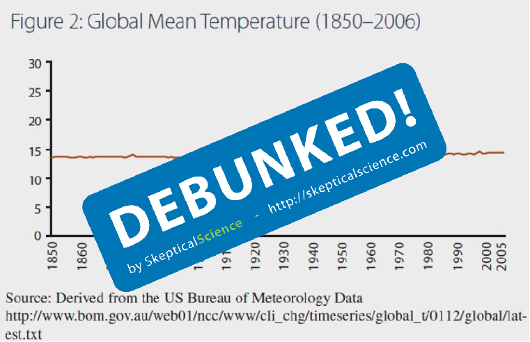
This is the chart D Böehm presented:

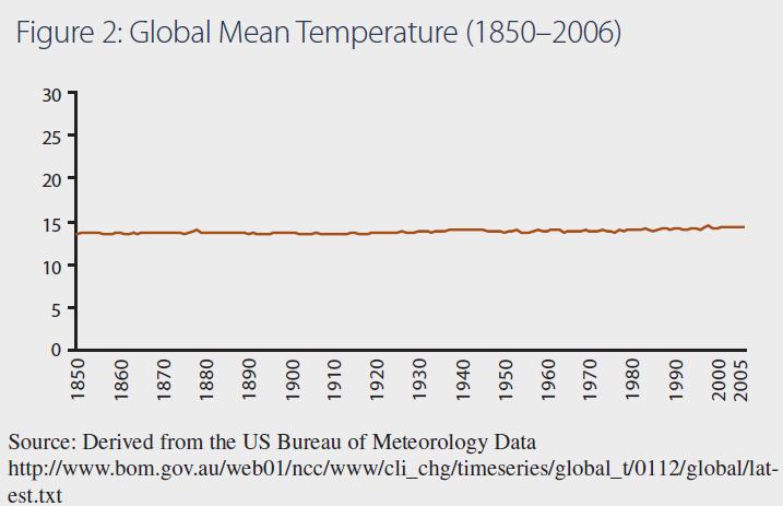
Fig:1 - Böehm's graph with a "normal" Y axis.

Confusing weather and climate

There is, of course, an element of truth here.  You might define "normal" as the temperature range we experience on an annual basis at most locations around the planet.  In fact, the annual temperature range can be greater than this in most mid-latitude locations.  Anyone who has been following climate issues would instantly recognize this as yet another act of confusing weather with climate. Weather is what we experience on a day-to-day basis.  Climate is what weather is doing over longer periods of time.

So, let's give some context to D Böehm's chart. Let's first put this chart in context of the past 500 million years.

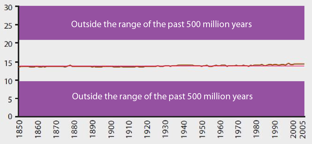
Fig: 2 - Limiting the Y axis to the past 500 million years (click for larger image)

This is taking us back to the Precambrian Explosion. This is the full range of global mean temperature seen on our planet that allowed the evolution of complex life. Anything outside of this +8°C to -6°C we just don't know.  That's a range of just 14°C.  In "normal Y-axis" terms (i.e., weather) this is laying on a sunny beach or a chilly hike in the mountains. In terms of climate these are the boundaries of the existence of life as we understand it on this planet. On the lower bounds we know it's a planet in deep glaciation. At the upper bounds we have tropical conditions near the poles.

Deep glaciation and ice free arctic

Let's now add some additional context: The glacial-interglacial cycles of the past 5 million years or so.

These global mean temperatures range from possibly +2°C to -6°C relative to current global mean temps. At the lower boundary we are talking about a mile high glacier covering Manhattan and near ice free conditions at the Arctic for the upper bounds. That mere 8°C change in global average temp means a vastly different planet.

Remember, in terms of weather, 8°C is only the difference between wearing a t-shirt or a sweater when you go outside.  In terms of climate it's a mile of ice.

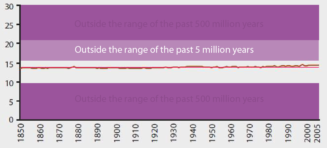
Fig: 3 - Limiting the Y axis to the past 5 million years (click for larger image)

The Holocene, our stable warm period

Now let's look at the Holocene.  The Holocene is the period of the past 10,000 years which has given rise to human civilization. This narrow range of global average temperature is, in part, what has allowed us to prosper the way we have as a species. As we work our way up toward a global population of 10 Billion, we are very reliant upon this narrow stable climate to sustain the global agriculture that can support such a vast population of humans.


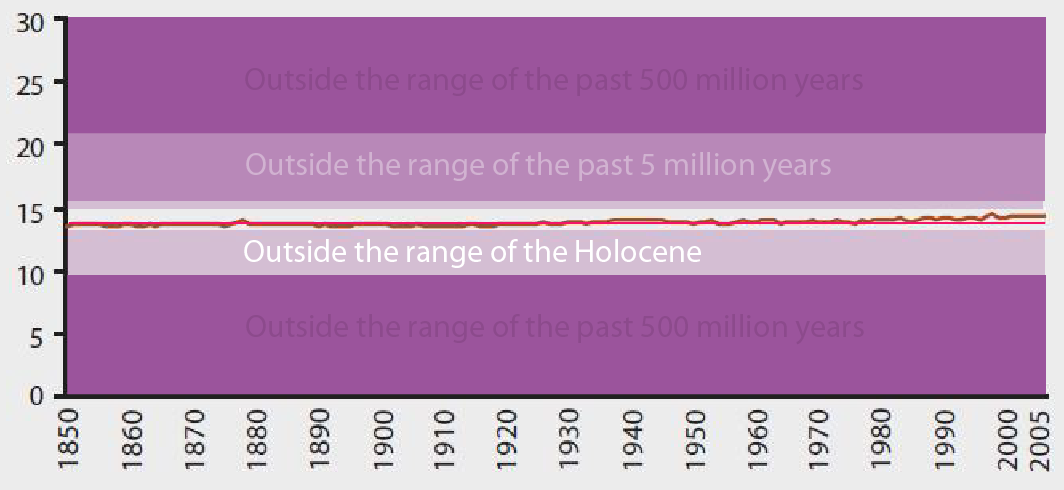
Fig: 4 - Limiting the Y axis to the Holocene (click for larger image)

Business as usual implications

IPCC estimates suggest that Business As Usual (BAU) use of fossil fuels will drive global average temperature up by 1.4—6.4°C by 2100 (IPCC AR4, Figure SPM.6, A1 scenarios).

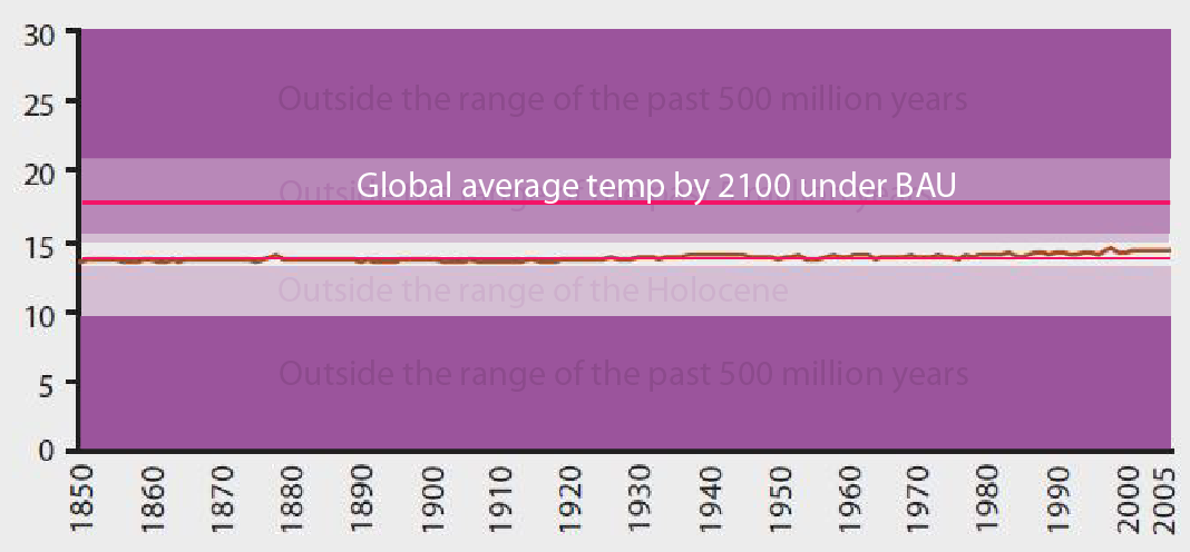
Fig: 5 - Projected temperature by 2100 with Business As Usual emissions (click for larger image)

The bigger question – the larger and more immediate concern – is where is the upper boundary for large scale sustainable agriculture necessary to feed the coming 10 Billion humans? We are certainly headed into new territory, well beyond the "normal" range of the Holocene, regardless of what we do.  BAU use of fossil fuels will certainly drive global average temperature outside the range of the past 5 miliion years. If we do nothing we will likely see such conditions within the next 100 years.

Scary now, D Böehm?

How far are we going to push it? Exactly where on the Y-axis will things get evil?

Y Axis of Evil - Debunked

0 0

Printable Version  |  Link to this page

Comments

1  2  Next

Comments 1 to 50 out of 54:

  1. Why start the y-axis at 0°C? The only objective lower temperature limit is zero Kelvin. :-) Any suggestions for an objective upper limit?
    0 0
  2. Nice build up. Fig 3, getting worried, but that bau line is the killer - welcome to the oligocene!
    0 0
  3. VictorVenema @1, the natural upper bound is the Planck Temperature, or 1.416834*10^32 degrees K. Clearly, on a graph properly displayed, not only is recent global warming completely inconsequential, but current global temperatures are, to a first approximation, zero (being 22 orders of magnitude smaller than the accuracy to which the Planck temperature is known, and hence massive warming by millions of degrees Kelvin is an absolute necessity for the future survival of life on Earth ... At least, I think that's how Böehm's reasoning goes.
    0 0
  4. D Böehm aka Smokey aka dbs (a moderator on WUWT who likes to post under sock-puppets) has posted any number of monstrously distorted graphs - he appears to make a hobby of them. Over and over and over.. Now, I will note that I feel anonymity on the Web is a good thing. Sock-puppeting, however, is another story entirely - if a moderator on a site misrepresents himself/herself as a rather virulent poster or two (who seem oddly immune to moderation), that is not honest. I don't care what a posters real name is, or where they work, their posts should make sense on their own. But if they are mixing roles as moderator of a site and an unrestrained sock-puppet poster of distorted information and insults, that's just downright deceptive. And calls into question the site itself - if there's deception in an aspect as important as moderation, what else is going on? From the WUWT policy page:
    * Internet phantoms who have cryptic handles, no name, and no real email address get no respect here. If you think your opinion or idea is important, elevate your status by being open and honest. People that use their real name get more respect than phantoms with handles. I encourage open discussion. * Anonymity is not guaranteed on this blog. Posters that use a government or publicly funded ip address that assume false identities for the purpose of hiding their source of opinion while on the taxpayers dime get preferential treatment for full disclosure. * A real working email address that you own (as a commenter) is required, so that I may contact you if needed. False or misleading email addresses may earn banishment. Changing handles and/or changing email addresses to get around this will also earn the same fate.
    Hmm... I sense an inconsistency. For a previous critique on this kind of graphic distortion, with no discernible purpose other than to deceive, see a comment on D Böehm/Smokey's work here.
    Summary: If you see a graph with unneeded compression or expansion, and in particular if you see one where [ ] the important data has been altered to change values, you can conclude one thing with certainty. The presenter of that graph is attempting to mislead. - KR
    --- Disclosure: I have been banned from that particular site since a post of mine that mentioned "D Böehm/Smokey", i.e. calling attention to the sock-puppet. Annoying, but rather unsurprising.
    0 0
  5. KR... That's interesting that our D Böehm has an actual history. Perhaps he'll be inclined to come and explain himself. (I'm not holding my breath on that one.)
    0 0
  6. Rob, thanks for the post. That last graph says everything worth saying: BAU will take us outside conditions that have existed for the past 5 million years. There's a sobering thought, as we approach another year of policy makers fiddling round the edges at best and deliberately making things worse at worst. Evolution has not fitted us to occupy our niche for very long, in geological terms. What a stupid species.
    0 0
  7. Please do not link to WTFIUWTW. I am also curious about the upper and lower bounds on that graph. I would have been nice if the producer of the graph would have found out the upper and lower limits of complex multicellular life, but no. These would have been c.+40 (°C) and -2 (°C), but maybe he's using some other scale. I mean, the '30' in that graph might well represent the Planck Temperature and the '0' might be 0 Kelvin. Of course it looks like the range between 10 and 20 is about the same as in Celsius scale, but I can't say for sure. No way this kind of graph would have passed in the secretary school, I hear. The X-scale is another matter, but given the incompetence in choosing the Y-axis endpoints, I'm afraid the producer of the graph may have misunderstood the 1850-2006 column in the ref. It is NOT the time of the day, but the year (which again is not shown in the graph.) Of course the above is just pure speculation about what's been going on in the mind of the producer of that graph. What I'm pretty sure of though, he doesn't want to draw attention to changes in global temperatures, and wants to have a bit of fun reading these responses.
    0 0
  8. Similar issues on selection of graph scales have been covered over at Denial Depot, by good ol' Dr. Inferno...
    0 0
  9. Nice post Rob. Dick Lindzen is guilty of using the same form of trickery with the y axis scale to mislead his audience.
    0 0
  10. Harold Wainers's Visual Revelations Chapter 1 - Rules of Bad Graphics Rule 1: Show as little data as possible Rule 2: Hide what data you do show .... hiding the data in the grid,.. hiding the data in the scale . . People like Wainer and Edward Tufte (The Visual Display of Quantitative Information) are already aware of the tricks of people like Böehm and Lindzen.
    0 0
  11. KR: Clearly your sock puppet learned from the best - PT Barnum. He's notorious in PR circles for writing letters to the editors of several newspapers using multiple pseudonyms in order to increase awareness of his circus and sway public opinion. He even "criticized" himself under some names so that he could then defend himself under different ones.
    0 0
  12. What an excellent explanation of the difference between global average temperature changes and changes in weather temperature! It's something that can be hard to grasp because it can be counter-intuitive that the difference in global temperature between glaciation and alligators in the Arctic can be less than the day-to-day changes in temperature at a single place. I don't know who D Böehm is or what his or her background is, but for Dr Lindzen, who is an actual scientist, to use such a distortion is unforgivable. Choosing appropriate> values for the X and Y axes was one of the things that was drummed into us in secondary school science and I'm sure it must be a basic of any high school science education. We were always taught that one should choose values that start at or near the smallest data value and end at or near the largest one; for example if you were producing a graph showing people's height it would be absurd to start the Y axis at 0 cm as no person is 0 cm tall.
    0 0
  13. Jennifer Marohasy once posted using the same gambit as D Böehm. It shows ignorance - either wilful or otherwise - of the high school-level* concept of magnitude-of-variation versus consequence. If such folk do not understand the significance appropriate display of the magnitude of variations relative to sequelæ, they should consider the tolerance of humans to changes in core body temperature. Doesn't matter if one describes it in terms of kelvin or celsius - a few degrees way from optimum spells death, and even fractions of a degree have profound effects. Attempting to illustrate the tolerable physiological range on a kelvin scale starting at absolute zero would be nothing short of ridiculous. [*I see after refreshing the thread that bath_ed made the same observation]
    0 0
  14. There are an astonishingly large number of examples demonstrating how fake skeptics and those in denial use graphics to mislead their audience. Here is another one Dick Lindzen used recently. Here is an example of Roger Pielke Jnr. misleading people by claiming the damage from Superstorm Sandy was about only half of the current estimate. His misleading graphic has not yet been updated. Other tricks employed by fake skeptics include failing to remove the annual cycle in temperature and sea ice data (for example), failing to apply the inverse barometer correction in sea level data so as to reduce sea-level rise, using uncorrected ENVIROSAT data in order to lower the rate of sea-level rise. The list goes on and on and on. At one point back in 2009 Roger Pielke Snr. was adamant that sea-level rise between 2006 and 2009 had "flattened" and that, by his misguided reckoning, this meant that sea levels was not rising at the upper bound of projections summarized in the IPCC reports. Now look where we are today, global sea level continue to rise at the upper end of the projections discussed in the IPCC assessment reports. [Source] All attempts by fake skeptics, contrarians and those in denial to do whatever it takes to hide the signal in a noisy data time series. They have no credibility and simply cannot and must not be trusted to report the science accurately and correctly, despite what they may try and claim to the contrary.
    0 0
  15. In addition to the Denial Depot post pointed to by Bob Loblaw, this post from Dr. Inferno takes on this kind of absurdity with almost exactly the same graph cooked up by Böehm.
    0 0
  16. One response to D Boehm is that yes, you can live from 0 to 30 C; you just can't feed yourself for long outside 14 to 16 C.
    0 0
  17. Somebody better tell the skeptical Dr. Roy Spencer that his charts are wrong. ;-) Here is a simple analogy for non-experts: Imagine a mountain range that starts with small hills and works its way to taller mountains. Now imagine looking at that mountain range from 50 miles away and being told that there are no tall mountains.
    0 0
    Moderator Response: [RH] Fixed image width.
  18. villabolo @ 17. It was only a few month ago that Dr Spencer overlaid an oscillating sine wave over this graph to make it appear as if the recent warm weather was part of a cycle. He himself included a disclaimer to the effect that it was for comparison purposes only, but his graph was reproduced on many denialist sites that did not include this disclaimer. It is interesting that Dr Spencer has now removed the sine wave.
    0 0
  19. Cornelius B... Might be interesting to add it back for him to see what it implies about his motivations for removing it.
    0 0
  20. Cornelius @ #18 I noticed that too. I'm sure he'll put that sine wave back when we get the next La Nina. A volcano or two would also help.
    0 0
  21. This is a truly classic article. Very well expressed. Incidentally you mention that "we are very reliant upon this narrow stable climate to sustain the global agriculture that can support such a vast population of humans." Yup!! and we are virtually certain to be outside this envelope rather soon. What's the corollary to this. You guessed it. The Lovelock number. 1b (0r less??) people on earth. I get all smug (probably without justification) when I realize that I live in the southern hemisphere surrounded by a huge climate moderating ocean. http://mtkass.blogspot.co.nz/2012/11/greenland-melting.html
    0 0
  22. I have to say, I'd thought of this "perception" problem before, or this "opportunity for distortion", and I'd like to propose a solution: declare a new unit of temperature, the "millitherm" - 1/1000th of a degree Celsius. So what we are all trying to avoid is an increase in GAST of 2000 millitherms. Currently we've experienced an increase of 800 millitherms. I know, it's the same thing...but this is a PR game whether we like it or not, and perceptions count. Just my 2000 mils worth.
    0 0
  23. Very convincing rebuttal; slam dunk! I would like to see two more charts inserted into the article. Take the last two charts and then "blow" the Y-axis back up. 1) Add a Fig.4b. It would be same as Fig.4 except change the upper & lower Y-axis limits to the Holocene limits. 2) Add a Fig.5b. It would be the same as Fig.5 except change the upper Y-axis limit to equal the BAU red-line (or slightly greater) and change the lower Y-axis limit to equal the Holocene lower limit. Doing so, would allow us to better see the true extent of the temperature changes relative to these properly set boundary limits. ... Excellent article!
    0 0
  24. Cornelius and villabolo. Spencer's fit was actually a third order polynomial, and many of us disparaged him over the years for the statistical uselessness of prediction that it provided. I suspect that Spencer omits it now because the most recent values for time have reached the point where the record and the polynomial are starting to permanently part ways as the polynomial decends toward y = minus infinity. Of course, Spencer can always go up an order or two - but then he'd be an even greater laughing stock (if such is possible) amongst people with any operant understanding of appropriate curve fitting... Jimspy, 1/1000th of a degree Celsius would simply be a millidegree, just as 1/1000th of a metre is a millimetre!
    0 0
  25. Reading through my post again I was just realizing something. We're already committed to temperatures outside the past 5 million years, regardless of what we do. The question is, how far outside of the Holocene are we going to push it. Just how bad are we going to make this. That is the predicament we face and the choices we are making today.
    0 0
  26. Rob Honeycutt at #25. Business as usual for a few more decades will likely take us to (and perhaps beyond) temperature territory visited only four times in the last 55 million years. Humans as endotherms are frankly not designed for such conditions, and nor is the environment in which we evolved and on which we rely.
    0 0
  27. Bernard @26, Denialists often show your temp graph (of the Cenozoic era from d18O proxy) but dress it in precisely opposite ethical considerations: "the Earth was far warmer few My ago, so a little bit of warming ain't bad... Acrtic ice will melt and polar bears will go extinct as the result? So what? Extinctions have always been happening and old species have been replaced by new ones. Polar bear will be replaced by a better species" When I'm looking at such thoughtless crank, and see other egotic cranks or such being our policymakers (i.e. reps in US, libs in Australia), I become depressed and I really wish that "polar bears" be replaced with "homo sapiens" in their silly, ignorant talk. If homo sapiens' collective mindset is determined by the lowest denominator (i.e. a crank above), then this species is not worth living on this planet.
    0 0
  28. Chriskoz: don't say this "I become depressed and I really wish that "polar bears" be replaced with "homo sapiens" in their silly, ignorant talk" Don't give up - it's the only way to defeat the mindset of the Cranks above. The collective will win.
    0 0
  29. I've seen similar trolls on Slashdot: . Note that the average depth of the ocean is 3790 meters. Graph that including zero, and I think it is safe to say that a 0.1% increase would look like no change at all -- a mere 3.79 meters.
    0 0
  30. Bernard J: I realize that, which is why I went for the more specific "millitherm = 1/1000th of a degree CELSIUS." Creating a new term gets the media's (and their readers') attention. And attention is what is needed, and quickly. It also allows us to speak in terms of hundreds, and not "hundredths."
    0 0
  31. Respectfully, jimspy, and from my POV as a earth scientist, I see absolutely no reason whatever to muddy up the discussion with a new metric of temperature. Degrees are widely-and well-understood by lay and scientific folk, and though we (Americans) still cling to our Fahrenheit, over the *rest* of the world, there is still a plenty enough comprehension of what a 6C temp rise will be: Uninhabitable.
    0 0
  32. @ vrooomie & jimspy Jimpsy, I know you're thinking from a PR point of view but there is a flaw in your terminology. "Milli" is a well known term by the public for thousandths thus using it will give the impression of triviality. A more public friendly response to this pseudoscientific nonsense would be to simply state that the chart has been "compressed" or "squashed down" or some similar phrase that the public can understand. vrooomie Most Americans, uneducated as they are, won't fully appreciate what a 6C rise would do; especially if they live in a relatively cool place.
    0 0
  33. Vroomie & Villabolo: From my decidedly un-scientifically-uneducatedly layman's POV, working as I do with the Great Unwashed, I have to point out, as does Villabolo, that the masses are only dimly aware that there two temperature scales (and don't even mention Kelvin to them). At the very least, they are not -instinctively- aware of the six-degree problem, and must be told about it. And then it's a crapshoot as to whether they believe it, or become fully invested in it. The average person thinks, When I drive from New York to Miami in the winter, the temperature goes up THIRTY degrees, so how bad could 6 be? It's probably a bit difficult for some scientists to fully appreciate the depths of American ignorance of science, working as they do with colleagues and interested students who have acquired a modicum of knowledge. But people do react to large numbers, and I merely thought the opportunity for us to say the words "Six thousand millitherms" would give us a chance to open some eyes. However, if you think it will muddy the waters, or give deniers yet more fodder for lobbing grenades, forget I mentioned it.
    0 0
  34. No offense intended,,, I think jimspy sort of has a point in that larger numbers have an effect on peoples' perception. (humor) I would indeed be probably more understandable to general public if, let's say 0,05 picoCelsiuses would be converted to... let's say 'negative dollars'. Then it could be easily stated that we're fighting against a temperature rise of -40'000'000'000'000 dollars. This might even be divided against the negative of population of the earth to get the temperature rise per person to get 5714,3 dollars/person which would approximate towards the cost of conversion of a averge american household running on renewables instead of fossils. It might be I got the numbers wrong there. Of course this sort of scale would only obfuscate the argument for those using €s or other currencies, like the Zimbabwean dollar which (at least a couple of years ago) was the basic unit of currency being the smallest measurable unit of currency (the so called 'Planck currency') (/humor) Of course this sort of thing has been calculated better in those carbon trading schemes, but apparently nowadays people are talking more about carbon taxes.
    0 0
  35. con't on the humor bit, 5714 dollars means about a minimum wage of half a year. so to counter the climate change one would have to do double shifts for half a year and put all the income from the extra job to sustainable growth projects in the house. Then on other half of the year one should install the stuff bought (no way a man can do +16 hours/day continuously), in the rental apartment (ever heard of a minimum wager actually owning a house??) and get sued for not getting a permit from the housing committee of the guarded community. the deniers on the other side of the fence would rip the solar installation some night and get the annoying hyper-active green person growing vegetables on the front yard evicted. (/end humor) Sorry this went way off topic (delete if necessary).
    0 0
  36. By the way, the source of the graph is NOT from the US Bureau of Meteorology that D. B. claims; it is quite evidently (by the domain) from the Australian Bureau...and shows a rising graph in any scale.
    0 0
    Moderator Response: [DB] Note that the chart depicted in Fig 1 itself notes that it is derived from US Bureau of Meteorology data, NOT from a reproduced work originally from the US Bureau of Meteorology.
  37. While compressing or expanding an axis (as well as clipping and truncating data sets) is an old tactic frequently used in advertizing. When I see this, I just get out my red pencil and shift into 'peer review' mode. Typically, published journal articles do not present results in absolute temperatures but instead compare temperature to an average datum period which variance from is considered an anomaly. These average periods, in the US are from 1961-1980 and in the UK and Australia is 1961-1990, are intended to even out seasonal influences as well as the larger periodic cyclic processes such as ENSO (El Nino Southern Oscillation) and the AO (Arctic Oscillation) Comparing temperature anomalies gives a bit more value in making comparisons and it also makes the statistical hurdles a bit less challenging. As a point of reference here in the United States, most of our meteorological services are provided by NOAA and the National Weather Service. These agencies along with DoD, NASA, GISS, NFS, NPS, BLM are just a few of many agencies conducting climate studies as these changes affect our policy making.
    0 0
  38. In a current discussion on WUWT (http://tinyurl.com/by6lp2h) concerning a paper where a figure incorrectly (in my opinion) states that there is no acceleration in the temperature trend from 1880 to the present, D Boehm is caught out in a flagrant manipulation of the Y axis to flatten the data set. My initial comment is at Philip Shehan says: January 4, 2013 at 8:43 am The discussion with Boehm and others continues thereafter but his manipulation is evident here where my losing patience unfortunately leads me to being a little rude Philip Shehan says: January 4, 2013 at 4:42 pm D Boehm, Look, don’t try to blow smoke. You have been caught out manipulating the data sets to produce a chart which attempts to hide the trend. Here is your chart going back to 1850: http://tinyurl.com/bkoy8or and here is your chart with the irrelevant camouflage removed. http://tinyurl.com/af5xwmv Your linear fit, stripped of the camouflage is inferior to the nonlinear fit: http://www.skepticalscience.com/pics/AMTI.png Later Boehm describes the non linear fit of the data as being “without provenace” and “John Cook’s cartoon”. I rebut that but I often get this from “skeptics” when I present this figure. Is anyone there able to give details of the actual temperature data set used and the function used for the nonlinear fit?
    0 0
    Moderator Response: [RH] Added hot links.
  39. Philip Shehan - That graph is from Monckton Myth #2: Temperature records, trends and El Nino, and is an average of 10 temperature records brought to a common baseline. That averaging should minimize biases from any particular dataset involved. The fit appears to be a simple quadratic trend line.
    0 0
  40. Philip Shehan - Oh, and Boehm/Smokey has been called on that particular graph before... As discussed in the opening post, he appears to have quite a hobby of generating what turn out to be misleading figures with compressed axes, cherry-picked and statistically insignificant short time frames, of representing something like the Central England Temperature (CET) record as representing the globe, on and on and on. I don't expect him to suddenly change his mind when these issues are pointed out...
    0 0
  41. Thanks to the moderator for the links. I assumed that they would just come up when I copied them with the text. Thanks KR for providing the "provenance" for the graph.
    0 0
  42. The strangest thing about Boehm/Smokey's contorted graphs is that they still show acceleration despite his protestations otherwise. The earliest HadCRUT data lies above the magenta line, the middle section dips down to the blue line, and the end part breaks through the magenta line again. It's easier to see (Ha! What a concept...) if we look at the residuals after removing the trend, and even clearer if we use the non-obsolete HadCRUT4. (The figures of 0.741546672 and 0.7562876736 come from finding the linear trend for the period and multiplying it by the number of years in that period; the green line is both to help visualise the residuals as well as prove the detrend figure is correct by showing the result is horizontal.) If you try fitting a polynomial to those residuals then a quadratic does a nice job of showing what's left after the linear trend has been removed. Who to believe? Boehm/Smokey or the data? The good thing about his claims is that they have to be one of the easiest to debunk. :-)
    0 0
  43. Boehm is excellent at showing people exactly how he's managed to convince himself that he's right. He's a wonderful example of motivated reasoning and confirmation bias.
    0 0
  44. A comment I have just posted on the WUWT thread for which the link is provided at comment 38 I refer to his post of January 9, 2013 at 11:37 am I recognise that this comment is decidedly "ad hominem' in the sense of being highly critical of Boehm personally as opposed to his adeas but I beleive the remarks are entirely justified being an reasonable description of his conduct and in the interest of exposing Boem's conduct I request it be posted. D Boehm Stealy [snip] I have previously drawn attention to your manipulation of Wood for trees data sets to flatten the appearance of the temperature data sets. Your conduct [snip] . Your chart in your post purports to be a plot of Muona Loa CO2 output and Hadcrut3 temperature data. It is nothing of the sort. As the WTF website states your use of the Isolate function means that you are plotting the noise after subtraction of the data, not the data itself. [snip]
    0 0
    Moderator Response: TC: Ad hominens snipped.
  45. With reference to Philip Shehan's comment, this is the image used by Boehm to argue that temperature increases are responsible for the increase in CO2. The essential function used is the isolate function, which removes the trend and resets the mean of the series to zero. This has been illustrated here, with the "isolated" data offset for ease of comparison. As such, Boehme has joined a long list of deniers who have "proved" that temperature increases cause the rising trend of CO2 concentration by first removing that trend from the analysis. Shehan thinks such arguments raise serious ethical concerns, but that is not a permitted topic of conversation on SkS. I will note that Boehme rescales the CO2 data by a factor of 0.25. That means, even if we accept his premise, each degree rise in temperature will only cause a 4 ppmv increase in CO2. With temperatures rising by approximately 1 degree C since the pre-industrial revolution, that means at best he has shown that 4 ppmv of the 110 ppmv increase in CO2 is due to increased temperatures. Yet again we have a denier thinking only sufficiently to give himself a convenient sound bite, and not carrying the analysis through to see its full implications. That is, of course, because people who do carry the analysis through cease to be deniers (if they ever were).
    0 0
  46. Apologies to moderators for my personal remarks about Boehm, I have tried to be polite in discussions with folks over at WUWT even when they are slightly snarky and even abusive, but Boehm is apparently permitted to tip buckets of manure over people in post after post, and I had had enough of being on the receiving end. Tom Curtis informs me that we are not permitted to discuss "ethical issues" here, and that is what I was really getting stuck into Boehm about. Tom Curtis: Thank you for your explanation. I am still a little confused. According to the Wood For Trees help section: Mean (Months) Running mean over the given number of months. Keeps the number of samples the same, but smooths them by taking the average of that number of months around each sample. Isolate (Months) Does the same running mean as 'mean', but then subtracts this from the raw data to leave the 'noise' I thought the functions you mention were performed by (quoting from WFT help again) Scale (Scale factor) Multiplies each sample by the given scale factor Offset (Offset amount) Adds the given offset to each sample (can be negative) Normalise - Scales and offsets all samples so they fall into the range 0..1 I posted the following to you over at WUWT but appear to be now banned. Do you have any comment? My suspicions were aroused by informal inspection of the graph (and presentation of another graph from the same source in which extraneous processing had been used which did nothing but introduce extraneous lines which flattened the temperature data obscuring the curve of the data which the graph was supposed to be showing did not exist) shows that the match of the data sets is ridiculously good. Given that temperature is affected by solar cycles, aerosols, volcanic eruptions, El Niño and la Nina events etc etc, how could there be such a near perfect correlation between temperature and CO2 content alone? Well we now know there isn’t.
    0 0
  47. Philip, I don't want to be a downer and certainly your efforts should be lauded. However, I understood for myself years ago that any time spent at WUWT is wasted. The crowd's response there to the carbonic snow incident revealed a mixture of intellectual indigence coupled with ideological fanatism, the combination of which can not respond to any amount of rational thinking.
    0 0
  48. Philippe Chantreau, Thank you for your advice. You are tright of course and I too recognised that WUWT is no place for reasoned debate, nor is the Andrew Bolt site (Australian reders will understand, but every now and then I can't resist the temptation to have a peek toand get sucked in. It can pay off in a way as shown by this post I have made there which refers to the comment by KR at 12:49 PM on 28 December, 2012 above. Of course I do not expect it to survive moderation: Philip Shehan says: Your comment is awaiting moderation. January 10, 2013 at 9:19 pm Fascinating. A poster is referring to a comment of mine which at the time of reading and typing this response has not appeared. I had read elsewhere that this person was in fact a moderator here who has posted under more than one name without disclosing their status. Quoting this source: “Now, I will note that I feel anonymity on the Web is a good thing. Sock-puppeting, however, is another story entirely – if a moderator on a site misrepresents himself/herself as a rather virulent poster or two (who seem oddly immune to moderation), that is not honest. I don’t care what a posters real name is, or where they work, their posts should make sense on their own. But if they are mixing roles as moderator of a site and an unrestrained sock-puppet poster of distorted information and insults, that’s just downright deceptive. And calls into question the site itself – if there’s deception in an aspect as important as moderation, what else is going on?” As no evidence was presented to support the assertion, I made no judgement. Now I have the evidence and I make the judgement.
    0 0
  49. Here is another payoff I managed to have an explanation with His Lordship. He appears to be a stickler for formality, but I have not informed him that the correct form of adress is Dr Shehan, or perhaps Shehan of Brunswick. Still waiting on a reply. Philip Shehan says: January 10, 2013 at 1:10 am Monckton of Brenchley says: January 7, 2013 at 3:29 pm Mr Shehan attributes to me a statement that I did not make. Some 40 per cent of the CO2 in the air is anthropogenic, not the 3 per cent that Mr Shehan attributes to me. Thank you for the reply. The only sense in which I attributed the 3% to you was in that I found that this sentence was confusing in that it seemed to suggest this and asked for a clarification: ‘Philip Shehan says: January 7, 2013 at 12:56 pm Monckton of Benchley says: “Today’s high CO2 levels – the 97% natural and the 3% human-released” This may lead people to conclude that human activities have added only 3% to atmospheric CO2. In the interests of clarity, Monckton should point out that the 97% natural contribution refers to CO2 being recycled through the biosphere, whereas the 3% is that added to the atmosphere by the burning of fossil fuels which has seen the CO2 concentration rise from 280 ppm at the beginning of the industrial revolution to 390 ppm today This is a rise of 39%.’ We are afte rall in agrement that the anthropogenic CO2 content is 40%. As the 97% vs 3% figure is frequently given, and I am sure many other than myself misinterpret this statement, can you explain to me what you understand is meant by it. Can you also suggest an expalnation the other difficulty I had with this: “I am also unclear about what time period the 3% covers. According to the following sources, the rise in atmospheric carbon was only 2.0 ppm in the decade 2000-2009, which is only a 0.52% rise over that period.” Thank you again and hoping you can help
    0 0
  50. Sorry about the sloppy typing and lack of proof reading before I hit the submit button.
    0 0

1  2  Next

You need to be logged in to post a comment. Login via the left margin or if you're new, register here.


The Consensus Project Website

THE ESCALATOR

(free to republish)


© Copyright 2024 John Cook
Home | Translations | About Us | Privacy | Contact Us