


 Arguments


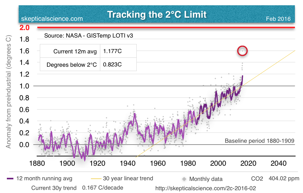
Tracking the 2°C Limit - February 2016
Posted on 16 March 2016 by Rob Honeycutt
February has seen yet another record anomaly in the GISS data, and this one is another large jump up from last month's anomaly of 1.14°C. GISS just reported February 2016 at 1.35°C. The next highest February anomaly was 0.88°C in 1998, so February 2016 is a full 0.47°C warmer than that. (Full size graph here.)
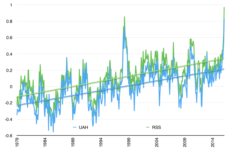
The satellite data are also starting to show a strong response to the El Nino. In January, Roy Spencer made the comment that, "We are now approaching peak warmth in the tropics due to El Nino conditions. Only time will tell if warming continues for a few more months, or whether January was the peak." It's not entirely clear to me whether he's talking about the peak in sea surface temps or whether he was expecting the January UAH data to have peaked, but February came back and blew January out of the water (so to speak).
Both RSS and UAH data showed a very sharp rise in temperature for February. (Full size image here.)
If you've been following these posts, you'll remember I'm also tracking the Ocean Nino Index (ONI) relative to the satellite data. I'm now tracking this for both UAH and RSS in different charts. If 2016 plays out anything like the 1998 El Nino, we're in for many more months of similar temps before they fall back to the long term trend. (Full size image here.)

I came up with a simple graphical way for estimating what might happen over the coming months, again, if the satellite temperature data behaves similarly to 1998. (Full size image here.)
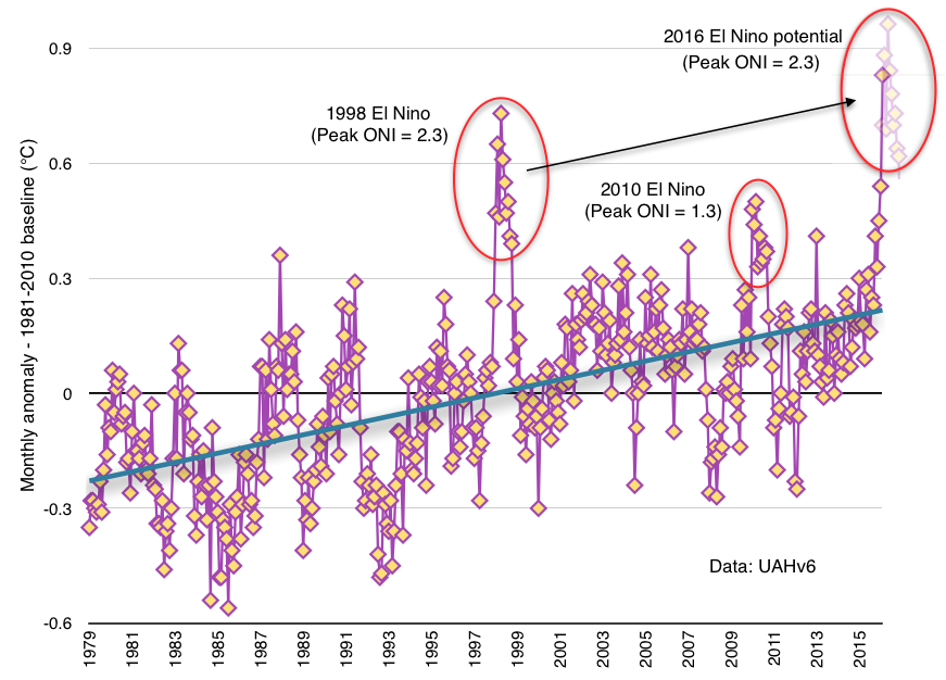
This suggests that we could be in for most of 2016 ranging in the same temperature territory for the satellite record.
Of course, everyone likely knows by now that the big news of late has been the v4 update to the RSS satellite data set, which raised the trend in their data by about 60%. Currently I've been working with the lower troposphere data (TLT) and the RSS update so far is only for the TMT and TTT data. I haven't heard otherwise, but I'm assuming an update for TLT will also be coming.
Given that February was such a huge jump relative to January in the GISS data and the surface station data seems to lead the satellite data in response to El Ninos, I think we're likely in for at least a few more very interesting months. This phase of the temperature trend is probably going to continue on at least through the NH summer and into the NH fall.
Buckle your seat belts. This is where the ride starts getting interesting.


I’m always debating with my friend who is a skeptic about global warming. Maybe I’m just slow but I cannot find a graph that shows a projected temperature by a model along with the actual temperature data of say NASA up to some time period where I can add the most recent temperature data to show the models are correct. Can anyone point me to that information? I’ve tried googling everything I can think of. In addition I know the base times have to the same and I’m not sure how to calculate that. Any help would be appreciated.
I should add that we are both structural engineers who use finite element software extensively. As I understand it the climate models are basically very similar to finite element used in other industries. So If I can show the models, or a specific model with the amount of CO2 assumed then I can make a persuasive argument comparing them to how we verify our models.
Hank, you can try these two from Real Climate:
They are, of course, only current to the end of 2014. 2015 was about 0.12 C warmer than 2014 (GISTEMP), which still leaves it below the model mean, but well within the uncertainty.
2016 looks to be warmer again. In fact, its montly value for February was 0.61 C warmer than the annual value for 2014. That means it is literally of this chart. However, later months are likely to be cooler, bringing the mean down. Therefore it is likely 2016 will be above the model mean, but not necessarilly by much. Overall, I think the model mean overpredicts the temperature trend by about 15%.
Michael Mann has been saying that February was more than 2 C above "pre-industrial". Does that seem plausible? Obviously, the 1880-1909 baseline used to compute the 1.35 C February anomaly in the article above is after the industrial revolution had begun, but does an additional 0.65 C of warming prior to that seem likely or is Mann jumping the gun?
@Hank
This latest graph is from Zeke Hausfather, Berkeley Earth:
CDB... If I'm not mistaken, Mike is looking at data that goes back to ~1750, which also includes a lot of land use changes. With all due respect for Dr. Mann (who clearly is far better informed than I am), I tend to think there is likely some natural cooling influence baked into those figures. I've heard that Hansen uses 1880 as preindustrial, so even among experts there's disagreement.
For now I'm going to stick with the preindustrial baseline I have just because it's what I can calculate from the GISS data.
We will soon need an ear for ultrasonic sound.
https://www.youtube.com/watch?v=yDdaTSnAFlo
CBDunkerson @4, I have previously caclulated that using the Mann 2008 EIV reconstruction and the 1736-1765 mean value as the 'preindustrial' benchmark', the gives a preindustrial temperature 0.12 C lower than using the GISTEMP 1880-1909 mean. Based on that 1880-1909 baseline, Feb 2016 had a 1.587 C anomaly. Therefore, based on Mann's currently most recently published best estimate of preindustrial temperatures, February 2016 was 1.71 C above the preindustrial average.
Michael Mann may have an as yet unpublished estimate that increases that value (or I may have missed a published estimate that supercedes Mann 2008). Alternatively, he may have used some other baseline terminating in 1749 or 1750. Without knowing his method of determining the value he claims, I cannot comment on whether I think it reasonable.
As a side, note, the 1.35 C anomaly is relative to the GISTEMP baseline of 1951-1980. As noted above, it is substantially greater relative to 1880-1909.
Thank you Tom and Charles. I have actually seen the one’s you posted Tom but I don’t know what CMIP5 Ensemble means. I understand that models are run considering different scenarios of CO2 projection levels but I don’t understand if the charts are showing the average of all these different scenarios or what.
I read the Climatology Versus Pseudoscience book by Dana Nuccitelli which was very helpful. Although I mainly use the Skepticalscience website for information I’m looking for a book or website that explains the graphs in more detail.
Hank, CMIP stands for Coupled Model Intercomparison Project. By 'Coupled Model' they mean climate models including both an atmosphere model and an ocean model run together, ie, what is generally referred to as a climate model (although there are other types of climate models). The project has run a series of phases in which models participating were required to meet progressively more realistic standards, and given the option of running a set of defined standard experiments, thereby facilitating comparisons between the models. You will often see references to CMIP3 which was the phase run explicitly to meet the needs of the IPCC Assessment Report 4 (AR4), while CMIP5 was the phase run to meet the needs of IPCC Assessment Report 5 (AR5). That is, in short, CMIP5 models are the models used for IPCC AR5.
I don't believe the standards for the next CMIP project have yet been defined, but am open for correction.
Thank you very much Tom. I’m pretty sure I understand what you are talking about now.
Hank@1. All models are incorrect (as a structural engr I'm sure you already know that). Hence, comparing predictions against reality is bound to lose, the predictions of climate scientists properly should be compared against other predictions, like those of climate deniers. Has your denier friend every offered you such a prediction by a prominant denier? If not, why not? Who told him he is automatically 'off the hook' for such information? This discusses James Hansens 1981 prediction and This discusses Wallace Broecker's 1974 prediction, and how each compared with the subsequent reality. But its not the comparison with reality that matters, but the comparison with the predictions of competing theories. If your friend is unable to field such predictions, let him know that this is actually saying something very significant about the theories he prefers.
It turns out that Michael Mann's claim was made in an email, the rest of which has not been quoted. As such, I can make no informed comment on what he meant. Supposing TonyW @13 is correct, however, then using GISTEMP, the February 2016 anomaly relative to 1951-1980 was 1.9 C, making it 2.18 C greater than the 1880-1909 average.
Basically Feb has peaked at ~2C above pre-industrial, a level considerred so dangerous to geopoltical stability that even the politicians have made honest pledges that they don't want to go above it.
What carbon budget??????
Like we can seriously put more GHG into the atmosphere safely, what a load of nonsesne.
2015 was also the highest yearly CO2 rise at ~3ppm.
Wars are raging and Wars cost lots CO2 (manufacturing all those nice weapons) and cause mass environmental damage.
And the highly elite driven system humankind is under isn't intending to change anything any time soon and when pressure falls on the basic necessities and the weather ravages homes and crops, more wars and migrants are inevitable.
The pope has already called the plight of the Syrian refugees who are average kind people escaping tyranny and terror an invasion of a holy nature into Europe.
Antartica is melting quickly, Greenland too, the Arctic sea ice is vanishing rapidly and the permafrost is melting, forest fires raging and peaks lands burning all relaeasing more GHG than expected in all the policy makers models.
???
Isn't time to transform everything we do?
Impossible???
Or does anyone know a place of sanctuary for those who care to escape to?
Tom Curtis... Mann also tweeted several comments related to this anomaly being 2°C over preindustrial.
https://twitter.com/MichaelEMann/status/708814127267885057
I keep reading reports about how climate scientists are responding to this February peak with words like ‘shocking,’ ‘stunning,’ and just ‘wow.’
I agree, and I know they expected _some_ increases in an El Nino year. But now I want to know what the science didn’t anticipate that has made this monthly peak so high.
Is it just the super strong El Nino on top of GW? Or aret there carbon, or albedo or other feedbacks kicking in? Are we losing our 'aerosol umbrella'? Perhaps calculations of climate sensitivity have been too low? Do we have any clue at all why the reading for February is so much higher than anticipated?
There was a lot of heat coming out of the ocean in the mid latitudes as well...
Whereas I believe the 1998 El Nino was primarily limited to the equitorial Pacific.
Here's an interesting comparison I just found...
Ubrew12:
Thanks for the links. There were helpful and interesting.
No my denier friend has never given any projections by skeptics. I’ve even pointed out that they have been predicting a downturn in temperature for 20 years and it hasn’t happened yet. Those emails are ignored. Although he has sent me some curve fitting that was used to show ‘natural change’ (never any definition of what ‘natural’ is) and then subtracted from the actual to show that climate sensitivity is very low. I’m sure you have seen those. A few natural cycle sine curves with the amplitude and frequency adjusted and anything can be fit with a Fourier series.
My friend is very intelligent. I’ve even asked him how he picks between which science fields he accepts and which he rejects since he rejects very few but just get a convoluted answer about it has to be based on the evidence of all things! He accepts the temperature is rising and CO2 has some effect but not enough that even if we did something it would matter much or that it’s going to get that bad. I’m pretty sure the problem is his conservative views about the government getting involved in this with taxes. You know the story. I don’t think I will ever convince him in this lifetime but I actually enjoy learning something new and our debates require me to study the subject in order to give factual and rational responses. So that’s the benefit I get from our debates. I’m a long way from knowing a lot about the subject but I can follow the math and science part enough to know I need to be worried about my children and grandchildren.
I will respectively disagree with you on comparing projections with models. I do know that models are incorrect as I use finite element almost every day in my work. However at least from a structural engineering perspective they better at least be close or bad things happen. On occasion I have the opportunity to verify my designs by observations from the field. It happened just a few weeks ago when a structure had to be loaded for testing and we took deflection readings while it was loaded. The deflections were within 10% of what my model predicted so I was ecstatic. It verified my model was created correctly and was also a step towards validating the entire method of the software finite element program I was using. I think projections reasonable close to matching the models is a powerful argument that the science is correct and we need to do something about global warming.
Hank@20 said "from a structural engineering perspective... [the models] better at least be close or bad things happen" I typically make 3 models of anything I'm tasked with understanding: a full 20k-2000k finite-element or difference model using appropriate software, a 100 node model performed with a spreadsheet, and a 1-5 node model calculated 'back-of-envelope' by hand. Always tie your calculations back to something you did by hand. It confirms the most critical assumptions in your calculation and prevents embarrassment. A 2000k-node model can be right in its particulars, and yet spectacularly wrong in its generals.
"anything can be fit with a Fourier series" John von Neumann: "with four parameters I can fit an elephant, and with five I can make him wiggle his trunk." Earth does not exist outside Physics. If your friend cannot tie his math modelling back to the Physical fundamentals, thats a 'red flag'.
Re: Climate models
=> This Is Why The Record Warmth is Not Natural
by Dan Satterfield
Ubrew12 I completely agree. Are you a structural engineer? I started engineering long before computers when everything was done with hand calculations using basic assumptions. I have trained several engineers and with the latter ones coming right out of college I’ve become very concerned that they so completely depend on the computer. I’ve had them bring me results that I could see in 2 seconds was not even close. It’s like the proverbial pulling eye teeth to get them to do a rough hand calculation.
Unfortunately some of my models are complicated plate and solid models which can be difficult to do classical hand calculations but I try to at least do exactly as you have said, run different meshes to see if they converge on a number.
Rob Honeycutt @16, thanks for the headsup.
Mann's tweet says:
Citing the GISTEMP global anomally as he does, that should indicate that he is talking about global temperatures, but it turns out he is not.
Specifically, when you follow up to the referenced article in the Huffington Post, he makes use of information cited in two other articles, one peer reviewed, and one from Scientific American, both of which deal exclusively with Northern Hemisphere temperatures. Indeed, he is quite clear about that in the Huffington Post article.
In the end, the data he shows is used in this graph from the Scientific American article:
This is derived from a combination of temperature data, including BEST NH land back to 1750, forcing data and an energy balance model. Exactly how these are combined to produce the preindustrial temperature is unclear to me. He does provide Matlab code, but as I do not have Matlab, I am unable to read the code. He writes (Huffington Post):
The 1.2 C figure for the NH is significantly less than the 2001-2011 mean for BEST NH land relative to a 1750-1779 baseline, which is 1.67 C. That is no surprise as a land only anomaly will be higher than an ocean/land anomaly. The difference shows, however, that Mann has not simply taken the BEST land only value, although he may have taken the straight 1750 value, which was high relative to the 1750-1779 mean. I suspect, however, he has used a much better method than that and would not dispute his figure.
What I do dispute is taking the NH as an analogue for the globe. There are good reasons for doing so in the cited articles, specifically the much better historical and paleo records for the NH. But the 2 C target is for global temperatures. Because the NH is approximatley 2/3rds land, it is expected to have a higher anomally than the whole globe at 2 C, and thus 2 C NH is not equivalent to 2 C globally. Suggesting that the February 2016 temperature gives us an idea of what 2 C is like is misleading. We still have significant warming to go before we crack 2 C globally, and thus actually reach the 2 C limit.
I really liked the 'Tracking the 2 °C Limit' plot the first time I saw it, and I therefore generated a similar plot for my blog. I still like the plot, but I have a couple of comments on it.
The plot and the text in the blog post focus on the 'Current 12 months average' and on the last month. If we focus too much on the warming in the current El Nino phase, we have to accept that the contrarians will focus on the cooling in the next La Nina phase. These ups and downs in temperature are caused by natural climate variability. Our concern must be the long term warming, and we should therefore concentrate on the long term trend line.
My other comment is that the plot may give the impression that we may wait some years, maybe even a decade, before harsh measures to reduce the emissions must be implemented. This is because the temperature increases rather slowly due to the inertia in the climate system. Despite more than one hundred years with man-made carbon emissions, the long term temperature trend has increased by only 1 °C. In the next decade it will probably rise by another 0.2 °C, and there is still 0.3 °C left before the 1.5 °C limit is reached. We get a more grim and realistic view on the situation if we focus on the carbon emissions and on the carbon budgets. If the current carbon emissions continue as they were in 2014, the IPCC carbon budget for 1.5 °C warming will be exhausted in six years.
I have written more about this on my blog.
Hans... I'm not really so sure La Nina is going to come save us. The ONI figures dropped back down to -1.6 after the 1997/98 El Nino, but if you look at the 2nd or 4th figures in this post, temps only dropped back down to the long term trend. I would expect something similar for this El Nino.
Hank@23 said: "I started engineering long before computers when everything was done with hand calculations" Sorry, I had no idea! I assumed I was talking with a modern stamp-product of the STEM system.
I'm a lowly thermal engineer. However, primarily in spacecraft (of which Earth is such) and so the entire 'controversy' over a CO2-induced radiative imbalance over our spacecrafts heat-rejection capability quite frankly has been 'cramping my 88*ss' for 20 years now. It's time to let Physics tell its story, and believe the story its telling.
The carbon budgets was the main issue in my @25. The budget for 1.5 °C warming may soon be exhausted, perhaps when we still focus on the ups and downs in the temps. And the budget for 2 °C warming may be exhausted before the temperature has risen 1.5 °C. CDIAC publishes data for the carbon emissions on a yearly basis, and the data for 2014 was published some months ago. These data has up till 2014 been very stable and predictable, maybe due to the inertia in our economic system, infrastructure etc. It may be difficult to make a newsworthy plot every month showing the carbon emissions and the carbon budgets. But maybe the issue of carbon budgets should be mentioned when we show how the temps approach the 1.5 and 2 °C limits ?
Rob @26, in your December 2015 update you show a plot with the full ONI (Ocean Nino Index) data going back to 1950. The plot shows the La Ninas following the El Ninos in 1998 and 2010. During these La Ninas the global surface temperature fell below the long term trend line, as shown in the plot below. The plot is similar to the main plot in your February 2016 update, but it is zoomed in to see the details after 1997.
I think we should expect something similar for the next La Nina. Then the contrarians will probably focus on the decline in the monthly temperatures and in the 12 months running average, and we will get a new version of the 'No warming in the last nn years' myth. We somehow legitimize their future wrongdoing by now focusing too much on the warm temps in the current El Nino.
In my opinion the field 'Current 12 m avg' in the upper left part of your plot could be replaced with 'Trend line current month'. That would focus on the long term trend, and it would make future versions of your plot more informative when the temps drop below the trend line, which they hopefully will do for 50 % of the future months. The current value of the long term trend line will vary slowly, but the 12 months running average and the red circle around the temp in the last month will retain the newsworthiness of the plot. (I know that others disagree with me, partly because 'Trend line current month' would require more explanation and would be more difficult to understand. It means the value of the 30 year linear trend line at the current month.)