Climate Science Glossary

Term Lookup

Enter a term in the search box to find its definition.

Settings

Use the controls in the far right panel to increase or decrease the number of terms automatically displayed (or to completely turn that feature off).

Term Lookup

Settings


All IPCC definitions taken from Climate Change 2007: The Physical Science Basis. Working Group I Contribution to the Fourth Assessment Report of the Intergovernmental Panel on Climate Change, Annex I, Glossary, pp. 941-954. Cambridge University Press.

Home Arguments Software Resources Comments The Consensus Project Translations About Support

Twitter Facebook YouTube Mastodon MeWe

RSS Posts RSS Comments Email Subscribe


Climate's changed before
It's the sun
It's not bad
There is no consensus
It's cooling
Models are unreliable
Temp record is unreliable
Animals and plants can adapt
It hasn't warmed since 1998
Antarctica is gaining ice
View All Arguments...


Username
Password
New? Register here
Forgot your password?

Latest Posts

Archives

Websites to monitor the Arctic Sea Ice

Posted on 28 May 2010 by michael sweet

Guest post by Michael Sweet

The Arctic melt season is starting to get into gear.  The ice really starts to melt in June and it'll be interesting to see what develops this year. This post is to describe some web sites I've found to be useful to monitor the summer ice melt in the northern hemisphere.   They can also be used to track the Antarctic ice.  I'm not an ice scientist so I will limit commentary about the web sites.  In general, the data and the web sites speak for themselves.

National Snow and Ice Data Center (NSIDC)


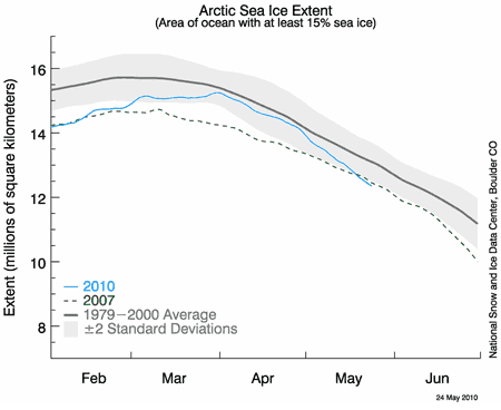
These people are the real deal in anything to do with ice and snow.  The linked page shows the sea ice extent and is updated most days.  If you click on the map it gives the day the data was last updated.  Sea ice extent is defined as the area of sea covered by at least 15% ice.  They use a 20 year average for their graphs.  They have new comments monthly (usually about the 5th of the month) and additional comments as they see fit over the melt season.  They often refer to other useful web sites.  This site is generally user friendly and has a good frequently asked questions section.  There are interesting stories about the scientists and their recent publications.  They have a huge data library if you are interested in checking raw data.

Cryosphere Today

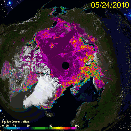
This site has a lot of interesting and historic data.  It's good for putting data in a long-term context.  They offer little or no commentary on the data.  The graphs on the main pictures come from the University of Bremen (via NSIDC) and are updated most days.  Cryosphere Today uses a very high contrast in the images so small changes are evident.  Don’t read too much into these small changes - the sensor sometimes has trouble telling melt ponds on top of the ice from open sea.  Wait a week and see how the image changes. Their images use a different sensor from NSIDC and the contrast is different so the images are not directly comparable.  It is best to compare a Cryosphere Today image to another CT image and an NSIDC image to another NSIDC image. 

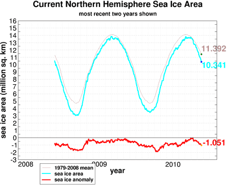
This graph shows ice area.  The anomaly just went over 1 million km2, after being close to normal in March.  Those changes are caused by the weather.   The important data is the end of the melt season.  To determine ice area they take the sea ice extent and subtract out the area of open sea.  NSIDC likes sea ice extent.  This is an example of good scientists who disagree on the most useful measure of the ice.  The difference is small, for long-term trends they are essentially the same, but the graphs are not directly comparable.  CT uses a 30 year baseline for their graphs.

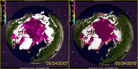
CT has an interesting comparison app to compare any two single days of ice extent (and snow for recent years).  You can compare to today’s date in 1980 or 2007 if you want.  They also have 30 day animations for their main pictures if you want to see the last months’ changes.

Canadian Ice Service

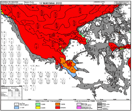
The Canadian Ice Service has interesting data for the North American Arctic.  The weekly regional maps (shown above) show detailed ice extent and give the last weeks climatology.  The climatology puts the data in more context.  They also have ice forecasts every two weeks and a detailed summer forecast will come out the beginning of June.  They have daily ice maps if you want to really see the detail.  It was interesting to me to see how much detail the scientists measure and know about - much more than I had expected.

Polar Science Center

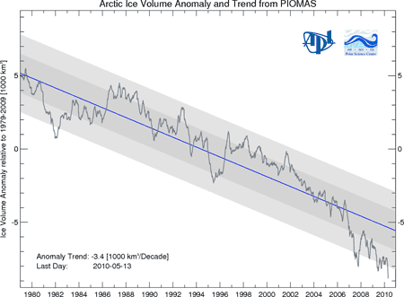
This is a new site that tracks ice volume.  They seem to update about every two weeks.  It will be interesting to compare to ice area this summer.   Many scientists feel that the volume of ice is the most important measure of the health of Arctic Ice.  The ice volume has not recovered in the last two years like ice area has.

University of Bremen

The University of Bremen has a daily ice map (used the next day on CT).  They have a few close-ups if you want more detail.  Daily changes are related to weather and not climate so don’t get too excited about what you see.

Rutgers National Snow lab

This site has current and historic snow data.  This is a good site for data if you want to make graphs.  They only update about once a month.

0 0

Printable Version  |  Link to this page

Comments

Comments 1 to 32:

  1. Couple more I follow: for ice movement : http://iabp.apl.washington.edu/maps_daily_track-map.html for weather : http://wxmaps.org/pix/hemi.fcst.html the weather maps here are not standard sea level charts, they need somewhat getting used to but fe. the 200mb chart pretty well shows the polar vortex (and its quirks) and the temp charts allows tracking heat movements around the pole.
    0 0
  2. For some reason I have seen very little coverage of Cryosat -launched in April and already starting to send back data. Here is a nice explanation with some video animations showing how it works. It should give us much more accurate measurements of sea ice volume. http://www.esa.int/SPECIALS/Cryosat/index.html
    0 0
  3. Here's another one I have started watching recently, with Google Maps-like pictures of the Arctic: http://ice-map.appspot.com/ These pictures come from here: http://rapidfire.sci.gsfc.nasa.gov/subsets/?mosaic=Arctic And of course a well-beloved graph for sea ice extent is the one from JAXA, where you see the current trend line compared to those of previous years (from 2002 onwards) and where you can easily download data to play with in Excel: http://www.ijis.iarc.uaf.edu/en/home/seaice_extent.htm
    0 0
  4. Adrianco thanks for pointing that out. I knew Cryosat had launched but did not know it was done w/engineering checks and the like. So good to see it running; the previous copy ironically ended up splashing down in the Arctic ocean after a launch problem but fortunately was swiftly replaced.
    0 0
  5. The Cryostat page Adrianco links to also has a good summary of the prospects and state of the ice in Arctic, Greenland and Antarctica: Earth's changing ice
    0 0
  6. Thanks for the post, Michael. It's a nice overview of the resources available. Just one minor suggestion. You write The ice volume has not recovered in the last two years like ice area has. What do you mean by the suggestion that (northern hemisphere) ice area has "recovered"? It's back above the alarmingly steep 2001-2007 trendline, but it's still well below what it was in the early years of the record (early 80s) and is still completely consistent with the long-term downward trend.
    0 0
  7. A few other international websites include Norway Denmark Japan This page on the Norwegian Arctic ROOS website has some interesting links including a page on the way the different groups do their extent calculations. As a curiosity I quite like this page on the DMI website which lets you see satellite images around Greenland. You can watch the ice break up and flow out the Nares Strait, if that's your thing.
    0 0
  8. From the Cryosat page, it looks like orbital verification is not complete. They say: With LEOP complete, ground experts will now put CryoSat-2 through an exhaustive commissioning phase lasting several months... LEOP is Launch and Early Orbit Phase, which I assume includes things like deploying solar panels, tuning the attitude control, and turning on and functional checks of all instruments. So they know basically that nothing broke on launch, which is great. But now they have to finish performance checks and on-orbit calibration. For the kind of spacecraft I am familiar with (astronomy satellites), this takes typically 2-6 months. Sounds like it's similar for the down-lookers. So it'll be late summer probably before the normal data products start arriving from Cryosat.
    0 0
  9. Ned, I tried to keep a neutral tone when I wrote the post. The sea ice area has recovered a little from its 2007 low, but the ice volume has not come up at all. As you point out, both continue their long term declines. Of course, a reasonable person would not expect a monotonic decline for a parameter as complex as sea ice that depends on the weather.
    0 0
  10. Great place to have all the links together. I can offer a little first hand knowledge on this topic since I was a navigation officer on ships that travelled in the Canadian arctic in the late 1970's and early 1980's. We always went about midway through July since the ice was thin enough to make it through then. Later on I will pull out some pictures of what the ice looked like in Hudson Straight and we can compare that to what it looks like this year. Best, John Cross
    0 0
  11. 10.John Cross Your pics would be great.
    0 0
  12. One more to add to the robust list. NPEO North Pole Environmental Observatory http://psc.apl.washington.edu/northpole/index.html Two automated observatories are placed, and tracked, pn the central Arctic ice-flow. Excellent meteorological support, and live pictures daily.
    0 0
  13. After dipping into WUWT, a lot is been spouted about the U.S.Navy monitoring of Arctic Ice. Where does the Navy monitoring fit in with the civilian monitoring?
    0 0
  14. #13 tobyjoyce at 18:57 PM on 30 May, 2010 After dipping into WUWT, a lot is been spouted about the U.S.Navy monitoring of Arctic Ice I have checked it. The claim May arctic ice volume inside 70N has grown by 25% since 2008 is bogus. The actual growth is only 13.6%. Here is the US Navy Polar Ice Prediction System. As it makes forecasts only for the next 24 hours, I suppose it can not be too far from reality and they must have some means to check it. Submarines, perhaps? Ice over the Arctic having some strategic military relevance, they must not be badly off the mark I suppose. Except if it were classified and public version is only for confusing the enemy :) Anyway. They do not publish tabular data, just pictures like this one: [img src="http://www7320.nrlssc.navy.mil/pips2/archive/pips2_thick/2010/pips2_thick.2010053000.gif">
    0 0
    Moderator Response: [Sph] Bad images removed
  15. Its been noted elsewhere that summer arctic ice loss is accelerating. Has anyone noticed a systematic asymmetry between the summer minimum and winter maximum ice extents? Both are decreasing, but the accelerating rate of decrease in the summer outpaces the somewhat linear decrease in the winter ice extent.
    Here's a graph:

    Notes: Ice extent from month-by-month data files for the years 1979-2009; expressed as a percentage of 1979 values, hence 1979=0. "Summer min" is the average of the 3 months of least extent (which are Aug-Sep-Oct), while winter max is the average of the corresponding three months (Feb-Mar-Apr) for each year in the dataset. Rather than plot these data as a time series, I've found it far more interesting to plot such data vs. a relevant independent variable on the 'x-axis'. In this case, I've used temperature: LOTI for latitude N64-N90, adjusting those temperature index values so that 0 falls at 1979. Note that this index is in hundredths of deg C.
    Hope that explanation of relatively minor data manipulation and presentation was vaguely comprehensible!
    The best-fit functions for each season (the central curves in each set of three) are shown with +/- 1 stdev, as labeled. The two seasonals intersect at 1979, which is (0,0) as explained above. I couldn't resist the forward projection, but its only 2 years. I suppose this is a symptom of the formation of short-lived "new ice" each winter and the loss of longer-lived "old ice". So don't buy the claim that ice area is recovering based on a couple of cold winters.
    0 0
  16. The difference between the navy data and PIOMAS is striking, even if the graph above of navy data only covers one particular date (is that correct BP?) According to PIOMAS, there has been a loss of around 9000 km^3 of ice in this period 1999-2010. The navy data shows almost no loss of ice, certainly much less than 9000 km^3. Does anyone have any idea about what is going on here?
    0 0
  17. Marcel Bökstedt, sometimes happens that critical thinking efficiency drops to zero. A post on WUWT is enough to spread the(ir) "truth". I do not have the answer to your question, obviously, but it should be noticed that PIPS is designed to predict ice concentration essentially near the ice edge and it is tested against this field (see for example here and here). On the contrary, PIOMAS is designed and tested to calculate volume. I'm not that surprised that the two do not match.
    0 0
  18. WUWT has integrated the colors of other peoples ice data unsuccessfully in the past (note here that BP got a lower value than WUWT). While BP has done an interesting analysis, I would not say that the US Navy has said what they think the ice volume is. BP has said what HE thinks the ice volume is based on the Navy graph. This type of analysis has many hidden errors since the Navy graph is not intended for this use. I agree with Riccardo, PIOMAS is intended for this use and will have lower error. PIOMAS undoubtedly has a high resolution map of the Navy graph that they consider in their analysis (unless the Navy gets their data from PIOMAS).
    0 0
  19. BP: I just looked at the Navy website. The red color shows ice AT LEAST 5 meters thick. Much of that ice was 10 or more meters thick (some was over 30 meters thick)in past years. You cannot integrate it as 5 meters thick. This results in underestimating the ice volume in past years. This alone is probably enough to explain the difference between you and PIOMAS.
    0 0
  20. #16 Marcel Bökstedt at 02:12 AM on 31 May, 2010 The difference between the navy data and PIOMAS is striking, even if the graph above of navy data only covers one particular date (is that correct BP?) Yes, that's correct. It is only for 28 May. I could do it for the entire year, but a huge amount of data (about 250 MB) is required to be downloaded and I am not sure the Navy would tolerate it :) Anyway, I've also did it for 14 September, the day Arctic sea ice extent was lowest in 2007. At that time of the year ice volume inside 70N is about all there is. Interesting to note that mid September ice volume was lowest in 2008, not in 2007. The low in 1999 is also unheard of. #17 Riccardo at 03:06 AM on 31 May, 2010 PIPS is designed to predict ice concentration essentially near the ice edge and it is tested against this field I don't think so. For submarines armed with strategic nuclear missiles ice thickness is a deciding factor anywhere in the Arctic. They simply can not do their job if the ice above is too thick. The Navy also have its own devices to monitor ice conditions including submarines, spy satellites, aircraft and drift buoys. PIPS do have a sophisticated data assimilation facility developed in more than twenty years.
    0 0
    Moderator Response: [Sph] Bad images removed.
  21. #19 michael sweet at 05:27 AM on 31 May, 2010 The red color shows ice AT LEAST 5 meters thick. Much of that ice was 10 or more meters thick (some was over 30 meters thick) in past years. You cannot integrate it as 5 meters thick.This results in underestimating the ice volume in past years Perhaps it was. But there is not much red in any PIPS map. For example the one for 14 September 1999 does not have any.
    0 0
  22. Berényi Péter, it's not about what I think but what THEY say, at least in the published papers. Maybe you have access to secret informations, do you? If not, you're just playing war games, not science. I know you can do much better than blindly follow people at WUWT, be skeptical of what they say there too.
    0 0
  23. Hmm.. lets just leave what WUWT writes out of this equation. And it's best that BP does not annoy the Navy, they can be nasty if they decide to retaliate. It would still be interesting to explain the differences between the estimates of ice volume. Could it be that the fact that PIPS is essentially a forecast makes it less reliable? (Maybe PIOMAS can use data obtained later than the fact to estimate ice thickness?)
    0 0
  24. Marcel, as i understand it they both "assimilate" data. Each day PIPS restart the forecast with actual data if their previous forecast was out more than a certain threshold. It's about the same process used for PIOMASS. I think the difference lies in the details. Apart from being the more recent of the two, PIOMAS includes a so called thickness and enthalpy distribution sea ice model which takes into account the rheology of ice and ice ridging. Apparently PIPS does not. I'm not able to go any further on these details, we should ask a specialist.
    0 0
  25. I would point out that one estimate of volume is from ice scientists who have estimated their error and the other is a derived number by a web blogger with unknown error bars. You have to choose how you determine what data is worth considering. The difficulty in determining ice volume is one reason why NSIDC uses ice extent. The ice extent is a firmer number than the ice volume. With luck NSIDC will comment on this in their next monthly report.
    0 0
  26. #22 Riccardo at 06:47 AM on 31 May, 2010 you're just playing war games No, it's the US Navy's job, not mine. And they do play it all the time. It includes verifying the forecast systems operated by smart guys using independent means. I reckon they send out patrols to check model forecast occasionally, ordered to report back their findings. Understanding the ice thickness distribution and its variability is important in both short-term operational forecasts and longer-term climate studies. Model-derived ice thickness fields are useful in obtaining a large-scale, but detailed picture of ice distribution and, more importantly, an understanding of its temporal variability. #25 michael sweet at 08:11 AM on 31 May, 2010 the other is a derived number by a web blogger with unknown error bars You must refer to my attempt. But you are overestimating my role by saying the numbers are derived by me. The algorithm I have run is actually pretty straightforward, the curves come from the PIPS 2.0 24 hour forecast maps. As there are no error bars supplied by PIPS, of course I could not pull out one from thin air. All I can say is errors introduced by the transformation are negligible. Casting doubts does not contribute to understanding. As for sea ice volume, please check the article Has Arctic sea ice returned to normal?, this site.

    What the science says...

    Sea ice extent tells us what about the state of the sea ice at the ocean's surface, not what's happening below. Arctic sea ice has been steadily thinning, even in the last few years while extent increased slightly. Consequently, the total amount of Arctic sea ice in 2008 and 2009 are the lowest on record.

    BTW, ice volume graph provided by the Polar Ice Center does not have error bars either.
    0 0
  27. Just to appreciate the difficulties in estimating ice volume, and the need for caution about drawing conclusions from relatively small changes in estimates, the accuracy that applies to measurements made needs to be taken on board. The acknowledged error involved in measuring ice thickness ABOVE the waterline is plus/minus 50mm. Because only about 10% of the ice is above the waterline this error multiplies to plus/minus 500mm which is very significant when first year ice is generally less than 2m thick, meaning less than 200mm freeboard and multi-year ice about 3m thick, meaning 300mm freeboard. All other estimates such as density have their own inbuilt errors, but the error involved in estimating actual ice volume comes down to this relatively large error involved in simply measuring the sea ice freeboard. Even as new technology and techniques improve the accuracy of measuring the ice freeboard, it will be still subject to a factor of 10. Even once that improved accuracy been established, it doesn't change the fact that all measurements obtained in the past will still have those large inbuilt errors which have to be taken into account when comparisons are made with any historical data.
    0 0
  28. Riccardo> I understand that PIOMAS uses a black art known as re-analysis. It is described as "reanalysing historical data using state of the art models". It sounds like something a forcasting system like pips would not do, and it could make the piomas model more reliable? But to be honest, I don't know anything concrete about this, I'm just improvising.
    0 0
  29. Well, we're now on our third day of record low extent-for-that-date per IJIS (JAXA). Bremen says it's been a week. Presumably NSIDC will put out a monthly update in the next couple of days. The trajectory around the end of this month may set the tone for the remainder of the melt season.
    0 0
  30. If it's OK I'd like to point out that I have tentatively started a blog that is dedicated to assembling news and data concerning the Arctic sea ice, as I kind of miss one central place where everyone who is interested can discuss what's going on. The blog is HERE and I'd appreciate it if people would come over and spread their knowledge, 'cause I'm lacking in that department. :-)
    0 0
  31. There are interesting similarities between sea ice extent and snow extent from the Rutgers Snow Lab mentioned at the bottom of the website list in the body of this article. And I couldn't resist the teaser "if you want to make graphs;" so I made graphs. For each of the following two graphs, I averaged the three months of maximum or minimum snow extent (area) and plotted the corresponding ice extent (one month, September min or March max). The snow data break out Eurasia, North America (Canada/US) and Greenland; I used the total snow area for the Northern Hemisphere. I then calculated the period average and plotted the percentage difference between that average and the snow extent for each year. The snow data are much noisier; for some minimal smoothing, I used a 2 year trailing average. JFM= Jan-Feb-Mar, JAS= July-Aug-Sept Note that both graphs have the same vertical scale; we see some impressive variation in the summer minima. However, the winter change is much smaller (so much for the anecdotal stories that run rampant during the winters: ‘What global warming? Its snowing here!’) The summer data steepens in slope, reminiscent of the logistic trend discussed here. Further, it would seem reasonable to conclude that if the winter snow-covered areas remain consistent while increasingly smaller areas are snow-covered each summer, more freshwater is changing from frozen to liquid back each year. Where does this water go? Increasing sea level? Then why don't we a corresponding up/down signal in sea level? Or could the snowmelt be fueling more precipitation? We observe that each melt season leaves a smaller snow-covered area, but each winter has about the same snow area; there must be more snow falling each winter. Here is a graph showing the growing disparity between winter snowfall and summer snowmelt. Or maybe global warming actually does result in more snowfall.
    0 0
  32. I have written and updated a blog post on my Arctic Sea Ice blog that collects more than 25 graphs and maps (satellite images, extent, area, volume, concentration, air and SST temperatures, weather maps, arctic oscillation, buoys, ice displacement) for monitoring the Arctic Sea Ice on a daily basis: Interesting websites for watching the ice
    0 0

You need to be logged in to post a comment. Login via the left margin or if you're new, register here.


The Consensus Project Website

THE ESCALATOR

(free to republish)


© Copyright 2024 John Cook
Home | Translations | About Us | Privacy | Contact Us