Climate Science Glossary

Term Lookup

Enter a term in the search box to find its definition.

Settings

Use the controls in the far right panel to increase or decrease the number of terms automatically displayed (or to completely turn that feature off).

Term Lookup

Settings


All IPCC definitions taken from Climate Change 2007: The Physical Science Basis. Working Group I Contribution to the Fourth Assessment Report of the Intergovernmental Panel on Climate Change, Annex I, Glossary, pp. 941-954. Cambridge University Press.

Home Arguments Software Resources Comments The Consensus Project Translations About Support

Bluesky Facebook LinkedIn Mastodon MeWe

Twitter YouTube RSS Posts RSS Comments Email Subscribe


Climate's changed before
It's the sun
It's not bad
There is no consensus
It's cooling
Models are unreliable
Temp record is unreliable
Animals and plants can adapt
It hasn't warmed since 1998
Antarctica is gaining ice
View All Arguments...


Username
Password
New? Register here
Forgot your password?

Latest Posts

Archives

Comparing all the temperature records

Posted on 23 December 2010 by John Cook

I've added a new graphic to the list of Hi-rez Climate Graphics: a composite of all the major global temperature records, going back to 1890 (obviously the satellite records only begin in the late 20th century). Many thanks to Benjamin Franz who sent me the spreadsheet of all the data:

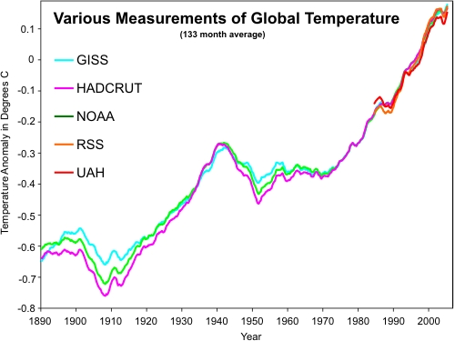
Benjamin has published a series of useful graphs including a version of the graph above. The data comes from surface temperature measurements of NASA GISS, HadCRUT, NOAA plus the satellite measurements of lower atmosphere temperature by RSS and UAH. The data was originally compiled by Kelly O'Day from Climate Charts and Graphs who put all 5 datasets into a single spreadsheet. The problem is all the different temperature records use different base periods.

Temperature records are expressed as an anomaly (or variation) from a specified base period. For example, the base period for both satellite recoreds (UAH and RSS) is 1979 to 1998. So for example, when the UAH record says 0.5°C, it actually means the temperature is 0.5°C warmer than the average temperature over 1979 to 1998. The GISS base period is 1951 to 1980. HadCRUT use the base period 1961 to 1990. NOAA use 1971 to 2000. The choice of base period doesn't really matter as its the trend that's important, not the absolute values. Nevertheless, some people do get a little confused when comparing two temperature records that use different base periods.

To get around the problem of different base periods, Benjamin normalised all the datasets by calculating each temperature record's average value over the period 1980 to 2010. Then he calculated the temperature anomaly from the 1980 to 2010 base period. Thus each record now used the same base period and could be directly compared.

As surface temperature is a noisy signal, with plenty of variation from year to year, Benjamin calculated the long-term trend by calculating the 133 month moving average. That is what is shown in the graph above. The graph is also available in a number of formats:

Now I would love to add the European Centre for Medium-Range Weather Forecasts (ECMWF) reanalysis to this graph. The ECMWF record covers the full globe but uses an independent technique to NASA to estimate warming in the Arctic regions. Their data is available on their website but I've never been able to penetrate their obtuse interface (no offence to the good folk at the ECMWF). So if anyone is able to post a link to the pertinent data or even better, hand it to me on a silver platter in Excel format (hint, hint), please be my guest :-)

P.S. - for a more rigorous treatment of this subject, Tamino at Open Mind has two recent blog posts worth a look: Odd Man Out and Comparing Temperature Data Sets.

0 0

Printable Version  |  Link to this page

Comments

1  2  Next

Comments 1 to 50 out of 54:

  1. Why can't you just leave the mean global surface temperature as a absolute figure? I think I must be missing something really simple somewhere but surely you would still be able to see the change over time.
    0 0
  2. It appears that the ERA 40 reanalysis is not free. Looks like it's about 500 British pounds. Here's a link to the page with the order forms. However, NCEP and NCAR's reanalysis is free (in gridded form).
    0 0
    Response: I'm not so sure that it's not free - a European scientist once mentioned to me in passing that the data was freely available online (but neglected to point to where).
  3. Hyperactive Hydrologist #1, GISS's calculation does produce a gridded data set of temperature. But the final gridded product that's readily available is in the form of anomalies. As per the GISS documentation, one could take annual averages and add, I think, about 14 degrees C to get back into temperature. The HadCRUT spatially averaged product is only available in anomalies. However, the 1961-1990 climatology is available, so one could add that to the anomalies to get back to temperature. NOAA is only available as anomalies for the most part (I think). Now if one did produce a temperature (as opposed to anomaly) time series, as the spatial coverage changes over time, that will certainly show up. Also, if the temperature time series is monthly, the annual cycle will obscure the changes relative to the long-term monthly means. The only way to solve this is the calculate annual averages.
    0 0
  4. Response: I'm not so sure that it's not free - a European scientist once mentioned to me in passing that the data was freely available online (but neglected to point to where).
    Yes, John. I think I've found where the data is. Unfortunately, there are multiple re-analyses and none continuously cover at least the MSU period.
    0 0
  5. HH - I think the paper you want is Hansen and Lebedeff (1987) on why anomalies are used - and whether there is such a thing as an meaningful measurement of absolute mean global surface temperature extractable from the temperature network. How do you "average" thermometers at different heights, with different screen etc. However, the anomalies are highly spatially correlated and thus meaningful.
    0 0
  6. That is a great graphic. The myth that satellite temps. show cooling is widespread. (Especially here in Huntsville with UAH down the road!) Big thanks to John and Ben. I put that up on twitter and will post it on my AGU blog as well.
    0 0
    Response: Thanks Dan. Don't forget to credit Kelly O'Day from Climate Charts & Graphs.

    Just a reminder to all, Dan's very cool AGU blog is Dan's Wild Wild Science Journal. BTW, the Twitter link on your blog doesn't work - do you still have a Twitter account?
  7. Great resourse John. Any idea why the satellite data starts in 1984? I thought data was available from 1979.
    0 0
    Response: You're correct, satellites started in 1979. It's because this graph shows the 133 month average. Download the spreadsheet to check out all the sausage making that went into this graph.
  8. #1 My understanding is that one of the reasons is that it helps to eliminate instrument variability. Just as a simple explanation, let's say we have two thermometers side by side. One reads correct temperature while the other reads the temperature 5 degrees higher. The average of those two instruments would be wrong. But if we only look at the change in temperature, the anomaly, they will both be the same.
    0 0
  9. Maybe this is covered somewhere, but why 133 months?
    0 0
  10. While it is true that we need to pay to get ECMWF data in full resolution, ECMWF makes their popular parts available on-line. They have some "conditions of use": http://data-portal.ecmwf.int/data/d/license/era40/ The essential point is "non-commercial". The document is written with academic institutions in mind, and I am not sure how it is applied to citizen engagements. Currently there are two major series of reanalysis: ERA 40: Sep 1957 - Aug 2002, finished. ERA Interim: Jan 1989 - Oct 2010, continuing. Data on a standard latitude-longitude grid are available. I remember that the grid interval is 2.5 degrees. If you want monthly mean values of near-surface air temperature, go to the pages ERA 40 Years Re-Analysis, Monthly Means of Daily Means Type of level: surface http://data-portal.ecmwf.int/data/d/era40_moda/levtype=sfc/ ERA Interim, Monthly Means of Daily Means Type of level: surface http://data-portal.ecmwf.int/data/d/interim_moda/levtype=sfc/ and select the item "2 metre temperature". The data format is called GRIB. It is complicated, but ECMWF provides a decoder software (C source program ) at a page linked to the above-mentioned ones.
    0 0
  11. I would like to advertise Japanese reanalysis as well. It is called JRA25 which covers 1979 - 2004, and continues as "JCDAS". The web site is here. http://jra.kishou.go.jp/JRA-25/index_en.html You need registration (called "Application" in their menu). And they have conditions, essentially similar to ECMWF's. Near-surface air temperature in 2.5 degree grids is item "TMPsfc" in the group "anl_p25". As for data format, I remember that monthly data are in simple binary (raster) format while data of shorter time periods are in GRIB.
    0 0
    Response: Thanks Kooiti, I did have in mind the JMA record as well. Does their record cover the entire globe? If so, how do they fill in the Arctic regions that HadCRUT exclude?

    I wonder if the fact that the European and Japanese records are published in the obtuse GRIB format are part of the reason why GISS, HadCRUT and NOAA are much more widely published online.

    UPDATE: Okay, this graph seems to indicate they exclude the Arctic regions similar to HadCRUT, as does the fact that their global average shows 1998 as the hottest on record.
  12. The link "single spreadsheet" in the paragraph under the graphic is broken John.
    0 0
    Response: Fixed, thanks Ron.
  13. I wonder if the fact that the European and Japanese records are published in the obtuse GRIB format are part of the reason why GISS, HadCRUT and NOAA are much more widely published online.
    GRIB is very popular with meteorological agencies. However, end-users who are used to downloading the "end product" (ASCII files) don't find it very useful. I think one reason why GISS, HadCRUT and NOAA are so popular is because they were among the first to produce comprehensive homogenized gridded climate data sets. In other words, they got in on the ground floor.
    0 0
  14. Just one point John. Should the graph not read "133 Month Moving Average"?
    0 0
  15. #6 dansat "That is a great graphic. The myth that satellite temps. show cooling is widespread. (Especially here in Huntsville with UAH down the road!)" Satellite temps. From the satellite graph I would agree that it is a myth that satellite temps show cooling is widespread. But they also do not show a clear warming trend. After 1998 the temps flatlined in the 2000's and only went up in 2010 which was an El Nino year. I do not see the upward trend in the satellite data. Using a 133 month moving average shows a trend but the actual data do not.
    0 0
  16. #15: "I do not see the upward trend in the satellite data" Look here and you will see. The trend is up at the familiar 0.15 degC per decade. If you do NH separately (with the data download; WfT doesn't show separate satellite data sets), the trend is higher.
    0 0
  17. Norman - Seasonal variation can be quite large. But if you look at long term trends, there is a statistically significant and easily seen warming. That takes 25-30 years of data, given the 'noise' of seasonal and yearly variations. But it's quite, quite clear.
    0 0
  18. Norman wrote "I do not see the upward trend in the satellite data. Using a 133 month moving average shows a trend but the actual data do not." The 133 month moving average is "actual data." The whole point of computing a moving average is to make more visible the trend that is in the actual data. It's not magic. It's not cheating. It's not artificial. It's not non-actual.
    0 0
  19. #16 muoncounter In your link, how do you get the graph to just plot 1998 to 2010? I will agree there is an upward trend from 1979 to present (and a decade is not long enough to represent a climate change) but in the decade of the 2000's I still do not see a warming signal.
    0 0
  20. The graphic looks very similar to the one in Hansen et al 2010 page 23 where 60 month and 132 month running averages are expressed using two different data sets.
    0 0
  21. #19: "to just plot 1998 to 2010" When the graph page opens, to the right of the graph are series 1-4. If you click under 'processing steps', you can choose how you'd like to slice and dice the data. Be aware that most of the datasets are monthly averages, so that a mean of 132 samples represents 11 years. "I agree there is an upward trend from 1979 to present... " The kick is up... "but in the decade of the 2000's... " Ohh. Wide to the right. Guess we go into overtime, folks. If, as you say in the immediate parenthetical, "a decade is not long enough to represent a climate change", what do you expect that looking at only the most recent decade will tell you?
    0 0
  22. #21 muoncounter, Thanks for explaining how the graph works. I did a trend line from 1998 to 2010 and it is actually negative so mythbusted. The satellite data does show a recent cooling trend. If this works here is the link to the graph I plotted. From 1998 to 2010 the temp trend is negative...cooling phase.
    0 0
    Response: I know this is a somewhat futile exercise as we're talking about a short period with a very noisy signal (satellite measurements of the lower atmosphere show strong variability from year to year). Nevertheless, I couldn't help noticing you had plotted the linear trend from 1998 to the start of 2010 (the purple line below):


    But why exclude all the temperature data throughout 2010? The 2010 temperatures are shown above - the green line. When we plot the linear trend from 1998 through to the end of 2010 (well, to very late 2010, we're not quite there yet), we get a positive trend (the red line).

    It bears mentioning that neither trend are statistically significant. It's a very noisy signal and we're looking at a short period. The lesson here is the danger of drawing solid conclusions from short periods. You assume a cooling phase when you plot the trend to December 2009. But you find a warming trend if you extend it to November 2010. You need to look at longer periods to get a result that is statistically significant.
  23. Re: Norman (22) Really, Norman, you missed your calling in life! You make the cardinal mistake of climate cherry-picking: picking one of the warmest years in the instrumental record as your starting point. That is cherry-picking of the highest order! Try moving your start point back to 1997 & see what happens. Or forward to 1999. We'll wait. ( - taps foot, whistles - ) Told you so. The Yooper
    0 0
  24. #22: "mythbusted" I don't want to be repetitive, so I ask you to please re-read #21. Or else its double overtime for sure. Your graph shows a similar 'cooling phase' between 1986-1989 and '93-94 (although that was Pinatubo-related). If we are to put any stock in these tiny wobbles within an obvious overall up-trend, then why did these two 'cooling phases' not 'bust' the myth already? Do you notice that after each one, the up-trend just kept on going? And why don't you declare the 'myth' unbusted by the distinct 'warming trend' from 2004-2006? Especially after you just said that "a decade is not long enough"!!! If you choose to believe 2-3 year blips over a 30 year trend, that's your right to have an opinion. But as they say, 'everybody gets an opinion, but they don't get their own facts.' Myth busted? Jamie and Adam wouldn't agree: "Greenhouse gases increase the amount of heat absorbed by air -- confirmed."
    0 0
  25. Re: muoncounter (24) In actuality, Norman's use of 1998 as his start year is such a blatant-cherry pick it constitutes use of the two-headed coin to determine field position for the extra period... ...so much so that there's no need to bother discussing the issue of statistical significance or weather vs climate (the 30-years thingy). In your parlance from 21, Norman squibbed the kick... The Yooper
    0 0
  26. #25: 15 yard penalty on the kicking team: Cherrypicking? Or would it be a 5 minute major in the NHL because it was blatant cherrypicking? Red card in the other football. I don't know the rules in the games our down-under friends play, but someone should cry 'Foul!'
    0 0
  27. Hey, at least it wasn't SG's CO2 snow... Not-Even-Wrong comes to mind, though. "1998"...to think I was heading to bed when I re-freshed...just...one...more...time. Be seeing that in my sleep, now. Norman, in case you're still reading this, you really should read this to get a better sense on why 1998 is such a climate faux paux. The Yooper
    0 0
  28. Norman, I was driving back down south for Christmas and halfway along I drove over a mountain pass. From this I have concluded that driving south is all downhill.
    0 0
  29. > #9 pdt: Maybe this is covered somewhere, but why 133 months? Because the solar cycle is roughly 11 years long on average (minimum-to-peak) (11 years -> 132 months) and because an odd number of months means that there are an equal number of months before and after the date for the moving average (132 months -> 133 months) thus keeping the average centered on the date. It helps make the temperature signal clearer by tending to average out the 11 year periodic solar variation as noise from the long term signal.
    0 0
  30. Trying to ascertain a trend for a short period (e.g. a decade) is largely a futile effort for two reasons, at least: 1 - ENSO episodes happen at irregular intervals of 2–7 years and they endure for nine months to two years. Opposite phases are not usually equal in intensity or length so it's not a true cycle, it’s more like frequent positive and negative volcanoes erupting. And ENSO episodes don’t follow in a “one El Niño then one La Nina” pattern, which further complicates any trend. The ENSO pattern for 1950 to present is something like this LELELELELEELELEEELELEELELLEEELEL (depending on how boundaries are defined). A short trend can be especially distorted by a single large episode, for example, the hot 1997-98 or cold 2007-08 episodes. ENSO episodes can cause global temperatures to vary by more than the GHG warming rate expected over an entire decade, that's a huge rate swing within a single episode. Several cycles must be measured to ensure the signal is not being influenced by these factors. One full ENSO cycle is long and asymmetric and would occupy most of any short period, distorting the trend into nonsense. 2 – A short period is likely to be fully within the wavelength of the 11-year solar oscillation, which causes global temperatures to vary by more than half the GHG warming rate expected for a decade and the effect of this cycle is continuous for years at a time in one direction. Any short trend is just picking up some part of the solar cycle oscillation and can’t be projected into the future. Therefore, we have 2 short term climate factors equalling up to 150% of the GHG warming rate over a decade. That’s why GHG warming rates must be measured over decades, no matter what skeptics claim. We have no idea what we are measuring with shorter periods.
    0 0
  31. Could someone tell me why all (??) temp. anomaly graphs show negative values on the y-axis? Why not just start at zero for 1890?
    0 0
  32. Re: BlueRock (31) Short answer: Convention. Habit. Longer answer: The first global datasets used 1950-1980 as their reference period. It is also the reference period most familiar to the majority of people as most were alive for at least a portion of that period (at the time the convention was adopted). And that's how the first anomaly temperature graphs were shown. Since then we've added the capability to extend global datasets into the deep paleo record via proxies and other means. So the use of a baseline reference period in the middle of the graph was retained, even though the specific reference period might have been different due to a different dataset being used. Graphs can be constructed any which way. But we tend to retain the familiar forms so as to retain context over time, to make the changes more pertinent to us. Good question. The Yooper
    0 0
  33. Does anyone here know why is it so that sattellite measurements of the lower tropospheric temps are so much more sensitive to ENSO than surface temps?
    0 0
  34. @32. Daniel Bailey If only all my questions were answered so quickly and comprehensively I would be a wise and wealthy man. :) Thanks v. much. David.
    0 0
    Moderator Response: (Daniel Bailey) You're very welcome! If only all commenters here were half so polite I would be wealthy in friends, at the very least. :)
  35. Note that JRA (Japanese reanalysis) is a different thing from the JMA surface temperature analysis which John linked from the response to my comment 11. The GRIB format, specially designed for gridpoint meteorological data and authorized by WMO, can scale gridpoint values as integers of an arbitrary number (e.g. 11, 12 or 13) of significant bits without padding insignificant bits. This saving of storage has merit when we use data at high spatial and temporal resolution (e.g. global in 1 degree latitude/longitude grid, 30 years in 6 hour time step). (NetCDF has some capabilities of compression, but is not so strong as GRIB at compression by scaling.) When we keep monthly mean gridpoint values, probably we do not need this level of storage saving, so the most convenient format seems (to me) binary 4-byte floating numbers simply put in an array. But then we need ancillary information in a companion text file. ECMWF prefers GRIB probably because of consistency with data at high time resolution. When we want just monthly mean global mean values, probably the most convenient form will be ASCII text.
    0 0
  36. Alexandre there is a short discussion on sensitivity of MSU's to ENSO at Open Mind
    0 0
    Moderator Response: [Daniel Bailey] See also the Rabett's comment a bit further down that discussion here.
  37. #9 pdt : you've already been answered, but to plug an old blog article I wrote, [here] is an explanation with graphs. As snowhare explained, 133 months is a reasonable choice!
    0 0
    Moderator Response: [Daniel Bailey] Fixed link.
  38. ECMWF global temperature data comes in two datasets: the 40-year reanalysis, covering 1957-2002, and the "interim" re-analysis, covering 1989-present. While the data is available online, it is gridded, making retrieval in this form difficult at best. However, a graph of ECMWF global temps can be found here: LINK This looks quite similar to GISS, in that the 1977-2010 slope is roughly .18 K per decade, and in that the 1998 peak has been surpassed 4 times (and essentially tied twice).

    0 0
  39. John Cook et al., You could also use GrADS to process the GRIB or NetCDF data. I was using GrADS to look at the ERA-interim data a few months ago. I think that GrADS may be able to process the GRIB data and write it to an array in ASCII format, or one could perhaps even calculate the global mean SAT and output those data. GrADs is free and can be run on a Mac or Windows machine.
    0 0
  40. Thanks Ian #36 and Daniel Bailey for teh response. Eli Rabett's response was more or less what I intuitively imagined... but why is it that the effect is less on the surface? Maybe the surface's mass itself helps keeping the temperature more stable? Or the lower pressure makes the water vapor content more significant?
    0 0
  41. Thanks for the answers about the 133 month averaging. That makes sense. Does any one have a link to a Fourier transform of global temperature data?
    0 0
  42. Re: Alexandre (40) Not an expert on the satellites, mind you (and from the linked Open Mind thread it would seem even experts have some uncertainty on this matter), but my thought is this: the satellites are calibrated to read a certain way under conditions found the majority of the time. ENSO comes along & throws up a prodigious amount of water vapor and heat higher into the sky than the satellites are calibrated to "read properly". Ergo the discrepancy. Climate science = hard work. If it were easy, anyone with an urge to audit something could do it... The Yooper
    0 0
  43. PDT 41 Woodfortrees has a Fourier function and global temp data.
    0 0
  44. #41: Be wary of edge effects when using the Fourier transform and filters at WfT. They can be pronounced and utterly artificial. #42: Yooper, climate science is easy when you're only in it for the cherries.
    0 0
  45. GrADS software is available at http://www.iges.org/grads/ . It is an open source software. On MS Windows, it requires CygWin. If you have latitude-longitude grid data of temperature and if you can read it with a variable name "TMPsfc" (for example), you can compute its global average as aave(TMPsfc, global) .
    0 0
  46. Norman said, From 1998 to 2010 the temp trend is negative...cooling phase. OK, Norman... here's an interesting exercise to try. Compute temperature trends for that length of time starting at 1980 and incrementing by 1 year for each new trend computation. (That is, compute the 1980-1992 trend, the 1981-1993 trend, the 1982-1994 trend.... etc, up to the 1998-2010 trend). How much variability do you see in your trend computations? What does that tell you about the robustness of trend computations for such a short time period?
    0 0
    Moderator Response: [Daniel Bailey] Fixed text.
  47. Norman (#15, #19, #22) had the audacity to point out a recent period of time, where he saw, if not a cooling trend, at least not a clear warming trend. For this 'felony' he was ridiculed by other writers (e.g. ##23-28). - "Norman, I was driving back down south for Christmas and halfway along I drove over a mountain pass. From this I have concluded that driving south is all downhill." He was accused of "cherry-picking of the highest order", or "blatant cherrypicking" (whichever is worst). He committed a climate faux pas. He is probably not ever coming back to this forum (re: #27). But Norman also got pieces of friendly advice in several comments, like, - please, take a look at other 12-year periods as well, or - please, use a longer period than 12 years. Specifically he was encouraged to not use 1998 as the starting point (because it was a warm year), but instead use another year, like 1997 or 1999 (because those were colder years). Voila, no trend! My experiences, from reading countless posts and comments on this website, tell me that if the purpose is to show something that is connected to warming (whether it be temperature curves, polar ice melting, or coral depletion) - no starting or ending point can ever be wrong. Also, any period length is allowed: 10 years, 12, 17, 30, or 87 years - all are OK. It doesn't matter as long as the cause is to show warming. However, if you want to present a trend that is connected to cooling, or even to warming at a slower rate, there are many important rules that you have to follow. Basically, don't go there! By the way, here in Stockholm, Sweden, we have now had the longest continuous cold spell since the winter of 1788-1789 (yes, we have a long unbroken series of temperature measurements, starting in 1756). But hey, that's only where I live, and that's not very global is it?
    0 0
  48. 47: "no starting or ending point can ever be wrong. Also, any period length is allowed" Sorry, but you are incorrect. See the thread on statistical significance and the thread on misuse of significance tests for starters. Significance of measurement is a fundamental point in every science; misuse in any form is a serious and very common flaw. But you obviously understand that; why else would you bring up your 'longest cold spell'?
    0 0
  49. 48: "Sorry, but you are incorrect." Yes, of course, I am incorrect if we are talking about real science. I was talking about a bias that I have noticed in the writings on this website, a bias that is more forgiving towards faulty statistics in showing evidence of warming, than the opposite. Thank you for pointing out how insignificant my "longest cold spell" is! I had a hunch about that when I wrote it. But the long heat spell this year around Moscow, was very significant, as we all know.
    0 0
  50. Argus, you claim that it is commonplace for a warming trend of just ten years to be considered completely acceptable as a valid indication of warming on this website. Please. Cite examples. I can't imagine that being true for anything except an extreme warming signal where the degree of change clearly overwhelms the noise signal even over such a short time frame... and I can't actually think of any examples of such. I have seen a few instances of short warming trends being cited... but they were always followed by caveats and notes about lack of significance. You claim otherwise... so please, prove your case. Post some links.
    0 0

1  2  Next

You need to be logged in to post a comment. Login via the left margin or if you're new, register here.


The Consensus Project Website

THE ESCALATOR

(free to republish)


© Copyright 2024 John Cook
Home | Translations | About Us | Privacy | Contact Us