Climate Science Glossary

Term Lookup

Enter a term in the search box to find its definition.

Settings

Use the controls in the far right panel to increase or decrease the number of terms automatically displayed (or to completely turn that feature off).

Term Lookup

Settings


All IPCC definitions taken from Climate Change 2007: The Physical Science Basis. Working Group I Contribution to the Fourth Assessment Report of the Intergovernmental Panel on Climate Change, Annex I, Glossary, pp. 941-954. Cambridge University Press.

Home Arguments Software Resources Comments The Consensus Project Translations About Support

Bluesky Facebook LinkedIn Mastodon MeWe

Twitter YouTube RSS Posts RSS Comments Email Subscribe


Climate's changed before
It's the sun
It's not bad
There is no consensus
It's cooling
Models are unreliable
Temp record is unreliable
Animals and plants can adapt
It hasn't warmed since 1998
Antarctica is gaining ice
View All Arguments...


Username
Password
New? Register here
Forgot your password?

Latest Posts

Archives

Has Global Warming Stopped?

Posted on 2 August 2010 by Alden Griffith

Guest post by Alden Griffith, creator of Fool Me Once, a new blog featuring video presentations explaining climate science. This blog post is a written version of his first video addressing the argument 'Global warming has stopped'.

Has global warming stopped? This claim has been around for several years, but received new attention this winter after a BBC interview with Phil Jones, the former director of the Climate Research Unit at the University of East Anglia (which maintains the HadCRU global temperature record).

BBC: Do you agree that from 1995 to the present there has been no statistically-significant global warming?
Phil Jones: Yes, but only just. I also calculated the trend for the period 1995 to 2009. This trend (0.12C per decade) is positive, but not significant at the 95% significance level. The positive trend is quite close to the significance level. Achieving statistical significance in scientific terms is much more likely for longer periods, and much less likely for shorter periods.

Those pushing the “global warming has stopped” argument immediately jumped on this as validation, and various media outlets ran with the story, e.g. “Climategate U-turn as scientist at centre of row admits: There has been no global warming since 1995” (Daily Mail).

Well, what can we take away from Dr. Jones’ answer? He says that the positive temperature trend is “quite close to the significance level” and that achieving statistical significance is “much less likely for shorter periods.” What does all of this mean? What can we learn about global temperature trends from the past 15 years of data?


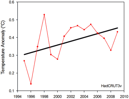
Figure 1: Global temperature anomalies for the 15-year period from 1995 to 2009 according to the HadCRUT3v analysis. The black line shows the linear trend.

First though, it’s worth briefly discussing what “statistically significant” means. This is referring to the linear regression test that informs our decision to conclude whether the slope of the trend line is truly different from zero. In other words, is the positive temperature trend that we observed really any different from what we would expect to see from just random temperature variation?  By convention, statistical significance is usually set at 5% (Dr. Jones has simply inverted it to 95%). This 5% refers to the probability that we would have observed such a positive trend if in reality there is no trend.  The lower this probability, the more we are compelled to conclude that the trend is indeed real.

Using the dataset available at the time, the statistical significance of the 15-year period from 1995 to 2009 is 7.6%, slightly above 5% (the most recent HadCRU dataset gives 7.1% for this period).

What can we conclude from the statistical test alone? If one was to make any real conclusion, it should probably lean toward there being a positive temperature trend (as the slope is quite close to being statistically significant). We certainly cannot strongly conclude that there’s no trend. Really though, we cannot conclude much at all from such a short time period. Although a 15-year period may seem like a long time, it is relatively short when thinking about changes in climate. So what to do? How can we tell if global warming has stopped or not? 

First we need to identify the important questions:

  1. Do 15 years tell us anything about the long-term temperature trend?
  2. What temperatures should we expect to see if global warming is continuing?

The first question is essentially putting the skeptics’ logic to the test. The logic is that a 15-year period without a statistically significant trend means that global warming has stopped, or at the very least that it contradicts a warming world. So let’s look further back and see if there are any other 15-year periods without a statistically significant trend:


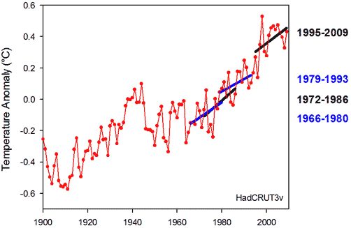
Figure 2: Global temperature anomalies since 1900 according to the HadCRUT3v analysis. The trend lines represent recent 15-year periods without statistically significant warming.

Lo and behold! If we just focus on the most recent period of rapid warming, we see several 15-year periods with trends that are "not significant at the 95% significance level" (actually, since 1965 there are 8 nonsignificant 15-year periods, several of which overlap, and 39 nonsignificant 15-year periods since 1900). So according to the logic, global warming keeps on stopping even though temperatures keep on rising. Clearly this makes no sense! That’s because 15 years of temperature data do not tell us much about temperature trends. Concluding that global warming has stopped from looking at the last 15 years is wishful thinking at best.

The second question is really what we should be asking: What temperatures should we expect to see if global warming is continuing? This is very easy to do. Let’s take the most recent warming trend beginning in 1960 and stop at 1994, just before the last 15-year period. Warming over this period is highly statistically significant (<0.0001%). We can then calculate what’s known as the 95% prediction interval. This gives us the range in which we would expect to see future temperature values if the trend is indeed continuing (i.e. if global warming is still happening at the same rate).


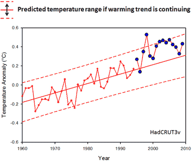
Figure 3: 95% prediction interval (dashed lines) if the linear trend from 1960-1994 is continuing. Temperatures from 1995 to 2009 are plotted in blue.

Lo and behold! The last 15 years are not only within this range, but temperatures are at the upper end of it. In fact, 1998, 2002, and 2003 were even warmer than the predicted range. If you do this analysis for the entire HadCRU time span (1850-2009) you can see that the last 15 years are almost entirely above the predicted range.


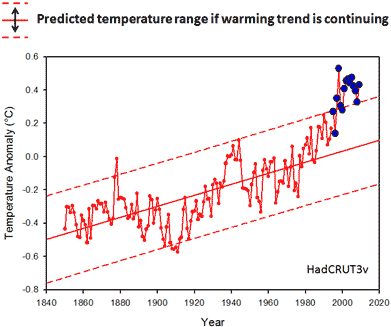
Figure 4: 95% prediction interval (dashed lines) if the linear trend from 1850-1994 is continuing. Temperatures from 1995 to 2009 are plotted in blue.

So here are two requirements for those wishing to conclude that global warming has stopped based on the interview with Phil Jones:

  1. Accept the backwards logic that allows global warming to keep on stopping while temperatures keep on rising.
  2. Ignore the real question of whether the last 15 years is consistent with a continued warming trend (which it is).

So no, global warming has not stopped. It takes some serious wishful thinking to say that it has.

[Lastly, I want to make the prediction that global warming will once again “stop” in 2013. Even if temperatures continue to rise over the next 3 years, the 15-year period from 1998 to 2012 will begin with the record setting 1998 El Niño year, which will make statistical significance unlikely. Beware, the return of the “global warming has stopped” argument!]

NOTE: be sure to check out a video presentation of this material at Fool Me Once.

NOTE: This post was updated on 11 Aug 2010. 

0 0

Printable Version  |  Link to this page

Comments

1  2  Next

Comments 1 to 50 out of 79:

  1. Good post and what looks like an excellent new resource to fight denialism. Thank you.
    0 0
  2. Based on this very nice bit of work, I s'pose we can predict that warming will keep on stopping - apart from the occasional wild El Nino year. Much appreciated.
    0 0
  3. That video might get a couple of airings with some statistics students. Good stuff.
    0 0
  4. What was Phil Jones thinking? His answer to the BBC was a disastrous failure to adapt his wording to his audience. No wonder the Daily Mail made it a headline interpreting it as "there has been no global warming" Why, even given that Jones was speaking scientific language rather than popularly comprehensible language, his wording is a disastrous mess. What was "no significance at the 95% significance level" supposed to mean? Worse yet, what possible grounds could he have for insisting on 95% instead of the 92.4% we actually got? None! The article is quite right to point out that 92.4% is good enough to show that yes, we do have global warming over the last 15 years.
    0 0
  5. MattJ, Phil Jones was thinking like a scientist and talking like one. Some in the public arena demand he do so, others demand he tailor his words for rhetorical effect. Someone will be damning him regardless of what he says. Anyway, the meaning of his words was crystal clear to anybody not wearing a contrarian cap. There's a recent interview in New Scientist with Jones. His own stated preference is to resume doing research without being hassled by amateur and professional politicians.
    0 0
  6. Matt, his answer was perfectly correct and his answer was the only honest and correct answer to a loaded question. The question asked was:
    Do you agree that from 1995 to the present there has been no statistically-significant global warming?
    Phil Jones' complete answer was:
    Yes, but only just. I also calculated the trend for the period 1995 to 2009. This trend (0.12C per decade) is positive, but not significant at the 95% significance level. The positive trend is quite close to the significance level. Achieving statistical significance in scientific terms is much more likely for longer periods, and much less likely for shorter periods.
    The dishonest press and deniers, of course, only quoted the first word of his answer.
    0 0
  7. Ian... I always felt that he could have answered that question far better and been absolutely accurate. BBC: Do you agree that from 1995 to the present there has been no statistically significant warming? Fake Phil (me): I calculated the trend from 1995 to 2009 and the warming trend is positive at 0.12C/decade. That time period is too short for where we'd expect to find a statistically significant trend, but even as such it falls at about the 92% confidence level.
    0 0
    Response: I sometimes reflect on conversations and think, "man, I should've said that". I have to feel for Phil Jones - he gave a bad interview and now has people all over the world saying what he should've said, including myself. Tough crowd.
  8. ABG, In the video (very good one, btw) you mention that the statistic significance is dependent of how many data points there are (among other things). Does the level of confidence change if we use, say, a monthly series instead of plotting just one figure per year?
    0 0
  9. robhon@7 The problem with that answer, is that it fails to give a direct answer to the question posed, which is "it is not statistically significant". Failure to answer the question would inevitably lead to an (valid) accusation of being evasive. A scientist should never shrink away from clearly stating the facts, especially when they don't (apear) to support their position. IMHO Prof. Jones provides an excellent example of how a scientist should answer questions, namely directly and honestly. The less scrupulous will twist his words to suit their own purposes, and there is little that can be done to prevent that, but that is an indication of the weakness of their position, not his.
    0 0
  10. Well, let's be very careful about what "statistically significant" means. As I tell my students, one should always state the alpha value when making a claim about statistical significance. Thus, this data is not statistically significant at alpha = 5% (95% level of significance/confidence) but it is at alpha = 10% (90% level of significance/confidence). It may be customary to always set significance at the 95% level, but for absolute precision you should state what it is.
    0 0
  11. Of course it stopped! It has been cloudy and cool at my house all week!
    0 0
  12. Thank you for the clear and concise discussion of the statistics behind the controversy. The real problem here is illiteracy with regards to the language of statistics among lay people. That's not hard to understand, I'm very nearly statistically illiterate. If anyone should be brought to task over this brouhaha it is the media outlets asking the question and reporting on the answer. Maybe I'm old fashioned, but if you ask a question and you're pretty darn sure the vast majority of your audience is not going to understand the answer, I think there is an obligation to ask Prof. Jones for a more in depth clarification of what the answer means. To take the answer that most of your audience doesn't understand and turn it into a sensationalist headline that doesn't reflect reality is just abysmal journalism. Unfortunately abysmal journalism seems to be contagious and running rampant through our society these days.
    0 0
  13. Poptech said:
    Sorry boys 95% is what statistically significant means. Anything less would not be "statistically significant".
    So, in your distorted view of reality "warming, but not at 95% significance" means "it's cooling"? No wonder your list of papers is so flawed.
    0 0
  14. ABG, Thanks for a interesting and well thought out post. I sadly suspect that your prediction for 2013 will come true-- that is the beauty of cherry-picking short windows in noisy datasets such as the SAT record, once can play that game of deception to the end of time. If I recall correctly, for the data and cherry-picked window in question (i.e., up until 2009 in the HadCRUT data), the warming is statistically significant at the 93% level. Poptech might want to inquire why and how Lindzen chose/cherry-picked this particular start date. I'll help, go here. Those in denial about AGW/ACC might also want to do some research on the meaning of statistical significance before pontificating. It seems that they are only too happy to hear what they wish to hear.
    0 0
  15. Poptech@10 - yes, which is why Prof. Jones was quite happy to explicitly state that the trend was not staitsically significant. But then again, statistical significance becomes meaningless if you cherry pick the start date to get the longest trend that fails to be statistically significant, just as it is meaningless if you cherry pick the start date at 1998 to bias the trend to show cooling. Basically this is because the cherry picking involves performing multiple hypothesis tests and not making the appropriate statistical adjustment to cater for it. BTW, failing to be statistically significant does not mean that a warming trend does not exist, or that it doesn't reflect a real physical process. It doesn't even mean (if it is a frequentist test) that we are 95% confident that the trend is positive. Tests have Type I errors (false positives) and type-II errors (false negatives). The "alpha" mentioned by dcruzuri in 11 refers to type-I errors, there is also a "beta" for type-II errors (retaining the null hypothesis when it is false), known as the "power" of the test (hardly ever mentioned). It should be no surprise if a trend fails to pass a test of statistical significance if the power of the test is very low, perhaps because there is too little data (as Prof. Jones pointed out). Essentially a failed statistical test means "insufficent evidence", nothing more. Easterling and Wehner (2009) is an excellent source of information for this one. They show that the trend is smaller in magnitude than the natural variability due to things like ENSO, and so we should expect to find the occasional decadal (10-20 year) tends that don't show significant warming, or even cooling. These have happened before (as shown above) and also appear in the output of the climate models. Thus is it completely unsurprising that "skeptics" can cherry pick an "inconvenient trend". However it is a specious argument.
    0 0
  16. I'd really like to turn this question around. Dr. Jones's response is the correct answer to a statistical test that is set up with a null hypothesis being no warming, or a slope of zero. According to the variability in the too-short dataset, this null hypothesis cannot be rejected with 95% confidence (only 92%). However, if you want to claim that global warming has stopped, you should really formulate the null hypothesis as continued warming at the prior rate - that is, you should start with a null hypothesis that the slope is equal to 0.101 degrees per decade. In that case, given that the slope from 1995-2009 was 0.116 (larger), there is no evidence that the warming has stopped. If I do a two-tailed test (checking to see whether the slope is simply different than 0.101, in either direction), I get a p-value of 0.40. In other words, I can statistically interpret the data from 1995-2009 in multiple ways: - If I say that there is evidence in this series (all on its own) of a warming trend, I have an 8% chance of being wrong (according to Dr. Jones). - If I say that the evidence shows that the rate of warming has changed (from 0.1 degrees/decade), I have a 60% chance of being wrong. - If I say that there is evidence in this series that the prior warming trend has stopped, I have a 100% chance of being wrong.
    0 0
  17. Well, not quite 100%. >95%, anyway, and poptech will tell you that the 5% confidence level is a long way away from statistical significance.
    0 0
  18. As an aside, Paul the octopus provides a good example of the problems with tests of statistical significance. Paul apparently predicted the results of 10 games in the recent football world cup, with 100% accuracy, but does that mean than Paul actually had some skill? If we simpify by ignoring draws, then just guessing would give a probability of a correct prediction of 1/2, i.e. just like flipping a coin. So we could hypothesise that Paul's true accuracy p > 0.5 (the "alternative hypothesis" H_1), with the null hypothesis (H_0) being that Paul was just guessing, i.e. p = 0.5. The p-value is the probability of the observed results assuming that the null hypothesis is correct, so p(D|H_0) = 0.5^8 = 0.0036. This is less than the usual alpha = 0.5, so we would conclude that Paul has statistically significant skill (at the 99.61% level, no less)! So, does this prove that Paul has skill - of couse not, he's a bloody octopus!!! So why does he pass the test of statistical significance - simple, because of cherry picking. We only know about Paul because he was successful; if you have a large enough pool (sic) of predictors, a few of them are bound to be 100% correct, simply by chance. The reason the test is fooled is because frequentist tests are based on the idea of the frequencies of events in a large number of random replications of an experiment. The test of statistical significance assumes that the predictions were a random sample of predictions made by a large number of "alternate Pauls" (or equivalently the predictions of one Paul for a large number of independent world cups). However, this is not the case, we were only interested in Paul after he had already got four predictions correct, so he isn't a random selection of anything, but a biased choice. The statistical significance of trends likewise assumes some fictitious large population of alternate Earths, of which this one is a random sample (or alternatively the particular period of observation being a random sample from a large set of such periods). However the period in question is nothing of the sort. The "skeptics" only became interested when the significance of the trend suited their argument, and they tend to cherry pick the start date to maximise its value (for instance start dates of 1998 and 2002 are used, but not 2000 for some reason ;o). Again, it isn't a random sample of anything, so the underlying assumptions of the test are invalidated (and hence so it the test). As a Bayesian, I find frequentist significance tests a rather odd (for example, why is the criterion independent of the alternate hypothesis?) and a bit of a minefield, but then Bayesian equivalents are not without their problems either. Admission: I was going to work all that out myself, but I found Wikipedia has done it already!
    0 0
  19. This analysis is correct, as far as linear trends are considered. The linear trend for 1995-2009 has an r2-value of 0.2269, which corresponds (for 15-2=13 degrees of freedom) to a significance of about 92%. However, if global warming has stopped or weakened, we do not talk about linear trends. Breaking down a 50-year trend into arbitrarily chosen 15-year intervals is not a technique that any serious statistician would apply. If the warming trend has flattened or reversed, we should look for non-linear trends. A convenient tool available in Excel is the polynomial function. Application of a fourth degree polynomial function to the trend for 1995-2009 gives the following picture.
    This trend shows a clear decline, with r2=0.4115. The significance of this trend is 99%, much higher than Phil Jones’ linear trend. Application of a polynomial function to the trend for 1960-2009 gives the following picture. .
    The significance of this trend is very high: r2=0.8448. With 48 degrees of freedom, this has a significance of 99.9% or more. This trend clearly shows a flattening of the warming trend, if not the beginning of a decline. Saturation functions are much more probable in natural processes than linear functions. Every natural scientist knows, that linear trends never continue ad infinitum!
    0 0
  20. Dikran Marsupial... I disagree. I could ask the question as: Do you agree that from 2008 to the present there has been no statistically significant warming? How would you answer that question? "Well, stupid, that's only two years. Of course there was no statistically significant warming." The formation of the question is the heart of the issue. Due to the noise level of climate you would not EXPECT to see statistical significance achieved in that time frame. It has almost nothing to do with the amount of warming. It has everything to do with the noise to signal ratio. So, rather than falling for the trap the questioner had obviously set it would have been more beneficial to point out the trap rather than stepping in it.
    0 0
  21. I would say "There has been no statistically significant warming since 2008 [if I had performed the test of course], however the statistical power of a test over such a short period would be so low that the results of such a test would be essentially meaningless." I would of course also be happy to explain what "statistical power" meant and other caveats about statistical hypothesis testing as required. However, the first thing I would do is give a direct answer to a direct question. Note it is entirely plausible that most climatologists have better things to do than read climate blogs, and hence may not have been that familiar with the sort of misunderstandings propagated via blogs rather than the journals.
    0 0
  22. Useful perspective, more informative in some ways than a linear trend IMHO fydijkstra, but why do you then spin it with "This trend clearly shows a flattening of the warming trend, if not the beginning of a decline" when "flat" only pertains to the last two years of the 1960-2009 graph by imaginative squinting and no decline is visible? Why introduce the term "decline" when no such decline is visible? More generally, it's acknowledged that a monotonic rise is not a feature we're going to see, which is why a linear treatment is in some ways better for looking at this problem. Even if we could successfully imagine the extension of fydijkstra's graph and could see a decline we'd not be surprised. Jones was speaking of specific claims in any case.
    0 0
  23. fydijkstra, there is however a problem with any purely statistical argument, which is that they ignore existing knowledge. For example, the cause of the apparent flattening is very probably ENSO. So just because a non-linear model gives a better fit (including the additional degrees of freedom) doesn't say anything about the underlying situation. It is entirely possible that a linear model works rather well after the effects of ENSO have been filtered out. In that case, there is still no evidence that (anthropogenic) global warming has stopped, just that it has been temporarily obscured by the effect of the (quasi-cyclic) ENSO.
    0 0
  24. fydijkstra #19 What you're doing there with your polynomial fit is almost certainly something called overfitting. This is where your model is describing the noise component of the relationship rather than the signal. Of course as Dikran points out, the noise could relate to ENSO in this instance.
    0 0
  25. (cont) Also your analysis indulges in a bit of cherry picking. Why not evaluate the linear trend since 1960? The R2 and p value will be pretty high for that too.
    0 0
  26. Poptech said: 'Sorry boys 95% is what statistically significant means. Anything less would not be "statistically significant".' My previous post was based on a misunderstanding of what Poptech wrote. In actual fact, the 95% level is merely a convention, a rule of thumb, with no deeper significance. You can claim statistical significance at any level you like (as long as you are clear about it), however nobody will be greatly impressed by a result that is significant at the 50% level of certainty. The 95% level is a sensible default, but it isn't set in stone. Bayesian significance tests also have a similar set of conventional threshold values for the Bayes factor, but likewise they are merely a useful rule of thumb.
    0 0
  27. Careful with Poptech! He's been suspended from both Deltoid and WUWT for posting personal details about another commenter.
    0 0
  28. As to fydijkstra's graph. In addition to what the others have said, it's worth thinking about what the poster is implying. That we have all been getting hot and bothered over nothing - that we thought we were climbing inexorably up a graph that led to 1 degree, 2 degrees, 6 degrees of warming, when, silly old us, it was just that we were cursed by living in interesting times. That we just happened to be lying on the temporarily upward slope of a polynomial wave graph (and of course that this temporary upward slope just happened to coincide with the rapid increase in CO2 levels being spewed out by the rapid industrialisation of the planet. Pure chance it was, and lucky that the deniers stopped us greenies taking western civilisation back to mud huts. Only the deniers managed to keep their nerve while all around were losing theirs). Trouble is, as with all of this kind of amateur graph reading from the deniers, there is no mechanism presented for explaining how the change in global temperatures could be polynomial rather than linear. Where is the negative feedback that takes CO2 back out of the air once it reaches a a certain concentration? Or, conversely, what is the mechanism that allows CO2 and the greenhouse effect to keep on up and up and up while temperatures go back down down down? Proper science doesn't work post hoc. That is, you need to work out an hypothesis for the climate systems of the planet, then test that against the actual data. You can't simply try to see patterns that apparently emerge from the data after the event. I'm sure we've discussed this before.
    0 0
  29. The statistical significance argument is also of limited value when you're dealing with a variety of indicators. The Jones example just refers to one - the HadCrut analysis. There is also the GISS and NOAA analysis, which (correct me if I'm wrong) reaches the 95% confidence level over the same time period. Now these aren't entirely independent. Then there is satellite data, which is mostly independent. I believe these reach similar levels of confidence as HadCrut over this time period. Not to mention that HadCrut neglects the Arctic. http://www.woodfortrees.org/plot/hadcrut3vgl/from:1995/to/trend/plot/gistemp/from:1995/to/offset:-0.09/trend/plot/rss/from:1995/to/offset:0.15/trend/plot/uah/from:1995/to/offset:0.15/trend Then we have the rapid melting of global glaciers and ice sheets observed over this period, along with a notable increase in ocean heat content. The existence of independent indicators is important. If I wanted to analyze the assertion that a slot machine has a net negative expected value for the player, I could observe a single player, accumulating a significant number of rounds, observing a downward trend in his bankroll, and reaching a 90% confidence level. Pretty good, but what if we include 3 other players, let them play the same number of rounds, and they reach 90-95% confidence also with a similar downward trend. Wouldn't true confidence be higher when such independent observations are combined? Not a precise analogy, I know.
    0 0
  30. fydijkstra #19: "Every natural scientist knows, that linear trends never continue ad infinitum!" Since we're not even close to a theoretical maximum (like, how hot would the Earth get with a 100% GHG atmosphere?), more-or-less linear trends can continue for quite a while. So why consider polynomial trends that show any kind of saturation or decline?
    0 0
  31. I am the person whose personal information poptech posted on Greenfyre's blog. I was a bit miffed when John deleted a post of mine earlier in this thread responding to poptech's nonsense after what he had inflicted on me and my family. I can assure everyone that it is very unsettling to see your address, phone number, map and a photo of your house posted for any unhinged denier to observe. I hope you will allow this post John since it shows everyone what sort of a person he is.
    0 0
    Response: For the record, it was one of the moderators that deleted that comment and I think perhaps the deletion was a little zealous - the reason given was you gave a strawman argument. Whether you did or not is immaterial, that's not covered in the Comments Policies. I've restored your comment.
  32. Thanks John.
    0 0
  33. Dikran @ 16, I think you meant 1 - beta is the power? I get about 80% power for 12~14 data points when 2009 is the latest year for GISS (albeit w/ a few caveats). fydijkstra @ 20, an n-1 polynomial can fit a dataset of n points, so R^2 is really not a valid measure of comparison in any situation. The adjusted-R^2 may be a little better. Also, your degrees of freedom goes down with increased predictors, which decrease power. IOW, if you pick a different range of dates (even w/ same sample size) to do the same analysis, your results won't be as robust. Babyak. (2004) What You See May Not Be What You Get: A Brief, Nontechnical Introduction to Overfitting in Regression-Type Models In general, I think it's very hard to extrapolate / predict a future without including at least some physical structure to the models. I've noticed most people who predict a near-future cooling go by purely statistical arguments or really broad-brush physical observations. The people who do predict significant warming are the attribution guys.
    0 0
  34. Get educated. Educate yourself about global warming. The more facts that you have as to what mainstream science says about it, the more you can persuade others to make simple yet effective changes in daily behavior. Energy-saving techniques either are initially expensive (for example, solar power) or take extra time (for example, recycling), so many people need to be convinced that their efforts matter.[9] Always keep in mind that you are aiming to demonstrate the benefits of these activities and highlight how each person can play a vital role in helping to reduce global warming. Remember that "[c]ivil society does not respond at all well to moralistic scolding."[10] Use education to enlighten, not frighten. 2Vote and influence your government with telephone calls, e-mails, letters and meetings with those who represent you in government. Learn as much as possible about the policies that you advocate before doing so; solving one problem often creates others. For example, replacing incandescent light bulbs with compact fluorescent light (CFL) bulbs has increased the hazard of mercury contamination in homes and landfills. Fluorescent light bulbs are still preferable to incandescent bulbs (see below), but one must be careful to recycle them and to not break them, releasing the mercury. The push to grow corn for ethanol has contributed to higher food prices while saving little energy, if any at all. http://www.globalwarmingsurvivalcenter.com/
    0 0
  35. Great post! My only question is about the technical details of assessing a confidence level for the presence of a warming trend- how is it done? I've googled a bit but everything I've found is a bit opaque. I imagine it goes something like this: a set of data {(x1, y1), (x2, y2), ... (xn, yn)} has a linear regression y = m*x + b. the 'range of the data' is Dx = xn - x1. the 'spread of the model' is calculated Dy = m*Dx. Dy represents the amount of change in the regression over the sample range. Dy is compared to the standard deviation of the data, std(y1, y2... yn), to gauge the confidence level of the observed trend (for example, 2 standard deviations = 95% confidence). Am I on the right track?
    0 0
  36. Re #27 and #32, I humble request to please do the same here, a certain poster's privileges, as has been done elsewhere.
    0 0
  37. robhon #7, The French have a word for it: l'esprit de l'escalier, roughly "the wisdom of the staircase". It is the hindsight we have on the way back down the stairs i.e. too late. Or, as someone misquoted Robbie Burns: The best said words of mice and men Are those we did not think of then
    0 0
  38. robhon #7, tobyjoyce #38 - For myself, I've always phrased it as "Hindsight consists of looking at an ass"...
    0 0
  39. That the Earth is warming is neither here nor there when it comes to AGW-CO2 discussions. The point in all this debate is whether the warming is man-made and man-controllable vis-a-vis CO2 reductions from fossil fuel usage. The input of CO2 is not considered a factor in temperature rises by warmists or skeptics until the period of 1965 or 1975. Graphs showing warming prior to this period show "natural" warming ASSUMED to have stopped to any significant level in the '65/'75 times. This is certainly an assumption without evidence, for the inclusion of some pre-CO2 impact warming is to reduce the effect of fossil fuel CO2 currently and to take away some of the "catastrophic" temperature rise. It would also serve to kill the more outlandish of the IPCC temperature rise modelling efforts. "Warming" per se is not the issue. Is the warming since the '60s following the IPCC CO2 models? Is the temperature data we are using corrected properly? The adjustments are a significant portion of the "anomalies". We are alarmed by a very small difference in the day-to-night, summer-to-winter variation, after all, and must have exceptionally good data to have confidence that what is purported is good. The confidence level of the IPCC reports is about the mathematics used to identify the change in the data involved, NOT the quality of the data being used. A 95% confidence in a 0.7C* change since 1960 is misleading when data adjustments during that time period amounts to 0.4C*: if an incorrrectly applied UHIE has biased the temperature readings upward by 0.15*C, then what does a 95% certainty mean? A temperature rise of 0.55C* (taking but one non-CO2 effect into account) devastates the AGW argument, as the catastrophe either no longer exists or is one to require us to burn INCREASING amounts of oil and gas for 300 years. Remember that the IPCC and Gore disaster is based on an expanding human population and industrialization that will rocket our use of fossil fuel even while those resources are limited and, as many think, past their peak. We lose track of the argument that it is only the post 1960s warming we are to associate with CO2, and that the predictions of disaster are modelled on a) the temperature data is 95% accurate, 2) no other significant "natural" temperature forcing mechanisms are working today, and 3) that human usage of fossil fuels will increase throughout this century as it did in the last part of the previous century. I suggest that each of these assumptions is questionable, and together they make the "death spiral" of the Earth a proposal more to help Mr. Gore buy more seaside mansions than to make Mrs. Gore buy an electric car.
    0 0
  40. Just as a general remark Doug Proctor, the instant you mention Al Gore in an argument you distract your audience by introducing political content having nothing to do with science. More, if you're concerned with making a scientific argument your speech loses credibility because many people reading your words will realize you're bringing an ideological slant to your treatment. ...the predictions of disaster are modelled on a) the temperature data is 95% accurate, 2) no other significant "natural" temperature forcing mechanisms are working today, and 3) that human usage of fossil fuels will increase throughout this century as it did in the last part of the previous century. All apparently true so far, with the caveat that even if we were somehow to stop using fossil fuels today we'd see significant warming for a long time to come.
    0 0
  41. You noticed it too, doug_bostrom, i.e. the Gore obsession. That certainly does reveal a lot about Doug Proctor. So too do the assertions about "natural warming", "pre-CO2 impact warming", "adjustments are a significant portion of the "anomalies"", "data adjustments during that time period amounts to 0.4C", "if an incorrrectly applied UHIE has biased the temperature readings upward by 0.15*C", "it is only the post 1960s warming we are to associate with CO2", "the "death spiral" of the Earth" Oh, and the lack of credible facts and figures ! Care to show some, Doug Proctor ?
    0 0
  42. Some answers to the comments on my comment #20 Dikram Marsupial: “It is entirely possible that a linear model works rather well after the effects of ENSO have been filtered out.” Yes, that’s possible, but that’s not the subject of this discussion. The only thing that Aldin Griffith shows is that, with statistical arguments, we cannot say that global warming has stopped. I show, that the data fit better to a flattening non-linear trend. By the way, a linear model is not the most appropriate in the case of infrared absorption by a greenhouse gas, because the absorption has a logarithmic relationship to the concentration. David Horton: (1) “Only the deniers managed to keep their nerve while all around were losing theirs.” Who is speaking here about denying? I denied nothing. I only showed that the data fit better to a flattening curve than to a linear curve. (2) “there is no mechanism presented for explaining how the change in global temperatures could be polynomial rather than linear. Where is the negative feedback that takes CO2 back out of the air once it reaches a certain concentration?” That’s true, but a polynomial function is pretty well able to describe (part of) a saturation curve. And there are plenty of mechanisms that can explain why the output of natural processes gradually grows to an equilibrium (plant growth, microbial growth, absorption of radiation, water vapour content of the air, etc.). (3) “Where is the negative feedback that takes CO2 back out of the air once it reaches a certain concentration?” CO2 is not taken out of the air when it reaches a certain concentration, but the effect of CO2 decreases when the concentration increases. Possible negative feedback mechanisms are the formation of clouds, increased growth of plants and algae. But I do not pretend to know which effect has caused the flattening of the temperature curve in the last decade. I only show, that a flattening trend fits better to the data than a linear trend. Apeescape: (1) “an n-1 polynomial can fit a dataset of n points, so R^2 is really not a valid measure of comparison in any situation. The adjusted-R^2 may be a little better.” A very high order polynomial function can fit every dataset, but that is not what I did: we have 15 data points, or 50, and I only used a 4th grade polynomial. In such a case (number of data >>polynomial grade) R^2 is a valid measure for the spread of the data around the trend line. (2) “IOW, if you pick a different range of dates (even w/ same sample size) to do the same analysis, your results won't be as robust.” If you mean, that with longer time series the flattening after 1999 disappears, you are right. I also tried the trends 1901-2009 and 1850-2009, and in these cases the general rise in the past century overwhelms the flattening in the last decade. But in all cases the polynomial trend fits better (higher R^2) to the data than a linear trend. Kdkd: “What you're doing there with your polynomial fit is almost certainly something called overfitting. This is where your model is describing the noise component of the relationship rather than the signal.” No, see my first answer to Apeescape. It would be overfitting if I used a 15-grade polynomial to describe the trend of 15 data points, but that is not what I did. With a 15-grade polynomial we could even fit the effects of El Niño and the eruption of a volcano. With a 4-grade polynomial these incidents remain part of the noise. Dark Skywise: “Since we're not even close to a theoretical maximum (like, how hot would the Earth get with a 100% GHG atmosphere?), more-or-less linear trends can continue for quite a while.” The maximum of the effect of greenhouse gasses could be much closer than you think. At sea level the effect of CO2 is already saturated. Only in the higher troposphere, where the air pressure is much lower, has an increase of CO2 effect on the infrared absorption. So it would not be surprising if the temperature does not increase ever and ever.
    0 0
  43. fydijkstra at 06:03 AM on 3 August, 2010 Now try your analysis but with updated HadCRUT3v values to June 2010, with same start dates. Surprised? worried? Now try a 2nd order fit for your trend since 1960, and look at the R squared value. Is this better than the 4th order fit? Discuss. Now plot the error bars. Let us know what you find.
    0 0
  44. The other thing that I was expecting would have been that 15 years is the WRONG INTERVAL - the correct interval is at least 22 years (or multiples of 22 years) and I believe you will see far more significance if you do the analysis like that !!!
    0 0
  45. I found this article http://www.theregister.co.uk/2010/08/02/arctic_treering_cooling_research/ I'm sure there's more than the article says, since it appears to give the impression of an study to back up the idea that climate change is only due to solar activity. But I'm not a subscriber of the magazine that contains the full paper. http://instaar.colorado.edu/aaar/browse_abstracts/abstract.php?id=2668 Can anyone with access have a read and comment about the paper itself?.
    0 0
  46. Regarding Al's pointer to The Register (At it again, El Reg? Steven Goddard jilted 'em but they're discouraged...) there's a much fuller treatment here though the full text still seems locked away: Signs of reversal of Arctic cooling in some areas
    0 0
  47. #43 fydijkstra: Actually, a linear model is appropriate. The combination of the logarithmic relationship of forcing to concentration with the exponential increase in concentration over time should be expected to create a roughly linear relationship between forcing and time. If you're unsatisfied with the fit, filtering out some of the noise makes more sense (given the underlying physical theories) than simply increasing the polynomial power. Correlation, as we are constantly reminded, does not prove causation.
    0 0
  48. fydijkstra #43 It would be overfitting if I used a 15-grade polynomial to describe the trend of 15 data points, but that is not what I did. With a 15-grade polynomial we could even fit the effects of El Niño and the eruption of a volcano. With a 4-grade polynomial these incidents remain part of the noise. If your polynomial fit were a valid model, you'd have to show it was reproducible over different time periods, and different starting dates, using different (independent) data sets. A plausible mechanism as to why your polynomial fit would be better than alternatives would also be good. However, in terms of dealing with the noise, what is far far better, rather than a straight polynomial regression, is to use multiple linear regression to filter out the "noise" components of the temperature increase, leaving the co2 increase by itself, as this helps provide a causal mechanism as explained by Adam C in #48
    0 0
  49. fydijkstra By the way, I did this multiple regression preocedure myself soe time ago, and while in before the mid-20th century solar effects were much larger than the co2 effects, after the mid 20th century, the effect was reversed. ENSO really didn't contribute much to the regression once the effect of solar and CO2 were accounted for. This is strong evidence that your "we can just show it obeys a mathematical function, and ignore causality" is incorrect.
    0 0
  50. Sorry, I'm at a conference right now so I haven't been able to reply as much as I would like. fydijkstra, Simply comparing R2 values between models with different numbers of parameters doesn’t tell you much. Fitting a higher order polynomial always increases your R2 value, which does not mean that the model is correct. To demonstrate, let’s try to decide which is the correct model below:
    The unadjusted R2 of the red 4th order polynomial (0.79) is higher than the blue linear model (0.73). So is the polynomial the correct model? With 100% confidence, I can say that it is NOT. Why? Because I created this dataset from the distinctly linear function y=3*x, with random, normally-distributed residuals. The linear model is most definitely correct. This is not to say that this means that the linear model is absolutely correct for the real temperature dataset, but that one cannot simply fit an overly complicated model with 5 parameters to a dataset without a reason. This is one of the main pillars of statistics: use the simpler model unless there’s a physical basis or the trend is obviously nonlinear. The temperatures from 1960 to 2009 don’t meet any of these requirements:
    Such an overly complicated model is not at all justified. To be honest, a 2nd order polynomial fits the data very nicely and at most might be justified (this shows an increasing trend). However, I still don't think anything above a linear trend is justified (especially from 1970 on). “If the warming trend has flattened or reversed, we should look for non-linear trends.” Fig 3. of my post does exactly this. It asks what a continuing linear trend (plus noise – this is important) would look like, and then compares this to the most recent data. Have the data deviated from a linear trend? No. By contrast, your analysis is not looking for non-linear trends, but is most likely creating them without a physical basis. As others have pointed out, overfitting will find all sorts of strange signals in the noise if your model has enough parameters (and five parameters is a lot!). Also, the comments about “any serious statistician” and what “every natural scientist knows” are really unnecessary. They deserve replies nonetheless: “Breaking down a 50-year trend into arbitrarily chosen 15-year intervals is not a technique that any serious statistician would apply.” Of course - that's pretty much the whole point of my post! Looking at 15 years tells you nothing. Why did I choose to look at 15-year periods? Ask the BBC, not me. “Every natural scientist knows, that linear trends never continue ad infinitum!” When did I ever say that? I extended the linear trend to the present. However, given the past trend in temperatures, I would suggest a slight linear extension into the future to be the most reasonable. I certainly wouldn’t recommend extending the 4th order polynomial that you fit to 1960-2009:
    Whoops! Be careful playing with polynomials when there’s noise in the data. They can find all sorts of things that aren’t there. -Alden
    0 0

1  2  Next

You need to be logged in to post a comment. Login via the left margin or if you're new, register here.


The Consensus Project Website

THE ESCALATOR

(free to republish)


© Copyright 2024 John Cook
Home | Translations | About Us | Privacy | Contact Us