Climate Science Glossary

Term Lookup

Enter a term in the search box to find its definition.

Settings

Use the controls in the far right panel to increase or decrease the number of terms automatically displayed (or to completely turn that feature off).

Term Lookup

Settings


All IPCC definitions taken from Climate Change 2007: The Physical Science Basis. Working Group I Contribution to the Fourth Assessment Report of the Intergovernmental Panel on Climate Change, Annex I, Glossary, pp. 941-954. Cambridge University Press.

Home Arguments Software Resources Comments The Consensus Project Translations About Support

Twitter Facebook YouTube Mastodon MeWe

RSS Posts RSS Comments Email Subscribe


Climate's changed before
It's the sun
It's not bad
There is no consensus
It's cooling
Models are unreliable
Temp record is unreliable
Animals and plants can adapt
It hasn't warmed since 1998
Antarctica is gaining ice
View All Arguments...


Username
Password
New? Register here
Forgot your password?

Latest Posts

Archives

Is the U.S. Surface Temperature Record Reliable?

Posted on 31 August 2009 by John Cook

The reliability of the surface temperature record has previously been questioned due to urban heat island effect. This is when weather stations are positioned in urban areas which tend to be warmer than rural areas. However, it has been shown that urban warming has little to no effect on the long term temperature trend, particularly when averaging out over large regions. However, another factor affecting the temperature record is microsite influences. This refers to the placement of weather stations near features that might influence the readings. For example, placing weather stations near objects or areas that absorb and radiate heat (eg - a parking lot) can give higher temperature data.

One of the more extensive efforts in cataloging instances of microsite influences is surfacestations.org. Created by meteorologist Anthony Watts, it features an army of volunteers who travel the U.S. photographing weather stations. They found stations located next to air conditioning units, near asphalt parking lots and on hot rooftops. The work is summarised in a report Is the U.S. Surface Temperature Record Reliable? Anthony Watts concludes no, it's not reliable.

Watts rates the stations using the same metric employed by the National Climatic Data Center (section 2.2.1). There are five ratings depending on how well sited the station is. Class 1 stations are the most reliable, located at least 100 metres from artificial heating or reflecting surfaces (eg - buildings, parking lots). Class 5 stations are the least reliable, located next to or above artificial heating surfaces.

Of the 1221 stations in the U.S., the surfacestation.org volunteers had rated 865 at the time the report was written (the website currently reports 1003 stations examined). They classified only 3% of stations as the most reliable Class 1. Most stations (58%) are rated Class 4 (artificial heating sources less than 10 metres from weather station).


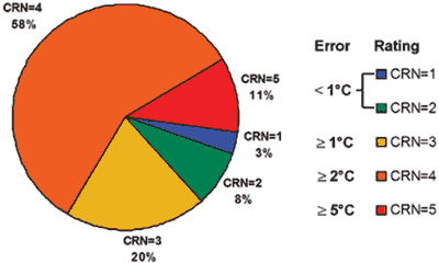
Figure 1: Station Site Quality by Rating (Watts 2009)

These numbers highlight the need to improve the quality of temperature measurement. Indeed, this had already been recognised by the NCDC when they released the Site Information Handbook in 2003. This report was designed to address shortcomings in documentation, changes to observing networks and the observing sites themselves.

The key question to the global warming debate is whether microsite influences actually add to the overall warming trend over the U.S. Anthony Watt's report doesn't answer this question directly. However, the NOAA have published Talking Points related to concerns about whether the U.S. temperature record is reliable. The NOAA used the site ratings by surfacestations.org to construct two national time series. One was the full data set, using all weather stations. The other used only Class 1 or Class 2 weather stations, classified as good or best.


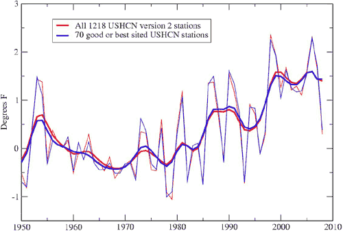
Figure 2: annual temperature anomaly (thin lines) and smoothed data (thick lines) for all U.S. weather stations (red) and Class 1/Class 2 weather stations (blue).

The two data sets cover different areas so some differences might be expected. The top rating stations only covered 43% of the country with some states not included (eg - New Mexico, Kansas, Nebraska, Iowa, Illinois, Ohio, West Virginia, Kentucky, Tennessee or North Carolina).

Nevertheless, the two data sets show practically identical trends. The work of surfacestations.org is useful in clarifying one point - microsite influence has imparted little to no warming bias in the U.S. temperature record.

0 0

Printable Version  |  Link to this page

Comments

Comments 1 to 37:

  1. Watts has argued that these are both plots of the data after it has been corrected. He argues that because the correction algorithm shifts data from dodgy stations to better match that from good stations and visa versa, it is unsurprising that there is a good match between the two lines. Is his reasoning sound? What would you get if you compared these two plots to a plot of only uncorrected data from the good stations?
    0 0
    Response: There's no vica versa. The good stations undergo very little adjustments because, well, they're good stations. For more info on adjustments made to weather station data due to microsite influences, see Examination of Potential Biases in Air Temperature Caused by Poor Station Locations (Peterson 2006).
  2. Re: pico at 13:02 PM on 31 August, 2009 No, Watts's reasoning is not sound. The combined class 1 and 2 dataset is uncontaminated by the "lower quality" stations. The tiny proportion of those "good quality" stations in the all-stations dataset should make them incapable of compensating for Watts's assumed horrible "quality" of the class 3, 4, and 5 stations. The near identical anomalies of the two datasets make perfect sense if whatever microsite effects on temperature anomaly are inconsequential. It's important to keep in mind that the anomaly is what's important for global warming. If a given station was installed on a black tar roof and remains on that black tar roof, the roof's contribution of heat will be constant across decades, and so will contribute zero bias to the change in temperature across decades.
    0 0
  3. Sorry, I should have written that the combined class 1 and 2 dataset is "nearly" uncontaminated by the "lower quality" stations. The data are adjusted not by simply smudging together the "good" with "bad" stations. Instead, a number of distinct types of corrections are made, based on completely sensible rationales having nothing to do with global warming. See The USHCN Version 2 Serial Monthly Dataset.
    0 0
  4. Has Watts ever found any station thats positioning under reports the temperature or is it all over reporting?
    0 0
    Response: I don't know about Watts but one paper (Hansen 2001) compared urban long term trends to nearby rural trends and found 42% of city trends are cooler relative to their country surroundings as weather stations are often sited in cool islands (eg - a park within the city). More here...
  5. re 2: "If a given station was installed on a black tar roof and remains on that black tar roof, the roof's contribution of heat will be constant across decades, and so will contribute zero bias to the change in temperature across decades". This statement is incorrect, and shows a misunderstanding of the differences in thermal inertia between different surfaces during temperature variation. This is also why eg the land heats faster than the ocean during rising temperatures(differences in thermal inertia); the relative difference/'contribution' also increases during rising temperatures/radiation. The same goes for black tar/concreted areas and eg vegetated areas-the black tar/concreted areas will rise in temperature faster during rising temperatures than in vegetated areas. The roofs "contribution of heat" will NOT be constant over the decades, IF the temperature is naturally rising/falling. Moreover, any site in an urban area not only has the surrounding urban heat island effect to deal with over time, (increase in levels of urban infrastructure/ concrete, reduction in natural soil cover, reduction in subsurface moisture, reduction in vegetation, increase in population, increase in car vehicles, increase in roads, etc etc), but it will also be subject to natural temperature trends, which, if the temperature is rising, will also produce an enhanced temperature effect-ie in other words, during a period of natural warming, the urban heat effect will itself be enhanced, particularly in an urban area which is itself expanding/developing. The best sites for measuring surface temperature trends are those within non-changing levels of vegetation, non-changes in rainfall, non-changes in agricultural practises (including irrigation), and stable soil moisture. These are relatively few. All others will show a pronounced surface heat bias during rising natural temperatures, together with any expanding urbanisation, changes in agricultural practices, and/or changes in infrastructure. As for John Cooks response to comment 1 above, it appears to be seriously flawed. If 1 set of data given in the discussion is actually corrected data (ie 'all stations'), and the other is just 'less corrected' (ie 'good' stations), it is a meaningless comparison. The 'good' stations are STILL not that good, and with the dodgy stations corrected to coincide with them in any case (a process known essentially as 'massaging'), the graphs and comparisons above are completely meaningless. Or have I misread this? There are lies, damned lies, and urban temperature stations in developing urban areas within a natural warming trend. re:4 note there are stations which show temperature drops.
    0 0
  6. During the heat wave that gave rise to the fires in Victoria (Australia) last Antipodean summer Tamino did an analysis of Melbourne temperatures showing that they had risen over the last century. Someone raised the heat island effect. I looked up the list of Bureau of meteorology high quality reference stations and suggested he analyse data from 5 rural Victorian stations, including two on headlands overlooking Bass Straight and the Southern Ocean. The Tamino's plots of data from those stations are here ... the trend at each is decidedly up, other than one inland site where night-time temperatures (but not day time) have dropped (probably due to reduced cloud cover). I'm a bit perplexed as to why a version of the the US temperature data is not produced and widely disseminated that is based solely on such high quality sites from places where urban heat island effects are likely to be minimal, and which does not include any corrections with reference to data from lesser quality sites at all. It's about time the whole debate is definitively put to rest. (Not that I think there is any kind or quality of data that will ever mollify Watts' hard core followers.)
    0 0
  7. @thingadonta I think you are confused between *diurnal* trends vs. *annual* trends. Of course there will be a bias - especially at night - from the UHI over when you examine daily or even seasonal data. But whatever urban bias in T trends will be constant when you compare T at annual scales. Unless you are saying that, e.g., 40 WM-2 near-surface flux from micro-scale concrete or anthropogenic sources in, say, 2000/1/2 will differ significantly from 2006/7/8? If it did, then the T comparison data above would be significantly different...but it isn't. Or have I misread this? I'd reckon so. If I were you, I'd also read David Parker's 2004 Nature paper and his 2006 Journal of Climate paper on why global-scale warming is not due to the UHI effect. Also, check out Pete Sinclair's YouTube video on Anthony Watts to show why surfacestations.org is flawed. PS: The best data for surface temp trends are ocean T data (or, if you are Pielke, ocean heat content)...and both, like the surface T data, show substantial rises in magnitude over the past 30 years. But that's another story, eh?
    0 0
  8. Irrelevant, but black tar roofs tend to dry and turn grayer over time. Maybe that would tend to cool a microsite until the roof was resurfaced. All the greatest increases or apparent increases in land temperatures seem to be far away from urban development (the far north, alpine glaciers), so it seems pretty strange to think that microsite stuff counters mainstream claims regarding AGW.
    0 0
  9. #7: The urban bias will not be a constant over long periods of time simply because urban areas grow and decay over decades..just look at the development of any reasonably medium/large connurbation. And the magnitude of that bias will relate to the economic activity of that area. With the current global recession I would expect a diminution in urban bias. If you can gain access to the data, your local power generators' mean power output will give a guide. If a comparison is made between rural sites and urban sites any trend should be apparent in both records even if the 'actual' numbers are different.
    0 0
  10. The NOAA analysis is quite good and the results not at all surprising. It's been estimated that less than 100 reasonably placed reliable stations are needed in each hemisphere to obtain an accurate trend. So if we make the big assumption that the Surface Stations team of volunteers have accurately assessed the quality of weather stations, and that all stations not meeting this standard are useless, that still leaves well over 100 good quality stations just in the United States, an area that makes up less than 4% of the northern hemisphere. http://cat.inist.fr/?aModele=afficheN&cpsidt=1802800 "...created by meteorologist Anthony Watts" Well - broadcast meteorologist to be more precise, and one with no academic degree in a science field.
    0 0
  11. Correction to #10: "leaves well over 100 good quality stations just in the United States" I was basing that off the percentage and 1,221 total stations, when the analysis was conducted on only the stations classified at the time. One could extrapolate and say it will probably be around 100 when the analysis is complete.
    0 0
  12. @Mizimi: Your question has been answered recently. Economic activity and influence of the anthro heat flux on the surface T record was hugely overstated by two papers (de Laat and Maurellis, 2006; McKitrick and Michaels, 2007). Please see this paper showing that such a relation between economic activity and surface temp is spurious.
    0 0
  13. #12 Interesting paper -thanks for the pointer - but I was referring to the UHI effect rather than the overall surface T. IE, I would expect to see urban station results begin to fall as a result of declining economic activity, not rural readings. The fall may not be large (weather patterns have a much greater effect on UHI)but should be discernable. Regarding the overall question..are USA surface stations reliable..it kind of begs the question. Global stations have fallen from over 6000 to just 2600 in a fairly short time period. Notably missing is data from what was the USSR and also China, so that USA data now represents nearly half of what we have...reliable or not. I would not consider the spread of surface data sources to be adequate for GMT calcs and would expect a heavy bias towards the USA climate conditions. Satellite records are somewhat better but restricted time-wise.
    0 0
  14. Thingadonta is going at it again with the diurnal "thermal inertia" nonsense, while it has been shown to him already that there is no such thing. The very premise to Watts' web site existence was invalidated fist by John V, and now by NCDC. Nothing more needs to be said. Actually, yes, one more thing: the data analysis done by John V and NCDC should have been done by Watts if he had any real intention to demonstrate the very thing he believes in. But he did not. Despite the clamored, iron-clad confidence that it was so bad, not once was there a true, mathematical data analysis of the surface stations data on WUWT. I wonder why. Mizimi, if you think that gridding is not properly done in the analyses, you have to substantiate. Take the papers, look at how they do the gridding and tell us how it's wrong. Your statement here is very vague and does not seem to refer specifically to how any given anlysis was done.
    0 0
  15. I don't know why my response to dorlomin is not here but I did say that yes some stations are found to have a cool bias though the numbers are not even and most have a bias that would tend to show warming. Phillipe I think you misunderstand the purpose of the project. It was to check data quality. Analysis of the effects of the discovered problems is a further step, go ahead and start on that I'm sure it would be welcome. I think a finding, that 89% of the stations in the USHCN (which is supposed to be the best data set) don't meet even minimal quality assurance standards is important news in and of itself. The sample size at present means that at least 2/3 of US stations have likely error greater than 2 degrees C, and that the error is overwelmingly inflating temperatures. A look at the corrections introduced by NASA on a site by site basis shows that the corrections do not fix the problem and often make no sense. If the raw data is off by more than 2 degrees and the corrections don't correct isn't any analysis or comparison using that data to look at fractional degree temperature changes simply rubbish? Can we assume the rest of the world data set is good?
    0 0
  16. "A look at the corrections..." You need to substantiate and specify that accusation, it makes no sense under this formulation. "Analysis of the effects of the discovered problems is a further step." Which has been preliminary taken by John V and completed by NCDC. The purpose of WUWT was never to check data quality, because they never closely looked at data. They took pictures of sites then went on wildly speculating about the significance of it. The significance is shown by data analysis, which is the part they never did. The state of the stations is not news to NOAA and NCDC, they were working on it before Watts. This statement "The sample size at present means that at least 2/3 of US stations have likely error greater than 2 degrees C, and that the error is overwelmingly inflating temperatures." is total nonsense, as was demonstrated by the data analysis. What paper has demonstrated the "overwhelming" warm bias? If that was the case, how is such agreement obtained with the satellite data? Even 3 minutes spent on WUWT is a waste of time.
    0 0
  17. Never mind. If you don't understand that a site with a likely error of 3 degrees cannot produce quality data than I am wasting my time. If you can look at the thousands of photos and not know the bias is overwelmingly positive... If you can look at site records where the warm bias has clearly been growing over time due to facility changes yet the corrections reduce past temperatures and increase recent temperatures. A pattern that has been shown many times with specific documented cases at the Surface stations project. Then you are apparently talking theology.
    0 0
  18. not really WA. The notion that one can "look at" a load of photos and "know that the bias is overwhelmingly positive" is simply non-scientific and indicates a pre-conceived view point that is also non-scientific. Science is about measuring and analyzing . As the NOAA showed (they're scientists who measure things!) calculating the temperature profile based on the "best" set of sites results in a data set that is barely distinguishable from the profile calculated from the full data set with bias corrections based on comparison with local rural sites (see John Cook's fig 2 above). It's astonishing that Mr Watts didn't do such an analysis; however it's perhaps understandable since Mr Watts isn't a scientist and apparently has non-scientific reasons for pursuing his photo campaign. Anyway, I don't understand how you can determine that a site has a "likely error of 3 degrees" by looking at a photo. What exactly are you measuring WA? And why not answer Philipe's straightforward questions? What scientific paper(s) has presented this "warm bias" that is "overwhelmingly inflating temperatures"? How can the US surface temperature data be inflating temperatures, when the surface temperature is consistent with that determined from satellite data, and with independent measures of temperature increase (e.g. temperature profiles calculated from the rates of mountain glacier retreat)? One of the problems with "stripping out" quantitative analysis and relying on qualitative descriptions (e.g. photos) is that the latter are heavily prone to subjective interpretation and ripe for misuse by propagandists. Theological arguments are subjective/qualitative whereas scientific arguments are quantitative. Less theology please WA; let's see your quantitative analysis or a link to a published relevant version.
    0 0
  19. '#14...Philippe....I am sure that datasets are analysed and configured to minimise the impact of losing stations within a grid. My point is that when you lose a massive amount of stations ( such as in Russia) then it must have a deleterous effect on overall data reliability. There is an interesting article on the subject here... http://www.uoguelph.ca/%7ermckitri/research/nvst.html'
    0 0
  20. It is worth watching the mpeg file at the Delaware site showing the loss of stations from 1950 onwards, especially in 1990 when the Russian Federation collapsed. http://climate.geog.udel.edu/~climate/html_pages/air_clim.html you will have to logon (free) to access the data.
    0 0
  21. Chris The greater than 3 degree etc. scale is NOAA's own scale, it has to do with what the errors are in the site location and what measurement error these are known to introduce; as determined by NOAA itself. For instance with something like 9% of US sites located adjacent to sewage digestors that run at about 35 C all the time we are going to have some considerable distortion especially when the outside temperature is -35 C. The rating scale attempts to quantify this error based on distance to things that introduce bias. You can get a pretty darn good idea of these problems through a survey of the site. And indeed this type of survey is the prescribed method from NOAA for determining site compliance. It isn't something Watts made up. The problem is correcting these issues is something that has not been done. Because they don't know? No. Because with all the billions spent on AGW by the government somehow they won't come up with a few bucks to get these fixed. I hope WUWT will force NOAA to fix this network.
    0 0
  22. You don't seem to have researched this subject very well WA, and are somewhat misinformed: So it's very surprising that you don't know that the NOAA, despite limited funds, has been underway with a very significant programme to address the problem of surface station siting since 2001. They have already constructed well over 100 sites in a new network to give high US surface coverage using optimal placement criteria. As time proceeds data from this network (the US Climate Reference Network) will merge with the pre-existing surface station data. So contrary to your assertion, "the government" is "coming up with the bucks" to improve the network of surface sites. I hope you're happy that your tax dollars are being put to good use! You can read about this here: http://www.ncdc.noaa.gov/crn/ You also seem unaware that despite a photo-campaign to attempt to discredit the US surface measurements, a reconstruction of the US surface temperature record employing only the sub-set of good or best-sited stations, yields a temperature anomaly record that is hardly distinguishable fom that created from the full set. You can read about this in John Cook's top post on this thread (see Figure 2 above). It desn't matter if some sites are poor - this is taken into account in the analysis of the temperature record and corrected for. So again it's silly to say that "correcting these issues is something that has not been done". In fact correcting these issues has been the subject of a huge amount of effort and has been done doubly (firstly by careful assessment of the pre-exisiting data network, and secondly by construction of an entirely new network). it's your tax dollars WA - you should make a better effort to determine how they are utilised!
    0 0
  23. Re #19 I'm not going to dignify your site it by re-citing it, Mizimi, but I'd expect a skeptic would not be taken in by the essential flaw in the presentation which is based on a confusion of "temperature" and "temperature anomaly". What’s very odd is that the practitioners of your dodgy site have elsewhere made great play of the essential meaninglessness of the concept of an earth “average temperature” or “global temperature” when in fact proper scientists don’t use this anyway…however on your site that’s the concept that is presented to attempt to portray something odd with the surface station data. Let’s have a look: Your site presents a graph of some form of an averaged station temperature (ordinate) as a function of year (abscissa) and overlays this with the number of stations. However this data tells us nothing about the effect of station loss on the global temperature anomaly trend which is actually what we’re interested in (and what NASA GISS and Hadley Hadcrut and NOAA determine). Your dodgy site asserts that: “Graphs of the 'Global Temperature' from places like GISS and CRU reflect attempts to correct for, among other things, the loss of stations within grid cells, so they don't show the same jump at 1990.” However that’s not why Giss/Hadcrut etc don’t show “the same jump at 1990”. These data don’t show the same jump because they don’t plot the meaningless “average temperature”, but the temperature anomaly. If one doesn’t understand the difference between these then one is likely to be taken in by the sort of plot on your dodgy site (perhaps that’s what its author is hoping for). We can look at some model data to illustrate what’s actually going on. Let’s take 10 surface sites located randomly around the world and look at their temperatures and temperature anomalies.
           Local average temperature (oC)
    Site     1985          1995
    
    1       13.1       13.3		
    2       8.3        8.5
    3       9.5        9.7		
    4       18.6       18.9
    5       12.4       12.6
    6       10.6       10.8
    7       17.4       17.6
    8       9.2        9.5
    9       21.3       21.4
    10      11.0       11.2
    
    
    If we take the change in temperature at each site as the anomaly (that’s what an anomaly is, although in reality it is relative to a base year range) then we can calculate the (meaningless) “global temperature” and the global anomaly: “global temperature” (1985) = 13.14 oC “global temperature” (1995) = 13.35 oC global anomaly (1995) = 0.21 oC (relative to 1985). Now we remove the five coldest sites from the 1995 data set due to “collapse” of the Soviet Union (say) in 1990: “global temperature” (1985) = 13.14 oC “global temperature” (1995) = 16.76 oC global anomaly (1995) = 0.20 oC (relative to 1985) Interesting, yes? The world has apparently got hotter while the global temperature anomaly is essentially unchanged. Do you see why one doesn’t use the meaningless “global average temperature”, but rather the temperature anomaly Mizimi? The temperature anomaly has a number of other excellent qualities. One of these is that while absolute temperature between distant sites is non-correlated (some might be at higher altitudes or in different local environments) the temperature change over time between sites is highly correlated even at high distances (up to 1200 km). Therefore the temperature anomaly allows one to get a rather accurate global scale assessment of temperature change even without full surface coverage. And (as we’ve just seen) the use of the temperature anomaly means that changes in coverage (loss or gain of stations) doesn’t materially affect the measured global temperature change so long as there are sufficient overall stations. Another quality is that additional temperature measures (e.g. from satellites) can be seamlessly incorporated into the temperature anomaly analysis.
    0 0
  24. Chris, not to be a downer, but methinks you're wasting your time. Confusion between temp and temp anomaly is rampant and obvious with some commenters on this site. So is the confusion between the various reference periods used to compute anomalies, which are not the same for GISS and HadCRU; that's the only reason why some prefere HadCRU (that and the lack of Arctic consideration), it looks better to them, while in fact it says exactly the same as GISS. Satellite records have a different baseline still, which gives a different absolute value to the anomaly, yet shows the exact same trend. Also source of confusion is the fact that satellite records include stratospheric components. Etc, etc. All stuff that was discussed here at some point or another but then gets forgotten so the same talking points can be recycled ad nauseam.
    0 0
  25. Chris, I do understand the difference between temperature and temperature anomaly. As you rightly point out in order to obtain a reasonable assessment of the anomaly you require a reasonable coverage of the earths surface. Taking a sample over a 1200km sq cell only requires about a 100 stations (for land temps. I don't think anybody would consider that to be enough. " So it's very surprising that you don't know that the NOAA, despite limited funds, has been underway with a very significant programme to address the problem of surface station siting since 2001. They have already constructed well over 100 sites in a new network to give high US surface coverage using optimal placement criteria.\" A couple of things...(1) obviously NOAA concedes there is a problem and (2)I would not consider 100 stations since 2001 as being significant. (but maybe since we only need 100 stations on a 1200km grid to get an accurate reading of the temp anomaly it will be more than enough).
    0 0
  26. Sub set etc... does a different subset have different results? I espect so but it doesn't even matter the point is that the uncertainty is much larger than people pretend and indeed larger than the entire signal. I am still hopeful for significant warming but belief... As to fixing the stations... Do you think that would have gotten funded if no one had made a fuss about the problem? If so do you also believe in the tooth fairy? We were doing corrections with a "algorythym based on low resolution satellite photos.
    0 0
  27. First post, please don't attack. Some thoughts crossed my mind as I read this and the various responses and I hope I can make those thoughts clear. With regard to the temperature anomaly, I understand the concept and that the change is important in trying to determine directional temperature trends. There was a point I think that thingadonta was trying to make in #5 with regard to Tom Dayton that Former Skeptic tried to counter in #7. If the absolute temperature error is constant, and the dynamics of that particular station are constant, then there is no effect on the anomaly. First, let\'s leave the dynamics of a particular station alone. If, in a perfect measurement, the station should read 32.0 degrees F, but it reads 32.2 degrees then for the anomaly to be unaffected, on a 95 degree day, the station should read 95.2 degrees. I would hazard to guess that the differential goes up in correlation with the increase in temperature above some certain level (e.g. the initial .2 degree difference may be unchanged until the real temperature reaches 50 degrees then begins to increase slightly thereafter due to external radiative influences). My question is whether there are similar influences that could make it go the other way, such as ice/snow on a 40 degree day and, even so, would that extend to temperatures below freezing? Also, I don\'t know if I should read anything into the fact that Figure 2 is in Fahrenheit while the NCDC ratings for range of error are in Celcius. Just thoughts about this topic and this topic only.
    0 0
  28. re #25 You're not really addressing the data Mizimi, and what you "think" isn't a good basis for addressing science. That's a theological position (see WA message above). After all you "think" that that web site you linked to is useful when it's demonstrably rubbish (see my post #23). So if you don't "think" that 100 stations is enough to determine the temperature anomaly "over a 1200km sq cell" you should give some evidence why. In fact you've misunderstood the 1200 km correlation point. The fact is (this can be ascertained by examining station data output [*]) that the temperature anomaly is well correlated between stations even if these are separated by quite large distances (up to 1200 km in middle to high latitudes). That means that data from stations separated by medium and even large distances can be combined to give high spatial coverage with apparently sparse sampling to determine the gridded anomaly. Obviously this wouldn't work if we were interested in some spurious notional "average temperature" since the absolute temperature varies markedly on the small spatial scale. But we don't pretend to be interested in that (whatever dodgy web sites say!); we're interested in the referenced spatially-averaged temperature change (the anomaly). If you don't understand this fundamental point you're simply not going to be in a position to comment meaningfully on the data. Do we have scientific evidence that this is valid? Yes. We can calculate the profile of temperature anomalies using sub-sets of the total data. This has been done numerous times. An example is given in Figure 2 of John Cook's top post in which the temporal temperature anomaly profile for the contiguous US is calculated using a subset of the 70 best stations. It's very similar to the profile determined from the full record. That's not surprising since while absolute temperatures are highly non-correlated on the local scale, the temperature anomaly is rather well correlated. So we don't need a vast number of stations to determine the temperature anomaly. In another theological argument you say you don't consider 100 stations since 2001 as being significant". In fact the US Climate Reference Network has constructed around 130 stations in the new network covering the entire US since 2001. If a representative anomaly can be reconstructed from a subset of 70 temperature stations (see John Cook's Figure 2 above), I wonder what lends you to consider that 130 optimally sited stations with carefully optimised spatial coverage isn't even "significant". Note that 130 sites covering the US (2% of Earth surface) is equivalent to 6500 sites averaged over the earth’s surface. That’s a good coverage. In fact the real difficulty in obtaining full spatial coverage in the past has been the large areas of ocean that were poorly represented. However with the advent of satellite sea surface temperature measures, and improved networks of in situ sea surface measures….that situation has changed and there is now good ocean coverage. Re your comment: “obviously NOAA concedes there is a problem …”, that also needs some qualification. There is a continual drive to improve methodologies and analysis (e.g. see [***] for the most recent improvements in NOAA surface temperature analysis). That’s an on-going process in science. The existing met station network and other records has produced useable data since the late 19th century and the methodology for analysis and quality control has been continually improved as described in many dozens of papers over the past 20 years. If the advent of satellite sea surface temperature measurements can improve SST coverage then why not include this vast resource into the surface temperature analysis…improved in situ sea surface measurements from buoys and disposable instruments has been made – why not include those? If we can construct an improved network of met stations in the contiguous USA, then great. None of this means that pre-existing networks and analyses were not adequate. But given decent funding and scientific inventiveness, we can always make things better, and that’s done in climate-related science as in any scientific endeavour. If you’ve got some substantive criticism of these methods then address them specifically. Referring us to dismal websites that are rather obviously designed to mislead the poorly informed isn’t “skepticism”. [*] see papers describing NASA Giss methodologies here: http://data.giss.nasa.gov/gistemp/ [**] papers describing Hadley Hadcrut methodologies here: http://www.cru.uea.ac.uk/cru/data/temperature/#sciref [***] see this paper for example, for recent improvements in the NOAA surface temperature record: Smith TM, Reynolds RW, Peterson TC et al (2008) Improvements to NOAA's historical merged land-ocean surface temperature analysis (1880-2006). Journal of Climate: 21, 2283-2296. http://ams.allenpress.com/perlserv/?request=get-abstract&doi=10.1175%2F2007JCLI2100.1
    0 0
  29. re #26 Not really WA. I don't think you've made an effort to investigate the US Climate Reference Network (USCRN). One can learn about the history of the development of this network here: http://www.ncdc.noaa.gov/crn/ and more specifically, here, for example: http://www1.ncdc.noaa.gov/pub/data/uscrn/publications/annual_reports/FY08_USCRN_Annual_Report.pdf In a nutshell, the USCRN was set up following a recognition starting in the mid-90's that it would be very useful to set up a network of US climate monitoring stations that would give a very long term (50-100 year) uninterrupted data set for high quality US climate analysis into the future. The network is part of the continuing role of the NOAA, enshrined by legislature to do climate monitoring. In other words it's a major role of the NOAA to continually assess its products and consider improvements/updates, much like any organization with a defined role. The essential nature of the USCRN was defined in a consultative period which came up with a set of principles by around 1999. There then began the process of planning, site acquisition, testing, quality control etc., with the first stations going "live" around 2001. There are now around 130 of these. Now that's all very well documented. The network was a response to careful analysis and planning and didn't have much to do with people "making a fuss".....nor did it have anything to do with "tooth fairys".
    0 0
  30. #23...a nice demonstration Chris of how x+ 0.2 - x =0.2 but are they real figures? I doubt it. So just for some indication I went to GISS dataset and abstracted annual mean temps for 20 stations picked at random across the globe from 1980 - 1990. Of those 20, four stopped sending data in 1990/1991 (Madrid, Riga,Fugin, Minqin). Constructed a simple mean 'global' T series from the data, then did it again dropping out those 4 stations. The result? With all stations included the ten year 'trend was 0.2C...not too far from established results. But the trend when they were removed fell to 0.12C. Not conclusive in absolute terms but enough I would say to demonstrate that both the number of stations and the area covered are vital to getting the trend right.
    0 0
  31. Well yes Mizimi....it's obvious that you can't determine the global temperature anomaly trend from 16 sites. I don't really understand your point. In post #25 you stated that you "would not consider 100 stations since 2001 as being significant" in the context of the US Climate Reference Network that I described in posts #22 and #29. However now you're attempting to determine the global anomaly from 16 sites which is a surface density of around 0.3% of the USCRN. So how can an analysis of 16 sites be sufficient in your post #30, when you consider a density equivalent to ~6500 sites worldwide to be insignificant for determining a temperature anomaly trend? Clearly there is a requisite number of sites for adequate determination of a global temperature anomaly with acceptable statistical uncertainty. It's obviously greater than 16. The fact that the US temperature anomaly trend can be defined pretty well with 70 sites (see Figure 2 in the top article), suggests that a number well below 6500 is enough. Making any further conclusions requires consideration of the vast multitude of data and analyses in the published science where these issues have already been addressed at length (see links in my post #28).
    0 0
  32. No Chris, I am not trying to calculate the anomaly from 20 stations, I am showing that insufficient data and poor coverage affects the end result. A pretty obvious thing I would have thought. So that the loss of data from Russia, China at al affects the the answers we get. Defining the US anomaly with 70 stations is rather unhelpful in defining the GLOBAL anomaly if we do not have data from stations on a GLOBAL scale.
    0 0
  33. No you're pursuing a non-sequiter Mizimi. Yes, insufficient data and poor coverage affects the end result. That is obvious. But no, the loss of data from Russia, China etc doesn't necessarily affect the answers we get...what makes you think it does? You certainly can't draw that conclusion from your simplistic perusal of 16 stations. These issues have to be analyzed properly. Raising theoretical issues based on simplistic analysis and then concluding that these issues apply without showing evidence that they do is false argumentation. In fact it's quite apposite in the context of this thread, since that selfsame false logic is the fundamental flaw of Mr Watt's misanalysis (or non-analysis) of the US surface temperature record.
    0 0
  34. On 1200km cells..........went back to GIStemp and took annual mean temp data from 6 stations within a 1200km grid. Calculated the temp anomaly for each station over a time period of 10 years (1980-1989). 3 stations had an anomaly of 0.14- 0.15 C, the other 3 had anomalies of 0.03/0.08/0.10C The average anomaly within the grid using just these stations is thus 0.106C which is half of what is expected. So I don't see correlation within a grid, let alone between grids. But I will do some more checking.............
    0 0
  35. #33.."But no, the loss of data from Russia, China etc doesn't necessarily affect the answers we get...what makes you think it does?" So let's pretend I own 60 supermarkets ( I wish) and each store downloads sales information on a weekly basis so that I can track sales of each item for re-ordering purposes ( central buying) and also so I can construct a profit/loss account. The computers at 20 stores go down and I don't replace them. How do I know what to order and how much? How can I construct a P/L account for the company? Answers...I cannot do either with the accuracy I used to have. I will over/under order and cannot determine the current financial state of the group. If you multiply the stores up to 1000 and I lose data from 500 ( roughly equivalent to the reduction in weather stations) the result is the same and I am left with only guesswork.
    0 0
  36. Analysed another random cell (6x6 degrees)in central USA using 4 rural stations. The ten-year trend varied from 0.08/0.03/-0.027/0 (zero) giving a mean value of 0.021C. Nowhere near the 0.2C per decade expected. Again a lack of correlation within the grid which seems to counter the argument that the trend is well correlated at great distances. Or maybe I just struck lucky.
    0 0
  37. Recording the temperatures on the surface of the planet aren't accurate and do not reflect the true participation of urban heat islands related to global warming. Global warming means there is a source of heat atmospherically. Here is a link to advanced temperature work to isolate the cause of urban heat islands. Look at the amount of heat generated in September. http://www.youtube.com/watch?v=1EmBQcXr6ng
    0 0
    Response: The source of atmospheric heat has been determined empirically by both satellites and surface measurements of longwave radiation to come from greenhouse gases trapping more heat that would otherwise have radiated back out to space. As for urban heat island, see this research into the effect of urban heat island effect on temperature records.

You need to be logged in to post a comment. Login via the left margin or if you're new, register here.


The Consensus Project Website

THE ESCALATOR

(free to republish)


© Copyright 2024 John Cook
Home | Translations | About Us | Privacy | Contact Us