Monckton Myth #9: Monckton vs Monckton on heat waves
Posted on 8 February 2011 by John Cook
It can be difficult debunking misinformation that contradicts itself. The problem is the shifting of goal posts presents a moving target. You could rebut one part of a person's argument and find yourself agreeing with them in another part. On the other hand, for a glass-half-full person, this lack of internal consistency might be seen as a useful resource. Why bother contradicting misinformation when the author contradicts himself. For example, in Monckton Skewers Steketee, Monckton presents a muddled series of thoughts on why climate change has nothing to do with extreme weather events. When talking about record hot weather, Monckton points out that while heatwaves happen, so too do cold snaps:
"...some very spectacular cold-weather records were also broken both in early 2010, when all 49 contiguous United States were covered in snow for the first time since satellite monitoring began 30 years ago, and in December, which was the coldest final month of the year in central England since records began 352 years ago."
For a rebuttal, I'll pass you over to Monckton:
"Cherry-picking individual extreme-weather events that point in one direction only, when there are thousands of such events that also point in another direction, is neither sound science nor sound journalism."Sage advice. The best approach is to look at all the evidence. For example, a perusal of all extreme hot or cold weather events in USA (Meehl et al 2009) find that there were double the amount of record highs compared to record lows in the last decade.

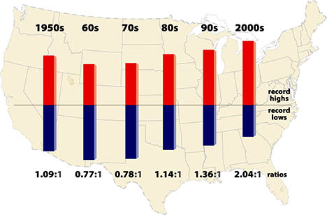
Figure 1: Ratio of record daily highs to record daily lows in the 48 contiguous United States from January 1950 through September 2009. Each bar shows the proportion of record highs (red) to record lows (blue) for each decade.
So Monckton may be onto something here - always look at the full body of evidence, not just cherry picked data. But what is the significance of this increase in record high temperatures? Monckton argues that global warming has very little to do with hot-weather:
"...neither the hot-weather nor the cold-weather extremes of 2010 have much to do with manmade “global warming”; like the heatwave of 2003 in Europe that is said to have killed 35,000 people, they are known to have been caused by an unusual pattern of what meteorologists call “blocking highs” – comparatively rare areas of stable high pressure that dislodge the jet-streams from their usual path and lock weather systems in place for days or sometimes even months at a time."
But then, a little later on, Monckton argues that the long-term warming trend does have an effect on the increasing number of heat waves:
"Since there has been some warming, more hot-weather than cold-weather records have been set. Not exactly surprising, and not exactly alarming either: for the mere fact of warming tells us nothing about the cause of the warming."
So the goal posts shift from "global warming doesn't affect weather" to "global warming affects weather but humans aren't causing global warming". In fact, according to Monckton, the influence of global warming on record highs is not even surprising. It may have been a surprise to those reading Monckton's article who found themselves agreeing with his earlier points.
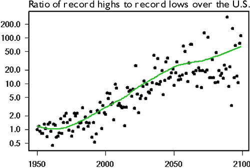
At this point, one may experience a crisis of confidence in Monckton as a reliable source of information. Which Monckton do we believe? I tend to gravitate towards peer-reviewed science, which undergoes more rigorous scrutiny before being published than a blog post on Watts Up With That. On the subject of heat waves, Meehl et al 2009 predicts that the U.S. ratio of record highs to record lows are projected to continue to increase to a ratio of about 20 to 1 by 2050 and roughly 50 to 1 by 2100.


Arguments


It is a fact that *some* snow was reported *somewhere* in each of the mainland states at that time. Monckton reports it as “…when all 49 contiguous United States were covered in snow…”
If a blanket is only on my left big toe at night, I don’t consider myself “covered”.
"a crisis of confidence in Monckton as a reliable source of information" ...Well put.
"neither the hot-weather nor the cold-weather extremes of 2010 have much to do with manmade “global warming”; like the heatwave of 2003 in Europe that is said to have killed 35,000 people, they are known to have been caused by an unusual pattern of what meteorologists call “blocking highs”".
Yes, blocking highs occurring in a warmer world-- a spike on top of a long-term warming trend. Regardless, Stott et al. (2004) studied the 2003 European heat wave and concluded that:
"The summer of 2003 was probably the hottest in Europe since at latest AD 1500, and unusually large numbers of heat-related deaths were reported in France, Germany and Italy."
and
"...we estimate it is very likely (confidence level >90%) that human influence has at least doubled the risk of a heatwave exceeding this threshold magnitude."
Now who to believe? Easy, not Monckton's internally inconsistent and unsubstantiated musings.
It is a little too soon to speak to the role of AGW in the Russian heat wave that killed an estimated 40-50 thousand , but early indications are that it too was exacerbated by AGW.
Some very odd snow that blanketed Los Angeles last January when the average temperature was 60F.
http://www.weather.gov/climate/xmacis.php?wfo=lox
I look forward to seeing the Oct-Dec 2009 data included in the graph so that it shows 6 complete decades. I can just hear someone saying the data is "cherry-picked"! (I know the graph was first published in November 2009, but it does need updating.)
In an attempt to fill the gap, I found:
1) “October [2009] was a very cold month across large parts of the country.” - Newswire.com
and
2) “The near-record global temperatures of 2009 occurred despite an unseasonably cool December in much of North America.” - ScienceDaily
3) I didn't find anything about November 2009, one way or the other, but I did stop searching.
This basically anecdotal information will definitely not decrease the height of the 2000s ‘record highs’ bar, but suggests the height of the ‘record lows’ bar will increase. How much will the 2.04:1 ratio change? “Very cold” October suggests lots of records may have been set; “unseasonable cool December” suggests no more than a few records set. Can somebody crunch some actual data?
Unlike the climate contrarians, we have to be careful with how we describe things. Meehl et al didn't describe an increase in record high temperatures. Because the number of records increases, the rate of achieving new records goes down over time. This can be modeled simply for stochastic variability. What's happening is that the rate of achieving new cold records is declining much faster than the stochastic model. Record highs in the US declined somewhat indestinguishably from the stochastic expectation. Thus the ratio of warm to cold records is not due to an "increase in record high temperatures".
Monckton 1:
"...neither the hot-weather nor the cold-weather extremes of 2010 have much to do with manmade “global warming"
Monckton 2:
"Since there has been some warming, more hot-weather than cold-weather records have been set...for the mere fact of warming tells us nothing about the cause of the warming"
John Cook:
"So the goal posts shift from "global warming doesn't affect weather" to "global warming affects weather but humans aren't causing global warming"".
It seems to me Monckton is not shifting the goal posts here. In the first quote he is referring to MAN MADE global warming and he says that is does not have MUCH to do with weather extremes. In the second quote he simply says "warming" not man made global warming. In fact he says "warming" does not tell us about the cause of the warming. He is, of course, denying that it is man made.
In other words, although he may be wrong about AGW, it does not seem to me that he is inconsistent.
Some one please point out my error though :(
I hate to say it too, but it seems you're right about the wording. But, in reality it is just semantics. In the end, Monckton is still trying to imply that warming doesn't cause extreme weather events by cherry-picking examples and follows it up with another statement he made that says that global warming does cause an increase in highs and lows.
If he didn't want to mislead readers into thinking that higher global temperatures doesn't equal more extremes, then why would he specifically dismiss those 2010 and 2003 weather events in the way h did? It is a tactic they use to spread misinformation. I don't know if he is right or not about the causes of those events, but either way he uses that information without regard for the bigger picture of AGW.
That also certainly doesn't dismiss the first set of his own contradictory statements as well.
Check the NCDC Climate Monitoring reports to find Global weather averages. I find October 2009 as 6th warmest on record (0.5C above average), November 2009 as 4th warmest (0.59 over) and December 2009 as 31st warmest (0.35 over average). It is unlikely that the decade results above will be lowered since the average temerature in those months was higher than the rest of the decade. October was only "cold" compared to the previous record hot years. Check your data before making wild, unsupported claims.
Steve L: In 2010 19 countries recorded all time record high temperatures and none recorded all time record lows see here (h/t Albatross). 20% of the Earths land surface is included in those records. Where is the room for questioning the "increase in high temperatures"?
In my opinion the immediate rebuttal to this, before bringing out any further evidence, should be that it was the heatwave in the Arctic that pushed the frigid polar air towards us therefore causing those cold snaps.
By making a direct link between that heatwave and the coldsnaps we have a higher chance of quickly neutralizing Lord Monckton's argument in the minds of the layman.
However, the ratio of record lows to record highs over any time period will be low (more highs than lows) if it's warming, high if it's cooling. That's the indicator to look at.
The information for years from 2002 can be found here. National records are labeled as such.
The semantics do not allow for a contradiction in that particular point that Monckton is making. This, irrespective of all his other contradictions.
As for the ratio of record lows to record highs ... I actually prefer numbers that sum to 1, and therefore percentages could be better. For example, I think projections for the future should be: "by 2050 5% of record temperatures will be cold; by 2100 that will drop to 2%." But this is just semantics.
At the time, Russian authorities estimated 15,000 premature deaths. Have they revised that estimate?
As you know, getting data from the Russian authorities is not easy. For this reason the estimates of the deaths vary wildly, from 15000 to 56000. The latter number (56000) is from this United Nations press release.
In my earlier post I could not remember the exact number that I read originally, so I gave a range and erred on the conservative side.
Whatever the final number of fatalities actually was, it was very likely in the tens of thousands. 2010 was a grim year for natural disasters.
"The role of human activity in the recent warming of extremely warm daytime temperatures
Nikolaos Christidis, Peter A. Stott, Simon J. Brown
Met Office, Hadley Centre for Climate Change, FitzRoy Road, Exeter, EX1 3PB, UK
Abstract
Formal detection and attribution analyses of changes in daily extremes give evidence of a significant human influence on the increasing severity of extremely warm nights and decreasing severity of extremely cold days and nights. We present an optimal fingerprinting analysis, which also detects the contributions of external forcings to recent changes in extremely warm days using non-stationary extreme value theory. Our analysis is the first that attempts to partition the observed change in warm daytime extremes between its anthropogenic and natural components and hence attribute part of the change to possible causes. Changes in the extreme temperatures are represented by the temporal changes in a parameter of an extreme value distribution. Regional distributions of the trend in the parameter are computed with and without human influence using constraints from the global optimal fingerprinting analysis. Anthropogenic forcings alter the regional distributions, indicating that extremely warm days have become hotter."
If I may-
Ambiguosityologist (am-big-U-osity-olo-gist); someone who makes a practice of intentionally manipulating vague or unclear terminology, or someone who misuses highly technical terminology, with the intent of misleading for propaganda purposes. E.g. the Viscount Monckton.
"I do not know, for example, in Albatross @17 if the abstract refers to 24 hour periods or daily maximum values."
The title for the paper specifically refers to daytime temperatures, as does the abstract. So that bolded sentence refers to daytime.
BTW, when was the last time you heard someone say: “A record high low was set for this date last night…”?
You appear to be claiming that monthly global temperature averages which are warm to extremely warm (note: global) cannot include American weather station temperature records which might include more record lows than record highs.
If you look at Figure 1 near the top of the blog, you will discover it reports on 59 years and 9 months of record high temperatures and record low temperatures in the contiguous USA, so for the rest of this post please ignore what’s happening in the rest of the world. (If you don’t like it, then complain that Figure 1 was included in the blog post in the first place.) The graph was first published in November 2009, so data for the end of 2009 was not available. I’m guessing the data to complete the last decade represented on the graph became available about a year ago, but it seems nobody has put the last three months’ data into the graph. Curious as to what that data might indicate, I did a Google search for 2009 USA temperature records and came up with two short statements about two of the three missing months. I treated that information as being anecdotal, but it was better data than no data. It was also accurate information, as far as it went.
Thank you, Michael Sweet, for directing me to the NCDC Climate Monitoring reports (although your link doesn’t seem to work). The Global Mean Temp Anomaly Maps for the three months I consider to be missing from the Figure 1 graph generally confirm the statements I obtained from the Google search, specifically,
Oct 2009 - most of contiguous USA, especially the upper midwest, up to 5C below the 1961-1990 base period.
Nov 2009 - contiguous USA mostly above the base period (up to 5C)
Dec 2009 - contiguous USA mostly below the base period (up to 4C).
We do not know from this added information whether there were *any* record high or record low temperatures at individual weather stations in the USA during those three months. However, this added information suggests to me that the 2000’s record high temperature bar might grow some, and the 2000’s record low temperature bar might grow some too, and probably a little more. I do not believe the three months missing data is likely to significantly alter the 2.04:1 ratio derived from 117 months, but I don’t know. I do believe it would be appropriate for each decade represented on the graph to have the same number of months.
The graph is apparantly part of a study by authors at NCAR, Climate Central, The Weather Channel and NOAA published in Geophysical Research Letters. I don’t have any leverage with those good folks (nor anybody else) to make the graph cover the entire 60 year period. I figured, however, someone reading this blog might.
I’m really just asking for a nifty graph that currently covers 59 years and 9 months to be revised so that it covers an even 60 years.
http://www.ncdc.noaa.gov/sotc/service/national/hprcc/1mt/200910.png
http://www.ncdc.noaa.gov/sotc/service/national/hprcc/1mt/200911.png
http://www.ncdc.noaa.gov/sotc/service/national/hprcc/1mt/200912.png
This is the best I could get from NOAA. The other series I wanted are currently unavailable for these individual months.
You said in 4 "“Very cold” October suggests lots of records may have been set; “unseasonable cool December” suggests no more than a few records set". That seems to me like a claim that lots of cold records were set in those months. I do not think your data sources are very reliable for such a claim. I am sorry I referred to the global temperatures, I did not realize you only cared about the USA. Fortunately the site I mentioned has the data for both. At least we both have a reliable data source now.
It is my experience that if I have a 117 month data set and I add three months there is little change in the data. This holds up even if all the last three months are extreme, which they were not (one warm, two cold, none hot or frigid). You also suggest that there will be little change. It is a lot of trouble to finish out the data properly. Arguing about good data is a method deniers use to delay action. I am sorry if I responded sharply to your post, there have been an unusual number of trolls lately.
Because I work with (regulate) about 400 clients' financial instruments that range from a few thousand dollars to a hundred million dollars (totaling about $500,000,000), adding 2 or 3 percent more clients would make me clueless as to whether ratios would stay put or change noticeably, even drastically. (The "right" 10 new clients could triple the total.) Being minimally familiar with actual counts of record highs and lows, but understanding (from reading Weather Underground Tropical Weather blog after Dr. Masters writes an AGW/ACC article) there can be hundreds of records set in a few weeks, I'm not convinced that the three months don't matter.
After looking at the NCDC month average temperature anomaly maps which show vaguely 1.5 months worth of potentially record setting cold and 1 month of potentially record setting hot, I suspect the 2.04:1 ratio (hi:lo records) won't change much, but I still don't know. It would be much much better for the graph to actually cover the full decade to dispel my concerns. In November 2009, it made sense for the graph to cover a spot less than 60 years; today it does not make sense. It cannot possibly be too much work for the originators of the graph to add in the "missing" data. The maps are useful for making an hypothesis (the ratio won't change much); they are not reliable in and of themselves to determine if or how much the 2.04:1 ration will change.
John Cook apparently cares about USA data sets, for he posted the two graphs above, and I am concerned about how the one graph might be perceived by Climate Ostriches and curious what the full decade ratio is. I don't know where to find the data and I'm not confident I would utilize it appropriately if I did. It doesn't mean I don't care.
I'm deeply concerned about Arctic sea ice loss (among other climate science concerns), and when naysaying co-workers respond with "Antarctica ..." or "Snow on the ground in 49 states," I see them as ignoring reality. So when I heard you say (paraphrased in my head) "It cannot be cold in the US because on average it's hot everywhere, you SOB" well, you can see the parallel. In the DeepClimate blog on Lisbon, a small piece of the discussion centered on how we get so used to warding off pseudo-sceptics that we assume the worst in others and begin to behave in ways we're not proud of. I can succumb to it too. My apologies. And thanks for yours.
This is now the 10th month out of the last 13 since last January that heat records have exceeded cold ones. The ratio of high temperature records to low temperature records over that period is 2.18 to 1, and the cumulative excess of heat records is almost 7000.
January Heat Outpaces Cold
Actually, GW would suggest the blocking highs move farther north and these extremes would become less severe.
Monckton was apparently right.
Quote:
"The heat wave was due primarily to a natural phenomenon called an atmospheric “blocking pattern”, in which a strong high pressure system developed and remained stationary over western Russian, keeping summer storms and cool air from sweeping through the region and leading to the extreme hot and dry conditions. While the blocking pattern associated with the 2010 event was unusually intense and persistent, its major features were similar to atmospheric patterns associated with prior extreme heat wave events in the region since 1880, the researchers found."
NOAA NEWS 3/9/2011
If you look at the region's anomaly for 2010 it is colder in winter and hotter in summer suggesting a local, not global phenomenon.
"Monckton was apparently right."
Not so much. Let's look at the rest of the NOAA report:
While a contribution to the heat wave from climate change could not be entirely ruled out, if it was present, it played a much smaller role than naturally occurring meteorological processes in explaining this heat wave's intensity.
The researchers cautioned that this extreme event provides a glimpse into the region’s future as greenhouse gases continue to increase, and the signal of a warming climate, even at this regional scale, begins to emerge more clearly from natural variability in coming decades.
Prior analysis showed that climate change increases the probability of these extreme events; as this report conflicts, why do you arbitrarily buy this one?
Sigh, please carefully read my post again @2. Note that I conclude by saying "It is a little too soon to speak to the role of AGW in the Russian heat wave that killed an estimated 40-50 thousand , but early indications are that it too was exacerbated by AGW."
And that bolded part is where Monckton misleads people and gets it wrong. For goodness' sakes meteorologists have known for a long time that there is a relationship between strong ridging and blocking events and heat waves (and drought) in the mid-latitudes (see for example Lyon and Dole 1995, J. Climate). What Monckton claims is nothing new. Also, the 2003 heat-wave event that I referred to was associated with blocking, for at least a portion of its duration. Yet, you and Monckton forget the findings made by Stott et al. (2004) which I link to in my post @2. Blocking events superimposed on an underlying warming trend will be worse than otherwise, and there was an anthro signal/contribution in the 2003 European heat wave. Again, please read Stott et al. (2004).
I'm pretty certain that journal papers published on the Russian heat wave will find an anthropogenic contribution, albeit it (probably) of secondary importance to the blocking.
And as muoncounter showed, you misrepresented the preliminary NOAA report. As muoncounter mentioned, research has found that as the planet as warmed, so too has the frequency and intensity of extreme heat events in Europe (e.g., Klein Tank and Konnen, 2003, J. Climate).
Monckton (and you TOP) are trying to play (way you think) is a very clever sleigh of hand to confuse lay people and muddy the waters, but it is not going to fool those in the know.
A far more interesting scientific question than Monckton's uninformed musings is how the warming and associated changes in precipitation etc. might affect the location, frequency, intensity and blocking events in the future.