Climate Science Glossary

Term Lookup

Enter a term in the search box to find its definition.

Settings

Use the controls in the far right panel to increase or decrease the number of terms automatically displayed (or to completely turn that feature off).

Term Lookup

Settings


All IPCC definitions taken from Climate Change 2007: The Physical Science Basis. Working Group I Contribution to the Fourth Assessment Report of the Intergovernmental Panel on Climate Change, Annex I, Glossary, pp. 941-954. Cambridge University Press.

Home Arguments Software Resources Comments The Consensus Project Translations About Support

Twitter Facebook YouTube Mastodon MeWe

RSS Posts RSS Comments Email Subscribe


Climate's changed before
It's the sun
It's not bad
There is no consensus
It's cooling
Models are unreliable
Temp record is unreliable
Animals and plants can adapt
It hasn't warmed since 1998
Antarctica is gaining ice
View All Arguments...


Username
Password
New? Register here
Forgot your password?

Latest Posts

Archives

Of Averages and Anomalies - Part 1B. How the Surface Temperature records are built

Posted on 30 May 2011 by Glenn Tamblyn

In Part 1A we looked at how a reasonable temperature record needs to be compiled. If you haven't already read part 1A, it might be worth reading it before 1B.

There are four major surface temperature analysis products produced at present: GISTemp from the Goddard Institute of Space Sciences (GISS); HadCRUT, a collaboration between the Hadley Research Center and the University of East Anglia Climate Research Unit (HadCRUT); The US National Oceanic And Atmospheric Administration’s (NOAA) National Climatic Data Center (NCDC); and the Japanese Meteorological Agency (JMA). Another major analysis effort is currently underway: the Berkeley Earth Surface Temperature Project (BEST), but as yet their results are preliminary.

GISTemp

We will look first specifically at the product from GISS, at how they do their Average of Anomalies, and their Area Weighting scheme. This product dates back to work undertaken at GISS in the early 1980s with the principle paper describing the method being Hansen & Lebedeff 1987 (HL87).

The following diagram illustrates the Average of Anomalies method used by HL87

Reference Station method for comparing stations series

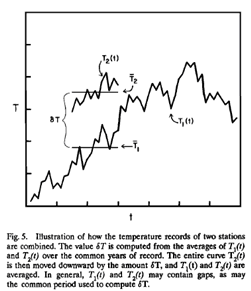
This method is called the ‘Reference Station Method’. One station in the region to be analysed is chosen as station 1, the reference station. The next stations are 2, 3, 4, etc., to 'N'. The average for each pair of stations (T1, T2), (T1, T3), etc. is calculated over the common reference period using the data series for each station T1(t), T2(t), etc., where "t" is the time of the temperature reading. So for each station their anomaly series is the individual readings - Tn(t) - minus the average value of Tn.

"δT" is the difference between their two averages. Simply calculating the two averages is sufficient to produce two series of anomalies, but GISTemp then shifts T2(t) down by δT, combines the values of T1(t) and T2(t) to produce a modified T1(t), and generates a new average for this (the diagram doesn’t show this, but the paper does describe it). Why are they doing this? Because this is where their Area Averaging scheme is included.

When combining T1(t) and T2(t) together, after adjusting for the difference in their averages, they still can’t just add them because that wouldn’t include any Area Weighting. Instead, each reading is multiplied by an Area Weighting factor based on the location of each station; these two values are then added together and divided by the combined area weighting for the two stations. So series T1(t) is now modified to be the area weighted average of series T1(t) and T2(t). Series T1(t) now needs to be averaged again since the values will have changed. Then they are ready to start incorporating data from station 3 etc. Finally, when all the stations have been combined together, the average is subtracted from the now heavily-modified T1(t) series, giving us a single series of Temperature Anomalies for the region being analysed.

So how are the Area Weighting values calculated? And how does GISTemp then average out larger regions or the entire globe?

They divide up the Earth into 80 equal area boxes – this means each box has sides of around 2500km. Then within each box they divide these up into 100 equal area smaller sub-boxes.

GISTemp Grids


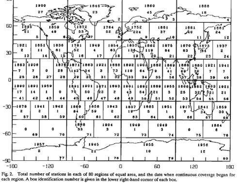
They then calculate an anomaly for each sub-box using the method above. Which stations get included in this calculation? Every station within 1200 km of the centre of the sub-box. And the weighting for each station used simply diminishes in proportion to its distance from the centre of the sub-box. So a station 10km from the centre will have a weighting of 1190/1200 = 0.99167, while a station 1190 km from the centre will have a weighting of 10/1200 = 0.00833. In this way, stations closer to the centre have a much larger influence while those farther away an ever smaller influence. And this method can be used even if there are no stations directly in the sub-box, inferring its result from surrounding stations. 

In the event that stations are extremely sparse and there were only 1 station within 1200 km, then that reading would be used for a sub-box. But as soon as you have even a handful of stations within range, their values will quickly start to balance out the result. And closer stations will tend to predominate. Then the sub-boxes are simply averaged together to produce an average for the larger box – we can do this without any further area averaging because we have already used area averaging within the sub-box and they are all of equal area. Then in turn the larger boxes can be averaged to produce results for latitude bands, hemispheres, or globally. Finally these results are then averaged over long time periods.

Remember our previous discussion of Teleconnection, and that long term climates are linked over significant distances. This is why this process can produce a meaningful result even when data is sparse. On the other hand, if we were trying to use this method to estimate daily temperatures in a sub-box, the results would be meaningless. The short term chaotic nature of daily weather would swamp any longer range relationships. But averaged out over longer time periods and larger areas, the noise starts to cancel out and underlying trends emerge. For this reason, the analysis used here will be inherently more accurate when looked at over larger times and distances. The monthly anomaly for one sub-box will be much less meaningful than the annual anomaly for the planet. And the 10-year average will be more meaningful again.

And why the range of 1200 km? This was determined in HL87 based on the correlation coefficients between stations shown in the earlier chart. The paper explains this choice:

“The 1200-km limit is the distance at which the average correlation coefficient of temperature variations falls to 0.5 at middle and high latitudes and 0.33 at low latitudes. Note that the global coverage defined in this way does not reach 50% until about 1900; the northern hemisphere obtains 50% coverage in about 1880 and the southern hemisphere in about 1940. Although the number of stations doubled in about 1950, this increased the area coverage by only about 10%, because the principal deficiency is ocean areas which remain uncovered even with the greater number of stations. For the same reason, the decrease in the number of stations in the early 1960s, (due to the shift from Smithsonian to Weather Bureau records), does not decrease the area coverage very much. If the 1200-km limit described above, which is somewhat arbitrary, is reduced to 800 km, the global area coverage by the stations in recent decades is reduced from about 80% to about 65%.”


Effect of station count on area coverage

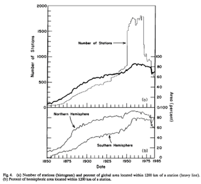
It’s a trade-off between how much coverage we have of the land area and how good the correlation coefficient is. Note that the large increase in contributing station numbers in the 1950s and subsequent drop off  in the mid-1970s does not have much of an impact on percentage station coverage – once you have enough stations, more doesn’t improve things much. And remember, this method only applies to calculating surface temperatures on land; ocean temperatures are calculated quite separately. When calculating the combined Land-Ocean temperature product, GISTemp uses land-based data in preference as long as there is a station within 100 km. Otherwise it uses ocean data. So in large land areas with sparse station coverage, it still calculates using the land-based method out to 1200 km. However, for an island in the middle of a large ocean, the land-based data from that island is only used out to 100 km. After that point, the ocean based data prevails. In this way data from small islands don’t influence the anomalies reported for large areas of ocean when ocean temperature data is available.

One aspect of this method is the order in which stations are merged together. This is done by ordering the list of stations used in calculating a sub-box by those that have the longest history of data first, with the stations with shorter histories last. So they are merging progressively shorter data series into a longer series. In principle, the method used to select the order in which the stations are being processed could have a small effect on the result. Selecting stations closer to the centre of the sub-box first is an alternative approach. HL87 considered this and found that the two techniques produced differences that were two orders of magnitude smaller than the observed temperature trends. And their chosen method was found to produce the lowest estimate of errors. They also looked at the 1200 km weighting radius and considered alternatives. Although this produced variations in temperature trends for smaller areas, it made no noticeable difference to zonal, hemispheric, or global trends.

The Others

The other temperature products use somewhat simpler methods.

HadCRUT (or really CRU, since the Hadley Centre contribution is Sea Surface Temperature data) calculate based on grid boxes that are xº by xº, with default value being 5º by 5º. At the equator, this means they are approximately 550 x 550 km, although much smaller at the polar regions. They then take a simple average all the anomalies for every station within that grid box. This is a much simpler area averaging scheme. Because they aren’t interpolating data like GISS, they are limited by the availability of stations as to how small their grid size can go, otherwise too many of their grids may have no station at all. And in grid boxes where there is no data available, they do not calculate anything. So they aren’t extrapolating / interpolating data. But equally, any large-scale temperature anomaly calculation such as for a hemisphere or the globe is effectively assuming that any uncalculated grid boxes are all actually at the calculated average temperature. However, to then build results for larger areas, they need to area weight the averages for the differing sizes of the grid boxes depending on the latitude they are at.

NCDC and JMA also use a 5º by 5º grid size and simply average anomalies for all stations within that grid then area weighted averaging is used to average grid boxes together. All three also combine land and sea anomaly data. Unlike HadCRU & NCDC, which use the same ocean data, JMA maintain their own separate database of SST data.

In this article and the Part 1A, I have tried to give you an overview of how and why surface temperatures are calculated, and why calculating anomalies then averaging them is far more robust than what might seem the more intuitive method of averaging then calculating the anomaly.

In parts 2A & 2B we will look at the implications of this for the various questions and criticisms that have been raised about the temperature record.

0 0

Printable Version  |  Link to this page

Comments

Comments 1 to 33:

  1. Thank you for a clear description of the methods and the reasons for choosing them.
    0 0
  2. I would like to echo post #1 To validate your procedure I suggest that you find what the actual correlation (in space and time) exists between the stations. At present the values for this parameter appear to be quite arbitrary.
    0 0
  3. damorbel, I take it the following escaped your reading.
    "“The 1200-km limit is the distance at which the average correlation coefficient of temperature variations falls to 0.5 at middle and high latitudes and 0.33 at low latitudes."
    0 0
  4. "Note that the large increase in contributing station numbers in the 1950s and subsequent drop off in the mid-1970s does not have much of an impact on percentage station coverage – once you have enough stations, more doesn’t improve things much."
    I have a post on my blog that illustrates this effect. From the late 1950s to the present, despite the varying number of stations reporting, GISTEMP accounts for virtually 100% of the Earth's land surface. If one takes into account the land data interpolated into the ocean, the spatial coverages is well over 100%
    0 0
  5. Re #3 GaryB you wrote:- “The 1200-km limit is the distance at which the average correlation coefficient of temperature variations falls to 0.5 at middle and high latitudes and 0.33 at low latitudes." Thank you for making my point. Can any serious analysis expect correlation of temperature over 1200km? 1200m may just be satisfactory over land mass but is unlikely to be so for a land/water interface and absolutely not if a change of elevation is involved. It is all too easy to 'assume' correlations instead of establishing them; the latter is of course the scientific thing to do. Re #4 Chad you wrote:- " If one takes into account the land data interpolated into the ocean, the spatial coverages is well over 100% " 'Interpolation' means creating data points where you have none; interpolation always means making assumptions about how some function, arbitrary (free hand sketch) or mathematical (a very big subject!) behaves. There you have it; you must show how the interpolation is valid, something that has not been done. This validity failure corresponds exactly with the failure to establish the correlation I have mentioned above.
    0 0
  6. To Glenn Tamblyn In order to monitor if the global surface temperature is rising, an absolute value is not needed. A checksum will do, wherein even temperature anomalies become part of what can be considered "all things being the same".
    0 0
  7. That is an excellent account of how James Hansen's Gistemp is an artefact very easily manipulated to give the desired outcome, because of the ample opportunity for subjective selection. For example, the latest Gistemp shows an anomaly for both Oxford and Heathrow UK over the period 1959-2010 relative to 1951-80 of 0.41 oC. However the UK Met Office shows the LS linear trend in Tmax for Heathrow of over 0.034 p.a. from 1959-2010, or 3.4 oC if projected forward to 2110, while Oxford, about 30 miles away has a down trend over 1959-2010 of 0.07 oC p.a., or MINUS 7 oC to 2110. Guess which is chosen by Gistemp using its 1200 km rule, which also enables GISS to use Heathrow to represent temperature trends in Scotland, even though like Oxford, Eskdalemuir up there (home to the main Scottish observatory)shows NEGATIVE trends of 0.051 for Tmax and 0.037 oC p.a. for Tmin from 1959-2010. Scotland's mean annual temperature is already less than 10 oC, and if these 50 year trends persist it is going to be really cold by the end of this century! Climate scientists are expert at linear projections when it suits them, but they don't want to know about Oxford with its temperature records going back to 1660, or Scotland, and Heathrow will do very nicely.
    0 0
  8. #7 Tim Curtin. I'll see your cherries (Eskdalemuir and Oxford) and raise them with the UK's April temperature according to CET. That graph looks almost like a hockey stick, with 2007 beating the previous record by 0.6C, and 2011 beating 2007 by 0.6C. In Scotland, where I live, global warming is manifesting itself in weird winter weather (either no snow or deluges of it), and by smashed temperature records any time the wind is persistently in the south, which has been relatively rare due to weird weather patterns. Flooding is also not uncommon. Extremes haven't been reached in the UK like Russia or Pakistan (though Cumbria and Gloucester might argue differently), but arguing on the basis of a few cherries that global temperature isn't rising is a lame duck argument. Why do satellites show the same warming, why are the seasons changing, and why are the glaciers retreating at a rate of knots? Did you go round and tell the glaciers that GISTEMP has been fudged and they should retreat so as to keep in with the conspiracy?
    0 0
  9. Tim Curtin #7 If it's so easy to get whatever desired outcome, how come no research institute, or even blogger, managed to produce a time series with the "real" decline in temperature you imply to be the case? How much evidence one can deny before admitting to himself he's in denial?
    0 0
  10. damorbel #5 What's the temperature trend if you used, say, a correlation to a distance as short as 250Km?
    0 0
  11. #5 damorbel; "It is all too easy to 'assume' correlations instead of establishing them; the latter is of course the scientific thing to do." Exactly, that's why they were determined from observations. And why shouldn't there be any hope of correlation if elevation is involved? Higher elevations would expect to be cooler than lower ones, but it's believable that their temperature changes might correlate: they might both warm and cool at the same time which is what is being calculated. Here are some New Zealand stations, with Kelburn being near to the airport, but at a higher elevation. A quick eyeball Mk.I suggests very strong correlation, despite the altitude difference. So it seems that it isn't impossible.
    0 0
  12. Re #11 MarkR et al You cannot learn anything from correlation processes unless you have a clear idea what you are looking for. Autocorrelation is frequently used for detecting (crudely) delay in a signal path; changing the delay enables the full impulse response of the signal path to be determined. Such a process could be used to measure how the temperatures on a planet such as Earth respond to variations tin the Sun's output. It is known that the sun's output varies in a cyclical way (basically 11 years but really rather more complex). It would be of interest to try to extract the dependence of any given temperature, global or local, by finding the correlation (at various delays) between the Sun's output and any temperature. As yet I have seen no attempt to do this. What Hansen is doing is looking to see if he can reconstruct temperature records where there aren't any which is creative, not scientific. There will always be a limited correlation between temperatures, the effects of variations in the Sun's output will see to that; trying to use this to support the argument that man, through generating in a surplus of CO2, is changing the climate of the Earth seems to me to be tenous in the extreme.
    0 0
  13. Re #12 for autocorrelation read cross-correlation
    0 0
  14. #12 damorbel: relationships between the effect of the Sun and temperature response are a different subject. Hansen and Lebedeff used pairs of stations, i.e. actual observations, to test the strength of spatial correlation and they found from their data that at 1200 km separation the temperature change correlation coefficient dropped below 0.5, so used 1200 km as their cut off for weighting. This doesn't sound unreasonable to me. There is a real temperature field, and for a large enough number of point observations you get a statistically good idea of spatial & temporal variability. I trust Hansen, Lebedeff and their reviewers did a reasonable job with the statistics until someone shows me otherwise. Can you demonstrate using the data that this isn't true, or pick out a mistake that invalidates the results of HL87?
    0 0
  15. Some serious fudging of the (non)issues here by damorbel. For comparison between the Sun's output and planetary temperature, there's a handy page on this site called It's the Sun. If you don't think that there's a relationship between temperatures of stations within 500km or 1000km, or stations of different elevations, clearly you haven't ever done any temperature reconstructions, understood lapse rates, or looked at the data. There's a handy temperature reconstruction that does not extrapolate to cover regions of missing data, it's done by those friendly folks at CRU and is the HADCRUT3 dataset. It shows just the same pattern of warming as GISS. Satellite data, done by those friendly folks at UAH, also shows just the same pattern of warming. Though it may "seem to you to be tenuous in the extreme", fortunately there are some clever people out there (including Hansen et al), both professionals and bloggers, who have done the maths and determined that your assertion of limited correlation between stations, supported by nothing more than handwaving, does not stand up to scrutiny. See many articles elsewhere on this site for why the 40% extra CO2 is the most important driver of present climate, concentrate on things like the fingerprints of CO2.
    0 0
  16. Re #14 MarkR You wrote:- "at 1200 km separation the temperature change correlation coefficient dropped below 0.5, so used 1200 km as their cut off for weighting." For a start a correlation coefficient of 0.5 is rather low. Also it is only related to climate change of any cause, the figures are just as valid for Svensmark's cosmic ray theory as for CO2. As far as HL87 is concerned, it is about 'filling in for missing stations' A feature of historical climate change are the ice ages; these were times when large sheets of ice formed over the land masses of the Northern Hemisphere. During the ice ages Antartica and the Southern Hemisphere did not acquire large sheets of ice, substantially beyond what they have now. The meaning of this being that climate change is not correlated over the Earth's surface.
    0 0
  17. Damorbel's riding that galloping horse hard ...
    A feature of historical climate change are the ice ages; these were times when large sheets of ice formed over the land masses of the Northern Hemisphere
    45 south is in the middle of the ocean (the "roaring 40s"). 45 north lies about about 30 miles south of where I'm sitting in Portland, Oregon. South America's a thin finger pointing southward, Africa's a blunt thumb, neither is in the least as massive as north america or eurasia and of course the latter two lie at much higher latitudes on average than the southern continents. Antarctica already had a large sheet of ice, BTW.
    0 0
  18. Readers Please note that damorbel has a history of arguing for the sake of arguing.. this includes contradicting himself to prolong a discussion. The'2nd law of thermodynamics' thread shows this clearly. I'm seeing the same pattern starting here.
    0 0
  19. No point in arguing with someone who thinks they're in the business of educating us about the ice ages, or thinks that how you compile a temperature record depends on what you think changed the temperature record. But in case any lurker thinks that mid-latitude ice sheets did not grow in South America and New Zealand (the only land masses at mid-southern latitudes of 40-60S), here's a little info. The Patagonian Ice Sheet covered about 480,000sq km from around 41 deg S down to Cape Horn. Geomorphology is unequivocal on this, though many key references on mapping tend to predate the Internet era - the existence of this ice sheet is not exactly scientific news! A small fraction (~4%) of this ice sheet remains as the North and South Patagonian Ice Sheets. A similar linear ice sheet grew on the Southern Alps of New Zealand, covering ~25% of South Island. Ice sheets grew where they could, but ice sheets don't tend to grow in deep oceans!
    0 0
  20. "The Patagonian Ice Sheet covered about 480,000sq km from around 41 deg S down to Cape Horn." 55 degrees south, the "thin finger" I mentioned above. The southern tip of africa is only about 35 degrees south, so it's not surprising it didn't get covered by ice sheets during various ice ages. Damorbel need to take more care that he doesn't fall off while galloping gish's horse.
    0 0
  21. Damorbel @16, a correlation of 0.5 is quite low. That is why the GISS method assigns a station a weighting to a station 1200km away of (1200-1200)/1200 = 0. A station 1199 km away will receive a weighting of (1200-1199)/1200 =~= 0.00083. In other words, it will have a significant influence on the GISS tempurature if there are very few, and very distant stations from that location. This, as with the rebuttal of all your other objections, was clearly explained in the article above. Nice piece of trolling about the ice ages, by the way. Transparently the lack of correlation of the existence of a continental ice sheet in the middle of the northern USA and the middle of the Antarctic Ocean has nothing what so ever to do with correlation of temperatures withing a 1200 km radius over land, but still you snuck it in there. As GISS (nor any other temperature index) does not use southern hemisphere temperatures at equivalent latitudes to determine northern hemisphere temperatures (except within 1200 km of the equator), your comments about the ice age are a complete red herring. Transparently so! Actually on topic, if you do not like GISS's 1200 km smooth, their website allows you to create anomaly maps with a 250 km smooth. It even computes the global anomaly for you using only the sub cells within 250 km of a surface station (over land). This is not a superior measure because, unlike the 1200 km smooth it de facto must assume that the temperature anomaly over land of any area more than 250 km from a surface station equals the global average. In effect, it does assume that the temperature anomaly in those isolated regions can be determined by measuring the temperature anomaly at arbitrary longitudes and latitudes in the opposite hemisphere. So I guess your red herring does have a point. It clearly demonstrates the superiority of using the 1200 km smooth over using a 250 km smooth.
    0 0
  22. Damorbel: Please provide citations to literature to support your assertions. The bloggers posting to this site and the commenters adding their two bits (or responding to posters making contrary efforts, such as yourself) generally take the time and effort to do so. It would be a minimum courtesy to back up your claims with evidence of similar quality, rather than with snide insinuation.
    0 0
  23. Further to my last, I did NOT cherry pick Oxford & Eskdalemuir as I had no reason to believe in advance that they were cooling. The opportunity for cherry picking is with GISS, and BoM, both notorious for that as well as for adjusting historic temperature records downwards (eg Gistemp now has the 1998 anomaly about 0.07 down on the actual as first reported). The Giss system so well described in part 2 by Glen Tamblyn produces the following real anomalies for the ACT: using the 1200 km radius it gets the ACT's cooling in March 2011 down to -0.16 from -0.44 at 250 km. So that means it has no actual record of temperature in Canberra, for if it did it would use it and it would be the same in both data sets. Instead Hansen casts round for a warming spot not more than 1200 km away, say Bateman's Bay or Dubbo (bugger the different latitude and longitude, both warmer and warming). Using 250km, why not Wagga Wagga, generally warmer and more warming than the ACT. Perish the thought that GISS ever uses actual temperature data for any single location on earth, as its 250 and 1200 readings are always different - in my admittedly random spot checks. ( -Profanity snipped- ), only actual site records should be allowed for the global so aptly named "anomaly", as it is just that, a fictional deviation from the actuals.
    0 0
    Response:

    [DB] Please acquaint yourself with the SkS Comments Policy.  Future comments with such profanity will be deleted in their entirety.

  24. Tim Curtin @23, the highest High Quality network station to Canberra is Wagga Wagga. If GISS just used the nearest station, that is the temperature record they would use. As it happens, GISS shows a 1910 to 2010 trend of between 0.2 and 0.5 degrees C per century in South Eastern NSW (including Wagga and Canberra). In contrast, BOM shows a 0.9 degree warming trend over the same period at Wagga Wagga. I checked the Canberra location only because you brought it into discussion. Clearly your concerns about GISS artificially inflating its temperature trends are unwarranted, a fact we already knew from the similarity between GISS trends and other major surface temperature indices.
    0 0
  25. Tom: so why does GISS have 2 different figures for Canberra, depending on the 250 or 1200 km radius? If Wagga is good enough for one (and I have been to the met.station there)why is it not good enough for the other? Your data confirm that Wagga is more convenient than Canberra. Canberra does have a number of met.sites. I prefer real data to the confections of Gistemp.
    0 0
  26. That's a large accusation to make without evidence there Tim Curtain, and yes you are cherry-picking, be it individual stations or individual records. The glaciers are 'cooked' as well, explains why nearly all of them are retreating...
    0 0
  27. it is worth noting that N.C.D.C. uses Empirical Orthogonal Teleconnections to fill in areas that are not well represented,so it's not just an average of stations in a 5 by 5 grid cell, I don't mean to take way from any other points being made thanks jacob l
    0 0
  28. What Hansen is doing is looking to see if he can reconstruct temperature records where there aren't any which is creative, not scientific.
    And yet this 'creative, not scientific' approach produces basically the same results as everything else. Apparently, Hansen is some sort of wizard.
    0 0
  29. Wow, I am of the net for a day due to 'technology problems' and my post is already into specific stations and ice sheets! The purpose of this series is to look at the broader issues and 'encourage debate' and consideration of how to think about this subject, in the mathematical sense. I would like to make a general point. The concept of Teleconnection is well established in Climatology/Meteorology. Things are connected together. Damorbel has suggested that things such as elevation need to be considered. However this can easily fall into the trap of looking at temperatures rather than temperature anomalies. The graph from Hansen & Lebedeff 87 shown in post 1a (sorry but with the declining health of my laptop, posting a link is too hard). Is a plot of the correlation of Temperature Variation (Anomaly) vs station separation for station pairs. And it is based on randomly selecting those station pairs. Including variation in elevation. This is the key point, which can easily distract us. Long term climatic conditions at differing locations out to 1000 km or so ARE correlated, based on the evidence. Not that they have the same climate. But that their climates are related. Damorbel makes a valid observation that this will start to breakdown at the land/ocean interface. Even more so, we can't project this correlation out into the ocean. But these analyses only apply to land data. Ocean temps are processed separately. And this aligns with the observation I make that the correlation between stations and how they decline with separation is clearest in those latitudes with the highest proportion of land. However, Damorbel suggests that a 1200 km link is in some way unreasonable without supporting data. Firstly, the analysis from HL97 provides the supporting data. As I mention, commonality of weather systems passing over 'adjacent' locations provides a mechanism by which adjacent locations can see comparable temperature variations (anomalies). And from the data the 1200 km range is most reasonable at latitudes where there are high proportions of land. This is where the difference between temperature and temperature anomaly, climate vs climate variability can be a bit of a head bender. The mathematically valid approach doesn't align with our unconscious, intuitive sense. The unconscious is strong, but in this context it is strong. I will discuss some of these issues further in the last 2 parts of the series. But with the tight publication schedule here at SkS, that won't be till the end of the week.
    0 0
  30. In reply to skywatcher at 15:53 PM on 31 May, 2011 who said: "That's a large accusation to make without evidence there Tim Curtin, and yes you are cherry-picking, be it individual stations or individual records. The glaciers are 'cooked' as well, explains why nearly all of them are retreating". I do NOT cherry pick, Hansen and BoM do, that is why they prefer to use Wagga rather than Canberra, and Heathrow rather than Oxford. As for the glaciers, they have been receding since the end of the Little Ice Age, and thank goodness for that. A retreating glacier does NOT imply reduced rainfall, especially as ( -Snip- ).
    0 0
    Moderator Response: (DB) All-caps usage is a Comments Policy violation; please refrain from their use.
  31. #30: Read #9 again. Why do all the datasets, not all of them depending on reading and amalgamating station data, show basically the same trend? Tamino has a great plot showing the relationship between temperature anomalies of the 5 major series (John probably has one locally too, haven't found it just now). The 4th plot in Tamino's post is one to concentrate hard on. If all five major series agree so well, and they do exceptionally well, there's not much room for 'cooking' GISS or any other. But then if you believe everything's 'cooked' yet are unwilling to do the analysis (not pick the cherries) that would show that to be the case, then you're not in a strong position. Many people have replicated the trend without selecting out stations. Glenn's done an excellent service by demonstrating the nitty gritty of not just replicating the basic trend but the details of how to go from a quick-and-dirty spatially-weighted average of anomalies to a more rigorous treatment of heterogeneous data, and how to approximate for areas without nearby temperature records. I recall reading something about successful validation of the interpolation of gaps against reanalysis data, but cannot recall where? So it's warmed since the end of the Little Ice Age. Why? You surely don't think it's just 'rebounded'? But that is of course O/T and should go to a more deserving thread for your insights.
    0 0
    Moderator Response: ... and that other thread is We're Coming Out of the Little Ice Age.
  32. The description of the reference station method in this blog post is a little different than the original description by Hansen and Lebedeff. The blog post writes: "The average for each pair of stations (T1, T2), (T1, T3), etc. is calculated over the common reference period using the data series for each station T1(t), T2(t), etc., where "t" is the time of the temperature reading" Below figure 5 in the article (inserted in the blog post) the description is: The value dT is computed from the averages of Tl(t) and T2(t) over the common years of record" The wording in the blog post suggests (at least to me) that dT is estimated only over the reference period, which for GISTEMP is 1951-1980. While the article emphasizes that dT is estimated using all data in the overlapping periods.
    0 0
  33. Would anyone know where to find a simple walkthrough/text book-like example illustrating the Hansen and Lebedeff technique for calculating their anomaly of averages? Would appreciate it very much. Thanks much for any help.
    0 0

You need to be logged in to post a comment. Login via the left margin or if you're new, register here.


The Consensus Project Website

THE ESCALATOR

(free to republish)


© Copyright 2024 John Cook
Home | Translations | About Us | Privacy | Contact Us