Climate Science Glossary

Term Lookup

Enter a term in the search box to find its definition.

Settings

Use the controls in the far right panel to increase or decrease the number of terms automatically displayed (or to completely turn that feature off).

Term Lookup

Settings


All IPCC definitions taken from Climate Change 2007: The Physical Science Basis. Working Group I Contribution to the Fourth Assessment Report of the Intergovernmental Panel on Climate Change, Annex I, Glossary, pp. 941-954. Cambridge University Press.

Home Arguments Software Resources Comments The Consensus Project Translations About Support

Twitter Facebook YouTube Mastodon MeWe

RSS Posts RSS Comments Email Subscribe


Climate's changed before
It's the sun
It's not bad
There is no consensus
It's cooling
Models are unreliable
Temp record is unreliable
Animals and plants can adapt
It hasn't warmed since 1998
Antarctica is gaining ice
View All Arguments...


Username
Password
New? Register here
Forgot your password?

Latest Posts

Archives

Quantifying Extreme Heat Events

Posted on 3 January 2012 by michael sweet

James Hansen, M. Sato and R. Ruedy have posted a new paper to their website.  It has not been peer reviewed yet, but will eventually be published with some changes.  Hansen et al. (2011) analyzes surface temperature data and quantify the number of very hot and very cold summers and winters. 

Temperature anomalies

Hansen et al. use the period 1951-1980 to calculate an average temperature for each location.   Then the difference between a measured temperature and the average is calculated and called the anomaly.  For example, if the average temperature in a place is 10°C, and one day records 15°C, then the anomaly is +5°C.  The anomaly makes it easier to compare temperature records in different locations.

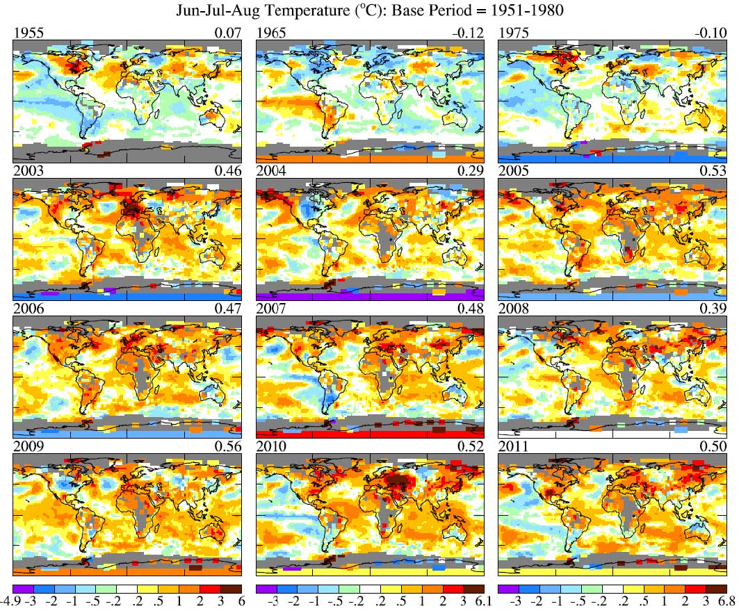
Where there are data, this allows maps of hotter-than-normal and colder-than-normal temperatures to be created, as in Figure 1.
Hansen 2011 figure 1

Figure 1. Jun-Jul-Aug surface temperature anomalies in 1955, 1965, 1975 and the past nine years relative to 1951-1980 mean. Number on upper right is the global (area with data) mean.

Standard Deviations

Hansen et al. calculate the standard deviation of the temperature at each location.  The standard deviation of the data measures how much the temperature normally varies about the average at that location.  They take the temperature anomaly at each location and divide it by the standard deviation for that location to determine how many standard deviations away from normal the temperatures at that location were.  This allows Hansen to compare how much the temperature has changed due to Global Warming (the anomaly) to how much the temperature normally varies at each location.

What does it mean to divide the anomaly by the standard deviation?

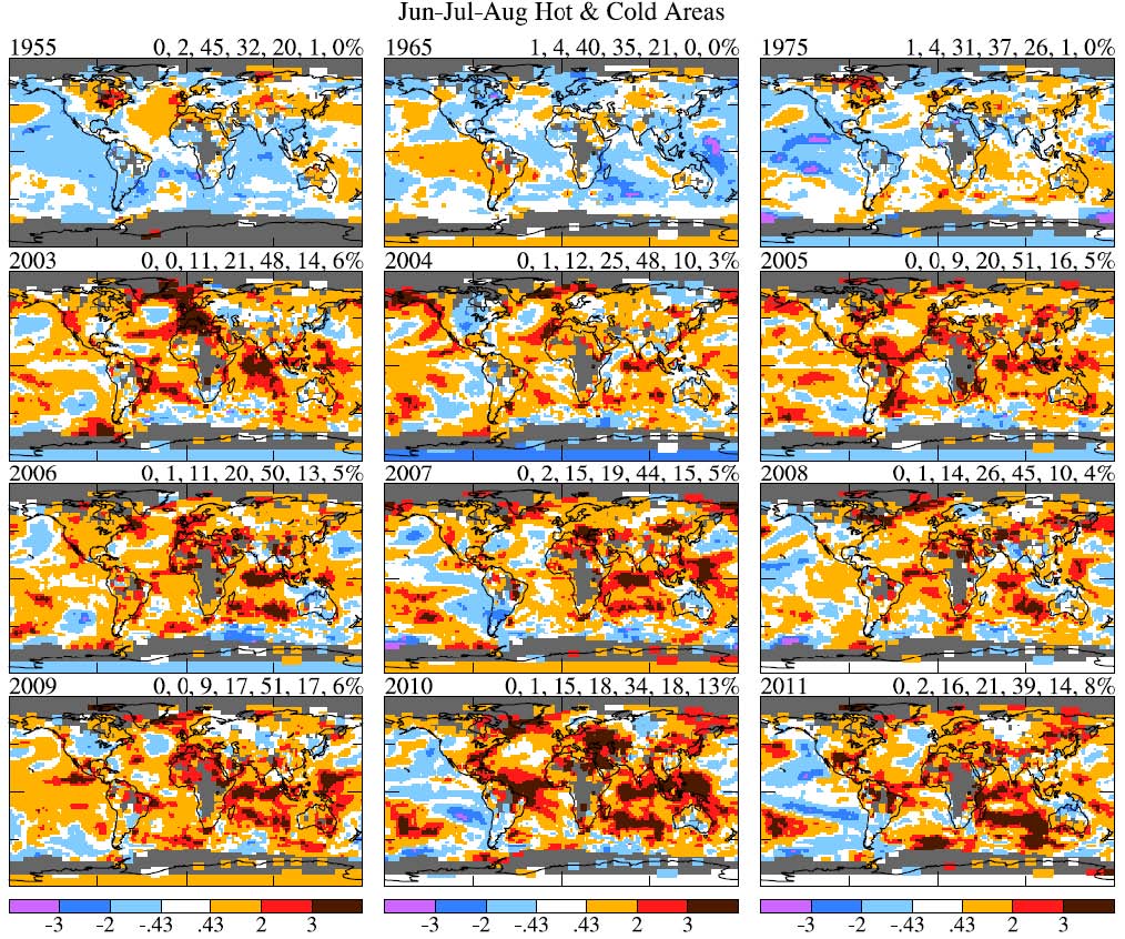
If the temperature anomaly follows a normal Gaussian curve, the number of data points that are more than one standard deviation (abbreviated as σ) from the average can be calculated.  In a normal distribution of the data, 68% of the data points fall within 1σ of the average value: 34% higher than average, 34% lower than average.  Only 2.3% of data points are expected to be over +2σ and only 0.13% over +3σ from the average (the same number would be -2σ and -3σ).  When Hansen looked at the data from 1951 to 1980, the distribution of data was very similar to a normal distribution.  The data from 2003-2011 tell a different story.  Here is the data for June-July-August showing 1955, 1965, 1975 and 2003-2011.
 Hansen 2011 figure 3

Figure 3. Jun-Jul-Aug surface temperature anomalies in 1955, 1965, 1975 and 2003-2011 relative to 1951-1980 mean temperature in units of the local standard deviation of temperature.

In this graph the gray areas have no data.  The dark red areas are +2σ hotter than normal and the black areas are +3σ hotter than normal.  Blue and purple areas are cooler than normal.  From 1955-1975 there are similar amounts of blue and orange, with little red and no black.  From 2003-2011 there is not much blue. Orange, red and black predominate.  Can we quantify the amount of difference?  Hansen has tallied the areas of each σ in the upper corner of each section of the figure, but I find the graph below easier to read.

Summer Anomalies

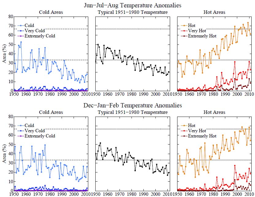
 Hansen 2011 figure 5

Figure 5. Area of the world covered by temperature anomalies in the categories defined as hot (σ > 0.43), very hot (σ > 2), and extremely hot (σ > 3), with analogous divisions for cold anomalies. These anomalies are relative to 1951-1980 climatology with σ from the detrended 1981-2010 data, but results are similar for the alternative choices for standard deviation.

In Figure 5, the center graph is “normal” temperatures, within 0.43σ of the average temperature.  We expect 33% of the measurements to fall in this range.  Hot (Cold) is defined as temperatures greater (less) than 0.43σ.  We expect each of these 33% of the time.  Very Hot (Very Cold) is greater (less) than 2σ, expected 2.3% of the time and Extremely Hot is greater than 3σ, expected only 0.13%.  The Hot data include the Very Hot points and the Very Hot data include the Extremely Hot points so the lines do not add up to 100% (Hot + Normal + Cold = 100%).  We will look at the June-July-August temperatures (December, January and February are slightly different, the reason is discussed in the paper).

The New Normal 

From 1950 to 1980 normal temperatures, cold and hot are all present about 33% of the time as expected.  There is little Very Hot or Very Cold. The Nauties are completely different.  Normal and Cold have dropped to 20 and 15% respectively and Hot has risen to about 66%.  In 2010, Very Hot (+2σ) occurred over 31% of the Earths surface and Extremely Hot (+3σ) occurred over 13% of the Earth’s surface, while the corresponding Very Cold and Extremely Cold were 1% and 0%.

Hansen says: 

The most dramatic and important change of the climate dice is the appearance of a new category of extreme climate outliers. These extremes were practically absent in the period of climatology, covering much less than 1% of Earth's surface. Now summertime extremely hot outliers, more than three standard deviations (σ) warmer than climatology, typically cover about 10% of the land area. Thus there is no need to equivocate about the summer heat waves in Texas in 2011 and Moscow in 2010, which exceeded 3σ – it is nearly certain that they would not have occurred in the absence of global warming. If global warming is not slowed from its current pace, by mid-century 3σ events will be the new norm and 5σ events will be common.”

Looking at Figure 3, we see in 2010 that Moscow was in the middle of a large black spot of +3σ, while in 2011 Texas was in the middle of a similar spot.  Europe had its time in the heat in 2003.  All these outliers were absent from 1950-1980.  People who continue to deny that extreme heat is caused by AGW need to look carefully at these graphs.  These extreme weather events were not normal; they are directly caused by AGW.  They are becoming normal now.  In 2010, 17% of the world’s land area was Extremely Hot (data not shown).  In the 1960s there were virtually zero Extremely Hot areas.

Conclusion

By doing an analysis of the entire globe at once, Hansen has gotten around the problem of attribution of a single event.  Global data, averaged over several months, allows Hansen to conclude that most of these events would not have happened without AGW.  Extremely Hot events, even for a single summer, kill established trees, permanently damage ecosystems and cause severe economic distress.  Praying for rain (as recommended by the Governor of Texas) is unlikely to correct the problem as long as we continue to emit large amounts of climate changing gasses.

0 0

Printable Version  |  Link to this page

Comments

Comments 1 to 37:

  1. How can anybody has a physical based argument other than AGW to explain what we are observing?? We are correct to call them deniers. They are in denial.
    0 0
  2. There is a high risk of me over-interpreting this information, but I'd like to toss out some thoughts and see what/if anyone else thinks of them. The areas where 3-sigma events are most commonly occurring seem to be clustered in three bands, the equator, and two bands roughly 30-40 degrees north and south. On the north and south bands, I'm wondering if the temperature anomalies are, at least in part, a result of Hadley cell circulation encroaching on regions previously under Ferrel cells. This would be consistent with GCMs that predict, and actual observations of, Hadley cell expansion in a warmer climate. Second SWAG (scientific wild-ass guess): If you project the increase forward, by somewhere around 2020 about 20% of the globe will be under a 3-sigma event in any given year. I wonder what people's memory is for events like Texas, Southern Europe, and the Moscow region. If events like these are happening about every 5 years in any area, will that finally get through to the general population that we are better off doing something about it than not?
    0 0
  3. It would be really useful, if a commonly defined baseline period from which anomalies should be calculated were used by climate change scientists. It's very confusing looking at graphs that cover different time periods and use different baselines in order to influence the viewer as to the veracity of their argument. Anybody know why different climate change scientists use different baseline periods e.g. The UK met office uses rolling 10 year periods, whereas Hansen et al seem to have settled on the 1950-80 period to be their baseline.
    0 0
  4. Mace, I think you are just going to have to accept that there are different periods of interest, just as a business is sometimes more interested in how this month compared with last month, and sometimes more interested in Q4 year-over-year results, and sometimes wants to see if a product line has grown revenue since 5 years ago. In this case, Dr Hansen may have simply thought that when observing anomalies for the last 30 years, the previous 30 would be an appropriate baseline. I think he mentions his reason in the paper itself, but memory fades. I don't think it matters, other than Hansen's baseline would probably not be appropriate for whatever the Met Office is doing just as theirs would not be appropriate for his observations.
    0 0
  5. Perhaps you could highlight a case where you found it confusing. For the purpose of determining trends and changes in the record, it doesnt matter what baseline you use. It only changes the zero.
    0 0
  6. Mace @ 7:22 I agree that consistent baseline periods would be nice, but to some extent they depend on available data. Without reference to sources ( I think there is mention of this in some of Hansen's material): - 30 years is considered by most climatologists to be the necessary minimum period for a good climatological baseline - Hansen normally uses the period 1951 - 1980 as being the 30-year period farthest back in time, for which there is adequate available data, in enough different parts of the globe, to establish a meaningful baseline. Even so,it is biased a bit high, as our CO2 emissions were already having an effect, especially in the 1970's! DaveW
    0 0
  7. "Even so,it is biased a bit high, as our CO2 emissions were already having an effect, especially in the 1970's!" Oh your just full of good news aren't you. This seems to me to be a pretty "simple" analysis (albeit of lots of data) in concept, and the way the graphs are presented should make the conclusions easy to communicate (which is enormously important) to the public. Will be interesting to the reaction when its published. Anyone want to make bets on how controversial this paper will be since up till now anyone attributing an extreme event to AGW has been (maybe with reason?) accused of mixing up weather and climate. What this paper seems to me to do is "plot" climate changes over time, and "oh looky" some of what we see from that correlates with the observed "weather". Thats going to be a powerful thing to take to the ongoing debate. [inflammatory snipped]
    0 0
    Moderator Response: [Rob P] If you have something worthwhile to say about the science please say it. Needlessly inflammatory comments are frowned upon here, and contravene the comments policy.
  8. I'm glad to see that the baseline issue was raised, because I have been concerned that the practice of 'rolling' baselines permits absolute temperature changes due to human carbon dioxide emissions to be disguised. Hansen has long explained why he uses the period he does (as KeenOn350 explained in turn) and I hope that future climatological analyses might be urged to use Hansen's approach wherever possible. On another matter, does anyone know off-hand how many separate long-term analyses there are of latitude shift of the prevailing westerlies? I'm curious to know if in future we will have the "Roaring Fifties-are-the-New-Forties"...
    0 0
  9. A terrific(if sobering)paper that quantifies an arguement that I have been having for a couple of years now. That a shift in a mean value has a disproportionate effect on the incidence of extreme events. I have e-mailed Prof. Hansen though to ask if he would remove the attack on Gov. Perry prior to publishing the paper. While the attack is well founded, it is not really well placed in the paper, it just gives deniers an opening to attack the paper whilst ignoring the science.
    0 0
  10. ChrisG I'm no expert but I think that you're correct. The worlds deserts appear at the base of the hadley cell. The cells descending dry air creates them. As the world gets warmer the hadley cells get more intense and move towards the poles. The real problem is that the most furtile land on the planet lies just poleward of the base of the hadley cell. So as GW gets more intense the planets food bowl gets more adversely affected.
    0 0
  11. Mikemcc, You are referring to this statement in Hansen, Sato and Ruedy: "I, Rick Perry, Governor of Texas, under the authority vested in me by the Constitution and Statutes of the State of Texas, do hereby proclaim the three-day period from Friday, April 22, 2011, to Sunday, April 24, 2011, as Days of Prayer for Rain in the State of Texas. I urge Texans of all faiths and traditions to offer prayers on those days for the healing of our land, the rebuilding of our communities and the restoration of our normal way of life." Science cannot disprove the possibility of divine intervention. However, there is a relevant saying that "Heaven helps those who help themselves." This is a purely factual reference to a real event. How is that an attack?
    0 0
  12. Having read the draft of Hansen's website, i'd have to agree with Mikemcc @ 9 regarding the section on Gov Perry. Yup, well founded and i think deserved, but in a scientific paper will give a broad spectrum of the denialatti a hook into dismissing the science. More broadly, having that in could mean that if it gets reported in the MSM it would be for the Perry part, not the findings.
    0 0
  13. Chris @2 I have my own version for what might wake people up. The 3 Cunard criuse liners, their Queens - Mary, Elizabeth & Victoria - stationary side by side, packed with tourists, On September 15th, surrounded by nothing but open water. At the North Pole. My current bet for that, based on the trends from PIOMass is 2016.
    0 0
  14. Just an editing note. For a general audience, it would be good if you defined sigma (and maybe even used the word sigma instead of the greek symbol) before using it. I know that it refers to standard deviation, and you know it does, but it's used as such before it's defined. For that matter, you might link to a definition of standard deviation for the statistically uneducated.
    0 0
  15. Right on que.... Seems like its going to be a regular thing already.... South Australia is sweltering with the hottest start to the year in more than a century as a hot air mass which can sear vegetation moves across the state http://www.abc.net.au/news/2012-01-03/more-power-cuts-possible-as-heatwave-continues/3755802
    0 0
  16. This previous post indicates that we have reach some kind of threshold already or are just stepping through one with respect to the sigma events.... http://www.skepticalscience.com/Canada-wildfire-threshold_IMC.html "In our opinion this is a sign that there are also threshold values for forests above which the wildfire regime drastically changes," reports Volker Grimm. "It is likely that the Boreale Plains have in recent decades, particularly around 1980, experienced a change to a system characterised by wildfires.
    0 0
  17. Is there any quantification of sigma value in Hansen's paper? I understand, Hansen calculated sigmas locally for each station, as local whether patterns differ at each location. But some average or weighed average value would be interesting to have. For example, how about comparing those Gaussian shifts on figure 3 to the average AGW signal measured by Foster and Rahmstorf and reported here... Hansen average mean shift and Foster and Rahmstorf AGW signal should be pretty much the same if both papers started from the same/similar data and strengthen both conclusions.
    0 0
  18. Paul Magnus @ 15 - The Western Australian heat record was very nearly broken in December with 49°C (120F). Don't think I could handle that kind of searing heat. Glad I live in a tiny country at high(ish) latitude surrounded by a vast ocean (NZ).
    0 0
  19. I got an extremely prompt reply from Prof. Hansen. He is working on a revised version without the political commentary.
    0 0
  20. All I can say are two things 1) Oh dear - bad (though not surprising) news. "Extremely Hot (+3σ) occurred over 13%" but "expected only 0.13%". If there was "nothing" going on and it was all "natural variation" what are the chances of such an occurence? Of course if it was just a single year (2010) such an "outlying" event" would be possible (albeit improbable) - but one must also look at the trend since 1980. It's like a heavily loaded dice. Although exactly what you would expect when you see a "normal" distribution of an output/response parameter subjected to a relentless external increase on one of its input driving parameters :( 2) How will the pseudo-skeptics spin this one away?? No doubt they will try and perform their usual feats of logical contortion.
    0 0
  21. Given that governor Perry is, tragically, a candidate for the GOP presidential nomination it certainly seems wisest to leave him out of the paper rather than to invite charges of science intruding on the political sphere... though we actually have a constitutional edict that religion not do so which Perry and many others now ignore with impunity. Hansen's findings are extremely powerful and suggest that the trend we have been seeing in new record high temperatures is only the beginning. Based on the 'extremely hot' curves in the graphs above it seems likely that the vast majority of 'highest daily temperature' records for all parts of the globe will be broken within the next 20 years. The increase in 'hot' days has gone largely without notice, but the 'very hot' and 'extremely hot' events have already been attracting attention and if they continue on the slopes shown that is only going to increase.
    0 0
  22. Regarding the Rick Perry reference, I've seen this perceived as an attack on some website or another, and in that way it was distracting. For my own part, like Muoncounter, I perceived it as merely an observation. Atcook27, we are coming to the same conclusion. Bernard J, I have found lots of hits on Hadley cell expansion from Google Scholar, and the Hadley cells define where the jet stream and prevailing winds occur. The impression I've gotten is that we can expect a 2-4 degree of latitude expansion per degree of warming. So, yes, what you are saying is within the realm of possibility.
    0 0
  23. Anyone aware of a similar global analysis of "extreme precipitation events?"
    0 0
  24. mreisner, That is significantly more difficult to do due to the complex nature of rainfall and the sparse data coverage of much of the globe. Current statistical technique for analysing trends or change points in the data are, to put it mildly, not very good.
    0 0
  25. This reads like a religious paper not a scientific paper. Let me explain: First of all there is no equations or real description of how to reproduce his numeric model. We are expected to have faith that his numeric methods are valid. Then half way through we get an attack on his "opponents". Forget what the attack is: What does this paragraph have to do with the Science discussed?!? The writer has such a political agenda he can't even get through a 4 page paper without a purely political criticism from someone completely unrelated to the subject at hand... I predict it will travel the path of most faith based documents. It will pass the peer review process by someone sympathetic. Be flogged at press releases and then be ripped apart within 18 months as what it is. Unscientific. It doesn't mean anything about Global Warming if this gets ripped apart. It should be labelled for what it is: Political commentary or Religion. Take your pick.
    0 0
    Response:

    [DB]  Your comment contains several inflammatory bits of ideological rhetoric, as well as insinuations of academic fraud and/or dishonesty.  All of which are violations of the Comments Policy.  Please better conform to said policy, as future, similar, comments will be simply deleted.

  26. What are you talking about James Wilson? The paper simply looks at temp anomalies. All the data are readily downloadable from GISTEMP. Get the data, calculate the averages, subtract the baseline averages from them and you get the anomalies. That's what the numerical model is. The time periods considered are clearly indicated in the paper. I expect the gridding is the usual GISTEMP 200 km boxes (is it 200? I forget). Not that a different gridding would make much difference anyway. For the next part, you need to know what standard deviation is and have some basic knowledge of stats. If you don't, acquire it before you try to reproduce the results, as you would have no business doing so without the knowledge base. Once you know how to do it, then you can calculate your own standard deviation, a much fruitful endeavior than reusing someone else's equations, which would not constitute reproduction of results and would not validate anything. All the following graphs are based on deviations as compared to the standard deviation. Once you have the necessary numbers, just plot them on a graph. All this can be done with the info that is in the paper and the GISTEMP data. Have at it. Furthermore, this paper is not yet formalized for publication, this caveat is clearly stated on top of the thread. Your insinuations that it will pass peer-review out of sympathy in its current form are unwarranted.
    0 0
  27. James, The data for the analysis are freely available at GISS. I have described the analysis in sufficient detail to reproduce Hansen's data. Hansen gives more detail than I have included. If you do not understand how to calculate a standard deviation you should hold back on your comments, my students in High School are required to learn standard deviations. This paper has been on the web for two months. Can you point to a serious criticism of it?
    0 0
  28. I am confused. If the sigmas are calculated based on one set of values (50-80) and then the temperatures go up on average (global warming). Then the 03-11 values are very likely to be skewed up and at a greater sigma value. The paper mentioned something about removing the linear trend in one scenario. Even with that removal, the values are a little more likely to be extreme. Now, perhaps the extremes have become worse, but why would you use the sigma of one set of points to judge a different set? I am not a statistician, but let me give an extreme example to show what I mean. If you calculate sigma off a set of values like 9, 11, 12, 13, 13, and 13, you get a small value near 1. If you then test that sigma on a new set of numbers, for example, a set that is proportionally equivalent to the first: 90, 110, 120, 130, 130, and 130, then every data point in this second set will generally be off by many of the sigmas calculated on the first set. .... On the other hand, if humans are adapted to a sigma of 1 and you jump to a sigma of 10, while the 10 might be absolutely sane and logical, the organisms that were adapted to sigma of 1 would likely be in trouble. .. OK, I am not so confused any longer. [Thankfully, these numbers I just used for the demonstration were much much more extreme than what we are experiencing in temp readings worldwide.]
    0 0
  29. 25, JamesWilson, The majority of your comment is in clear violation of the comments policy, and should be deleted. That said... a) What paragraph are you talking about? I see nothing remotely like an attack. You quoted the word "opponents" but it does not occur in the paper. Please support or withdraw your assertion. b) "...there is no equations or real description of how to reproduce his numeric model." There rarely is. Anyone competent should do so on their own, not by replicating Hansen's methods exactly but by approaching the problem themselves. That's how science is normally done. Your complaint is invalid, and uneducated. The rest of your comment is a tiresome rant of its own, and a clear violation of the comments policy. It represents your personal opinion, and is at odds with the clear and inarguable data presented by the paper. Do you have anything to say about the content, rather than your perception and opinion of the way it is phrased, or an otherwise unsupported dismissal of the results? Doesn't it scare you just a little?
    0 0
  30. #29 Sphaerica. It should scare people, after all, this paper documents observations of increasing extremes, and is not a prediction of the future. Perhaps JamesWilson does not believe that the 2003 European heatwave happened, or the 2010 heatwave, or the 2011 southern US heatwave? After all, it's in a Hansen paper. It couldn't actually have happened, could it? #28: Jose_X - looks like you more-or-less answered your own question. If you want to analyse the variability within the two different datasets, then you'd use a baseline calculated from within those datasets, but that would tell you nothing of how the datasets' absolute values changed from one to another. For documenting how different one datset is from another, the Hansen approach is perfectly valid. We can see that 2010 and 2011 have a lot more warm extremes across the globe compared to individual years before 1980, and that this trend is increasing.
    0 0
  31. A truly frightening perspective. If you wonder how the deniers will deny, it will look like this: "There isn't one shred of evidence that ties the increased heat to CO2 emissions. It is more likely ... (probably the Cosmic Ray thingy - that seems popular these days).
    0 0
  32. @23 mreisner, a 2011 paper published in Nature looked at human influence on precipitation extremes in North America: Human contribution to more-intense precipitation extremes Seung-Ki Min, Xuebin Zhang, Francis W. Zwiers & Gabriele C. Hegerl
    0 0
  33. I know it's a rather an indirect indication of heat build-up compared to the graphs in the article above, but to a layman like me this NOAA graph is much more compelling and -- if I was a US citizen living in the Southern States -- very frightening. [Note to moderator: please insert the graph if you think it's worth it.]
    0 0
    Response:

    [DB] Graph inserted:

    Click to enlarge

  34. actually thoughtful, and if deniers do use that approach (i.e. 'not one shred of evidence linking CO2 to increased heat') the response should be that it is a flat out lie... the equivalent of claiming that just because you put a hot dog on a lit barbecue grill and it has now been cooked on one side with vertical stripes corresponding to the grill frame that does not mean that the grill had anything to do with the hot dog becoming cooked. Some magical unknown force could have been shielding the hot dog from the grill heat while another magical force (cosmic rays in your example) came in and cooked the hot dog in exactly the same way that the grill would have. As you know, there is overwhelming evidence (rather than 'not one shred') that CO2 is responsible for this warming... to the same level as the grill and hot dog example. I've found that people tend to understand how global warming 'fingerprints' tie it back to CO2 better when presented with this sort of 'heating food' analogy. Just as the grill has observable heating patterns on the hot dog so too does CO2 have specific global warming patterns that differ from cosmic rays, solar, and other warming sources. Given that the observed warming matches both the degree and patterns we would expect from CO2 and does NOT match any other known source the efforts of 'skeptics' to claim 'something else' is responsible have drifted into the realm of denying observed reality.
    0 0
  35. This paper makes me even more frustrated with my lack of training in physics and stats. Wish I could take my 60-year-old brain back to my 12-year-old body and really try to understand more of what I was taught in school. As it is, I have to stand on the shoulders of others in order to gain an understanding of the topic. My thanks to those who take the time to explain the steps in calculating the stats. It really helps an interested outsider like me.
    0 0
  36. James@25, this silly shibboleth of science-one-does-like being called "religion" is a particualy bothersome one to me. Definition, from Dictionary.com: "re·li·gion   /rɪˈlɪdʒən/ Show Spelled[ri-lij-uhn] noun 1. a set of beliefs concerning the cause, nature, and purpose of the universe, especially when considered as the creation of a superhuman agency or agencies, usually involving devotional and ritual observances, and often containing a moral code governing the conduct of human affairs. 2. a specific fundamental set of beliefs and practices generally agreed upon by a number of persons or sects: the Christian religion; the Buddhist religion. 3. the body of persons adhering to a particular set of beliefs and practices: a world council of religions. 4. the life or state of a monk, nun, etc.: to enter religion. 5. the practice of religious beliefs; ritual observance of faith" Please point out to me *which* of these generally-accepted definitions ANYTHING in the above referenced paper approaches "religion." When you do that, we can then discuss what, for me, is a matter of simple and purposefully-inflammatory rhetoric. Said another way; science not understood is not religion: it is just science that is beyond your pay grade, as many areas of science are to me. I don't accuse the watchmaker of sorcery or gbeing a religionist, just because I haven't an idea how a watch works: I trust in his/her ability to make watches, which is, last I checked, based on science, no?
    0 0
  37. vrooomie, James has not posted in this forum since January 14th, so it might be quite some time before you get a response...
    0 0

You need to be logged in to post a comment. Login via the left margin or if you're new, register here.


The Consensus Project Website

THE ESCALATOR

(free to republish)


© Copyright 2024 John Cook
Home | Translations | About Us | Privacy | Contact Us